This CE Center article is no longer eligible for receiving credits.
Color is a strong and integral part of both our natural and built environment. People experience color in different ways and in different settings often reacting subtly or overtly to its impact. In particular, people in health-care settings who are vulnerable, healing, or aging have been understood to be influenced by colors used in interior design. It is not surprising then that a fair amount of research and inquiry has been undertaken on the use, role, myths, and impact that color can have on people in health-care settings. By learning from these studies and applying the knowledge gained about the role that color plays in health-care environments, designers can create spaces that better meet the needs of patients, staff, visitors, and other users. In addition, some of the misunderstandings and myths about color in health-care environments can be cleared up to clarify what really does or does not impact people in the context of the built environment.
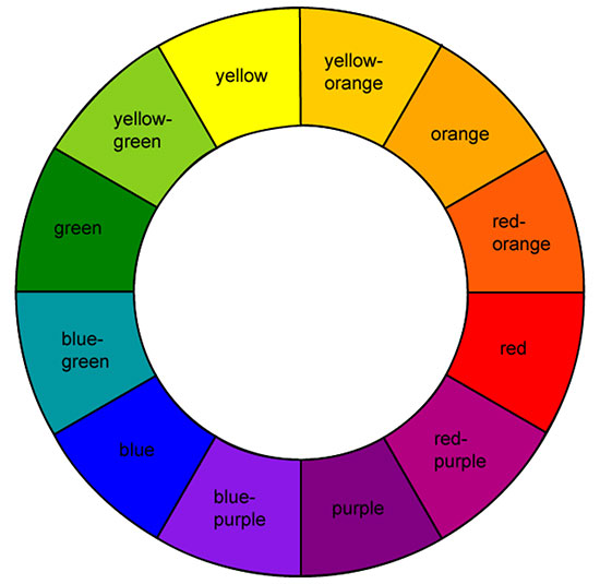
Color Fundamentals
We know from our school studies that color is an aspect of light that is either generated from a source or reflected from an object. We perceive color through our eyes as a portion of the visible spectrum and differentiate colors and objects from each other based on the hue, value, and chroma of those colors (see sidebar for description of terms). Further, color has been broken down and understood as a very orderly system as first analyzed and developed by Albert Henry Munsell in the early 1900s. As a painter and teacher of art in Boston, Massachusetts, his Munsell Color System was a foundational contribution to the areas of color science and color theory. This was the first system to separate colors by hue, value, and chroma such that they could be perceived as a three dimensional model that allowed for a consistent means to identify humanly perceptible differences in these three different dimensions of color.

Photo courtesy of American Biltrite
Color in building design helps define spaces, aids in wayfinding, and elicits
varying degrees of personal and emotional responses.
Objectively recognizing color is important and useful in design by providing us with the ability to select and fine tune specific colors used for a particular space. However, there is another aspect of color that is important too, namely that of human perception related to color. A review of some of the literature surrounding color and perceptions produces a variety of theories. For example, researcher Grant Hildebrand of the University of Washington, Seattle has posited, “It cannot reasonably be denied that color matters in our innate perceptions… in a psychobiological interpretation. For example, blues and greens are generally regarded as restful—in our early experiences in the savannas of Africa these colors stood for shelter, water, and vegetable food sources. There are many associations with red as an attention-commanding color—red lights, red flags, etc.” These statements suggest that human beings have been conditioned through the centuries to associate certain colors with certain outcomes and that we can be expected to respond to colors based on those expected associations.
Much of this work is based in large part on the field of neuroscience which is the scientific study of the nervous system including the brain and sensory elements such as the retina of the eyes. Perceived color is based on the relative activity of ganglion cells that provide a stream of information to the brain which in turn is involved in the spatial comparison of three opposing processes: light versus dark, red versus green, and blue versus yellow. Dr. Thomas Albright, Ph.D. of The Salk Institute for Biological Studies is a neuroscientist who has devoted significant study to vision as it relates to human perception and behavior. He has demonstrated that our eyes function to receive an image consisting of color, texture, motion, and distance related to something that we view in our external environment. But that image then has to be detected and perceived by the brain to be understood. The meaning of the image is discerned based on things like attention, memory, and emotion. He points out, “Vision is important for social communication, understanding the environment, mediums of communications, and mediums of expression and impression, like art. In principle, there isn’t sufficient information just in a visual image to gain a perception of it, so vision depends on prior experience.” Depending on the meaning that we ascribe to what we see, he asserts that we will then take a corresponding action on that image.
In addition to emotional and historical associations, color perception can be impacted by the observer’s age, vision capacity, and mental health. This means that different perceptions can result in different people at different times in their lives and under differing personal circumstances. The design implication of this point is that all spaces cannot be assumed to be treated the same if different groups of people are using them. Rather they need to be designed with a sensitivity to the different color perceptions appropriate to the needs of each group.
Color in the Health-Care Environment
With all of the above thoughts in mind, let’s look specifically at health-care settings in terms of visual perceptions and color. Numerous theories and studies regarding the psychophysiological effects of color have been undertaken. A comprehensive review of that work was published in 2003 by the Coalition for Health Environments Research (CHER) located in San Francisco. Titled simply, “Color in Healthcare Environments,” its stated purpose was “to review the literature on color in health-care environments in order to separate among common myths and realities in the research and application of color in health-care design.” Some of the relevant findings of this study are summarized in the following paragraphs.

Photo courtesy of American Biltrite
Red is commonly thought to provoke an emotional response of arousal in people, but the research indicates that this is not universally true nor is it as dramatic as some suspect.
Color for Calming or Arousal
It has been commonly thought that people have universally direct emotional or psychological responses to specific colors. In particular, colors such as red have been associated with arousal and excitement while blues have been associated with calming people. The CHER study reviewed numerous reports and documented studies in this regard to discern the degree to which this can be regarded as reliable design information. Researchers found that while some work suggested particular associations of hues with human experiences, others refuted that a predictable response came about because of that association. More than the actual hue or color itself, some of the studies found that lighter or darker values and chroma intensities seemed to be more influential on behavior. In other words, the intensity of a color seemed to make more difference than the color itself. The overall assessment on this point is that a clear consensus that color alone can create a calming or arousing response in all people, and in patients in particular, does not exist. There are simply too many other factors that can come in to play either with a person or an interior environment that can cause differing results. This conclusion was demonstrated by some studies that showed no measured difference in responses of being calmed or of being aroused between people who were subjected to rooms of different colors. Hence, while color may evoke an association or representation of something, it does not follow that it necessarily causes a direct emotional response. Therefore, it is inappropriate to make broad, sweeping generalizations that particular colors will affect all people in an overall design scheme to elicit either a sense of calm or arousal in a health-care space.
Color and Spaciousness
Color has also been understood to either “advance” or “recede” from a viewer which in the context of building design means that colored surfaces feel closer or farther away from the viewer. That perception is then assumed to contribute to either a feeling of spaciousness in a room or a feeling of enclosure. In reviewing the available research in this area, the CHER study found a number of interesting things. One is that the lighting in a space contributed directly to a feeling of spaciousness—cool white fluorescent light contributed more than other lighting types. Others found that the level of color saturation (chroma) made more of a difference than the actual hue. In one case, yellow was reported to be perceived as “heavier” than blue based on high chromas of each, contrary to popular thinking. The CHER researchers conclude, “Clearly, the apparent weight of color is a psychological characteristic that appears to be indisputable. However, the major effects of this quality might be attributable to the saturation and the brightness of the hue and not the hue itself.”
Color and Thermal Comfort
Colors are routinely referred to as “warm” or “cool.” Those in the warm category are typically the reds, oranges, and yellows that we might associate with sunshine or fire. Those in the cool category are the blues, greens, violets, and even whites that may be reminiscent of water, snow, or ice. But does the simple psychological association of color and temperature have any real impact on people in buildings? A number of studies sought to answer that question using different colored rooms or different colored lighting. In this research people were either asked for their perceptions on being cold or warm or were allowed to change thermostats based on how they felt. Alternatively, some researchers kept the temperature constant and changed the color of the room. After looking at the various efforts, the CHER study concluded that certain hues were found to influence the psychological perception of comfort but not an actual physical reaction. That is, people expressed a feeling of being cooler or warmer based on colors in a room, but actual measured body or surface temperatures didn’t change. A specific study cited (Clark, 1975) experimented with employees of an air-conditioned factory and discovered that when the walls of the cafeteria in the factory were painted in light blue, employees felt cold at 75 degrees F. When the same walls were painted orange, employees were too hot at 75 degrees F and the temperature had to be changed to 72 degrees F to improve the comfort level of the subjects. Porter and Mikellides (1976) confirmed the results in a similar study. Thus, color can affect people’s sense of temperature and their perceived comfort but clearly only to a limited degree and only within the context of an overall design strategy. The CHER researchers indicate that color should not be applied indiscriminately by designers as a means to “warm up” or “cool down” a space.
Color Preferences
It is difficult in most settings to achieve a consensus or a preference among a given group of people. Establishing a broad consensus on people’s preferences for color is even more challenging. Color preference then, the discernment of what colors people prefer, has been a central part of the color studies literature.
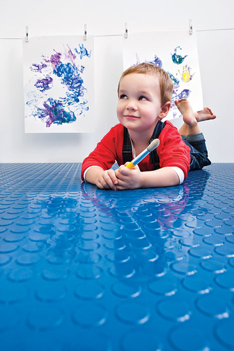
Photo courtesy of American Biltrite
Research on color preferences in children has identified certain colors and patterns that are preferred at different ages.
Some studies have focused on children who, between the ages of three to six reportedly prefer orange, followed by pink and red as their favorites. Sensitivity to harmony between colors was found to be present at age four, but it generally takes until sometime between the ages of eight and twelve before it is used for artistic purposes and it takes adulthood to be fully developed. Girls between the ages of six and seventeen demonstrate a preference for warm colors whereas boys prefer cool colors. It also appears that as age increases, hue is more important than saturation and brightness.
Beyond these early life observations, there does not seem to be much to point to clear color preferences among adults. A study by Beach et al. (1988) found “The assumption that there is a clear, universal preference for certain colors over others is simply not substantiated in the research literature.” The study went on to indicate that colors need to be evaluated in and environmental context and not in isolation since the design of spaces has so many variables. Even in such contextual settings, color studies have to be carefully controlled for hue, value, and chroma—all of which can be variable. The researchers did find a slight preference for blue as a color among the study evidence, but point out that the “preference is not an intrinsic property of the color.” Rather, they state, “Color preference is a function of factors such as value and chroma, illumination, background, and surrounding conditions, possible color combinations, cultural factors, surface and textural effects, and many other variables.” Hence we need to be careful as designers to be sensitive to these variables first since colors that we select may well look very different in a built setting between different people. We should also be aware that colors which we may prefer based on our own point of view may not be fully appreciated by those that we are designing for. Of course, preference for colors is not a static thing among individuals or society, rather it can change over time subject to trends in fashion and interior design.
Color Myths in Health Care
Thus far, we have looked at research on color in non-specific settings focused on finding some universally accepted norms about the interaction between people and color. Looking specifically at color in health-care settings, the CHER study found that the body of actual research studies is not very satisfying. The authors indicate, “In many of the reported studies the sample size is often small, and rarely is the research replicated to validate findings. To compensate for the lack of valid research, too often findings regarding physiological and psychological effects of color have been taken out of their laboratory context and applied indiscriminately to various health-care environments.” This has led to what they classify as a number of myths or misunderstandings about color in health-care settings.
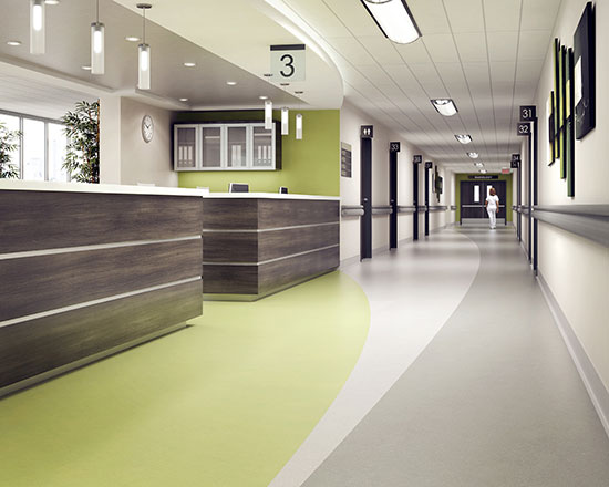
Photo courtesy of American Biltrite
While green is considered a good choice for visual reasons in operating rooms, there is nothing to support that the same benefits apply elsewhere in health-care settings.
One common belief is that green is easy on the eyes and is the preferred or even advantageous color in medical environments. A 2004 study by Fehrman and Fehrman seems to support this since the researchers observed, “After spending hours in surgery visually focused on red blood, surgical staff would experience green flashes on the walls of the operating room, caused by the afterimage phenomenon.” Accordingly, many hospitals replaced the white color of operating room walls with light green to counteract and obscure these green afterimages. But not all areas of a hospital have the same conditions or concerns of an operating room. In many cases, it was inferred incorrectly that if green is good for the operating room, then it must be good and beneficial for other areas of a hospital without any real studies to back that up. Worse, assuming that it represented a restful condition in hospitals, green hues started showing up in other institutional settings such as prisons, libraries, classrooms, and public spaces. This indiscriminate use of green as a calming agent became so widespread, that many people, including design professionals, simply assumed it was factual. In reality no studies are known to support this to date.
Sometimes the best of intentions are used to generate some practical guidelines for designers to use in health-care settings, but those guidelines may rely too much on anecdotal stories rather than actual research. For example, a manual on designing for better environments for patients suffering from Alzheimer’s disease (Brawley, 1997, pp. 108-109) contains the following recommendation: “Yellow-based pinks, such as salmon, coral, peach, or a soft yellow-orange, will provide residents with pleasing surroundings. The pale tints, soft apricot and peach, accent the skin’s own natural pigmentation, and of all the colors, are the most flattering to human skin tones. Turquoise and aquamarine, considered ‘universal’ colors, also compliment most people’s skin tones. When people look better, they feel better!” The authors of the CHER study do not find any evidence to back up any of these statements. Further, it is not clear what skin tones are being referred to and whether they include all those beyond Caucasian skin tones or not.
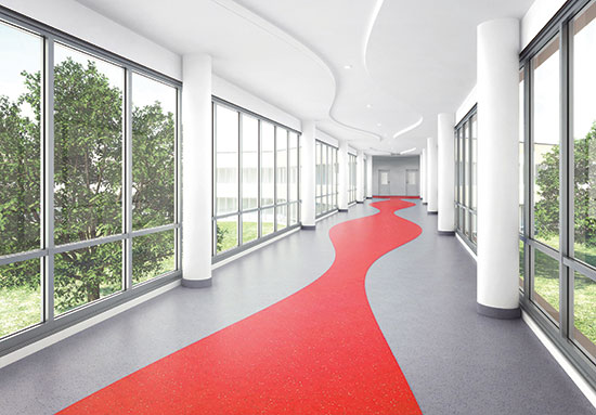
Photo courtesy of American Biltrite
Attractive environments that use color well as part of the overall design scheme can positively affect patients’ perceptions of the quality of care.
Color in Health Care Consensus
In light of all of the above, it would appear that the study of color in health care does not offer as much in the way of solid design guidelines as might be hoped for or has been presumed. However, there are a number of things that the CHER researchers did identify which were revealed by their extensive review of the many studies performed by others on these subjects. They did find substantial general agreement from the research on the following points which designers can base their thinking on regarding color in health-care environments:
- Influence: While not necessarily causing a direct reaction or emotional response in people, the many authors of the various studies accept the hypothesis that color can influence health care either positively or negatively. They also accept the premise that color can help to make the health-care setting appear less institutional. For example, bright colors that appear cheerful to a child can certainly be welcomed in a children’s hospital design.
- Perception: Attractive environments that use color well as part of the overall design scheme can positively affect patients’ perceptions of the quality of care.
- Context: Most study authors agree that color has the power to compensate for contextual noise to some extent—cool colors are somewhat more relaxing, warm colors offer some level of increased stimulation.
- Space definition: While spaciousness and enclosure may vary, most study authors accept that volumes, forms, edge changes, and planes can be better defined through the assistance of high-contrast colors. Some situations call for such a high-contrast while others do not.
- Weight and volume: Most authors agree with the idea that weight and volume can be altered by color—warm colors make objects look heavier whereas cool colors make objects appear lighter.
- Room size: Most authors accept the hypothesis that color has the capacity to alter room size with cool colors receding and warm colors advancing.
- Monotony: The use of too much of one color is accepted by most study authors as creating a monotonous setting which is regarded as harmful.
- Operating Rooms: The theory that the after-image of red (i.e., color of blood) is offset by blue-green is generally accepted with a blue-green color still recommended for surgical operating room surfaces, not for elsewhere.
- Elderly: It is readily agreed that that elderly people experience changes in their color vision.
• Time: Many study authors accept the hypothesis that color has the capacity to alter the sense of time—although how it is altered is debated.
- Skin tones: Most study authors are sensitive to the impact of color with skin tones—although it is debated which colors are better or worse.
Of course, as scientists and researchers, most of the study authors prefer to see color choices being made based on empirical research. The role of health-care design and the requirements of health-care operators to support decisions with solid evidence suggests that more collaboration and understanding of the research is needed. Along the way, it will likely require some balance and compromise between aesthetic considerations and empirical evidence.
Color and Aging
Beyond the CHER study, it has been commonly observed that as the population grows older, health-care facilities are facing new challenges that demand careful design considerations and color applications. First and foremost, we need to recognize that many health-care settings treat an older population whose eyes are aging and may have vision that is compromised by any number of possible health issues. Cataracts are a very common age related eye issue that causes clouding or yellowing of the lens of the eye. This makes it difficult to see clearly and limits the ability to distinguish blues, blue-greens, and purples from gray or black. A more dramatic disease, age-related macular degeneration causes blurriness or a literal blind spot in the center of the field of vision. This makes it very difficult or impossible to focus on an object to recognize what is being seen except for clues from peripheral vision. Conversely, glaucoma is a disease that affects the optic nerve and diminishes the periphery of the field of vision leaving only a small “tunnel” in the center that is visible. Glaucoma sufferers often have very diminished color recognition and may eventually experience complete vision loss.
Separate from specific eye diseases, other conditions may contribute to visual impairments. Diabetics are at risk for developing diabetic retinopathy which affects the blood vessels in the retina. This can cause blurred or blocked vision and impact the ability to discern objects and colors. Similarly dementia, which includes Alzheimer’s disease or Parkinson’s disease, can impact the ability of a person to process and understand what is being seen, even if the eyes are healthy. This is because the nature of these diseases is to affect the brain and interfere with things like memory, object recognition, depth perception, and visual perception. Since these are diseases that start out slowly and become progressively worse over time, it may not be readily apparent why someone is having difficulty.
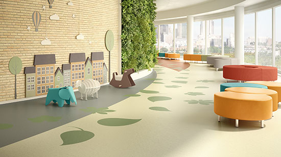
Photo courtesy of American Biltrite
A specific, comprehensive, and detailed color plan should be a conscious part of the design of all health-care settings.
Developing a Color Plan
With all of the research findings at our disposal, and a sensitivity to the people being served, the task of developing a specific, comprehensive, and detailed color plan should be a conscious part of the design of health-care settings. It begins with the establishment of specific design objectives for the project and an understanding of how a color plan can play into meeting those objectives. This can be true for general or overall items or for specific detailed items in the design program and scope of a health-care project.
When looking at specific spaces it is important to remember the numerous variables identified in the research that can influence how different people will experience the space. Things like age, general background, ethnicity, and other human factors of the patients or residents should be acknowledged and related back to the research findings. Assumptions should be challenged for specific color preferences based on these human factors as well as on the basis of specific room types and uses. Not every room is an operating room, for example, so not every room needs to use color the same way. It is also important to coordinate a color plan with a lighting plan. Will there be natural daylight in the spaces? What type of artificial lighting is planned and what is the color range of that lighting (i.e., cooler, warmer, etc.)? What is the impact of different lighting conditions in different rooms or areas?
An important and often necessary element of most health-care facilities, particularly larger ones, is the ability for people to find their way into and through what may be viewed as a confusing and disorienting facility. A study by the U.S. Department of Commerce (1978) titled “Color in the Health Care Environment” points out that approximately 80 percent of the information we gather is accomplished with vision. For the aged and ill, the study indicates that there is frequently a visual problem in distinguishing boundaries such as the corners where walls meet, the boundary between wall and floor, or a door and wall with the same color. The use of bright color contrasts and different colors can clarify these boundaries.
At the most basic level, color-coded wayfinding signage along with corresponding color-coded walls and surfaces can help people differentiate spaces as they move through lobbies, corridors, elevators, and similar circulation spaces. Different patterns and colors can similarly be used to more readily differentiate level changes in order to prevent stumbles and falls. Coordinating this colored wayfinding with the color plan of the places that they are directing people toward can help create an overall indoor environment that presents itself in an ordered and less stressful manner. The particular colors, value, and chroma for each area can then be selected based on the specific design goals and human factors for each area.
Flooring and Color in Health Care
One of the primary and most visible places to add color in a health-care setting is on the floor. As part of a total color plan, flooring can make a bold, contrasting color statement or be a neutral or complementary element. Depending on the material selected, the particular hues, values, and chroma of the colors selected can be chosen to produce the intended result.
In order to demonstrate the practical use of color in health-care interiors, rubber flooring can be used as an example of an optimal choice for incorporating color effectively. As a manufactured product, it is available in both tile and sheet flooring. From a color standpoint, it is readily available in a broad range of hues and values with considerable capability to provide very strong color saturations (chroma). As such, it can work with a full variety of color plans. It can also be readily cut and formed to suit different design schemes to create patterns, imagery, wayfinding, etc.

Photo courtesy of American Biltrite
Non-SBR rubber flooring has the ability to provide long-lasting, durable color in high saturation (chroma) levels while still meeting other demands for hygiene, maintenance, and durability.
Most rubber flooring is made from styrene-butadiene rubber (SBR) which has limitations in the amount of color saturation that it can hold initially and its limited resistance to fading over time. At least one manufacturer offers rubber flooring that does not contain SBR. Beyond the color aspects of non-SBR rubber flooring, there are several other important user concerns that designers need to consider in such flooring.
- Safety: Flooring selection must conform to strict safety standards for mobility including the standards outlined in the Americans with Disabilities Act (ADA). In addition to its well-known wheelchair mobility requirements, the ADA also refers to flooring safety against slips and falls. The standard requires flooring to meet a coefficient of friction of 0.5 for flat surfaces and 0.7 for ramped applications, under dry conditions.
- Infection Control: An increased incidence of hospital-acquired infections has made it necessary to select flooring that can be decontaminated by the broadest selection of disinfectants. If there are any doubts about the flooring capability, then installing a small test floor area can determine if the flooring type is suitable for its intended use. When making flooring selections for health care, designers should inquire about the product’s bacterial blocking agents. Flooring such as rubber has natural bacterial suppressers, and now many manufacturers are introducing natural antibacterial additives such as silver.
- Hygiene: Health-care floors must be capable of eliminating any open areas for mold and mildew to grow. Rubber floors that can offer a totally sealed area at the floor and wall intersection, such as built-in cove base systems, flash cove, or integral cove systems, can do this easily. Similarly, selecting floors that do not need regular coats of floor finish to protect them from surface moisture penetration are preferable since the material itself, and not the coatings, help assure better hygiene.
- Maintenance: Look for floors that require low maintenance procedures. Floors that require stripping and waxing on a regular basis just to retain its physical properties as well as protection against moisture penetration are burdens on the facility’s resources. Appropriate flooring for health care must have the capability of being cleaned daily by such methods as auto scrubbing anddamp mopping as well as periodically dry-buffed.
- Durability: Select flooring that has a 15- to20-year lifespan that will not deteriorate from chemicals, disinfectants, or abrasion and can hold up under rolling traffic (i.e., beds and gurneys) per ASTM 925. It should also pass appropriate ASTM requirements for light (UV) stability and static load.
- Comfort: Health-care flooring should offer the highest ergonomic values possible. Consider the use of rubber-based products that are favored for their comfort and sound reducing capabilities—not only for patients, but also for staff.
- Life Cycle and the Return on Investment (ROI): Research has confirmed that the lowest-cost flooring is not the best purchase. Facilities that invest in low-maintenance flooring gain that investment back within a short period of time. Rubber-based flooring routinely demonstrates the highest ROI followed by ceramic.
Properly considering all of the above aspects will help assure that the flooring is appropriate for health-care designs without compromising the visual and color aspects.
Conclusion
The use of color in health-care settings is an important part of any design. The impact of color on people’s perceptions in those settings is important, but it’s influenced by a variety of variables—not all of which are readily discernable nor uniform. Nonetheless, research has helped to create some general suggested guidelines that can be referred to and relied upon when preparing a color plan for a particular facility. Further, when selecting and specifying materials for that facility, non-SBR rubber flooring has been shown to be an appropriate and attractive option, both for achieving and retaining color goals as well as meeting the other needs of health-care facility owners and operators.
Endnotes
- Munsell Color http://munsell.com/about-munsell-color/
- Origins of Architectural Pleasure – June 30, 1999 by Grant Hildebrand ISBN-13: 978-0520215054; ISBN-10:0520215052 Edition: 1st]
- Neuroscience, Exploring the Brain, by Bear, Connors and Paradiso — 2nd ed.
- Color In Healthcare Environments - A Research Report by Ruth Brent Tofle, Ph.D., Benyamin Schwarz, Ph.D , So-Yeon Yoon, MA, and Andrea Max-Royale, M.E.Des. Copyright © 2003 Coalition for Health Environments Research (CHER)
- Beach, L., Wise, B. K., & Wise, J. A. (1988). The Human Factors of Color in Environmental Design: a critical review. Moffet Field, CA.: National Aeronautics and Space Administration, Ames Research.
- Fehrman, K. R., & Fehrman, C. (2004). Color: The Secret Influence. Upper Saddle River, N.J.: Prentice Hall.
- Brawley, E. (1997). Designing for Alzheimer’s Disease: Strategies for creating better care environments. NY: Wiley.
- US Department of Commerce, Color in the Health Care Environment, 1978; p.11
Peter J. Arsenault, FAIA, NCARB, LEED AP, is an architect and green building consultant who has authored more than 100 continuing education and technical publications as part of a nationwide practice. www.linkedin.com/in/pjaarch
 |
American Biltrite manufactures and distributes commercial flooring and performance sheet rubber throughout North America.
With over a hundred years of careful growth, American Biltrite has built a reputation for the quality of its products and the sincerity of its commitment to customer service. With ISO9001 since 1996, ISO14001, FloorScore and LEED certifications, today American Biltrite continues to strive to improve its processes and the products our customers need.
American Biltrite offers a select range of flooring solutions for the educational, healthcare and institutional sectors. With high aesthetics, great durability, low maintenance and excellent environmental qualities, our collections offer the best alternatives for every project. Your options include resilient rubber sheet and tile, PVC/VOC-free tile, solid vinyl tile (ESD), low-VOC luxury vinyl tiles. www.american-biltrite.com
|