Color in Health Care Environments


Color for Calming or Arousal
It has been commonly thought that people have universally direct emotional or psychological responses to specific colors. In particular, colors such as red have been associated with arousal and excitement while blues have been associated with calming people. The CHER study reviewed numerous reports and documented studies in this regard to discern the degree to which this can be regarded as reliable design information. Researchers found that while some work suggested particular associations of hues with human experiences, others refuted that a predictable response came about because of that association. More than the actual hue or color itself, some of the studies found that lighter or darker values and chroma intensities seemed to be more influential on behavior. In other words, the intensity of a color seemed to make more difference than the color itself. The overall assessment on this point is that a clear consensus that color alone can create a calming or arousing response in all people, and in patients in particular, does not exist. There are simply too many other factors that can come in to play either with a person or an interior environment that can cause differing results. This conclusion was demonstrated by some studies that showed no measured difference in responses of being calmed or of being aroused between people who were subjected to rooms of different colors. Hence, while color may evoke an association or representation of something, it does not follow that it necessarily causes a direct emotional response. Therefore, it is inappropriate to make broad, sweeping generalizations that particular colors will affect all people in an overall design scheme to elicit either a sense of calm or arousal in a health-care space.
Color and Spaciousness
Color has also been understood to either “advance” or “recede” from a viewer which in the context of building design means that colored surfaces feel closer or farther away from the viewer. That perception is then assumed to contribute to either a feeling of spaciousness in a room or a feeling of enclosure. In reviewing the available research in this area, the CHER study found a number of interesting things. One is that the lighting in a space contributed directly to a feeling of spaciousness—cool white fluorescent light contributed more than other lighting types. Others found that the level of color saturation (chroma) made more of a difference than the actual hue. In one case, yellow was reported to be perceived as “heavier” than blue based on high chromas of each, contrary to popular thinking. The CHER researchers conclude, “Clearly, the apparent weight of color is a psychological characteristic that appears to be indisputable. However, the major effects of this quality might be attributable to the saturation and the brightness of the hue and not the hue itself.”
Color and Thermal Comfort
Colors are routinely referred to as “warm” or “cool.” Those in the warm category are typically the reds, oranges, and yellows that we might associate with sunshine or fire. Those in the cool category are the blues, greens, violets, and even whites that may be reminiscent of water, snow, or ice. But does the simple psychological association of color and temperature have any real impact on people in buildings? A number of studies sought to answer that question using different colored rooms or different colored lighting. In this research people were either asked for their perceptions on being cold or warm or were allowed to change thermostats based on how they felt. Alternatively, some researchers kept the temperature constant and changed the color of the room. After looking at the various efforts, the CHER study concluded that certain hues were found to influence the psychological perception of comfort but not an actual physical reaction. That is, people expressed a feeling of being cooler or warmer based on colors in a room, but actual measured body or surface temperatures didn’t change. A specific study cited (Clark, 1975) experimented with employees of an air-conditioned factory and discovered that when the walls of the cafeteria in the factory were painted in light blue, employees felt cold at 75 degrees F. When the same walls were painted orange, employees were too hot at 75 degrees F and the temperature had to be changed to 72 degrees F to improve the comfort level of the subjects. Porter and Mikellides (1976) confirmed the results in a similar study. Thus, color can affect people’s sense of temperature and their perceived comfort but clearly only to a limited degree and only within the context of an overall design strategy. The CHER researchers indicate that color should not be applied indiscriminately by designers as a means to “warm up” or “cool down” a space.
Color Preferences
It is difficult in most settings to achieve a consensus or a preference among a given group of people. Establishing a broad consensus on people’s preferences for color is even more challenging. Color preference then, the discernment of what colors people prefer, has been a central part of the color studies literature.
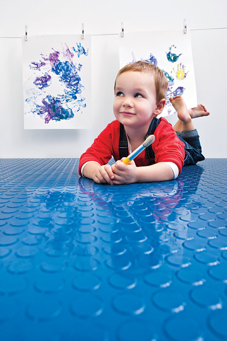
Photo courtesy of American Biltrite
Research on color preferences in children has identified certain colors and patterns that are preferred at different ages.
Notice