Color in Health Care Environments


One common belief is that green is easy on the eyes and is the preferred or even advantageous color in medical environments. A 2004 study by Fehrman and Fehrman seems to support this since the researchers observed, “After spending hours in surgery visually focused on red blood, surgical staff would experience green flashes on the walls of the operating room, caused by the afterimage phenomenon.” Accordingly, many hospitals replaced the white color of operating room walls with light green to counteract and obscure these green afterimages. But not all areas of a hospital have the same conditions or concerns of an operating room. In many cases, it was inferred incorrectly that if green is good for the operating room, then it must be good and beneficial for other areas of a hospital without any real studies to back that up. Worse, assuming that it represented a restful condition in hospitals, green hues started showing up in other institutional settings such as prisons, libraries, classrooms, and public spaces. This indiscriminate use of green as a calming agent became so widespread, that many people, including design professionals, simply assumed it was factual. In reality no studies are known to support this to date.
Sometimes the best of intentions are used to generate some practical guidelines for designers to use in health-care settings, but those guidelines may rely too much on anecdotal stories rather than actual research. For example, a manual on designing for better environments for patients suffering from Alzheimer’s disease (Brawley, 1997, pp. 108-109) contains the following recommendation: “Yellow-based pinks, such as salmon, coral, peach, or a soft yellow-orange, will provide residents with pleasing surroundings. The pale tints, soft apricot and peach, accent the skin’s own natural pigmentation, and of all the colors, are the most flattering to human skin tones. Turquoise and aquamarine, considered ‘universal’ colors, also compliment most people’s skin tones. When people look better, they feel better!” The authors of the CHER study do not find any evidence to back up any of these statements. Further, it is not clear what skin tones are being referred to and whether they include all those beyond Caucasian skin tones or not.
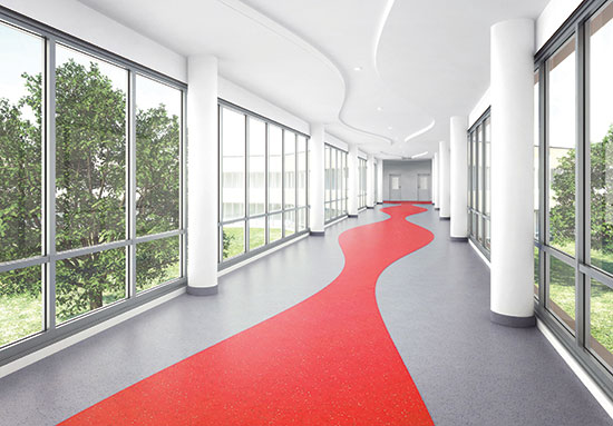
Photo courtesy of American Biltrite
Attractive environments that use color well as part of the overall design scheme can positively affect patients’ perceptions of the quality of care.
Color in Health Care Consensus
In light of all of the above, it would appear that the study of color in health care does not offer as much in the way of solid design guidelines as might be hoped for or has been presumed. However, there are a number of things that the CHER researchers did identify which were revealed by their extensive review of the many studies performed by others on these subjects. They did find substantial general agreement from the research on the following points which designers can base their thinking on regarding color in health-care environments:
- Influence: While not necessarily causing a direct reaction or emotional response in people, the many authors of the various studies accept the hypothesis that color can influence health care either positively or negatively. They also accept the premise that color can help to make the health-care setting appear less institutional. For example, bright colors that appear cheerful to a child can certainly be welcomed in a children’s hospital design.
- Perception: Attractive environments that use color well as part of the overall design scheme can positively affect patients’ perceptions of the quality of care.
- Context: Most study authors agree that color has the power to compensate for contextual noise to some extent—cool colors are somewhat more relaxing, warm colors offer some level of increased stimulation.
- Space definition: While spaciousness and enclosure may vary, most study authors accept that volumes, forms, edge changes, and planes can be better defined through the assistance of high-contrast colors. Some situations call for such a high-contrast while others do not.
- Weight and volume: Most authors agree with the idea that weight and volume can be altered by color—warm colors make objects look heavier whereas cool colors make objects appear lighter.
- Room size: Most authors accept the hypothesis that color has the capacity to alter room size with cool colors receding and warm colors advancing.
- Monotony: The use of too much of one color is accepted by most study authors as creating a monotonous setting which is regarded as harmful.
- Operating Rooms: The theory that the after-image of red (i.e., color of blood) is offset by blue-green is generally accepted with a blue-green color still recommended for surgical operating room surfaces, not for elsewhere.
- Elderly: It is readily agreed that that elderly people experience changes in their color vision. • Time: Many study authors accept the hypothesis that color has the capacity to alter the sense of time—although how it is altered is debated.
- Skin tones: Most study authors are sensitive to the impact of color with skin tones—although it is debated which colors are better or worse.
Of course, as scientists and researchers, most of the study authors prefer to see color choices being made based on empirical research. The role of health-care design and the requirements of health-care operators to support decisions with solid evidence suggests that more collaboration and understanding of the research is needed. Along the way, it will likely require some balance and compromise between aesthetic considerations and empirical evidence.
Notice