Color in Health Care Environments


Some studies have focused on children who, between the ages of three to six reportedly prefer orange, followed by pink and red as their favorites. Sensitivity to harmony between colors was found to be present at age four, but it generally takes until sometime between the ages of eight and twelve before it is used for artistic purposes and it takes adulthood to be fully developed. Girls between the ages of six and seventeen demonstrate a preference for warm colors whereas boys prefer cool colors. It also appears that as age increases, hue is more important than saturation and brightness.
Beyond these early life observations, there does not seem to be much to point to clear color preferences among adults. A study by Beach et al. (1988) found “The assumption that there is a clear, universal preference for certain colors over others is simply not substantiated in the research literature.” The study went on to indicate that colors need to be evaluated in and environmental context and not in isolation since the design of spaces has so many variables. Even in such contextual settings, color studies have to be carefully controlled for hue, value, and chroma—all of which can be variable. The researchers did find a slight preference for blue as a color among the study evidence, but point out that the “preference is not an intrinsic property of the color.” Rather, they state, “Color preference is a function of factors such as value and chroma, illumination, background, and surrounding conditions, possible color combinations, cultural factors, surface and textural effects, and many other variables.” Hence we need to be careful as designers to be sensitive to these variables first since colors that we select may well look very different in a built setting between different people. We should also be aware that colors which we may prefer based on our own point of view may not be fully appreciated by those that we are designing for. Of course, preference for colors is not a static thing among individuals or society, rather it can change over time subject to trends in fashion and interior design.
Color Myths in Health Care
Thus far, we have looked at research on color in non-specific settings focused on finding some universally accepted norms about the interaction between people and color. Looking specifically at color in health-care settings, the CHER study found that the body of actual research studies is not very satisfying. The authors indicate, “In many of the reported studies the sample size is often small, and rarely is the research replicated to validate findings. To compensate for the lack of valid research, too often findings regarding physiological and psychological effects of color have been taken out of their laboratory context and applied indiscriminately to various health-care environments.” This has led to what they classify as a number of myths or misunderstandings about color in health-care settings.
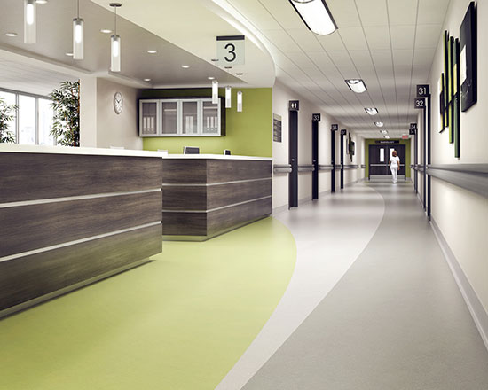
Photo courtesy of American Biltrite
While green is considered a good choice for visual reasons in operating rooms, there is nothing to support that the same benefits apply elsewhere in health-care settings.
Notice