Color in Health Care Environments


Color and Aging
Beyond the CHER study, it has been commonly observed that as the population grows older, health-care facilities are facing new challenges that demand careful design considerations and color applications. First and foremost, we need to recognize that many health-care settings treat an older population whose eyes are aging and may have vision that is compromised by any number of possible health issues. Cataracts are a very common age related eye issue that causes clouding or yellowing of the lens of the eye. This makes it difficult to see clearly and limits the ability to distinguish blues, blue-greens, and purples from gray or black. A more dramatic disease, age-related macular degeneration causes blurriness or a literal blind spot in the center of the field of vision. This makes it very difficult or impossible to focus on an object to recognize what is being seen except for clues from peripheral vision. Conversely, glaucoma is a disease that affects the optic nerve and diminishes the periphery of the field of vision leaving only a small “tunnel” in the center that is visible. Glaucoma sufferers often have very diminished color recognition and may eventually experience complete vision loss.
Separate from specific eye diseases, other conditions may contribute to visual impairments. Diabetics are at risk for developing diabetic retinopathy which affects the blood vessels in the retina. This can cause blurred or blocked vision and impact the ability to discern objects and colors. Similarly dementia, which includes Alzheimer’s disease or Parkinson’s disease, can impact the ability of a person to process and understand what is being seen, even if the eyes are healthy. This is because the nature of these diseases is to affect the brain and interfere with things like memory, object recognition, depth perception, and visual perception. Since these are diseases that start out slowly and become progressively worse over time, it may not be readily apparent why someone is having difficulty.
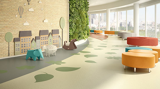
Photo courtesy of American Biltrite
A specific, comprehensive, and detailed color plan should be a conscious part of the design of all health-care settings.
Developing a Color Plan
With all of the research findings at our disposal, and a sensitivity to the people being served, the task of developing a specific, comprehensive, and detailed color plan should be a conscious part of the design of health-care settings. It begins with the establishment of specific design objectives for the project and an understanding of how a color plan can play into meeting those objectives. This can be true for general or overall items or for specific detailed items in the design program and scope of a health-care project.
When looking at specific spaces it is important to remember the numerous variables identified in the research that can influence how different people will experience the space. Things like age, general background, ethnicity, and other human factors of the patients or residents should be acknowledged and related back to the research findings. Assumptions should be challenged for specific color preferences based on these human factors as well as on the basis of specific room types and uses. Not every room is an operating room, for example, so not every room needs to use color the same way. It is also important to coordinate a color plan with a lighting plan. Will there be natural daylight in the spaces? What type of artificial lighting is planned and what is the color range of that lighting (i.e., cooler, warmer, etc.)? What is the impact of different lighting conditions in different rooms or areas?
An important and often necessary element of most health-care facilities, particularly larger ones, is the ability for people to find their way into and through what may be viewed as a confusing and disorienting facility. A study by the U.S. Department of Commerce (1978) titled “Color in the Health Care Environment” points out that approximately 80 percent of the information we gather is accomplished with vision. For the aged and ill, the study indicates that there is frequently a visual problem in distinguishing boundaries such as the corners where walls meet, the boundary between wall and floor, or a door and wall with the same color. The use of bright color contrasts and different colors can clarify these boundaries.
At the most basic level, color-coded wayfinding signage along with corresponding color-coded walls and surfaces can help people differentiate spaces as they move through lobbies, corridors, elevators, and similar circulation spaces. Different patterns and colors can similarly be used to more readily differentiate level changes in order to prevent stumbles and falls. Coordinating this colored wayfinding with the color plan of the places that they are directing people toward can help create an overall indoor environment that presents itself in an ordered and less stressful manner. The particular colors, value, and chroma for each area can then be selected based on the specific design goals and human factors for each area.
Notice