Blending Aesthetics and Sustainable Design Through Facades
CALGARY CENTRAL LIBRARY, ALBERTA, CANADA

Photo courtesy of Vitro Architectural Glass
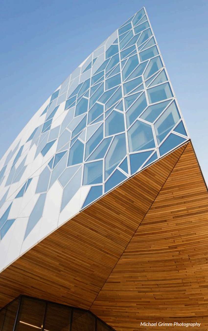
The Calgary Central Library in Alberta, Canada, incorporates a beautiful and functional glass and metal facade that features ultra-clear glass panels resembling an open book, snowflakes, snowdrifts, or ice cracking on a lake.
When it opened as one of Architectural Digest’s most anticipated buildings of 2018, the Calgary Central Library in Alberta, Canada, was already being celebrated for its beauty as well as its brains, thanks in large part to an extraordinary glass-and-metal facade featuring ultra-clear glasses. Variously described as resembling an open book, snowflakes, snowdrifts, or ice cracking on a lake, the library’s curved exterior surface is outfitted with a hexagonal pattern of alternating clear, glazed, and ceramic-fritted glass and iridescent aluminum panels — an arrangement meant to convey the ideas of collective and community embodied in one of the city’s most treasured assets. A more functional purpose of the alternating panels, according to project architect Dennis Rijkhoff, is to diffuse light inside the building while preserving views outside.
After studying how daylighting and views affected interior spaces and the overall composition of the facade, the architect settled on a mix of 60% insulating metal panels and 40% triple-pane insulating glass units (IGUs).
The finished IGUs were then supplied to Ferguson Corporation, which engineered, assembled, and installed the library’s curtain wall. A big part of that job included fabricating 462 uniquely shaped unitized panels, which were painted in three different colors for various interior and exterior surfaces and infilled with clear, glazed, or fritted IGUs. The panels, which took eight months to fabricate, were placed randomly around the building to create a consistent aesthetic and to enable each side to function as its front.
20 ROPEMAKER STREET, LONDON, ENGLAND

Photo courtesy of Hofmann Facades Group
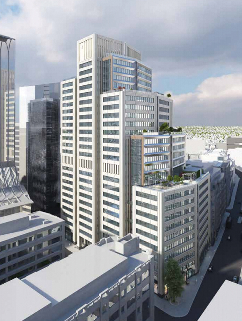
The 400,000-square-foot commercial and premium retail space building located at 20 Ropemaker Street in London uses a combination of beige limestone and titanium-colored terracotta in its striking facade, thus reducing the carbon footprint compared to using terracotta alone. At nearly 130 meters (427 feet) high, it will be the tallest stone building in the City London.
A new commercial building of 400,000-square-feet of Grade A, BREEAM Outstanding office space and premium retail space resides at 20 Ropemaker Street in London, England. The BREEAM rating benchmark levels enable a client or other stakeholder to compare an individual building's performance with other BREEAM-rated buildings and the typical sustainability performance of new non-domestic buildings in the UK.
The exterior facade of 20 Ropemaker Street uses two different materials, natural stone, and terracotta. The natural stone exterior is 50 millimeters in thickness and is a combination of limestone and granite. The terracotta exterior is 40 millimeters in thickness, but is double-fired, leading to a much larger carbon footprint than materials that are solely processed without heat, like natural stone.
If the entire building had been made from terracotta instead of a combination of natural stone and terracotta, 20 Ropemaker Street would have led to 900 additional tons of carbon released into the atmosphere. The use of natural stone only creates 131 tons of carbon, thus using natural stone as opposed to terracotta led to an 85% reduction in overall carbon creation. 769 tons of carbon were saved.
TOHA BUILDING, TEL AVIV, ISRAEL

Photo courtesy of Cosentino
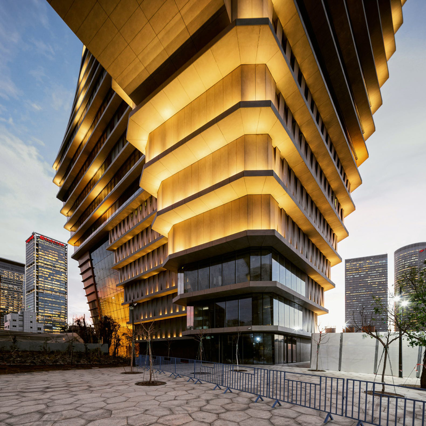
The ToHA building is an artistic marvel, utilizing a mix of architecture and sculpture, and featuring an ultracompact surface facade that is not only aesthetically pleasing, but functional.
In the center of Tel Aviv, the ToHA building was designed by Ron Arad with the local team of Avner Yashar. The ToHa building offers a unique office complex complete with a public garden, an observation deck, and a restaurant.
More than 300,000 square feet of ultracompact surface clad the ensemble and appear on the ventilated facades, fixed facades, cladding on the exterior insulation and finish system (EIFS), flooring, elevators, ceilings, and the interior partitions. The ultracompact surface pieces are 126-by-56-inches with thicknesses of 30 mm, 20 mm, 12 mm, 8 mm, and 4 mm.
One of the main strategies in the design of the project was that of reducing the built area at street level to create a large park with the idea of giving the surroundings a public character. The building emerges atop two large legs that widen gradually and create a twisting volume. Because of its geometric versatility, the ultracompact surface manages to adapt with precision to this formal complexity thanks to its endless range of formats, with many thicknesses and ultra large format. In the building's intermediate levels, the jagged perimeter of the concrete slabs is clad with panels measuring 12-mm- thick and 79-inches-wide that, with their careful detailing, define the vertices and edges, conveying an image of perfection.
The ultracompact surface material used has a carbon neutral certification is noncombustible, making it perfect for building facades. The surface material has an extremely minimum porosity with maximum resistance to scratching and impact and will not expand. The large format allows for dimensional stability and resistance to sunlight (UV) rays. It is also stain and graffiti resistant. The low porosity also makes it freeze and thaw proof.
EXPLORATORIUM, SAN FRANCISCO, CALIFORNIA

Photo courtesy of Inpro
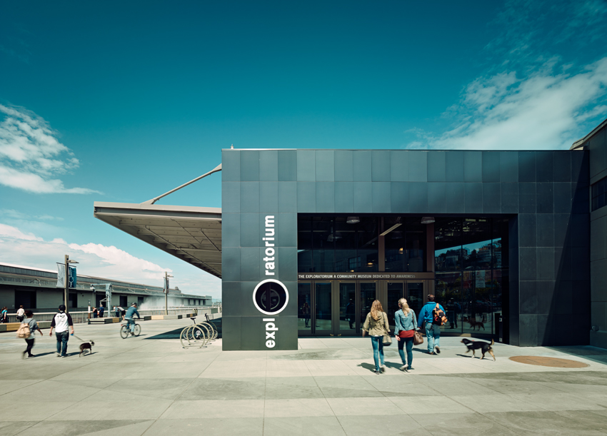
The Exploratorium in San Francisco is a modern, net-zero facility with a facade that fits its history and surroundings. The expansion joint system contributes to the energy efficiency and sustainability of this structure.
The Exploratorium was opened by Frank Oppenheimer in 1969 and is located at the Palace of Fine Arts in San Francisco. Nearby are Pier 17, built in 1912, and Pier 15, built in 1915, with a major renovation in 1931. During a recent renovation of The Exploratorium, the architect wanted to create a LEED Gold, net-zero facility that was resistant to seismic movements, while also providing protection against fire and moisture from precipitation and the nearby saltwater from the San Francisco Bay. The facade of this contemporary building would still blend in with its historical surroundings while utilizing the latest technology to keep occupants safe and comfortable.
A single manufacturer was specified to provide the entire expansion joint and barrier package for the Exploratorium project. Almost 1,500 linear feet of interior and exterior seismic expansion joints are used throughout the building. Joint widths varied from 8 inches to as wide as 27 inches. Of the 1,500 linear feet, nearly 95 percent of the joint systems were custom designed and built, including several joints incorporating 3/8-inch-thick aluminum diamond plate. Where these joints bridged fire separation areas, waterproof fire barriers were specified and installed. The fire ratings were needed to maintain the safety of the walls, floors, and roof systems that made up the fire separations. The waterproof component was needed to withstand the moist and humid conditions of being over the water. Designers also specified specific coatings on many of the exposed joint systems to fight saltwater degradation and assure durability.
Jessica Jarrard is an independent writer and editor focusing on health, science, and technology. She contributes to continuing education courses and publications through Confluence Communications. www.confluencec.com


