Reimagining Restrooms for Human Health & Wellness
Signage
Signage itself is emerging as an essential product solution to enhance health and wellness in the restroom, supporting the signaling protocol.
Signage can encourage users to wash and dry their hands properly, dispose of waste properly, maintain 6 feet of distance between patrons, and wear a mask while using the restroom. Signage should reinforce CDC virus-containment best practices.

Image courtesy of Bobrick Washroom Equipment, Inc.
Optimizing traffic flow while maintaining accessibility is a top priority.
Examining Space-Planning Strategies to Optimize Traffic Flow and Physical Distancing
Optimizing space-planning and layout strategies can support both the occupancy and queuing protocols. Reimagining restrooms for enhanced health and wellness often requires designers to reevaluate their density and design assumptions. When designing commercial restrooms, the following strategies should be considered:
- The locations and layouts of handwashing stations;
- The locations of entrances and exits, and whether they have doors;
- How patrons will queue or gather;
- The traffic flow of the restroom, including from the compartment or urinal to the lavatory and waste disposal; and
- The ability of the restroom to be efficiently and effectively cleaned and maintained.
Space-Planning Solutions
In today’s environment, there are several planning strategies that can optimize traffic flow and physical distancing between patrons while simultaneously maintaining accessibility. The following space-planning solutions are emerging to address current health and wellness challenges:
- Remove or block open exit/entry doors to eliminate germ transfer points on door handles and plates that must be cleaned daily. Waste receptacles should also be placed near the exit opening.
- Reduce restroom capacity by blocking off or alternating adjoining lavatories, toilet compartments, and urinals.
- Add 6-foot-distance floor marking outside the restroom and in front of lavatories, toilets, and urinals.
- Add screens between lavatories above the countertop surface. These can be up to 84 inches in height, extending the full depth of the countertop to achieve 6 feet of physical-distancing spacing at lavatories.
- Toilet compartments and urinal screens also can be increased height to maximize privacy and provide a larger physical barrier between patrons.
- As an extra level of safety, place hand-sanitizer stations outside the restroom.
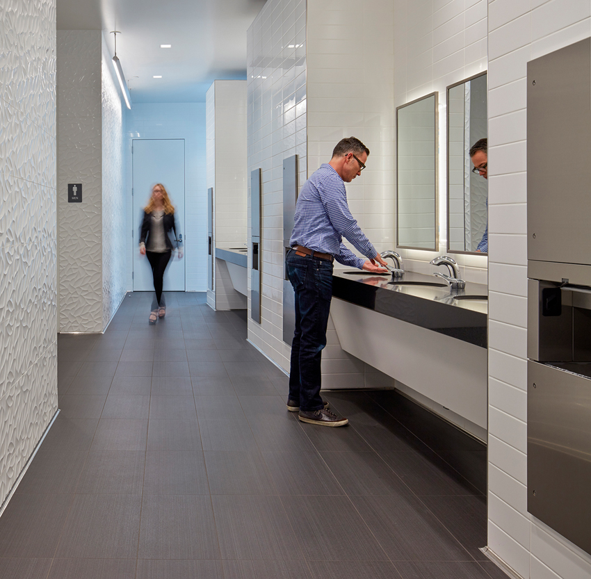
In addition, shared, non-gendered handwashing stations (pictured below) are emerging as a new strategy that uses social pressure to incentivize proper handwashing. This strategy is employed at the headquarters of Bobrick Washroom Equipment, Inc. in North Hollywood, California. The common handwashing station helps ensure handwashing hygiene norms are consistently followed, as social pressure incentivizes that hands are washed “every time” in public view. The single station also facilitates frequent and thorough cleaning of countertop and lavatory surfaces, removal of waste, and resupply of paper towels and liquid soap.
Occupancy Signaling
In toilet compartments, occupancy-signaling solutions can help facilitate physical distancing while reducing queuing times and contact. Standard occupancy indicator latches provide a cost-effective solution for ensuring privacy because users can see easily which compartments are in use.
As a midrange solution, external occupancy indicators are available, which can be mounted on compartments with left or right hinges and with doors that swing in or out. LED indicators, which eliminate the need for conventional lock indicators, are also available on higher-end systems.
Maintaining Accessibility
Although hygiene has become a top design requirement, accessible design remains nonnegotiable. Good design ensures that new space-planning strategies do not compromise ADA requirements.
Entrances and exits must be laid out to minimize congestion and for universal access. Remove doors or block doors open to maximize access.
Passageways and access aisles must be a minimum of 42–60 inches wide. Limit the leading edges of protruding objects into circulation routes to 4 inches maximum between 27–80 inches above the floor. Fully recessed restroom accessories can help satisfy this requirement.
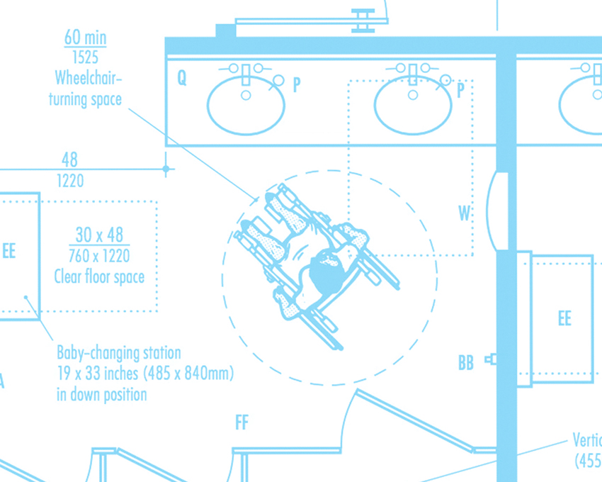
Consider increased wheelchair-turning spaces for oversized wheelchairs. Provide 30-inch x 48- to 52-inch clear floor space centered at each accessory and plumbing fixture. Lavatory, toilet compartment, and urinal dimensional layouts must comply.
When six or more toilets and urinals are in one restroom, provide an ambulatory-accessible compartment in addition to the wheelchair-accessible compartment. Make sure the baby-changing station does not block access to accessories and plumbing fixtures.
Gensler LA Offices: Circulation and Queuing
Going back to the Gensler LA Office redesign and looking at it from a space-planning perspective, the firm instituted a circulation path throughout the office that only goes in one direction. That same strategy was applied to the restroom.
However, in addition, Gensler provided a two-sided entry/exit to the restroom, which helps the flow of traffic. Users enter at one side of the restroom and exit on the other side. This helps significantly with distancing and the overall traffic flow.
To communicate this circulation strategy to people, Gensler installed signage to ensure users follow the guidelines that have been established. In the queuing area, it provided signals for the entry and exit points and encourages physical distancing with floor decals.
Gensler also located the entry to the restrooms along the wall perpendicular to the side corridors off the main circulation, which provides a place to queue while also providing circulation. From an infection-prevention standpoint, these circulation and queuing strategies encourage people to maintain safe physical distancing. Plus, the layouts are easy to navigate for a person using a wheelchair.

Photo courtesy of Bobrick Washroom Equipment, Inc.
Space-planning solutions include allowing for 6-foot physical-distancing spacing and shared, non-gendered handwashing stations.


