In Living Color


NAPA VALLEY KITCHEN REMODEL
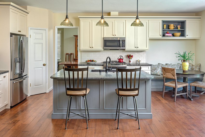
Photo: Bart Edson Photography
A client’s kitchen went from tired to fresh with careful application of color.
In Napa Valley, California, two-time award-winning and published interior designer and principal of PLC Interiors Patti Cowger recently transformed an outdated kitchen into a fresh farmhouse space for longtime friends Jeff and Cathy. Cowger completed a full kitchen renovation for the couple featuring soft, coastal gray quartz countertops, beautiful creamy white cabinetry, and a café brown granite composite sink in order to create a dream kitchen for her friends of more than 50 years.
From the very beginning of the project, Cowger began her remodel facing the challenge of finding enough space to accommodate all the features Jeff and Cathy wanted for their kitchen. High on the couple’s list was getting a table large enough to enjoy breakfast and spread out the morning paper. Another tough challenge was creating a layout that is inviting for family functions and meetings.
Both Jeff and Cathy have busy social and professional lives, often holding meetings in their family room, adjacent to the kitchen. They needed their kitchen to always look clean and tidy, without having to spend too much time doing the work. Since their sink is located in the middle island, which is visible from the family room, Cathy worried about having the sink appear spotless for her guests.
Cowger noted that Cathy was immediately drawn to granite composite sinks and their various dark color possibilities. “She was immediately intrigued,” Cowger recalls.
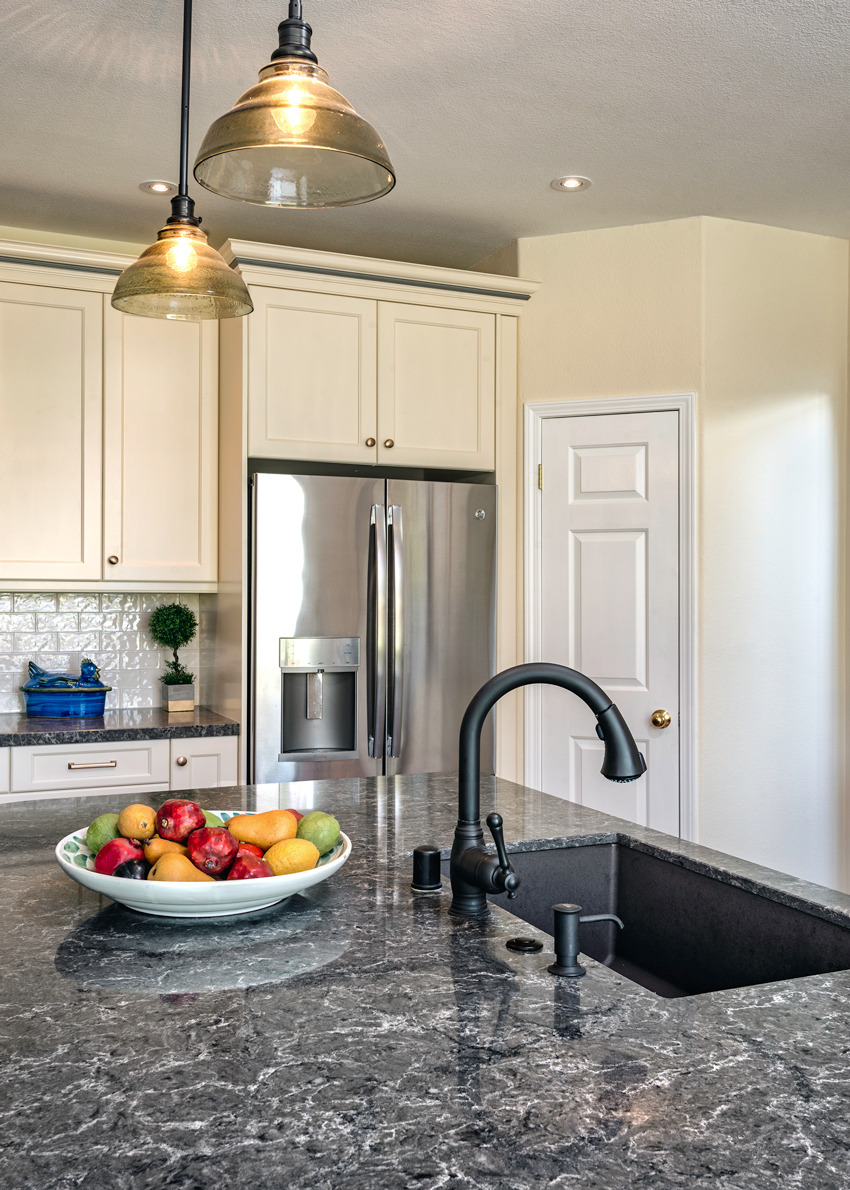
Photo: Bart Edson Photography
The white cabinetry, coastal gray quartz counters, cream walls, and a gray island come together perfectly to create a warm, neutral look. The café brown granite composite sink and dark bronze faucet were the perfect finishing touches due to their earthy tones.
Granite composite sink technology is durable and heat, scratch, stain, and chip resistant—the perfect functional combination for Cathy and Jeff. From a design standpoint, the color selection was both sophisticated and novel, pairing perfectly with the quartz counter top.
Jeff and Cathy’s new modern-day farmhouse-style kitchen exudes a peaceful yet family-friendly ambiance. The white cabinetry, coastal gray quartz counters, cream walls, and a gray island come together perfectly to create a warm, neutral look. The café brown granite composite sink and dark bronze faucet were the perfect finishing touches due to their earthy tones.
Thanks to Cowger, each of Cathy and Jeff’s must haves were checked off their list, and there were even a few extras thrown in, like island seating for their grandchildren. The couple is now ready to enjoy their new kitchen and host family and friends.
Coloring the Path to Function, Welfare and Health, and Safety
Form and Function in the Kitchen
“Most clients are particular about aesthetics, but all clients insist on functionality,” responded a design professional in “Trends Stories in Kitchen Design & Color.” Clients want spaces that convey their personality, but most of all, they want their kitchen to make their lives easier. Here—perhaps surprisingly—color has critical roles to play.
Color provides an essential foundation for successful interior design. The use of color as a design element in interior environments also contributes to creating a design solution that encourages engagement and improves perceptions of safety. According to O’Connor, color can be harnessed as an effective nonverbal mnemonic device for orientation and wayfinding at a range of different scales. That means that color in the kitchen plays a vital role in welfare, health, and safety.
Color and Its Role Welfare, Health, and Safety
Surveyed designers reported that a majority of kitchens are being designed for people older than 55 or multigenerational/family households. Boomers, who are 77 million strong and make up 28 percent of the U.S. population, are quickly catching on to the economics of aging-in-place designer modifications. Moving into a typical assisted-living facility can cost up to $60,000 annually, according to the National Association of Home Builders (NAHB). The cost to adapt a home by widening doorways, putting in safety bars, switching out a sink, and adding a roll-in shower might typically cost about $8,000, but this represents a one-time expense rather than the on-going expenses involved in assisted-living facilities.
“From preventing falls through something as simple as choosing the right kind of carpet to designing beautiful, welcoming shared spaces to help address social isolation, architects and interior designers have the chance to improve, and even extend, the lives of seniors,” writes Karen Kubey, an urbanist whose practice specializes in housing and health. She also edited New York City Department for the Aging’s (DFTA’s) Aging in Place Guide in 2016 in collaboration with DFTA and AIA New York Chapter’s Design for Aging Committee.7
Color is the designer’s tool to establish wayfinding. Wayfinding is a term used to describe user experience and orientation within an environmental context. “Good architectural wayfinding design is important to universal design because it facilitates user access, increases satisfaction, and reduces stigma and isolation of users with disabilities,” writes Susan Hunter, Ph.D., M.Arch. IDeA Center, University at Buffalo.8 It reduces the confusion of visitors and mistakes by employees, saving time and money, and preventing accidents. It also reduces stress, boosting health and productivity.9
What does wayfinding look like in a home? “Painting walls a different color than the floor can help with perception,” says Mark Hager, cofounder of AgeInPlace.com, an aging-in-place resource.10 “Similarly, adding colored lines on the edges of steps, floor transitions, and counter edges can offer visual cues of a transition. These cues are easy to add and don’t distract from the design of the home.”
Colors and wayfinding are vital as we age.
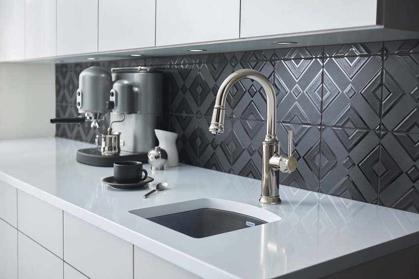
Photo courtesy of BLANCO
The contrast of black and white enhances both welfare and safety in a kitchen, particularly for users with visual limitations. The color highlights different workspaces, allowing for easy identification of counter and sink.
Visual perception declines from middle age onward. A strong color contrast improves environmental legibility. Environmental legibility is the degree of distinctiveness that enables viewers to comprehend their surroundings or the degree to which a building facilitates the ability of users to find their way within it.11
According to O’Connor, people with Dementia and Alzheimer’s disease can experience difficulties with spatial awareness. This includes difficulty judging distances, identifying an object from its background, finding light switches, and distinguishing between the toilet and bathroom floor.
While a distinct color contrast obviously is important between features like steps and risers, the leading edge of a step, and at contours and boundaries (walls from floors, doors from walls, windows from walls, and railings from walls), color contrast is also applicable in many other ways. For example, contrasting colors in the kitchen create much more legible work environments. A contrasting sink clearly delineates where the counter ends and the sink begins, as well as alerts a user to the depth discrepancy between basin and counter.
Aging-in-place principles are sweeping changes designed to custom fit a home to a client and his or her family as time goes by, according to the NAHB. Making remodeling decisions with aging in place in mind allows clients to continue living safely, independently, and comfortably at home in a familiar environment throughout their maturing years. Aging-in-place design principles focus on elegant, aesthetically enriching, and barrier-free environments.
The NAHB Aging in Place Checklist for the Kitchen includes the following recommendations:12
- Wall support and provision for adjustable and/or varied height counters and removable base cabinets
- Upper wall cabinetry three inches lower than conventional height
- Accented stripes on edge of countertops to provide visual orientation to the workspace
- Counter space for dish landing adjacent to or opposite all appliances
- Base cabinets with rollout trays and turntable features
- Pull-down shelving
- Glass-front cabinet doors
- Open shelving for easy access to frequently used items
- Easy-to-read controls
- Microwave oven at counter height or in wall
- Side-by-side refrigerator/freezer
- Side-swing or wall oven
- Raised dishwasher with push-button controls
- Electric cooktop with level burners for safety in transferring between the burners, front controls, and downdraft feature to pull heat away from user; light to indicate when surface is hot
- 30-inch by 48-inch clear space at appliances or 60-inch-diameter clear space for turns
- Multilevel work areas to accommodate cooks of different heights
- Open under-counter seated work areas
- Placement of task lighting in appropriate work areas
- Loop handles for easy grip and pull
- Pull-out spray faucet
- Lever or pedal-controlled handles
- Thermostatic or anti-scald controls
- Pressure-balanced faucets
Knowledge Check
Notice