In Living Color


Intelligent Color Matching in the Kitchen
The Science Behind Color Choice
Modern design’s twin movements toward personalization of color and the evolution of kitchen design allow homeowners to set the tone and reflect the mood they wish to cultivate in a much more unbounded manner. It also creates a more adaptive and usable space. “The colors and design of a home should be a reflection of the people who live inside,” says International Color Consultant Amy Wax.
With the expansion of the color palette and the proliferation of new materials available in the kitchen, architects and design professionals are increasingly seeking how to best support client welfare through color choice.
Most building occupants don’t spend a lot of time thinking about the effects of color in their space. Yet color should reflect and assist the people and activities within a structure. Whether aware of it or not, color does drive behavior. Dave Alan Kopec, professor at the New School of Architecture and Design in San Diego, conducts research to find out how the physical environment affects emotions and behavior.4 Kopec defines environmental psychology as the study of human relations and behaviors within the context of the built and natural environments. This research-based information studies the complex interactions between environmental factors and people’s feelings and actions. As architects apply lessons about aesthetics and their impact on people in a space, these studies are providing data that support conclusions about the importance of design decisions like color.
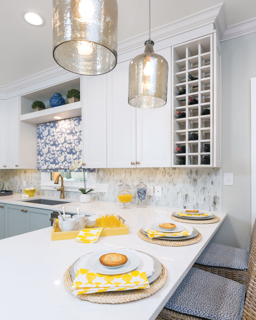
Photo courtesy of Cheryl Kees Clendenon, In Detail Interiors
Complementary shades of blue pop when set against white and yellow accents, creating a cheerful family kitchen.
Designers and architects are now increasingly equipped with both the knowledge and products to use colors wisely to create the intended aesthetic in a building. Not only can color create a visual celebration, but it also enhances welfare by defining workspaces and crafting optical clues that enhance occupant safety.
Color saturation and tonal value have impact, according to the Morgridge Institute for Research and Wisconsin State Journal.5 Color can create responses in three different categories of human performance: cognitive, affective, and behavioral, notes Dr. Zena O’Connor, founder of Design Research Associates and the Colour Collective in Sydney, Australia, and member of the International Colour Association (AIC).6 Cognitive responses include judgments, assessments, and evaluations. Affective responses include mood and emotional reactions. Behavioral responses encompass actions, movements, and wayfinding.
With the expansion of the palette available to designers in the kitchen, architects and design professionals are freer than ever to explore personal expression for their clients. What will the kitchen be used for? Does the client prefer the kitchen as a more private or public space, and how much of the space will be used? Is the intent of the kitchen design and layout for engagement and work or serenity and relaxation?
How much and what kind of light will be used? Is there a lot natural lighting available in the space, or will incandescent or ambient be the main light source? Color can appear drastically different depending on the light source.
What kinds of accents will be used in the room? Does the design highlight bold accents in the space or patterns and textures? Do appliances and sinks take center stage, or do they complement cabinets and paint? Accents can warm up or cool down a space, according to Anna Vichnevetskaia, content development at TheArtCareerProject.com. They can add personality, bring out energy, make a room look modern, and more. Because of their flexibility, sinks and kitchen elements should bring out the personal style and taste of the homeowner.
In her presentation, “Colour in the Built Environment,” O’Connor reveals the highly complex interface between color and human response. Despite the complexity of factors that generate an individual response to a specific color, there are general strategies for color that can demonstrably humanize a space and encourage engagement.
In active, collaborative areas, O’Connor favors a range of mid-level saturated colors to indicate work teams, social areas, and meeting rooms. Strong color and light/dark contrast draws attention to key details. For quiet or contemplative spaces, less-saturated colors with minimal hue and light/dark contrasts evoke a sense of calm. O’Connor recommends the use of colors that the client considers calming. A sense of tranquility can be created simply by reducing the number of contrasts in tonal value and saturation.
O’Connor found that moderately colorful interiors support positive mood and sense of well-being, and that her research indicates people prefer some level of contrast. The interplay of color and light also encourages engagement and improves perceptions of safety.
Making Sense of Trends in Faucets, Counters, and Sinks
The move toward personalization in color does not spell design anarchy. There are notable trends being embraced in the market. In its 2019 survey of 60 kitchen design professionals, Frank Advertising asked about colors the design professionals plan to specify for kitchens in 2019. For cabinets, the top responses were white, gray, blue, and warm tones. This reflects the growing trend toward more overall color in the kitchen. The dominant responses for countertop color were white and gray. The top two appliance colors were stainless steel and black. Traditional choices of stainless steel and white were still tops for sinks. Faucets and hardware selections reflected the growing diversity of color tastes and personalization: stainless steel, brushed nickel, black, and chrome reigned at the top. Sneaking into the top choices for faucets were dual- and full-color finishes. Overall, designers noted that clients wanted to avoid the appearance of a “cookie-cutter” or “volume driven/standard appearance” kitchen.
The rising popularity of the color gray in the kitchen makes sense. Clean, organic, and extremely balanced, gray is at home in both urban and natural settings. The right gray offers both red and blue undertones, making it an exceptionally versatile color.
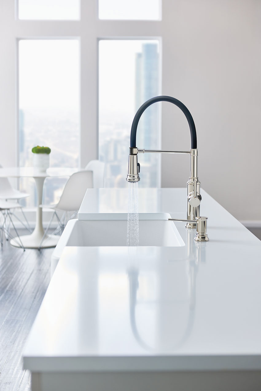
Photo courtesy of BLANCO
Mixed materials are becoming popular as clients seek to create a custom kitchen look.
“Our latest color innovation, Concrete Gray, makes a statement on many levels,” states Tim Maicher, director of marketing for BLANCO. “Concrete gray provides the greatest design flexibility. It is a perfect match for today’s kitchen materials and complements a wide range of countertops for a cool, modern design. We spend countless hours analyzing color trends to find timeless neutrals that offer a fresh, sophisticated look and seamlessly blend in a way that is practical yet inspirational.”
Right on trend, gray can create the perfect fit with a wide array of countertop and cabinet designs. This versatility is important, as designers report a fairly even split between contemporary, transitional, farmhouse, and traditional as top design trends overall in the kitchen.
The expansion of color and emergence of new technologies means the flexibility to match a sink and faucet, or match these elements seamlessly to appliances and countertops. However, this flexibility also offers the ability to create contrast; for example, with white countertops and black sink, appliances, and hardware for a black-and-white theme. Metal contrasts nicely with color; dual finishes in faucets can both match and contrast a sink and a color scheme. Polished chrome enhances a modern setting or marble counters, and satin nickel shines when paired with warmer finishes.
Although the abandonment of most of the rules and traditions in the kitchen brings freedom, it can also overwhelm a client with choices. Certain manufacturers offer modernized tools to help ease the selection process. Mobile color application tools help users evaluate a prospective sink’s appearance when paired with popular countertops and allow them to select the perfect color combination for their kitchen designs. These tools even permit users to add their own countertop selections to the app by capturing images using the device’s camera. Favorite combinations can be added to a list and emailed to others. Manufacturers also offer image galleries for inspiration and design ideas.
Knowledge Check
Notice