Green Campus Design
 1 AIA LU/HSW; 0.1 IACET CEU*; AAA 1 Structured Learning Hour; This course can be self-reported to the AANB, as per their CE Guidelines; AAPEI 1 Structured Learning Hour; This course can be self-reported to the AIBC, as per their CE Guidelines.; MAA 1 Structured Learning Hour; This course can be self-reported to the NLAA.; This course can be self-reported to the NSAA; NWTAA 1 Structured Learning Hour; OAA 1 Learning Hour; SAA 1 Hour of Core Learning
Learning Objectives:
- Discuss how the strategies for energy and water conservation and resilience are deployed at the new Cornell Tech campus.
- Define the term “net zero energy.”
- Explain the principles of Passive House and outline its certification requirements.
- Describe some of the design and construction challenges faced by the team behind The House residential tower, slated to be the largest Passive House building in the world.
This course is part of the Resiliency Academy
View course on architecturalrecord.com »
The Bridge
Cornell Tech
Weiss/Manfredi
By Suzanne Stephens
In designing The Bridge for the new Cornell Tech campus in New York, Weiss/Manfredi faced several architectural challenges. As part of the first phase of creating this engineering and computer-science complex for Cornell University and Technion-Israel Institute of Technology, the project was one of three new buildings on Roosevelt Island in the East River. Accordingly, it needed to strongly express its identity. At the same time, it had to acknowledge its neighbors: Morphosis’s prominently placed four-story Bloomberg Center across the way (page 2) and Handel Architect’s The House, a 26-story academic residence just to the north (page 4).
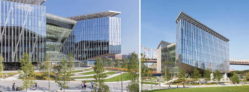
PHOTOGRAPHY: © ALBERT VECERKA/ESTO, EXCEPT AS NOTED; IWAN BAAN (LEFT)
LIGHT LIFT
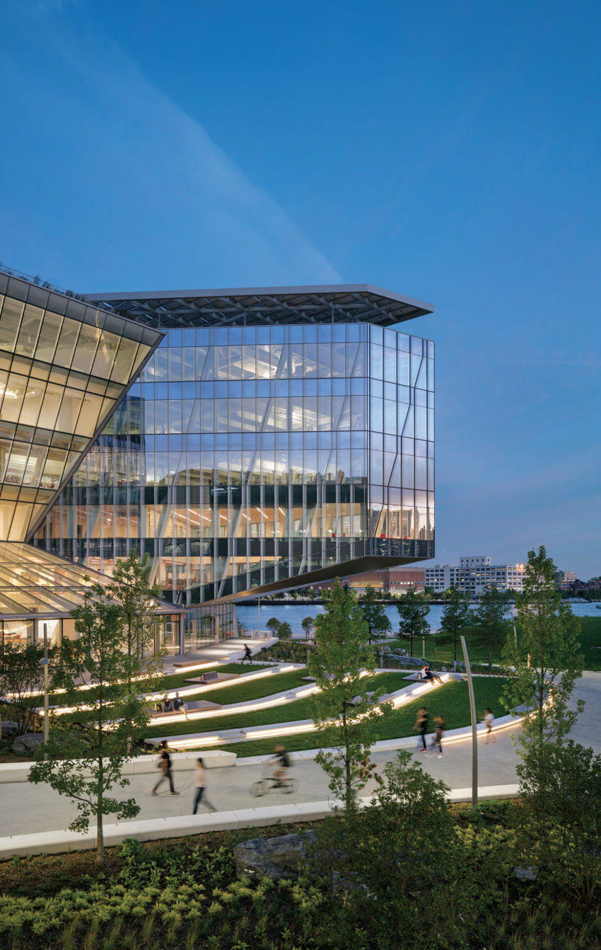
The cantilevered wings of The Bridge frame views for those passing by on the main promenade; landscaping by James Corner Field Operations softens the building’s base. Fritted-glass strips activate the facades, while solar canopies and terraces do the same for the roof.
But perhaps the most challenging was the relatively untried program—a co-location space. Here in a 235,000-square-foot building, graduate students would be encouraged to mingle with entrepreneurs to generate start-ups. One-third of the space would be filled with students, while two-thirds would accommodate workplaces for tech businesses. The developer, Forest City Ratner Companies (FCR), actually owns the facility, leasing space both to the school and to tech-related companies.
Yet there was no “co-location” building typology on which the architects could model a design: “The new program was both liberating and terrifying,” says principal Michael Manfredi. FCR had invited Weiss/Manfredi to submit an RFQ based on the firm’s past institutional work, particularly the nanotechnology center at the University of Pennsylvania (RECORD, November 2013, page 140) and the architecture and arts building for Barnard College (2010).
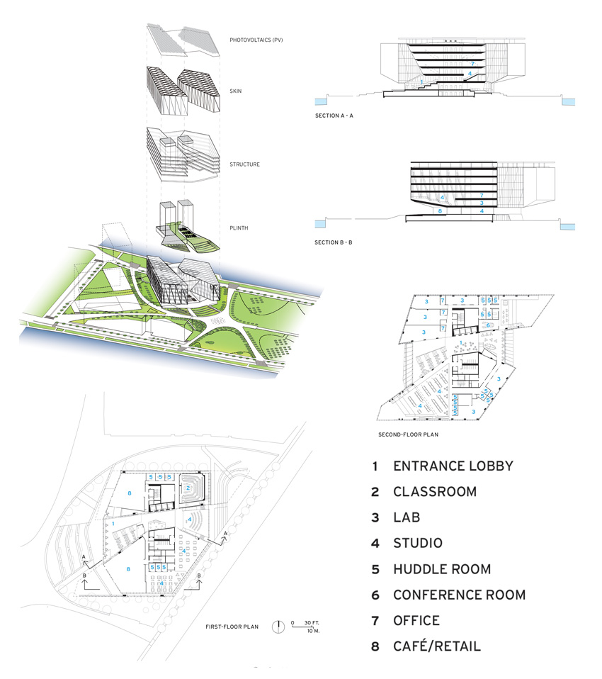
To create an open, flexible environment where students and entrepreneurs could spontaneously interact, Weiss/Manfredi split a rhomboid-like block into two prisms divided by an atrium and generous circulation space. The fissure “is our biggest single move,” says principal Marion Weiss about the parti: “We cut through the middle of the block on an east–west axis that takes in river-to-river views.” Loft spaces and an “inefficient core,” as Weiss refers to this expansive atrium, could foster unexpected encounters. Cornell Tech occupies the first and second floors and part of the third, while the rest of the six levels are leased to business groups such as Two Sigma, an investment firm involved in tech activities, as well as Citicorp’s securities division, and Microsoft.
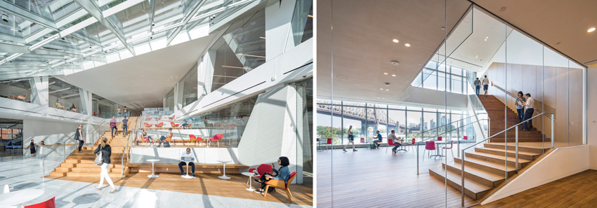
PHOTOGRAPHY: © ALBERT VECERKA/ESTO
WALK RIGHT IN
An expansive stadium stair (left) fills the lobby, interrupted with interior landings that complement the landscaped terraces outdoors. Another stair (right) links the second and third levels of floors on the east side of the building, where views of the Queensboro Bridge dominate.
The mostly steel structure rests on a poured concrete base (clad in precast concrete panels where exposed), which is raised 7 feet above the elevation recommended for severe flooding. The Bridge’s entrance opens onto an expansive pedestrian plaza with cascading grassy terraces designed by James Corner Field Operations. Two wings, which dramatically cantilever in northeast and southwest directions, lift off the ground to shelter outdoor spaces for classes and sitting areas. More important, the space under the cantilevers allows unobstructed views—of the East River on both sides, and cityscapes of Manhattan and Queens.
The entrance to The Bridge draws passersby into the almost column-free lobby. Here café tables and a broad stadium stair, interspersed with three expansive interior terraces, offer ample opportunities for impromptu schmoozing, studying, or discussion. Sectional cuts through the atrium provide glimpses of both upper and lower levels, and glazed perimeter walls of each polyhedral wing amplify the opportunity for different kinds of light and glimpses of the water and urban shoreline.
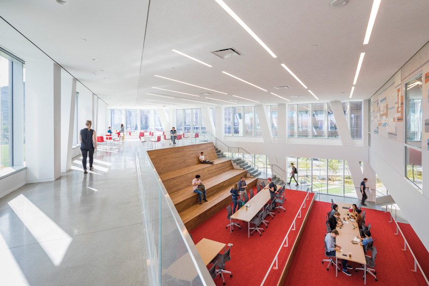
PHOTOGRAPHY: © ALBERT VECERKA/ESTO
IN THE PROW
In the second-level studio space (above, at left), which follows the lift of the cantilevered wing, tenants can work or confer in a variety of settings. A 1942 WPA mural by Albert Swinden from the razed Goldwater Memorial Hospital is installed on the inner wall (above, at right).
Since the energy-code requirements called for a 60:40 ratio of wall to window, the glass-skinned Bridge might seem to not comply. However, Weiss/Manfredi combined thermally efficient, transparent insulated glass with 5-foot-tall “shadow box” units, where double-glazing is placed 3 inches in front of insulated gray metal panels. Reflective coatings give the impression of a continuous surface of glass and reduce heat gain and glare, while diagonal fritted-glass strips, zigzagging across the facades, further mitigate the solar load and add an active pattern to the vitreous surfaces.
The architects planned the spaces so that 75 percent of the learning, working, and socializing areas are within 30 feet of the windows, keeping the need for electric light lower than normal. Another energy savings comes from the 761 photovoltaic (pv) panels in the 24,000-¬ square-foot array on the rooftop canopy. Although the electricity generated by those pvs goes toward the neighboring Bloomberg Center’s net zero goal, the canopy itself shades outdoor terraces overlooking mesmerizing, panoramic views of the East River and the New York skyline.
The gigantic full-height elevated trusses that support the cantilevers hardly look economical. But the architects argue that they make the structure 40 percent lighter than a typical steel frame and cut down the need for more interior columns. The lavish use of gypsum board to cover the trusses does diminish the drama a bit, even if its white color keeps the light level high.
Gauging the success in how The Bridge does (or doesn’t) meet its goals—in terms of encouraging interaction and creativity between students and businesspeople, not to mention energy efficiency—should be instructive and fascinating to follow as it reaches its full occupancy in the coming months. Already, the building is on track for achieving LEED Gold status and is a remarkable addition to the ensemble: its geodic features, gleaming glass, and dramatic cantilevers exhibit a frank optimism about Cornell Tech’s educational significance and its own contribution to the ensemble. Its crystalline surfaces stand out from the metal-paneled The House hovering behind it. And, while The Bridge is lighter, if sharper-edged, than the brawnier Bloomberg Center by Morphosis, it complements the dynamism of its neighbor with its own shimmering, bravura statement.
PHOTOGRAPHY: © ALBERT VECERKA/ESTO
GLASS EXPRESSIONISM
The polyhedral volumes of The Bridge amplify light and views within the building. Transparent insulated glass is combined with 5-foot-tall “shadow box” units where double glazing is placed in front of insulated metal panels.
Credits
Architect: Weiss/Manfredi Architecture/Landscape/Urbanism — Marion Weiss, Michael Manfredi, design partners; Mike Harshman, project manager; Joe Vessell, Pierre Hoppenot, project architects
Engineers: Thornton Tomasetti (structural); Jaros, Baum & Bolles (m/e/p/fp)
Consultants: Heintges (glazing); Renfro Design Group (lighting); Arup (acoustics); Arup, Jaros, Baum & Bolles (AVIT and security)
Owner: Forest City Ratner
Client: Forest City Ratner and Cornell Tech
Size: 235,000 square feet
Cost: withheld
Completion date: September 2017
Sources
Metal/Glass Curtain Wall: W&W Glass; Erie Architectural Products
Metal Panels: Jobin Organization; Sobotec
Glass: Interpane, Viracon
Acoustical Plaster Ceiling: Baswa Acoustic, Sonakrete
Classroom/Studio Furniture: Herman Miller


