Innovations in Color and Texture


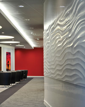 |
In addition to hand-applied polished plaster wall finishes, a new pre-cast, panelized approach can be used to create seamless sculptural wall textures. This muted textured wall is offset by a vibrant jolt of color. Photo courtesy of Armourcoat |
Selecting Hues
For practical reasons, both architects and material suppliers limit the number of colors considered for a given architectural application. One of the primary delimiters is the surrounding condition. "Color and texture choices are highly context-driven," notes Steven Wright, AIA, LEED AP, a project manager with Rafael Viñoly Architects. "Largely they are influenced by the regional and specific locale. And, of course, the client may have certain requirements, such as brand colors."
Combinations of colors may also be similarly limited, by considering the effects of color mixing. "Value is one of the most important elements. Whether light or dark, little value contrast makes for unity, and sharper contrast makes for stronger punctuation," said the Mad Men-era designer, Truex.
Looking to the existing context offers a backdrop for the new color choice, says Viñoly's Wright. "Depending on the situation and the design goals, the designer will seek to align the new colors and textures to the old, or she may wish to contrast and play off the old. Sometimes the introduction of a new and startling color or texture serves to bring a heightened appreciation of the existing," he says.
Manufacturers restrict their color palettes for practical reasons. Pigmentation and dyes are costly (see "Color Prognosticators" sidebar), and experience shows that specifiers and end-users prefer to choose from a pre-edited palette or have matching hues made to order.
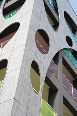 |
A dramatic residential building in Barletta, Italy, employs a double-layered rainscreen of durable panels to add texture and color. Architect: Michele Sfregola. Photo courtesy of Trespa® |
"Five thousand colors is simply too many to choose from. We've focused on a standard color range of about 350 hues, but recognize that custom color-matching is always needed," says Shawn Tweedy, chief operating officer for Armourcoat, a distributor of decorative finishes including polished plaster, a historical wall treatment technique still used widely today. "A critical issue is being able to offer a custom solution: to provide the exact color, hue and texture."
In addition to focusing on bespoke solutions, leading design teams and their suppliers shortlist colors and textures using an iterative process of surveying market feedback. "Based on external research in architecture and adjacent fields such as design and fashion—clothing, furniture, interior, automotive—and through specific discussions with global trend watchers, we identify a selection of possible future trends," says Remon Veraart, director—Americas for Trespa, which makes exterior claddings. "The trends are discussed in workshops with architects in Europe, Asia and the USA to identify the most captivating currently on the market." The company's in-house designers then translate the selected trends into product colors, textures and full façade design systems, adds Veraart.
Color Trends: Rich Neutrals
The investment in market research and expert advice pays off, say those in the building materials supply chain. "We must follow the palette of the times, and fit within what's happening in the market," says Stephanie Goudreau, marketing manager for Lamin-Art, a supplier of decorative high-pressure laminate (HPL). Recently Goudreau has noted a trend back towards neutral colors, "But very interesting neutrals such as greys and beiges, with undertones or hints of colorations such as taupes, blues or mauves. Abstract prints and wood grains also tend to combine warm and cool tones in the same design, making them suitable for both cool and warm color palettes."
Warm neutrals primarily include beiges and tans, while the most common cool neutral is gray. Other cool neutrals include white and green.
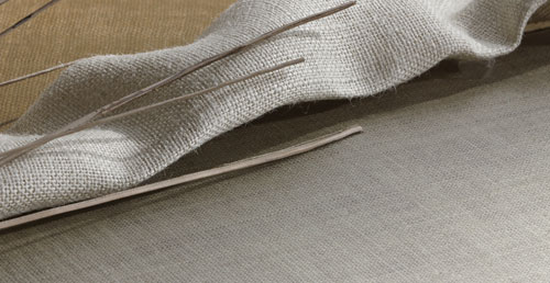 |
Novel textured interior finishes include laminates made with embossing techniques and the use of "inclusion materials," such as burlap cloth or banana fibers, which are pressed into the material's melamine face layer. Photo courtesy of Lamin-Art |
"We've seen an overall shift in the neutral base color palette," confirms Marybeth Orlando, interior design director with the firm The Architectural Team. "Instead of cooler, minimalist grays, clients are opting for classic warmer beiges for both interior and exterior materials." These warmer tones tend to work well with wood finishes and other natural palettes that have a biophilic effect, exploiting the connection that humans have with nature and natural forms.
"Earth tones never go out of style, particularly given our culture's concern today with natural materials, the environment and the out-of-doors," says Katie Grimwood, an interior designer with TowerPinkster Architects Engineers. "Particularly in colder climates, bringing the outside in becomes a strong design concept. In fact, brown has really become the new black in many settings."
Notice