This CE Center article is no longer eligible for receiving credits.
PHOTOGRAPHY: © JOHN HORNER
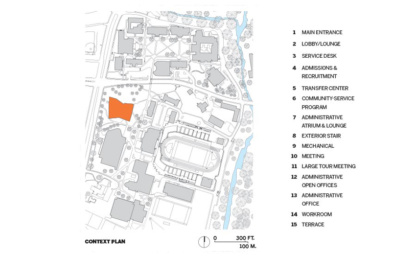
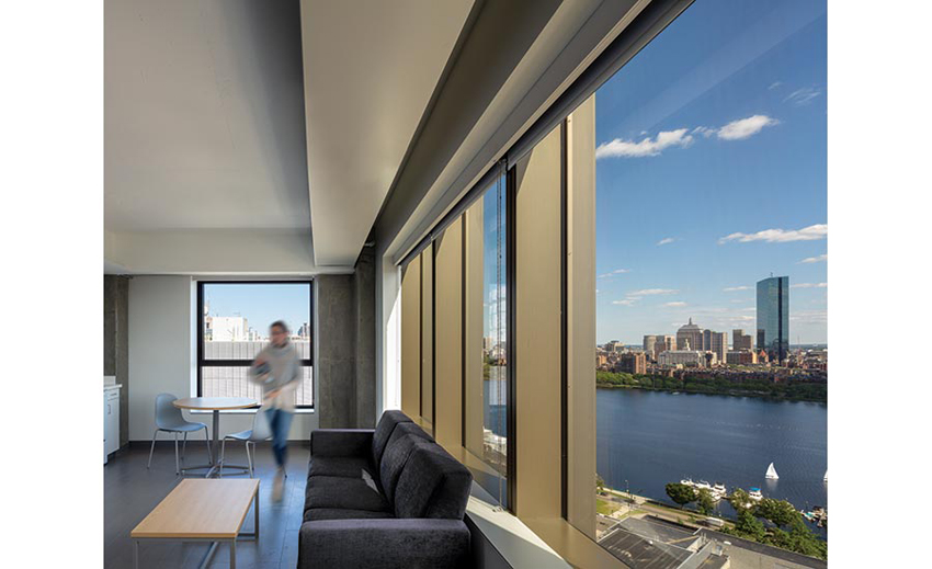
MIT SITE 4, CAMBRIDGE, MASSACHUSETTS NADAAA WITH PERKINS&WILL
Making Waves
SANAA meshes a sinuous cluster of gossamer buildings into the rigid urban plan of Bocconi University’s campus in Milan.
BY NAOMI POLLOCK, FAIA
PHOTOGRAPHY BY IWAN BAAN
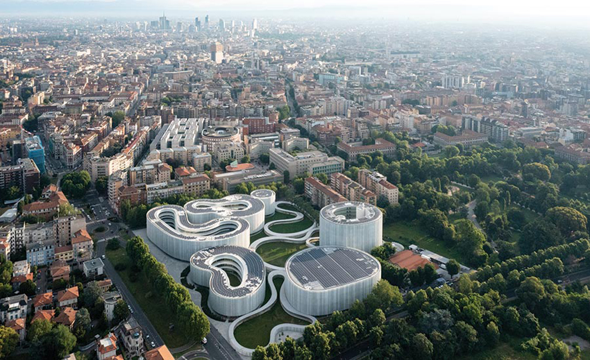
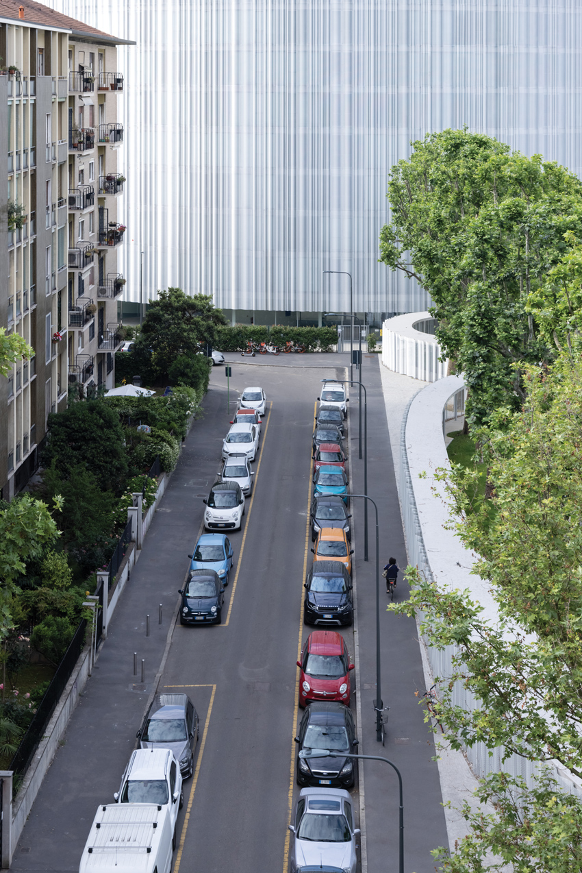
FOUNDED IN 1902, Milan’s Bocconi University has undergone numerous expansions and renovations over the years. But its latest addition—full of curves and covered in a shimmery metallic skin—is a radical departure from the axial relationships and rectilinear volumes typical of the campus. This time, the school, which specializes in business, opted for a grouping of buildings whose sinuous forms relate to each other like internal organs, bound together by a portico-covered circulatory system and grassy connective tissue. Unsurprisingly, this dynamic scheme is the work of the Pritzker Prize–winning Tokyo firm SANAA.
The architects started by studying Milan’s urban fabric, which informed both the site’s master plan and the buildings’ massing strategy. Previously occupied by a milk-processing plant, the nine-acre property abuts the existing campus to the north, including the School of Economics (2008), designed by fellow Pritzker laureates Grafton Architects, and a busy ring road to the south. This location sits between the city’s dense historic center and spacious more recent developments on its periphery. Straddling these scales, the architects divided the program into separate buildings and interspersed them with a public garden requested by the city. “We wanted to make the building part of the park,” explains SANAA principal Kazuyo Sejima. Combining the Master and Executive academic programs with administrative offices, the MEO cluster (the name is an abbreviation of its three main components) fills the northwest corner of the property, with the gymnasium to the south and the dormitory (SANAA designed only its exterior) to the east, near an existing street connecting to the main campus.
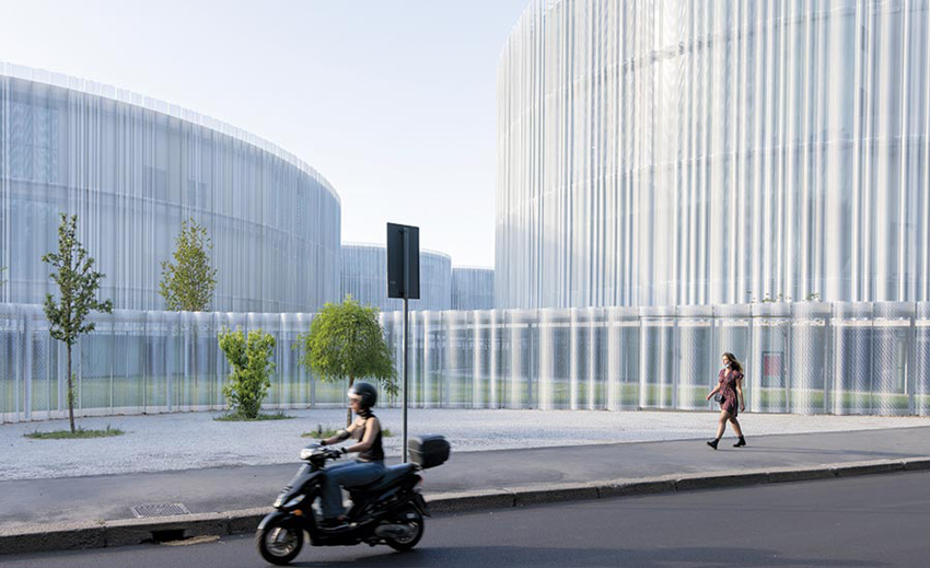
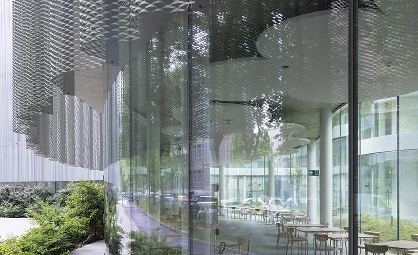
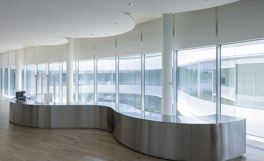
The basic design idea came from the historic Milanese courtyard building: all of the SANAA structures are essentially hollow in the center. While the 11-story dorm wraps an interior garden, the three-story gymnasium centers on a pair of Olympic-size pools below grade and basketball courts upstairs. Similarly, the MEO incorporates four courtyards of its own. Due to the narrow width of its building elements, sight lines extend clear through at ground level, creating a cadence of solid and void. This visually links inside and out, as well as public and private, a theme underscored by the building’s metal-mesh skin.
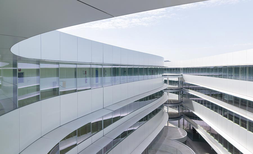
Within the MEO, the three divisions—plus the Pod, the circular component which serves as the building’s entrance—are each housed in separate but connected curvilinear forms. Attached to the Executive portion, the Pod leads to sequential lobbies at the base of the other structures. The ground floors of the Executive and Office volumes also hold dining areas for the school, while the Office element includes a café and commercial space, both open to the public, with four floors of university offices above and the kitchen and meeting rooms below. The Executive and Master volumes mainly contain classrooms, and meeting areas on their basement and upper levels.
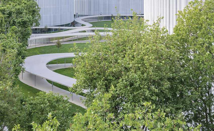
COVERED walkways connect the organic buildings. On the courtyard elevations, horizontal bands of glass are interspersed with opaque panels and shielded with shallow eaves.
Ranging in size and seating capacity, curved classrooms follow the MEO’s overall geometry and promote communication between instructor and students. Their ringed chairs are symmetrical in relation to the lectern. They also sit comfortably between the 1½-foot-diameter steel columns supporting the concrete slabs. The columns were located and sized to provide optimal eye contact between student and professor. Suspended from the ceiling, cloud-shaped acoustic panels conceal lighting, smoke detectors, and other technical apparatus. While whiteboards and projection surfaces line the inner walls, full-height glass forms the outer ones. “Every classroom has a different view,” notes Sejima. Between the classrooms and corridors, double walls sandwich arched spaces for individual HVAC units, eliminating the need for ductwork. This efficient solution helped the project achieve LEED Platinum status. Other factors were the use of Milan’s underground water for the buildings’ heating and cooling, roof-mounted solar panels, the reuse of rainwater to irrigate the park and, of course, the metal mesh exterior panels, which help control the strong Milanese sun.
While transparency is a signature of SANAA’s architecture, the building’s see-through glass skin had to be tempered with the perforated metal wrapping. But because of their different exposures, the building’s inner and outer surfaces were treated differently. Overlooking the courtyards, horizontal bands of glass are interspersed with opaque panels and shielded with shallow eaves, while the outward walls consist of floor-to-ceiling glass, layered from inside to out with narrow balconies and the exterior’s distinctive aluminum mesh, which cuts glare and reduces heat gain.
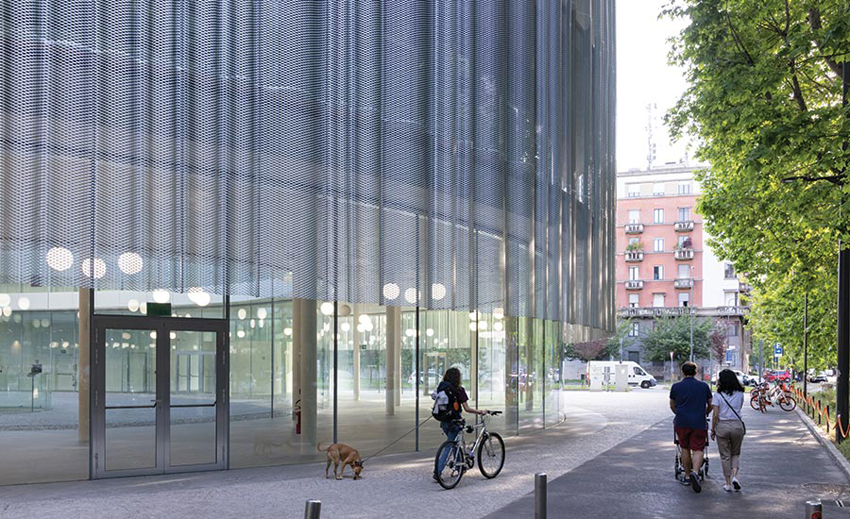
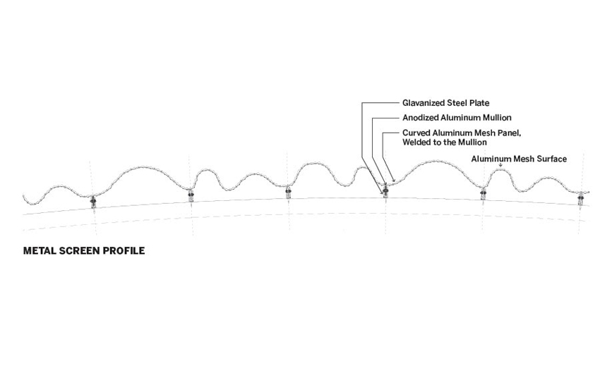
THE METAL-MESH screen positioned in front of the glass skin begins 8 feet above ground level and runs the length of each of the buildings.
Positioned 8 feet above ground level and extending 4 feet above the roofline, these screens are defined by diamond-shaped perforations and undulating profiles. The nearly inch-thick sheets of anodized aluminum were bent into eight different types of wavy sections, turning a flat material into a self-supporting three-dimensional one. This resulted in lighter mesh and skinnier vertical mullions. Welded to the inner face of the mesh, the mullions attach to the structural slabs. But aligning the mesh panels perfectly was no small feat. While the metal sheets were punctured, molded, and welded to the mullions at the factory, the panels’ precision installation took the eye and hand of the artisan. In lieu of welded connections, they simply abut end-to-end, with their oscillations flowing effortlessly from panel to panel. The result is a seamless silvery surface which conforms perfectly to the buildings’ continuously curving walls. “It’s tailor-made prefabrication,” explains project architect Francesca Singer. Unifying the entire project, the mesh also encloses the dorm, sports center, and the outer walls of the covered walkway along the perimeter.
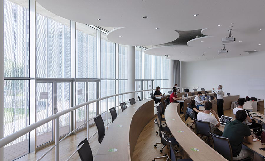
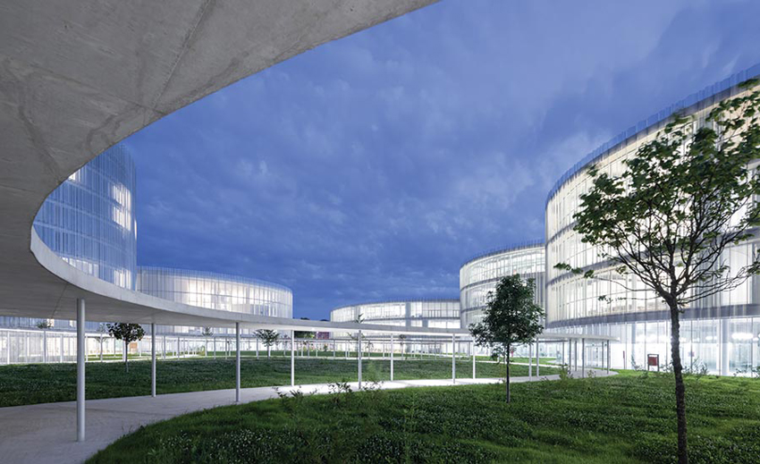
CLOUD-SHAPED acoustic panels on the ceiling conceal lighting and technical equipment in classrooms and other interior spaces. The grouping of buildings is set within a park.
This textured metal skin not only reduces the impact of the building mass, it also makes SANAA’s Bocconi University campus an elegant backdrop for the life of the city as well as the school. Combining the client’s pedagogy and the architects’ clear-cut-design ethos, the new campus embodies both brains and brawn.
Credits
Architect: SANAA — Kazuyo Sejima, Ryue Nishizawa, principals; Yoshitaka Tanase, Francesca Singer, Nicolo Bertino, Lucy Styles, Enrico Armellin, Design Team
Architect of Record: Costa Zanibelli Associati
Executive Architect: Progetto CMR
Engineers: Studio di Ingegneria Pereira (structural); Advanced Engineering (mechanical)
Consultants: Federico Oliva Associati (master plan); SAPS (structure); Ing. Silvestre Mistretta (fire safety); Soluzioni (security); Politecnico di Milano (scientific support)
General Contractors: Grassi & Crespi; Percassi
Client: Universita’ Commerciale Luigi Bocconi
Size: 700,000 square feet
Cost: Withheld
Completion date: December 2020
Town and Gown
A mixed-use tower complex by NADAAA with Perkins&Will anchors MIT’s campus expansion.
BY JOANN GONCHAR, FAIA
Photography By John Horner
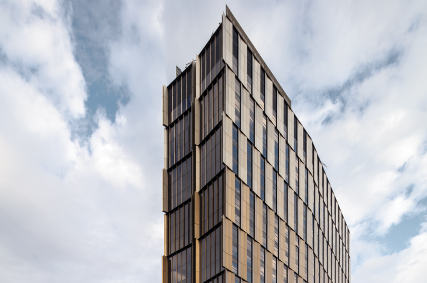
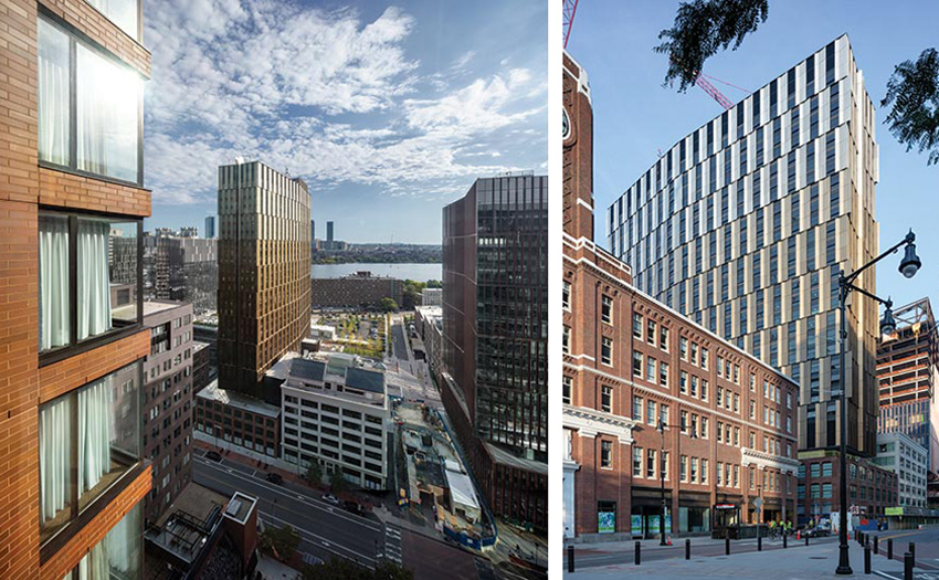
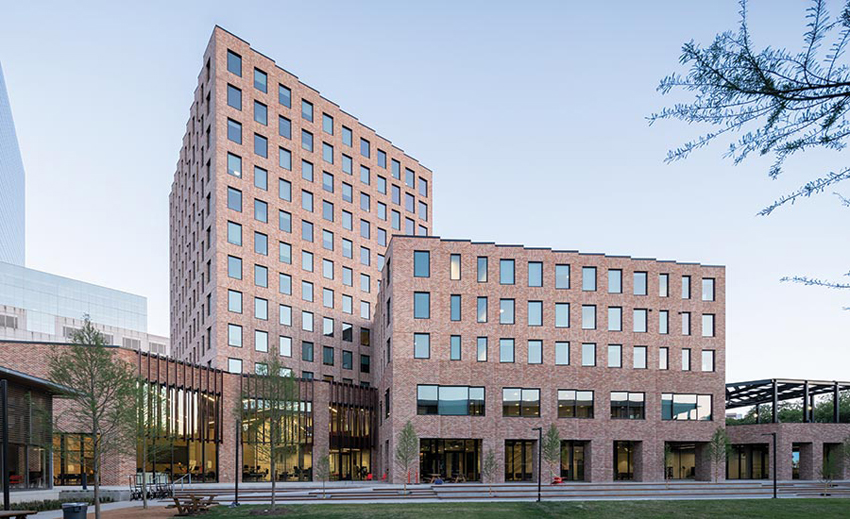
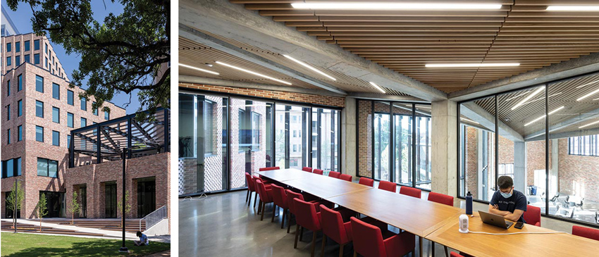
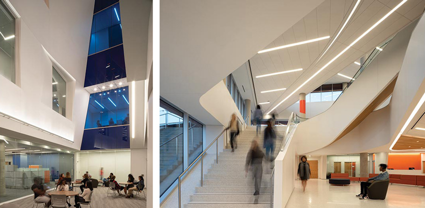
THE NEW MIT high-rise is easily picked out from the other buildings in Cambridge’s burgeoning tech and life-sciences hub of Kendall Square. From the Boston side of the Charles River, its copper-toned sheathing catches the eye: glinting in the sunlight, it appears to be subtly shifting. But though the 29-story building stands out, it has a less-than-distinctive name, referred to by the client, the Massachusetts Institute of Technology (MIT), simply as “Site 4.”
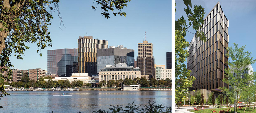
ITS DISTINCTIVE copper skin, and its height, make the Site 4 tower stand out on the Kendall Square skyline. The building overlooks a new quad-like green space to the south.
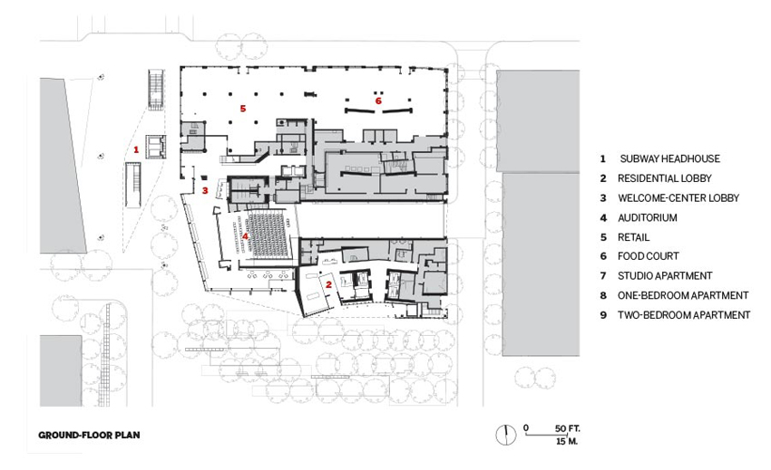
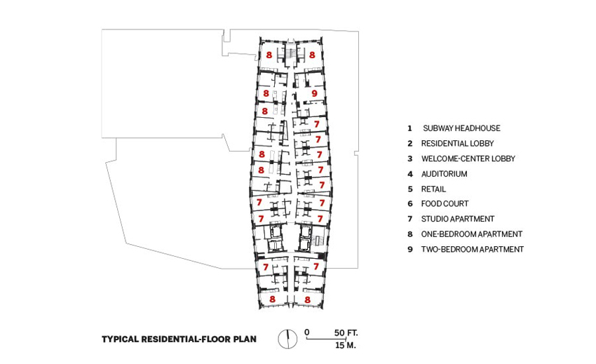
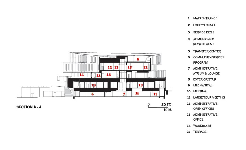
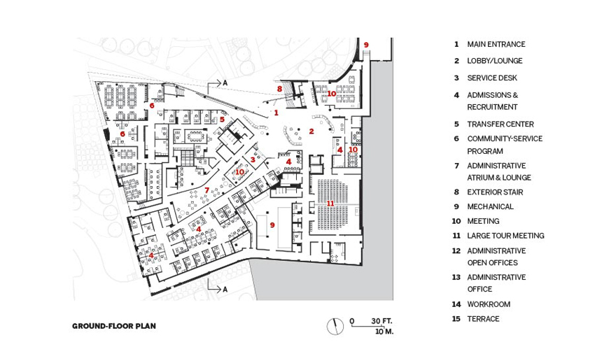
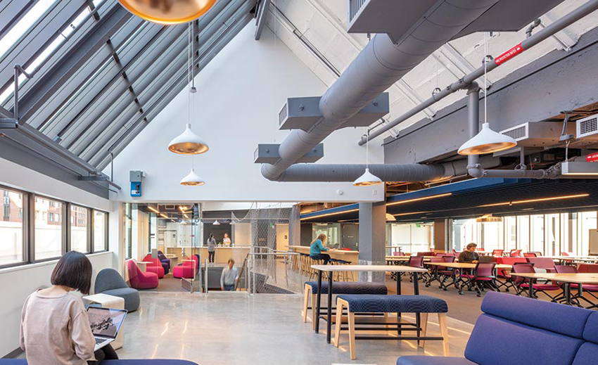
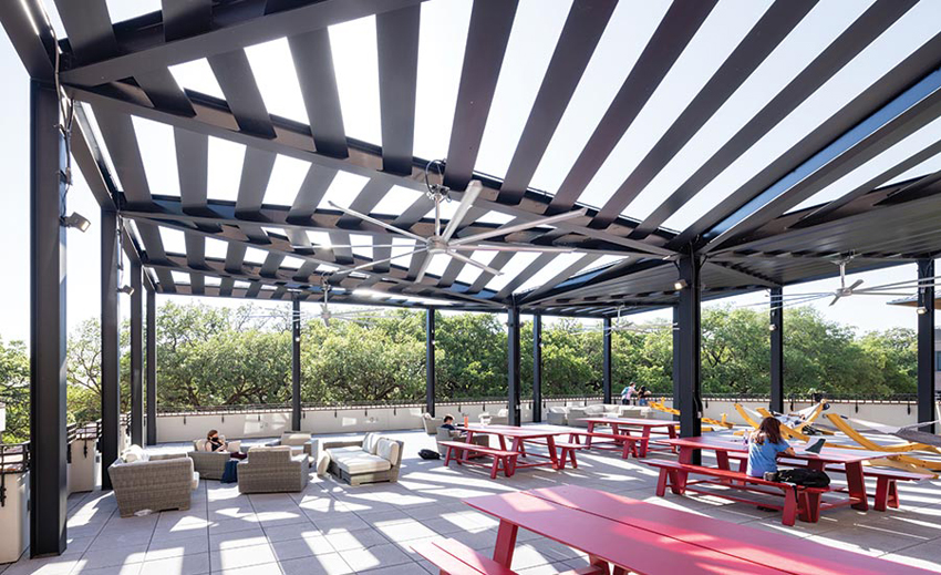
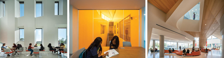
Site 4 houses a varied program and an unusual number of components, of which the lozenge-shaped tower—containing 454 studio to two-bedroom apartments for graduate students—is the most prominent part. Yet the housing is merely a “subchapter,” says Nader Tehrani, principal of Boston-based NADAAA, architect for Site 4 with the local office of Perkins&Will. In addition to the flat-plate concrete high-rise, which cantilevers over a steel-and-concrete framed podium, the project also incorporates the adaptive reuse of two century-old warehouses—remnants of Kendall Square’s not-so-distant industrial past. The interconnected assemblage provides amenities that cater to residents, including group study and social spaces, an exercise studio, and a day-care center open to the wider MIT community. It also houses university programs, such as an innovation and entrepreneurship hub, several sustainability initiatives, and the admissions office, which features a 200-seat auditorium. Other Site 4 elements are intended to engage Kendall Square residents and workers, including a food court and retail spaces.
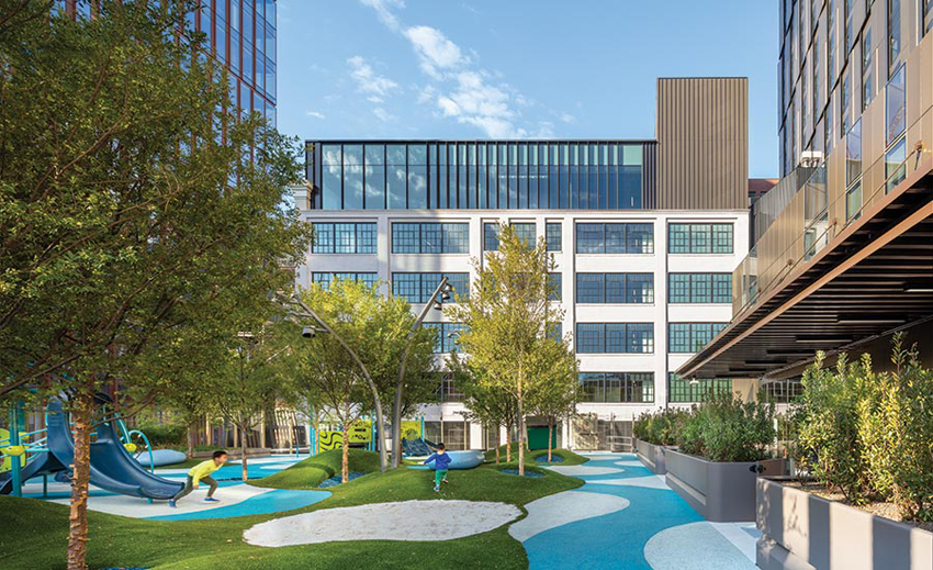
TWO HISTORIC warehouse structures that front Main Street are incorporated into the project. A sheltered playground for Site 4’s day-care center sits atop the podium’s roof.
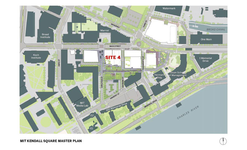
But beyond its programmatic elements, there is another aspect to the project—one that is arguably more significant: Site 4 is part of a larger master-planning effort to expand the MIT campus eastward, deeper into Kendall Square. Here, on land that was a collection of parking lots, the university is building approximately 1.8 million square feet of residential, academic, research, and commercial space in six buildings, and a series of interconnected outdoor spaces.
MIT envisions this emerging district as a new gateway to campus, with Site 4 as the anchor. Tehrani points out that the tower sits on axis with the school’s “infinite corridor,” an 820-foot-long, above- and below-ground hallway that runs through the university’s main buildings. Under a separate contract, NADAAA and Perkins&Will have also designed a more literal gateway—a new headhouse for the Kendall Square Red Line subway stop, now under construction next to Site 4.
As Cambridge’s tallest building (at least for now), Site 4’s tower is visible from several points on campus and especially along Main Street—a primary east–west route leading to the Longfellow Bridge and Boston beyond. With a few deft moves, the architects have given the tower a skin that is worthy of this prominence, creating a unitized glass-and-aluminum curtain wall with an unusual level of refinement. It reads as though it has been fabricated in three-floor sections (a reference to the triple-decker, the ubiquitous Cambridge housing type, says Tehrani). In actuality, due to transportation constraints, the enclosure has been fabricated in horizontal units, 10 feet high and up to 29 feet long, and brought to the site complete with glazing installed.
Within each three-story curtain-wall section, vertical bands of glazing and aluminum panels alternate, and are staggered relative to the section below. The arrangement creates the illusion of movement, enhanced by the use of different colors for the panels—from dark bronze near the base, where the shaft emerges from the podium, to a light copper where the tower meets the sky. Vertical creases in the aluminum make shadows, further emphasizing the variation, while the panels’ knife-blade edges, which pull a few inches away from the glazing, establish a “thinness and crispness” that expresses the non-load-bearing nature of the skin, points out Tehrani. The sum of all these moves serves to dematerialize the building, and at the same time distinguish it.
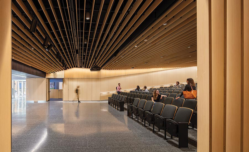
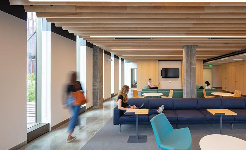
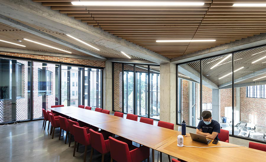
MAPLE MILLWORK warms a study space and the auditorium. Many apartments have river views. A once roofed-over skylight illuminates the Innovation HQ’s top floor.
For the tower’s interiors, the team has taken a more no-nonsense approach. In the residential common spaces within the podium, many of which overlook a new landscaped quad to the south, concrete slabs have been largely left exposed and then polished as the finished floors. Mechanical systems are only partially concealed, camouflaged above maple-plywood ceiling baffles. The design strategy is also highly practical on the floors above, but with a more domestic feel within the units. Here a 7-foot 6-inch dropped ceiling covers a portion of each apartment, enclosing the mechanical services. But the living spaces open up, with 9-foot ceiling heights at the windows, making the most of daylight and views.
The hope for the new campus precinct is that it will not be an insular academic environment, but will meld with its urban environs. This ambition is apparent in the treatment of the former warehouses, which front Main Street and, on their upper levels, now hold the offices for the admissions staff, the sustainability groups, and the MIT Innovation HQ. Previously, the structures’ first floors had been at loading dock level, several feet above the sidewalk. But, because these spaces will be leased to shops and eateries, the team lowered the slab heights. One of the warehouses, a three-story brick edifice, has been gutted, its original heavy-timber and iron structure removed and replaced with a concrete one that helps support the tower above. Meanwhile, for the adjacent seven-story concrete-framed building, the architects took a more surgical approach. Its structure has been left mostly intact, except that the first-floor slab has been demolished and replaced at a lower elevation. Elsewhere within the old printing plant, the designers worked with the building’s existing assets, revealing distinctive mushroom-shaped column capitals, formerly hidden by drywall, and uncovering a roofed-over top-floor skylight.
This reuse of Kendall Square’s historic fabric is just one of the many noteworthy aspects of Site 4. In accommodating diverse programmatic needs, engaging the urban surroundings, and incorporating an ingeniously clad tower, the multifaceted project creates a fitting cornerstone for an emerging part of MIT’s campus.
Credits
Architect: NADAAA — Nader Tehrani, Katherine Faulkner, principals in charge; Harry Lowd, project manager
Architect of Record: Perkins&Will — David Damon, principal in charge; Andrew Grote, project manager
Consultants: Odeh Engineers (structural); ARUP (m/e/p/fp); Studio NYL (envelope); Landworks Studio, Hargreaves Associates (landscape); Lam Partners (lighting); Ateleir Ten (sustainability)
General Contractor: Turner Construction
Client: Massachusetts Institute of Technology
Size: 426,000 square feet
Cost: Withheld
Completion date: September 2020
Sources
Curtain Wall: Island Exterior Fabricators, Ipswich Bay Glass, Morin, ATAS, Wassau, Kawneer
Rainscreen: Trespa
Skylights: Oldcastle BuildingEnvelope
Fire-Control Doors: Total Door Systems, U.S. Smoke & Fire
Paints: Sherwin-Williams
Tile: Daltile
Carpet: Mohawk Group
Conveyance: TK Elevator
Lighting: Lumenwerx, Ecosense, Focal Point, Lumenpulse, Bega, Structura, Lutron
Clear Vision
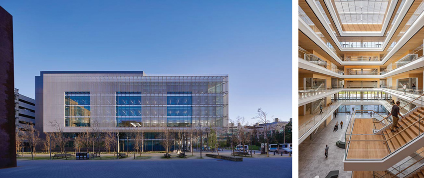
Mark Cavagnero collaborates with SmithGroup to foster well-being at the Joan & Sanford I. Weill Neurosciences Building at UCSF Mission Bay.
BY CLARE JACOBSON
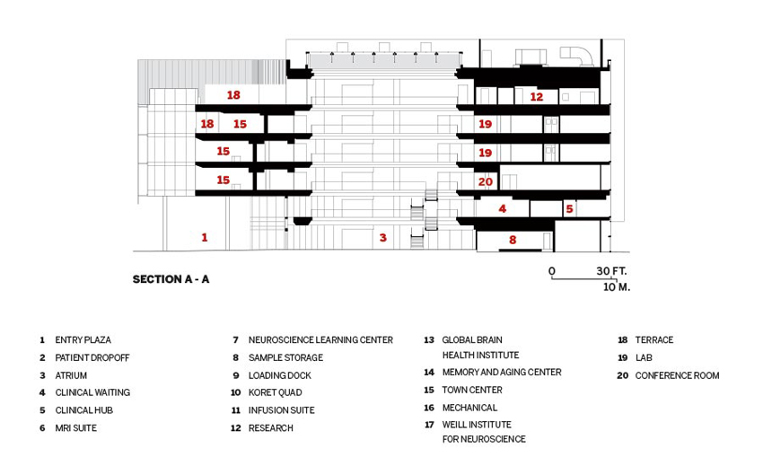
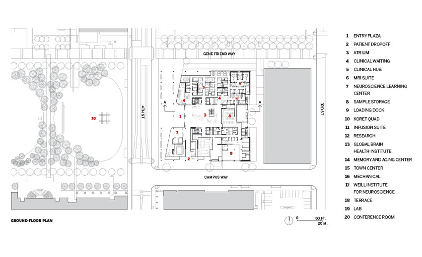
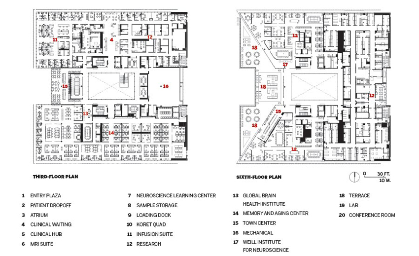
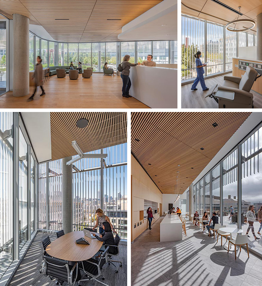
THE FIRST THING you notice is the light: a skylit six-story central atrium, sunbathed patient-treatment rooms, rows of daylit lab benches, and a broad, sunset-facing rooftop terrace. The 283,000-square-foot Joan and Sanford I. Weill Neurosciences Building at the University of California, San Francisco (UCSF) Mission Bay campus is crazy for light, even by California standards. For this atypical facility that integrates the research and treatment of neuroscience and psychiatry, SmithGroup and Mark Cavagnero Associates (MCA) took an unconventional approach, disregarding sterile institutional precedents in favor of a more natural environment. “I was trying to use this one idea of designing with light as opposed to a material—not steel, not concrete,” says design architect Mark Cavagnero. “Everything else is subordinate.”

PHOTOGRAPHY: © TIM GRIFFITH
THE MAIN entrance faces Koret Quad, across the street. Social areas and terraces occupy the center of the upper levels.
Daylight is what Cavagnero used to organize the two-way flat-slab structure’s plan. The main, west entrance faces Koret Quad, a park at the center of the UCSF campus. With some encouragement from the MCA team, a dense line of trees was removed at the park’s eastern edge, opposite the entry, allowing the architects to take advantage of more sunshine and views to the quad. They established open terraces, social spaces, waiting rooms, and an infusion suite—where patients may spend hours receiving treatments—on this west end and located workspaces along the building’s glazed northern and southern expanses. The east side—which is clad with metal panels, has a few small windows and faces a parking garage with the Chase Center arena by Snøhetta just beyond it—holds mechanical rooms, circulation, and other spaces less dependent on natural light.
The north, south, and west elevations enable this strategy with a recessed glass curtain wall at the two lower clinic levels and a procession of white aluminum louvers that defines the four upper research floors. These fixed shading devices activate the glazed facade during the course of a day, as the sun’s ever-changing patterns of light and shadow wash over them. At the same time, they maintain daylit interiors (supplemented by LED task fixtures and overhead luminaires with occupancy sensors and manual overrides) open to vistas beyond, obstruct glare, and virtually eliminate the need for shades during summer months. They also reduce the building’s heat load, allowing for a lighter low-E coating on the glass. Weill Hall recently achieved LEED Gold certification, higher than the UC-required LEED Silver.
OPENINGS in north-facing louvers soften the building’s mass and allow views in. The skylit atrium is clad with sycamore and oak.
The louver design—which was developed using virtual-reality simulations as well as quarter-scale and full-scale models—needed to address the sunny and windy Mission Bay conditions, attach to the curtain wall structure, and project far enough from the glass for window washing. As a bonus, this projection gives occupants of the university-mandated 75-square-foot perimeter offices the impression of having greater space. Large patches of glazing were left exposed within this screen for several reasons. These typically coincide with shared spaces, such as waiting areas and open-plan offices, where there is no seating near the glass, explains MCA senior associate Paul Davison. Contextually, he adds, the openings respond to bay windows in an adjacent building and help to soften the building’s mass while allowing passersby to see into the building. After studies showed that the adjacent Mission Hall would help protect the south facade from heat gain and glare, “we felt comfortable with the larger openings, to admit more daylight and allow greater transparency,” he says.
PHOTOGRAPHY: © TIM GRIFFITH (BOTTOM, RIGHT); KYLE JEFFERS (4)
SUNLIT spaces include a clinic waiting room at the entrance and third-floor infusion suite, plus sixth-floor meeting room, and “town center”.
For Cavagnero, daylight is an abstraction, or representation, of nature, which he sees as essential to the well-being of occupants. The interior material palette—sycamore-veneer wall panels, oak flooring, gray broadloom carpets, and a mix of olive green, slate blue, and dark brown furniture—is intentionally more natural, even residential, than what one might expect in an institutional building. The architect had a personal incentive for this scheme. As he was beginning work on the project, his mother was diagnosed with dementia—a condition to be studied at Weill Hall—and he wanted the facility to be calming to visitors like her, rather than complex and disorienting. “Her connection to liking this space would have to be something natural. It wouldn’t be Mark’s stupid concrete!” he quips. “She could walk in and say, ‘This is comfortable; this is beautiful.’”
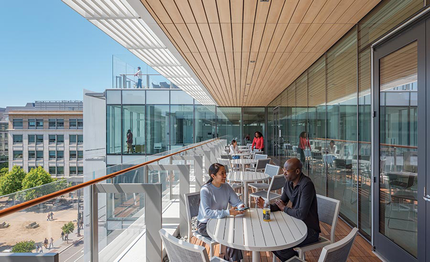
OVERLOOKING Koret Quad to the west, a comfortable fifth-floor terrace is shaded by a more expansive terrace above it.
MCA was equally concerned for the neuroscientists and psychiatrists, who will spend long hours working here. Davison notes the firm’s intention to “create a great environment, connected to nature, because ultimately that is what they’re studying.” The building’s aesthetic does not translate as raw or unrefined, however. “We worked hard on how every piece is assembled, attached, crafted,” says Cavagnero. “The scientists love the fact that there’s a precision in the building.” Such exactitude is derived from the lab benches themselves, which have a standard 10-foot 6-inch spacing between them. This measure and divisions of it are used throughout the structure, from the column grid and width of the wall panels to the 7-inch spacing between the louvers.
Despite its simple organization and palette, this building was not designed to disappear into its surroundings. With its central position on the UCSF Mission Bay campus—across Koret Quad from Ricardo Legorreta’s imposing William J. Rutter Center—it is meant to be seen. Its glass-and-louver facade is decidedly different from the many travertine-clad buildings on campus. This not only brings daylight to its occupants but also makes the building glow at night—a beacon of activity as researchers work on their next breakthrough. Cavagnero says the university understood that a unique building could attract scientists by offering an environment that was unlike any other. According to Dr. Stephen L. Hauser, director of the UCSF Weill Institute for Neurosciences, “The building has to be a place that radiates hope—that is luminous.”
Clare Jacobson is a San Francisco–based design writer and editor.
Credits
Architect: Mark Cavagnero Associates — Mark Cavagnero, design principal; Kang Kiang, principal in charge; Paul Davison, project director; Federica Carrara, lead interior designer
Architect of Record: SmithGroup
Engineers: Degenkolb (structural); Critchfield Mechanical (mechanical); Freyer and Laureta (civil); Walters & Wolf (facade)
General Contractor: DPR
Consultants: Jacobs Lab Planning Group (lab programmer); Loisos + Ubbelohde (lighting); Atelier 10 (sustainability); Arup (acoustics/vibrations/code); CPP (wind engineering); Office of Cheryl Barton (landscape)
Client: Univeristy of California, San Francisco
Size: 283,000 square feet
Cost: Withheld
Completion date: June 2021
Sources
Glazing: Viracon; Metcoe Skylight
Metal Panels: Elward; USG
Wood: 9Wood; AML Limited; Mission Bell USA Millwork
Tile: ASN NaturalStone; Eurowest
Brick by Brick
A residential college by Barkow Leibinger continues the tradition of good design at Rice University.
BY MARK LAMSTER
PHOTOGRAPHY BY IWAN BAAN
IF YOU WERE to construct a giant dome over the Houston campus of Rice University, you’d have a pretty good museum of architectural movements over the last century. The school, which was founded in 1912, has been a patron of ambitious architecture from the start, with its very first buildings, designed by Ralph Adams Cram, a sui generis mashup of historic styles. Recent projects by Michael Maltzan, KieranTimberlake, and Rogers Partners join a legacy of name-brand architecture.
THE TRIO of structures that forms the college is sympathetic to the lush campus as well as the adjacent medical district.
The latest addition to this tradition comes from the German-American firm Barkow Leibinger. “Rice is kind of an incubator for architecture,” says Frank Barkow, a founding partner. The firm’s 148,000-square-foot Sid Richardson residential college, completed earlier this year, is a trio of linked structures (two, five, and 12 stories) that sits alongside the building it was commissioned to replace, a 14-story Brutalist tower designed by the Houston firm Neuhaus & Taylor, which opened in 1971. The future of this decommissioned tower is undetermined, though Barkow would like to see it repurposed. “Our building is very much in dialogue with it,” he says, noting that the new college structure wraps around it on two sides. “It would be my hope to save it.”
The new complex deftly negotiates the relationship between the bucolic Rice campus, with its broad quads lined by arcades and shaded allées of live oaks, and the towers of Houston’s Medical District, directly across Main Street. It manages this in both scale, with its structures stepping down in height, and in plan, by rotating away from the grid of the city and toward the grid of the campus.
It also makes subtle reference to the architectural legacy of the school; its interlocking volumes, with punched windows aligned in orderly formation, nod to the modernist tradition on campus, while its complex brickwork looks back to its earliest buildings and to its many Postmodern additions, in particular works by James Stirling and Michael Graves. It is nonetheless decidedly of this moment, free of flashy formalism and confident in its reserved modernism.
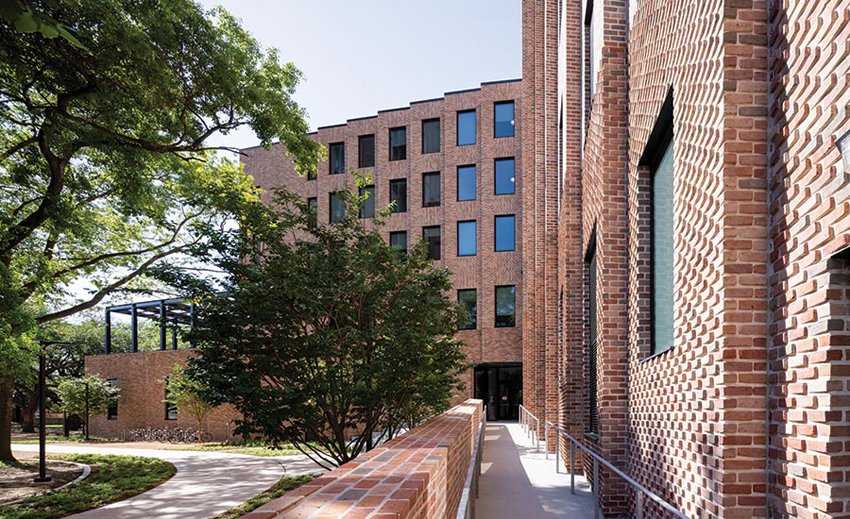
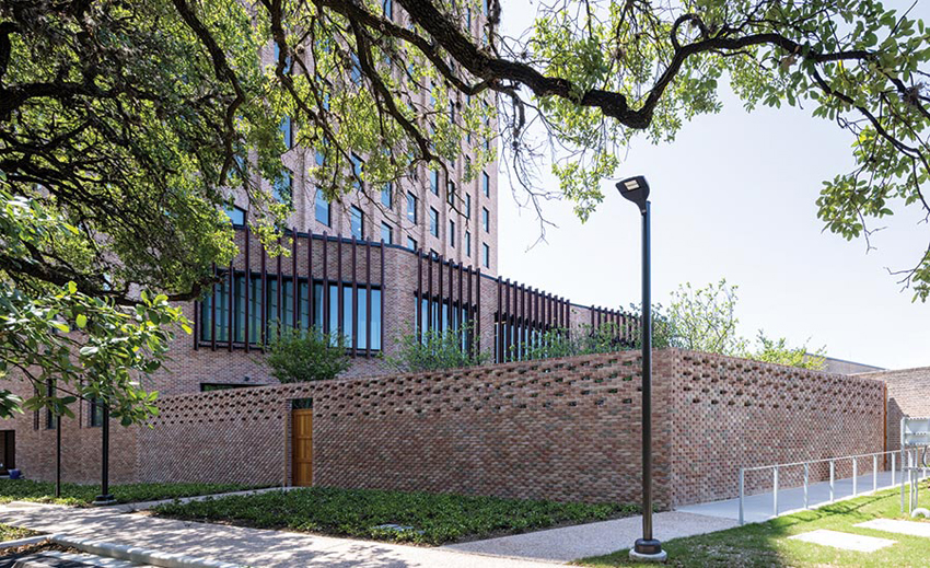
THE BRICK’S distinct patterning and range of colors animate the facades. The new complex establishes a dialogue with the existing Brutalist tower.
Like much of the architecture at Rice, “Sid Rich,” as it is known (it is named for the legendary Texas oil baron and philanthropist Sid Richardson, who was not an alum), is faced in warm St. Joe brick from New Orleans. But this was not the original intention. The project’s genesis came in 2017, when Barkow ran into Sarah Whiting—then the dean of Rice’s architecture school and now dean of Harvard’s GSD—at the Chicago Architecture Biennial. Whiting envisioned the new Sid Rich as a pilot project in mass timber, and invited Barkow Leibinger to submit for the job. The firm won the commission but, as it turned out, Houston’s building code precluded a mass timber building of 12 stories, and the idea was scrapped in favor of a concrete post-and-beam system faced with the traditional brick.
There is little that is conventional about those brick facades, however. They are articulated by alternating sections with distinct arrangements in a range of complementary colors—rose, red, orange, and gray. Zigzag and sawtooth patterns are more dramatic at the lower levels and then flatten out at higher elevations. “We spent a lot of time working out the brick modules so there would be as little cutting as possible,” says Barkow. The masonry was laid on-site and not prefabricated in panels. “We have good masons in Texas, so we took advantage.”
The facades shield a cavity wall and a sandwich of flashing and insulation, with a plywood layer and drywall interior face. A ceramic brise-soleil of vertical fins provides shading to glass-fronted common areas on the lower levels of the complex, adding definition to the exterior while subtly modulating the light within.
RAISED TERRACEA provides a sheltered gathering space. A flexible space looks down to the dramatic commons. The lobby also serves as a lounge and study area.
The goal is for the college to achieve a LEED Silver standard, though Rice did not require certification. Elements contributing to the building’s sustainability include photovoltaic arrays on roofs, rainwater collection, and the use of shaded arcades for circulation, in keeping with Rice tradition.
The complex’s most architecturally dynamic interiors are the common areas that link the three buildings at their lower level, in particular the dining hall—a 300-seat space defined by a triangulated grid of concrete columns and exposed ceiling beams. A lattice of wood slats between the concrete beams provides acoustical dampening and is equipped with strip lighting set slightly askew to create a bit of visual play. The result is dramatic but also warmly inviting.
The college provides “Sidizens” with 97 double units (each with its own bathroom) and 118 singles (which share common bathrooms), the dining hall, a duplex magister’s apartment, and three apartments for advisors.
While the 12- and five-story structures are predominantly residential, the two-story building houses workshops and makerspaces, with a roof terrace that serves as a central social space for the college. It is shaded by a space-frame pergola of blackened steel, with slats in fan formation, its language borrowed from the concrete frame of the lower levels.
Pleased with the results at Sid Richardson, Rice has commissioned Barkow Leibinger to expand a second residential college—one of the school’s first, Hanszen—designed as part of Cram’s original plan for the campus. That will present a challenge different from Richardson’s Brutalist legacy, but, this time, without a tower in play, the firm will have a chance to build in mass timber.
Mark Lamster is the architecture critic of the Dallas Morning News and a professor at the University of Texas at Arlington.
Credits
Architect: Barkow Leibinger — Frank Barkow, Regine Leibinger, Martina Bauer, Emma Benintende, Jordan Berta, Deborah Chang, Evan Farley, Ian Miley
Architect of Record: Kirksey Architecture
Consultants: Knippers Helbig (structural design); Ensight Haynes Whaley (structural engineer of record); 4B Technology Group (technology & security); I.A. Naman + Associates (m/e/p); The Office of James Burnett (landscape)
General Contractor: Anslow Bryant Construction
Client: Rice University
Size: 148,000 square feet
Cost: Withheld
Completion date: January 2021
Sources
Masonry: St. Joe Brick Works
Curtain Wall, Windows: Kawneer
Terra-cotta Louvers: NBK
Glazing: Vitro
Acoustical Ceilings: Armstrong, Cardinal Acoustics
Floor & Wall Tile: DalTile
Ship Shape
A sustainable classroom building by Susan T. Rodriguez | Architecture • Design in collaboration with OPAL embodies the mission of the College of the Atlantic in Bar Harbor, Maine.
BY SUZANNE STEPHENS
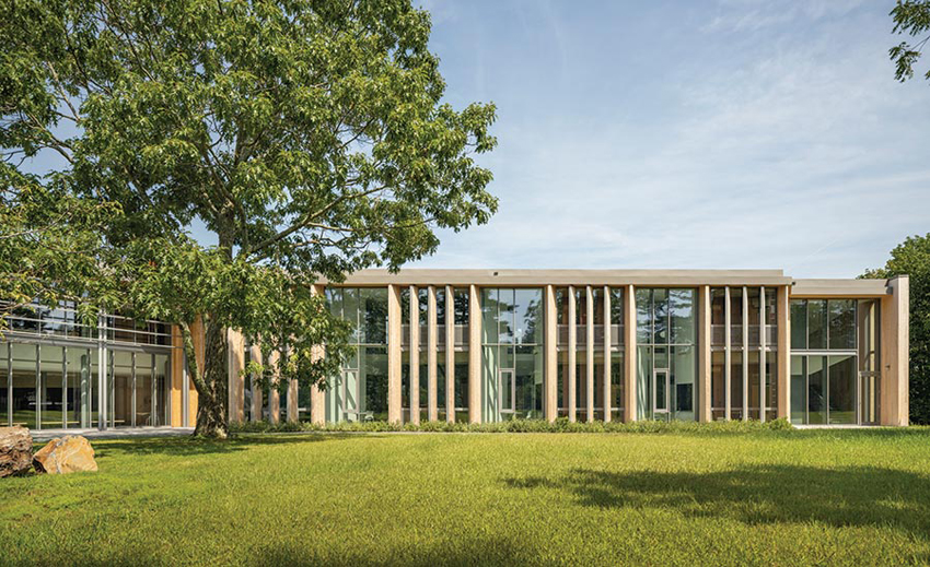
BAR HARBOR is the busiest venue on Maine’s idyllic Mount Desert Island, known for its 6,000-acre Acadia National Park and for the island’s history as a summer colony for the Rockefellers, Astors, and Vanderbilts. While the village of Bar Harbor teems in the summer with tourists crowding T-shirt shops and ice cream parlors, calmer enclaves exist outside the village, such as the 38-acre College of the Atlantic (COA) on Frenchman Bay. For this small private undergraduate institution, Susan T. Rodriguez | Architecture • Design of New York collaborated with OPAL Architecture of Belfast, Maine, to create a crisply tailored, sustainable, 28,000-square-foot, two-story classroom building. The polished result, dedicated in September, meets remarkably high standards of sustainability with a design distinction often missing in energy-efficient efforts.


PHOTOGRAPHY: © JAMESON LOWREY (TOP); TRENT BELL (MIDDLE AND BOTTOM )
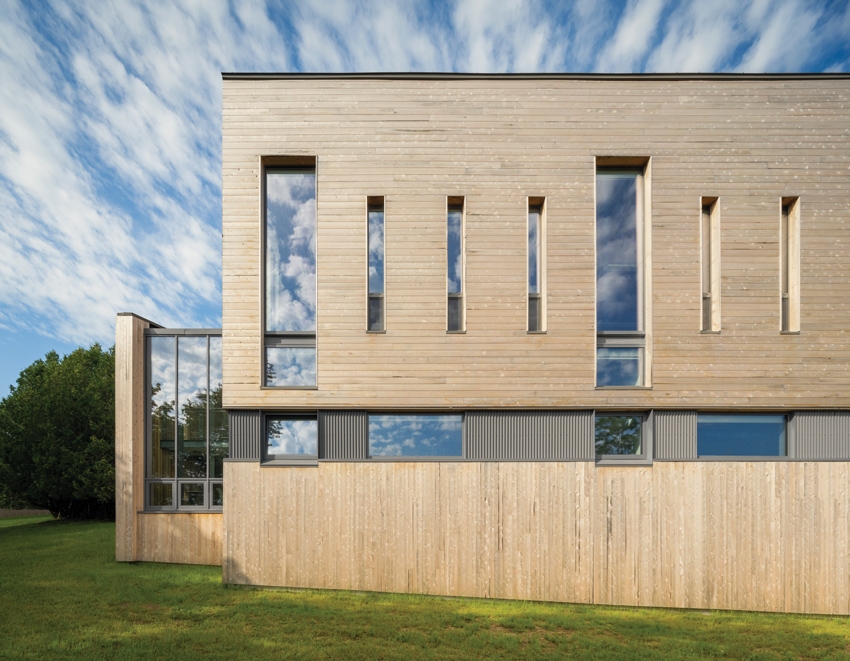
THE L-SHAPED classroom building is at the campus’s north end. It frames a lawn, where horizontal metal grates and vertical cedar fins help shield expanses of glass from the sun.
Founded in 1969, the college’s mission, shaped by the era’s counter-cultural values and growing ecological concerns, led to the creation of an interdisciplinary program focusing on the environment and on community service. All students graduate with a B.A. in Human Ecology (except for a few pursuing master’s degrees). Says COA’s president, Darron Collins (class of ’92), “We were a small, scrappy institution, but we have grown over time in size and recognition.”
Located on a bluff overlooking the bay, the college began in a cluster of farmhouses, vacation retreats, and a granite French Renaissance–style manse designed by Bruce Price in 1895. A garden by Beatrix Ferrand is next door. And, while the school added other structures over the years (including a rambling barnlike performing-arts center by Turner Brooks in 1993 and an expansive Postmodern shingle-style library and dining hall by Daniel V. Scully in 1988), it needed a new classroom building that would express the sensibility of the school today.
“We didn’t want to just build a box that was sustainable—we wanted design quality,” says Collins, and, to that end, students, faculty, and staff were all involved in the selection of the architect for what is called the Davis Center for Human Ecology. “That meant we had 400 clients,” jokes Susan Rodriguez, who won the commission.
Rodriguez, a longtime summer resident whose off-the-grid cluster of cabins on a nearby island was a Record House (April 1997), well knows Maine’s obsession with the outdoors. She felt the architecture should “capture the ethos of the place and make a building truly about a grass-roots community.” Sited at the north end of the campus, the two-story L-shaped building, with wings that meet at a 120-degree angle, follows the promontory overlooking the bay. “It’s not an ‘object’ building,” says the architect. “It is more about the memorable experience and generating the framework for that to happen.” On the land-facing side, the L shape encloses a protected space, which is the point of arrival, with a greenhouse next to the entrance and open area where students can gather around a giant oak tree.

PHOTOGRAPHY: © JEN HOLT (TOP); TRENT BELL
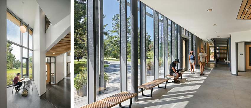
ALONG THE EDGE of the bluff, narrow slots of glass protect against wintry weather. The entrance opens into an expansive hallway, which angles around to a wing with vertical spaces used as study alcoves.
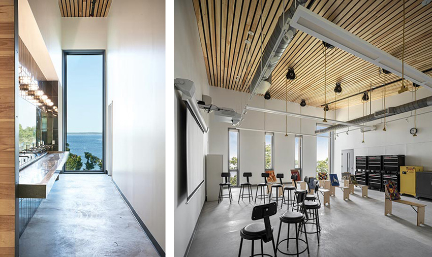
Inside the interdisciplinary Davis Center, both floors are devoted to studios for painting and printmaking, and labs for botany, chemistry, geology, and physics, as well as classrooms, faculty offices, and meeting spaces. Labs and classrooms on the second level have ceilings with a gentle pitch upward, so that the tall windows reveal stunning views of the water and trees. At the juncture of the two arms, wedge-shaped spaces on each floor accommodate lectures.
In one wing, Rodriguez and her team cut through the two floors to create light wells that alternate with faculty offices. On the ground floor, these vertical shafts become alcoves for study; on the second level, they are flanked by narrow bridges that link offices to the main hallway. (On a sunny day, the play of light and shadow generated by this sectional exercise is memorable.)
Of course, the $10 million building was designed to be a model of sustainability, using 80 percent less energy than a normally code-compliant classroom or lab. While the college is not seeking certification, it is following the Passive House standard, which requires a thermally robust, airtight envelope for heating and cooling, so that energy use intensity (EUI) is no more than 12k BTUs per square foot per year. A typical building with art studios and labs is 10 times the EUI of the Davis Center, notes Timothy Lock, OPAL principal.
Almost all of the structure is wood, with its carbon-storing properties, including glulaminated beams and posts (the latter concealed behind gypsum board), and structural floor decking of local spruce. On the exterior, local northern white cedar, with ship-lapped joints in a horizontal and vertical pattern, acts as a rainscreen.
The building is insulated with dense-pack cellulose in all wall and roof cavities, and the exterior walls above grade are built with 5½ inches of continuous, rigid wood-fiber insulation board.
The architects minimized expanses of glass at the back of the building to afford protection against the strong winds coming off the water from the north and east. All windows are triple-glazed and treated with a UV-reflective coating perceptible to flying birds but not humans.

PHOTOGRAPHY: © JEN HOLT (TOP); TRENT BELL (BOTTOM)
THE L-SHAPED building creates a point of arrival and a protected public space. In a painting studio, an acoustical pine ceiling tilts up to take in light and views. A gender-neutral restroom has a spectacular view of Frenchman Bay.
The wings facing to the south deploy larger expanses of glass, to take advantage of the sun’s light and warmth in winter, but a brise soleil of horizontal metal grating mitigates solar load, while deep vertical cedar fins alternate with vertical steel framing on the west-facing wing.
Inside the center, natural materials, such as local eastern white pine for the beams, ceilings, and wall paneling, add texture and warmth. For heating and cooling, the design emphasizes passive measures, with only a simple mechanical system supplying 100-percent outdoor air. On the roof, the array of solar panels is expected to cover 75 percent of the total EUI, in accordance with COA’s requirements for all new buildings on campus.
The Davis Center conforms admirably to the college’s goals for sustainability, as well as being a place where students can meet and pursue programs that take advantage of the outdoors, including the study of agriculture on two farms owned by the school and marine life on two offshore research stations. The school-year weather can be challenging, with gusty sea air and the occasional nor’easter—and sometimes a blinding blizzard as early as Thanksgiving. Yet the students find much to do after the summer people have gone home. And now they have the new Davis Center to help them interact with each other, enhance their academic investigations, and bond in a new way with nature.
Credits
Design Architect: Susan T. Rodriguez | Architecture • Design, Susan T. Rodriguez — design principal; Joshua Homer, project architect
Architect of record/building performance design: OPAL Architecture — Timothy Lock, principal in charge; Alex Rosenthal, project manager
Engineers: Silman (structural); van Zelm Engineers (m/e/p)
Consultants: Michael Boucher Landscape Architecture (landscape); Brandston Partnership (lighting)
Client: Darron Collins, president, College of the Atlantic
Size: 28,000 square feet
Cost: $10 million
Completion date: September 2021
Sources
Glass: Ornilux
Curtain Wall (wood, glass, aluminum): Unilux
Lighting: Zaneen (pendants); Litecontrol (downlights)
Furniture: Herman Miller, West Elm, Uline, KI, Metro, Safco
Paints and stains: Sherwin-Williams
Photovoltaics: ReVision Energy
Open Door Policy
Teeple Architects’ student-services center at Morgan State provides a welcoming new gateway.
BY LAURA RASKIN
PHOTOGRAPHY BY NIC LEHOUX
IN 2016, the National Trust for Historic Preservation designated Morgan State University’s campus in Baltimore a National Treasure. Founded in 1867, Morgan is one of the first Historically Black Colleges and Universities (HBCUs), and the National Trust’s designation noted the public university’s 20-some significant structures by celebrated Black architects including Leon Bridges, Albert Cassell, Louis Fry, and Hilyard Robinson.
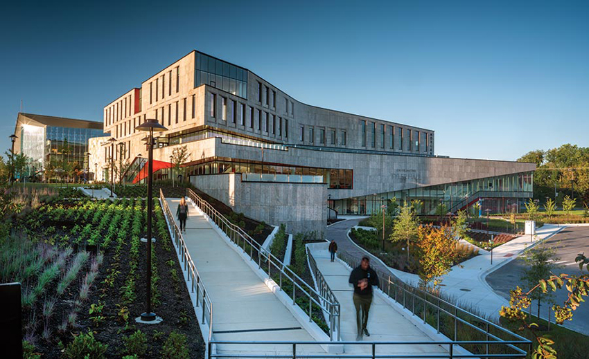
A RAMP guides visitors from an entry court to the commons. Tiered floor plates feature prow-like corners and dramatic cantilevers.
Morgan has occupied its current site in northeast Baltimore since 1917, and though the campus is rich with important buildings—ranging in style from Brutalist to Modern to Neoclassical—it also includes more than a few duds. When university president David Wilson was hired in 2010, he made it his mission to oversee a period of “capital eminence,” in which underutilized or dysfunctional buildings would be renovated or replaced, sending a message that Morgan is a preeminent research university that cares about its students and welcomes private investment. Wilson’s vision is also an attempt to keep up with the university’s highest-ever enrollment, of about 8,000 students for the last five years.
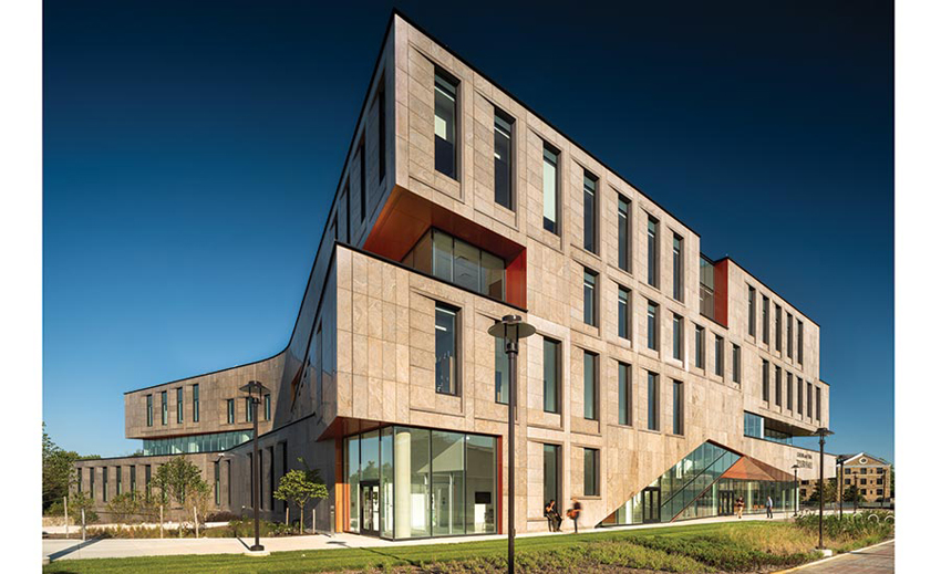
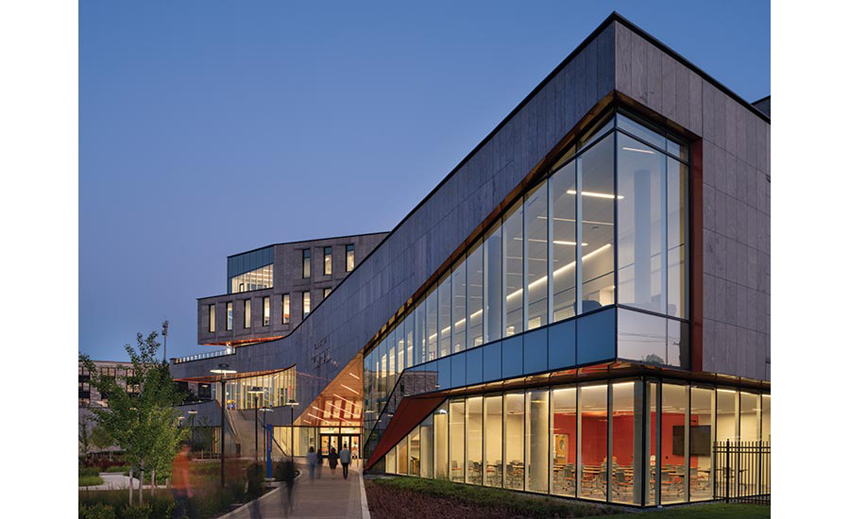
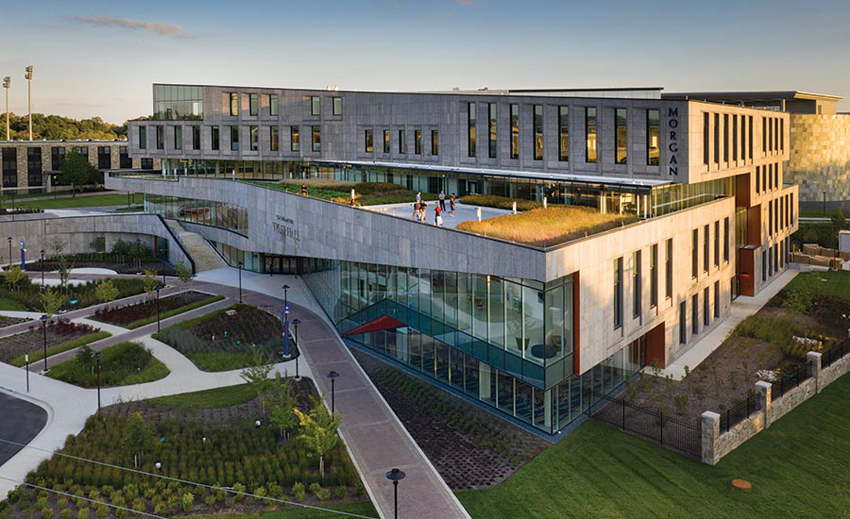
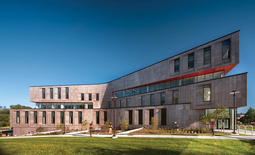
The linchpin of Wilson’s blueprint is the new Calvin and Tina Tyler Hall, Student Services Building, which opened in September of 2020. The 140,000-square-foot building, designed by Toronto’s Teeple Architects, with Baltimore-based GWWO as architect of record, is bow tie–shaped and clad with panels formed from precast concrete and 2-inch-thick Eramosa limestone slabs.
To the north, the building’s curved facade embraces a generous arrival court; to the south, its arcing form responds to the glazed, convex wing of the adjacent library. Teeple’s team conducted an exhaustive search for Tyler Hall’s limestone, ultimately finding the Eramosa in a quarry north of Toronto. “We wanted a modern, clean, sculptured look,” says founding principal Stephen Teeple, “but we also were looking for depth and texture in the facade and hoped to create a dialogue with the thickness of the old stone buildings on campus.”
A ROOF TERRACE overlooks the campus. Rain gardens flank the commons. School tours start at the north entrance.
The architects honed the limestone to match the dark hue of the existing buildings’ masonry, giving the panels a relief that also helps to minimize the reading of the panel joints. Rows of punched windows march across the facades and are set within angled surrounds. Tyler Hall is unmistakably contemporary, but stitches the materiality and scale of Morgan’s historic campus to the north to the modern campus to the south. “We don’t want this period of architectural newness in a fistfight with the historic and legacy buildings on campus,” says Wilson.
Housing admissions, enrollment, financial aid, work-study, the bursar’s office, and other essential services, Tyler Hall is now Morgan’s gateway. When Wilson first arrived on campus, student services were divided up among a warren of offices in a former hospital building, sending confused students running between disparate departments. “Now our front-door offices are indeed on the front side of campus and speak volumes about what this institution values,” he says.
As Teeple explains, Tyler Hall’s sculptural form and complex geometries serve a purpose beyond acting as viewsheds; they create an obvious choreography and path through the building that helps with wayfinding. At the arrival court, prospective students and visitors are drawn to the front door by a prow-like glazed corner that reveals a community-outreach lounge and a dramatic carved canopy covered in orange aluminum-composite panels. And, inside, a wood ceiling mirrors the building’s exterior curves, cladding the underside of an interior monumental stair and leading the way through clearly marked program areas.
The building navigates a 15-foot grade change from front to back, so an exterior stair and a winding ramp guide people to the southern, second-story entrance. From there, students can drop by a one-stop service hub inside the three-story lobby. Generous lounges invite lingering and study. Administrative offices and conference rooms on the third, fourth, and fifth floors are arranged around a skylit atrium.
A DAYLIGHT-DRENCHED lobby, lounges, and breakout rooms offer a variety of areas for gathering and study.
On the third floor, a 10,000-square-foot roof terrace is planted with tall grasses and native pollinator species, offering space for gatherings and events with views of campus. The green roof helped Tyler Hall achieve LEED Silver certification, as did light-colored roofing materials to minimize the heat-island effect and the use of energy-recovering HVAC systems, among other strategies. Because Baltimore is part of the Chesapeake Bay watershed, the building must comply with stormwater-runoff regulations. In response, landscape architecture firm Floura Teeter created a series of lush, terraced bioretention rain gardens.
Calvin Tyler, for whom Tyler Hall is named, grew up in west Baltimore and was a student at Morgan in the 1960s. When he couldn’t afford to continue to pay for school, he dropped out and got a job as a driver for UPS. He rose through the corporation’s ranks, ultimately becoming senior vice president of operations. Last February, he gave Morgan $20 million, the largest-ever private donation to an HBCU from a former student. With his gift, which has endowed dozens of scholarships, he hopes to help students achieve what he could not. Now, with Tyler Hall, Morgan sends a similar message of hope and belonging. As Wilson says, “In marginalized communities, individuals should live in buildings at the highest level of design. We are not going to settle for second-rate architecture.”
Credits
Architect: Teeple Architects — Stephen Teeple, design principal in charge; Tomer Diamant, senior design architect/manager; Jason Nelson, Eric Boelling, Nicole Rak, Fadi Salib, Patrick Harvey, Carla Pareja, Eric Oh, Melanie Lo, James Janzer, Cameron Parkin, Miguel Sanchez Enkerlin, Paula Lee, Haotian Liu, Rob Cheung, Yasser Raees, Kateryna Lokhnina, team
Architect of record: GWWO Architects
Engineers: ReStl Designers (structural); Mueller Associates (mechanical); WFT Engineering (electrical); Carroll Engineering (civil); Sustainable Design Consulting (sustainability); Navarro & Wright (geotechical & site)
General Contractor: Barton Marlow
Consultants: Floura Teeter (landscape); PLDA (interiors & signage); Forella (cost); KPN Architects (FFE)
Client: Morgan State University
Size: 141,675 square feet
Construction Cost: $69 million
Completion Date: October 2020
Sources
Masonry: Owen Sound Ledgerock
Metal Panels/Curtain Wall & Storefront glazing: YKK, Zephyr Aluminum
Acoustical ceilings: EOMAC
PVB Glass Accent Walls: Vanceva
Epoxy terrazzo flooring: Roman Mosaic & Tile