Colleges & Universities
Making Waves
SANAA meshes a sinuous cluster of gossamer buildings into the rigid urban plan of Bocconi University’s campus in Milan.
BY NAOMI POLLOCK, FAIA
PHOTOGRAPHY BY IWAN BAAN
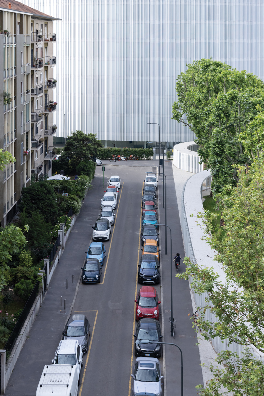
FOUNDED IN 1902, Milan’s Bocconi University has undergone numerous expansions and renovations over the years. But its latest addition—full of curves and covered in a shimmery metallic skin—is a radical departure from the axial relationships and rectilinear volumes typical of the campus. This time, the school, which specializes in business, opted for a grouping of buildings whose sinuous forms relate to each other like internal organs, bound together by a portico-covered circulatory system and grassy connective tissue. Unsurprisingly, this dynamic scheme is the work of the Pritzker Prize–winning Tokyo firm SANAA.
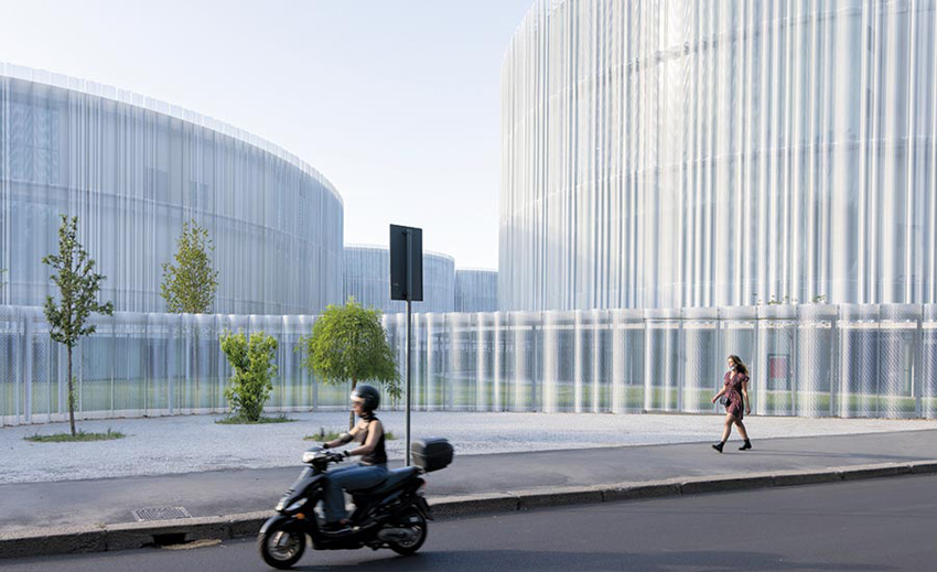
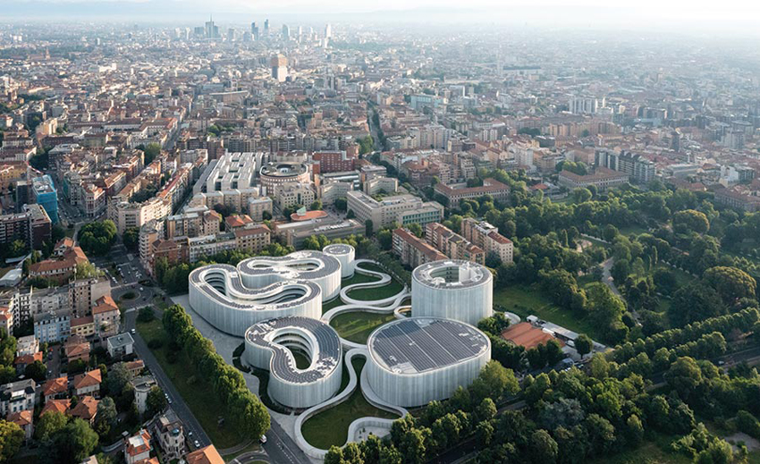
The architects started by studying Milan’s urban fabric, which informed both the site’s master plan and the buildings’ massing strategy. Previously occupied by a milk-processing plant, the nine-acre property abuts the existing campus to the north, including the School of Economics (2008), designed by fellow Pritzker laureates Grafton Architects, and a busy ring road to the south. This location sits between the city’s dense historic center and spacious more recent developments on its periphery. Straddling these scales, the architects divided the program into separate buildings and interspersed them with a public garden requested by the city. “We wanted to make the building part of the park,” explains SANAA principal Kazuyo Sejima. Combining the Master and Executive academic programs with administrative offices, the MEO cluster (the name is an abbreviation of its three main components) fills the northwest corner of the property, with the gymnasium to the south and the dormitory (SANAA designed only its exterior) to the east, near an existing street connecting to the main campus.
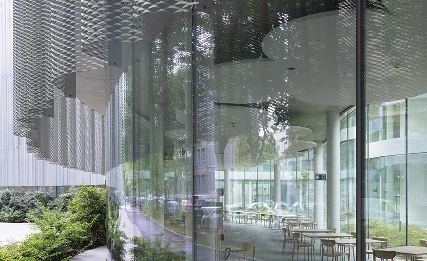
The basic design idea came from the historic Milanese courtyard building: all of the SANAA structures are essentially hollow in the center. While the 11-story dorm wraps an interior garden, the three-story gymnasium centers on a pair of Olympic-size pools below grade and basketball courts upstairs. Similarly, the MEO incorporates four courtyards of its own. Due to the narrow width of its building elements, sight lines extend clear through at ground level, creating a cadence of solid and void. This visually links inside and out, as well as public and private, a theme underscored by the building’s metal-mesh skin.
Within the MEO, the three divisions—plus the Pod, the circular component which serves as the building’s entrance—are each housed in separate but connected curvilinear forms. Attached to the Executive portion, the Pod leads to sequential lobbies at the base of the other structures. The ground floors of the Executive and Office volumes also hold dining areas for the school, while the Office element includes a café and commercial space, both open to the public, with four floors of university offices above and the kitchen and meeting rooms below. The Executive and Master volumes mainly contain classrooms, and meeting areas on their basement and upper levels.
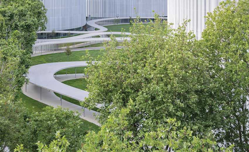
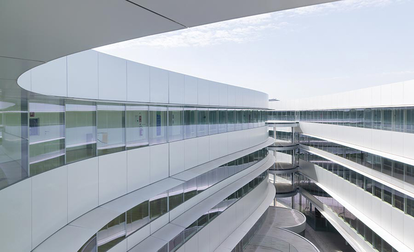
COVERED walkways connect the organic buildings. On the courtyard elevations, horizontal bands of glass are interspersed with opaque panels and shielded with shallow eaves.
Ranging in size and seating capacity, curved classrooms follow the MEO’s overall geometry and promote communication between instructor and students. Their ringed chairs are symmetrical in relation to the lectern. They also sit comfortably between the 1½-foot-diameter steel columns supporting the concrete slabs. The columns were located and sized to provide optimal eye contact between student and professor. Suspended from the ceiling, cloud-shaped acoustic panels conceal lighting, smoke detectors, and other technical apparatus. While whiteboards and projection surfaces line the inner walls, full-height glass forms the outer ones. “Every classroom has a different view,” notes Sejima. Between the classrooms and corridors, double walls sandwich arched spaces for individual HVAC units, eliminating the need for ductwork. This efficient solution helped the project achieve LEED Platinum status. Other factors were the use of Milan’s underground water for the buildings’ heating and cooling, roof-mounted solar panels, the reuse of rainwater to irrigate the park and, of course, the metal mesh exterior panels, which help control the strong Milanese sun.
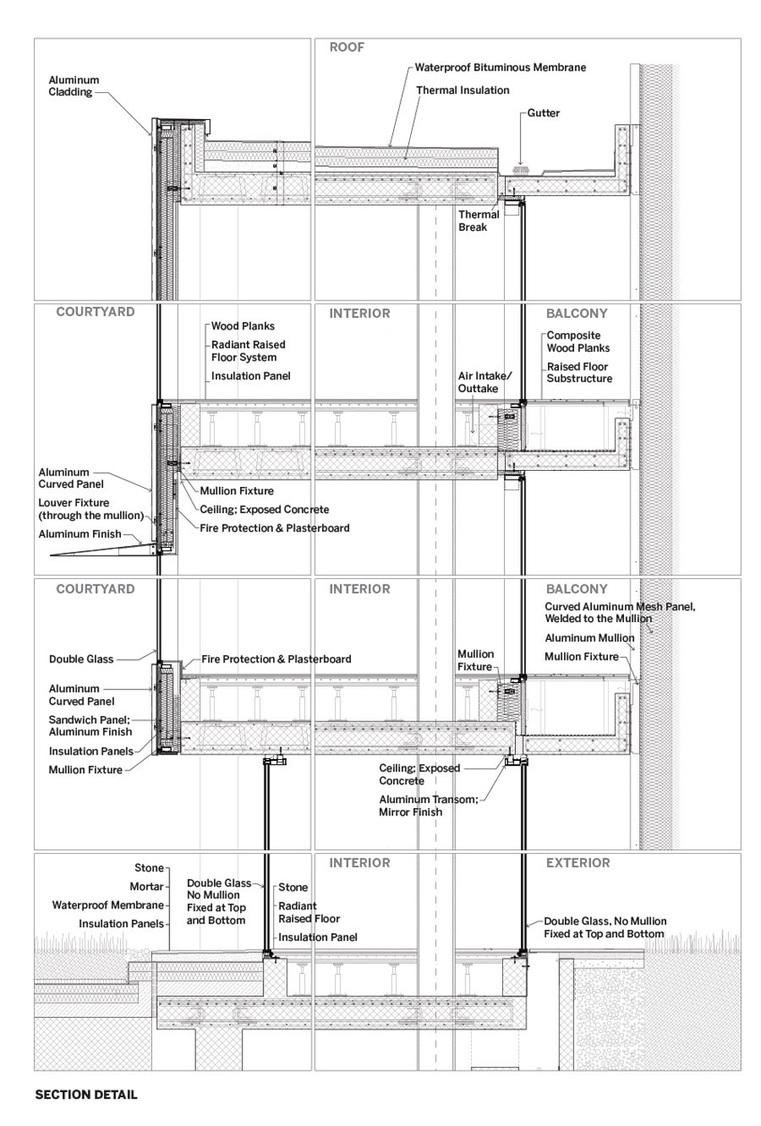
While transparency is a signature of SANAA’s architecture, the building’s see-through glass skin had to be tempered with the perforated metal wrapping. But because of their different exposures, the building’s inner and outer surfaces were treated differently. Overlooking the courtyards, horizontal bands of glass are interspersed with opaque panels and shielded with shallow eaves, while the outward walls consist of floor-to-ceiling glass, layered from inside to out with narrow balconies and the exterior’s distinctive aluminum mesh, which cuts glare and reduces heat gain.
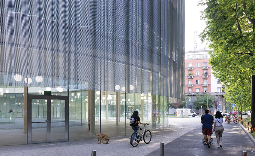
THE METAL-MESH screen positioned in front of the glass skin begins 8 feet above ground level and runs the length of each of the buildings.
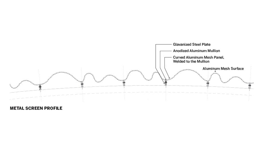
Positioned 8 feet above ground level and extending 4 feet above the roofline, these screens are defined by diamond-shaped perforations and undulating profiles. The nearly inch-thick sheets of anodized aluminum were bent into eight different types of wavy sections, turning a flat material into a self-supporting three-dimensional one. This resulted in lighter mesh and skinnier vertical mullions. Welded to the inner face of the mesh, the mullions attach to the structural slabs. But aligning the mesh panels perfectly was no small feat. While the metal sheets were punctured, molded, and welded to the mullions at the factory, the panels’ precision installation took the eye and hand of the artisan. In lieu of welded connections, they simply abut end-to-end, with their oscillations flowing effortlessly from panel to panel. The result is a seamless silvery surface which conforms perfectly to the buildings’ continuously curving walls. “It’s tailor-made prefabrication,” explains project architect Francesca Singer. Unifying the entire project, the mesh also encloses the dorm, sports center, and the outer walls of the covered walkway along the perimeter.
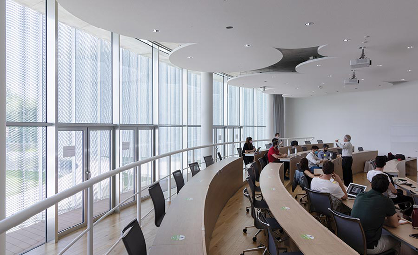
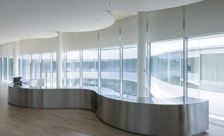
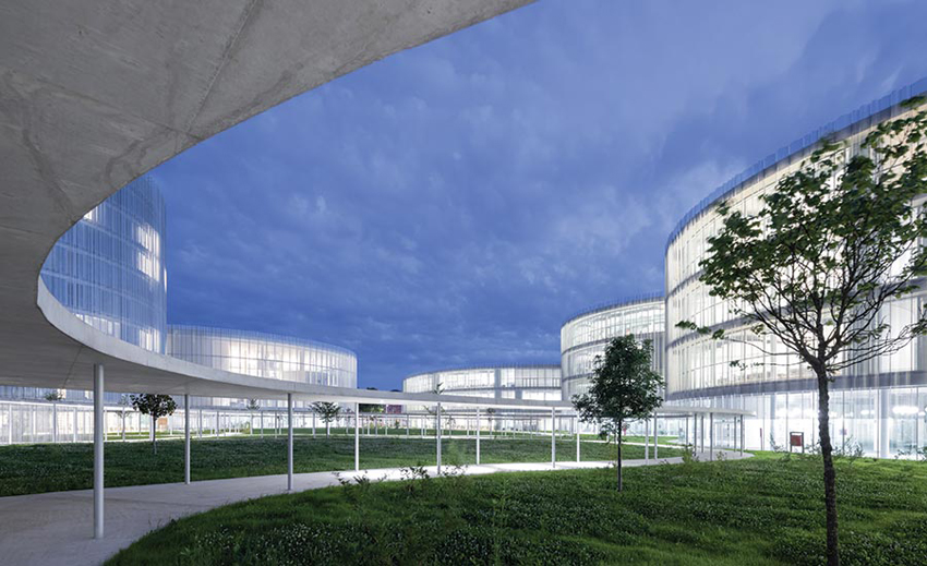
CLOUD-SHAPED acoustic panels on the ceiling conceal lighting and technical equipment in classrooms and other interior spaces. The grouping of buildings is set within a park.
This textured metal skin not only reduces the impact of the building mass, it also makes SANAA’s Bocconi University campus an elegant backdrop for the life of the city as well as the school. Combining the client’s pedagogy and the architects’ clear-cut-design ethos, the new campus embodies both brains and brawn.
Credits
Architect: SANAA — Kazuyo Sejima, Ryue Nishizawa, principals; Yoshitaka Tanase, Francesca Singer, Nicolo Bertino, Lucy Styles, Enrico Armellin, Design Team
Architect of Record: Costa Zanibelli Associati
Executive Architect: Progetto CMR
Engineers: Studio di Ingegneria Pereira (structural); Advanced Engineering (mechanical)
Consultants: Federico Oliva Associati (master plan); SAPS (structure); Ing. Silvestre Mistretta (fire safety); Soluzioni (security); Politecnico di Milano (scientific support)
General Contractors: Grassi & Crespi; Percassi
Client: Universita’ Commerciale Luigi Bocconi
Size: 700,000 square feet
Cost: Withheld
Completion date: December 2020


