Linear Lighting Frenzy
Dramatically Improved Optics
Statistics indicate that lighting is the biggest power drain in an office building, accounting for a mind-blowing 29 percent of the energy consumed.3 There’s lots of talk about LED efficacy with organizations like Design Lights Consortium (DLC) driving energy rebates with their fixture listings, but efficacy is only part of the equation. The most efficient fixtures do not necessarily make the best or even good lighting, nor do they even lead to the most energy efficient spaces. The end goal is using less energy in our workplaces and schools, and that can be partly achieved by controlling the light, directing it where it’s needed, thereby lowering energy demands by using fewer fixtures.
We also need to consider the human part of the equation. Lighting is ultimately for our benefit, and when we enjoy our workplaces, we tend to be more productive. The Illuminating Engineering Society (IES) offers lighting criteria for making lighting safe, pleasant, and efficient, but if we only follow the letter of the law in meeting foot candle requirements and don’t consider the light’s actual effectiveness in its environment, we are missing the intention driving the IES requirements. When efficacy is the primary or sole consideration for evaluating the performance of LED luminaires, it undermines the power of control, and ultimately, the light distribution suffers, negatively impacting the quality of the user experience.
For example, consider open office and classroom lighting needs. Two main issues lie in problems caused by static light distribution that’s either too high or too tight. If the distribution is too high, wasted light spills where it’s not needed, essentially becoming “light pollution,” causing glare and requiring more lumens to reach optimum light levels. However, if the distribution is too tight or contained, it results in hotspots beneath the uncontrolled sources, requiring more fixtures to even it out—ultimately resulting in escalated material and installation costs and higher site wattage.4
Think About Irrigating a Garden
To better understand the power of optics, consider a meticulously maintained botanical garden. Each variety of plant differs in the amount of water it requires, so a somewhat haphazard blasting from wide-open, full-circle sprinklers isn’t going to cut it. There’s an excessive amount of waste, and the plants aren’t getting what they need. Instead, each sprinkler needs to be placed with precision (with appropriate nozzles chosen to control where the water is directed—quarters, halves, and fulls for lawns, thin side strips for planters, and bubblers or drip for trees, with the output calibrated for the particular plant it’s watering, conserving water and giving each plant or tree the optimal amount of water, not too little or too much.
The same is true with light, both to lessen the amount of light wasted and to improve the human experience, whether that be even distribution over workspaces or selectively focused to enhance the drama of the space’s architectural features (walls and ceilings) with asymmetric and cove lighting.
Historically, optic design was achieved for fluorescent lights with the use of clunky mechanical kickers or a one-size-fits-all optic film with mixed results, often resulting in big efficiency drops and poor control. Now, with tiny LED light sources, light can be more controlled. Lens refractor technology shapes light in new and powerful ways while maintaining high levels of efficacy. Developed by lighting physics gurus and engineering wizards, this design coup has transformed the lighting experience. Lenses are no longer simply frosted acrylic. They can be engineered to map each ray of light to create more precise illumination patterns in the desired shape: batwings for open office, and asymmetric wall washes and grazes for vertical surfaces.
Batwing for Open Office and Classrooom Lighting
Often, office lighting is poorly designed with uneven distribution of light. There’s too much light directly below fixtures and not enough in between them. This is because most linear and troffer fixtures distribute light in a narrow ellipse shape, where the batwing shape is far more ideal, distributing light more evenly across the working plane. Batwings also allow for wider spacing of fixtures. Eight-foot or 10-foot spacing between linear fixtures has been the norm for decades, but batwing distributions allow for 14 feet or even 16 feet between fixtures.
That extra 4 inches in the spacing results in about a 30 percent savings in fixture and installation costs in large open office or classroom spaces, with similar energy savings as well. First-generation LED batwing lenses had unattractive technical looks, but new laser-engraved batwing lenses are far more aesthetically pleasing, with the soft, smooth frosted look of typical open office lighting. Batwing distributions also reduce eye strain since minimal light is thrown up into the glare zone (above 65 degrees where light reflects off shiny computer screens).
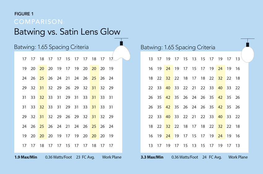
Figure 1 shows a foot candle comparison. A foot candle is a measurement of light intensity and is defined as the illuminance on a 1-square-foot surface from a uniform source of light. The wide, even distribution of light from batwing optics allows for wider spacing between fixtures than typical LED satin lens linear fixtures, while still producing a more uniform glow across the work plane (indicated by the space inside the gray bars). These fixtures are spaced 12 feet apart. The batwing has much more even light distribution than typical linear fixtures with satin lenses, as can be seen by the foot candle distributions and Max/Min in the lower left (a lower Max/Min is better).
Notes:
- 3,500 K at 4.5 watts/foot direct only
- 12-foot spacing between fixtures
- 9-foot ceiling
- Foot candles at working plane
- 0.9 LLF
Note: while batwing distributions are ideal for open offices or classrooms, or individual offices, they lose effectiveness with high cubicle walls that block the light.

Room application batwing vs. typical satin-lensed linear fixture comparison
Uniform Ceilings: Indirect Extreme Batwings or Ceiling Washes
The 1990s computer revolution brought about the evolution of indirect illumination. Bouncing light off ceilings and walls creates less glare on shiny screens and veiling reflections on paper tasks. However, LED lighting took a small step backward with tiny LED arrays pointing too much light directly above the light fixtures and not enough across the ceiling plane, leading to stripes along ceilings. What’s the solution? Wide, even, indirect light, extreme batwings, or ceiling washes with broad, low-angle beams casting wide, indirect uplight and creating beautifully uniform ceilings with minimal glare. Ceiling wash optics also allow for linear fixtures to be installed closer to the ceiling. Eighteen to 24 inches is typically recommended, and a good ceiling wash will illuminate ceilings far more evenly compared with generic indirect LED lighting. Ceiling washes not only reduce glare, but they also reduce the cave effect and provide a more comfortable vertical illumination (mimicking the outdoors).
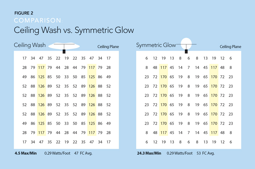
Figure 2 shows a comparison of a linear indirect ceiling wash optic vs a typical LED indirect fixture with a glow of light that often creates zebra-like stripes on the ceiling—way too bright above the fixture and too dark in between fixtures. Ceiling wash optics offer a significantly more even glow across the ceiling (indicated by the space between the gray bars indicating linear fixtures). Ceiling washes provide far lower variation in light levels than typical symmetric glow fixtures. For comparison, see the dramatically different Max/Min range at the lower left of each chart.
Notes:
- 3,500 K at 4.5 watts/foot indirect only
- 14-foot spacing between fixtures
- Fixtures hung 18 inches below ceiling
- Foot candles on ceiling plane
- 0.9 LLF

Ceiling wash room application vs. typical indirect glow comparison


