Linear Lighting Frenzy
Learning Objectives:
- Explain how the drivers in the lighting specification process vary by the role of each key decision maker.
- Elaborate upon key trends in LED linear that are flourishing right now and their impact on the user experience.
- Describe the artistic inspiration behind veiled ambient lighting, its widespread aesthetic appeal, and how it’s enhancing the user experience.
- List two of the next wave of technological advances in LED linear lighting.
Credits:
This course is approved as a Structured Course
This course can be self-reported to the AANB, as per their CE Guidelines
Approved for structured learning
Approved for Core Learning
This course can be self-reported to the NLAA
Course may qualify for Learning Hours with NWTAA
Course eligible for OAA Learning Hours
This course is approved as a core course
This course can be self-reported for Learning Units to the Architectural Institute of British Columbia
Inspiration can come from many places, and for lighting, it only makes sense that those seeking new revelation would turn to the sky. Consider the work of American artist James Turrell, globally renowned for his interpretation of light, space, and playfulness in terms of perceived reality. He fancies the sky his studio, material, and canvas—creating a trompe l’oeil effect where he figuratively “drops the bass” on depth perception. As Calvin Tomkins of the New Yorker once said, “His work is not about light or a record of light; it is light—the physical presence of light made manifest in sensory form.”
Captivated by this concept, fixture designers found a way to reinterpret what Turrell was doing in the art world in a way that was commercially applicable. Dubbed “veiled ambient” lighting, it’s a brilliantly minimalist breakthrough that enables light channels to visually recede into the ceiling, virtually disappearing. The illumination is present, but the source is barely perceptible. Jon Steele, GM of Prudential Lighting, pioneer of this emerging design, commented on the inspiration behind the concept. “We wondered if there was a way to pump light through channels that felt like daylight on a cloudy day, with no shadows or sense of source. We accomplished this through incredibly uniform indirect lighting with a ‘forever’ look that appears seamlessly integrated into the architecture.”
To fully appreciate the magnitude of this breakthrough, it’s important to understand how long it has taken for the lighting industry to truly flourish in the innovation arena.

All images courtesy of Prudential Lighting, except as noted
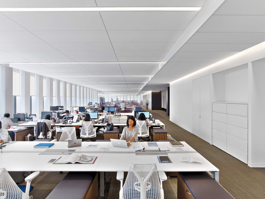
Veiled ambient lighting, with no lenses or seams, emanates more like cove lighting or sunlight funneled through the architecture than typical lensed linear fixtures.
Architect: Larry Marner Architects
Lighting Designer: Kugler Ning
Linear Lighting: From Fossil to Fast Track
Over the past several decades, while nearly every other building material continued to evolve, becoming stronger, smarter, longer lasting, and more cost efficient, lighting didn’t have much in the way of newslworthiness—until now. These days, lighting is making up for lost time at an incredibly accelerated pace—particularly linear lighting (those long, narrow fixtures you see in nearly every commercial environment).
Thanks to the emergence, explosive growth, and continual fine-tuning of LED, lighting has seen more momentum in the past decade than the previous five decades. Given all those years of lackluster history, this momentum has the industry understandably abuzz. Granted, many of the first few breakthroughs were primarily designed to improve energy efficiency and extend life, but significant strides in form factors for aesthetics, light optics, adaptability, and control are making headlines as well. The term “form factor” encompasses the variety of fixture shapes and sizes available for specification.
The History of Linear Illumination
Linear lighting appeared on the scene as early as the 1950s as an alternative to recessed rectangular troffers in modular dropped ceilings, and it was immediately embraced. Originally introduced by Samuel Herst of Peerless Lighting, linear direct and indirect lighting struck a chord within the design community. It created intrigue with its long lines of light, and over the years, it has established itself as the “Class A” luminaire—catapulting in popularity to become the go-to for architectural lighting.
A myriad of linear form factors evolved from the 70s through the 90s, and linear gradually replaced millions of boxy square troffers in offices and classrooms. With the rise of desktop computers in the 90s, screen glare became a concern, screen glare became a concern so louvers were implemented to minimize the way the light bounced off the shiny screens. Indirect and direct/indirect lighting also became far more popular in an effort to reduce glare on computer screens and offset the cave effect of louvered troffers. Then in 1995, the introduction of the T5/HO lamp allowed for smaller form factor, higher lumen packages, and increased optical control.
The early 2000s brought the introduction of recessed linear lighting as a companion to direct/indirect pendants to create complete systems. The response was phenomenal, and linear lighting became the norm for commercial lighting, increasing demand for innovation. The industry quickly responded with different form factors and apertures, patterns, and improved optics. One noteworthy breakthrough in the mid-2000s was the development of “batwing” film, which enhanced linear distribution, allowing for wider spacing of fixtures (12-foot spacing instead of the typical 8-foot or 10-foot), ultimately reducing materials and labor costs while also saving energy. But the technology itself hadn’t improved. They were essentially the same fluorescent lamps people were using back in the 1950s even though we were well into the 2000s. They had mediocre optics, dimming was expensive, and form factors were large. Thankfully, change was imminent.
The LED Revolution
As LED light sources became more affordable around 2010–2012, a retrofit situation emerged for the sake of speed to market. Manufacturers were simply giving their old fluorescent fixtures new LED arrays, instead of reimagining how fixtures could play to LED’s unique strengths. The result? Longer life, improved energy efficiency, and less maintenance—but little or no improvement in form factor freedom or optical control. Bothersome striations, dark spots, and screen glare continued to plague office workers.
A 2014 Professional Lighting Designers Association (PLDA) survey reported that a shocking 47 percent of lighting designers citing a need for glare reduction—their top concern.1 Specifically, participants in the study cited frustrations due to dim areas, overly bright work stations, and glare on computer screens. Similar studies going back to the 1990s and early 2000s conducted by global interiors giant Steelcase and Interior Design Magazine point to lighting as the primary source of frustration with work environments.2
What’s to Blame?
Common problems included too little or too much light, glare on shiny computer screens, and dark walls and ceilings creating cave-like effects and causing employee eye strain for extended periods of time. With the recent LED revolution, manufacturers scrambled to respond to demand, jamming the compact, precise, directional LEDs into linear fixtures designed for fluorescent lamps. Glare issues often worsened with exposed LEDs or light spilling out in harsh direct light.
Additionally, fixtures were not delivering on the manufacturers’ claims in terms of lumen output—the dimming systems were not smooth or subtle, and the light was often far too bright for the environment. There were also some challenges with maintenance and field replacement. All in all, the transition from fluorescent lighting to LED was a bit of a “two steps forward, one step back” process as lighting evolved into a viable technology industry.
The Ideal Luminaire Look
The conversion to LED was so fast and furious in the industry, few stopped to ask the critical questions: What would the ideal luminaire look like? What do the end users desire in their workplaces, schools, etc.? Part of the complexity of these questions is that the answers vary by audience.
The architect or interior designer is often looking for the fixtures to disappear, recede into the architecture, and not interrupt the lines and flow of the space. They want to see light, not light fixtures. Their dream would be to eliminate those seams and clunky lenses that trap dirt and bugs, crack and leak light, and generally distract from the architecture. The ideal lighting would be sunlight pouring through the architecture into every interior space, with no light fixture clutter, just soft glowing light—think cove lighting.
The lighting designer/engineer focuses on the quality of light, enhancing the experience with vertical illumination (lighting walls and ceilings), creating soft, even light across the working plane, limiting glare, and of course, managing energy code and safety requirements.
On the flip side, the contractor simply wants fixtures that install easily. Fast, cheap, and “good enough” might well be their unofficial motto. There’s typically pushback on fixtures that take longer to install, costing more than they originally estimated. They sometimes create problems by substituting less-expensive, lower-performing fixtures in place of those that have been specified by interior or lighting teams—so simple installation should be a key consideration in the new product development process.
The building owner is looking for a bit of everything: stunning aesthetics, smooth installation, easy maintenance, energy efficiency (lower watts per square foot), and lower overall cost.
Maintenance teams have a similar mindset, and prefer low-maintenance fixtures and easy field replacement.
And finally, end users want a better experience: beautiful, soft light, simple, intuitive controls, and no glare. They want to enjoy the spaces where they work and play.
Where’s the Common Ground?
The quintessential illumination effect is subtle, with a soft, uniform, highly efficient glow of light—like sunlight filtered through the structure into the architectural space. It has no seams or glare so the focus is on light, not light sources. It’s energy efficient, simple to install, and easy to maintain. As humans, we are vertical creatures, so illuminating walls and ceilings is essential for avoiding depressing cave effects. Improved work environment has an impact on employee productivity, and research has shown even a 1-percent improvement in employee productivity has significant financial benefits.
These are exciting times. Here’s what’s currently trending in linear lighting:
- Optics (controlling light distribution)
- Miniaturization
- Organic form factors (curvilinear)
- Hidden light sources, which we will call “veiled ambient”
- Technology leaps from IoT to controls integration
- Tunable white or circadian lighting and tunable color


