Achieving Design Objectives with Metal Roofs and Facades
Continuous Transition between Roof and Wall
When Southside Bank began a campaign to modernize its brand, management understood that the buildings it occupied played a significant role in its branding efforts. The existing flagship branch in Tyler, Texas, was reimagined and renovated to reflect the contemporary way the bank now interacts with its customers.
One of the most important design objectives was to rediscover the original character of the building, which had been muddied over the years after multiple additions and renovations. “In the 1970s, they added a concrete superstructure, and then in the 90s, instead of removing it, they built a giant green mansard roof over it. Over time, the building’s design became a mixture of ideas with no clear vision in mind. Our job was to simplify and unify everything,” explains Chad Humphries, AIA, RID, project architect and partner with Fitzpatrick Architects in Tyler, Texas.
“The gable roof was a key element of the original structure, and so we looked for ways to pay tribute to it while updating the look and feel of the facade,” explains Eddie LaCroix, project architect at Fitzpatrick Architects and part of the Southside Bank renovation team. “We decided to create a continuous roof-to-wall transition at the entryways to refresh the gable feature and impart the upscale aesthetic desired by the client.”
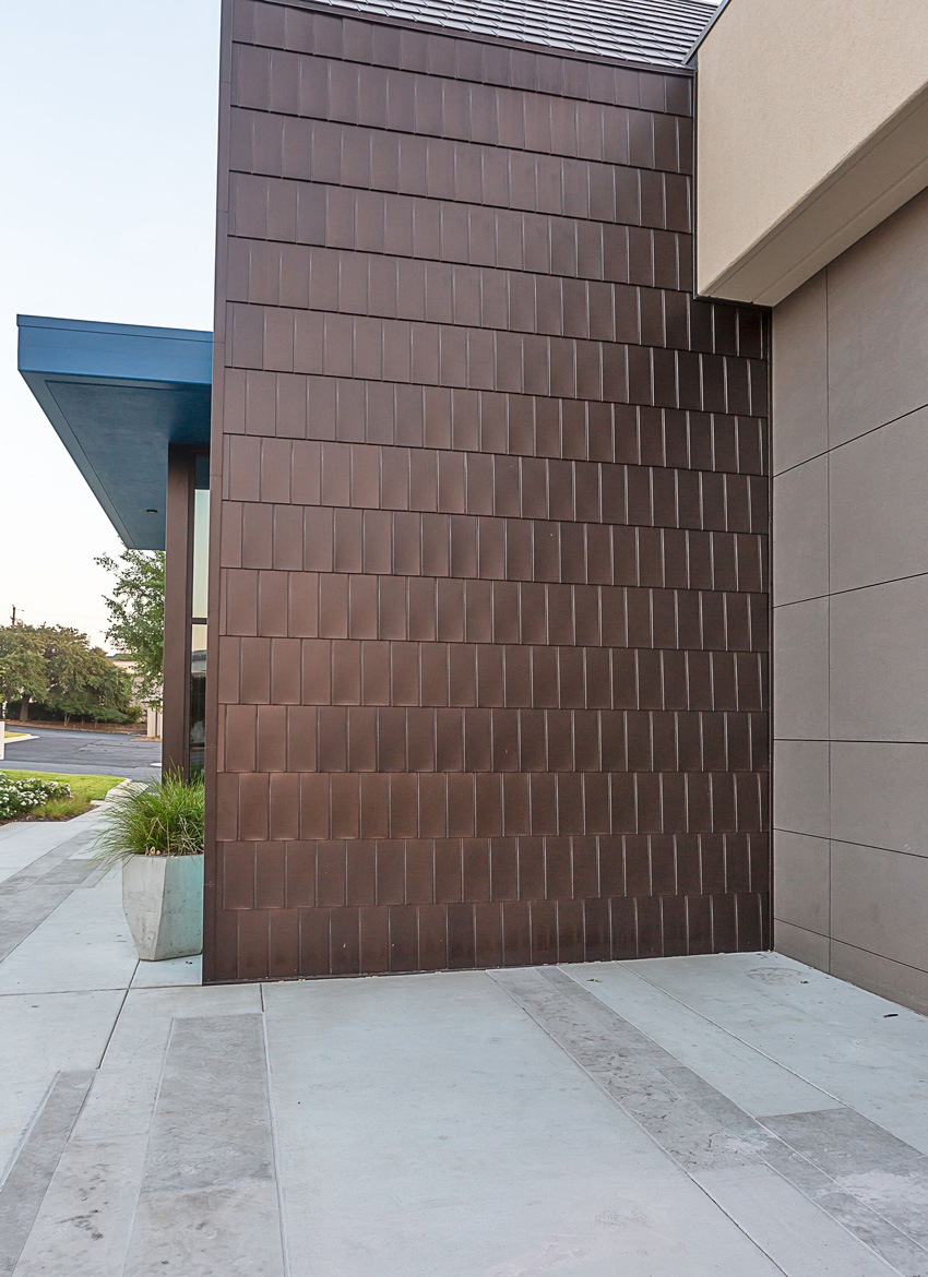
The team explored a few different materials to create the continuous roof-to-wall element. “Standing-seam metal panels and corrugated metal panels have been used in similar applications, but both of those solutions would have required a custom fitting to bridge the gap between the roof and the wall or a bulky-break metal element that would have visually broken up the plane. Metal tiles were able to function as both a wall and roof material to accommodate the 45-degree turn without requiring an edge band,” LaCroix explains. “This allowed us to create the visual continuity we wanted between the roof and the wall.”
“Metal has a timelessness that is appealing, and, in this project, it achieved the aesthetic vision we had and created a wonderful texture on the wall. I especially like the way the light interacts on the surface of the tile, which allows for the wall to change its appearance as the sun progresses across the sky throughout the day,” Humphries says.

Photo: Tom Coplen
“We used metal tiles to create a continuous roof-to-wall transition at the entryways to refresh the gable feature and impart the upscale aesthetic desired by the client,” says project architect Eddie LaCroix.
In addition to the metal tiles cladding the gabled roofs and walls at the entryways of the building, the flagship Southside Bank building features a standing-seam metal roof. The material was selected because of its longevity and natural complement to the metal-tile aesthetic. A special metal-to-metal joint was used where the standing-seam panels intersected with the metal tiles, making the installation of the two metal materials easy and straightforward.
Ultimately, the renovation of the flagship Southside Bank branch was a success, and the metal-tile treatment at the entryways has been so well received that it will be incorporated onto many other Southside Bank branches as the company continues its rebranding initiative.
Mitered Corners Deliver Prairie-Style Design
Another development in metal-panel technology now enables designers to create a cleaner corner aesthetic on facades with metal panels. A mitered corner refers to a corner where two metal panels are joined without a vertical metal trim piece. It allows designers to create a continuous and uninterrupted horizontal line that wraps around the building.
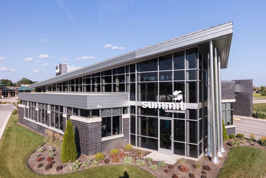
The mitered corner offered designers a useful solution when creating the newest branch of the Summit Credit Union in Muskego, Wisconsin, because it enabled the team to satisfy the somewhat divergent community guidelines of the Muskego City Planning Department and the corporate branding guidelines of Summit Credit Union.

Photo: Scott Bell
Mitered corners, where two metal panels are joined at a corner without a vertical metal trim piece, helped designers achieve the horizontality necessary to satisfy the Prairie-style aesthetic required by the Muskego City Planning Department.
The Muskego City Planning Department required that buildings be constructed in Prairie-style architecture. Horizontal lines are a signature element of the style, with trim, bricks, and siding horizontally oriented in many of the homes built by or inspired by the father of the Prairie style, Frank Lloyd Wright. Cantilevered, flat roofs, rows of windows, and open, flowing interior layouts are other key features of this low-slung aesthetic.
“The credit union has a specific brand style that is youthful, forward-looking, welcoming, and cheerful with plenty of glass,” explains designer Peter Tan, AIA, NCARB, LEED AP, executive vice president and chief design officer at Strang. “The palette of materials for the Summit brand includes a manganese brick that is both black and silver at the same time. It has great depth to it, and the silver metal standing-seam roof and metal siding panels really complement this brick and the glass. The metal siding is a staple of the Summit branch aesthetic.”
The design team was tasked with delivering the Prairie-style look required by Muskego using the materials that had become synonymous with the Summit Credit Union brand. Mitered corners provided a solution that allowed the designers to achieve the horizontality necessary to satisfy the mandatory Prairie-style aesthetic. “When you have horizontal ribbed metal panels finished with J-trim, it interrupts the horizontal line, and the corner becomes visually enclosed,” Tan explains. “The mitered corners on this building created the unbroken horizontal lines we wanted. We absolutely needed to specify the mitered corners to meet the planning department’s requirement for true Prairie-style design.”
“With this building,” Tan says, “we gave the Muskego City Planning Department the Prairie style its community guidelines require and maintained the corporate branding the credit union wanted.”


