Move It!
Knox considers Discovery’s re-envisioning of the classroom concept to be one of the school’s biggest successes. A variety of specialized, customizable, and flexible areas, linked by programmable open spaces and clear lines of sight, increase the options for “active classrooms,” another of the guideline domains. Transparency, achieved with glass partitions instead of solid walls, enables teachers to keep an eye on children working on their own in adjacent spaces, effectively lowering the student-to-teacher ratio at times. The strategy has also allowed the school to dispense with hall passes and let the kids move around the building independently. “The concept of the classroom is no longer bound up by four walls,” says Knox.
Transparency and spatial flexibility are significant features of the Northland Innova¬tion Center for Students in Academically Gifted Education (SAGE), which won a 2017 Excellence Award from the Center for Active Design, a health-focused leadership and advocacy nonprofit. Inserted into a newly constructed office building in Gladstone, the 33,800-square-foot SAGE Center supports active, student-led, participatory learning: students spend only 5 percent of their school day in structured lecture-style classes, with the rest used for researching, creating, performing, and socializing.
“The notion of kids’ following their passion, or path, marries nicely with the principles of active design,” says Steven Turckes, PreK–12 global practice leader at the Chicago office of Perkins+Will, designers for the project in association with Leawood, Kansas-based Hoefer Wysocki Architects. “Sitting inactive in a chair listening to a teacher lecture all day is one way of learning, but we would argue it’s not the best way. SAGE gives kids the space and the freedom to move, to explore, to experience, and to collaborate.”
The two-story facility, serving 250 K–5 students daily, consists primarily of open studio spaces in which focus areas are defined by rich colors and separated by glass partitions, or walkways marked with a change of floor material. Visual connections between neighboring learning environments encourage interdisciplinary thinking as students move throughout the space and engage a variety of settings over the course of a day.
As at Discovery, the furniture at SAGE was selected to foster a more dynamic environment: movable tables and chairs allow children and teachers to configure spaces as needed, chairs with a V-shaped back are equally functional facing forward or backward, stools designed to rock promote active sitting, padded seating-blocks double as work surfaces. Enabling these types of micro-movements turns sitting into an activity, and aligns with research findings that students learn more effectively when they’re able to move.
Turckes credits North Kansas School District’s then-superintendent Todd White (now with nearby Blue Valley School District) with making this paradigm shift possible. White provided the leadership to accomplish change: facilitating the necessary conversations, leading tours of precedent-setting facilities, and organizing workshops, such as one with an educational-furniture specialist, so teachers could experience the options and discuss their use in a range of settings.
Transforming schools to promote mobility among students necessarily promotes it among teachers too. Shifting from self-contained classrooms to a more fluid environment has helped to increase camaraderie and support a level of collaboration that, SAGE’s teachers say, didn’t previously exist. The ability to monitor and facilitate the children’s learning across a variety of workstations in the open space also enables teachers to observe one another’s classes more easily, and to share ideas. Facili¬ties for staff include a planning room with a large table and kitchenette, and a meeting room with acoustical privacy. But without self-contained classrooms or even designated desks of their own, “the environment has challenged the school’s teachers to reconsider how they teach,” says Turckes. “It’s created a freedom that they just didn’t have before.”


PHOTOGRAPHY: © FRANK OUDEMAN (TOP AND BOTTOM LEFT); PETER AARON/ESTO (BOTTOM RIGHT)
ROOFTOP RECESS
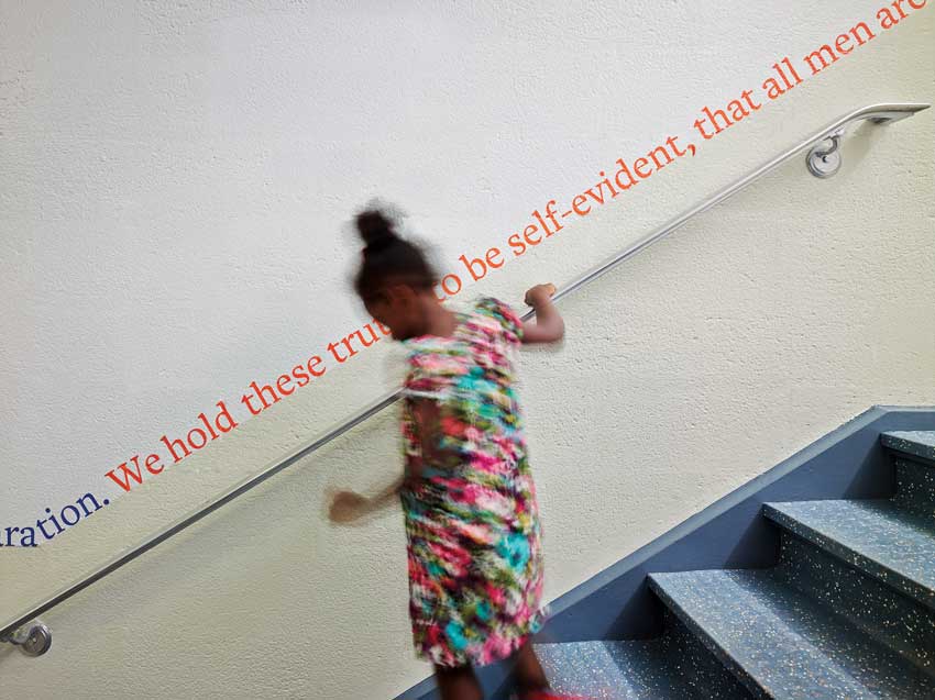
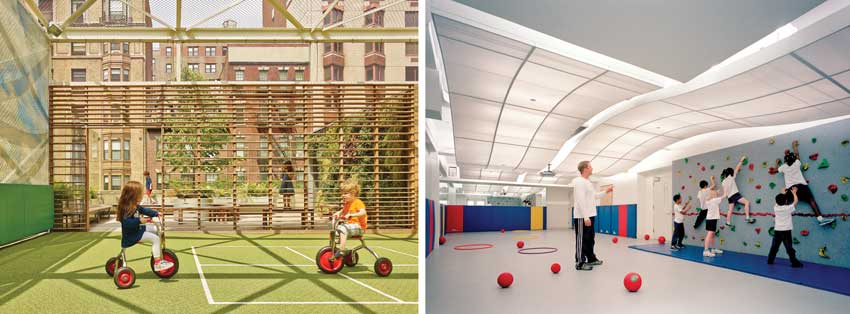
At St. Hilda’s & St. Hugh’s in New York, the architects designed a variety of outdoor environments to suit vigorous and quiet play (bottom left). Inside, they created a small gym with a climbing wall in space reclaimed from mechanical services (bottom right). Stairs (top) are made inviting with the inclusion of daylight and a quote from the Declaration of Independence.
Maximizing opportunities for students (and staff) to be more active in their indoor learning spaces improves the environments where they spend most of their time, but outdoor learning and play opportunities are also essential for children’s physical well-being, and their intellectual and social development. “There’s more and more focus on making these larger spaces positive from a mental health perspective,” says Sara Grant, a partner at New York–based Murphy Burnham and Buttrick Architects (MBB), “and on the need to support healthy interactions by designing them as warm, welcoming, and nurturing.”
In a 20-year series of projects at St. Hilda’s & St. Hugh’s School, MBB has been transforming a utilitarian structure in Manhattan’s Morn¬ingside Heights neighborhood into a building more sympathetic to the pre–K through eighth-grade school’s holistic, child-centered philosophy. One of these projects, a collaboration with landscape architecture firm RKLA Studio, is a rooftop play deck for the lower school (pre–K to grade three). Not just an area for outdoor activity (which in itself is something of an achievement on this tight urban site), the design uses materials and spatial composition to offer variety and choice, appeal to multiple senses, and generate a feeling of security and comfort.
The deck comprises three separate zones, each with a distinct character. A ball-play area allows children to make the big, exciting moves they can’t make indoors. A climbing zone includes fixed and changing elements that encourage adventurous and imaginative activity. A garden incorporates a planted wall and seating, and opens to views of the Hudson River; sheltered by a slatted screen from the more vigorous uses in the other two spaces, this “room” serves as a protected area for outdoor classes and quiet play.
One of the challenges that constructed urban play areas face is how to reintroduce nature and renewal so the space doesn’t get stale. All three zones of St. Hilda’s & St. Hugh’s play deck incorporate plantings; their colors, scents, and textures change with the seasons. The active ball zone incorporates banners—printed with clouds, for example, or an abstraction of trees—that can be changed to transform the character of the enclosure. Exhibits in the climbing zone are also switched out periodically: an airplane fuselage, a teardrop trailer, and a tiny tugboat are examples of real-world objects that have been stripped down and made safe for children.
The success of the play deck and other active-design interventions at St. Hilda’s & St. Hugh’s—such as a daylit stair limned with a quote from the Declaration of Independence, a climbing gym and dance studio in found space reclaimed from building services, and a range of immersive, hands-on learning environments that pre-date but nonetheless exemplify the active-classroom guidelines—is evidenced by data showing that students at the school take an average of over 8,300 steps during school hours alone, with the lower school children averaging over 10,700 steps.
Notwithstanding this success, Grant cautions designers against focusing too narrowly on physical activity, and encourages instead a more holistic approach to student health and well-being. That’s an idea that resonates at Discov¬ery Elementary too: activity was a secondary motivation for many of Discovery’s design features, says VMDO’s Knox. “The primary motivation was the kids’ joy and happiness.” And it’s the same for the activity-promoting features at SAGE: “What we’re seeing,” says Julie Alsobrook, retired director of the program, “is that kids are happier.”
Katharine Logan is a designer and writer focusing on architecture, sustainability, and well-being.


