Frank Lloyd Wright: American Icon, Architectural Master, Modern Dreamer


The total grouping of the 36 hues on the original Taliesin West color palette is exceptionally complete and offers exponential variations for micro harmonies. We will take a look in greater detail at these micro harmonies a bit later to understand how they were created and can be used in actual design, but first we will break down the original palette to take a look at it by family and grouping type:
Seventeen neutrals were included, with varying undertones of pink, yellow, green, and blue. This ensured there would be a neutral to pair with virtually any combination of other colors, no matter what their hue or tone.
Pastels might be seen as unlikely hues for Wright, since he was known to lean heavily towards neutrals and strong earthen hues. Yet the presence of a mere five pastels indicates how thoroughly he considered the marketability and totality of the color card for American consumers. These five pastels were primarily warm shades of red, pink and yellow and suited the southwest landscape.
Let's look at the palette further, dividing it into warm and cool tones. By pulling all of the warm hues of the palette together, some of the 17 neutrals, and all of the pastels, reappear, but are now flanked by richer orange and red hues.
The cool hues of the Taliesin West palette are nearly as plentiful as the warm tones, and are dominated by airy blues and nature-derived greens.
Another way to consider the palette is to isolate the mid-tones, of which there are several from both the cool and warm directions of the palette. With a mix across hues of nicely saturated shades, it's easy to see how Wright considered colors for textiles and carpeting.
And, since we began with describing almost a full half of the 1955 Taliesin palette from the perspective of 'baked earth,' we must of course address the earthen shades. This mix of clay-like neutrals, sunset reds and oranges, and natural greens is truly indicative of the striking Arizona landscape.
In complete contrast to the predominant earthen shades, Wright still managed to include colors that could be considered light as air—like clouds or mist. These are considered ethereal shades, again including the pastels and some neutrals in the mix.
We now return to the full Taliesin palette once more, to address additional micro harmonies. As we've already pointed out, part of Wright's brilliance as an architect and designer is that he obsessed over every last detail to the point of absolute perfection —keeping the pillars of unity, simplicity, harmony, and integrity as his essentials. His obsession with these things is just as evident in the Taliesin West palette. One can literally find an exponential amount of exquisite micro harmonies to suit any style or occasion among this carefully selected group of 36 shades. These micro harmonies can be seen grouped on the palette as four colors in a single row, or by creating a 2 X 2 boxed grouping, illustrating the skill with which the palette was put together.
It is also important to acknowledge some of those potential micro harmonies as they relate to design today and how they can still be seen on some of the latest product offerings on the market. Despite being created almost 60 years ago, the range of colors in the Taliesin West palette are exceptionally relevant for our contemporary market place. There are countless examples of this timeless palette still in use today—whether for residential or for commercial use—in clothing, furniture, carpets, textiles, and on all types of decorative accessories. This certainly lends credence as yet another example of Frank Lloyd Wright's true genius.
In Summary
In short, Frank Lloyd Wright was a designer of more than just architecture. Believing the architect should create total environments, he also designed art glass windows, furniture, fabrics, lamps, carpets, china, statuary, urns, tiles, and paint color palettes that are organic and ethereal, organized and inspiring. He found ways to bring nature into his work that is unparalleled to this day. And, his ability to achieve harmony and integrity throughout his designs is, in itself, a work of art.
Today, there are thousands of design examples, created by as many different artists, which were clearly influenced by Wright's unique style and mastery. It is a testament to the genius behind the vision of this great American icon, an architectural master to his core and one of our nation's best examples of a modern dreamer—Frank Lloyd Wright.
The Frank Lloyd Wright Collection product is authorized by the Frank Lloyd Wright Foundation, Taliesin West, Scottsdale, Arizona, U.S.A. “Frank Lloyd Wright”, “Frank Lloyd Wright Collection”, Mr. Wright's photograph and signature are trademarks of the Frank Lloyd Wright Foundation and are used with permission. © 2014 Frank Lloyd Wright Foundation. All rights reserved.
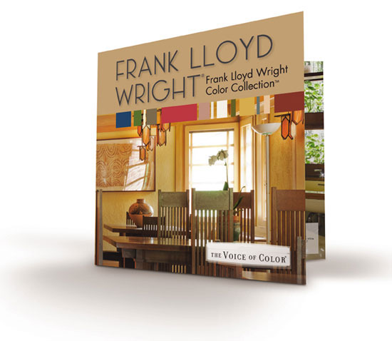
Image courtesy of PPG Architectural Coatings
Wright's brilliance is evident in his choice of color palettes.
Additional Resources
Should you wish to review Frank Lloyd Wright in more depth, the following is a bibliography listing of relevant and compelling source material.
1) “Frank Lloyd Wright, An Autobiography,” Frank Lloyd Wright (New York: Duell, Sloan and Pearce, 1943) or as reprinted by Barnes and Noble.
2) “Frank Lloyd Wright's Taliesin and Taliesin West,” Kathryn Smith (New York: Harry Abrams, 1997)
3) “Frank Lloyd Wright: In the Realm of Ideas,” Bruce Brooks Pfeiffer & Gerald Nordland (Carbondale: Southern Illinois University Press, 1988)
4) “The Essential Frank Lloyd Wright: Critical Writings on Architecture,” Bruce Brooks Pfeiffer, Editor, Princeton University Press, 2008.
The following is an excellent source for quotations:
1) “An American Architecture: Frank Lloyd Wright,” Edgar Kaufmann, Editor (Pomegranate Communications, 2006)
The following are excellent sources for design images:
1) “Frank Lloyd Wright - Graphic Artist,” Penny Fowler (Pomegranate Communications, 2002)
2) “Light Screens - the Leaded Glass of Frank Lloyd Wright,” Julie L. Sloan, (Rizzoli International Publications, Inc., 2001)
| PPG PAINTS™ unites the store networks of PPG Pittsburgh Paints www.ppgpaints.com®, PPG Porter Paints www.ppgpaints.com® and Glidden Professional into one powerful brand with a complete line of professional-grade paints and sundries. www.ppgpaints.com |
Notice