Frank Lloyd Wright: American Icon, Architectural Master, Modern Dreamer


Colors of Taliesin West—Then and Now
We now move on to the third section of the presentation and take an in-depth look at the colors Wright chose to create a palette for Martin Senour paints that represented the wealth of hues in the landscapes and environments of Taliesin.
Frank Lloyd Wright's original palette was compiled for Martin Senour, a West Coast paint brand, back in 1955. The palette was formatted with 36 colors—16 hues on the left side of the card, while 20 more hues appeared on the right side of the fold. Next to the hues on the left was a small amount of copy. This copy gave credit to not just the Martin Senour brand for paint, but also several other manufacturers of other elements in the home, including furniture (Heritage-Henredon), rugs (Karastan) and fabrics and wallpaper (F. Schumacher & Co.).

Image courtesy of Frank Lloyd Wright Foundation, OBMA, © Wright Fdn.
But as Wright was a careful and deliberate designer, it appears the design of the card was not just merely a matter of formatting.
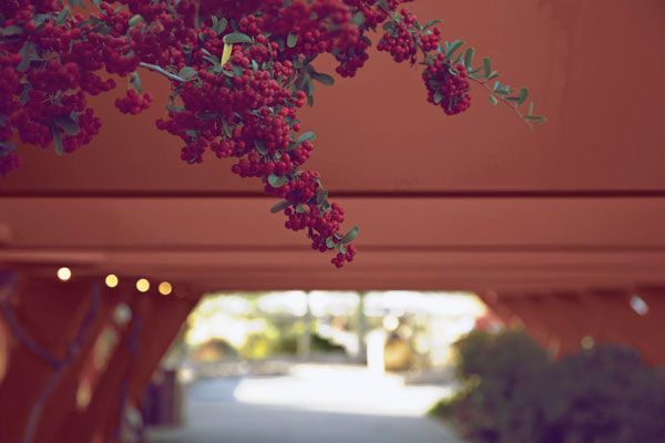
Photo courtesy of Frank Lloyd Wright Foundation, OBMA, © Wright Fdn.
Colors at Taliesin West
On the left side of the color card, there is a dominant interest in what we refer to as 'baked earthen' tones. Neutral browns, oranges, and reds make up the majority of the palette. As mentioned earlier, Wright's favorite color, which is a deep vibrant red, is among these cherished baked earth hues. It was used for steel elements of the Taliesin buildings, in the same way that he used it for steel at Fallingwater.
On the right side of the color card, there is a distinct interest in what we refer to as more airy, or ethereal, tones derived from nature. Indeed, this side of the palette is decidedly cooler in tone, with sky and watery blues along with leafy greens dominating the palette.
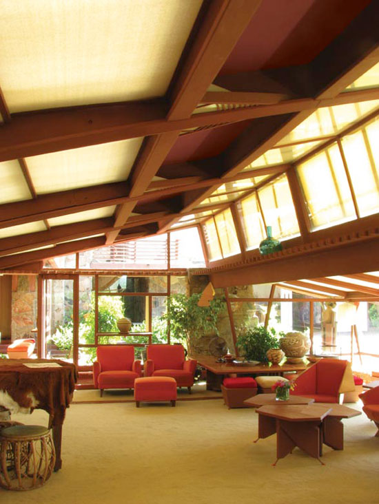
Photo courtesy of Frank Lloyd Wright Foundation, OBMA, © Wright Fdn.
Colors at Taliesin West
Notice