Frank Lloyd Wright: American Icon, Architectural Master, Modern Dreamer


The Approach to Color at Fallingwater
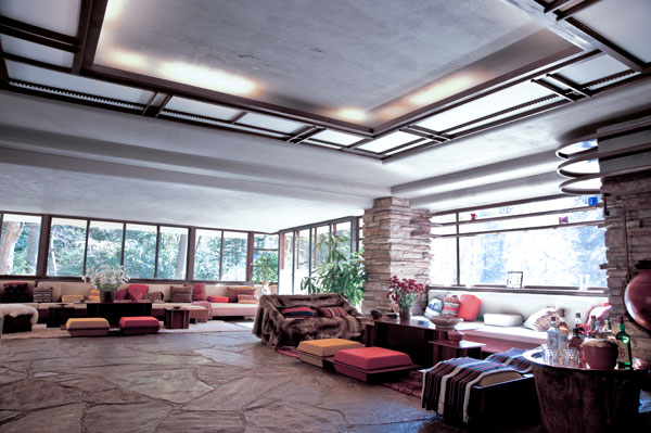
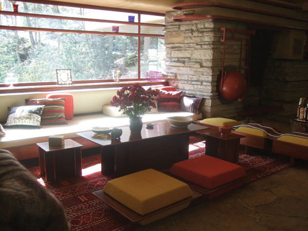
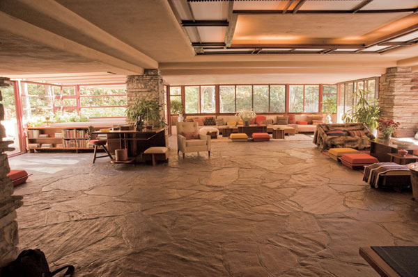
According to Lynda Waggoner, vice president and director of Fallingwater, color was always very important in conveying Frank Lloyd Wright's aesthetic of organic architecture as a unified whole. He drew from two sources in determining his palette for a given project: the nature of the site and the nature of the building materials. In the early projects, particularly the Prairie houses that were constructed of brick and stucco, autumnal colors appear to predominate: those include warm shades of red, gold, brown and yellow-green. These restful yet intense colors were accented by a palette of related hues and created a harmonious, unified and serene environment for the client. At Fallingwater, Wright employed both a limited palette of color and a limited number of materials in his desire to create an organic and integrated whole.
As in all of Wright's works, the colors at Fallingwater were chosen thoughtfully and deliberately. In keeping with his strong connection to nature, he selected each color to illustrate the significance of the direct impact of the landscape and the environment that surrounds this unique property. Here is a look at the meaning behind each of the 13 colors Wright used in the celebrated Fallingwater color palette:
There are two reds in the palette. The first is a deep, autumnal red with hints of brown that was widely recognized as Frank Lloyd Wright's personal favorite color. It is perhaps the most famous color at Fallingwater, and was used to coat all of the home's metal and ironwork. Wright is said to have limited his use of this red at Fallingwater only to metal accents.
The second red is brighter and was drawn from a fabric that was used at Fallingwater, specifically for accent pillows on the cantilevered couches. It is a warm complement to many of the neutrals used in the home, helping to create a welcoming feel.
Photos courtesy of the Western Pennsylvania Conservancy, Mill Run, PA
Fallingwater® living room
Notice