Arts & Culture
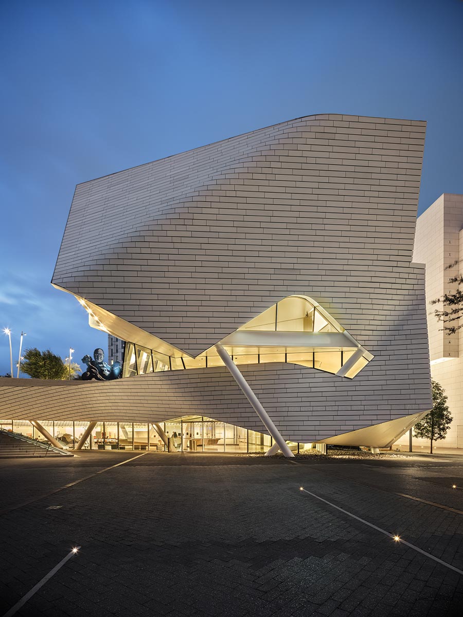
Morphosis’s highly sculpted museum in Costa Mesa, California, was shaped in response to its urban context.
BY SARAH AMELAR
All photos courtesy of Photography by Mike Kelley
Orange County Museum of Art.
In 2007, Morphosis won the competition for the new home of the Orange County Museum of Art (OCMA), in Costa Mesa, California, and, by 2008, the project was officially under way. “Fourteen years and 17 schemes later,” as OCMA CEO and director Heidi Zuckerman recently put it, the building finally opened, in October. The project had evolved in fits and starts as the museum’s leadership changed (twice) and the program shifted from a museum with one, even two, residential towers above it to a stand-alone venue for art.
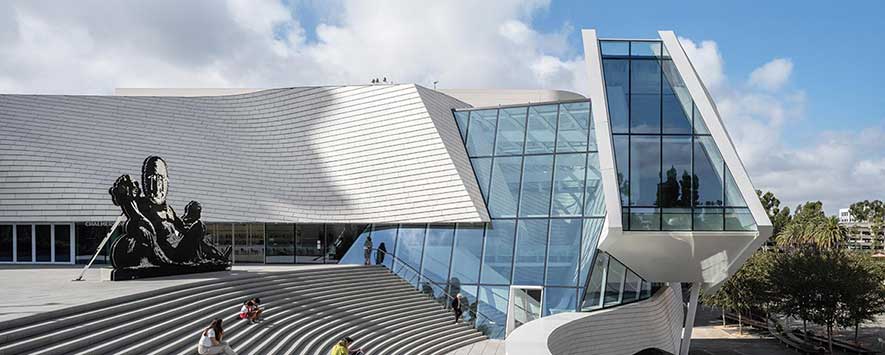
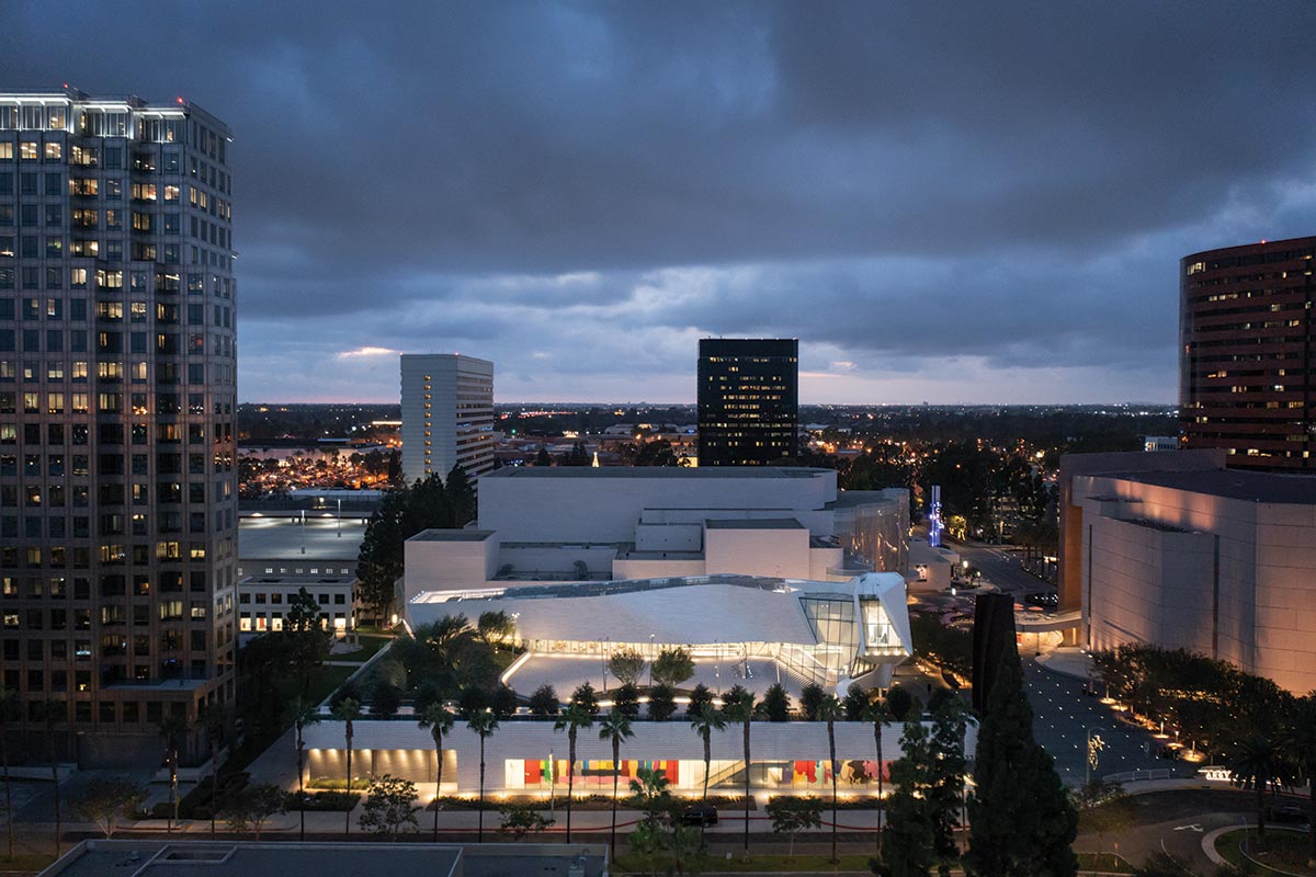
OCMA’S generous roof terrace includes an amphitheater-like grand stair whose shape is mirrored in a bank of seating at street level.
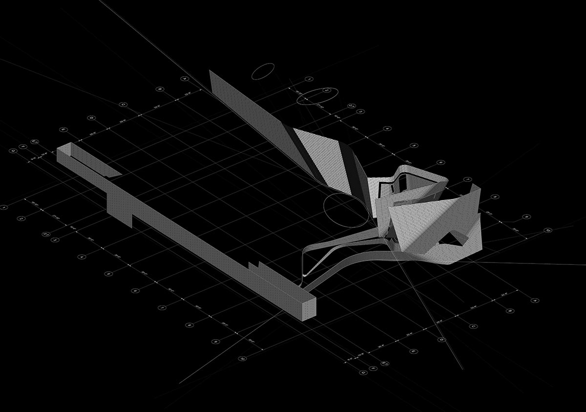
In the final results, Morphosis’s DNA is instantly recognizable. Highly energized with multiple, complex moves, the building features a rainscreen—clad in off-white, lightly glazed terra-cotta tile—that warps, bends, and undulates across its facades (see sidebar, page 71). Each curve skews the wrapper’s large-scale, bricklike pattern at a different angle, as if it were a wallpaper overlay. Like a great curtain, the screen also pulls away in key places to reveal idiosyncratically shaped areas of glazing or muscular structural elements, including canted supporting columns.
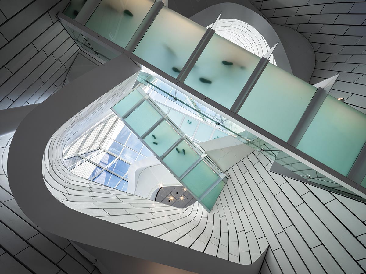
Fluid as textile, the rainscreen flows from outside to inside and loosely spirals up through the atrium.
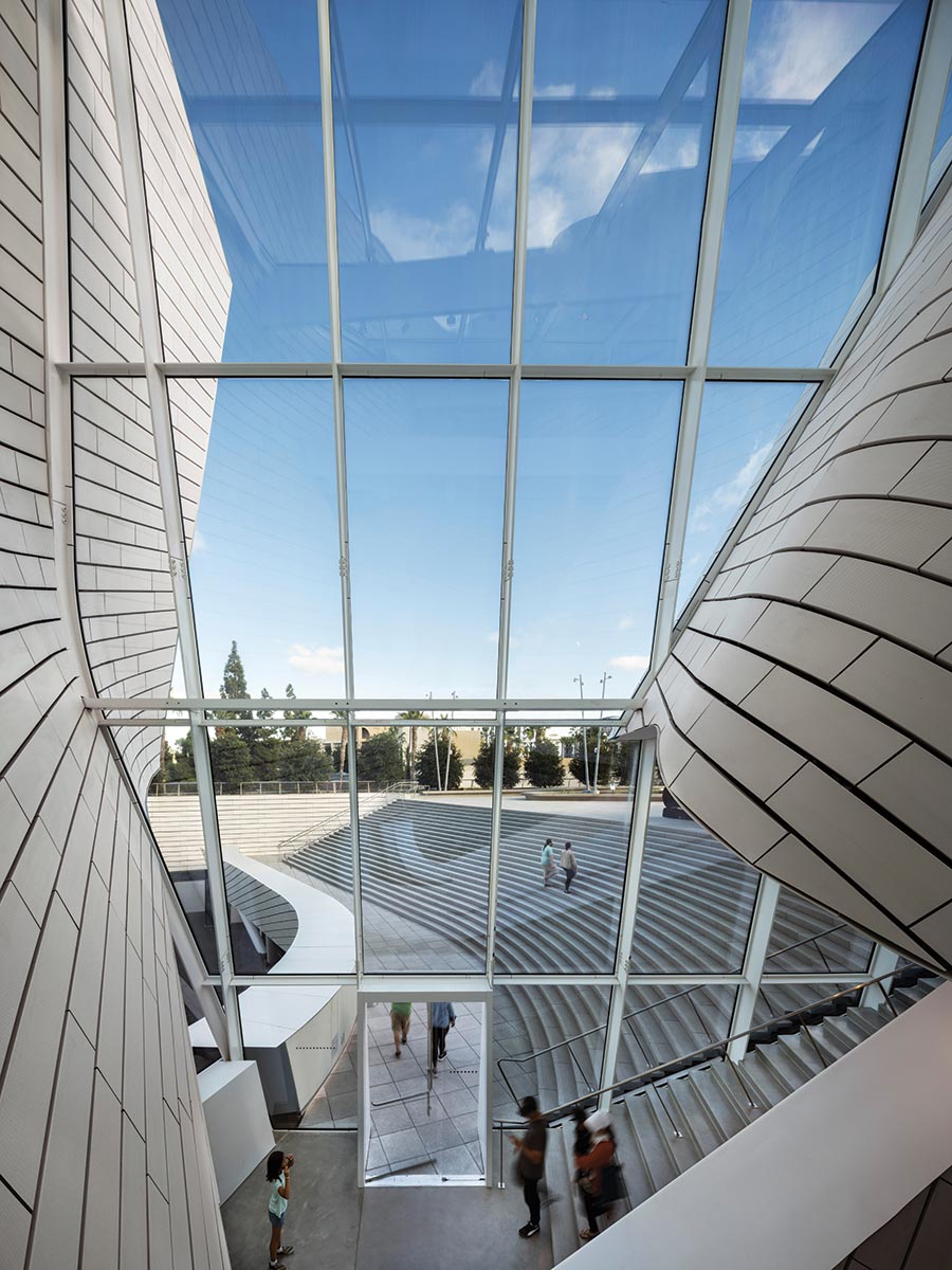
“This is an architecture about civic space, about city-making. It’s also about interactions, rather than shiny objects. I’ve been attacking the idea of ‘object’ building for years,” says Morphosis founder Thom Mayne. “I’m most interested in the interstitial moments, the spatial experiences of the in-between, and how those seeming fragments can become a cohesive whole.” Tying it all together, the enveloping skin—independent of any solid volume and appearing almost as fluid as a textile—continues from outside in. “It’s a hybrid solution that expresses multiple conditions at once,” Mayne continues. “It’s part urban space, part landscape, part building, part outdoor, part indoor.” Indeed, the results defy characterization as a single form, or object.
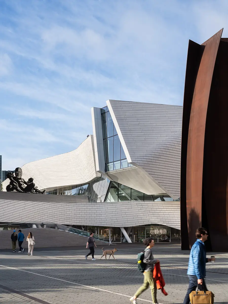
The museum’s facade seems to bow inward to honor a monumental Richard Serra sculpture in front of it.
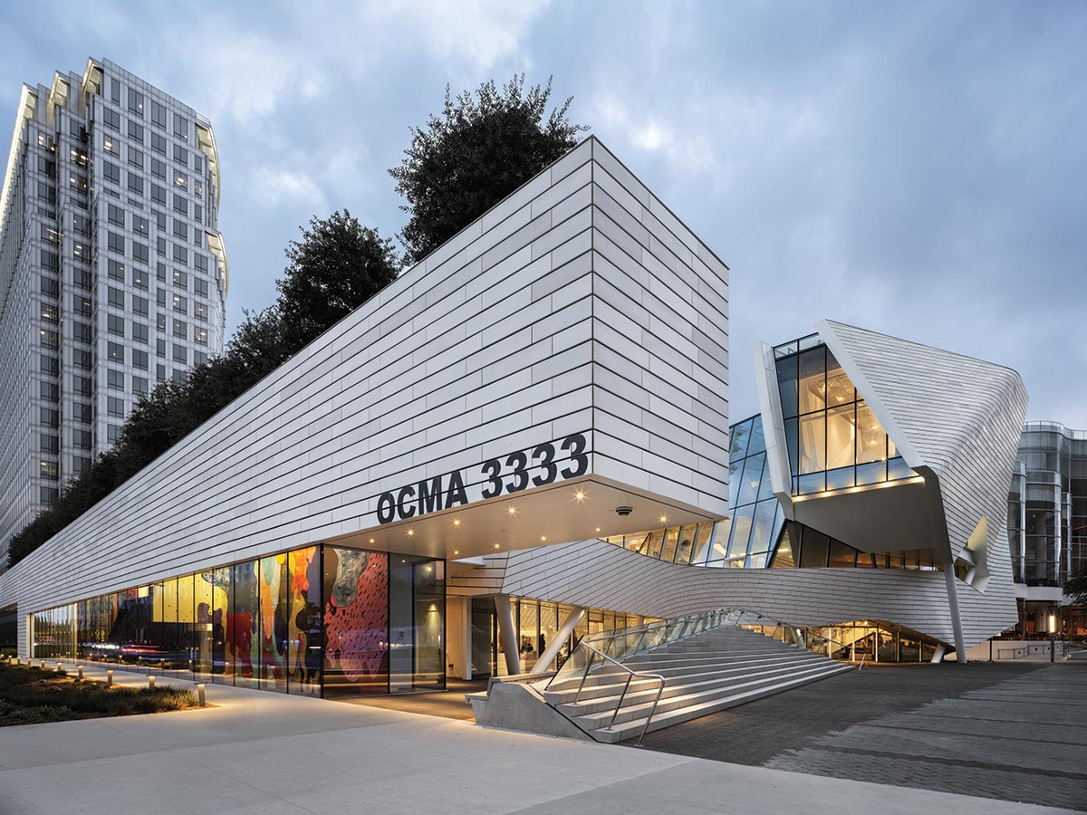
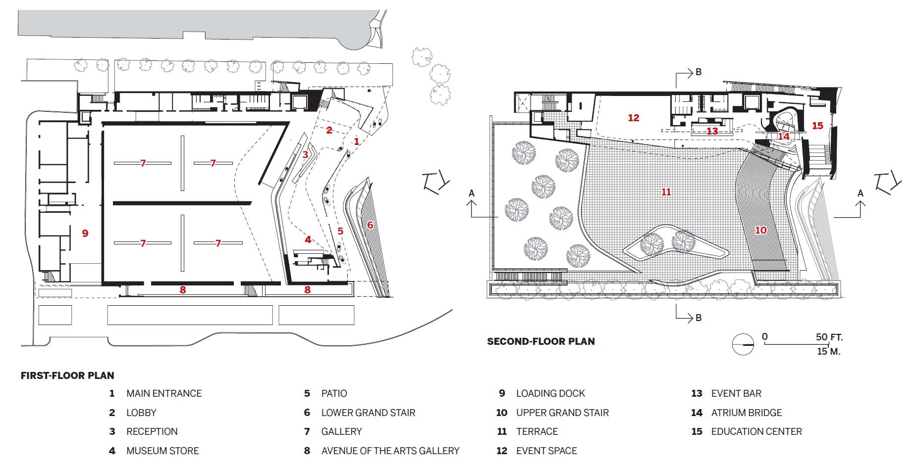
Sculpted in the round, the 53,000-square-foot, $94-million structure also addresses the likelihood that visitors will approach from many different directions. The site—long slated for an art museum—was the last unbuilt parcel at Segerstrom Center for the Arts (SCA), a 14-acre campus with several theaters, erected between 1986 and 2006, as well as a 2017 plaza by Michael Maltzan. SCA’s freestanding buildings are densely packed and stylistically eclectic—ranging from the mega-scaled masonry geometries of architect Charles Lawrence’s Segerstrom Hall to the glassy, wavelike facade of Cesar Pelli’s concert venue, next door to OCMA. Whether intentionally or not, the museum’s tile wrapper seems to riff on the pale, strictly rectilinear stonework of Pelli’s side elevation. But Morphosis’s most explicit contextual gesture is where its facade bows inward to honor the aptly named Connector in front of it—a monumental vertical weathered-steel sculpture by Richard Serra, a campus landmark that predates the museum. “Another factor: this site was an open field for a long time,” says Morphosis partner in charge Brandon Welling. “So we [conceptually] lifted the field and inserted the museum under it.” By creating a publicly accessible roof deck one story up, he adds, “the design essentially gives back to the community 70 percent of the building footprint.” That 28,000-square-foot “outdoor room” includes landscaping by the Office of Jim Burnett, as well as a grand stairway, reminiscent of a raked theater balcony, overlooking the plaza below. The broad steps—mirrored by a detached lower run that rises from the sidewalk like a bank of “orchestra” seating—form not so much a circulation route as a two-tiered amphitheater and urban social space, a nod to the front steps of the Metropolitan Museum of Art in New York.
The museum, part of the Segerstrom Center for the Arts, includes a skylit atrium soaring to 50 feet.
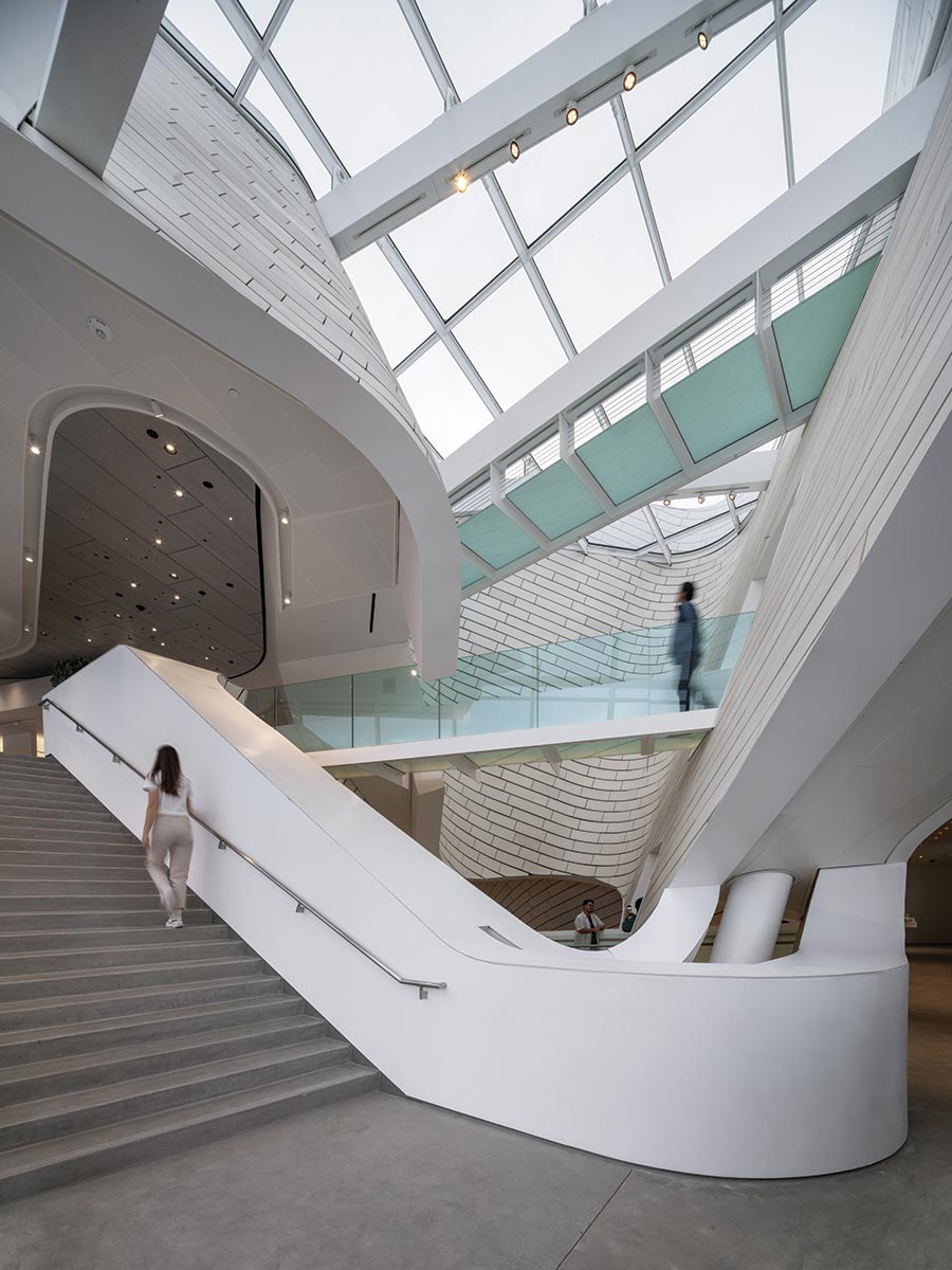
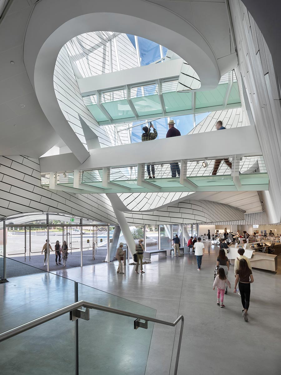
Leading essentially nowhere, OCMA’s version is more purely a gathering place and civic gesture or symbol. The museum’s main entrance is at street level, through a glassy section of the north-facing facade. Inside, the sequence proceeds from compression to expansion, with a relatively low ceiling giving way to a soaring atrium. Such shifts recur at key thresholds throughout the museum. “Actually,” says Mayne, “I would have made the compression even more extreme—if that were allowed—to further accentuate the contrast.” With a floor area of roughly 2,500 square feet, the irregularly shaped atrium rises 50 feet to a clear skylight, with the tiled rainscreen loosely spiraling up through it and translucent glass footbridges crisscrossing overhead. This nexus’s dynamism recalls the dramatic elevated walkways of the 1927 sci-fi film Metropolis. Yet OCMA’s lobby—which includes a museum shop and Minimalist-style coffee bar on one end—is neither monumental nor looming, but mostly human-scale and surprisingly intimate.
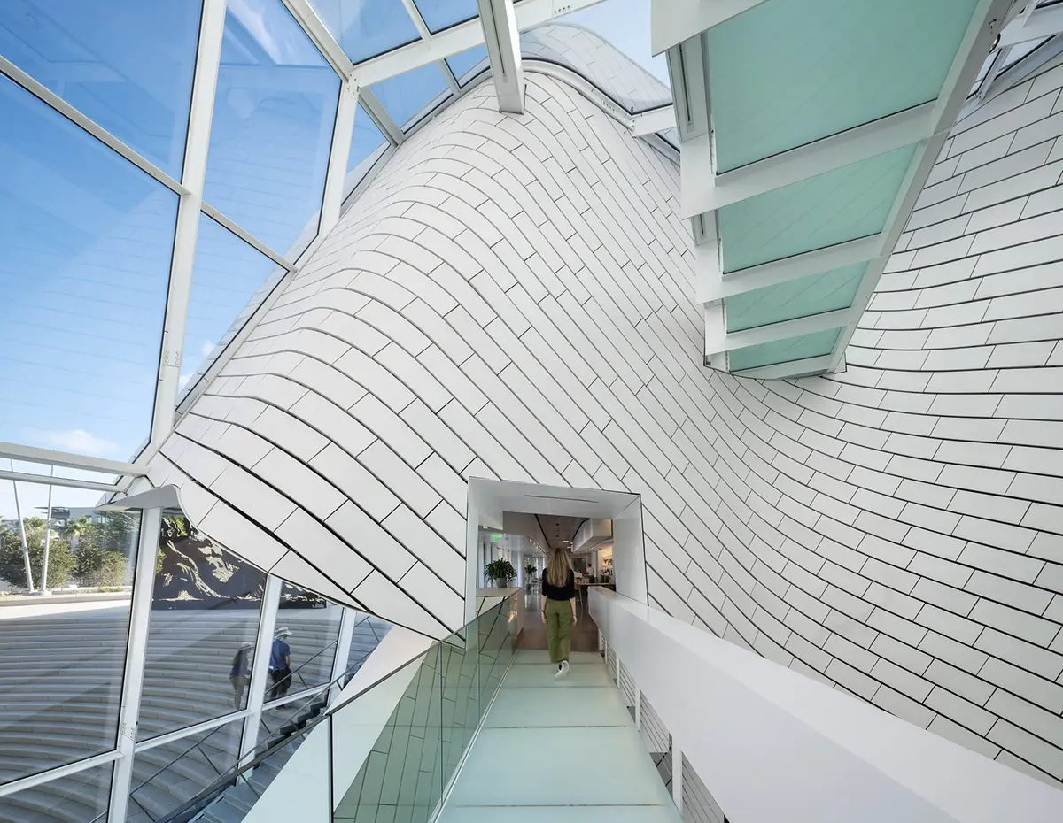
Translucent footbridges span the atrium.
Here, behind a long, ash-wood reception desk, a curved glass wall—echoing the facade’s bowed form—invites glimpses into the main galleries, set 18 inches below the lobby. “We wanted the exhibition areas to feel accessible, rather than hidden or precious,” says Welling. Anything but sequestered, the interior integrates long views all the way out to a street along the site’s eastern edge.
Like the tiled wrapper, other exterior forms and materials also flow inward. Concrete paving, for example, extends indoors to become polished flooring; and rough, piled stones appear both inside and out around the canted column bases. Similarly blurring boundaries, the lobby’s reception counter crosses the glass divide into the galleries, morphing into a long bench. Meanwhile, throughout the interiors, unexpected slots and moments of transparency open up, offering views from one space into another, or occasionally into the architecture’s underlying material or structural layers.
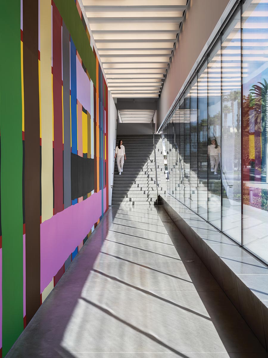
The main galleries have louvered ceilings and LED illumination evocative of daylight. A tall street-facing hall showcases a mural by Alicia McCarthy.
In contrast to the highly charged entry zone, the main galleries are serene, rectilinear, and luminously white—a sublime backdrop for the permanent collection of mostly 20th- and 21st-century art with ties to California. Forming the bulk of the building’s 25,000 square feet of exhibition space, this 17,000-square-foot, column-free expanse has a louvered, 19½-foot-high ceiling that provides even, diffuse illumination, convincingly evocative of daylight (though it’s an LED system, which the curators preferred over skylights). With partitions stopping short of the ceiling, the glowing surface continues uninterrupted overhead, capping a reconfigurable space so cleanly detailed that not even an electrical switch or outlet appears on any art wall. Just east of these galleries, a tall, separate hall opens itself to abundant daylight, with floor-to-ceiling glazing, showcasing to passersby a colorful, site-specific interior mural by Alicia McCarthy. Overall, the building doubles the art-display area of OCMA’s previous home, in Newport Beach.
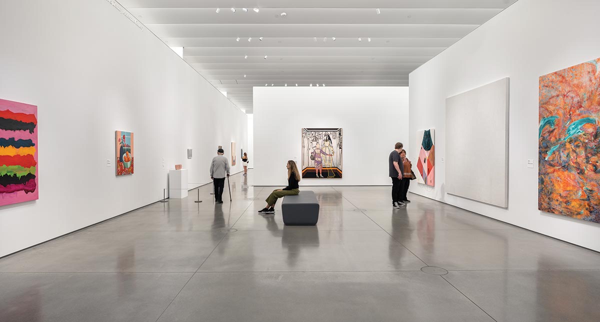
A tall streetfacing hall showcases a mural by Alicia McCarthy.
Upstairs is a smaller gallery, suitable for works on paper, plus a lofty 900-square-foot education space—a partially cantilevered volume, prominently visible out front. “We wanted to give education a position of importance and not relegate it to a basement,” says Welling. Though the upper level is primarily outdoor space, it includes, along one edge, a restaurant and bar that can open completely to the roof terrace.
“Embracing the community has always been core to our mission,” says Zuckerman. Not only is the roof deck accessible to everyone, whether or not they’re visiting the museum, but—thanks to a $2.5 million gift from Lugano Diamonds, a Newport Beach jewelry store—OCMA will operate admission-free for the next decade. “We were searching for a new museum paradigm,” says Mayne of the hybrid, fluid model that merges with its urban setting. “In the end, of course, it’s people who will activate the spaces and really make them work. As Heidi [Zuckerman] and I were just saying, we hope the building will make lots of kids curious enough to poke their heads in and look at art for the first time—and maybe, someday, one of them will end up on the museum’s board. That’s how high we’re aiming.”

Credits
Architect: Morphosis Architects — Thom Mayne, design director; Brandon Welling, partner in charge; Aaron Ragan, Crystal Wang, project architects; Tom Day, Daniel Pruske, project designers; Ilaria Campi, Austin Griffis, Salvador Hidalgo, Zach Pauls, Stan Su, Natalia Traverso Caruana, Abagael Warnars, project team; Cory Brugger, Joseph D’Oria, Kerenza Harris, Atsushi Sugiuchi, advanced technology; Jasmine Park, visualization
Consultants: John A. Martin & Associates (structure); Buro Happold (m/e/p, sustainability); KPFF (civil engineering); OJB Land-scape Architecture (land-scape); HLB Lighting Design and TM Light (lighting); Walter P Moore (facade)
General Contractor: Clark Construction Group
Client: Orange County Museum of Art
Size: 53,000 square feet
Cost: $94 million
Completion date: October 2022
Sources
Terra-cotta: Boston Valley Terra Cotta
Glass: Guardian
Skylights: Roschmann Group
Entrances: CRL/Blumcraft
Sliding doors: Dormakaba
Ceilings: Armstrong
Gallery lighting: Litelab


