Experiential Graphic Design
Another of the building-integrated installations is a 60-foot-long image based on waves, by local artist Gail Wight, which covers a series of glass panels enclosing a conference room. The work consists of more than 2,000 inverted-color photographs of waves digitally collaged together so tightly that the source images become indiscernible, and the composite resembles an ink drawing of a roiling, near-abstract landscape. Backing the image, which is still, a window film applied to the panels turns opaque or transparent in response to electrical currents that are tied to the tide levels at Stanford’s marine biology research station in Monterey Bay, 90 miles away.
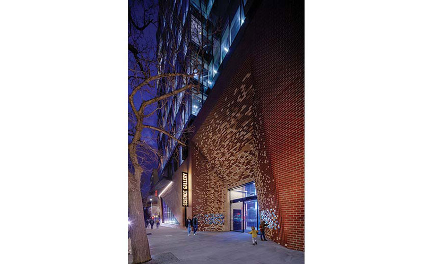
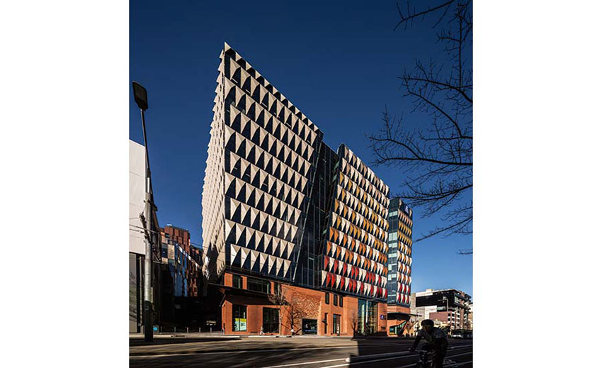
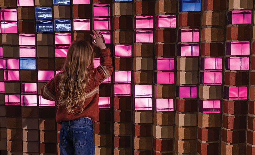
Venetian Glass Bricks incorporating touch-sensitive screens are integrated into the entry portal of Woods Bagot’s Science Gallery Melbourne.
“Interactive digital tools have been around for a long time,” says Yun, “but putting them into spaces and using more thoughtfully developed systems to help integrate with the architecture is a new and rapidly developing area. Over the last couple of decades, the ubiquity of this technology and these tools has skyrocketed.” Technology is no longer the limiting factor, he says—it’s now only a matter of imagination.
As at Stanford, innovating with architecturally integrated digital media was an aspiration for Science Gallery Melbourne, where exhibitions aimed specifically at 15- to 25-year-olds explore the confluence of science and art. Located between the University of Melbourne, Australia, and the city’s central business district, the gallery forms part of Melbourne Connect (Video: Courtesy Flad Architects), a three-building, 800,000-square-foot innovation hub designed by the local office of Woods Bagot and completed this year.
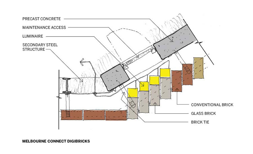
The 12-story building’s street-front podium is executed in brick, with upper stories consisting of prismatic glass panels and colored-glass shading hoods. At the gallery entrance, the red brick transitions from a contextual running-bond pattern to form a pixelated complex-geometry portal that incorporates 226 hand-cast Venetian-glass bricks. Backing each brick is a touch-responsive high-resolution screen (1280x720px), which can be programmed individually or in concert with others. The touch-responsiveness can enable nearly the same interactivity as a tablet computer or smartphone: when glass bricks are tapped, new layers of content unfold—on the tapped screen itself, and perhaps on adjacent bricks as well, or even the entire facade. All 226 screens together create a resolution of over 200 megapixels—the equivalent of about 70 iPhone 12s. Content is generated at over 800 megapixels (a requirement because the digital bricks are dispersed among clay bricks), forming what for now is the world’s highest-resolution interactive display. The combination of the digital content and the optical distortions of the hand-made glass generates an effect that’s both dramatic and intimate, and invites visitors to peer in for a closer look.
Research and development for the digital bricks took three years and brought together an interdisciplinary team that included the architects, construction professionals, electronics and lighting engineers, and graphic designers. They worked out how to support the tech-integrated bricks structurally, developed a mortar mix to bond the glass bricks with clay ones, identified a particular black to paint behind them so that the screens wouldn’t be affected by the color of adjacent bricks, and coordinated access openings in the large precast-concrete panels that back them. They also ensured that the screens would be able to detect finger taps through the solid glass, resolved the project’s unprecedented demand on computer graphics cards, and designed (and continue to design) the content. “The wow factor as you pass through this overscaled brick entrance portal sets up the experience of the gallery inside,” says Hazel Porter, a principal at Woods Bagot, “and offers a dynamic and engaging experience in its own right.”
As media architecture increasingly transforms public spaces by embedding digital technologies in the built environment, current examples worldwide are too often doing so to the detriment of the architecture, say the gallery’s head of research and emerging practice, Niels Wouters, and its digital experiences manager, Susie Anderson, in an article they coauthored for the University of Melbourne’s magazine. The design for Melbourne Connect, however, “lets the architecture speak for itself—even when screens are switched off,” they say.
The seamless integration of architecture with experience design is a major strength of each of these three examples—88 Kearny, the Bass Biology Building, and Melbourne Connect—making them more agile and responsive while intensifying their identity and meaning. “The more integral the dialogue between architects and experience designers, the better the project serves its audience,” says SEGD’s Jones. She expects to see more such partnerships as the potential of digital materials to transform the experience of architecture becomes more widely understood. “Architects have a new tool set at their disposal,” she says, “one that lets buildings do things that maybe they haven’t been able to do before.”
Supplemental Materials
The Business Case for Media Architecture: Modelling Project Benefits to Justify Investment, Niels Wouters, Franz Wohlgezogen, Kim Halskov; May 2021
 |
Architectural Record is the #1 source for design news, architect continuing education, and info on sustainability, houses, projects, and architectural products. |


