Experiential Graphic Design
About a third of the cost of the lobby is digital—including equipment, programming, and the purchase of assets, such as specially commissioned photography—with funds from the building’s operations budget ear-marked for check-ins and upkeep to software and hardware. “Normally with architecture, it’s exciting and fresh on the day it opens, and as time goes by it becomes less and less so, until in 15 years, you renovate,” says Zucker. “With a digital experience, we can continually update.” A person could come to work here every day and never see the same display twice. And instead of sticking a Christmas tree in the corner for the winter holidays, says Zucker, “we can have it snow.”
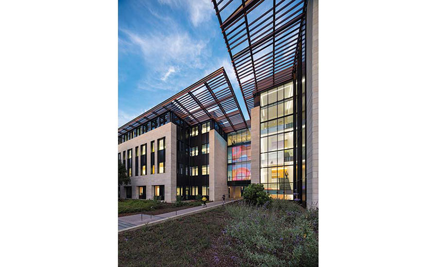
Engaging building users with architecture-integrated interactive media is a key EGD strategy at the Anne T. and Robert M. Bass Biology Research Building (Video: © Flad) at Stanford University. The five-story, 132,000-square-foot structure—designed by New York–based Ennead Architects (base building) and the San Francisco office of Flad Architects (interior architecture), and completed in 2019—consolidates the university’s biology department and serves as a gateway to a new science precinct. To contrast with the literal narratives on signage along the campus path to the precinct, the university asked the design team to express Bass Biology’s identity and function in innovative, non-literal ways. “Integrating digital technologies architecturally requires an intention and a purpose, but more importantly an advocate,” says Ian Grossman, Flad’s project architect. “The client was committed to incorporating digital media into the project in a manner that hadn’t previously been done on campus.”
Responsiveness and change are distinguishing characteristics of life, so the ability of digital methods to convey those qualities makes them especially relevant for a biology building, says Michael Yun, a principal at Knot, experiential graphic designers for the project. The design takes “patterns in nature” as its theme, and uses such pattern types as fractals, spirals, waves, moiré, and spots and stripes to inspire a variety of animated and interactive elements.


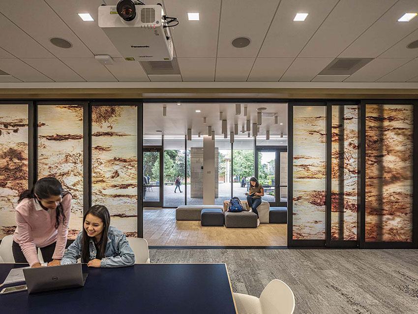
Digitally collaged images of waves have been integrated into conference-room doors within Bass (above). The glass turns opaque or transparent in response to electrical currents synched with the tides in Monterey Bay.
Above the building’s main entrance, an installation called Morphogenesis displays a potentially infinite series of passerby-generated Turing patterns (named after Alan Turing, who identified the mathematical equations that explain spots and stripes in nature). Working with Australian artist Jonathan McCabe, who first coded the Turing equations into the basis for a digital display, the building’s EGD team figured out how to make the equations interactive. The team teased out the variables, and connected them to a system (basically a video synthesizer) that passersby could manipulate with sliders on a touch screen integrated into the ground-level curtain wall glazing. When they have something they like, they press a button to upload it to the permanent database, and head around front to watch the display morph into their pattern on a media mesh screen 32 feet tall before it slowly transitions to the next one.
The Bass mesh screen is a standard architectural product commonly used for sports stadium signage, with high-output, low-energy LED pixels integrated into the outward facing side. From the inside, it’s like looking through the mesh of a solar shade—and in fact the screen serves that function for a glass bridge that links the building’s two wings. The material may be common, but using it interactively is a first, according to the manufacturer.


