This CE Center article is no longer eligible for receiving credits.
Packing a Punch
A new corporate headquarters makes a big impact both inside and out.
By Blair Kamin
Supertall skyscrapers get all the attention, but far shorter office buildings deserve deliberation too. After all, they’re much more pervasive—and, thus, have a greater impact—than the world’s Burj Khalifas. Consider the new nine-story Cummins Distribution Business headquarters in downtown Indianapolis, the first office building designed by New York architect Deborah Berke, founder of the eponymous firm and dean of Yale’s School of Architecture. It’s an impressive, innovative debut, one that extends this Fortune 500 engine maker’s tradition of forward-looking patronage from nearby Columbus, Indiana—the small town that the company transformed into a showcase of modern architecture—to the state’s largest city.

ALL PHOTOGRAPHY BY CHRIS COOPER
SITE SPECIFIC
Cummins Tower | Indianapolis | Deborah Berke Partners
Enlivened by cantilevers and sunshades of varying depths, the south-facing wall of the Cummins Distribution Business headquarters (left) is calibrated to optimize energy efficiency. The nine-story building’s north and west walls (right) frame the urban corridor of Market Street and gesture toward Monument Circle, the heart of downtown Indianapolis.
That Cummins tradition began in 1957, when the company’s late CEO, J. Irwin Miller, created a charitable foundation that encouraged the design of progressive new school buildings in Columbus. Miller’s commitment to design excellence prodded other local executives and officials to sponsor equally distinguished architecture, including a newspaper building by Skidmore, Owings & Merrill, a church by Eero Saarinen, and a library by I.M. Pei. While Cummins remains headquartered in Columbus, 40 miles south of Indianapolis, its new building brings the company closer to its global-sales and customer-support network via proximity to the city’s international airport and nexus of interstate highways.

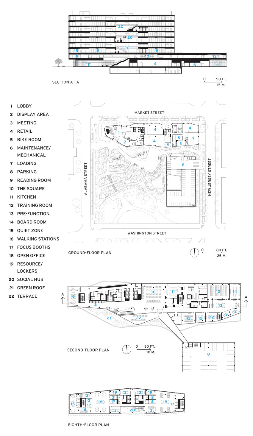
Located two blocks east of Monument Circle, the Beaux-Arts heart of downtown Indianapolis’s L’Enfant-esque mile-square plan, the 142-foot-tall structure rises on a four-acre site once occupied by the now-demolished Market Square Arena, an anti-urban behemoth where Elvis Presley performed his last concert in 1977. A block-long podium skirts the site’s north edge and frames the urban corridor of Market Street. A multilevel parking garage forms the bottom leg of the L-shaped Cummins complex, defining the edge of an adjacent park and orienting the site toward a transit center to the southwest. A second-story bridge links the carefully detailed garage to the office building and creates a gateway into the site from the east. Such moves turn the necessity of the garage into an urban design virtue.

GRAND ENTRANCE
Kendall Buster’s engine-inspired sculpture and a dramatic staircase animate the ground-floor lobby.
While the office building can be accused of indulging the current architectural fashion for stacked boxes, its form actually derives from three rational imperatives: provide a light-filled work environment, reduce energy consumption, and continue Cummins’s tradition of distinguished modern architecture. A sun-and-energy study prepared by Atelier Ten in cooperation with Berke’s firm led to a tower of shifting floor plans whose overhangs create dynamic massing and provide sun-shading. Vertical fins and brises-soleil offer more protection from the sun as well as rich textures and visual rhythms. The sun-shading elements vary not only from facade to facade, but within a facade, based on the position of the sun and the interior function of the space behind the glass. The exterior “is calibrated in terms of performance and syncopated in terms of aesthetics,” Berke says, explaining that Cummins’s precision-oriented engineers embraced the notion of calibration. Her narrow floor plates enable daylight to penetrate deep into the interior of the post-tensioned concrete structure and further reduce the need for electric illumination. The design is projected to cut peak cooling loads by 10 percent, she says.
Just as the building engages the city around it, so it bids Cummins’s employees to interact with each other. That communitarian impulse is evident in a streetlike second-floor corridor that gathers workers coming into the building from the garage with those who ascend a dramatic staircase from the generously proportioned lobby. The design, as Berke says, creates “a moment in the building where people all come together in one place.”
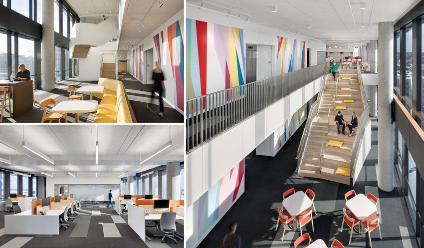
The most intriguing spaces occupy the upper floors, which are organized in pairs (3-4, 5-6, 7-8, with the empty 9th reserved for expansion). Along the south-facing wall, double-height “social hubs” create airy, light-filled meeting zones and, along with internal stairs, link four sets of open-plan “neighborhoods,” two on each floor (there are no private offices, not even for executives). Workstations in these are not reserved for one person because many Cummins employees are often on the road. Accordingly, workers must clean their desks at the end of the day and are encouraged to place family pictures on top of their lockers. But what they give up in ownership of a particular cubicle the design compensates for in an alluring variety of work environments.

FIT FOR THE JOB
The narrow footprint draws natural light into the “neighborhoods” (top, left). Employees, who often travel, use workstations on a revolving basis. Three “social hubs,” linked by staircases of varying design (bottom, left and right), line the south-facing wall and provide light-filled meeting areas. Odili Donald Odita’s multistory mural enlivens each hub and, at night, projects a colorful image to passersby.
Small rooms known as “focus booths” provide space for speaker-phone conversations or isolated work, and treadmill-like “walking stations” enable staff to get in their exercise while checking e-mails. Employees have embraced the new offices and give high praise to the abundant natural light and the opportunity, afforded by the social hubs and other gathering spots, to communicate face-to-face rather than by e-mail.
Still, there are myriad questions about this building, on which Cummins spent at least $30 million. Will it reduce energy costs and increase productivity enough to justify premium features like the articulated curtain wall? How will it function and feel in the future if, as anticipated, the number of employees swells from the current 300 to as many 450? And will those now-pristine workstations stay uncluttered? Whatever the answers, Cummins and Berke have provided a striking essay in what can be termed, with apologies to Louis Sullivan, “the short office building, artistically considered.”
Record contributing editor Blair Kamin is the Chicago Tribune’s Pulitzer Prize–winning architecture critic.
Credits
Architect: Deborah Berke Partners --— Deborah Berke, principal; Marc Leff, project leader; Arthi Krishnamoorthy, project manager; Ameet Hiremath, project designer (interior architecture); Noah Biklen, project designer (facade & exterior); Stephen Brockman, project designer (interior design); Yasemin Tarhan, Thao Nguyen, Dasha Khapalova, Jessie Peksa, Stephen Lam, design team
Architect of record: RATIO Architects
Engineers: Fink Roberts & Petrie (structural); Robert Silman Associates (design/structural); Circle Design Group (m/e/p); Syska Hennessy Group (design m/e/p); Civil & Environmental Consultants (civil)
Consultants: Atelier 10 (sustainability); Front (facade); One Lux Studios (lighting)
General Contractor: F.A. Wilhelm Construction
Size: 179,600 square feet
Cost: withheld
Completion Date: December 2016
Sources
Metal/Glass Curtain Wall: Erie Architectural Products
Sunshades: Clover Architectural Products
Elastomeric Roofing: Firestone Building Products
Glass: Viracon, Cristacurva
Acoustical Ceilings: Tectum, Armstrong, RealAcoustix
Carpet: Shaw Contract
Raised Flooring: Haworth
Office Furniture: Knoll
Dimming System: Lutron
Elevators/Escalators: Kone
View course on architecturalrecord.com »
Developers, corporations, architects, and clients invariably want to make their mark on the skyline. But as the following projects demonstrate, there is more to designing a good tower. It’s not all about image, or simply gazing up. It’s also about the experience of occupying such structures—with ample daylight and access to views—and how they engage the surrounding environment.

PHOTOGRAPHY: © MICHAEL MORAN
10 HUDSON YARDS, NEW YORK
BY KOHN PEDERSEN FOX ASSOCIATES
STACKING THE DECK
A New York residential tower presents a new take on the city’s classic skyscrapers.
By Joann Gonchar, AIA
For quite a while, it seemed as if Herzog & de Meuron’s 56 Leonard Street project—a 57-story residential tower in the Tribeca neighborhood of Lower Manhattan—would never get built. For four years during the financial crisis, construction was at a total standstill. But now, nearly a decade after ground was broken, the structure, made up of stacked glass-enclosed volumes and projecting terraces, is almost finished, and residents are starting to move in.

PHOTOGRAPHY: © IWAN BAAN, EXCEPT AS NOTED
HIGH LIFE
56 Leonard Street | New York | Herzog & de Meuron
56 Leonard Street, in the Tribeca neighborhood of Lower Manhattan (right), is an assemblage of glass-ensclosed volumes and cantilevering terraces, with the most exuberant projections occurring near its top (left).
Ascan Mergenthaler, a Herzog & de Meuron partner, says that the idea behind the unusual cantilevering geometry was not to defy gravity, but to design the units from the inside out and then express the individual apartments and their generous outdoor spaces in the form of the architecture.
Although 56 Leonard has been referred to as “Jenga-like” countless times in the press, the result is an assemblage that appears carefully balanced in equilibrium rather than on the verge of toppling over. Its protruding elements recall the famous image of a disembodied hand sliding one apartment into a model of Le Corbusier’s Unité d’Habitation in Marseille, France. This sensation of pushing and pulling, together with its reflective glass envelope, give the building a compelling chimera-like quality, with features that seem to change depending on one’s vantage point, the weather conditions, or the time of day.
The 831-foot-tall reinforced concrete structure (see sidebar, page 96) contains only 145 condominiums, ranging from 650-square-foot studios to penthouse apartments of more than 6,000 square feet. Although no two floors within the building are exactly the same, the unit types are organized into seven zones that can be discerned from the outside if one carefully studies the shift in the patterns of the extending balconies. The most exuberant projections occur near the top.

But even if the expressive crown refers to an earlier time of New York’s classical skyscrapers with silhouetted spires, Herzog & de Meuron’s building, which has a width-to-height ratio of about 1:10.5, is also representative of an emerging New York typology. This is the tall, slim, luxury residential tower with spectacular city views. In the case of 56 Leonard, depending on an apartment’s position and orientation within the structure, occupants look out over the surrounding neighborhood and toward the Hudson and East rivers, Wall Street and the World Trade Center, and, in the distance, Midtown. These vistas—as well as views of the tower from elsewhere in Manhattan—could actually remain unobstructed due to the peculiarities of the 12,500-square-foot parcel, which is surrounded by a mostly low-rise, height-restricted historic district. The 56 Leonard lot, previously owned by the New York Law School, was exempt from these limits. And when the developer, Alexico Group, purchased it in 2006, it also acquired the air rights transferred from the school’s adjacent properties.


Bottom, Right: PHOTOGRAPHY: © ALEXANDER SEVERIN
BACK IN BLACK
Views of 56 Leonard should remain unobstructed from the nearby streets (top) since it is surrounded by a height--restricted district. Residents and visitors enter the building through a sober lobby with walls clad in lozenge-shaped black granite tiles (bottom, left). The amenity spaces continue the dark palette. The pool (bottom, right) has black terraz-zo floors, treated to make them slip resistant.
It should be noted that Leonard Street’s peers in slenderness, such as the completed 432 Park by Rafael Viñoly, or under-construction towers like SHoP’s 111 West 57th and Jean Nouvel’s 53 West 53rd, have sparked criticism on many fronts. One complaint is that the apartments’ uber-wealthy investors will rarely occupy them, leaving the buildings—most of which are concentrated around the southern end of Central Park—empty and lifeless.
Both Herzog & de Meuron and Alexico take pains to distinguish their tower from their uptown super-skinny cousins. The apartments at 56 Leonard “are not safe deposit boxes in the sky,” says Mergenthaler. “The majority of the owners are really living there.” Many of the buyers are moving from elsewhere in Tribeca, says Izak Senbahar, Alexico’s president. He points out that the neighborhood has a paucity of buildings with amenities like those at 56 Leonard, which include parking, a 75-foot-long lap pool, and a movie screening room. Though construction is still not entirely complete, about 45 apartments are already occupied.
Most of these residents may well be actual New Yorkers, but they are without question very affluent ones. All except two of 65 Leonard’s units have been sold, fetching an average of $3,250 per square foot, according to one local real-estate publication. All that remains is a 15th-floor one-bedroom, with an asking price of just over $3 million, and a 3,700-square-foot penthouse listed at $17.75 million.

VIEW MASTER
Floor-to-ceiling window walls (left) wrap the entire perimeter of every apartment, providing spectacular views, especially from the upper floors. All the units have projecting balconies (right), but none line up with those on the floors above or below.
To reach the apartments, residents and visitors travel through a very sober lobby. It has walls clad in lozenge-shaped black granite tiles, exposed concrete slab as the ceiling, and a light gray terrazzo floor. But once 56 Leonard’s denizens ascend, daylight and the dramatic views take command. Inside the units, the ceilings are a minimum of 11 feet high, while some penthouses have almost 19-foot ceilings. Finishes are primarily soft-toned and light-reflective, including white oak floors, acid-etched mirrored kitchen cabinets, and bathroom walls covered in white marble. The insulated glazing, which stretches from slab to slab and around the entire perimeter, includes two different coatings to help control heat gain and glare. (It is up to the owners to install the window treatments they will presumably want for privacy.)
One of the project’s rare missteps is a planned public art piece by Anish Kapoor. As shown in renderings, the sculpture will be an unfortunate adaptation of his beanlike Cloud Gate at Chicago’s Millennium Park. The aim is to help anchor the building to the ground, says Senbahar. But it is hard to imagine how the mirrored sculpture will accomplish that: the piece will be awkwardly lodged under one corner at street level, appearing as though it is slightly deflated from the weight of the structure above.
Fortunately, most people will be able to avoid the Kapoor sculpture and admire the building as an arresting addition to Lower Manhattan’s skyline.
Credits
Architect: Herzog & de Meuron — Jacques Herzog, Pierre de Meuron, partners; Ascan Mergenthaler, partner in charge; Philip Schmerbeck, project director; Mehmet Noyan, project manager; Vladimir Pajkic, associate
Executive Architect: Goldstein, Hill & West Architects
Consultants: Cosentini Associates (mechanical); WSP|Parsons Brinckerhoff (structural); Schwinghammer Lighting (lighting); Gordon H. Smith Corporation (facade)
Construction Manager: Lend Lease
Client: Alexico Group
Size: 490,000 square feet
Cost: withheld
Projected Completion Date: June 2017
Sources
Window Walls: Enclos
Operable Windows: Schüco
Wood Floors: RQ Floors
Lighting: Maison Lucien Gau; Patrick Nash Design
The Ripple Effect
Concealing a straightforward office tower within, a curvilinear exterior commands attention.
By Shonquis Moreno
Turkey’s recent boom economy, though now bust, is manifest in Maslak, Istanbul’s business district. Office blocks, malls, and high-rent residential towers, arising haphazardly, have formed a skyline with little coherence. In the absence of urban planning, Turkish corporations have vied to embody their power and prestige in buildings, forming a mismatched, chest-beating architectural tribe. There is one office tower in the area, however, whose voluptuous, textured silhouette stands out against the hard, glossy grids and erratic geometries. Designed by Emre Arolat Architecture, Maslak Tower No. 1 is named for its street address. It occupies an irregular site—at the confluence of two busy boulevards, limited by local code to a footprint of only 7,535 square feet and 20 stories (280 feet) high—while surrounding towers rise to about 50 stories.

ALL PHOTOGRAPHY BY THOMAS MAYER
MIESIAN DREAMS
Maslak Tower No. 1 | Istanbul | Emre Arolat Architecture
Mies van der Rohe’s early, unbuilt skyscraper designs, including his curvilinear one of 1922, continue to influence architects today. The 20-story Maslak Tower No. 1 in Istanbul (right) renders the modernist prototype in fritted and clear glass. Its biomorphic outer wall is connected to the interior concrete-and-glass curtain wall structure by an exoskeleton of steel and curving beams (left).
“The client was looking for an extravaganza, something distinct from the others,” Arolat says, “but the business partners didn’t have a site on which it was possible to do a grandiose or powerful-looking building. I told them that it’s not easy, when everyone is shouting, to make yourself heard. To distinguish oneself, it’s better to be very, very quiet.” It turned out that, although regulations restricted the building’s floor area, there was no limitation on the volume of the building. “We realized that if we created a void inside, it wouldn’t count in the regulation’s numbers,” explains Arolat’s partner, Gonca Paşolar, “but the building would look much bigger than it really was.”

The architects decided to build a rather ordinary, inexpensive, reinforced-concrete building with a double-glazed curtain wall inside an outer, strikingly unique, curvilinear facade. This facade would have overlapping laminated, fritted, and clear glass panels. Its undulating exterior wall stands apart from the basic inner box for office space, so that an airy void is created between the two. This peripheral interior space contains 66-foot-high vertical gardens facing southeast with planters on every fourth floor, and metal grate walkways on the north, which can be accessed by the occupants. The void has its own natural microclimate: it is warmer in winter and cooler in summer, providing ventilation and lower energy consumption while filtering light, cutting street noise by 70 percent, and shielding the offices from wind and dust.
The biomorphic facade hides an explicitly industrial exoskeleton that anchors the outer skin to the inner structure. The architects left these columns and curving beams exposed within the cavity to preserve sight lines from the ground to the roof.


WITHIN THE WHORL
The exterior facade’s overlapping fish scale–like cladding covers the curvilinear facade (bottom). Spaces between the fins allow air to enter the void located between the outer skin and the interior concrete structure (top, right). At the ground level, the void between the exterior and interior enclosures provides space for the entrance lobby (top, left).
The building’s spatter-shaped plan consists of 12 folds or extrusions from the face of the building that generate a variety of views in and out. “There are very fast roads around the building,” Arolat says, “so when you see it, it always appears at a different angle and in a different color or light.”
Security is a priority in Istanbul, where political coups, shootings, and bombings occur, and new sections of the city are characterized by gated communities. One of the resulting failings of Maslak’s neighborhood is its lack of public or green space. Access, controlled by guards and X-ray monitors, is limited to employees, which makes the ground floor of most towers impermeable. To mix security and porosity, exclusivity and inclusivity, Arolat designed indoor and outdoor spaces for a café (called Prototype No. 1) at street level. Only employees can enter upper floors—there are no floor-selection buttons in the elevators because staff IDs admit them only to the levels they work on—but the eatery is open to any passerby.

LAYERED LOOK
The offices within the concrete-and-glass inner structure open into the void (top, left). This space also allows for a café off the lobby (top, right). Offices are fitted with operable windows for natural ventilation (bottom, left). The interior is not revealed on the outside (bottom, right), which is enclosed with fritted and transparent glass.
And that, not coincidentally, is where the void begins. Those sitting on the café’s island-like inner terrace, surrounded by a shallow pool of water and its reflections, can look up through the building’s industrial filigree and feel the sun filtering through onto their faces. Not far from security, it is a manifestly peaceful space.
Shonquis Moreno is a design and architecture journalist based in Istanbul, San Francisco, and Brooklyn, New York.
Credits
Architect: Emre Arolat Architecture — Deniz Kösemen
Engineers: Altineller Engineering (structural); Tanriöver Engineering (mechanical); Aykar Engineering (electrical)
Consultants: Marka (landscape)
General Contractor: Alsar Reic
Client: Alsar Reic, Koçkaya Holding Company
Size: 312,000 square feet
Cost: $20 million
Completion Date: August 2014
Sources
Masonry: Nuh Yapi
Metal Panels and Rainscreen: Erbay Aluminum
Metal Frame: Erbay Aluminum, Schüco
Glass: Trayka
Entrances and Hardware: Dorma
Elevators: Otis
Plumbing: VitrA
Packing a Punch
A new corporate headquarters makes a big impact both inside and out.
By Blair Kamin
Supertall skyscrapers get all the attention, but far shorter office buildings deserve deliberation too. After all, they’re much more pervasive—and, thus, have a greater impact—than the world’s Burj Khalifas. Consider the new nine-story Cummins Distribution Business headquarters in downtown Indianapolis, the first office building designed by New York architect Deborah Berke, founder of the eponymous firm and dean of Yale’s School of Architecture. It’s an impressive, innovative debut, one that extends this Fortune 500 engine maker’s tradition of forward-looking patronage from nearby Columbus, Indiana—the small town that the company transformed into a showcase of modern architecture—to the state’s largest city.

ALL PHOTOGRAPHY BY CHRIS COOPER
SITE SPECIFIC
Cummins Tower | Indianapolis | Deborah Berke Partners
Enlivened by cantilevers and sunshades of varying depths, the south-facing wall of the Cummins Distribution Business headquarters (left) is calibrated to optimize energy efficiency. The nine-story building’s north and west walls (right) frame the urban corridor of Market Street and gesture toward Monument Circle, the heart of downtown Indianapolis.
That Cummins tradition began in 1957, when the company’s late CEO, J. Irwin Miller, created a charitable foundation that encouraged the design of progressive new school buildings in Columbus. Miller’s commitment to design excellence prodded other local executives and officials to sponsor equally distinguished architecture, including a newspaper building by Skidmore, Owings & Merrill, a church by Eero Saarinen, and a library by I.M. Pei. While Cummins remains headquartered in Columbus, 40 miles south of Indianapolis, its new building brings the company closer to its global-sales and customer-support network via proximity to the city’s international airport and nexus of interstate highways.

Located two blocks east of Monument Circle, the Beaux-Arts heart of downtown Indianapolis’s L’Enfant-esque mile-square plan, the 142-foot-tall structure rises on a four-acre site once occupied by the now-demolished Market Square Arena, an anti-urban behemoth where Elvis Presley performed his last concert in 1977. A block-long podium skirts the site’s north edge and frames the urban corridor of Market Street. A multilevel parking garage forms the bottom leg of the L-shaped Cummins complex, defining the edge of an adjacent park and orienting the site toward a transit center to the southwest. A second-story bridge links the carefully detailed garage to the office building and creates a gateway into the site from the east. Such moves turn the necessity of the garage into an urban design virtue.

GRAND ENTRANCE
Kendall Buster’s engine-inspired sculpture and a dramatic staircase animate the ground-floor lobby.
While the office building can be accused of indulging the current architectural fashion for stacked boxes, its form actually derives from three rational imperatives: provide a light-filled work environment, reduce energy consumption, and continue Cummins’s tradition of distinguished modern architecture. A sun-and-energy study prepared by Atelier Ten in cooperation with Berke’s firm led to a tower of shifting floor plans whose overhangs create dynamic massing and provide sun-shading. Vertical fins and brises-soleil offer more protection from the sun as well as rich textures and visual rhythms. The sun-shading elements vary not only from facade to facade, but within a facade, based on the position of the sun and the interior function of the space behind the glass. The exterior “is calibrated in terms of performance and syncopated in terms of aesthetics,” Berke says, explaining that Cummins’s precision-oriented engineers embraced the notion of calibration. Her narrow floor plates enable daylight to penetrate deep into the interior of the post-tensioned concrete structure and further reduce the need for electric illumination. The design is projected to cut peak cooling loads by 10 percent, she says.
Just as the building engages the city around it, so it bids Cummins’s employees to interact with each other. That communitarian impulse is evident in a streetlike second-floor corridor that gathers workers coming into the building from the garage with those who ascend a dramatic staircase from the generously proportioned lobby. The design, as Berke says, creates “a moment in the building where people all come together in one place.”
The most intriguing spaces occupy the upper floors, which are organized in pairs (3-4, 5-6, 7-8, with the empty 9th reserved for expansion). Along the south-facing wall, double-height “social hubs” create airy, light-filled meeting zones and, along with internal stairs, link four sets of open-plan “neighborhoods,” two on each floor (there are no private offices, not even for executives). Workstations in these are not reserved for one person because many Cummins employees are often on the road. Accordingly, workers must clean their desks at the end of the day and are encouraged to place family pictures on top of their lockers. But what they give up in ownership of a particular cubicle the design compensates for in an alluring variety of work environments.

FIT FOR THE JOB
The narrow footprint draws natural light into the “neighborhoods” (top, left). Employees, who often travel, use workstations on a revolving basis. Three “social hubs,” linked by staircases of varying design (bottom, left and right), line the south-facing wall and provide light-filled meeting areas. Odili Donald Odita’s multistory mural enlivens each hub and, at night, projects a colorful image to passersby.
Small rooms known as “focus booths” provide space for speaker-phone conversations or isolated work, and treadmill-like “walking stations” enable staff to get in their exercise while checking e-mails. Employees have embraced the new offices and give high praise to the abundant natural light and the opportunity, afforded by the social hubs and other gathering spots, to communicate face-to-face rather than by e-mail.
Still, there are myriad questions about this building, on which Cummins spent at least $30 million. Will it reduce energy costs and increase productivity enough to justify premium features like the articulated curtain wall? How will it function and feel in the future if, as anticipated, the number of employees swells from the current 300 to as many 450? And will those now-pristine workstations stay uncluttered? Whatever the answers, Cummins and Berke have provided a striking essay in what can be termed, with apologies to Louis Sullivan, “the short office building, artistically considered.”
Record contributing editor Blair Kamin is the Chicago Tribune’s Pulitzer Prize–winning architecture critic.
Credits
Architect: Deborah Berke Partners --— Deborah Berke, principal; Marc Leff, project leader; Arthi Krishnamoorthy, project manager; Ameet Hiremath, project designer (interior architecture); Noah Biklen, project designer (facade & exterior); Stephen Brockman, project designer (interior design); Yasemin Tarhan, Thao Nguyen, Dasha Khapalova, Jessie Peksa, Stephen Lam, design team
Architect of record: RATIO Architects
Engineers: Fink Roberts & Petrie (structural); Robert Silman Associates (design/structural); Circle Design Group (m/e/p); Syska Hennessy Group (design m/e/p); Civil & Environmental Consultants (civil)
Consultants: Atelier 10 (sustainability); Front (facade); One Lux Studios (lighting)
General Contractor: F.A. Wilhelm Construction
Size: 179,600 square feet
Cost: withheld
Completion Date: December 2016
Sources
Metal/Glass Curtain Wall: Erie Architectural Products
Sunshades: Clover Architectural Products
Elastomeric Roofing: Firestone Building Products
Glass: Viracon, Cristacurva
Acoustical Ceilings: Tectum, Armstrong, RealAcoustix
Carpet: Shaw Contract
Raised Flooring: Haworth
Office Furniture: Knoll
Dimming System: Lutron
Elevators/Escalators: Kone
Diamond Standard
A high-rise for a Chinese conglomerate showcases its distinctive structural system.
By Alexandra A. Seno
Much of contemporary Beijing’s urban layout has its roots in the 15th century, when the Ming Dynasty built the Forbidden City as its seat of power. Today the sprawling metropolis is still organized according to districts and ring roads encircling the former imperial palace. In the Wangjing area, half-way between the traditional city center and the international airport to the northeast, a shiny new business district has risen in recent years on what was formerly farmland and tracts of squat Soviet-style buildings.

ALL PHOTOGRAPHY BY BRUCE DAMONTE
PUSHING THE ENVELOPE
Poly International Plaza | Beijing | SOM
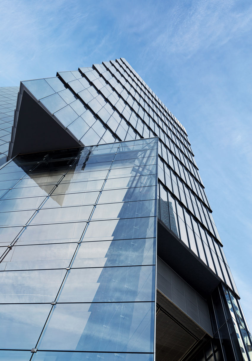
Nicknamed the Diamond Lantern, Tower One rises 499 feet, flanked by a pair of lower buildings also designed by SOM and completed in 2016 (left). Its distinctive exoskeleton creates an animated facade, as well as a covered space at ground level where people enter the building (right).
Today the area’s glass-clad skyscrapers house the headquarters of financial firms, the homegrown Alibaba technology behemoth, and industrial companies. China Poly Group—one of the country’s biggest state-supervised conglomerates—received from the city government a choice piece of land that in the last decade it transformed into high-end apartment buildings and Poly International Plaza, the group’s most prestigious commercial project, which sits on a 5.7-acre lot.
With a portfolio ranging from real estate to one of the country’s biggest art auction houses, the company wanted to build a modern and elegant complex befitting its public profile. For the three office buildings on the site and the master plan, the company turned to Skidmore, Owings & Merrill (SOM), which had designed several projects for it, including the Poly Real Estate Headquarters in Guangzhou and the Poly Corporation Headquarters in central Beijing. The firm has been active in China for 25 years, having designed the U.S. Consulate in Guangzhou (ARCHITECTURAL RECORD, March 2014, page 132), as well as the U.S. Embassy in Beijing.
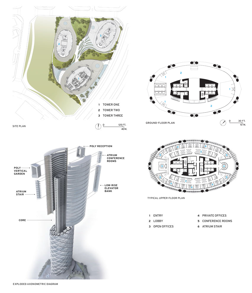
The San Francisco office of SOM took charge of the project and envisioned it as three elliptical towers connected by a shared basement, set against manicured stone-and-shrubbery gardens. With a smile, Poly executive Zhang Wei says, “We wanted something that can make our company more famous.” As a key project manager for the complex over the last five years, Zhang has seen the Poly development unfold to much acclaim in both the local and international press.
The centerpiece of the complex is a 499-foot-high building, nicknamed the Diamond Lantern, that is flanked by two shorter buildings, 276 feet and 220 feet high (all three were completed last year). While the shorter towers—since sold by Poly—are discreetly clad in vertical grids of dark metal rods, the main building—which Poly intends to keep and mostly lease out—features a crisscrossing steel-and-concrete diagrid, along with a concrete core. These make up the primary load-resisting system (see sidebar page 114). This white aluminum–clad exoskeleton and the facade’s angled glass give the building the appearance of an origami lantern, especially at night when it is dramatically illuminated by lights embedded in the structural elements.

Nestled alongside Poly’s residential development, called Central Park—“ultraluxury,” Zhang points out—the office buildings project a genteel, contemporary character distinct from the bustle and flash of much taller buildings nearby or the undulating forms of Zaha Hadid’s Wangjing SOHO complex visible in the distance.
“We went through a process of soul-searching with the client,” says structural engineer Mark Sarkisian, one of the leads on the project for SOM. “We looked at what the site means and developed something iconic and responsible.”

STAIR MASTER
A skylit atrium rises the full height of the 31-story tower, offering views of the other buildings in the complex and the surrounding area. A circular stair near the top of the atrium connects some of the upper floors.
Leo Chow, the SOM partner who headed the design team, says the architects sought to satisfy “the functional and business needs of the owner, creating a high-performance space that elevates the daily experience of the users and achieves a cultural resonance with the site.” In the end, they settled on an elliptical form that responds to the curving highway adjacent to the site and sets it apart from the blocky residential towers nearby. Chow also recognized the “symbolic significance of a lantern hung outside a door as a sign of welcome and an object that attracts good fortune.”
Inside the building, white-gloved attendants man the spare lobby, covered in Calacatta marble specially quarried for Poly from Carrara in Italy. The main entry at the north end of the lozenge-shaped building leads to an impressive 410-foot-tall, skylit atrium that draws the eye up the tower’s curtain wall and to the office floors above. A secondary atrium on the south end is primarily visible from upper floors, where one of the elevator cores drops off to reveal the space. Three banks of elevators take visitors to office floors, while a separate elevator bank goes down to cafeterias in the first basement level and parking below that.


ROUNDING UP
Although the building’s plan is an ellipse, all of its structural elements and curtain wall are straight (top and bottom, left). Inside the lobby, walls are clad with Carrara marble from Italy (bottom, right).
Each elliptical floor plate provides about 21,200 square feet of column-free space. Floor-to-ceiling glass allows sweeping vistas of the emerging neighborhood and delivers a sense of expansiveness to the offices. Last autumn, the headquarters of Hyundai Capital, a Korean investment firm, moved into floors 19 to 26, becoming Poly’s main tenant. Other levels have attracted single and multiple tenants. Poly has reserved the double-height top floor (31)—designed to feature vertical gardens—for its own use in the future.
The building also had to cater to Beijing’s particular environmental requirements: air-quality concerns, energy efficiency, extreme climate, and seismic activity. In pleasant weather, external vents in the glass facade open to assist air circulation. Behind the exterior skin, a second glass envelope reduces noise from the busy street and mitigates Beijing’s high summer temperatures and sub-freezing winter weather. According to SOM, the tower’s design lowers carbon emissions by 18 percent and energy use by 23 percent.
Instead of competing with other buildings in terms of superlatives—height, price, or spectacle—Poly and SOM created a tower that stands out as a technological achievement and a distinctive landmark in a booming new district of the city.
Credits
Architect and Engineer: Skidmore, Owings & Merrill — Leo Chow, design partner; Gene Schnair, consulting partner; Keith Boswell, technical partner; Larry Chien, project managing director; Mark Sarkisian, structural engineering partner
Architect of Record: Beijing Institute of Architectural Design (BIAD)
Consultants: Skidmore, Owings & Merrill (structure); WSP Engineering Services (m/e/p); SWA Group (landscape); Francis Krahe & Associates (Lighting)
General Contractor: China Construction Third Engineering Bureau Company
Client: China Poly Real Estate Company
Size: 1.25 million square feet
Completion Date: July 2016
Sources
Metal Panels: Shandong Dahua Rixin Aluminum
Curtain Wall: Jiangho Group
Glass: Xinyi Glass; North Glass
Carpet: Interface
River Dance
A chiseled skyscraper anchors Manhattan’s new west-side neighborhood.
By Alan G. Brake
Writing about 10 Hudson Yards now is a bit like writing about one hand clapping,” says William Pedersen, a founding partner of Kohn Pedersen Fox Associates (KPF) and lead designer of the new skyscraper. He sees it as one-half of a grand urban gesture, with the other half being its future, taller neighbor, 30 Hudson Yards, currently only partially completed. Together, the two KPF towers, developed by the Related Companies with Oxford Properties, will radically alter the Manhattan skyline and help anchor Hudson Yards, the ambitious new 28-acre mixed-use district now being built over an active rail yard on the island’s far west side, along the Hudson River.

ALL PHOTOGRAPHY BY MICHAEL MORAN
TRACK RECORD
10 Hudson Yards | New York | Kohn Pedersen Fox Associates
KPF’s 900-foot-tall 10 Hudson Yards is the first tower to be completed in a 28-acre mixed-use district taking shape over an active rail yard on Manhattan’s far west side.
Unlike Minoru Yamasaki’s twin towers at the old World Trade Center, a pair of identical, emphatic objects at the tip of Manhattan, 10 and 30 Hudson Yards will have a more complex relationship to one another, as well as to the rest of the city. At 900 feet tall, 10 Hudson Yards slopes on its west elevation, facing the Hudson River—to meet the city’s zoning setback requirements—while its 1,300-foot-tall companion will present a flat elevation to the river and a slanted facade toward the east, with a cantilevered skydeck offering dramatic city views. A large, eight-story retail podium will connect the buildings. Both towers will feature angled crowns that point to one another: their related but opposing profiles will create a “V” shape that will widen and narrow depending on one’s vantage point, placing them, says Pedersen, “in a kind of dance.”

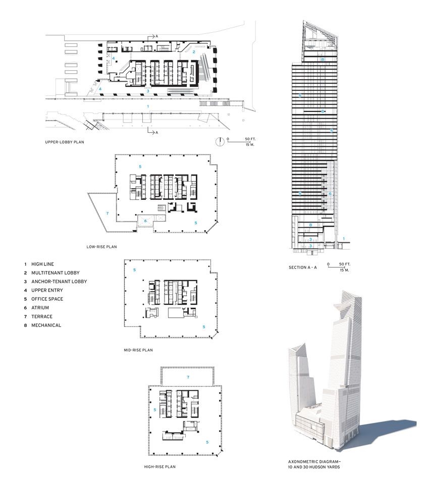
The entirety of this skyline gesture will not be evident until 30 Hudson Yards finishes construction and the rest of the development emerges, sometime in the 2020s. With a master plan by KPF, the neighborhood—larger than Rockefeller Center—will include 14 residential and commercial skyscrapers, by Skidmore, Owings & Merrill and Foster + Partners, among others, as well as parkland designed by such landscape architects as Michael Van Valkenburgh Associates. But No. 10’s impact on the multilevel site and its surroundings is already apparent. At its southeast corner, a lobby is tucked under the north end of the High Line elevated park. The space houses three banks of escalators, one of which leads to an individual lobby for the apparel brand Coach, the building’s anchor tenant, while the other two lead to a shared lobby for the additional tenants, including L’Oreal and the technology company SAP. The Coach lobby is lined with pale wood paneling, while the shared-lobby walls are clad in textured cast-aluminum panels, which KPF chose to allude to the area’s industrial past. Stretching along 30th Street under the High Line, a new food hall will activate the street below.

HANDBAG HEAVEN
The building has a dedicated lobby for its anchor tenant, Coach, which features a giant vitrine displaying vintage leather goods (left). A shared lobby for the other tenants (right) has walls clad in textured aluminum panels.
At the High Line level, two stories above grade, park visitors will be able to walk seamlessly onto a new plaza, designed by Nelson Byrd Woltz Landscape Architects. The Coach lobby is flanked by the plaza entrance to the east and Diller Scofidio + Renfro and Rockwell Group’s multidisciplinary arts venue, the Shed, rising to the west (RECORD, October 2016, page 119). A pair of giant legs, clad in translucent gray glass, supports the building over “the spur,” a branch of the High Line not yet opened to the public. From here, you can see the vast Coach lobby, with a huge electronic billboard of Coach ads and a multistory vitrine showcasing vintage handbags.
At 1.8 million square feet, 10 Hudson Yards packs a lot of rentable space into 52 stories (the structure rises to 54 stories, including mechanical floors). Though the building appears quite bulky from 10th Avenue, it is more modulated when viewed from the High Line and the new plaza. Several different facade treatments and setbacks break up the bulk and subtly define different tenant zones within the building. The lower level features a “shingled” facade of layered and angled glass panels, the result of a collaboration with Reed Krakoff, former creative director of Coach, according to Marianne Kwok, a director at KPF. “He felt it was a very American design idea, the notion of the shingle,” she says. “He thought it fit very well with the Coach brand.”
Inside the building, a 15-story atrium in the Coach offices looks out over the plaza and provides floor-to-floor connections. Informal meeting areas and double-height conference rooms are inserted within the atrium, animating the space throughout the day (Studios Architecture designed the office interiors). On the 23rd floor, an outdoor terrace tops the setback.
The building’s all-concrete structure, rather than the typical concrete and steel for New York office buildings, shortened the construction schedule, according to Kwok. This extended the time KPF could work on design, allowing elements like two more sky terraces to be added to the upper setbacks in response to tenant feedback. “It’s a spec building that feels like a building that was custom-designed for its tenants,” Kwok says.

INSIDE OUT
Within Coach’s portion of the building, a 15-story atrium (left) provides visual connections between floors and affords views over the High Line (right) through a large, glazed cable wall set into a “shingled” portion of the facade.
Ten Hudson Yards is 100 percent leased, and Pedersen and Kwok believe the entire development is drawing strong interest from tenants (CNN and HBO are among those that have already signed to move into No. 30) because of the location, open space, and mix of uses. “People want access to parks, to dining and shopping, as well as hotels and residences. Hudson Yards will have all of that.”
Looking out from the upper floors of 10 Hudson Yards, it is easy to understand their vision. “We are stitching the city together with the river,” Pedersen says. It’s a grand urban gesture, to say the least.
Alan G. Brake is the editor of Oculus and a columnist for Dezeen.
Credits
Architect: Kohn Pedersen Fox Associates — William Pedersen, Paul Katz, Anthony Mosellie, Marianne Kwok, Mark Townsend, Robert Scymanski, Justin Whiteford, Gregory Mell, Terri Lee, Joe Michael, Devon Loweth, Heather Ross, Andrew Werner, Sameer Kumar, John Oliver, Courtney Higgins, Christina Ladd, Josh Treiber, Keith Johns, Steve Wang, Frank Lindemann, Russell Patterson, Sonal Patel
Coach Interiors Architect: Studios Architecture
Consultants: Thornton Tomasetti (structure); JB&B (m/e/p); Philip Habib and Associates (civil); Nelson Byrd Woltz (landscape); L’Observatoire International (lighting)
Construction Manager: Tutor Perini
Client: Related Companies
Size: 1.8 million square feet
Cost: withheld
Completion Date: May 2016
Sources
Curtain Wall: Enclos
Cable Wall: W&W Glass
Glass: Interpane, Viracon
Storefront: Coordinated Metals
Exterior Stone: Port Morris
Exterior Metal Panels: M. Cohen and Sons
Cast Aluminum Panels: UAP
Stone Floor: Wilkstone
Up and Coming
These eight towers around the world, some in planning and others approaching completion, project ambition in scale and form.
By Miriam Sitz

