This CE Center article is no longer eligible for receiving credits.
View course on architecturalrecord.com »
Most architects of tall buildings will admit that height for height’s sake is an empty pursuit: there is so much more involved than garnering a spot in the record books. The towers on the following pages bear this out. They make their mark with inventive facades, innovative structural systems, and new strategies for defining public space—and they still meet the sky in graceful ways.
PHOTOGRAPHY: © JASON O'REAR
SalesForce Tower, San Francisco,
Pelli Clarke Pelli Architects
Urban Jungle
A lush garden at the center of a mixed-use complex provides respite from the heat for occupants and the public.
By Alexandra A. Seno
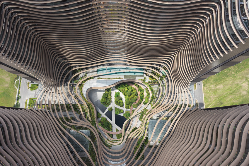
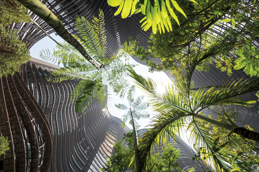
The public space in the middle of Singapore’s recently completed Marina One complex provides genuine respite. Above the district of concrete-and-glass towers, the noonday sun beats down relentlessly. But even though temperatures in this tropical city regularly tip to over 90 degrees Fahrenheit and humidity often hits 95 percent, it is a refreshing experience to walk through the center of this new development. Here wood and stone paths are surrounded by lush plants and trees that sway gently in an unexpected breeze.
ALL PHOTOGRAPHY BY HG ESCH
GREEN OASIS
Tropical gardens, atop a podium and on several levels, are the centerpiece of Marina One, an apartment and office-building complex in Singapore.
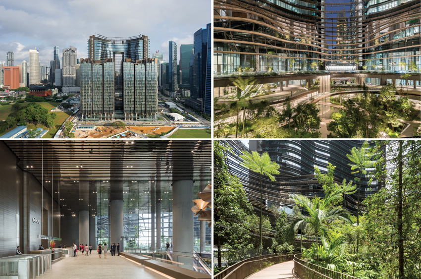
Marina One, which opened at the end of last year, is built on four lots of reclaimed land totaling 6.5 acres in Marina Bay, the city-state’s expansion of it business district. The 4.3 million-square-foot complex has two 750-foot-tall 30-story office towers and two 475-foot-tall 34-story residential towers, linked on the lower levels with a podium that hosts the gardens and encloses dining and retail outlets. The assemblage sits atop underground passages with direct access to four of the city’s six metro lines.
The ambitious mixed-use center emerged out of a partnership between the state-owned investment funds of Malaysia and Singapore. In 2011, the entity named Dusseldorf, Germany–based Ingenhoven Architects the winner of an international competition. One typical approach to maximize the built volume would be to create a cube approximately 650 feet on each side and 650 feet tall. But “temperature and humidity would be working against the human condition” with such an arrangement, explains the firm’s founder, Christoph Ingenhoven. So, instead, he and his team created an ensemble clad in glass and bronze-hued metal and supported by reinforced-concrete or steel structures, carving it—and curving it—to define 398,000 square feet of gardens. This greenery is more than decorative. It contributes to the comfortable microclimate at the base of the complex, and is accessible to all, not just the center’s tenants and residents. “We have created an oasis,” says Olaf Kluge, director of the local Ingenhoven office.
DESIRABLE DENSITY
Thousands of people will eventually live and work in Marina One’s four towers (top left)—a pair each for residential units and for offices. The gardens at the center of the complex (top right and bottom right) include a network of ramps and pathways that link the buildings. The reflective material on the ceiling of the office lobby (bottom left) helps bring these gardens inside.
One advantage of designing this kind of environment for Singapore is the year-round growing season, points out Kathryn Gustafson, founder of Gustafson Porter + Bowman (GP+B). The London-based landscape architecture firm, which is separate from Gustafson’s Seattle-based practice, developed the gardens in partnership with local ICN Design International. Still, a prime concern was selecting bushes and shrubs that would thrive even under the shade of trees and the buildings’ long shadows. But such practicalities weren’t Gustafson’s only interest. “It’s about the leaf,” she says. “Texture, size, and color are important.” Toward that end, the two firms selected 350 varieties of tropical plants.
Although the buildings’ street-facing elevations are rectilinear and almost conventional, from within the green heart, the towers are much more organic. The facades appear to undulate, an effect that is enhanced by curving metal louvers—which help shade both the gardens and the glazing—and by the floor plates of the office blocks. These increase in size in the upper levels of the buildings, achieved by canting the garden-facing support columns.
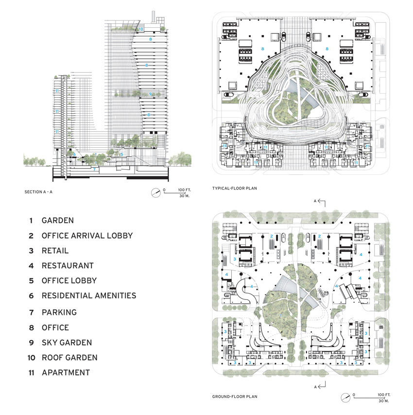
Within each of the office towers, the designers created nearly 1.9 million square feet of unobstructed rentable space by limiting the columns so that they are mainly on the buildings’ perimeters. In addition, they placed the elevators to the upper floors within their own silos, at the buildings’ corners. The configuration allowed for glass-enclosed capsules facing Straits View, the boulevard that hosts the complex’s main entrance. So far, space has been leased by firms that include Facebook and the banks Julius Baer and Mitsubishi UFJ Financial Group.
The residential towers have four penthouses with features like oversize terraces with their own swimming pools. However, the vast majority of the more than 1,000 condominium apartments are smaller one- to four-bedroom units. But though these are more modest, all have balconies, many with views of the gardens or of the rapidly developing neighborhood, including its many construction sites, Moshe Safdie’s nearby Marina Bay Sands Hotel, and the soon-to-be-relocated container port.
CONTOURS AND CURVES
Ribbonlike metal louvers, which shade the buildings’ glazing and the central green space, help make the garden-facing facades appear to undulate.
Marina One is rational without being conventional—daring and quirky while very functional for the more than 20,000 people who will eventually live and work there. But, above all, it aims to enhance not only the well-being of its occupants, but that of anyone in the area, welcome to enjoy its serene and verdant gardens. “It is a very high-density development,” explains Ingenhoven. “If you do density like that, you also need to be generous.”
Alexandra A. Seno is a Hong Kong–based architecture and design critic who has written for The Wall Street Journal and The New York Times, among other publications.
Credits
ARCHITECT: Ingenhoven Architects — Christoph Ingenhoven, principal; Martin Reuter, Olaf Kluge, directors
ASSOCIATE ARCHITECT: architects61
CONSULTANTS: Beca Carter Holdings & Ferner (structure, m/e/p, fire); Langdon & Seah (quantity surveyor); Gustafson Porter + Bowman, ICN Design International (landscape); Arup (facade, lighting, vertical transport); Axis ID (residential interiors)
GENERAL CONTRACTOR: Hyundai-GS Joint Venture
CLIENT: M+S Pte.
SIZE: 4.3 million square feet
CONSTRUTION COST: $1.35 billion
COMPLETION DATE: November 2017
Sources
SOFFITS: Alucobond
PODIUM CURTAIN WALL: Meso ASia Pacific
TOWER CURTAIN WALL: Yuanda Curtain Wall
CEILINGS: Sunray Woodcraft Construction
GLASS: China Specialty Glass
Sky Shaper
The tallest office building west of the Mississippi gives the city by the bay a sleek new landmark.
By Joann Gonchar, FAIA
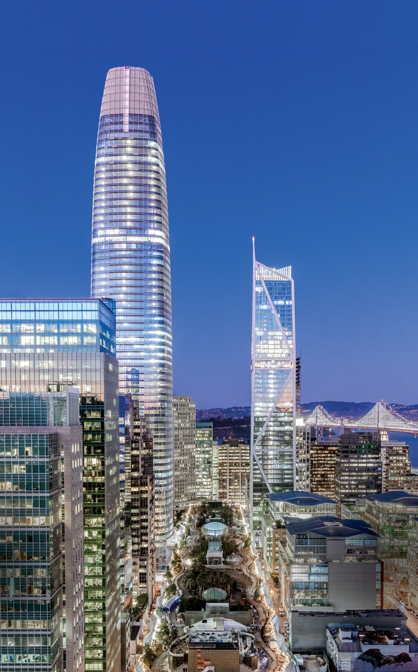
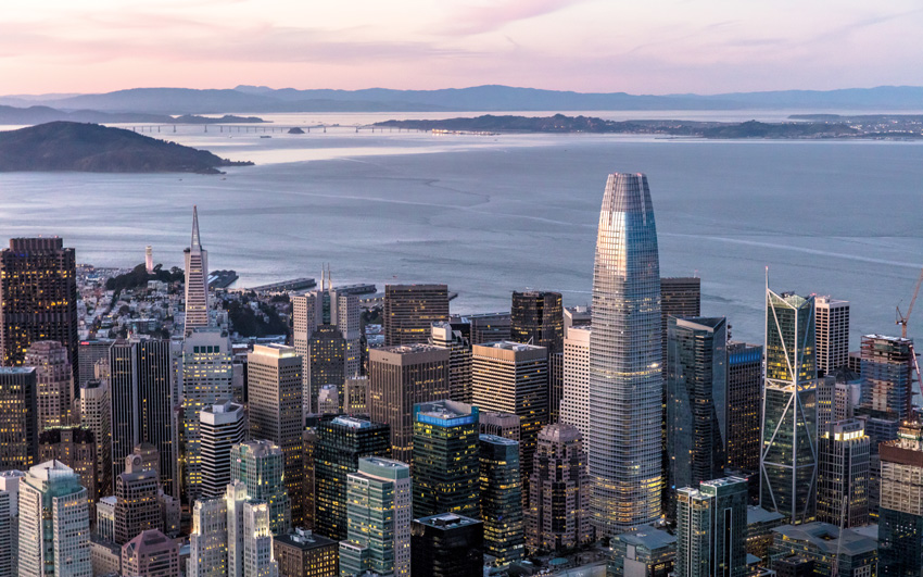
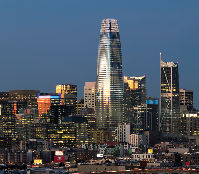
The Salesforce Tower has been an undeniable presence on San Francisco’s skyline for some time—since long before the spring of 2017, when it topped out. But now, with the completion of the 61-story, 1,070-foot-tall skyscraper earlier this year, the Pelli Clarke Pelli Architects–designed project has officially earned the titles of the city’s tallest structure and the tallest office building west of the Mississippi.
PHOTOGRAPHY: © JASON O’REAR
TAPERED FIT
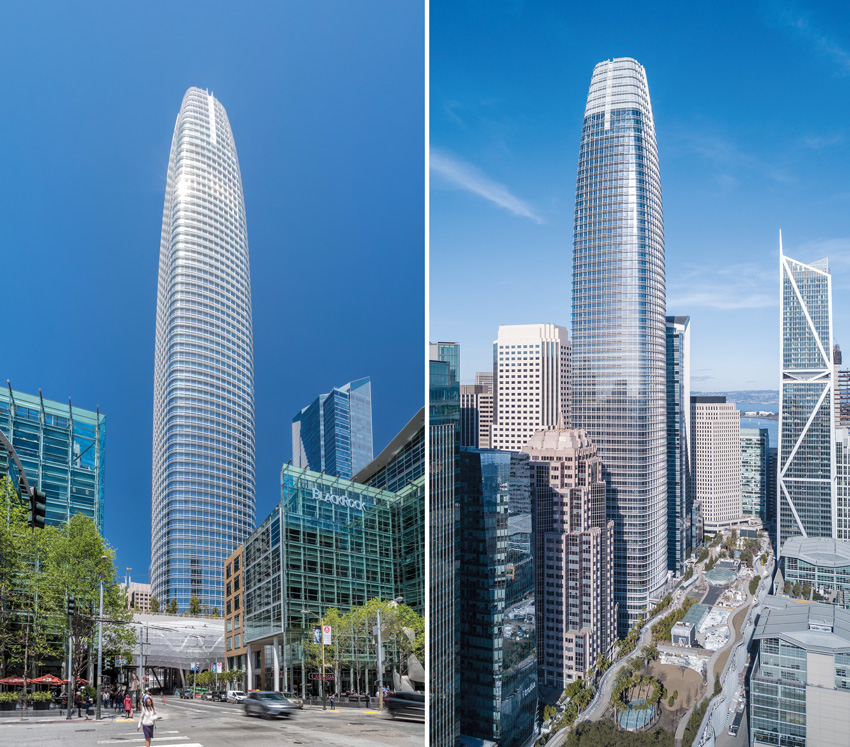
The Salesforce Tower surpasses the height of the city's next-tallest building, the Transamerica Pyramid (far left) by more than 200 feet.
Of course, critics have decried the Salesforce Tower as the inappropriate Manhattanization of San Francisco. But though it is big (it encloses 1.4 million square feet) and is highly visible, it doesn’t loom. Square in plan, with rounded corners, the top third of the obelisk softly tapers. And while it might seem at first glance to be just another glass-clad tower that could have been built anywhere, it has features that make it a fitting symbol of this rapidly changing city and its startup economy, including a 150-foot-tall perforated-metal screen at the pinnacle: by day it helps the building’s top dissolve into the sky and conceals unsightly mechanical equipment, but at night, the scrim transforms into a giant canvas for an installation by local LED artist Jim Campbell.
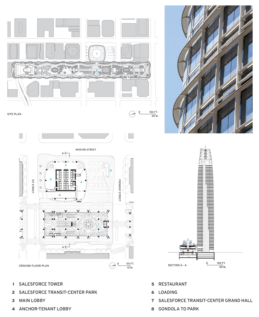
Surpassing San Francisco’s former record holder, the 1972 Transamerica Pyramid, by more than 200 feet, the Salesforce Tower is nearly impossible to miss from almost any spot in San Francisco and beyond. But, at one point, it was not clear if the project—whose gestation period ended up being more than 10 years—would even get off the ground. In 2007, the developer Hines and architects Pelli Clarke Pelli won a competition with their proposal for the skyscraper and an adjacent transit hub, with a 5.4-acre public park on top designed by PWP Landscape Architecture. The two buildings, then known as the Transbay Tower and the Transbay Terminal, were conceived as the centerpieces of a much larger redevelopment zone at the edge of the city’s financial district, made possible in part by the demolition of an elevated freeway damaged in the 1989 Loma Prieta earthquake.
But the Great Recession that hit in late 2008 put the brakes on the tower’s construction. Ground wasn’t broken until 2013, after Boston Properties became the lead developer, assuming a 95 percent stake in the project. Later, the cloud-computing company Salesforce would acquire the naming rights for the skyscraper, with a lease for what would eventually total 900,000 square feet, including the two top floors. Subsequently, the company would also put its name on the transit center and the rooftop park, which are slated to open next month.
PHOTOGRAPHY: © TIM GRIFFITH (RIGHT); JASON O’REAR (LEFT)
UP ON THE ROOF
The tower was conceived together with a transit hub topped by a 5.4-acre public park (right). The four-block-long transit station’s bus deck bridges over several streets and is enclosed in a lacelike skin (left, bottom of image).
In the post-crash economic climate, the design team naturally faced pressure to be exceedingly practical. However, Fred Clarke, senior principal at Pelli Clarke Pelli, claims that no design sacrifices were made. He points to refinements like the rounded-glass corners, which consist of curved insulated glass panels rather than being assembled from faceted flat panes. And he calls out the exterior aluminum sunshades. The gridded system sits proud of the glass skin, adding texture and depth. Its white epoxy coating contains mica to make the most of the quality of light that is particular to San Francisco.
Still, there were some challenging developer demands, including a directive that there be no elements that would interfere with the tower’s dramatic views or that would hinder office layouts. For the structural engineer, Magnusson Klemencic Associates, this meant that the building could not rely on the typical seismic systems generally found in skyscrapers in earthquake-prone San Francisco. “There could be no perimeter braces, no outrigger trusses, no belt trusses,” says Ron Klemencic, chairman and CEO of the Seattle-based firm. Instead, the lateral system is confined to the 85-foot-square reinforced-concrete core with walls that are 4 feet thick at the base. Perimeter columns take only the gravity loads. There are three of these per face, placed about 40 feet apart, and none at the all-important curved corners or within the interior of the 25,000-square-foot floor plates. But even without a readily apparent seismic system, the tower is designed to sway 25 percent less in a quake than a more conventional one, says Klemencic.
PHOTOGRAPHY: © JASON O’REAR (LEFT); VITTORIA ZUPICICH (RIGHT)
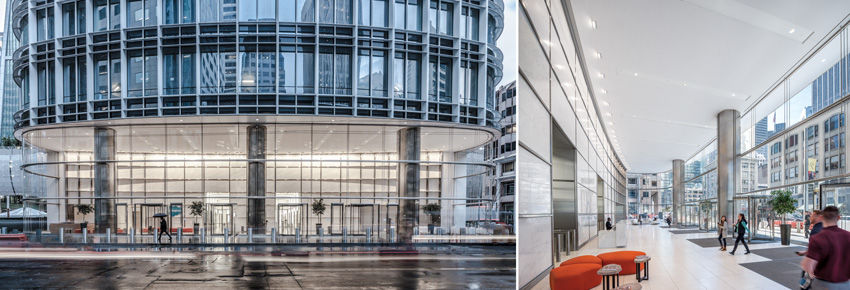
MAKING AN ENTRANCE
At the ground, the highly transparent façade, supported by a system of horizontal trusses and cable nets, puts the marble-and-chrome lobby on display.
PHOTOGRAPHY: COURTESY PELLI CLARKE PELLI ARCHITECTS
Above street level, the building’s aluminum sunshade grid, which sits proud of the skin, adds texture and depth.
This “quiet” but robust superstructure sits on a mat foundation with piles that extend more than 300 feet to bedrock. The team made the decision to go that deep at the outset of the project, when the sinking and listing of nearby Millennium Tower was known in construction circles, but before it had been widely publicized. The condominium building’s piles only go down about 70 feet, to the Colma clay layer.
But arguably more notable than the depth of the Salesforce Tower foundations, or the seemingly straightforward configuration of its superstructure, is the process used to engineer them—a methodology known as performance-based seismic design (PBSD). Under this alternative to code-prescribed techniques, designers and owners can develop an enhanced level of earthquake performance and devise a scheme tailored to that outcome. Because PBSD depends on sophisticated computer-modeling techniques, engineers are able to “interrogate and analyze” the structure to determine the response of the building to ground motion and then “fine-tune and allocate strength where it is needed,” says Klemencic. Salesforce Tower provides an enhanced level of protection, beyond what is mandated by code for buildings with more than 5,000 occupants.
PHOTOGRAPHY: © TIM GRIFFITH
LIGHT SHOW
The scrim at the tower’s pinnacle becomes a canvas at night for an LED installation by artist Jim Campbell.
PHOTOGRAPHY: COURTESY SALESFORCE
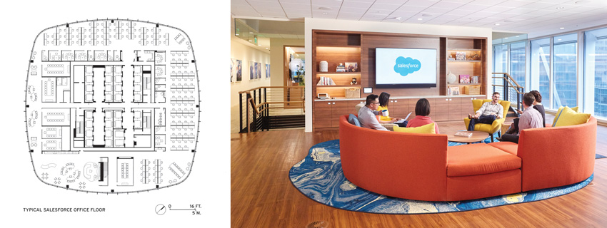
The office floors for Salesforce employees (left) are non-hierarchical, without private offices. Spaces for informal collaboration include a loungelike area with sofas and upholstered chairs (right).
This advanced engineering will only be tested in an extreme event, of course. But other building systems will have an effect on occupants’ day-to-day well-being. Clarke touts the energy-conserving air-conditioning system. It takes advantage of outdoor air and San Francisco’s mild climate to provide “free cooling” when conditions are right. In conjunction with raised floor distribution, the system should improve indoor air quality and thermal comfort. It is one of many features that have helped the tower’s core and shell garner a LEED Platinum certification.
The Salesforce offices are also on track to earn their own Platinum rating. Mark Cavagnero Associates (MCA), working with Interior Architects, has designed the Salesforce floors, creating a non-hierarchical environment intended to encourage teamwork. The scheme includes “neighborhoods,” each comprising three floors connected with a communicating stair. Instead of private offices, the workplace has unassigned, open desks. In addition to conference rooms enclosed almost entirely in glass, there are spaces for less formal collaboration and socializing, including a kitchenette and a loungelike area with sofas and upholstered chairs. These more relaxed spaces occupy the prime part of each floor plate—the side that overlooks the park atop the transit center. “Marc wanted the best views and best light to be shared,” says MCA’s founding partner, Mark Cavagnero, referring to Salesforce CEO Marc Benioff.
Benioff’s workplace-as-community philosophy extends to the building’s top floor, which has dramatic views of the Golden Gate Bridge, Coit Tower, and the piers along the Embarcadero. There Cavagnero is creating a gathering and event space with a large kitchen and a café, rather than executive offices, as one might expect. The facility is envisioned as a “living room” of which customers, employees, their families, and even the public could take advantage.
This floor is still under construction, so it is too soon to know just how accessible this space will be to non-Salesforce employees. But in many respects, the tower is already proving a success. Its leasing is virtually complete—with tenants that include coworking giant WeWork, consulting firm Accenture, and real-estate brokerage CBRE—but its impact is even further-reaching. The tower has refocused the energy of downtown with a sophisticated new skyline topper emblematic of the future.
Credits
ARCHITECT: Pelli Clarke Pelli — Cesar Pelli, Fred Clarke, Edward Dionne, Chris Herring, IIeana Dumitriu, project team
ARCHITECT OF RECORD: Kendall-Heaton Associates
CONSULTANTS: Magnusson Klemencic Associates (structural); WSP Group (m/e/p); BKF Engineers (civil); Arup (geotechnical); Morrison Hershfield (curtain wall); Stok (environmental); HLB Lighting Design (lighting); PWP Landscape Architecture, RHAA (landscape)
GENERAL CONTRACTOR: Clark Hathaway Dinwiddie Joint Venture
CLIENT: Boston Properties, Inc., Hines Interests Limited Partnership
SIZE: 1.4 million square feet
CONSTRUTION COST: withheld
COMPLETION DATE: May 2018
Sources
CURTAIN WALL: Benson Industries
GLAZING: Guardian Industries
LOBBY STONE: Campolonghi
LIGHTING: Lithonia Lighting, LaMar Lighting, Luna, Birchwood, Gotham, Selux, Lumenpulse, Boca Flasher, Lucifer, Elliptipar, USAI, AION LED, Finelite, AXIS
Pleats Please
A folded curtain wall on an office building saves energy while throwing a few curves.
By Clifford A. Pearson
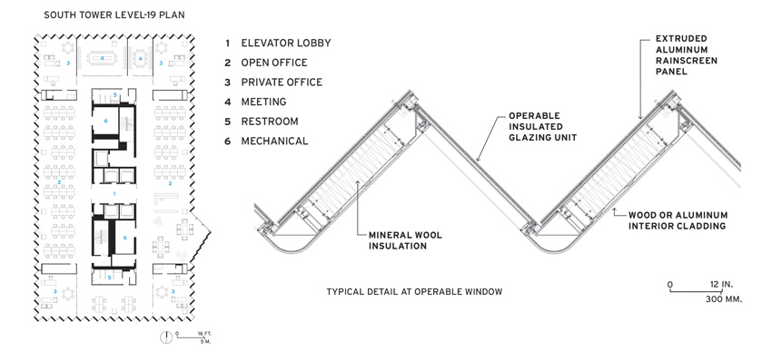
For much of the industrial age, factory roofs with sawtooth clerestories brought steady north daylight into spaces where workers toiled at assembly lines and production tables. For today’s office workers, the Bjarke Ingels Group (BIG) flipped this model on its side, wrapping the facades of the Shenzhen International Energy Mansion with a zigzagging curtain wall made of alternating panels of glass and powder-coated (PVDF) aluminum. Like its industrial predecessor, the 21st-century wall system blocks a great deal of direct sunlight, reducing solar loads by 30 percent, according to the architects. BIG then took the concept one step further, pulling on the vertical folds in certain places, so they form supple curves that animate the elevations in surprising ways.
PHOTOGRAPHY: © LAURIAN GHINITOIU
PUSHING THE ENVELOPE
On the west facade of the 42-story tower, a bulging slit brings in extra daylight to conference rooms inside.
Located in Shenzhen’s central business district, not far from the Futian border crossing with Hong Kong, the 1 million-square-foot complex contains a pair of office towers and a nine-story connecting block with shared facilities such as a cafeteria, conference spaces, and retail. The top 13 floors of the 42-story north tower serve as the headquarters for the Shenzhen Energy Company; the rest of that building and all of the 19-story south tower will be leased to other tenants. While the Energy Mansion is surrounded by much taller buildings, including KPF’s 115-story Ping An International Finance Center, completed in 2017, it uses its curvaceous lines to stand out in the crowd.
PHOTOGRAPHY: © LAURIAN GHINITOIU
PUSHING THE ENVELOPE
The 19-story tower sits on the south end of the site.
BIG won the project in an invited competition in 2009 just as it was designing the Danish Pavilion at the 2010 World Expo in Shanghai. The theme for that Expo was “Better City, Better Life,” and the firm explored notions of “hedonistic sustainability” for its pavilion, says Bjarke Ingels, the firm’s founding partner. Many of those ideas, such as making green design beautiful and visually pleasurable, informed his work on the Energy Mansion too, as he tried to adapt modern architecture to the subtropical climate of Shenzhen. Updating the wisdom of vernacular design and collaborating with the firm Transsolar on sustainability issues, Ingels wondered if he and his team could develop “engineering without engines.” So they developed passive solar strategies such as using one tower to shade the other and designing a skin that would reduce solar loads and glare without expensive mechanical equipment. “As architects used to do, we put the performance of the building in its bones, not the machines added to it,” explains Ingels.
PHOTOGRAPHY: © CHAOS ZHANG (LEFT); LAURIAN GHINITOIU (RIGHT)
SCULPTED MASS
The architects sliced away some of the corners, eliminating the sawtooth facade there and introducing subtle curves to the rest of the building envelope (left). The two towers stand out without screaming for attention (right).
They ended up designing a curtain wall with tall, double-glazed panes of low-E tempered glass angled at 45 degrees in plan, so the clear portions face northwest on the west side of the building and northeast on the east side—always blocking out the stronger southeast and southwest sun with the rippled aluminum panels. Originally, the architects hoped to use solar-thermal panels that would power air-conditioning and dehumidification, but that proved too expensive.
After they established their design, the architects learned that Eero Saarinen had used a similar sawtooth curtain wall for his Laird Bell Law Quadrangle at the University of Chicago in 1959, a discovery that pleased them, says Ingels: “I’ve always admired Saarinen.” More recently, SOM designed a zigzagging glass envelope for its United States Courthouse in downtown Los Angeles (RECORD, March 2017).
The other ingenious aspect of the Energy Mansion is the way its folded facades get twisted into pleats at critical places—such as pedestrian entries at the northeast and southwest corners—and pulled out into a bulging slit on the upper portion of the west facade of the taller tower. These moves result in a graceful dynamism that becomes more apparent the closer you get. “We were inspired by the way Issey Miyake uses pleats in his clothes,” says Ingels.
PHOTOGRAPHY: © CHAOS ZHANG
MATERIAL MATTERS
For the public interiors, BIG used a palette of natural and industrial surfaces, including black stainless steel (bottom left), bamboo veneer (top), and white marble flooring (bottom right).
Visitors arriving by car enter the steel-frame building at the low connecting block between the two towers, where a three-story lobby features white marble floors and walls clad in anodized aluminum and black stainless steel. Bamboo veneer on the angled fins of the building’s sawtooth perimeter and a cascading sheet of water on one wall add touches of nature to the interior. On the energy company’s office floors, low cubicles occupy the areas in the middle, while casual tables and chairs fill in the spaces along the curtain wall. The company is still trying to figure out how to use the extra space on floors where the building bulges out. Currently these areas are furnished sparsely with random chairs, while adjacent meeting rooms face them to take advantage of daylight coming in from the vertical slit.
Due to a strict zoning envelope and a tight budget, “we focused our efforts on what we had the most control over—the facades,” says Ingels. These elevations, with their pleated wrapping, perform double duty—giving the project its distinctive identity and showing how sustainability can be sexy.
Clifford Pearson was an editor at Architectural Record for over 25 years. Now with the University of Southern California, he serves as a contributing editor at the magazine.
Credits
ARCHITECT: Bjarke Ingels Group (BIG) — Bjarke Ingels, Andreas Klok Pedersen, partners in charge; Martin Voelkle, project manager; Andre Schmidt, Song He, project leaders; Cat Huang, concept project leader
ASSOCIATE ARCHITECTS: SADI Shenzhen Architecture and Design
Institute
INTERIOR DESIGNERS: BIG, SADI
ENGINEER: Arup
GENERAL CONTRACTOR: CSCEC
CLIENT: Shenzhen Energy Company
SIZE: 1 million square feet
CONSTRUTION COST: withheld
COMPLETION DATE: June 2018
Sources
METAL PANELS: Xiangfa Aluminum
OPERABLE WINDOWS: Aumüller
GLASS: SYP Group
ENTRANCES: Dorma
ACOUSTICAL CEILINGS: Armstrong
CARPET: Haima Carpet
ELEVATORS/ESCALATORS: Kone
A Dash of Local Color
An unusual golden skin makes a tower stand out amid a forest of anonymous high-rises.
By Jeremy Hanson
Sydney’s central business district is studded with skyscrapers by international architecture firms, including Renzo Piano Building Workshop’s Aurora Place (2000), Foster + Partners’ Deutsche Bank Place (2005), and Rogers Stirk Harbour + Partners’ 8 Chifley (2013). The work of these big guns from abroad is so pervasive that it’s almost unusual to see a high-rise development led by Australian architects.
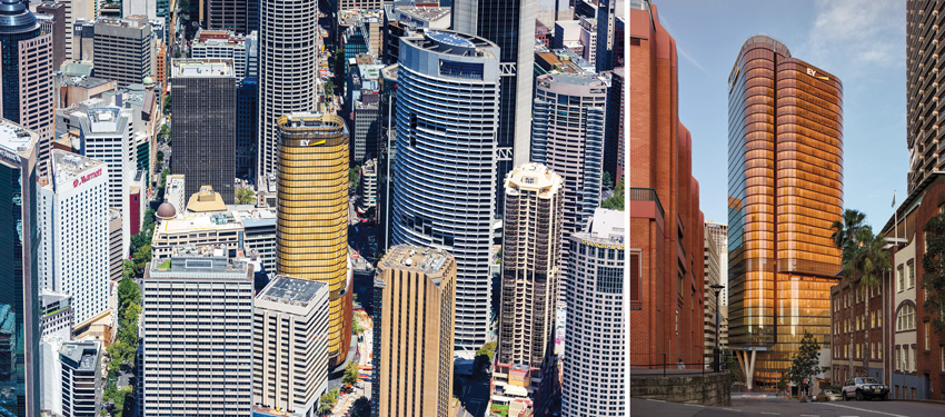
PHOTOGRAPHY: © MARK MERTON (LEFT); RODRIGO VARGAS (RIGHT)
ALL AGLOW
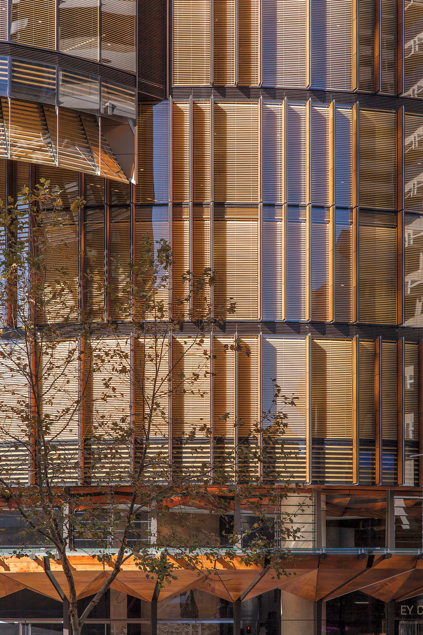
Sydney’s EY Centre by fjmt features an Australian first: a cavity curtain wall system enclosing timber blinds. These shade the interior and take on a golden glow in the sun, making the building stand out from its neighbors.
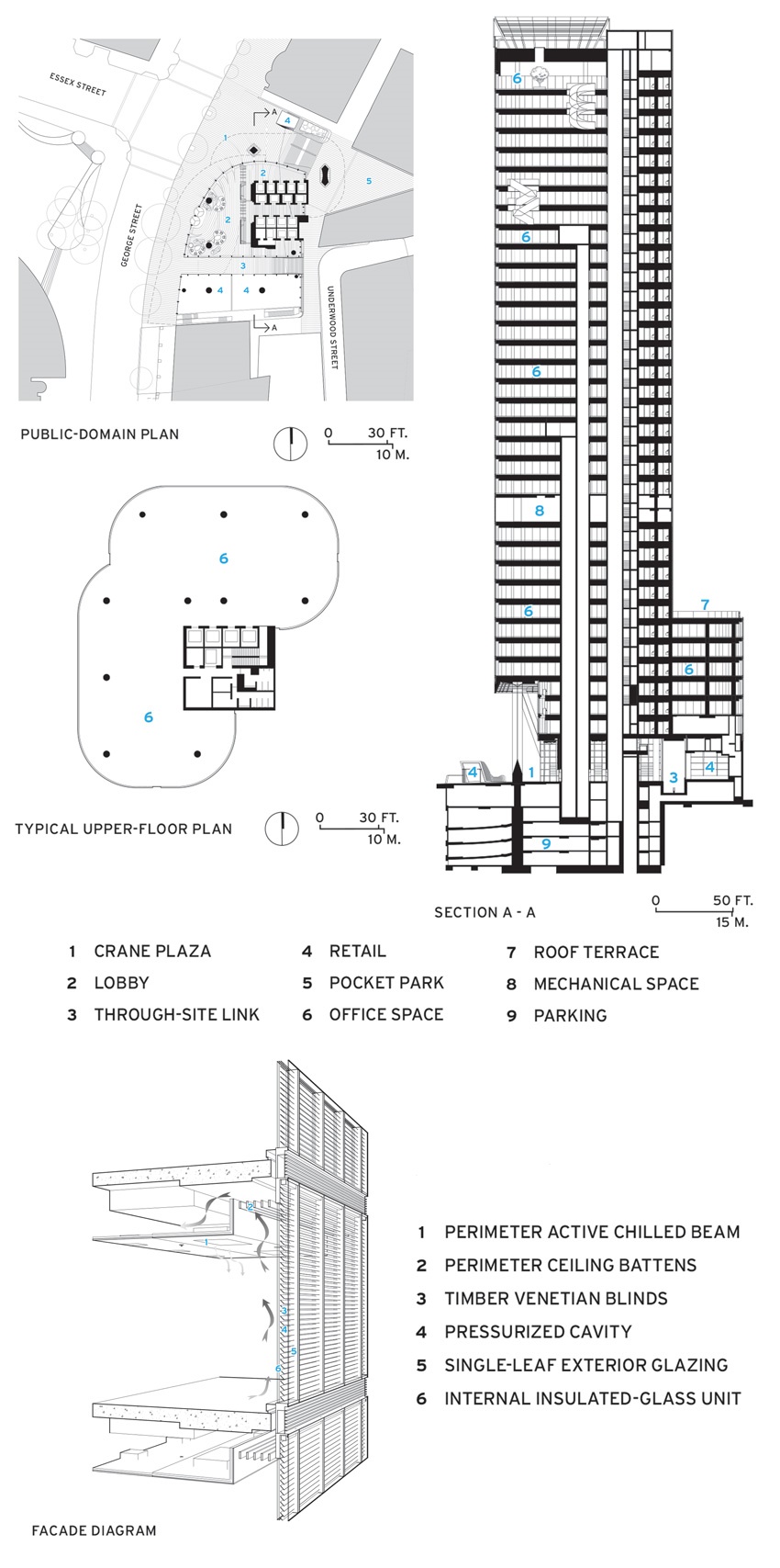
Not far from Sydney Cove, the compact bay that connects Jørn Utzon’s Opera House and the Harbour Bridge, a new building by Sydney-based fjmt has been designed to show the strength of going local, not global. Fjmt’s design director, Richard Francis-Jones—whose studio won the World Architecture Festival’s World Building of the Year in 2013 for its work on the Auckland Art Gallery—predicated his firm’s competition-winning scheme on demonstrating a rich Australian sense of place, a counterpoint to the bland globalized homogeneity of glass-and-steel office towers. The EY Centre isn’t the tallest building in the district—its height was limited by a requirement for sunlight access for a nearby square. But in a downtown dominated by high-rise buildings of cool gray stone and dark glass, fjmt’s 37-floor, 509-foot-tall building is a surprising shot of warmth: a curvaceous, organic form lined top-to-bottom with timber blinds that glow golden in the bright Australian sunlight from behind a single pane of clear, low-iron glass.
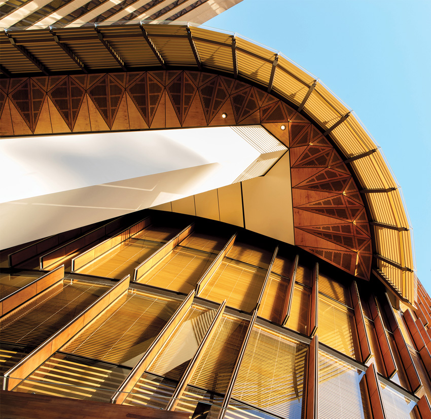
The EY Centre’s sleek assembly of two intersecting vertical and rectangular volumes, with curved edges and a four-story podium, occupies a site on George Street, one of the city’s most important boulevards. It features a brass strip that runs across the ground floor and a new plaza to mark the 1780 shoreline of Sydney Harbour. The indigenous Gadigal clan and Australia’s first colonial settlers used the now-buried Tank Stream that once ran beside the site as a freshwater source; the shoreline was fringed with eucalyptus trees, the inspiration behind the marine ply panels on the podium’s vertical fins, street awning, and lobby ceiling.
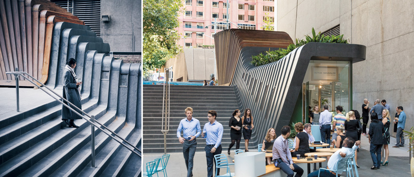
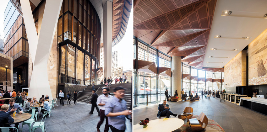
Francis-Jones was determined that the building would look and feel distinctive, and that it would be a good citizen of the city. “Towers usually just crush their sites through sheer scale,” he says. Instead of gobbling its site at ground level, the EY Centre’s podium peels away to create the new plaza. From there, steps emulating the original contour of the land lead down to an intimate courtyard with a slim, curvaceous kiosk and a series of laneways previously inaccessible from this part of George Street. Elegant white steel-and-concrete V-columns support the part of the tower that overhangs the plaza, providing shade from the scorching summer sun.
PHOTOGRAPHY: © BRETT BOARDMAN, EXCEPT AS NOTED; JOHN GOLLING (TOP RIGHT)
CURB APPEAL
The podium peels away to create two courtyards linked by stairs and a curvaceous kiosk (top, left and right). While steel-and-concrete V-columns (bottom left) support the tower overhead. In the lobby (bottom right), a work by indigenous artist Judy Watson is incised on sandstone quarried from the site. The chairs are by Australian designer Brodie Neill.
Visitors to Sydney will be familiar with the honeyed hues of the sandstone, known as Yellow Block, used in the construction of many of the city’s stately Victorian buildings. At the EY Centre, sandstone was quarried from the site during excavation and now clads the elevator core, creating the impression that the building’s reinforced-concrete structure has actually been fashioned from the stone below. In the lobby, this sandstone is the basis of a dramatic 3,200-square-foot artwork by indigenous artist Judy Watson. Other buildings on George Street have grand artworks in their lobbies by Sol LeWitt and Frank Stella; it seems fitting that this building, in its aspirations to create a truly Australian sense of place, puts an indigenous Australian woman artist on an equal footing with these American men.
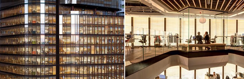
For all this generosity at ground level, it is what happens upstairs that is the building’s real talking point. Some people who have not been inside have asked why anyone would cover the spectacular view of the Sydney Harbour Bridge and Opera House with blinds, but the blinds are controlled by an algorithm and are only closed for part of the day. When the sun is shining from the west, the blinds to the east and south are usually open, so that there is always a vista of somewhere (the building’s offset core means that even the bathrooms have windows with views). When the blinds are closed, plenty of daylight still gets in, and the occupants see the timber screen suffused with a golden glow.
OPEN AND SHUT
The timber blinds are controlled by an algorithm and are fully open later in the day (left). When the blinds are closed, the interiors are suffused with a warm light (right).
The closed-cavity facade and timber blind system is an Australian first that required extensive research and development. The exterior of the building is comprised of a single sheet of clear low-iron glass in front of a sealed, dust-free pressurized cavity containing the timber blinds (the cavity’s edges are also lined with wood). Behind this is a layer of double-glazed high-performing insulated glass. The cavity containing the blinds heats up in the summer sun, but excess heat is emitted straight back through the single exterior pane, and the double-glazed pane is never in direct sunlight.
PHOTOGRAPHY: © BRETT BOARDMAN
OPEN AND SHUT
The use of wood also extends to the exterior, including the soffit where the tower extends beyond the podium.
PHOTOGRAPHY: © BRETT BOARDMAN
The facade system has a solar heat gain coefficient of 0.11, making its thermal performance 35 percent better than that of a more standard curtain wall assembly. The sophisticated skin works in conjunction with such features as hybrid chilled beams, an all-LED lighting scheme, and an advanced energy-monitoring system to earn the EY Centre six stars under Australia’s green building certification program—the highest rating possible.
PHOTOGRAPHY: © BRETT BOARDMAN
WOOD WORKS
The building’s awning features an intricate arrangement of marine-grade plywood, while vertical fins clad in timber project from the four-story podium.
The building’s developer and builder, Mirvac, moved its head office to the EY Centre after completion in 2016 (other occupants include EY, a business consultancy and the primary tenant, and AGL, an electricity and gas company). Since then, Mirvac has been surveying the satisfaction of its employees. Staff have reported a 50 percent increase in their sense of “spatial comfort,” a particularly impressive response given that the old headquarters had 129 square feet of space per person; there are only 86 square feet of space per person in the EY Centre. Most gratifying for the architects, the staff’s sense of connection to the outdoor environment has increased 41 percent, making it that much harder to mistake the EY Centre for a product of any other place.
Jeremy Hansen is an architecture writer based in Auckland, New Zealand.
Credits
ARCHITECT: fjmt (Francis-Jones Morehen Thorp) — Richard Francis-Jones, Johnathan Redman, Soenke Dethlefsen, Peter Dawson, Steven Wu, Natalie Fan, Martin Hallen, Pray Mathur, Stephen Pratt, Owen Sharp, Daniel Karamaneas, Richard Desgrand, Richard Tripolone, Chris Roberts-Brewer, Matthew Todd, project team
CONSULTANTS: BG&E (civil, structural); Arup (m/e/p, fire, vertical transport, sustainability); Surface Design (facade); AR-MA (geometry); CPP (wind); GML (heritage); Judy Watson, Michael McIntyre (art); Renzo Tonin & Associates (acoustics); Climatech Group (energy concept)
GENERAL CONTRACTOR: Mirvac Construction
CLIENT: Mirvac Projects
SIZE: 470,000 square feet
CONSTRUTION COST: withheld
COMPLETION DATE: June 2016
Sources
MASONRY: Boral
METAL PANELS: Alucobond
CURTAIN WALL: Permasteelisa
MARINE PLYWOOD: Austral
CEILING SUSPENSION GRID: Armstrong
RESILIENT FLOORING: Forbo
CARPET: Interface