This CE Center article is no longer eligible for receiving credits.
View course on architecturalrecord.com »
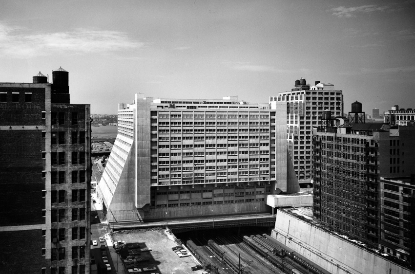
Even before it was built, plans for the Westyard Distribution Center in Manhattan were heralded, with a December 18, 1966, New York Times headline reading “Project Combats Lure of Suburbs.” The article referred to the 15-story building’s more than 32 acres of rentable space, spanning 220 feet like a bridge over Penn Station’s active rail lines, as “an urban rebuttal to arguments for landscaped suburban warehouses.” Upon completion in 1969, the concrete-clad, ziggurat-like design, by Davis Brody & Associates (now Davis Brody Bond) was generally well received, a rare Brutalist structure to instantly garner praise. At the time, RECORD called it “a confident giant standing astride a broad valley.” The magazine pointed out that “a planned 65/35 percent industrial facilities/offices ratio was almost directly reversed, as tenants, taken with the building’s appearance, sought to have more of their offices housed in it” (RECORD, May 1970).


PHOTOGRAPHY: COURTESY DAVIS BRODY BOND; © LAURIAN GHINITOIU, EXCEPT AS NOTED
GLOSS OVER
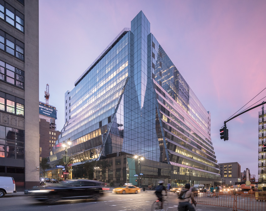
The reskinned structure (bottom) represents a dramatic transformation from the original concrete building (top, shown
in 1969).
In the nearly 50 years since it opened, both the building, also known as 450 West 33rd, and its neighborhood have changed dramatically. During the 1980s, the facade’s precast-concrete infill panels—into which the windows were integrated—were sheathed in brown-colored metal siding, and the remaining concrete painted beige. The once handsome pile turned into a giant eyesore in what became a bleak part of town. (When the building was planned, then mayor John Lindsay optimistically called West Chelsea the “southern counterpart to Lincoln Center.”)
But the building had an incredible asset—immense floor plates that range from nearly 90,000 to over 120,000 square feet. In recent years, the huge Hudson Yards and Manhattan West developments began to go up immediately surrounding 450 West 33rd, while the elevated rail line just across 10th Avenue was transformed into the High Line park. The former warehouse building, which included floors for light manufacturing, came to be seen as a perfect space to attract higher-paying commercial tenants—as soon as something could be done about its exterior.
Brookfield, developers of Manhattan West, which comprises 7 million square feet of office, retail, apartments, and a boutique hotel in several buildings, acquired 450 West 33rd, rebranding it as Five Manhattan West. It hired Brooklyn-based REX in 2011 to reimagine the enclosure. “The decision to reclad it entirely in glass was driven by a recognition that the market demands natural light,” explains John Durschinger, senior vice president for global design at Brookfield. Since the floor plates are so large, floor-to-ceiling glass was required to get daylight deep inside. “Creative companies that tend to have open-plan offices really value that.”
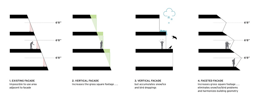
The building’s sloping sides presented several obstacles, from both an aesthetic and practical point of view. Simply allowing the glass to conform to the existing geometry would have made the new building look like a truncated version of the glassy, pyramid-shaped Luxor Hotel in Las Vegas. What is more important, the majority of the perimeter walls were canted at a 20-degree angle. To provide minimum height for accessible paths of travel required by current code—avoiding head-strike conditions—a sizable floor area would be unleasable. Rather than create a stepped-back facade where snow, ice, and bird droppings could accumulate over the narrow horizontal portions, REX, together with facade consultant Front and executive architect Adamson Associates, pushed the glass panels out in a large horizontal pleat so that the pleat’s joint is above head-strike range.
Working on a building completed almost five decades ago meant working with drawings done on vellum and reproduced on blueprints that disintegrate over time. The structure itself also went through all kinds of renovations over the years, including ones that touched the enclosure—but were only partially or incorrectly documented. “On a daily basis, we found things that no one knew existed,” says REX principal Joshua Prince-Ramus. In one instance, a building survey along the 10th Avenue side of the structure was inaccurate, so an element of the facade there that was designed to 17 inches in the renovation needed to be reduced to under 4 inches. Of course, such unforeseen conditions are typical with retrofit projects. But REX embraced that reality as part of the design. “Instead of worrying about whether the floor slabs were poured to the proper tolerances or whether they had deflected over time, and instead of trying to create a curtain wall in which we would use slab embeds to hold it up, we decided to avoid that entire possible problem and create our own elements.” (Structural engineers at SOM, also part of the design team, advised that the existing structure would be unable to satisfy the deflection criteria.)
View course on architecturalrecord.com »
Even before it was built, plans for the Westyard Distribution Center in Manhattan were heralded, with a December 18, 1966, New York Times headline reading “Project Combats Lure of Suburbs.” The article referred to the 15-story building’s more than 32 acres of rentable space, spanning 220 feet like a bridge over Penn Station’s active rail lines, as “an urban rebuttal to arguments for landscaped suburban warehouses.” Upon completion in 1969, the concrete-clad, ziggurat-like design, by Davis Brody & Associates (now Davis Brody Bond) was generally well received, a rare Brutalist structure to instantly garner praise. At the time, RECORD called it “a confident giant standing astride a broad valley.” The magazine pointed out that “a planned 65/35 percent industrial facilities/offices ratio was almost directly reversed, as tenants, taken with the building’s appearance, sought to have more of their offices housed in it” (RECORD, May 1970).


PHOTOGRAPHY: COURTESY DAVIS BRODY BOND; © LAURIAN GHINITOIU, EXCEPT AS NOTED
GLOSS OVER
The reskinned structure (bottom) represents a dramatic transformation from the original concrete building (top, shown
in 1969).
In the nearly 50 years since it opened, both the building, also known as 450 West 33rd, and its neighborhood have changed dramatically. During the 1980s, the facade’s precast-concrete infill panels—into which the windows were integrated—were sheathed in brown-colored metal siding, and the remaining concrete painted beige. The once handsome pile turned into a giant eyesore in what became a bleak part of town. (When the building was planned, then mayor John Lindsay optimistically called West Chelsea the “southern counterpart to Lincoln Center.”)
But the building had an incredible asset—immense floor plates that range from nearly 90,000 to over 120,000 square feet. In recent years, the huge Hudson Yards and Manhattan West developments began to go up immediately surrounding 450 West 33rd, while the elevated rail line just across 10th Avenue was transformed into the High Line park. The former warehouse building, which included floors for light manufacturing, came to be seen as a perfect space to attract higher-paying commercial tenants—as soon as something could be done about its exterior.
Brookfield, developers of Manhattan West, which comprises 7 million square feet of office, retail, apartments, and a boutique hotel in several buildings, acquired 450 West 33rd, rebranding it as Five Manhattan West. It hired Brooklyn-based REX in 2011 to reimagine the enclosure. “The decision to reclad it entirely in glass was driven by a recognition that the market demands natural light,” explains John Durschinger, senior vice president for global design at Brookfield. Since the floor plates are so large, floor-to-ceiling glass was required to get daylight deep inside. “Creative companies that tend to have open-plan offices really value that.”
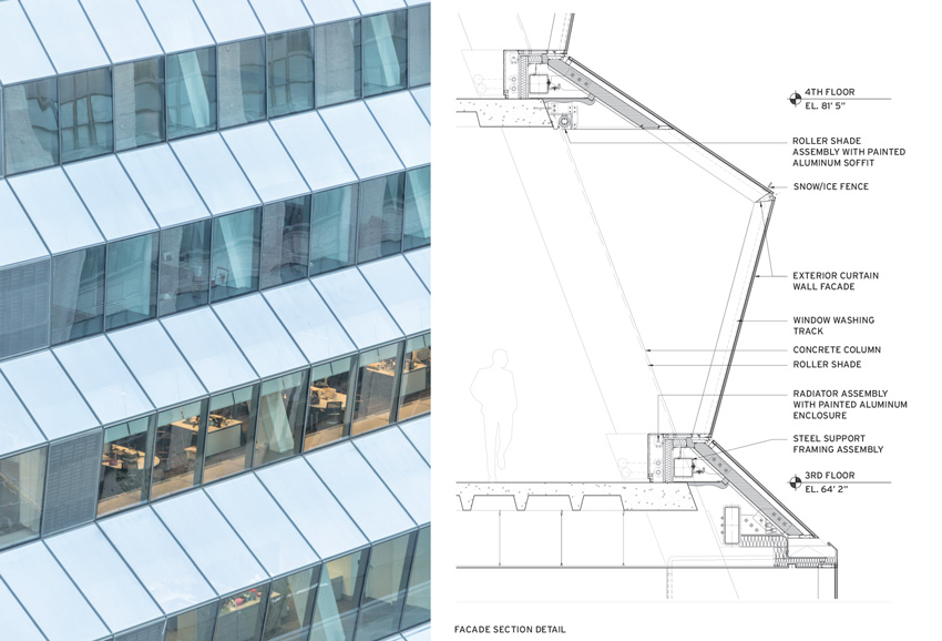
The building’s sloping sides presented several obstacles, from both an aesthetic and practical point of view. Simply allowing the glass to conform to the existing geometry would have made the new building look like a truncated version of the glassy, pyramid-shaped Luxor Hotel in Las Vegas. What is more important, the majority of the perimeter walls were canted at a 20-degree angle. To provide minimum height for accessible paths of travel required by current code—avoiding head-strike conditions—a sizable floor area would be unleasable. Rather than create a stepped-back facade where snow, ice, and bird droppings could accumulate over the narrow horizontal portions, REX, together with facade consultant Front and executive architect Adamson Associates, pushed the glass panels out in a large horizontal pleat so that the pleat’s joint is above head-strike range.
Working on a building completed almost five decades ago meant working with drawings done on vellum and reproduced on blueprints that disintegrate over time. The structure itself also went through all kinds of renovations over the years, including ones that touched the enclosure—but were only partially or incorrectly documented. “On a daily basis, we found things that no one knew existed,” says REX principal Joshua Prince-Ramus. In one instance, a building survey along the 10th Avenue side of the structure was inaccurate, so an element of the facade there that was designed to 17 inches in the renovation needed to be reduced to under 4 inches. Of course, such unforeseen conditions are typical with retrofit projects. But REX embraced that reality as part of the design. “Instead of worrying about whether the floor slabs were poured to the proper tolerances or whether they had deflected over time, and instead of trying to create a curtain wall in which we would use slab embeds to hold it up, we decided to avoid that entire possible problem and create our own elements.” (Structural engineers at SOM, also part of the design team, advised that the existing structure would be unable to satisfy the deflection criteria.)
The old facade was stripped down to the columns while the building was still occupied. (A temporary construction wall was erected.) Rather than anchoring brackets into the old concrete, the design team put steel collars around the columns and attached new steel tubes to the collars just above each floor, knowing that facade attachments could be fabricated in the shop and adjusted with tailored precision.


FOLD UP
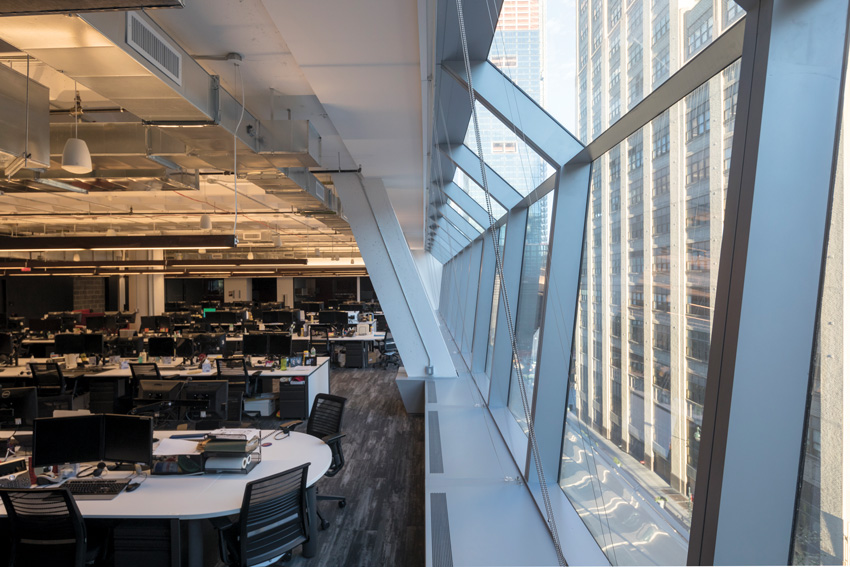
The new pleated glass facade (top) offers office space with abundant daylight (bottom).
This “spreader bar” system, spanning column to column, is more flexible and reliable than attaching to the edge of the slab, and is sized to carry the dead load and wind load of the facade so the slab does not have to do any work. (Some of the larger pleated assemblies measure almost 17 feet tall and weigh over 2,000 pounds.) The spreader bars also allowed for easier installation of the unitized curtain wall that comprises two hinged panels, connected via a very stiff, continuous steel plate, to create the horizontal fold. “The utilization of the pleated panels as a typical unitized panel was pretty innovative,” says Anthony Kantzas, senior associate at Front. “Most of the contractors that were bidding the project didn’t want to do it that way.”
Because the angle on the canted bottom portion of glass was kept under 15 degrees, the team was able to use standard vision glass there. The double-glazed IGUs include a ⅜-inch-thick outer lite with a 5/16-inch-thick inner one. (The thicknesses were deliberately varied for better acoustic performance.) The upper panel, because it is considered a skylight by code, uses glass lites of the same thickness, but it is laminated. The pleated geometry improves both energy performance and visual comfort compared to that of a planar facade. Because the original building was intended to accommodate both offices and industrial space, the floors were designed with different ceiling heights. Each of the pleats is therefore slightly different. The upper panels, which feature a selective frit over what would be the spandrel portion on a typical facade, reduce direct solar gain and glare, and self shade the lower panels. The insulation value of the new glazing assembly is significantly higher than that of the original glass.
Reskinning old buildings in glass is nothing new. Often it involves updating nondescript, even unattractive, masonry buildings. That is the case with a former Verizon equipment tower near the Brooklyn Bridge, generally agreed to be one of the ugliest buildings in Manhattan: its upper floors were recently glazed over for use as offices. But sometimes controversy ensues. Preservationists have decried a recent design by Snøhetta to replace the pink granite front facade of Philip Johnson and John Burgee’s AT&T tower in New York at the lower levels with a diaphanous glass curtain wall. In a recent commentary (RECORD, January 2018), architecture critic Mark Lamster called it “unacceptable.” As a counterpoint, architect and writer Robert Kahn, contributing to architecturalrecord.com, said, “Those who believe [the building] important do injustice to serious architecture.”
So what do we make of transforming buildings that are not landmarks, but whose status as significant or even good architecture is up for debate? Westyard was arguably a good building, but hardly an icon. “It’s never appealed to me as a significant piece of architecture,” says Theodore Prudon, an architect and adjunct professor of preservation at Columbia Graduate School of Architecture, Planning and Preservation. Prudon worked on the restoration of a similar Brutalist structure, the low-rise Hubert H. Humphrey Building in Washington, D.C., completed in the early 1970s and one of Marcel Breuer’s last designs. He could never have imagined reskinning that building in glass. Instead, it retains its precast-concrete panels, with much of it finished with a thin granite veneer. “That’s where the value judgment comes in,” says Prudon. “In Breuer’s portfolio, it probably wouldn’t be the top building, but in my mind, from an architectural point of view, it’s far more sophisticated than Westyard in its materiality.”


COME INSIDE
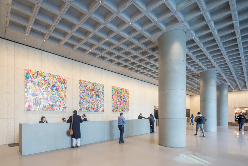
The sloping ground-floor entrance (top, left) leads to a refurbished lobby (bottom). On the second level, REX opened a portion of the facade to create a breezeway (top, right).
Prudon is also the founding president of DOCOMOMO US, whose mission is to increase public awareness and appreciation of Modern-movement architecture. “Recladding for the purposes of simply recladding for any kind of structure that deserves attention is not something we would ever recommend,” he explains, “but I’m also a pragmatic realist.” Buildings from the 1960s and ’70s are in a gray zone. “If they were older, they’d get more respect.”
Davis Brody Bond, Westyard’s original architect, currently working with REX on the Ronald O. Perelman Performing Arts Center at the World Trade Center site in Lower Manhattan, declined to comment for this article. Ramus points out that REX’s design did not overhaul the Brutalist exterior but a later, butchered version of it. Brookfield admits it never considered restoring the original facade.
Since completion of the recladding and interior renovation, which includes a dramatically improved and expanded lobby, rents at Five Manhattan West have increased threefold, to over $90 per square foot (by comparison, office space went for $14.75 in today’s dollars when the building opened), attracting such tenants as Amazon, which signed a 15-year, 360,000-square-foot lease last September. J.P. Morgan Chase announced plans to triple its space at the building. It is now full, according to Brookfield, including retail space for a Whole Foods, which plans to open on the second floor at the end of 2019.
According to the 2016 AIA Firm Survey Report, renovation projects are nearly on a par with new construction. As our building stock ages and systems become outdated, a growing share of design activity will consist of modernizing existing buildings. And it’s mostly true that rehabbing old buildings—especially giant ones like Westyard, which could not be built at that scale today under current zoning—is more economical and sustainable. “It’s going to become the vast majority of commissions,” says Ramus. “The profession must start looking at the adaptive reuse of existing structures as ‘Capital-A Architecture’ and embrace it with the same excitement, vigor, commitment, enthusiasm, and ingenuity as a new build—because we need to.”
