As a broadcaster that is publicly funded through mandatory fees, the BBC has a responsibility to represent the diversity of society, both in its programs and in how those programs are made. The BBC Cymru Wales Broadcast Centre, a 280,000-square-foot facility that opened in 2019 in the country’s capital city of Cardiff, exemplifies the movement to make buildings more accessible and healthful for neurodiverse talent. “A lot of design for wellness focuses on super-fit people and outstanding performance in the workplace,” says Helen Berresford, the partner in Sheppard Robson’s London office who led the project’s interior-architecture team. “For the BBC, it’s got to do more.”

PHOTOGRAPHY: © HALKIN MASON (BOTTOM TWO); JAMES STEINKAMP (TOP TWO)
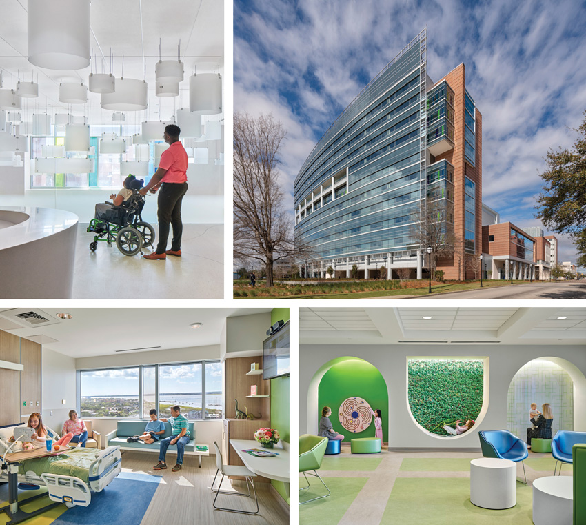
A CHILDREN’S hospital at the Medical University of South Carolina (top, right) has such autism-friendly features as cloudlike lobby light fixtures that create interest without adding distracting pattern (top, left), waiting-area nooks that encourage play (bottom, right), and display shelves that allow patients to make their rooms their own (bottom, left).
To help guide new design or evaluate an existing space, the broadcast corporation’s CAPE (Creating A Positive Environment) initiative has produced a Neuro-Inclusive Toolkit, which identifies visual, auditory, olfactory, and tactile factors that can affect people with heightened sensitivity. To provide a more visceral understanding, BBC film crews have produced videos portraying typical workplace settings from a neurodivergent perspective. At pre-design workshops for the Wales HQ , design team members who viewed these videos through virtual reality headsets emerged converted. “It generated a physical and emotional response,” says Berresford. “After having experienced it, none of us could design the same way again.”
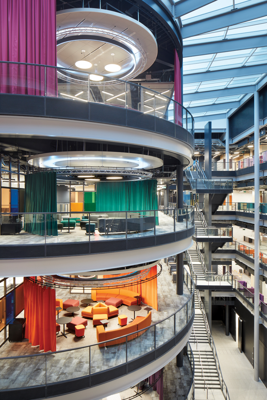
A key strategy in making the new BBC building more neuro-inclusive is clarity of wayfinding. A grand atrium is designed to welcome the broadcaster’s employees and visitors, “but if you’re somebody with a more rich and complex neuro scenario—that the BBC is now looking to include as normal—you could be intimidated,” says Berresford. So the design uses both spatial organization and signage to make finding a destination straightforward. A person entering the Centre can go directly to a building plan, view their objective on a simple graphic complete with landmarks, map out an “open” or “safe” path, and rediscover their route at signposts along the way. Meeting rooms, each with its own color, are stacked on bridges visible from the entrance, and immediately obvious staircases provide a clear path of travel.
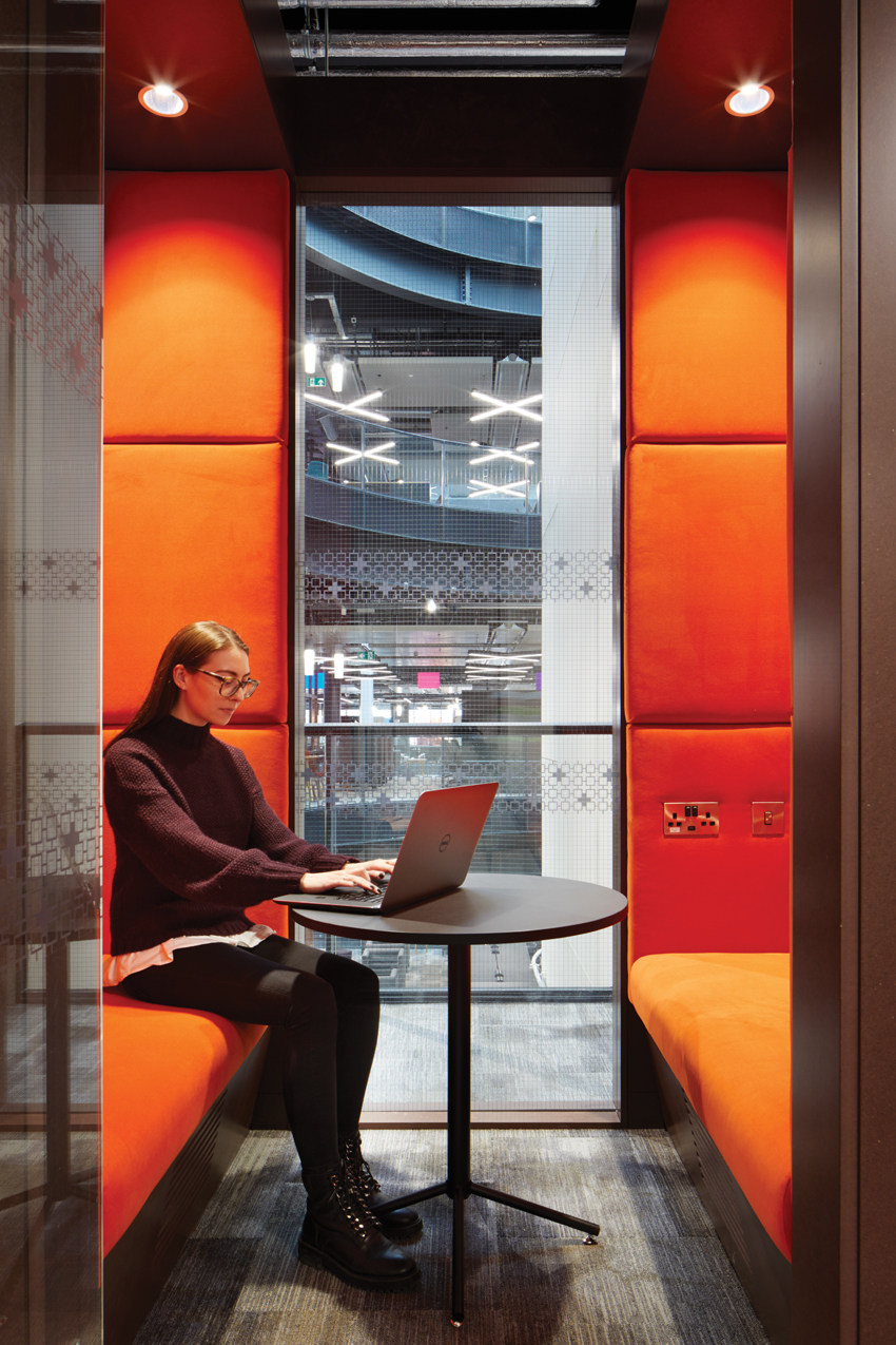
To meet the needs and preferences of a neurodiverse workforce, the building offers more than two dozen different types of spaces from which employees can choose what will best support them and their work over the course of the day. For example, an employee recovering from a traumatic commute might start the day in a small booth with the door closed for a couple of hours of quiet work before migrating to a collaboration space, desk area, studio, or presentation zone. “In a sense, it’s given us an opportunity to design in a more human way,” says Berresford. “We’ve got scientific-medical backup to create spaces that are softer and more enclosed, and to provide that variety. It just backs up what we think as designers you should be doing in an office environment anyway.”
Helping to validate the team’s decision-making was a process of iterative consultation with neurodivergent BBC staff. Berresford describes testing a meeting room mockup in which a colored film on the room’s glass wall incorporated a thematic pattern. The pattern, an abstraction of the iconic cliffs of Wales, had been pulled from a competition-winning fabric by a Welsh design student and threaded throughout the building. For the test group, though, the pattern was too strong for them to sit comfortably in the room. Instead of eliminating it (an obvious response, which the test group rejected), the solution was to intensify the color, thereby softening the pattern, and to add layers of enclosure inside the glass, including soft veils that occupants could draw if they were starting to feel uneasy. “Instead of dumbing down the solution, we ended up heightening it,” says Berresford. “And we were able to do that because we were speaking with the people who were experiencing it.”
User group experience was similarly important in the design of a new children’s hospital that opened in 2020 in Charleston, South Carolina. At the facility this project replaced, children with autism were sometimes too overwhelmed to get out of the car, and practitioners ended up treating them in the parking garage. Among the goals for the Medical University of South Carolina’s (MUSC) new 625,000-square-foot building was an aspiration to be the most autism-friendly hospital in the country.
“Truly listening to the challenges of families and caregivers enabled us to collaborate to solve for the complex needs of both,” says Carolyn BaRoss, health-care-interiors design director for Perkins&Will. “MUSC relinquishes traditional notions of what a children’s hospital should be and instead is designed with sensitivity to the specific needs of those who use the space.” So, rather than a chaotically colorful, patterned, and even cartoony environment, which is often an adult’s idea of what a children’s world should be, says Manuel Cadrecha, architecture design principal at Perkins&Will, “it was important that it be a place that not challenge patients but offer a level of balance, familiarity, and control.”
Attention to spatial composition and scale helps to make the environment feel manageable. On each floor, a theme wall at the elevator orients building users, and a color accent from the artwork links to the floor’s nursing stations and patient rooms. Waiting areas provide places where children can run around and nooks where they can tuck themselves in. Patient rooms support the child’s sense of control with a choice of places to sit, lighting they can adjust to their comfort, and opportunities to make the room their own: a write-on wall, shelves and display areas for their things, and even the possibility of decorating their door.
View course on architecturalrecord.com »
NO ONE expects that a person who uses a wheelchair could live their best life in a world without ramps. And yet the needs of people whose differences are neurological rather than physical are all too often ignored in design. Conditions such as autism, ADHD, dyslexia, dyspraxia, and others can affect how people process sensory information, hampering their ability to achieve their daily objectives, whether as learners, workers, patients, or in other life roles. Environments designed to support neurodiversity can help.


PHOTOGRAPHY: © JACK HOBHOUSE
WAYFINDING at the BBC’s new headquarters in Wales is aided by a color-coded organization legible from a grand atrium (top). Private booths (bottom) are among the many types of spaces that employees can choose to work in over the course of a day.
“Neurodiversity” refers to the vast range of neurocognitive variability within the human population. Everyone has a unique nervous system, with a unique combination of abilities and needs, and, while most of the people most of the time occupy a range that’s considered neurotypical, for a significant and increasing minority (estimates range between 10 and 30 percent of the population), functioning beyond this range can open up exceptional strengths and pose daunting challenges. Strengths that are often associated with various forms of neurodivergence include—depending on the type and degree of the condition—high intelligence, creativity, leadership, focus, and/or attention to detail. Common challenges pertain to organization, distractibility, social interaction, and/or self-regulation. Because sensory experience can play a major role in determining whether the strengths or the challenges are out front, environmental design matters.
Recent buildings prioritizing design for neurodiversity include the British Broadcasting Corporation’s (BBC) new headquarters for Wales, with master planning and interior architecture by Sheppard Robson, and core and shell architecture by Foster+Partners; the Medical University of South Carolina Shawn Jenkins Children’s Hospital and Pearl Tourville Women’s Pavilion by Perkins&Will in collaboration with associate architect McMillan Pazdan Smith Architecture; and the Quad Preparatory Upper and Lower School renovations by Verona Carpenter Architects with ENV as executive architect on the upper school.
As a broadcaster that is publicly funded through mandatory fees, the BBC has a responsibility to represent the diversity of society, both in its programs and in how those programs are made. The BBC Cymru Wales Broadcast Centre, a 280,000-square-foot facility that opened in 2019 in the country’s capital city of Cardiff, exemplifies the movement to make buildings more accessible and healthful for neurodiverse talent. “A lot of design for wellness focuses on super-fit people and outstanding performance in the workplace,” says Helen Berresford, the partner in Sheppard Robson’s London office who led the project’s interior-architecture team. “For the BBC, it’s got to do more.”

PHOTOGRAPHY: © HALKIN MASON (BOTTOM TWO); JAMES STEINKAMP (TOP TWO)
A CHILDREN’S hospital at the Medical University of South Carolina (top, right) has such autism-friendly features as cloudlike lobby light fixtures that create interest without adding distracting pattern (top, left), waiting-area nooks that encourage play (bottom, right), and display shelves that allow patients to make their rooms their own (bottom, left).
To help guide new design or evaluate an existing space, the broadcast corporation’s CAPE (Creating A Positive Environment) initiative has produced a Neuro-Inclusive Toolkit, which identifies visual, auditory, olfactory, and tactile factors that can affect people with heightened sensitivity. To provide a more visceral understanding, BBC film crews have produced videos portraying typical workplace settings from a neurodivergent perspective. At pre-design workshops for the Wales HQ , design team members who viewed these videos through virtual reality headsets emerged converted. “It generated a physical and emotional response,” says Berresford. “After having experienced it, none of us could design the same way again.”
A key strategy in making the new BBC building more neuro-inclusive is clarity of wayfinding. A grand atrium is designed to welcome the broadcaster’s employees and visitors, “but if you’re somebody with a more rich and complex neuro scenario—that the BBC is now looking to include as normal—you could be intimidated,” says Berresford. So the design uses both spatial organization and signage to make finding a destination straightforward. A person entering the Centre can go directly to a building plan, view their objective on a simple graphic complete with landmarks, map out an “open” or “safe” path, and rediscover their route at signposts along the way. Meeting rooms, each with its own color, are stacked on bridges visible from the entrance, and immediately obvious staircases provide a clear path of travel.
To meet the needs and preferences of a neurodiverse workforce, the building offers more than two dozen different types of spaces from which employees can choose what will best support them and their work over the course of the day. For example, an employee recovering from a traumatic commute might start the day in a small booth with the door closed for a couple of hours of quiet work before migrating to a collaboration space, desk area, studio, or presentation zone. “In a sense, it’s given us an opportunity to design in a more human way,” says Berresford. “We’ve got scientific-medical backup to create spaces that are softer and more enclosed, and to provide that variety. It just backs up what we think as designers you should be doing in an office environment anyway.”
Helping to validate the team’s decision-making was a process of iterative consultation with neurodivergent BBC staff. Berresford describes testing a meeting room mockup in which a colored film on the room’s glass wall incorporated a thematic pattern. The pattern, an abstraction of the iconic cliffs of Wales, had been pulled from a competition-winning fabric by a Welsh design student and threaded throughout the building. For the test group, though, the pattern was too strong for them to sit comfortably in the room. Instead of eliminating it (an obvious response, which the test group rejected), the solution was to intensify the color, thereby softening the pattern, and to add layers of enclosure inside the glass, including soft veils that occupants could draw if they were starting to feel uneasy. “Instead of dumbing down the solution, we ended up heightening it,” says Berresford. “And we were able to do that because we were speaking with the people who were experiencing it.”
User group experience was similarly important in the design of a new children’s hospital that opened in 2020 in Charleston, South Carolina. At the facility this project replaced, children with autism were sometimes too overwhelmed to get out of the car, and practitioners ended up treating them in the parking garage. Among the goals for the Medical University of South Carolina’s (MUSC) new 625,000-square-foot building was an aspiration to be the most autism-friendly hospital in the country.
“Truly listening to the challenges of families and caregivers enabled us to collaborate to solve for the complex needs of both,” says Carolyn BaRoss, health-care-interiors design director for Perkins&Will. “MUSC relinquishes traditional notions of what a children’s hospital should be and instead is designed with sensitivity to the specific needs of those who use the space.” So, rather than a chaotically colorful, patterned, and even cartoony environment, which is often an adult’s idea of what a children’s world should be, says Manuel Cadrecha, architecture design principal at Perkins&Will, “it was important that it be a place that not challenge patients but offer a level of balance, familiarity, and control.”
Attention to spatial composition and scale helps to make the environment feel manageable. On each floor, a theme wall at the elevator orients building users, and a color accent from the artwork links to the floor’s nursing stations and patient rooms. Waiting areas provide places where children can run around and nooks where they can tuck themselves in. Patient rooms support the child’s sense of control with a choice of places to sit, lighting they can adjust to their comfort, and opportunities to make the room their own: a write-on wall, shelves and display areas for their things, and even the possibility of decorating their door.
The building, which is set in a park, also maximizes connections to the calming, restorative power of nature. In addition to the views from the family lounge, a seventh-story verandah offers vistas of the Lowcountry salt marsh, and a sensory-rich rooftop garden with pathways inspired by the marsh lets kids get outside. Throughout the hospital, artworks evoking “stories of the Lowcountry” bring the soft colors of the marshlands into the building.
To minimize strong or intrusive sensory experiences that can distress a person with autism, the design team paid careful attention to acoustics, lighting, and even the smells of materials and the products that would be needed to clean them.
Care-team areas are enclosed behind glass walls, with doors positioned so that conversations don’t project down corridors. Slight articulations in corridor walls create acoustic breaks while also defining a “porch” area for each room. Automatic toilet flushers and electric hand dryers have been eliminated altogether.
The use of LED fixtures throughout (now more common than when the building was in design) eliminates the buzz of fluorescent ballasts. To prevent glare, fixtures illuminate surfaces rather than space, forming soft washes and pools of light. Corridor lighting is dimmable, and outside each patient room a little porch light reinforces the domestic feel.
“What we brought to this project was a sense of humanity,” says Cadrecha, in an echo of Berresford’s insight. “It’s really about designing buildings that are sensitive to the needs of the people who are going to be using them—in this case, children who have special needs.”
Another type of building that serves children, including exceptional ones, is schools. Less well funded than workplaces or healthcare facilities, schools nonetheless have to meet the needs of neurodiverse populations. The Quad Preparatory School in Manhattan serves students who are twice exceptional: they face challenges with emotional and social learning and excel at intellectual learning, so rising to the level of their talents requires extra support with both. Design strategies developed for Quad by New York–based Verona Carpenter Architects (VCA) suggest options for making any school more supportive of students’ neurodiversity.


PHOTOGRAPHY: © JEFFREY ROSENBERG
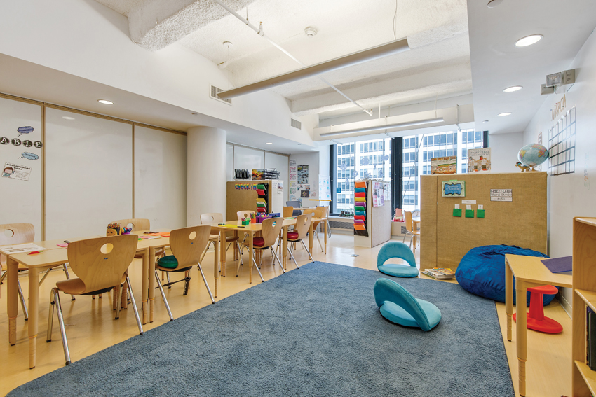
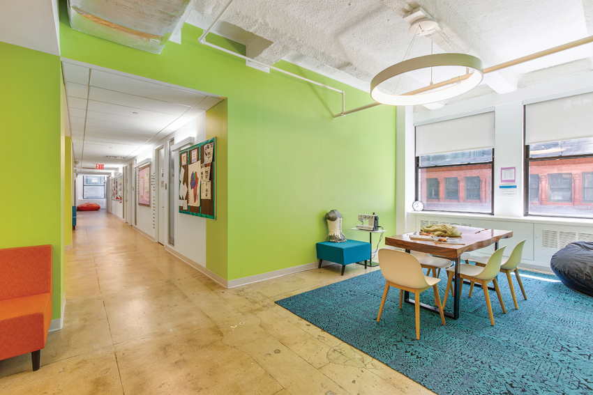
SPACES for the lower (top) and upper (bottom) schools for Quad Prep, housed in separate commercial buildings in New York, include a variety of seating options, indirect lighting, and spray-on acoustical treatment to make students comfortable and enable them to focus on learning.
Quad’s renovated upper and lower schools each occupy a floor of separate commercial buildings—18,000 square feet (completed in 2019) and 32,000 square feet (completed in 2017), respectively. The designs are based on VCA’s extensive process of research and consultation with staff, students, and families.
“To design for neurodiversity is to create environments that offer choice,” says VCA principal Jennifer Carpenter. “Providing a range of sensory environments lets kids find the spaces that work for them.” Variously sized learning spaces—including classrooms (which are smaller than a typical school’s), more intimate areas defined with furniture, meeting rooms for one-on-one support, alcoves with soft furnishings, and even corridor stations—provide choices to match a range of needs. And because heightened sensory awareness can contribute to social isolation, a gathering space where students can sit around low tables also includes carrel desks nearby, allowing students who prefer a more enclosed space and more muted acoustics to still feel connected to the group.
A variety of seating options is another important choice the design offers. “If you’re not comfortable, you can’t pay attention,” says Carpenter. Classrooms offer chairs with a slightly cantilevered seat for a bit of bounce, seating balls, stools designed to rock and tip, legless floor chairs, and squashy beanbags. These options allow students to make themselves comfortable, increase their activity level with micro-movements, and meet their needs for sensory feedback, all without interrupting—and instead supporting—their focus on learning.
As an independent not-for-profit school, Quad needed to put every renovation dollar to the highest use. For neurodivergent users, acoustic treatments—which can be expensive—are well worth the money, says Carpenter. In the lower school, the reception area eases arrival with noise-dampening burlap-wrapped cellulose-based-fiber wallboard that also serves as space dividers and as a display area for student work. At both the upper and lower schools, acoustic ceiling spray eliminates echoes and reverberation, soaks up background noise, and generates a calmer acoustic environment. Soft furnishings and floor coverings also help.
To reduce sensory input and anxiety in transition zones, lighting levels are lower than in the work areas, and illumination is indirect, with an uplight wash. Throughout all areas, the lighting design prioritizes controllability and choice with dual-circuited, separately switched direct and indirect fixtures. “It lets us get a lot of options for not a lot of investment,” says Carpenter.
Orientation in space is something neurodivergent people commonly struggle with. To help, a consistent use of color defines the upper school’s two wings, with a range of greens to the south and blues to the north, and counseling and therapy areas coded in yellow. The color palette is simple, but graduated to avoid being stagnant. A similar use of material, color, and lighting across the lower and upper schools (with refinements for a more grown-up feel in the upper school) provides familiarity and continuity, supporting students as they graduate from one school to the other.
Architecture that supports students or patients or workers, in all their diversity—as this trio of projects demonstrates—expands opportunities for human well-being. “People who are on the spectrum that we’re now starting to consider as a new normal are very sensitive to their environment. I think all human beings are, really,” says Berresford. “When it comes down to it,” adds Perkins&Will’s Cadrecha, “design for neurodiversity is just good design.”
Supplemental Materials
BBC Sensory Environment Checklist
