Aesthetics in Designing With Metal Composite Material (MCM)
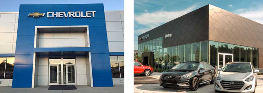
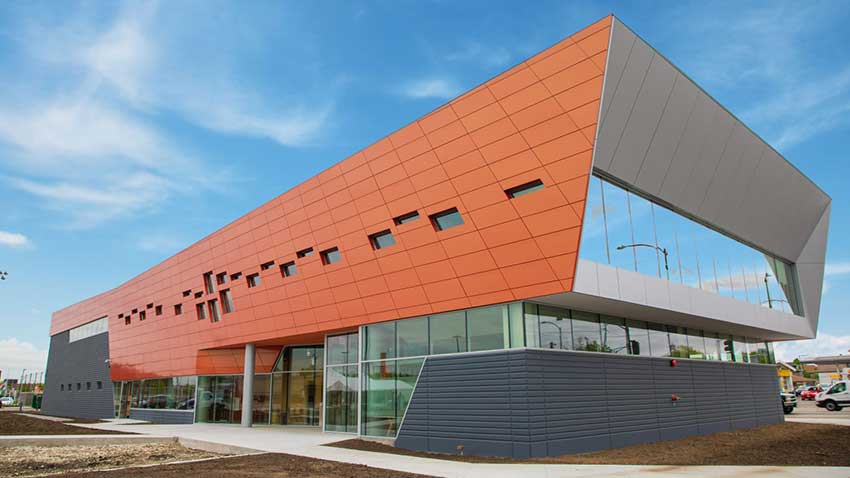
Curved, bended, textured, or patterned, metal composite material panels can be used to create decorative, eye-catching facade designs
Sponsored by Metal Construction Association | By Barbara Horwitz-Bennett
Metal composite material (MCM) panels are an increasingly popular cladding choice. Being energy efficient, sustainable, affordable, and long lasting—with approximately 70% of its weight made of recycled content—MCMs are a great exterior facade material option.
As compared to alternative exterior products like precast, granite or brick, MCMs are much faster to install and their lightweight nature means reduced structural requirements and cost. MCMs are low maintenance and durable, they retain their color and finish over time, and provide an appearance that resists fading, cracking, and peeling.
But there’s more. MCM offer a fantastic aesthetic, turning building facades into sleek, colorful, and textured works of art.
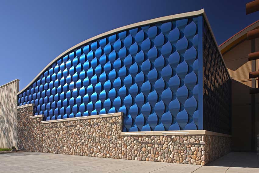
Photo courtesy of 3A Composites USA
Showcasing the beauty and versatility of metal composite material, this custom wet seal system mimics a blue wave pattern at the Seven Clans Casino in Red Lake, Minn.
“Metal composite wall panels impart a very contemporary, high-tech look to a building exuding a high quality finish together with their characteristic ability to be formed into various shapes and patterns,” writes Peter J. Arsenault, FAIA, NCARB, LEED AP, in an Architectural Record CEU on metal exterior walls.
In the past, MCMs were reserved for high-end projects. But advanced manufacturing and fabricating capabilities enabled manufacturers and fabricators to be more competitive, thus making the MCMs much more available for a wider range of applications.
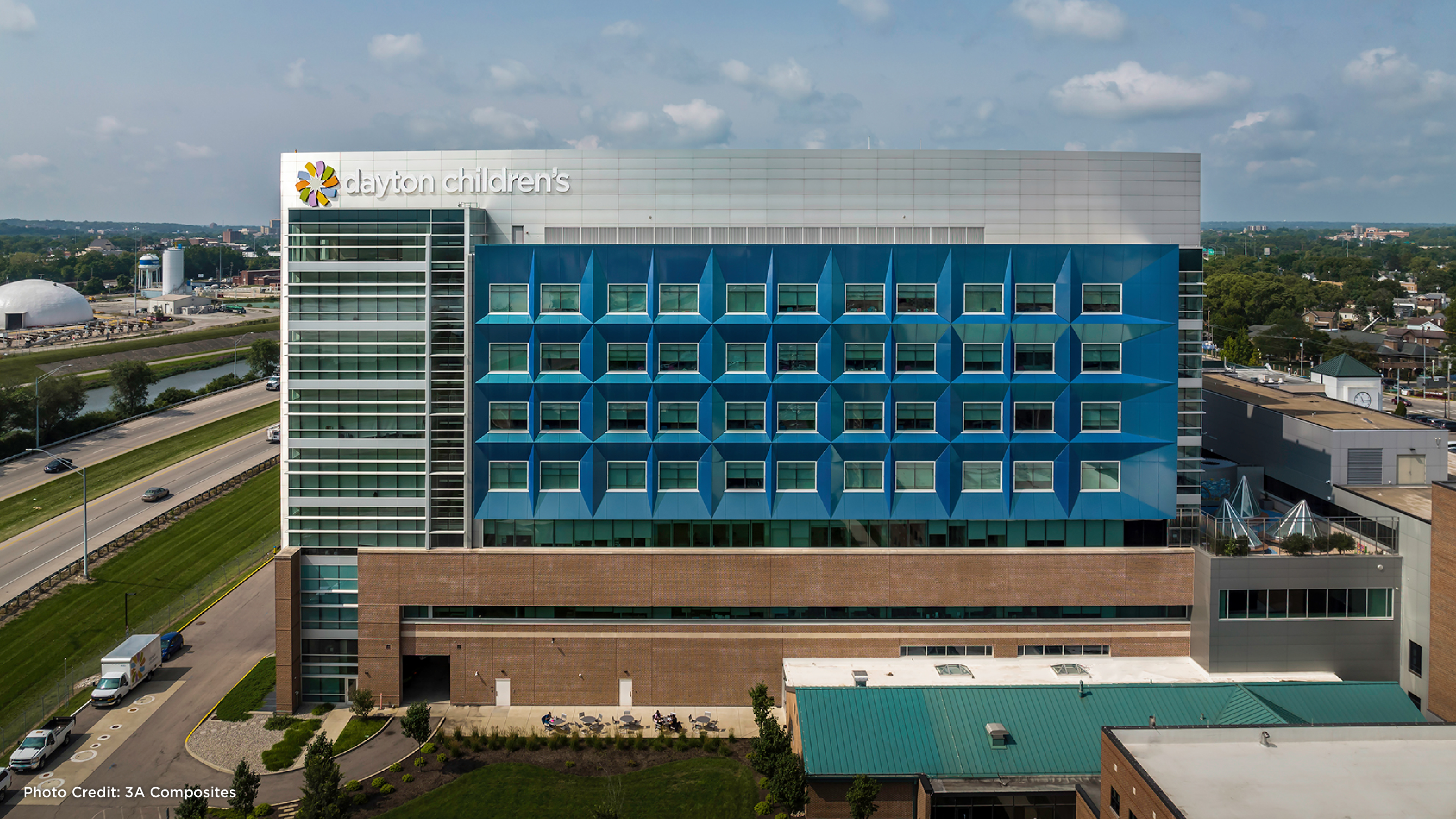
Popular for commercial, corporate, healthcare, educational spaces, and more, the material’s versatility and flexibility makes it very well suited for a large variety of creative designs. MCMs can also be found in architectural cornices and soffit designs.
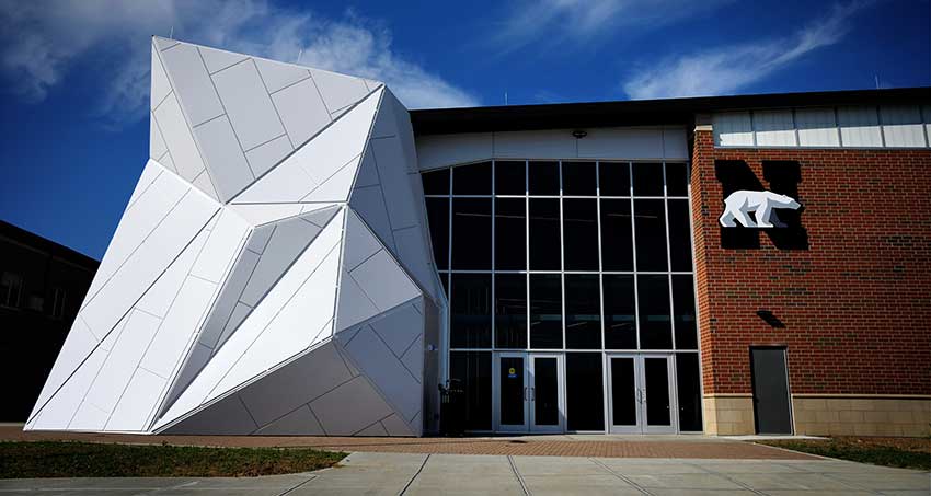
Photo courtesy of East Coast Metal Systems
Capitalizing on the extensive fabrication capabilities of MCM panels, Levin Porter Architects designed an iceberg with a rainscreen system for Northridge High School in Dayton, Ohio.
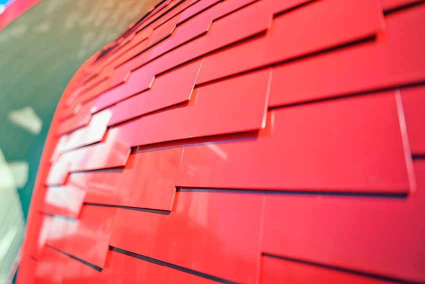
Photo courtesy of Robert Stefanowicz
The Northern Gateway Pavilion in Vancouver, British Columbia, demonstrates a unique fabricating MCM edge detail hiding the core.
Sleek Designs
One of the ways in which MCMs are able to produce such a high quality “canvas” for architects is via its fabrication process which yields extremely flat, consistent panels capable of supporting highly consistent coil coated finishes, not to mention creative and decorative building facade designs.
Essentially, the manufacturing processes leverages bonding technology with heat, pressure, and tension, thereby creating a well-balanced sheet that remains flat even as the temperature changes. In addition, its thermoplastic core makes MCM considerably lighter than a solid metal panel of the same thickness, without any loss in rigidity.
In addition to supporting a vast array of geometric designs, MCMs have the added benefit of being formable into bends and curves. This transports creative design options to a whole other level, enabling architects to bring their more iconic, out-of-the-box formations to life.
Once MCMs are manufactured to thickness and dimensions required for a project, the panels are then sent to a fabricator where many textures, perforations, and patterns can be created through advanced fabrication technologies. In fact, the material is much more versatile and easier to fabricate than solid plate metal, which makes it well suited for interior applications as well.
For example, in the fabricator’s shop, the MCMs can be cut, grooved, punched, drilled, bent, or rolled with regular woodworking or metalworking tools with no need for special tools. These types of design capabilities help support those striking, stand-out designs architects are seeking.
More details on fabrication capabilities are provided in the following categories:
Punching and Die-Cutting Fabricated with a computerized numerical control (CNC) machine, this technique enables pointillist or artistic style patterns or more complicated, detailed drawings on the facade. It is recommended that the smallest punch diameter be no less than 4 mm and that the distances between the centers be at least double that of the diameter. Further, the perforated surface area should be less than 35% of the panel’s total surface area.
Edging MCMs have the capability of being edge folded on their profile. Edging is performed in three different ways. A simple application hides the edging, a double interior approach hides the edge and part of the back, and a double outside method hides the edge and extends a flange that hides the joints with other panel sheets. For optimal results, the initial panel dimensions should be oversized to accommodate the requirements of each type of border.
Curving: Curved MCM lets designers add unique and functional features to their designs. Proper MCM curving is done with a pyramid roller. A pyramid roller has three rollers, two on the bottom and one on top. Material is fed through the roller, and through various degrees of tension on each of the rollers, you change the radius on the roll.
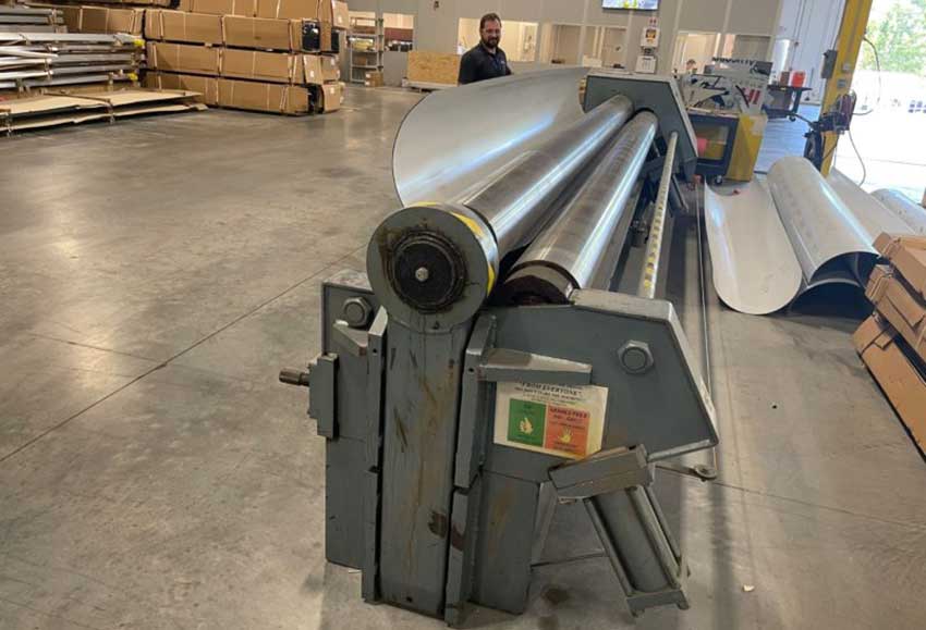
Photo courtesy of Robert Stefanowicz
A pyramid roller is used for bending and forming metal plates.
Stamping and Engraving: CNC machines are used to emboss or engrave the panels. By modifying the panel’s depth, engravings can be created with no need to cut-die the panel.
3D Forming: In addition to its use for manufacturing aluminum composite panels for hanging systems, this process also creates projected 3D surfaces. The panels are formed by bending the perimeter leg and the legs are made by partial routing of the panel with the correct dimensions for the system. To fasten/anchor the panels, aluminum extrusions, or composite material from the panel itself, are attached using pop-rivets or fasteners. To avoid superficial damage, the panel should be well protected during the forming, shipping, and the field installation process.
Routing: Performed with a CNC machine, a vertical saw with a routing blade, or a portable hand router. The partial routing of MCMs allows them to be bent into shape and allows the subsequent folding of the pieces to give them creative shapes. Scoring is done using 90º or 135º router bits, depending on the bend required. To achieve the desired measurements, the fold must be made on the axis of the routed score line. The remaining thickness of the panel allows it to be bent into shape by hand using specific tools.
Riveting and Screwing: When installing MCMs to each other or other materials with rivets or screws, thermal expansion of the panels must be taken into account. The use of centering bits for correct drilling and fitting of rivets is recommended.
In addition to spacing nose pieces to limit the pressure exerted on the expansion points and avoid creation of a fixed attachment point.
Cutting: MCMs can be cut straight, curved, or angled with CNC machinery or done manually using a vertical panel saw or portable hand-router.

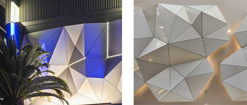
Photo (left) courtesy of AGI; photos (center; right) courtesy of 3A Composites USA
An example of creative curved CNC cutting is seen on the left, while center and right, the striking visual impact of the triangular perforations demonstrate another potential for utilizing MCM.
Drilling: Because drilling may be frequently called for during installation of the product on site—particularly with riveted and screwed assembly systems—the use of a special drill bits is recommended for fasteners with an expansion margin.
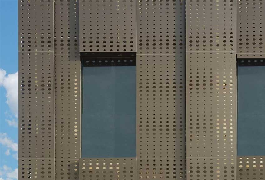
Photo courtesy of 3A Composites USA
CNC drilling gives perforation another option for MCM.
Gluing Panels: can be glued using special adhesives and double-sided adhesive tape suited for composite panel systems.
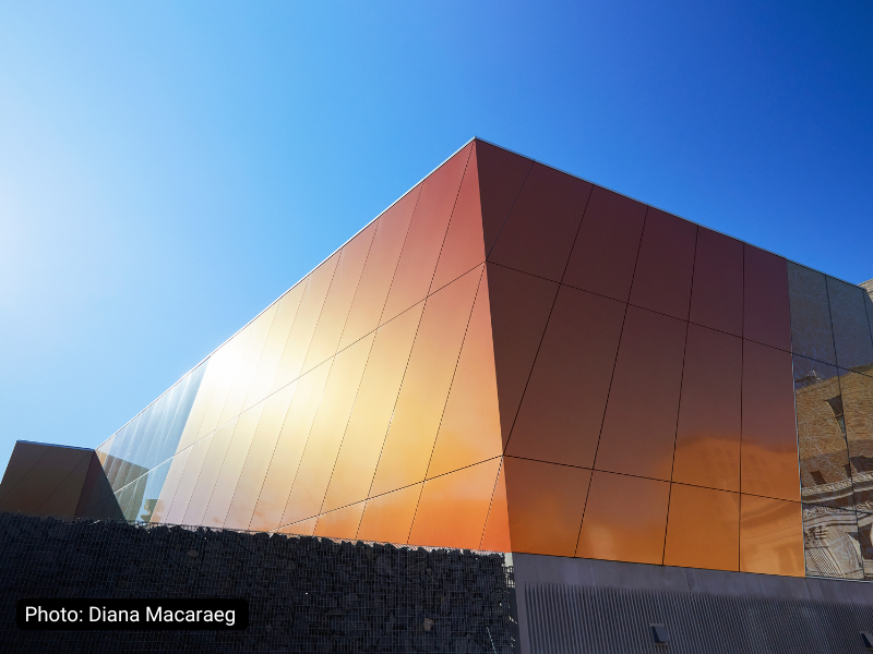
Finishes and Paints: Enhancing aesthetics, MCMs come in a wide variety of attractive finishes. This includes two-coat solids, two-coat micas, three-coat metallics, three-coat prismatics with color shifting capabilities, mirror 3D-looking printed patterns, matte, and anodized finishes.
Photos courtesy of © Lunghi Media
Guests are treated to an origami-like sculptural facade for the porte-cochère made from colored MCM panels at this LAX hotel. The nearly 300-foot-long, 14,950-square-foot 3D cladding spans the entire length of the hotel
For example, special effects can create a shimmering pearlescent look while prismatic finishes can change appearance depending on the time of day and angle viewed. Printed patterns can also be applied to replicate the look of other natural materials such as stone, travertine, marble, or many different wood species.
In applying paint, a popular choice for MCMs is coil-coated polyvinylidene fluoride (PVDF). The coating lends a high level of durability and resistance against weathering, chalking, fading, and ultraviolet rays.
Because of its low melting point, high dielectric, and mechanical strength, PVDF paint offers the following advantages:
- Excellent resistance characteristics to acids, solvents, and bases
- Proven protection against abrasion and wear
- Impedes chipping and peeling
- Battles environmental stresses for acid rain and ultraviolet attack
- Exceptional color consistency and fade resistance
- Highly inert and stable, providing excellent resistance from metal weathering over time
- Meets the high standards of the AAMA 2605 performance requirements.
MCMs can be finished with two-coat solid colors, two-coat mica, three-coat metallic, high-gloss up to 80% gloss, and low-gloss 15-20% matte finishes, standard glosses with a 30% gloss factor, and hybrid finishes consisting of a PVDF color coat and FEVE clear coat.
Photos courtesy of 3A Composites USA
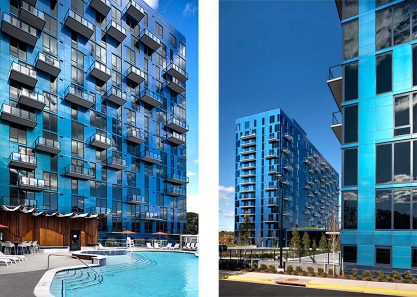
MCMs in a color-shifting finish decorate the Exo, a 457-unit multifamily facility in Reston, Va.
Carbon Footprint
In addition to the aesthetic and design capabilities proffered by MCMs, one area where metal really shines is in the arena of sustainability.
Due to the fabricated nature of MCM production, metal members are precisely engineered and created to each project’s customized specifications. This means that the use of metal is fully optimized during fabrication and construction process and very little, if any, material is wasted.
And because there are many production facilities in different regions around the country, building owners and architects have the opportunity to regionally source their metal fabricated panels.
To investigate metal’s sustainability factors the Metal Construction Association commissioned environmental consultant thinkstep to perform a study entitled, “Life-Cycle Assessment of Metal Construction Association Production Processes, Metal Roof and Wall Panel Products.”
As reported in a MCA Architectural Record CEU “The ABCs of LCAs and EPDs,” Trisha Montalbo, senior consultant with thinkstep in Boston, stated that a high level of recyclability is one of metal’s strongest environmental attributes. “Additionally, with respect to carbon footprint and demand for nonrenewable energy resources, most of the metal wall assemblies were preferable to the concrete-based assemblies.”
Another key finding of the study reported that the appropriate treatment of waste material can significantly reduce a product’s environmental profile while the transportation of goods and materials is considered minor within the context of the overall manufacturing process.
Another study was commissioned by the Metal Building Manufacturers Association and performed by Walter P. Moore and Associates found metal buildings to display lower environmental impacts in all six metrics as compared to load-bearing masonry walls, concrete, tilt-up, and steel-framed construction of the same building footprint and functional equivalence. For the types of building where metal buildings are typically most economical, the report concluded that metal generally performs better in life-cycle analyses and produce the least embodied building material impact.
Fire Protection
Another important issue with MCMs is ensuring fire protection, particularly in light of advancements in the National Fire Protection Association NFPA 285-23 Standard Fire Test Method for Evaluation of Fire Propagation Characteristics of Exterior Non-Load-Bearing Wall Assemblies Containing Combustible Components performance requirements for limiting fire propagation in building assemblies contained combustible materials.
Offering a little perspective on the evolution of this important standard, John Valiulis, P.E., technical director of the International Firestop Council stated in a Fire Engineering magazine article, “The fire protection engineering community in the U.S. foresaw the increasing use of combustible components in exterior wall construction decades ago. The test method, which today is titled NFPA 285, has resulted in an existing building stock with exterior walls that have exhibited a resistance to self-propagating fires.”
The main fire-related issue with an MCM system is the panel core sandwiched between the two metal facers. MCM panels have been developed with a thermoplastic core that resists the propagation of flames and these panels are commonly used where compliance with NFPA 285-23 is required by local and national building codes.
MCM panel systems made with fire-retardant FR core perform well when tested to the NFPA 285-23 standard. The FR core is made with fire-retardant compounds that break down to create water vapor when subjected to extreme heat. This water vapor helps suppress flame spread, and causes the material to self-extinguish once the flame source is removed.
The large-scale, two-story test involves a number of detailed requirements limiting the extent of flame spread over the test wall assembly. Consequently, if an exterior assembly using MCM panels meets the performance criteria of this standard, there is a high level of assurance for the fire protection and safety of building occupants.
The most recent version of the NFPA 285-23 contains valuable guidance in the appendix on the level and type of modification that can be considered for a project based on a successfully tested assembly. This evaluation would be made by a registered design professional and allows for the project design flexibility.
Visual Acceptance Parameters Beyond The Codes
While the International Building and Fire Codes define a number of exterior cladding performance requirements—including material performance, structural integrity, and allowable deflection limits—a number of flatness and localized issues, such as denting and colorfastness, are not specifically addressed within the code.
To highlight the industry standards for perceived “defects” in MCM panel installations, and essentially promote a higher standard for these systems, MCA developed a useful white paper titled, Visual Acceptance Parameters for Metal Composite Material Panels and Panel Systems.
The document identifies four main areas: panel deflection, panel bow, surface imperfections, and finish performance and color fastness. Panel Deflection: Metal panel deflection is generally caused by two factors: wind load and thermal movement of the panel due to temperature change. Any expansion and contraction commonly resulting in panel deflection can easily be addressed with proper design, fabrication, and installation techniques.
Of note, MCM cladding is allowed by code to have a panel deflection of L/60, which recognizes the ability of metal cladding to deflect a considerable amount and still return to its original position without yielding the material.
Panel Bow: When subjected to a change in ambient temperature, a restraint in an MCM panel can cause panel bow. The movement causes the panel to grow as the temperature rises and shrink as the temperature declines. These dimensional changes are directly related to these temperature changes in the panels when compared to the installation temperature. For example, with aluminum panels, this change in temperature can easily vary +/- 100°F from the installation temperature and cause a change in panel length of 1/8-in (per 8 feet in length) or more. If this is not considered in the panel system design, fabrication, and installation, this level of panel movement may cause visual panel bowing.
Further, movement within the structure itself, or the sub-framing may directly impact the panel flatness. Consequently, the load deflection criteria of the panel system and connection methods should be coordinated with the load deflection criteria of the primary support system to control movement and reduce significant panel bowing. To address these issues prior to installation, panel fabrication often includes slotted holes in panel framing members or use of adhesives that allow some panel movement.
Panels are usually installed with a fixed point in the center of the panel, allowing for expansion and contraction of the panel in both directions from the fixed point. While this technique can become particularly difficult around openings and at building corners, proper planning can minimize this difficulty.
Finally, consideration must be given to allow free panel movement. This means that fasteners generally should not be torqued tight against connecting extrusions, effectively locking the panels in place.
In sum, as objectionable as panel bow can be on a project, the effect is generally temporary and will often subside as the panel approaches the installation temperature.
Surface Imperfections: Not specifically addressed within the code, Imperfections typically include surface dents, dimples, abnormal core defects, and defects within the metal facing material.
As defined by the Insulated Glass Manufacturers Association’s insulating glass units and American Architectural Manufacturers Association (AAMA) 2605 Section 5.2, the Voluntary Specification, Performance Requirements and Test Procedures for Superior Performing Organic Coatings on Aluminum Extrusions and Panels, a visual inspection is made when standing 10 feet from the surface at a 90° angle, typically under natural exterior lighting conditions.
If imperfections are identified, they should be indicated to the installer for investigation and possible remediation or replacement.
Finish Performance and Color Fastness: Also not specifically addressed in the building codes, finish criteria are often defined in detail in the project specifications. These performance characteristics include, but not limited to hardness, impact resistance, wear resistance, humidity, and corrosion resistance, as defined by various ASTM, AAMA and NCCA standards.
Color fastness is measured under laboratory conditions and compares a sample of the project panel to a production control sample using one of several standard test methods.
A cleaning and maintenance standard should be included to sustain the finish of the MCM panel systems. Also of note, the performance characteristic of the detergent resistance used for cleaning should conform to the chemical resistance criteria specified in AAMA 2605.
Working With Certified MCM Fabricators
When designing MCM exteriors, architects can significantly boost the quality of the installed panels by working with certified MCM fabricators.
Photos courtesy of 3A Composites USA
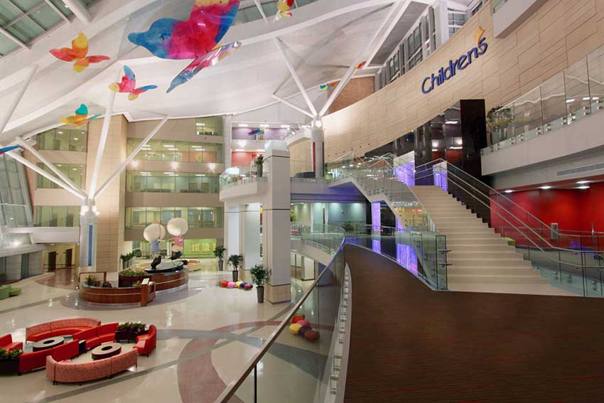
Miles Associates chose MCM for the interior design of the 65,000-square-foot atrium of the Children’s Hospital at Oklahoma University Medical Center in Oklahoma City.
Developed by MCA’s Metal Composite Material Council, certification is based on experience, the extent of services offered—i.e., project design, fabrication, installation, in-house engineering—meeting industry performance requirements, and demonstrating the company’s level of financial strength, thereby offering assurance that the company can support large projects.
For example, fabricators earn qualification points by meeting standard performance testing such as:
- ASTM E 283 Static Air Infiltration standard of no more than 0.06 cubic ft. per minute per sq. ft. at 6.24 pounds per sq. ft. (PSF) of loading
- ASTM E 330 Structural Design Load where deflection of framing members doesn’t exceed L/60 of the clear span or anchor deflection doesn’t exceed 1/16 inch at +/– 30 PSF.3
- ASTM E 331 Static Water Infiltration with no uncontrolled water passing from the panel system onto the substrate at 12.0 PSF loading
- AAMA 508 or 509 for rainscreen installation systems
In terms of quality of the services that certified MCM fabricators offer to architects, these premium subcontractors create project and shop drawings and often provide engineering calculations to verify the adequacy of the panel system design. The fabricator also takes responsibility for designing, sourcing, and fabricating all structural components including extruded aluminum, fasteners, and clips.
Quality control procedures used by certified subcontractors can identify problems early, before installation, avoiding time-consuming delays and modifications. In addition, by selecting selected certified MCM fabricators, architects are ensuring that the fabricated systems will meet performance requirements in the area of water penetration, structural performance, and visual appearance.
In Conclusion
While MCMs are more commonly used in a variety of commercial applications for today’s buildings, many architects may not be aware of the extent of their capabilities in the realm of design. From unique shapes and curves to textures and patterns to bold and trendy colors, MCMs are an amazing tool in an architect’s design toolbox.
Sustainable and cost effective, this long-lasting, exceptional fire protection material is a great option for projects seeking both sleek, stand-out designs and more traditional facades. As more retail, healthcare, office, automotive, convention centers, and multi-family buildings select MCM wall cladding, their popularity is expected to continue growing.
Barbara Horwitz-Bennett is a veteran architectural journalist who has written hundreds of CEUs and articles for various AEC publications. BHBennett.com
The Metal Construction Association brings together a diverse industry for the purpose of expanding the use of metal in construction through marketing, research, technology, and education. MCA member companies gain tremendous benefit from association activities that focus on research, codes and standards, market development, and technical programs. www.metalconstruction.org
Originally published in Architectural Record
Originally published in December 2022
LEARNING OBJECTIVES
- Describe the aesthetic design capabilities MCMs offer including the material’s ability to stay absolutely flat or bent, shaped, curved, textured, perforated, and patterned in many colors and finishes.
- Explain the sustainable and fire protection capabilities offered by MCMs.
- Identify ways in which MCMs are high suitable for branding designs.
- Discuss recent case studies where the unique design capabilities of MCMs are showcased.

