Just Released

Custom Ceiling Design
Systems can meet many different needs and design goals
Sponsored By Arktura
Credits: AIA, GBCI, ICC
Type: Article
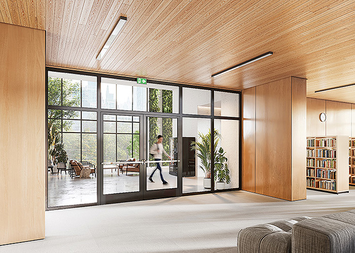
Emerging Trends Influencing Innovation in Fire-Rated Glazing
Advances in technology increase sustainability, views, and installation ease
Sponsored By Vetrotech Saint-Gobain North America
Credits: AIA, GBCI, ICC
Type: Article
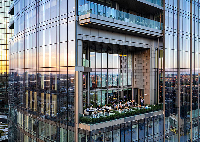
Longevity and Sustainability of Curtain Walls
Will your facade last a few decades or a millennium?
Sponsored By The Ornamental Metal Institute of New York
Credits: AIA, GBCI, ICC
Type: Article
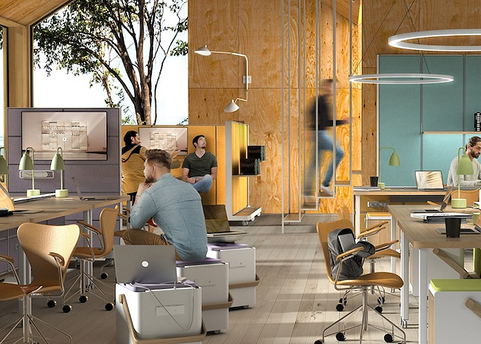
Sit, Stand, Move, Repeat
How to design a dynamic workplace
Sponsored By B+N Industries
Credits: AIA, GBCI, ICC, IDCEC
Type: Multimedia
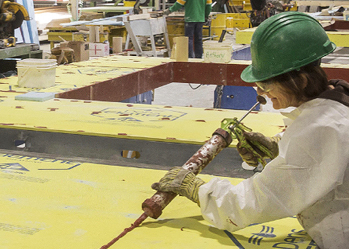
Changing the Way We Think of Prefabrication: New Solutions for Your Building Envelope
Integrated sheathing is a key component
Sponsored By Georgia-Pacific Building Products
Credits: AIA, ICC
Type: Multimedia
Editorial

Joost Moolhuijzen
Credits: AIA
Type: Podcast
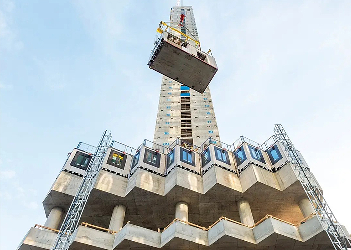
Prefabrication
Credits: AIA
Type: Article

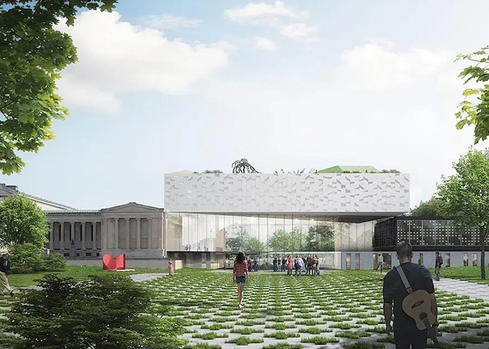
Remaking the Met
Credits: AIA
Type: Article
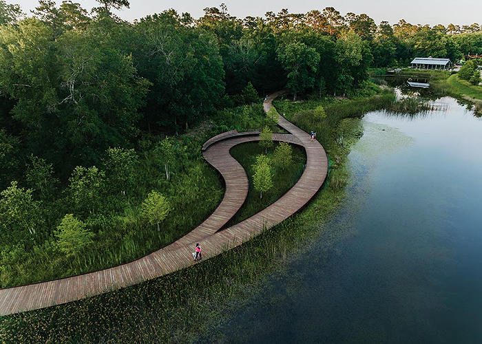
High-Performance Landscapes
Credits: AIA, ICC
Type: Article
Choosing the Right Waterproofing System
Credits: AIA, ICC
Type: Article
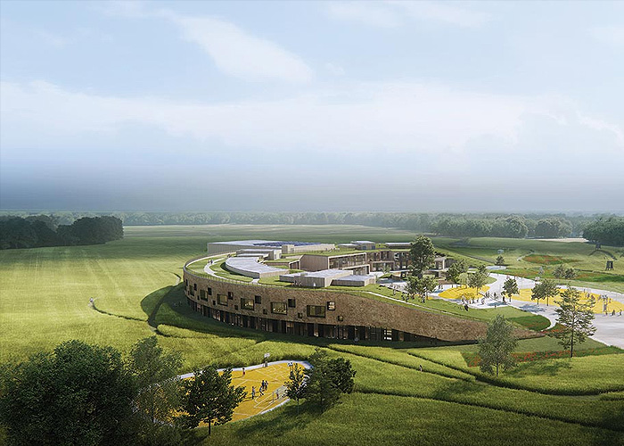
Bio-Based Materials
Credits: AIA, ICC
Type: Article
.jpg)
Circular Construction
Credits: AIA, ICC
Type: Article
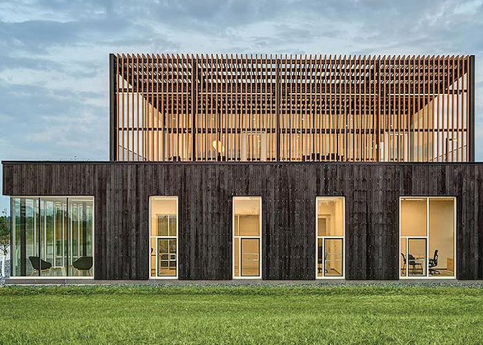
Taking Care of the Customer
Credits: AIA, ICC
Type: Article
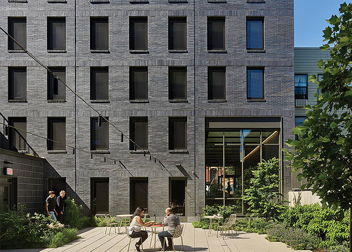
Affordable Housing & Energy Performance
Credits: AIA, ICC
Type: Article

Tall Buildings
Credits: AIA, ICC
Type: Article
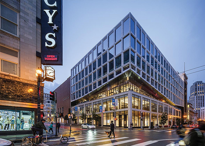
Building Recladding
Credits: AIA, ICC
Type: Article
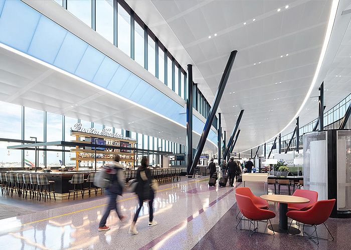
Transportation & Infrastructure
Credits: AIA, ICC
Type: Article
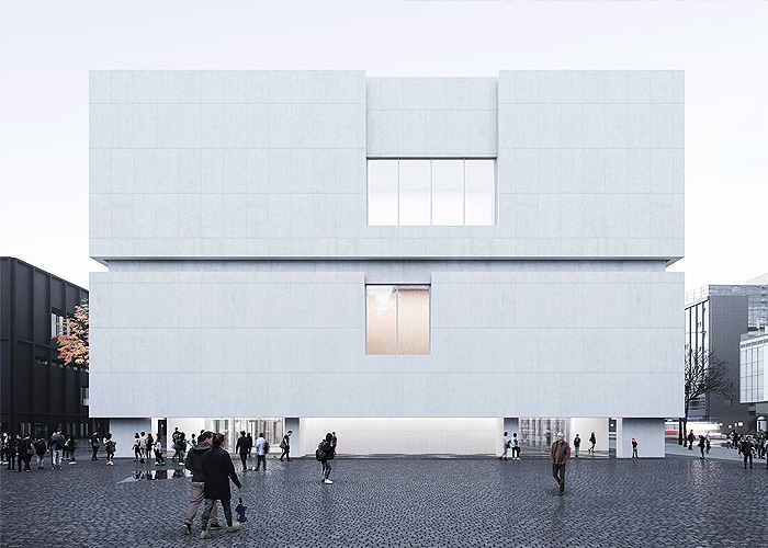
Daylighting in Museums
Credits: AIA, ICC
Type: Article
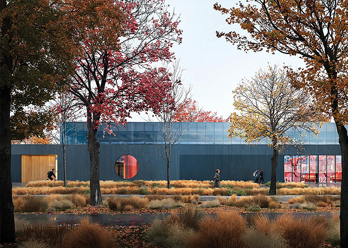
Campus Geo-Exchange Systems
Credits: AIA, ICC
Type: Article

Office Conversions
Credits: AIA
Type: Article
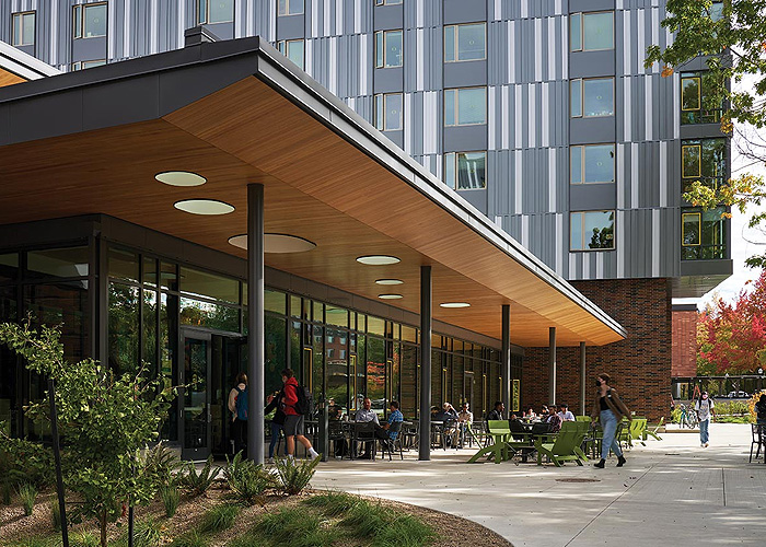
Extreme Heat
Credits: AIA
Type: Article
Accessibility

Fully Integrated Health Care Solutions: The Restroom and Beyond
Credits: AIA, ICC
Type: Multimedia

Designing Smarter Restrooms for Education
Credits: AIA, ICC
Type: Multimedia

ADA - Accessibility in Toilet Room Design
Credits: AIA, ICC
Type: Multimedia

Design Trends in Commercial Washrooms and Locker Facilities
Credits: AIA, ICC
Type: Multimedia

The Sustainability of Automated Parking with EV Charging
Credits: AIA
Type: Article

Wellness-Based Design Strategies in Healthcare
Credits: AIA, GBCI, ICC
Type: Article

INCLUSIVITY: People, Public Furniture, and Public Space
Credits: AIA, GBCI, ICC
Type: Article

2024 International Building Code® Updates – Fire Safety Provisions for Exterior Wall Assemblies, Foam Plastic Insulations, Section 104
Credits: AIA, ICC
Type: Article

Tatiana Bilbao - Tatiana Bilbao Estudio
Credits: AIA
Type: Podcast

Navigating Compliance with ADA Signage
Credits: AIA, ICC
Type: Webinar On-Demand
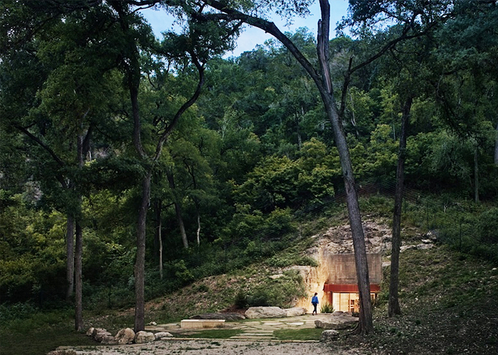
Brian Korte-Clayton Korte
Credits: AIA
Type: Podcast

Health Care Design
Credits: AIA, ICC
Type: Article

Designing ADA-compliant Commercial Showers & Bathrooms
Credits: AIA, ICC
Type: Webinar On-Demand
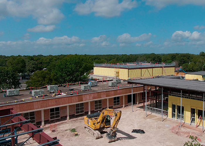
Creating a Safe Haven in Educational Buildings
Credits: AIA, GBCI, ICC
Type: Article

Sit, Stand, Move, Repeat
Credits: AIA, GBCI, ICC, IDCEC
Type: Multimedia
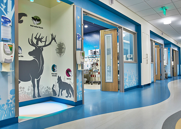
Built to Protect
Credits: AIA, ICC
Type: Webinar On-Demand
Acoustics

Beyond the Noise: Elevating Building Design, Performance and Experience with Acoustics
Credits: AIA
Type: Article

Focus on Facility Guidelines Institute Ceilings
Credits: AIA, ICC
Type: Article

Sonic Shangri-la – The Art of Sound
Credits: AIA, ICC
Type: Webinar
Feb 4 2025 2:00 PM EST

Acoustic and Aesthetic Suspended Ceiling Solutions Using Stone Wool
Credits: AIA, ICC, IDCEC
Type: Multimedia

Custom Ceiling Design
Credits: AIA, GBCI, ICC
Type: Article

Healthy Spaces for Healing Environments
Credits: AIA, ICC
Type: Webinar On-Demand
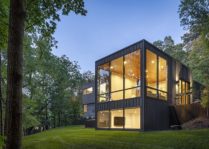
Get Smart with Windows, Doors and Skylights!
Credits: AIA
Type: Multimedia
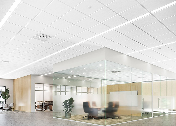
Harmonizing Spaces
Credits: AIA
Type: Webinar On-Demand
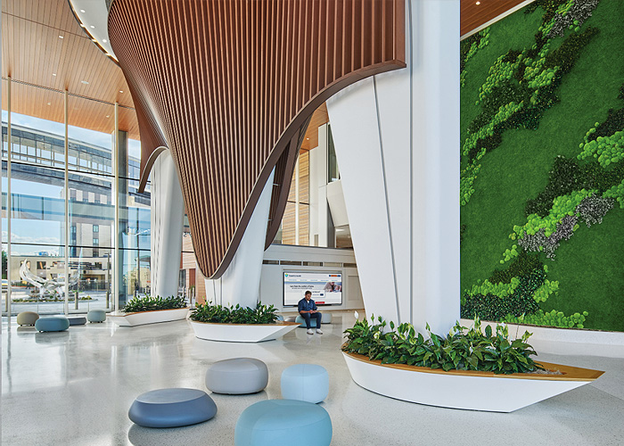
Unveiling the Vital Role of Material Health in Preserved Gardens and Moss Walls: An Introductory Overview
Credits: AIA, GBCI, ICC
Type: Multimedia
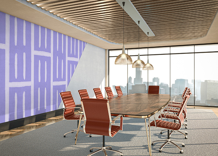
Unlock Acoustic Excellence
Type: Webinar On-Demand

Designing Smarter Places of Learning
Credits: AIA, ICC
Type: Webinar On-Demand
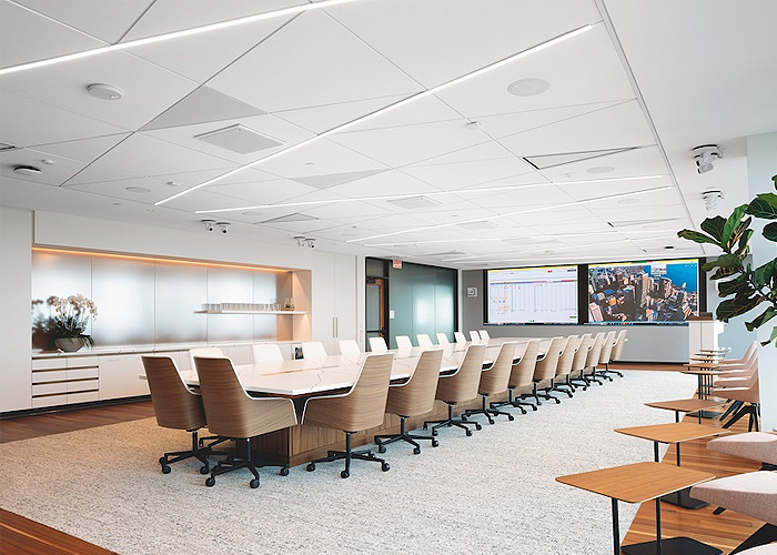
Acoustical Design for Today's Buildings
Credits: AIA, GBCI, ICC
Type: Multimedia

From Survive to Thrive: Buildings that Enrich Health and Wellness
Credits: AIA, GBCI, ICC
Type: Article
Patricia Viel, ACPV Architects
Credits: AIA
Type: Podcast

Living with Neighbors
Credits: AIA, ICC
Type: Article

Designing an Architecture Career: Alternatives to Traditional Practice
Credits: AIA, ICC
Type: Webinar On-Demand
Building Envelope Design

Built to Protect
Credits: AIA
Type: Webinar
Feb 12 2025 2:00 PM EST

Electronic Leak Detection for Roofing, Waterproofing and the Building Envelope
Credits: AIA, ICC
Type: Webinar
Feb 25 2025 2:00 PM EST

Modified Bitumen Roof Assemblies: Where Old Meets New
Credits: AIA, ICC
Type: Webinar
Feb 12 2025 2:00 PM EST

Joost Moolhuijzen
Credits: AIA
Type: Podcast

Prefabrication
Credits: AIA
Type: Article
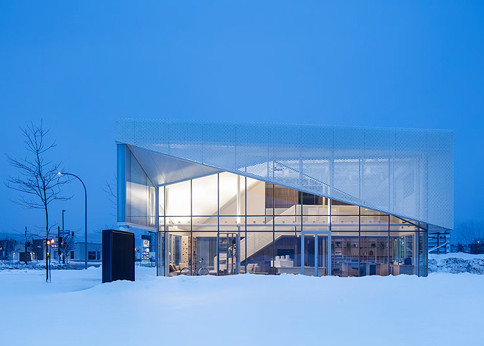
Expanded Metal and Perforated Mesh Interior and Exterior Applications
Credits: AIA, ICC
Type: Webinar On-Demand

Using Charred Wood for Exteriors and Interiors
Credits: AIA, GBCI, ICC
Type: Article
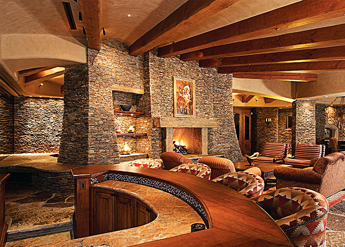
Picking the Proper Mortar for Adhered Veneers
Credits: AIA, GBCI, ICC
Type: Article
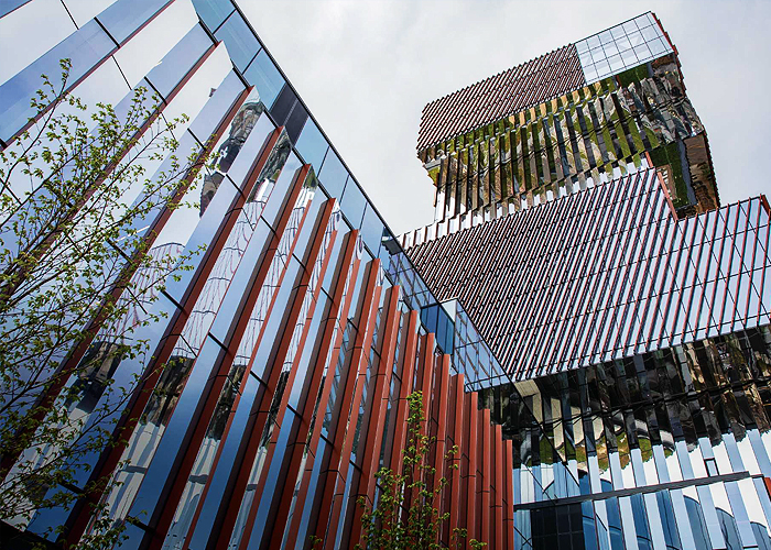
Versatility of Design and LEED Certification with Metal Composite Materials
Credits: AIA, GBCI, ICC
Type: Article

Insulated Metal Panels for Wall and Roofing Retrofits
Credits: AIA, GBCI, ICC
Type: Article

The Sustainability of Automated Parking with EV Charging
Credits: AIA
Type: Article

Profiles in Multifamily Innovation
Credits: AIA, GBCI, ICC
Type: Article

Introduction to Building Science
Credits: AIA, ICC
Type: Article

Stucco: Beyond the Basics
Credits: AIA, ICC
Type: Webinar On-Demand

The Evolving Landscape of Commercial Energy Efficiency
Credits: AIA, ICC
Type: Webinar On-Demand
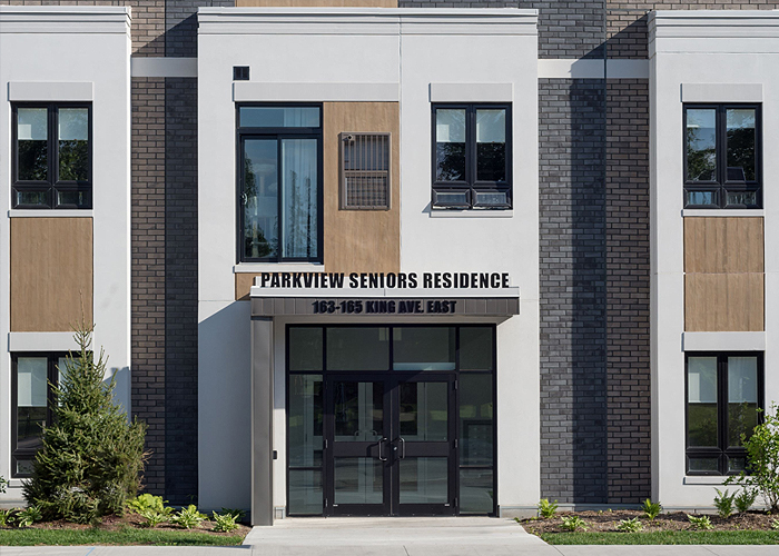
Next Level Cladding with Resin Cast Shapes
Credits: AIA, ICC
Type: Webinar On-Demand
Electrical and Mechanical

Heating Oil Conversion
Credits: AIA, GBCI, ICC
Type: Multimedia

Remaking the Met
Credits: AIA
Type: Article

The Sustainability of Automated Parking with EV Charging
Credits: AIA
Type: Article

Meeting Energy Demands While Facing the Challenges of Electric Grid Instability
Credits: AIA, GBCI, ICC
Type: Article

Propane and Building Design for Commercial Businesses
Credits: AIA, GBCI, ICC
Type: Multimedia

Propane Gas Systems
Credits: AIA, GBCI, ICC
Type: Multimedia

Human-Centric Lighting Made Simple with Automation
Credits: AIA, GBCI, ICC
Type: Article

Propane-Enabled Solutions for Commercial Buildings in Rural Areas
Credits: AIA, GBCI, ICC
Type: Multimedia

Controls Optimization for Residential Heating Systems for New and Retrofit Homes
Credits: AIA, ICC
Type: Webinar On-Demand

Energy Efficiency and Resilience of Building and Renovating With Propane
Credits: AIA, GBCI, ICC
Type: Article

Roof Hatches Simplified
Credits: AIA, ICC
Type: Article

Building for the Future: Digitally Connected Elevators
Credits: AIA, ICC
Type: Webinar On-Demand

Keeping Pace with Technology
Credits: AIA, ICC
Type: Webinar On-Demand

Get Smart with Windows, Doors and Skylights!
Credits: AIA
Type: Multimedia
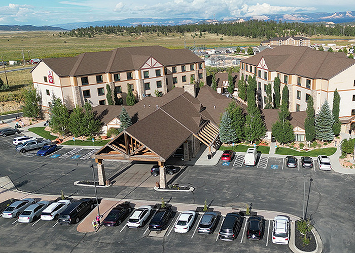
The Future of Hot Water in Commercial Operations
Credits: AIA, ICC
Type: Article
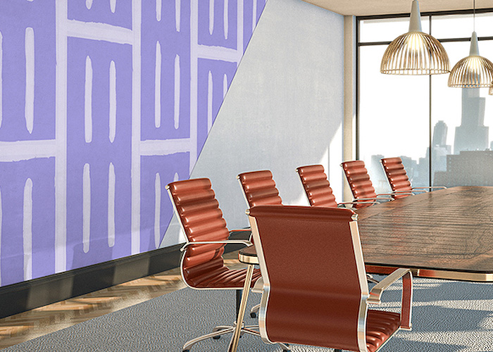
Achieve Acoustic Excellence: Design Strategies that Affect STC Ratings
Credits: AIA, ICC
Type: Podcast
Privacy Policy
Terms and Conditions
Do Not Sell My Personal Information
Privacy Request


BNP Media, All Rights Reserved
Powered by Building Media Inc (7.4.33)


