This CE Center article is no longer eligible for receiving credits.
455 Central Park West: Inverting The Paradigm
The first oncologic specialty hospital in the nation, the New York Cancer Hospital (later to evolve into Memorial Sloan-Kettering Cancer Center), started in 1884 and soon moved to this uniquely configured building on Central Park West between 105th and 106th Streets. Designed by Charles Coolidge Haight with features aimed at advancing medical care as it was understood at the time, it was completed in 1887, inhabited by several decades' worth of patients, and eventually viewed as an object of fear because of the fates endured there in eras when cancer treatments were largely palliative at best. After the institution moved to the East Side in 1955, the building fell into disrepair and narrowly escaped demolition before it was landmarked in 1976.
Multiple attempts to develop the building misfired, but financial support from Columbia University (for faculty housing) and a Chicago developer (for luxury condominiums, including a new 27-story tower) finally resulted in sufficient renovation for high-end condos to open there in 2005. RKTB, with diverse and longstanding experience in adaptive reuse, led the renovation efforts, which resulted in multiple awards and 100 distinctive residential units.
“The innovations there were these enormous windows that you could open up,” says Bafitis, “and suck the air through”—ironically, an approach to negative-pressure ventilation now known to be effective for today's infectious diseases, though irrelevant to cancer. “They didn't really understand germ theory very well back then; they believed that germs bred in corners, and so they eliminated the corners in the hospital wards of that building. Their thinking was that the elimination of corners would help in preventing germs and grime from building up, and so the round turrets of that building were created and fashioned after a French castle.” Locals reportedly referred to it over the years as “the towers,” “the castle,” or “the Bastille.”
“This was a building that does not lend itself to anything but being a hospital, really,” Bafitis continues, “but we converted it.” Preserving the exterior masonry was mandatory owing to landmark status; wooden structural elements were decrepit enough to need demolition, and a new concrete interior structure allowed removal of all columns, creating column-free spaces in the large turrets (42 feet in diameter), functioning as living/dining rooms for the massive units, with ceiling heights of 15 feet. “In effect, [it] was a brand new building within the existing skin that was preserved and repaired and left in place.” The 455 building is basically the inverse of a reclad.
A key lesson from RKTB's experience here, Bafitis says, is that “every building, even as morphologically distinct as 455, can be adapted. I think there are ways of taking advantage, volumetrically, of the spaces that are offered within; I venture to say that we could do it very creatively, very ingeniously, in any structure. Hospital conversion is something that has taken place a fair amount, and you wind up having the same kind of issues there: you have very tall floors, and they tend to be wide in places and narrow in other places, but it's a matter of working with the building and working with the structure, working with the volumes. And we were offered a lot of latitude in 455.”
Bee compares the 455 experience to other famous adaptive-reuse projects like the former Bell Labs building Westbeth (1970), “probably the granddaddy of all the artists' live-work spaces in the country [and] the building that really put Richard Meier on the map.” Having chaired Westbeth's board for a number of years, Bee admires its flexible layouts as well as its status as an affordable community. RKTB's own conversion experience dates from the same era, when they adapted an east Midtown manufacturing building into the Turtle Bay Towers rental units, taking advantage of zoning-mandated setbacks by adding curtain-wall greenhouse structures to setback terraces on the western face, removing masonry for access. The developer Rockrose allowed considerable experimentation on that project, leading to further conversions including the West Coast Apartments (a block of former meatpacking warehouses, “[that had been] refrigerated for so long that it developed permafrost in the building, so when we went to convert it, we had to thaw out the building... the building started falling apart, because the permafrost kept things together.”). They have also performed several office-to-school conversions, frequently an easier typologic match than office-to-residential because of floorplate and ceiling dimensions.
The greatest challenge in adaptive reuse, Bafitis comments, is applying lessons from high-end projects to the affordable sector, which severely needs “ownership and a clientele that has real vision and doesn't necessarily want to provide cookie-cutter solutions.” Yet quirky cases like 455 fire his long-range optimism. “We've been doing it naturally, in our practice and as residential architects for a long time in New York City, and it's heartening to see that this is really sort of catching on.”

Photo credit: KieranTimberlake/Matthew Krissel.
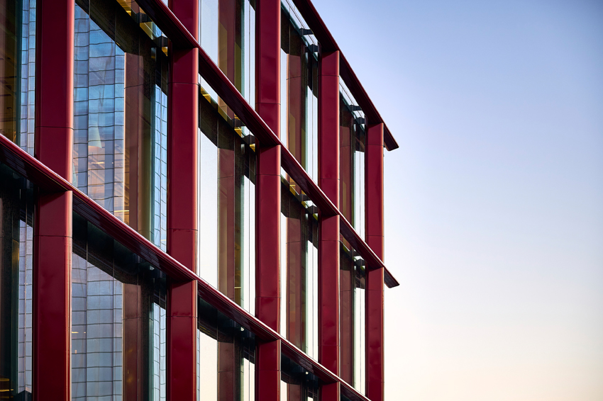
Facade of Bulletin Building, Philadelphia. Close inspection reveals frit pattern on glazing.

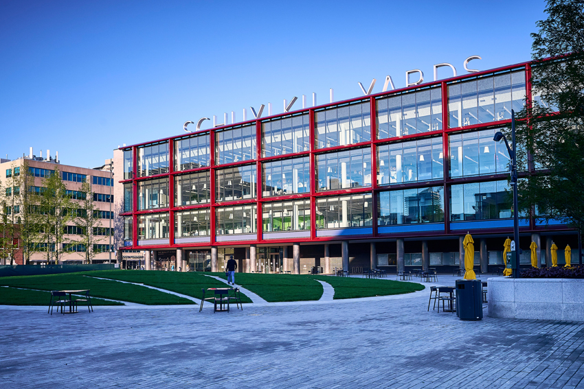
Bulletin Building, Philadelphia. The red metallic armature creates a contrast with the internal grid of structural columns and slab floors.
Bulletin Building: Icon Reborn as Urban Catalyst
In Philadelphia, the headquarters of a long-respected newspaper, the Evening Bulletin, expressed a certain midcentury modernist ideal. Now, four decades after the Bulletin lost the circulation wars to the morning Inquirer and to televised news, going defunct in 1982, its facilities have a new life as a research building, the gateway to Brandywine Realty Trust's new Schuylkill Yards “innovation district.” The four-story Bulletin Building, transformed from its largely windowless original image (and a transitory condition as Class B space for Drexel University) to an open design, now presents the neighborhood with a dramatic curtain wall, framed and deepened by a bold red metallic grid. The converted building offsets the high energy demands of life science laboratories with envelope features that yielded a net decrease in environmental footprint while reasserting a distinctive presence on the skyline.
The Bulletin headquarters (1955), Philadelphia architect George Howe's last building, says KieranTimberlake's Richard Maimon, answered the Beaux-Arts civic dignity of its neighbor 30th Street Station (1933, designed by Daniel Burnham's successor firm Graham, Anderson, Probst and White) with the mid-century modernist equivalent: a monumental concrete-framed volume balanced on narrow columns and a simple, largely blank east facade. Except for a small news ticker and the paper's name in lettering over a story high, the gray brick volume maintained a dignified silence.
During Drexel's use of the building after the Bulletin's demise, an intermediate renovation during the 1990s broke up the blank facade with three undistinguished, poorly performing single-glazed strip windows, resembling narrow slots on the short facades of Howe's building that had never admitted ample light. Its new incarnation, now the headquarters of biotech firm Spark Therapeutics, opts for full-scale transparency, daylight, and views, with better full-envelope insulation despite the dematerialization of replacing brick with glass.
Spark initially moved into the second floor during reconstruction, attracted by the location near Drexel and the University of Pennsylvania; finding the space congenial during a proof-of-concept period (and enjoying a boom phase after a merger with Roche Group), the firm expanded to fill floors three and four. Ground-lease holder Drexel retains a below-grade academic space under the adjoining park, Drexel Square (converted from the Bulletin's parking lot), Maimon reports, and at this writing Brandywine is seeking a retail tenant (e.g., a food hall) for the ground level. Technically a mixed-use building, the Bulletin Building places Spark's work (chiefly in anti-blindness/anticancer research) in public view and announces to the city the increasing prominence of the “eds and meds” economic sector.
On large and small scales, the building reimagines Howe's vision of a modern building as a communicative entity. Sculptural roof-mounted signage announces the Schuylkill Yards brand as the Bulletin's large lettering heralded the paper. Close inspection of the new glazing, Maimon points out, reveals a custom ceramic frit pattern above eye level for solar-gain reduction, derived from the Bulletin's typefaces, a gesture to “subtly represent the history of the building as a place of print.” By night, uplighting from inside the glass lets the metallic armature articulate the building's form as interior lighting makes the building a beacon. Between the first and second floors, where the soffit meets the colonnade, a new and larger LED information ticker updates that feature of Howe's original building.
An essential aspect of the mission was “not imposing new loads on the building,” Maimon says, “despite having much more significant solar gain.” With loft-scale 16-foot ceiling heights and floorplates in the 50,000-square-foot range, plus roof space, the building can accommodate ample mechanical systems, and Spark's operations move considerable air through the building – yet the combination of high-performance low-iron, low-emissivity glass and reroofing with significant insulation “actually reduced the energy load in the building,” Maimon reports.
The armature suspended two feet off the east facade is sloped to prevent birds from roosting and painted with an automotive-grade metallic red (including touches of orange and a reflective mica-like glass element), developed in consultation with PPG and Spectrum Paint; its golden-section dimensions contrast with the 28-foot bays of Howe's interior pilotis, creating a visual polyrhythm that complicates the simplicity of the forms.

Photo credit: © Ashok Sinha
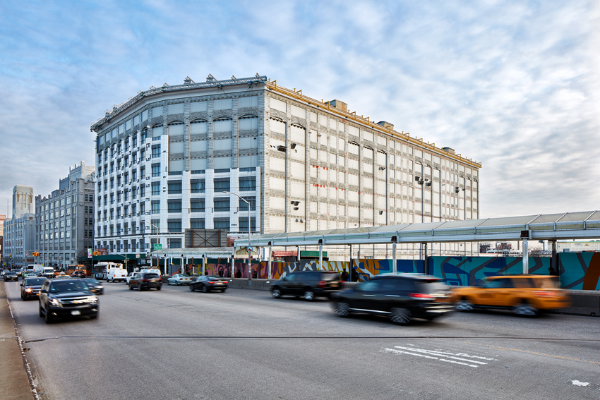
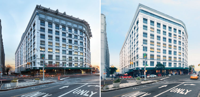
LaGuardia Community College, Brooklyn, midway through recladding.

Photo credit: ©SinzianaVelicescu
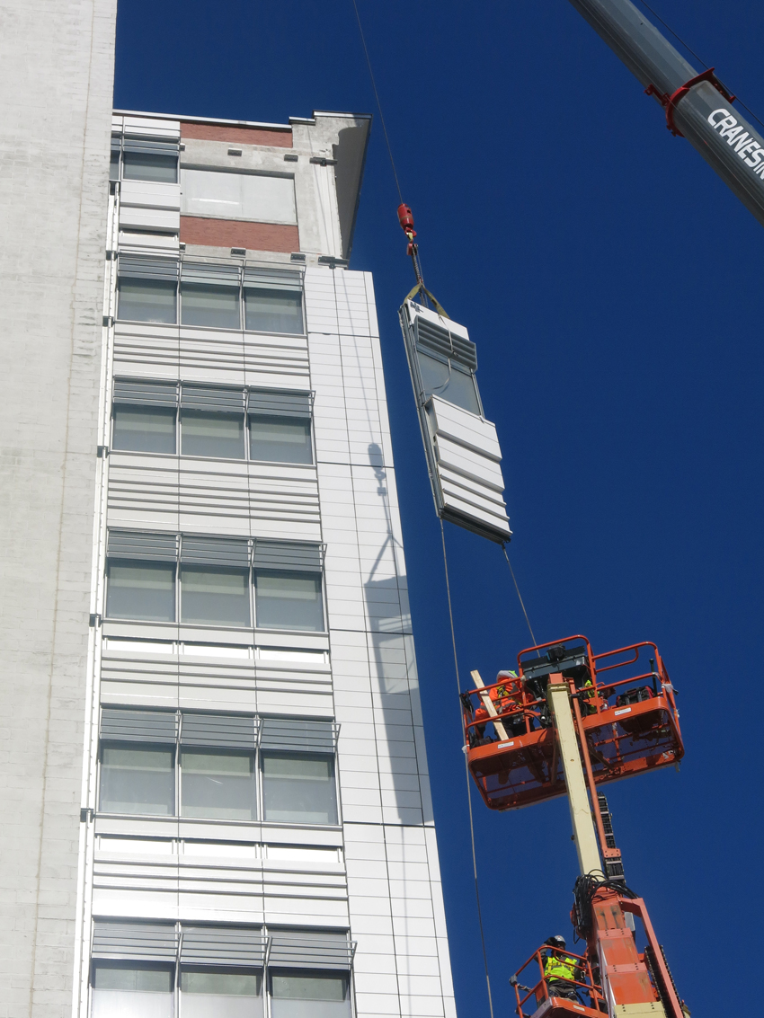
Installation of curtain wall panels at LaGuardia Community College, Brooklyn.
The COVID-19 pandemic has changed many long-held assumptions about working conditions and commercial real estate in American cities. While working from home suits some workers and organizations better than others, these flexible operations have made considerable inroads against the 9-to-5 workday and the centripetal commute to central business districts. Few observers are confident that demand for urban office space will rebound fully. Even if the pandemic comes under nearly complete control and “Zoom fatigue” sours many workers and managers on home-office arrangements, some degree of ratchet effect on office-space demand is likely.

Photo credit: ©Ashok Sinha
LaGuardia Community College in Brooklyn as recladding work designed by Mitchell Giurgola nears completion (left). The facade following installation of new curtain wall panels (right).
Vacancy rates have reached unprecedented levels: New York's commercial vacancy rate peaked at 18.7 percent in July 2021, according to real estate services company Newmark, and remains at 18.5 percent at this writing (the close of the year's third quarter). Similar conditions affect other cities: as New York’s vacancy rate was reaching record levels, Los Angeles reported 24 percent, and Chicago 22 percent.1, 2 With a glut of office space, at least for the foreseeable future, questions arise in many quarters about ways to put those square feet to better use.
Adaptive reuse of commercial space as residential, educational, or research space is intuitively appealing to architects, developers, environmentalists, and occupants, particularly in congested cities where new construction is difficult. Yet the adage that “the greenest building is the one that is already built”3 does not carry a corollary that any existing building is readily convertible to any new program. Sites and structures vary widely in convertibility. The different requirements for indoor environmental quality (IEQ), dimensions, sightlines, vertical circulation, egress, energy performance, and code compliance make some commercial buildings readily suitable for adaptation and others challenging, inefficient, or unworkable. Architects with experience in adaptive reuse note that repurposing an older building calls for careful analysis of site conditions, scales, proportions, materials, technologies, and environmental metrics, both before a project launches and during design and construction.
Retrofitting mid-century buildings involves proportional challenges in several dimensions, notes principal John Lesak of California-based Page & Turnbull. Vertically, floor-to-floor heights may not be sufficient for daylight penetration and views, or for mechanical systems and air ducts. Horizontally, a large square floorplate can make it harder for light and air to reach the center core than a more rectangular plan, unless light ports or carved-out courtyards are present. Some locations and architectural generations also pose distinct problems: in downtown Los Angeles, Lesak says, a core of buildings from the 1920s have been “vastly underutilized” in their upper floors, though ground-level storefronts remained active. Local adaptive-reuse ordinances in LA since about 2001, “specifically designed to convert older commercial office buildings into houses,” have focused more on egress safety and seismic structural upgrades than ventilation and energy performance.
Critical elements of adapting a commercial space for any new program include determining how its facade manages air, daylight, and energy relative to the new use's specific requirements. Conditions that are tolerated in offices, which can rely extensively on artificial lighting and mechanical ventilation, may be neither marketable nor up to code for residences, which require operable windows in New York City. Commercial buildings' curtain walls lacking operable segments are often efficient from the standpoint of energy conservation but incapable of allowing fresh air to reach occupants, contributing to the much-derided “sick building syndrome” noted in construction from the 1970s and 1980s.
Decisions about recladding or other facade modifications can be essential determinants of a conversion project's environmental, operational, and financial viability. Contemporary approaches to curtain walls, window walls, and other facade types have expanded the options available for balancing the contrasting imperatives associated with these projects. “There are incredibly technologically sophisticated curtain-wall systems now,” notes Peter Bafitis of RKTB (formerly Rothzeid Kaiserman Thomson & Bee), a New York City-based firm with an extensive adaptive-reuse portfolio, “but you need to do it in conjunction with other energy measures to get a building in compliance these days.” Curtain walls and related structures are “like putting a blanket on a building” inefficiently providing insulation, says Bafitis's colleague Carmi Bee, “a membrane that maximizes the amount of usable floor area.” These facade modifications have a long history as problem-solving components of buildings undergoing a change of use.
The logistics of recladding any type of non-vacant institutional building can be a significant part of the decision process, notes associate principal John Breisky of envelope consultant Heintges. “One thing that's foremost in any discussion about a reclad or an overclad is what you do with the building population while you're doing the work,” he says; a single-tenant building is generally easier to work with than a multi-tenant building, considering the demolition component, the need for a temporary weather wall, and the complexities of moving tenants to leased space offsite. “The expense to move out a large portion or the entire building population and just leave the floorplate open can very easily be the biggest cost of doing a project like this... Where you're taking a commercial office building and converting it to a residential use, whenever you're starting with an existing curtain wall, you have to look at the material that you're working with; you have to do a discovery, dig up all the information you can find. Hopefully there are records on file with the facilities department and/or the owner or the architect; you just gather what you can find, and then you can verify those findings by doing probes. If the owner is really serious about it, they'll work with you on that.”
Adding operable windows for residential adaptation, Breisky continues, requires close attention to code compliance, including, in New York, differences between the 1968 code and modern code.4 “You may find, using current analysis, that the building doesn't really perform for the '68 code, but it's okay with the modern code, or vice versa; you can find that certain elements are overstressed or the deflections are not really what they ought to be. But maybe the single biggest difference is that when you introduce an opening or a series of openings into a building, that can affect the design pressure, the cladding pressure; that can have a big effect on feasibility, so when you're trying to control the pressures that a building experiences and stack pressures that occur seasonally through the building, you have to think about how tight the enclosure is, but also about compartmentation.”
Curtain walls of earlier eras commonly had operable sections, notes RKTB's Bee, recalling such features on early adaptive-reuse projects in the Financial District. “As time has gone on,” he says, “there is no operable section because of the sophisticated climate controls that we have. So what does that mean? That means that curtain walls are fixed, there are no requirements to have operable sections, and therein lies the rub, because in order to make it habitable, you have to have fresh air.”
The balance between Passivhaus-style envelope tightness and ventilation requires case-specific solutions. With some buildings, despite policy incentives for residential conversion, the solution is transformation into a different purpose, e.g., education or research. In recent years, the life sciences sector has been a particularly vigorous component of both the economy at large and the adaptive-reuse movement.
Background Variables: Policies, Markets, Typologies, Proportions
Commercial-to-residential conversions are of particular interest given the chronic need for affordable housing in New York and other economically vigorous cities. Patrick O'Shei, director of market development for the New York State Environmental Research and Development Authority (NYSERDA), expects to see an increase in commercial-to-residential conversions over the next three years. “I would say in the moment it appears commercial is overbuilt and residential is underbuilt. Nationwide, office-to-residential conversions in 2021 are already occurring at twice the rate that they did in the previous two years combined, so that's already a national trend,” he says. “We haven't seen this yet in New York. “I think it's primarily because our commercial leases in New York City tend to be so long.” Visible and measurable vacancies imply that the city should be ripe for a wave of these adaptations.
“Adaptive reuse incorporates the fact that you're triggering a whole different set of code when you're changing the building from its intended use to a different use than what it originally was designed for,” O'Shei continues. “The most likely candidates in terms of the commercial space are going to be buildings that were underperforming before COVID-19 or buildings that are located far from the main commuting stations, such as Penn Station or Grand Central.” Compliance with Local Law 97, he says, the 2019 measure that phases in carbon caps for about 50,000 commercial and residential buildings over 25,000 square feet between 2024 and 2050, is another critical determinant of the investments required in these buildings.
Many observers attribute the rise of the financial district as a 24-hour residential/commercial/recreational neighborhood, rather than a daytime commercial area with little nocturnal life, to the 421-g tax incentive for commercial-to-residential conversions below Murray Street, City Hall, and the Brooklyn Bridge, in effect from 1995 to 2006. Some of these occurred in buildings of acknowledged architectural significance, with or without landmark status (another important variable in site selection and design decisions). Market momentum in this neighborhood remained strong after the 421-g incentive period ended. The number of residential units in Lower Manhattan, according to real estate services firm Coldwell Banker Richard Ellis (CBRE) and the Downtown Alliance, rose from approximately 14,500 units in 2001 to more than 33,000 in 2020.
Basha Gerhards, senior vice president of planning for the Real Estate Board of New York (REBNY), observes a recurrent pattern in demand for commercial space. “In economic downturns,” she says, “there's been a flight to quality in office leasing,” i.e., Class A office space, leaving Class B or C buildings as the logical sites for conversion. “Demand for Class A space has remained robust,” as implied by rising interest in site visits: “A recent report from VTS [a property-management technology firm] found that tours of Class A office properties accounted for 70 percent of all tours citywide in late 2020; that represented a significant increase over the start of 2020 before the onset of the pandemic, when Class A office properties accounted for 55 percent of all tours." Gerhards finds that the “Class A office market is where we're going to continue to see vibrancy and growth, and this question of 'What do we do with the other buildings?' is, I don't think, a six-month conversation or a two-month conversation. This is a multiyear conversation.”
With softening of demand for Class B and C space, along with zoning obstacles (many such buildings are in areas like the Garment District where zoning disallows residential use), she continues, conversions at that level are worth exploring, though still somewhat speculative. “The industry is sorting out what are the financial incentives that are necessary,” Gerhards says. “What is the market going to look like? How much Class B and C office space will be liable for a conversion? How much will be taken up post-pandemic by new offices, new entrepreneurs, new commercial users? What is the regulatory landscape going to look like in order to incentivize or encourage the flexibility for these conversions to take place? We keep looking back to the Lower Manhattan model as an example of where everything really fell into place.”
That model has its critics, however. Between the tax benefits to developers and underlying market conditions, the 421-g program largely led to conversions at the upper end of the market, adding some striking contributions to the city's luxury-housing stock but making little dent in the affordable-housing shortage or the size of the city's homeless population. A more recent measure, the Housing Our Neighbors with Dignity Act (HONDA), signed into state law in August 20215 has targeted distressed commercial properties more suited to the affordable and supportive sectors, particularly hotel-to-residential conversions, another intuitive target given pandemic-era vacancy rates.
Hotel conversions are a specialized typology with repetitive floorplans, note Bafitis and Bee, requiring adaptation of mechanical systems, fenestration, and other features, along with layout changes to accommodate families rather than only one or two occupants. With rooms below 350 square feet, “you can't even get a viable studio, according to the zoning, in a hotel,” says Bafitis. “Morphologically, hotels are very narrow,” cautions Bee; “a standard residential building is in the area of about 60 feet deep, and that allows for double-loaded corridors, which are the most efficient. In hotels, they're much narrower, because the rooms aren't very deep at all [and] you don't have any hallways. Rooms would get really, really shallow, unless it was converted to a single-loaded corridor situation.” Disability-related features are regulated differently in hotels and residential buildings, too, Bafitis notes. “There might be some relief there from government that might allow, in the case of a conversion, a more lenient interpretation of the handicap requirements to allow some of these bathrooms, for instance, to just remain in place, which would lessen the cost of conversion, and it would be a very quick step to getting a hotel to become an apartment building.”
The ample plumbing in hotels, on the other hand, offers advantages over retrofitting office buildings, where expanding plumbing is costlier, comments Richard Maimon of Philadelphia-based KieranTimberlake. Maimon points to a recent proliferation of “mid-block, lower-tier chain hotels that are all over between Flatiron and Penn Station” as logical candidates for residential conversion. Potential obstacles to hotel-to-residential conversion, he finds, include the challenge of adding kitchens and exhaust infrastructure to units rarely configured for them, along with the city's uncertain, fluctuating lodging rate as tourism reacts to the pandemic, perhaps reducing owners' incentives for repurposing. International travel may recover as border restrictions relax, though in the Zoom era, he says, “I don't think business travel is going to get to the level that it ever was.”
Maimon finds the research sector, particularly biological, to be a burgeoning field for adaptive reuse, even though research facilities need proportions and mechanical components that differ from those of available commercial buildings. “The conversion to life sciences is the hot topic in every market around the country, maybe, except Washington, D.C., which still has a strong office market,” he says. “What that requires is generous floor-to-floor height and a generous structural bay. So what you find is, in a 1970s building, you might have a really good bay dimension, but deep steel beams or deep concrete beams that then are really difficult in terms of getting mechanical through. So that really is it: it's the ability to work the mechanical into the space, and then being able to accommodate the equipment on the roof or in intervening floors for the movement of air. And not every building can provide that, despite what you read in the paper about every landlord looking for life sciences.”
Considerable numbers of Class B and C buildings date from eras when mechanical ventilation was largely unknown and operable windows were the norm. Though today's environmental performance standards were hardly a concern to the architects of the first half of the 20th century, some of these buildings outperform buildings of later generations in energy management, and their ventilation is more suitable to residential purposes than the heating/ventilation/air conditioning (HVAC) systems and sealed facades that dominated commercial construction after the mid-20th century.
To John Cetra, principal at CetraRuddy, initial questions about the viability of an adaptive-reuse project center on the floorplate. “In a typical apartment-building floorplate,” he says, “you might have buildings that are about 60 to 65 feet in width, with a center double-loaded corridor, and you'd plan the apartments around this 30-foot lease span from the corridor to the window. The entire industry in the United States has refined that process, that kind of planning, and so you see that all around the country, for new residential buildings, that would fit into those kinds of dimensions. But when you start looking at conversions, the one major difference is that in most cases, you're dealing with a much deeper floorplate.” The architect's challenge, he says, is how to take advantage of the additional depth while meeting code requirements for the elements of IEQ. “A big difference between the residential and commercial use is that most of the commercial uses did not require ventilation through a window.”
The flexibility of curtain wall design is one of the most useful tools an architect has to address those challenges. Cetra calls attention to fabrication processes that are rarely visible to occupants or developers but of intimate interest to architects: “I think that's the big thing people don't realize about curtain walls: when you go to the factory and see how they're putting it together, it is essentially handmade. They're building all the pieces, putting them together to make a larger panel by hand, and then it goes to the job site.” This century-old technology and related components offer a wide range of examples where problems of IEQ and environmental performance found solutions in the facades of buildings undergoing a transformation to serve new functions.

Photo credit: CetraRuddy Architecture (left); CetraRuddy Architecture (right)
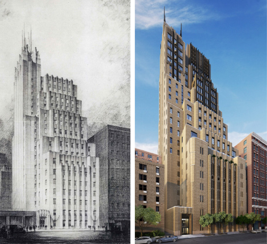
New York Telephone Company Building (Ralph Walker, 1929) before conversion to Walker Tower (left). Walker Tower after conversion to residential use (2012) (right).
Walker Tower: Reinventing the Wedding Cake
One of CetraRuddy's highest profile projects has been adapting Ralph Walker's 1929 Art Deco building in Chelsea from its commercial use as a telephone exchange building to a high-end condominium building, rechristened the Walker Tower when it reopened in 2012. Its commercial occupant, Verizon (successor to the New York Telephone Company), sold two-thirds of the 24-story building (from the 10th floor up) to CetraRuddy’s client; it is one of three Walker telephone buildings the firm has adapted. With high-end amenities, classic wedding-cake setbacks from its base depth of 198 feet, already-large windows dating from the pre-mechanical-ventilation era, and extremely large apartments (3,000 square feet with 10- to 14-foot ceilings), the building has become a magnet for both glamour photography and celebrity residents.
Cetra's firm addressed the new residential program's ventilation and energy challenges by dramatically transforming the masonry facade to include new structural steel, ventilated curtain-wall systems, and expanded glazing. The changes brought other benefits to floorplans and views. “We changed what was almost 48-inch windowsill heights,” he says; “we brought them down to the floor,” creating access to large terraces atop the setbacks. “The interesting thing about the terraces was that in the New York City zoning resolution, those terraces were counted as part of the floor area of the building because of the height of the parapet walls. When we realized this, we went to the Building Department, had a conversation with the commissioner in Manhattan, and we presented our case and said, 'Well, this is really floor area.'” The officials agreed, observing that this space was enclosed; by recalculating existing floor area, the architects were able to shift some floor area to create large apartments on upper floors. Officials also allowed them to lower the parapets, “so that if you were sitting in a room or sitting on a terrace, you didn't feel like you were in a bathtub.”
Adding glass balustrades, changing the heights of certain setbacks, and adding to the building's width in certain areas, Cetra and colleagues were “basically creating a new facade element, all within the style of the building... we didn't want to create something that was alien to the design of the building.” The new envelope, combining curtain-wall segments with masonry, stainless bronze, and stainless steel, features large tilt-and-turn windows yet is also more energy efficient thanks to modern codes. “Improving the thermal quality of the wall,” Cetra says, “unless you're going to add another entirely new layer to the outside, you're going to really be working from the inside, because you want to preserve some of the beauty of the masonry.” Along with four new corner spires based on Walker's drawings (though absent from his final design) and geometric Art Deco ornamentation, the tower updates Walker's vision without adhering literally to its original realization. The absence of a landmark designation made this improvisation possible.

Photo credit: CetraRuddy Architecture
The former Flatotel at 135 West 52nd Street after adaptation for residential use.
20 Broad Street, Flatotel, and 180 Water Street: Mid-Century Modifications
Cetra notes that New York's major mid-century zoning change, from the 1916 law calling for setbacks to the 1961 zoning allowing for the large corporate floorplates of tower-on-base or tower-on-plaza designs, make later commercial buildings, if converted, more suitable to narrower, longer apartments on smaller scales (450-800 feet), more easily marketable as rentals than condos (thus addressing the city’s need for mid-price rental housing). Floor plans in that generation include larger elevator cores, built for commercial-scale workday traffic “where a million-square-foot building could have over 5,000 people working in it,” and sometimes windowless interior rooms or alcoves with mechanical ventilation, sometimes adaptable as home offices. (The city's 2014 code requires each bedroom or other “habitable room” to have at least 12 square feet of window area.) “You have to rethink that whole experience and sequence of space, going into a much longer apartment,” he comments: “what's the entry like, and where is the point that you can see a window.”
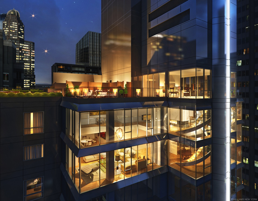
hese smaller spaces in other CetraRuddy projects like 20 Broad Street (converted from a New York Stock Exchange extension space), he notes, with over 500 apartments typically about 18-20 feet wide and 40 feet long, are popular with younger residents; here, replacing largely nonfunctional single-pane operable windows with double-pane glazing, keeping the curtain wall's aluminum stick system, sharply increased thermal efficiency. Another conversion on West 52nd Street, the former Flatotel (originally designed by Rafael Viñoly), involved complete replacement of a poorly fabricated and thermally troublesome curtain wall—“I guess it just missed the time when there were changes in the code which required a higher energy efficiency,” Cetra comments—so that the new system with floor-to-ceiling glass and thermally broken aluminum, along with an infill system over the back of the building to combine transparency and opacity, meets contemporary energy standards. Hotel-to-residential conversions, he notes, are often easier because of shorter lease spans, in the range of 25 feet from corridor to exterior wall.
At 180 Water Street in the Financial District, a former office block built in 1971 and converted in 2016, Cetra's team encountered “a much more consistent curtain wall, almost like a Miesian curtain wall of verticals that ran around three sides of the structure” and replaced fixed panes with operable windows to meet residential ventilation needs. Floorplates here were so large that space remained left over beyond the approximately 40-foot apartment depth, so Cetra's team carved out a courtyard running through the building from the 3rd to 25th floors, adding three new floors to the top of the building. This is not always possible in 1950s and 1960s structures, he notes, because of seismic and wind-load requirements limiting changes in the height-to-width ratio and lateral load calculations.
Cetra looks to technological advances for assistance in bringing light and air into adapted buildings with challenging dimensions. “You're going to be probably changing the entire mechanical system,” he notes; “you're going to be providing some ventilation from outdoors, but the whole system is being upgraded, so better MERV [minimum efficiency reporting value] filters, more air changes per minute, things like that, are elements that can be easily incorporated into new buildings, and especially into these new conversions.” Where daylight penetration is limited, he adds, new films and daylight-redirection glazings, as seen in larger spaces like museums and gymnasiums, offer the opportunity to overcome sharp shadow lines, dim interior zones, and excessive glare.
Another innovation, he speculates, could drastically change the thermal properties of building envelopes: “I'm seeing some incredible claims that essentially global warming could be eliminated if we changed the way that we paint outside of buildings,” making roofs and walls reflective surfaces rather than dark heat sinks. “There's research being done now which replaces the titanium oxide in paint and uses a barite or a powdered Teflon in a way to reduce that ultraviolet radiation that still comes through the wall, and it's pretty dramatic.” Reflective paint on spandrel panels of curtain walls, he imagines, could bring “tremendous benefit to the environment by reducing that solar heat gain.” While recognizing that looking to facade features as a silver bullet solution to the climate emergency is in the literal sense incredible, Cetra is optimistic about new materials that continue to advance buildings' resilience and improve their occupants' experience.
Customization of unitized panels, he finds, can also contribute bridges to the past. “We're working now on a project at 65 Franklin Street... [where] we created a curtain wall which really takes its cues from the cast-iron architecture that is surrounding that area. We just did all the mockup testing two weeks ago, and everything is great, but we took the idea that in cast-iron architecture, each piece is cast and then assembled, and they used a classic style at the time to create columns and pilasters and cornice lines and all that. We reduced all of that to a more contemporary language, but in a way, it's a similar thing, because it's a unitized curtain wall. Some pieces are even handmade.”
455 Central Park West: Inverting The Paradigm
The first oncologic specialty hospital in the nation, the New York Cancer Hospital (later to evolve into Memorial Sloan-Kettering Cancer Center), started in 1884 and soon moved to this uniquely configured building on Central Park West between 105th and 106th Streets. Designed by Charles Coolidge Haight with features aimed at advancing medical care as it was understood at the time, it was completed in 1887, inhabited by several decades' worth of patients, and eventually viewed as an object of fear because of the fates endured there in eras when cancer treatments were largely palliative at best. After the institution moved to the East Side in 1955, the building fell into disrepair and narrowly escaped demolition before it was landmarked in 1976.
Multiple attempts to develop the building misfired, but financial support from Columbia University (for faculty housing) and a Chicago developer (for luxury condominiums, including a new 27-story tower) finally resulted in sufficient renovation for high-end condos to open there in 2005. RKTB, with diverse and longstanding experience in adaptive reuse, led the renovation efforts, which resulted in multiple awards and 100 distinctive residential units.
“The innovations there were these enormous windows that you could open up,” says Bafitis, “and suck the air through”—ironically, an approach to negative-pressure ventilation now known to be effective for today's infectious diseases, though irrelevant to cancer. “They didn't really understand germ theory very well back then; they believed that germs bred in corners, and so they eliminated the corners in the hospital wards of that building. Their thinking was that the elimination of corners would help in preventing germs and grime from building up, and so the round turrets of that building were created and fashioned after a French castle.” Locals reportedly referred to it over the years as “the towers,” “the castle,” or “the Bastille.”
“This was a building that does not lend itself to anything but being a hospital, really,” Bafitis continues, “but we converted it.” Preserving the exterior masonry was mandatory owing to landmark status; wooden structural elements were decrepit enough to need demolition, and a new concrete interior structure allowed removal of all columns, creating column-free spaces in the large turrets (42 feet in diameter), functioning as living/dining rooms for the massive units, with ceiling heights of 15 feet. “In effect, [it] was a brand new building within the existing skin that was preserved and repaired and left in place.” The 455 building is basically the inverse of a reclad.
A key lesson from RKTB's experience here, Bafitis says, is that “every building, even as morphologically distinct as 455, can be adapted. I think there are ways of taking advantage, volumetrically, of the spaces that are offered within; I venture to say that we could do it very creatively, very ingeniously, in any structure. Hospital conversion is something that has taken place a fair amount, and you wind up having the same kind of issues there: you have very tall floors, and they tend to be wide in places and narrow in other places, but it's a matter of working with the building and working with the structure, working with the volumes. And we were offered a lot of latitude in 455.”
Bee compares the 455 experience to other famous adaptive-reuse projects like the former Bell Labs building Westbeth (1970), “probably the granddaddy of all the artists' live-work spaces in the country [and] the building that really put Richard Meier on the map.” Having chaired Westbeth's board for a number of years, Bee admires its flexible layouts as well as its status as an affordable community. RKTB's own conversion experience dates from the same era, when they adapted an east Midtown manufacturing building into the Turtle Bay Towers rental units, taking advantage of zoning-mandated setbacks by adding curtain-wall greenhouse structures to setback terraces on the western face, removing masonry for access. The developer Rockrose allowed considerable experimentation on that project, leading to further conversions including the West Coast Apartments (a block of former meatpacking warehouses, “[that had been] refrigerated for so long that it developed permafrost in the building, so when we went to convert it, we had to thaw out the building... the building started falling apart, because the permafrost kept things together.”). They have also performed several office-to-school conversions, frequently an easier typologic match than office-to-residential because of floorplate and ceiling dimensions.
The greatest challenge in adaptive reuse, Bafitis comments, is applying lessons from high-end projects to the affordable sector, which severely needs “ownership and a clientele that has real vision and doesn't necessarily want to provide cookie-cutter solutions.” Yet quirky cases like 455 fire his long-range optimism. “We've been doing it naturally, in our practice and as residential architects for a long time in New York City, and it's heartening to see that this is really sort of catching on.”

Photo credit: KieranTimberlake/Matthew Krissel.
Facade of Bulletin Building, Philadelphia. Close inspection reveals frit pattern on glazing.

Bulletin Building, Philadelphia. The red metallic armature creates a contrast with the internal grid of structural columns and slab floors.
Bulletin Building: Icon Reborn as Urban Catalyst
In Philadelphia, the headquarters of a long-respected newspaper, the Evening Bulletin, expressed a certain midcentury modernist ideal. Now, four decades after the Bulletin lost the circulation wars to the morning Inquirer and to televised news, going defunct in 1982, its facilities have a new life as a research building, the gateway to Brandywine Realty Trust's new Schuylkill Yards “innovation district.” The four-story Bulletin Building, transformed from its largely windowless original image (and a transitory condition as Class B space for Drexel University) to an open design, now presents the neighborhood with a dramatic curtain wall, framed and deepened by a bold red metallic grid. The converted building offsets the high energy demands of life science laboratories with envelope features that yielded a net decrease in environmental footprint while reasserting a distinctive presence on the skyline.
The Bulletin headquarters (1955), Philadelphia architect George Howe's last building, says KieranTimberlake's Richard Maimon, answered the Beaux-Arts civic dignity of its neighbor 30th Street Station (1933, designed by Daniel Burnham's successor firm Graham, Anderson, Probst and White) with the mid-century modernist equivalent: a monumental concrete-framed volume balanced on narrow columns and a simple, largely blank east facade. Except for a small news ticker and the paper's name in lettering over a story high, the gray brick volume maintained a dignified silence.
During Drexel's use of the building after the Bulletin's demise, an intermediate renovation during the 1990s broke up the blank facade with three undistinguished, poorly performing single-glazed strip windows, resembling narrow slots on the short facades of Howe's building that had never admitted ample light. Its new incarnation, now the headquarters of biotech firm Spark Therapeutics, opts for full-scale transparency, daylight, and views, with better full-envelope insulation despite the dematerialization of replacing brick with glass.
Spark initially moved into the second floor during reconstruction, attracted by the location near Drexel and the University of Pennsylvania; finding the space congenial during a proof-of-concept period (and enjoying a boom phase after a merger with Roche Group), the firm expanded to fill floors three and four. Ground-lease holder Drexel retains a below-grade academic space under the adjoining park, Drexel Square (converted from the Bulletin's parking lot), Maimon reports, and at this writing Brandywine is seeking a retail tenant (e.g., a food hall) for the ground level. Technically a mixed-use building, the Bulletin Building places Spark's work (chiefly in anti-blindness/anticancer research) in public view and announces to the city the increasing prominence of the “eds and meds” economic sector.
On large and small scales, the building reimagines Howe's vision of a modern building as a communicative entity. Sculptural roof-mounted signage announces the Schuylkill Yards brand as the Bulletin's large lettering heralded the paper. Close inspection of the new glazing, Maimon points out, reveals a custom ceramic frit pattern above eye level for solar-gain reduction, derived from the Bulletin's typefaces, a gesture to “subtly represent the history of the building as a place of print.” By night, uplighting from inside the glass lets the metallic armature articulate the building's form as interior lighting makes the building a beacon. Between the first and second floors, where the soffit meets the colonnade, a new and larger LED information ticker updates that feature of Howe's original building.
An essential aspect of the mission was “not imposing new loads on the building,” Maimon says, “despite having much more significant solar gain.” With loft-scale 16-foot ceiling heights and floorplates in the 50,000-square-foot range, plus roof space, the building can accommodate ample mechanical systems, and Spark's operations move considerable air through the building – yet the combination of high-performance low-iron, low-emissivity glass and reroofing with significant insulation “actually reduced the energy load in the building,” Maimon reports.
The armature suspended two feet off the east facade is sloped to prevent birds from roosting and painted with an automotive-grade metallic red (including touches of orange and a reflective mica-like glass element), developed in consultation with PPG and Spectrum Paint; its golden-section dimensions contrast with the 28-foot bays of Howe's interior pilotis, creating a visual polyrhythm that complicates the simplicity of the forms.

Photo credit: © Ashok Sinha
LaGuardia Community College, Brooklyn, midway through recladding.

Photo credit: ©SinzianaVelicescu
Installation of curtain wall panels at LaGuardia Community College, Brooklyn.
LaGuardia Community College: Recladding Without Evacuation
New York firm Mitchell Giurgola and Heintges have collaborated on a commercial-to-academic conversion in Queens, where the former Sunshine Biscuit Factory (the “thousand-window bakery”) was adapted for use as LaGuardia Community College's Center III. The institution is part of the City University of New York, which serves a diverse community by providing affordable higher education; many of its students, notes Heintges senior principal Areta Pawlynsky, are the first of their families to attend college, often immigrants. Its facilities are rarely glamorous but pivotal for the city's cultural, social, and economic life. Recladding Center III with prefabricated unitized panels solved a problem that had plagued the building for years.
“It was long overdue for attention at the enclosure,” says Heintges's John Breisky, with “a lot of old windows, terracotta that had been failing, and a variety of other stuff that kind of been patched over the years.” Protective sidewalk sheds surrounded the building for over a decade as college officials considered practical responses, including demolition. Instead, “they put together a program to overclad it with a unitized curtain wall that was terracotta-clad,” he says. “I think it might not be on people's radar because it's in Long Island City, on the other side of the tracks from the waterfront.”
With the 168,000-square-foot building remaining occupied, Breisky says, the project began with demolition work and creation of a temporary weatherproof enclosure; the crew filled in window openings and applied a coating over the masonry. “They had to remove the terracotta that was loose and projecting outward to create a datum, so that they could then apply new unitized curtain wall panels, and the whole installation was done from the exterior.” The building comprises a full city block, and logistical challenges included partial street closures. Installers went up with boom lifts; curtain-wall units went up by crane; as panels went in section by section, the crew would isolate them from the ongoing work and remove the temporary framing in the window openings, restoring daylight to the classrooms. “So the kids had to go without light for a little while, but they managed to keep the place operational, and it's a really nice project.”
The new facade has sharply improved air infiltration, Breisky says, correcting leaks from single-glazed operable windows and minimal insulation. The process involved a performance mockup, subjected to tests for structural integrity and thermal control, a step he recommends for any bespoke project. The improvement in IEQ improves outcomes for the students; when “you have people sitting in a classroom having to concentrate and pay attention, when you're addressing thermal comfort, when you're looking at glare mitigation and your glazing selection and introducing sun shading, it's got to make a huge difference... There's a big difference in the fabric and what enclosure means between a 1910 biscuit factory and a 21st-century curtain wall.”
As code upgrades drive facade performance standards higher, Breisky sees advances in framing – sometimes overlooked amid attention to glazing and coatings – as an area of opportunity for improving a system's U factor. In thermal shields in portions of mullions that are exposed to the exterior or in rain-screen gaskets, “they're applying a less conductive material; it may be a snap-in piece of a polyamide, or it could be a PVC to stop the flow through those portions of the framing.” Thermal breaks, a time-tested strategy, are “getting a little deeper on some systems,” he notes; “you can have foils applied to the thermal breaks, closed-cell foam inserts that are used to stop convection within the profile.” Canted glass or other special conditions “might require that you jacket the mullion at the interior side...we're seeing more insulation on opaque units to improve performance [and] compensate for the glazed areas. We're always hearing that you should try and keep your window-to-wall ratio down; leasing people just want glass everywhere. The code really wants you to be honest about how you've come about your performance, and you have to demonstrate how you're deriving it.”
“The big selling points that really sell unitized curtain wall,” Breisky has found, are that “while the structure's going in, while the steel's going up, and ideally by the time your steel is up to a certain point, you can start erecting your units, so you can have all of those units manufactured, or a good number of them, ready to go. The idea is to streamline the process.”

Courtesy of Mitchell Giurgola
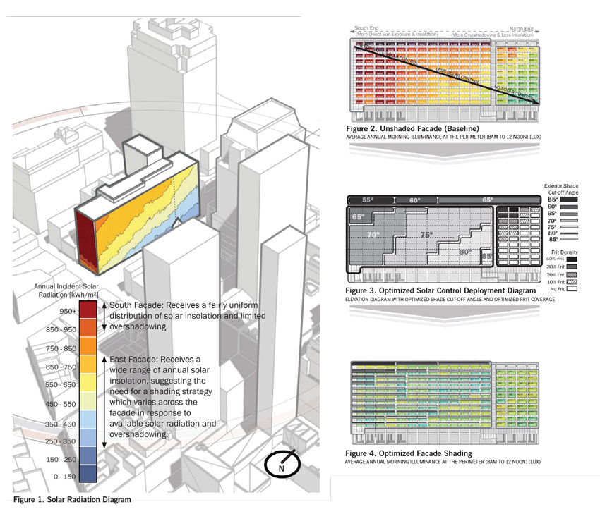
Solar radiation diagram and solar control plan, 370 Jay Street.
370 Jay Street: Subtlety Beats Heroics
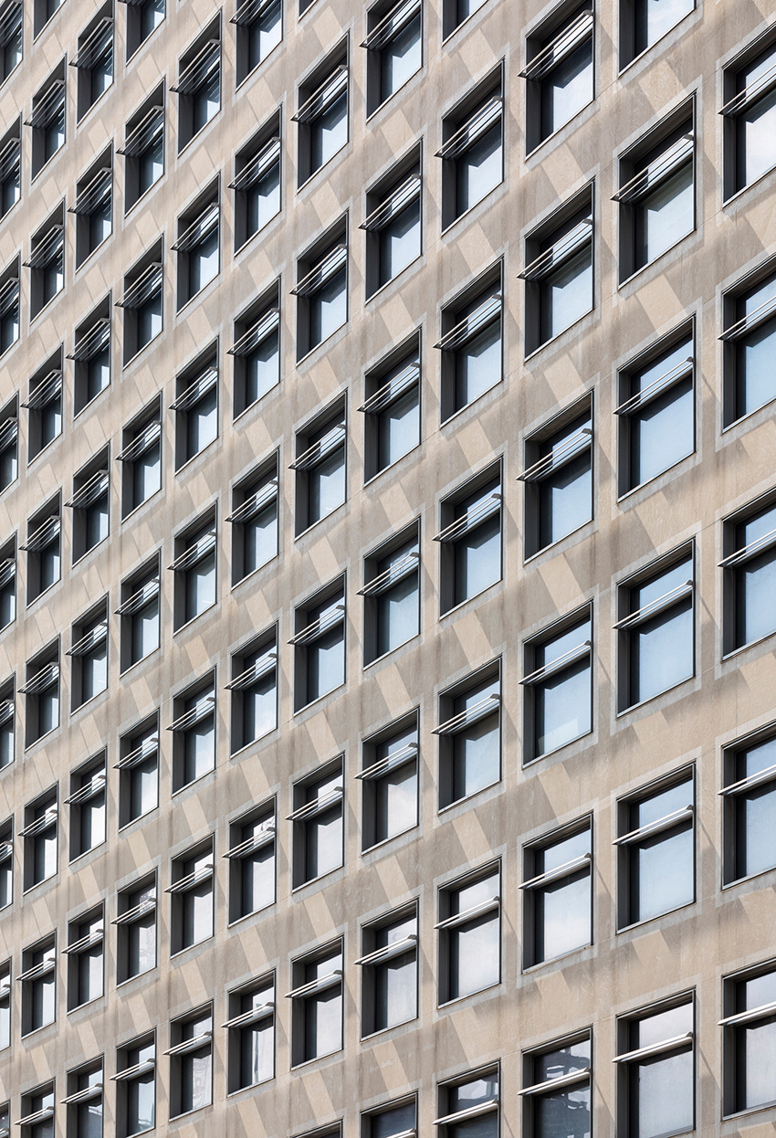
At 370 Jay Street in downtown Brooklyn, the Metropolitan Transit Authority's historic Transportation Building was taken over by New York University and adapted by Mitchell Giurgola for educational uses. The 13-story William Haugaard building, designed in the 1940s and completed in 1951, attracted praise from none other than Lewis Mumford. Its seven-by-seven casement windows, Corbusian pilotis, and five-inch-thick white limestone facade brought dignity to MTA operations for decades, until deferred maintenance gradually left it in disrepair; NYU took it over in 2012.
Early plans called for the building to host the Center for Urban Science and Progress (CUSP), an academic program combining informatics and urban policy, along with several other program components not identified at the time. “We were going to take off this heavy limestone facade and create a high-performing curtain wall, and it was really fun to design,” says Carol Loewenson, partner at Mitchell Giurgola. Ultimately, however, a subtler intervention made more sense.
Collaborating with Atelier Ten and Heintges, Mitchell Giurgola's architects studied its thermal performance at each point along the facade and found that the limestone facade performed well, but the existing windows allowed excessive solar gain, with a regular pattern, from the hottest points on the southern end and high floors to the coolest to the north and lower. “In fact, the windows were terrible, but that limestone facade was fine,” comments Loewenson. “So in terms of sustainability, the most sustainable thing you can do is to reuse something, and so it was from the architectural heroic designer point of view [that they thought] 'We need our new facade.' But the truth is, what are we doing here in this world right now?” Circumspection overcame the desire for a heroic intervention.
The windows were initially all flush with the limestone facade; the team decided to push them in and add extruded aluminum solar shades, varying both the depth of repositioning and the size of the sunshades south to north and high to low so as to even out the solar gain. “The sun shades become shallower and shallower, until at the north end they're just a decorative element,” Loewenson says. “The depth of the window casing is the same on all windows... from the front face to the inside face, it's something like 16 inches. The windows turned out in that extruded aluminum on all sides, and then the location of the window just traveled back and forth within what we call the cassette.” The system took advantage of mass-production efficiency and off-site fabrication of the aluminum units.
Ultimately, comments partner Stephen Dietz, the design team “stayed true to this fairly simplistic, repetitive modernist look of the building, but added this little fun twist where the sun shades are moving on that biangle, along the eastern facade. It's kind of playful, ultimately, when you walk by it.”
“When we had the schemes for replacing the facade, it was a real question of, 'How do you create some articulation when you don't know what the program is?'” Loewenson adds. “And frankly, I think they still wanted there to be a lot of flexibility, and one of the things we discovered was that this facade that seems very repetitive and rigid turned out to be quite flexible.”
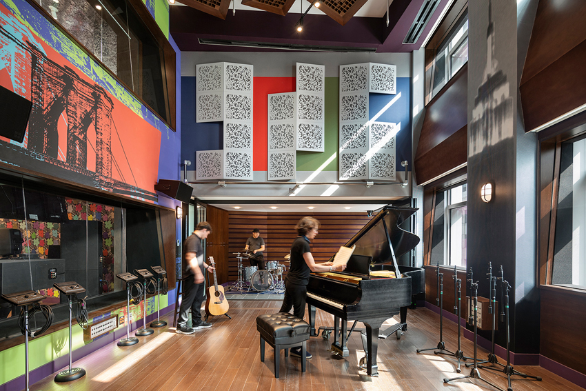
The building's program also evolved, she recalls. “Initially they thought it was all going to be back-of-house NYU program, and in the intervening years, downtown Brooklyn just became the hottest place, and so it ended up that the Clive Davis School of Recorded Music is now in there, and ITP [the Interactive Telecommunications Program], which is one of the most creative arts programs at NYU, and really anywhere in the country.” With the thick walls providing acoustic insulation and the new solar-control system managing light and temperatures, the performers and engineers in the Clive Davis School are able to work in an atmosphere that earlier generations of studio musicians, accustomed to sealed rooms and artificial light deep in interiors and basements, could scarcely imagine: a double-height studio with daylight.

Photo credit: ©Albert Vecerka / Esto.
Former Metropolitan Transit Authority building at 370 Jay Street, Brooklyn. Fenestration features gradual changes in window depth and sun shading in two dimensions (high to low floors, north to south).
125 West End Avenue And 45-18 Court Square: Robust Enough For Life Science
In two commercial-to-research conversions in New York undertaken by Perkins + Will, envelope renovations are under way to improve the functionality, energy performance, and code compliance of the existing buildings. In one case, an inadequately insulated building received a full metal overcladding, improving both its interior environment and its outward appearance; in the other, a new building will accompany a converted industrial loft, with new window walls and improved insulation. Both are slated to host life science research enterprises, adapted to meet the rigorous demands of that sector.
An eight-story building within the ABC/Disney network's Upper West Side complex, 125 West End Avenue, was originally a Chrysler automotive building (used for both repairs and sales) during the early 20th century; more recently, it included television studios, production and support spaces, and offices. “It's a concrete building that actually doesn't really have any appreciable insulation in it currently,” reports design director Robert Goodwin; “the actual concrete comes right out to the exterior, so it's not a very good building in terms of energy, and the facade was in a lot of need of repair.”
After exploring various options with developer Taconic Partners, including window replacements and repointing the brick, the Perkins + Will team decided to overclad it with a metal and glass wall, with folds in the metal emphasizing the verticality of the original concrete piers. “The city allows for a certain dimension to overclad buildings within the zoning parameters, and you're given more or less four inches over the property line to overclad a building,” Goodwin says, “and so metal was really probably the only option there, just in terms of thickness, to stay within that dimension.” The new exterior uses panelized insulated glass curtain wall between separate full-story painted aluminum column covers. Although the energy-modeling information remains confidential, an engineer told Goodwin that the envelope has “significant impact” on overall energy performance.

Photo credit: ©Albert Vecerka / Esto.
Double-height music studio at 370 Jay Street, with natural lighting.
“A life science building is quite different than a conventional office building,” Goodwin continues, “in that the infrastructure is much more robust, and you really need to build in a lot of flexibility for tenancy that way.” The building's dimensions and preexisting features are well-suited to research: with an automotive ramp and floors suited to the loading of vehicles, the structure limits vibration, an important quality in life science facilities. Upgrades of HVAC and electrical systems meet the needs of wet laboratories, including fume hoods ventilating to the exterior; floor-to-floor heights are large, in the 15-16-foot range. Energy modeling is under way to guide the scale of HVAC and other equipment; the building has been reported on track for LEED Gold certification.
At Long Island City's 45-18 Court Square, the 267,000-square-foot site of Innolabs, Perkins + Will are renovating an existing loft building to bring it up to code for life science tenancies and adding a six-story companion building with another metal curtain wall. “The idea of using a simple frame expression, with window wall inserted into a metal frame that has an angled expression of the metal column covers and sills,” Goodwin says, has “a fairly muscular design appearance, and I think that picks up on some of the scale and the rhythm of the existing building.” This complex did not have the energy challenges of 125 West End and did not need a full overcladding, with new windows and interior insulation to attain the desired level of performance.
Goodwin notes that the Innolabs project makes use of the city's Zone Green provision, which allows up to eight inches of additional wall thickness exempted from floor-area calculations, in an effort to incentivize high performance in retrofits. The sustainability goals of Local Law 97, encouraging all-electric power and Passivhaus-style minimal air changes, are in tension with life science buildings' ventilation requirements, he observes. The need to reconcile these aims implies that transformations of other programs into research facilities will focus attention on facade materials and details to find the appropriate balance.
Conclusion
Considering the uncertainties that the pandemic has brought to commercial real estate, office operations, and hospitality, adaptive reuse of underperforming commercial buildings is a logical and environmentally sound dot-connecting response. Whether it is practical in any given case, financially or otherwise, depends on creative approaches to the contrasting needs of the building types involved, working within the boundaries of codes, preservation laws, and market imperatives. Historical examples suggest that even an improbable conversion of a quirky, specialized building can succeed, provided the architects have the commitment and support of clients who perceive how long-range outcomes can justify the short-term investment these projects may require.
Specialists in adaptive reuse, while pointing to facade upgrades that dramatically improve buildings' habitability and environmental performance, largely agree that applying these gains to affordable housing remains the greatest challenge. Experience to date, at least in New York, indicates that incentivizing residential conversions at widely affordable levels is not something that private markets as currently constituted have done well. The wave of commercial-to-residential adaptations that succeeded in lower Manhattan in recent decades has largely occurred toward the higher end of the market; public officials have proposed several measures to expand on that model and support adaptations that aid more of the population.
“You can build a high-performance envelope that's installed as a curtain wall,” observes NYSERDA's O'Shei, “and there's examples of that mostly in new construction; it really hasn't to my knowledge, moved into the reuse/adaptive reuse/retrofit world, mostly due to cost. It's not a performance issue; it is a cost issue. It is very expensive to reskin a building. But in terms of dealing with the issues – air sealing, thermal breaks, those things – we've seen technical solutions in our Buildings of Excellence competition, which is a multifamily design-and-build competition.” In that program's first round, 68 percent of the units to be constructed serve low to moderate-income customers, and the second round increases that proportion to 78 percent.
The separate new program HONDA, O'Shei notes, makes financing available for adaptive reuse as affordable housing if building ownership is transferred to a not-for-profit organization; “the first project I'm aware of is in the Kingston-Poughkeepsie area,” he says, “and Catholic Charities is buying a hotel, converting it to housing and providing both affordable housing and services from the building.”6 HONDA may become a model for measures in other jurisdictions. Should this policy spread further, observers of architectural trends may find ground for hope that financial feasibility will catch up with the technical feasibility evinced by numerous successful adaptations to date.
Endnotes
1Newmark. Manhattan market reports, 3Q21, accessed Oct. 22, 2021
2Haag, Matthew. Office vacancies soar in New York, a dire sign for the city’s recovery. New York Times, July 2, 2021, p. 18, accessed Oct. 22, 2021
3Elefante, Carl. The greenest building is...one that is already built. Forum Journal 27(1):62-72
4New York City Department of Buildings. NYC Codes. (Includes links to current 2014 construction codes, electrical code, 2016 energy conservation code, and construction codes from 2008, 1968, and 1938.), accessed Oct. 26, 2021
5New York State Senate. Senate Bill S5257C, 2021-2022 Legislative Session. Enacts the "Housing Our Neighbors with Dignity Act."
6Callahan, Cloey. Ulster County group purchases hotel to convert it into supportive housing. Albany Times-Union, Aug. 20, 2021. , accessed Oct. 26, 2021
Bill Millard is a New York-based journalist who has contributed to Architectural Record, The Architect's Newspaper, Oculus, Architect, Annals of Emergency Medicine, OMA's Content, and other publications.
