This CE Center article is no longer eligible for receiving credits.
After space and structure, materiality is the essence of architecture. Surfaces play a large role in articulating materiality, with equal contributions of light, color and texture giving buildings their unique character. Louis Kahn poetically described these intertwined relationships: "All material in nature, the mountains and the streams and the air and we, are made of Light which has been spent, and this crumpled mass called material casts a shadow, and the shadow belongs to Light."
Applied as architecture, that material is essential to the result. "Colors and textures cannot be seen independently of design intent," says Jack Diamond, principal at Diamond and Schmitt Architects of Toronto. "Once the objectives for a building project are established, colors and textures become an integral means of achieving design ends."
Color is inherent to materiality and can also be applied as architectural surface or finish. In either case, it makes a significant contribution—one lost on too many minimalist architects of late. "Color makes visible the spatial effect toward which architecture tends," said Theo Van Doesburg, the Dutch artist, architect and De Stijl pioneer. "Color is an expressive material equivalent to other materials like stone, iron, or glass."
Even more, "Color is a major element in scale," wrote Van Day Truex, the influential Parsons president and Tiffany's design director from 1955 to 1962. "A small room can have a larger look by the use of closely related values, hues, and intensity. A large room can be made to look smaller by marked contrasts of color and value, hue, and intensity."
When architects select surface material, color and texture, much more is at stake than a mere stylistic choice. Fortunately, new techniques and technologies make almost any type of expression possible. What follows is a brief examination of some of the latest advances and underlying principles for their use in architecture.
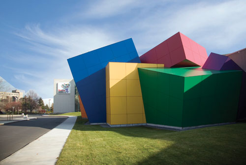 |
Panels of resin and wood fiber rendered in powerful, simple primary colors were selected for a feature facade on The Strong, also known as the National Museum of Play, in Rochester, New York. Photo courtesy of Trespa® |
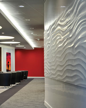 |
In addition to hand-applied polished plaster wall finishes, a new pre-cast, panelized approach can be used to create seamless sculptural wall textures. This muted textured wall is offset by a vibrant jolt of color.
Photo courtesy of Armourcoat |
Selecting Hues
For practical reasons, both architects and material suppliers limit the number of colors considered for a given architectural application. One of the primary delimiters is the surrounding condition. "Color and texture choices are highly context-driven," notes Steven Wright, AIA, LEED AP, a project manager with Rafael Viñoly Architects. "Largely they are influenced by the regional and specific locale. And, of course, the client may have certain requirements, such as brand colors."
Combinations of colors may also be similarly limited, by considering the effects of color mixing. "Value is one of the most important elements. Whether light or dark, little value contrast makes for unity, and sharper contrast makes for stronger punctuation," said the Mad Men-era designer, Truex.
Looking to the existing context offers a backdrop for the new color choice, says Viñoly's Wright. "Depending on the situation and the design goals, the designer will seek to align the new colors and textures to the old, or she may wish to contrast and play off the old. Sometimes the introduction of a new and startling color or texture serves to bring a heightened appreciation of the existing," he says.
Manufacturers restrict their color palettes for practical reasons. Pigmentation and dyes are costly (see "Color Prognosticators" sidebar), and experience shows that specifiers and end-users prefer to choose from a pre-edited palette or have matching hues made to order.
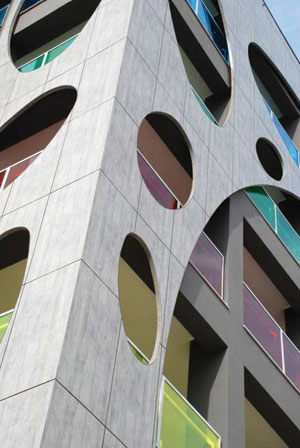 |
A dramatic residential building in Barletta, Italy, employs a double-layered rainscreen of durable panels to add texture and color. Architect: Michele Sfregola.
Photo courtesy of Trespa® |
"Five thousand colors is simply too many to choose from. We've focused on a standard color range of about 350 hues, but recognize that custom color-matching is always needed," says Shawn Tweedy, chief operating officer for Armourcoat, a distributor of decorative finishes including polished plaster, a historical wall treatment technique still used widely today. "A critical issue is being able to offer a custom solution: to provide the exact color, hue and texture."
In addition to focusing on bespoke solutions, leading design teams and their suppliers shortlist colors and textures using an iterative process of surveying market feedback. "Based on external research in architecture and adjacent fields such as design and fashion—clothing, furniture, interior, automotive—and through specific discussions with global trend watchers, we identify a selection of possible future trends," says Remon Veraart, director—Americas for Trespa, which makes exterior claddings. "The trends are discussed in workshops with architects in Europe, Asia and the USA to identify the most captivating currently on the market." The company's in-house designers then translate the selected trends into product colors, textures and full façade design systems, adds Veraart.
Color Trends: Rich Neutrals
The investment in market research and expert advice pays off, say those in the building materials supply chain. "We must follow the palette of the times, and fit within what's happening in the market," says Stephanie Goudreau, marketing manager for Lamin-Art, a supplier of decorative high-pressure laminate (HPL). Recently Goudreau has noted a trend back towards neutral colors, "But very interesting neutrals such as greys and beiges, with undertones or hints of colorations such as taupes, blues or mauves. Abstract prints and wood grains also tend to combine warm and cool tones in the same design, making them suitable for both cool and warm color palettes."
Warm neutrals primarily include beiges and tans, while the most common cool neutral is gray. Other cool neutrals include white and green.
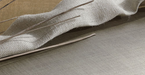 |
Novel textured interior finishes include laminates made with embossing techniques and the use of "inclusion materials," such as burlap cloth or banana fibers, which are pressed into the material's melamine face layer.
Photo courtesy of Lamin-Art |
"We've seen an overall shift in the neutral base color palette," confirms Marybeth Orlando, interior design director with the firm The Architectural Team. "Instead of cooler, minimalist grays, clients are opting for classic warmer beiges for both interior and exterior materials." These warmer tones tend to work well with wood finishes and other natural palettes that have a biophilic effect, exploiting the connection that humans have with nature and natural forms.
"Earth tones never go out of style, particularly given our culture's concern today with natural materials, the environment and the out-of-doors," says Katie Grimwood, an interior designer with TowerPinkster Architects Engineers. "Particularly in colder climates, bringing the outside in becomes a strong design concept. In fact, brown has really become the new black in many settings."
Yet many of the predictors of trendy, fashionable colors cut against this naturalist, neutral grain. "Right now, according to the September issue of Vogue, color is in: bright mix-and-match," says Jill Pilaroscia, IACC, a color expert and principal of Colour Studio, Inc. "Red pants with yellow shoes, with an emerald green accessory or blouse, is acceptable. This trend will result in more colorful interior environments, but it will not translate well into functional environments like healthcare or schools as trends will not support the specific behaviors and tasks that should drive public spaces."
So while mainstream architecture may not favor such Fauvist fancy, the mixing of colors and textures is now tending toward the higher value contrasts described by Truex. "Along with warmer neutrals, we are injecting bolder accents of color. Our once timid, muted accents are coming alive with more daring expressions of color and texture," says Orlando. Examples include wood finishes with more pop, says Trespa's Veraart, such as zebrawood.
As for texture, the latest consumer trends point to more variety and daring, adds Pilaroscia, an accredited color consultant who lectures frequently on theory and application. "For example, West Elm is offering accessory pillows in fur, textured felt and printed satin this season—the full range at hand," she explains. "Contract finishes include carpet tiles in a variety of neutrals with bold accents that pattern in unconventional ways. Some look like EKG tests or stock market fluctuations."
Exteriors and Façade Materials
For building façades and other exterior surfaces, color and texture preferences tend to follow material trends—not the momentary whims of fashion or consumerism. Yet this fact often sets up a tension between the material and its suitability for an architectural application. For example, wood exteriors have drawn interest, "yet there's strong demand for a natural look that requires very little maintenance during its lifetime, which is the opposite of real wood," says Veraart.
Fortunately, technology is filling the gap. "We're seeing many new manufacturing techniques reinterpreting the way we use materials," says Danny Pang, an interior designer with Lee H. Skolnick Architecture + Design Partnership, an architecture and interiors firm. "Porcelain tiles and laminates are made to look like wood, for use in locations where wood might not be suitable functionally."
Pang cites other examples including dimensional and sculpted glass, the novel application of laser cutting to metal, wood, resin and plastics, as well as expandable lightweight textile systems. "Many of these materials are changing the way we view a space and how a space communicates its character," says Pang. Others even allow for multiple colors on a single surface, adds Colour Studio's Pilaroscia: "One new system of metallic finishes employs a 45-degree angle of incidence, so as the viewer moves across the building exterior surface it changes colors, for example from grey to plum."
 |
Color affects the spatial qualities of architecture, as seen in the open classrooms created for Summit Elementary School in Casper, Wyoming. Designed by New York City's Lee H. Skolnick Architecture + Design Partnership with RB+B Architects, unique textures and colors are used to orient children and add meaning to their daily environment.
Photo by Fred Fuhrmeister |
Novel applications of texture are also enriching the interior material palette for architects. On the one hand are materials typically expected to have smooth or very limited textures, such as high-pressure laminate (HPL), which are now gaining much greater depths and surface varieties. According to Lamin-Art's Goudreau, the finish of HPL is more frequently created by pressing with steel plates. Embossing films are also used to create wood grains, stone pattern, and a variety of surface effects. More recently, novel textures are being added through the use of inclusion materials such as banana fibers that are imbedded in the melamine face layer of the HPL, or by pressing such products as burlap cloth in the laminate sheet.
On the other hand are precast, panelized approaches to traditionally hand-applied surface finishes, a novel twist for creating 3D sculptural wall effects, says Armourcoat's Tweedy. Examples include a solid gypsum panel product using lightweight filler that is mechanically fixed to walls, corners and columns. The precast patterns, measuring up to a half inch in actual relief, add texture and seamless pattern at a scale that would be prohibitive, for example, with routed panels of medium-density fiberboard.
"Mass customization is affordable, so there is a degree of texture and detail that can be designed which previously could only be attained with a natural material," says Sven Shockey, AIA, LEED AP, design principal with A/E firm SmithGroup. "A custom perforated material can have a texture and tactility that a flat graphic cannot achieve."
Bringing Texture to Surface
These novel surface approaches reflect a growing tendency, says Danny Pang, that emerged in the fashion industry: "In much contemporary architecture, there is a sense of movement either through form, material or texture."
Similar to fashion designers, architects can avail their works of two types of texture: optical (or visual) and tactile (or physical). According to design author and teacher, Joseph A. Gatto,1 tactile texture describes actual surface variation as found in wood grain, sand, metal and the like, which can be felt by the hand. The illusion of optical texture can be applied to such materials as smooth laminate through the repetition of shape and line—often to imitate surface characteristics that exist in nature. A third category, implied texture, is a visual texture that has no basis in everyday reality, according to Northern Illinois University's Mary Stewart,2 and the technique is often utilized in works of abstraction or surrealism.
"There are two ways to look at texture: haptic or optic," says Goudreau. "Haptic finishes are those that can be perceived by the sense of touch, while optic textures are perceived visually, and may appear to have a 3D or embossed effect while the surface is actually flat."
Both kinds of textured surfaces are "visually active," says Gatto, and they can impart personality by creating emphasis, rhythm, contrast and the like. "Light is an important factor," he adds, "because it can affect how a surface is viewed." Textures also have a distinct impact on interior acoustics.
While texture is clearly an artistic element of building design, it is hard to quantify. According to the National Institute of Standards and Technology (NIST), there are no standard definitions of architectural-scale texture. Some standards, such as ANSI/ASME B46.1, measure texture at a very small or microscopic scale for surfaces of mechanical systems or industrial machinery. NIST contrasts texture described as roughness, created by closely spaced peaks and valleys on a surface, as opposed to waviness, which is caused by more widely spaced irregularities. The term lay expresses the dominant direction of pattern on the surface. Topography expresses the spatial structure of the peaks and valleys on the surface, while surface finish is a catchall encompassing texture, flaws, the materials themselves and any applied coatings.
A given material surface has an inherent lay, topography and surface finish. Other architectural finishes, such as plasters, are manipulated to achieve a finish that suits the project needs. "Color is design-specific, or specific to a given region or country," says Tweedy, whose company specializes in plasters. "Some colors and textures are suited to specific parts of the world." The smooth, polished plaster walls descend from the Marmorino stucco used extensively in northern Italy during the Renaissance, often as a background for ornate frescoes. Today, high-gloss, polished finishes similar to stucco lustro Veneziano are popular in Asia and in many local markets such as Las Vegas casinos, while international design is often dominated by textured surfaces.
A deep library of descriptive terms helps communicate architectural texture; pitted walls have a grainy appearance, for example, while a dragged surface has a distinct directional lay. Some finishes emulate a different material, says Tweedy, such as travertine marble or a modern urban concrete finish—complete with shuttering marks.
Thanks to recent advances in manufacturing and fabrication, texture is appearing even on surfaces not generally considered for appreciable shape or grain. In fact, these can be applied to not only opaque materials, but also plastics, metals and glass. "The challenge we have with smooth surfaces is giving them scale, but a simple irregular pattern can give the surface life," says SmithGroup's Shockey. "For example, a dimpled stone or random dotted frit on glass."
Light-Permeable Color and Texture
Colored glass is produced by adding a metal oxide or sulfide to glass material while it is molten (see Table). Deep blues from cobalt or copper, red glasses made with traces of gold or selenium oxide, and the fluorescent yellowish green of uranium oxide are familiar in both historic cathedrals and contemporary feature walls. Manganese dioxide and sodium nitrate are employed as decoloring agents—materials that neutralize the coloring impact of impurities in glass. Texture is added to glass in the rolling machine and afterward through such finishing and treatment processes as etching, fritting and enameling, among others. Art glass textures include martelé (French for "hammered") and pulegoso, Italian for bubbly, which can be made by adding gasoline or bicarbonate of soda into the glass melt.
Metals Used to Impart Color to Glass |
Gold Chloride |
Red |
Cobalt Oxide |
Blue-Violet |
Manganese Dioxide |
Purple |
Nickel Oxide |
Violet |
Sulfur |
Yellow-Amber |
Chromic Oxide |
Emerald Green |
Uranium Oxide |
Fluorescent Yellow,
Green |
Iron Oxide |
Greens and Browns |
Selenium Oxide |
Reds |
Carbon Oxides |
Amber Brown |
Antimony Oxides |
White |
Copper compounds |
Blue, Green, Red |
Tin compounds |
White |
Lead Compounds |
Yellow |
Manganese Dioxide |
A decoloring agent |
Sodium Nitrate |
A decoloring agent |
These traditional art-glass techniques have been revived, but the technology has advanced dramatically. "Some new glass coatings have opened up some exciting new possibilities—dichroic glass is one example, says Viñoly's Wright. "Although an ancient technique it has been reintroduced on an industrial scale and offers truly dynamic effects that change with ambient lighting conditions. Combined with various glass textures, the results can be very beautiful." Some of the newer glazings are based on technology developed by NASA, with a polychromatic effect created by the interaction of light with specialized prismatic interlayers.
Rather than using colored glass, architectural solutions increasingly rely on such interlayers, films or other materials paired with clear glazing, as seen in two art-meets-architecture applications in New York City. For the new Louis Armstrong Museum, located in a residential section of Corona, Queens, across from the famed trumpeter's former home, the firm Caples-Jefferson Architects sought to create a "façade that speaks to the visitors of the contents," says principal Sara Caples, AIA, NCARB. The resulting curved glass wall, in a yellowish cast, was envisaged as a direct homage to Armstrong's famed instrument but also as a vibrant yet soothing filter for natural daylight.
"We tried many ways to have the façade glow a yellowish cast, like a brass color," says Caples. "We looked at colored films, tinted glass, and then started to experiment with custom interlayers. Finally, we found a glass product with a metal mesh interlayer, which we could request to be brass."
 |
For the renovation and expansion of the Theatre-in-the-Park in Queens, New York, the firm Caples-Jefferson Architecture highlights an inverted acoustical dome in peach, orange and red with cold cathode lighting.
Photo by Nic Lehoux |
For a very different application, a grid of custom colored glass was created by artist and photographer Spencer Finch for the defunct service rail trestles of the High Line in Lower Manhattan, an elevated park more than 20 city blocks in length with gardens, seating, refreshment areas and artworks. Finch's canvas, so to speak, was a pass-through under a commercial building. The glass panels, in seemingly random soft hues, actually each represent a single pixel point from a minute-by-minute series of Finch's photographs of the Hudson River, kept in chronological order. Finch applied a custom film to each panel in the corresponding pixel's precise color, arranged in sequence of capture.
Whether an homage to a great jazz artist or an industrial riverfront, glass proves a malleable and cost-effective way to apply both color and texture.
"Glass is an amazing blank canvas to work with," remarks Shannon Meyer, IIDA, LEED AP, director of interior design for KSQ Architects, Tulsa. "Adding texture to a glass surface aids in sun control at exterior facades and can create varying levels of privacy in interiors. Window films offer unending possibilities when it comes to color, texture and pattern. We've had great success combining multiple patterns and opacities in custom installations. The films add a level of detail and graphic pattern language to interior spaces." Novel products include a safety glass product with mirrored backing on both sides of the pane, creating two different aesthetic effects, one for each side of the glass. For interior uses, the glass product can be further modified by etching, rolling or coloring the mirror backing, creating subtle grains and hues that seem to change dramatically depending on the observer's viewing position.
"Manufacturers are redefining glass with their dimensional and sculpted products, some of which are also suitable for exterior purposes," says Lee H. Skolnick's Pang. Etched glass, for instance, is popular for decorative interior applications but often lacks the safety and insulating features for use as fenestration. Approaching the problem from an architectural viewpoint offers other solutions, says Pang. For instance, a "sculpted window" approach elevates artistic expression and offers the chance to integrate branded or decorative shapes. This dimensional glazing includes kiln-formed, heat-molded or cast glass, typically reserved for interior applications and even suitable as flooring.
 |
An artist's glass installation under a building along the High Line, an elevated park in Manhattan's Chelsea neighborhood, employs custom films laminated on glass to pick up colors associated with various light conditions over the nearby Hudson River.
Photo by Andrew Russeth |
Exterior vs. Interior Surfaces
As with glass, opaque materials are variously suited to exterior duty or to only interior applications. The choice of color or texture must be vetted and specified carefully for its suitability to the demands of the selected use. "Considerations for color selection tend to be much more critical for exterior applications than for interior applications," says Trespa's Veraart. Examples of color specification for façades, roofs and other outdoor surfaces include:
- Pigments with high resistance to UV exposure, as confirmed through recognized testing procedures.
- Treatment or inherent resistance for chemicals or the corrosive effects of salt spray and salt fog, for example in coastal environments.
- Graffiti resistance, which is a consideration for both interior and exterior product applications.
- Level of texture for the surface — high-gloss may be a desirable design consideration or maintenance strategy, for example.
Veraart adds that interior wall applications and low-level exterior façades have a need for impact- and scratch-resistance due to close proximity to the public or to moving equipment. Since building occupants spend the most time indoors, color and texture are often given the most consideration there, both for aesthetics and wear. Fortunately, interior materials and systems generally offer designers a high degree of creativity, since the requirements for durability of pigments, dyes and textured elements relax significantly.
Two very different but equally successful projects offer valuable lessons. One is the new Montreal Concert Hall, a project for the provincial government in Quebec, Canada. Here, acoustics were critical to the specification, so the architects Diamond and Schmitt focused on surfaces "to reflect and refract low, medium and high frequencies," says principal Jack Diamond. "For low frequencies, there are large-scale convex forms — randomly placed, undulating walls and balcony fronts in this case — and for medium frequencies, molded plaster bands serve as smaller-scale surface variations." For the refraction of high-frequency sounds, however, Diamond's team employed wood paneling with varying textures, some very smooth while others are rough like sandpaper.
 |
The Montreal Concert Hall, designed by Diamond+Schmitt Architects, uses colors and textures to highlight acoustical surfaces and improve their function. For medium frequencies, molded plaster bands in white offer small-scale surface variations and contrast to the wood paneling with various textures, which refracts high-frequency sounds.
Photo by Tom Arban |
 |
To create the smooth expanse of polished plaster for London's Natural History Museum, concrete was sprayed onto a mesh, followed by insulation and an EIFS basecoat. After adding a crack-resistant substrate and a lime-and-marble base, the ivory-colored plaster of hydrated lime, marble and concrete was finished by hand.
Photo by Stephen A. Wolfe |
"Given the variety of nonsymmetrical forms, textures and other elements, a predominant material and a monochromatic color scheme has been employed to achieve design cohesion," Diamond notes. The floors and seat backs are all in wood, as are the walls, in a honey-colored Quebec beech; the upholstery is a pale wheat tone. "To avoid the muddy effect an overall monochrome can have, the horizontal plaster bands for mid-frequency reflection are in white, to provide a neutral reference for the eye and a freshness and lightness to the room," adds Diamond.
While even the most seasoned concertgoer may not realize the effect these forms and textures have on the acoustics, those who attend the hall's performances rate the overall quality very highly. Kent Nagano, conductor of the Montreal Symphony Orchestra, has crowed that the facility will take its place among the famed philharmonic halls of Europe.
In another cultural project, this time for a museum, the ancient art of plastering is appropriated for a contemporary gesture of massive scale. Known as "The Cocoon," the architectural form is a large egg-shaped volume, a new and unusual extension to the Natural History Museum, London. Officially called Darwin Centre Phase Two, the $120-million, freestanding installation was designed by Danish architecture firm C. F. Møller and finished by U.K. specialty contractor Armourcoat to resemble a literal cocoon—a silk bubble criss-crossed by threadlike textures.
To achieve the effect on the 213-foot-long, eight-story Cocoon, concrete was spray-applied to a form of expanded metal mesh on reinforcing bar to create a 10-inch structural wall. The contractor HBG Construction affixed polystyrene insulation to the curved walls with adhesive and mechanical fasteners on lengths of plywood, followed by an EIFS basecoat. This surface was surveyed to establish positions of 1-inch chases for control joints between 340 cast panels with special edge beads for a desired shadow gap and to allow thermal movement. A crack-resisting substrate was then applied, followed by a plaster substrate consisting of hydrated lime, marble and cement. The ivory-colored, polished plaster finish gives the Cocoon its signature color and texture.
While complex, the Cocoon's walls provide a highly engineered thermal mass and surface treatment to inhibit temperature variations inside, where laboratories and exhibits share space with a vast collection of 17 million insect specimens and 3 million plants collected over 300 years by Charles Darwin and other famed scientists.
< page 6 >
Like the unique approach developed to house the museum's collection, every residential interior demands an individual, personal approach. But while an individual may have particular preferences for color palette or surface texture, architects note that residential clients drift toward certain commonalities.
Architects and Industry Collaborate on Color
The renovation and expansion of New
York City's Theatre-in-the-Park in Queens
offers a remarkable color solution yet it
also serves also as an example of the way in
which designers and product manufacturers
collaborate for striking results.
The lighting designer envisaged
illumination highlighting the form of the
building, which has gently spiraling lines
indoors and out. "He knew right away he
wanted to use cold cathode tubes," says Sara
Caples, principal of the project's architect,
the local Caples-Jefferson Architecture,
known for its colorful solutions.
The firm worked directly with
manufacturer National Cathode to develop
the lighting concept and enclosures to
make it work: enhancing and accenting
the existing lines. The lobby's inverted
acoustical dome received multi-colored
flourishes at its outer edges, with a unified
palette of peach, orange and red at the
center, rendered in pigmented plaster.
Critics note the polychrome solution
reflects the multicultural nature of 106
different ethnic groups in Queens.

The design for a renovated theater facility in Queens, New York, uses a polychromatic approach for the ceiling, with peach, orange and red hues.
Photo by Nic Lehoux |
"Soothing" tends to be the watchword for today's residential approach. Few want to live in a home whose décor asserts itself constantly, says the color consultant Pilaroscia. "People want textures and finishes that are soothing, healing, calming and uplifting, although those finishes and colors will vary given the individual's personal color likes and dislikes."
On the commercial side, soothing also has its place — but so does the enlivening, engaging surface design. Other factors become more important for the commercial setting, including durability, sustainability, affordability and, not least, aesthetic value.
Staying competitive in the commercial market means focusing on innovations in textured surfaces. "It's something we have been aggressively pursuing since 2005," says Lamin-Art's Goudreau. She, and Trespa's Veraart, note a much increased demand for wood prints and grains in the HPL and resin panel markets. "Fortunately, new trends and technical opportunities make these finish offerings more widespread," she says. Beyond the standard embossing for the ticks and grains of wood, new products include an HPL with an actual wood veneer imbedded in the laminate sheet; the fabrication process preserves the natural grain in the veneer, eliminating the need for a tick or wood pattern to be pressed into the sheet.
Yet the commercial markets often favor textures that are achieved optically, rather than actually. "Actual texture is not ideal for many applications, such as writing surfaces, or table- and countertops in restaurants, which need regular cleaning," says Goudreau. "Specifiers love real texture, but sometimes you need an alternative; that alternative can be an optic texture."
Recent commercial trends have veered into a world of greater variety, as noted by prognosticators like Pilaroscia. "There has been an ongoing trend for façade designers to include a variety of textures, colors, patterns, dimensionality and a mix of materials into the skin of a building," Trespa's Veraart agrees.
In addition to the fashion world, product manufacturers see the influences of the automotive and furniture industries on building materials. At international furniture fairs and auto shows, says Veraart, there's been a lot if interest in wood as well as digital prints and patterns. But the biggest surprise? "We've seen a lot of bright neon colors," he reports.
"It's not about overpowering the senses, but about teasing the eyes. The neon colors are used as an accent to furniture or as a dash of fun for the design."
Color Prognosticators See the Future of Building
Color is big business. According to a report
issued in early 2011 from Global Industry
Analysts, Inc., the global market for
pigmentation and dyes is expected to reach
an annual volume of 9 million tons in 2015,
representing a staggering market value of
more than $24 billion.
As such, there's more than a little interest
paid to which colors will be the most sought
after, meaning color trend analysis and
prediction has become its own industry.
The most frequently looked-to color
forecasts in the architectural community
include color classifiers like Pantone as well
as coatings and fiber producers. Companies
like Benjamin Moore and Sherwin-Williams
are gross consumers of all kinds of pigments
and dyes–and thus de facto market-makers
on global colors. The same is true of carpet
industry suppliers like Invista.
Taking advantage of its unique position
as a popular and ubiquitous color matching
system, Pantone markets itself as a "worldrenowned
authority on color" and unveils a
"Color of the Year" every late fall.
While architects may not give much
credence to the paint industry's best guess at
which colors will be popular in the coming
year, they will nevertheless discover that the
prices of coatings and finishes are driven by
market forces that do give credence to color
forecasts–perhaps especially Pantone's.
For instance, a maker of textiles or
interior lighting fixtures must hedge their
bets on what materials and colors will
most likely complement the palettes in
greatest demand. If bedrooms designed in
2011 frequently include "honeysuckle"—
Pantone's poster hue this year, a "dynamic
reddish-pink"–then makers of carpets,
wallcoverings and linens for the residential
market a prudent to take note.
"This is true for any manufacturer of
any product; they must follow the palette of
the times," says Lamin-Art's Goudreau.
Interestingly, this may be truer for the
commercial market than for residential.
Residences are generally designed for
individuals rather than groups, and the
color choices reflect that.
"Residential color choices are based on
subjective likes and dislikes formed early
in childhood," says Jill Pilaroscia, IA CC,
an architectural color consultant based
in San Francisco. "A positive childhood
experience in a sunny yellow room will
typically lead to a favorable association
with that color for life.
"Commercial color is more fickle." |
| ENDNOTES |
1 Gatto, Porter, and Selleck. Exploring Visual Design: The Elements and Principles. 3rd ed. Worcester: Davis Publications, Inc., 2000. ISBN 87192-379-3
2 Stewart, Mary, Launching the imagination: a comprehensive guide to basic design. 2nd ed. New York: The McGraw-Hill Companies, Inc., 2006. |