Proper signage in commercial and public spaces is key to how people safely navigate the built environment. And now, as more architects turn to human-centered design focused on healthy buildings, signs are playing a more important role than ever before. New signage products can be selected for durability, sustainable design, and allow for a range of digital art options, which designers can specify to meet their architectural vision. Far from being an afterthought, signs for health care and learning environments—as well as for hospitality and multifamily construction—must be seen as an asset for architects and as a transformative tool for renovation. This article discusses the latest in cutting-edge signage design and ADA compliance, and it offers a way for architects to stay on top of—and ahead of—the curve when it comes to keeping occupants safe, healthy, and comfortable.
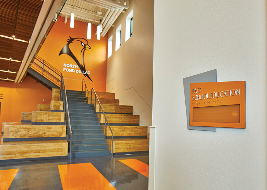
Photo courtesy of Inpro
A school in North Fond Du Lac, Wisconsin, uses ADA-compliant signage that incorporates aesthetic design.
SIGN(S) OF THE TIMES
Human-centered design considers the variety of ways occupants of a building interact—and react—to spaces. It accounts for the diverse abilities, backgrounds, and contexts of users and aims to create solutions that support a positive experience across those spectrums. While the concept of human-centered design has been discussed throughout architectural history, it has gained increased attention and significance in recent decades. Architects continue to explore and refine approaches to create designs that prioritize the well-being of occupants, reflecting an ongoing commitment to human-centered design principles.
Signage is one important way building designers can shape the experience of occupants in positive ways. Through language, symbols, color, and texture—among other things—signs can offer wayfinding and information, as well as provide emotional and physical comfort. In particular, signage in public spaces such as schools, hospitals, museums, and hotels plays a crucial role in occupant experience. When signs are effective, they can enhance learning and healing environments, and communicate clear messages that keep people safe, happy, and healthy.
The built environment is always changing. And signage, along with it, is ever-evolving. When architects consider signage in their designs, they must understand the ways in which signs function to support safety, health, and comfort within a space. They must understand accessibility laws, codes, and best practices. Just as important, designers can look to signage as an asset, rather than an afterthought or hindrance—an innovative solution to their architectural vision.
Types of Signage
Signs provide information. Some signs serve to provide basic information about a space, including health and safety guidelines, regulations, and best practices. For instance, the pandemic has necessitated signs displaying messages about wearing face masks, maintaining physical distancing, washing hands, and following other specific safety protocols. This kind of information helps raise awareness and reminds individuals to follow recommended health and safety practices. Information signage also provides basic information such as the location of restrooms, emergency exits, parking areas, and other facilities. Detailed and well-placed informational signage helps people feel more welcome and empowered in their surroundings. Informational signage can be creative, and employ additional value by offering intriguing information that sparks interest. Signs might offer historical information or details about the activities that happen within the building, and in doing so, give occupants a unique experience within the space.
Signs provide navigation. These types of signs are meant to guide people safely and accurately through spaces. That includes signage indicating a one-way flow of foot traffic, signage that identifies designated entrances and exits, or signage that directs individuals to specific areas such as first aid stations. When signs provide clear directions and helpful instructions, they help prevent confusion and ensure people follow protocols and get where they need to go. Wayfinding signage has evolved to provide clear directions and visual cues that help visitors navigate easily and feel more comfortable in unfamiliar surroundings. This includes the use of maps, directional arrows, and landmarks to enhance orientation.
Signs provide hazard warnings. Signs can warn individuals about potential hazards in public spaces. For example, signs can indicate wet floors, low ceilings, or areas under construction. These warnings can help people avoid accidents and injuries by alerting them to potential dangers and risks.
Signs provide emergency information. Emergency procedures and protocols should not be guesswork. These signs offer clear direction to people during intense and stressful situations with information on evacuation routes, emergency exits, the location of fire extinguishers, and emergency contact numbers.
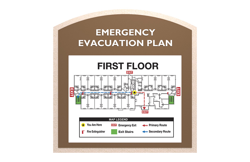
Photo courtesy of Inpro
Emergency evacuation plans provide detailed information in well-placed areas that supports the safety of occupants.
Signs reinforce compliance. When there are rules people must follow in a space, signs can serve as reminders to comply. They might indicate consequences for non-compliance, such as fines, and they generally act as a deterrent to rule-breaking to keep everyone in the space safe.
Signs aim to ensure accessibility. Signage should comply with accessibility standards, such as using braille, high-contrast colors, and large fonts, so that everyone can understand and follow health and safety messages.
Additional Qualities of Signage
Over the years, signage has become more intuitive and user-friendly, employing clear and concise language, simple graphics, and universally recognized symbols. This design approach ensures that signage is accessible to people with different cultural backgrounds, ages, and literacy levels.
Universal Accessibility: Architectural signage now focuses on meeting the needs of individuals with disabilities. Signage incorporates features like Braille, tactile elements, and high-contrast colors to enable visually impaired individuals to navigate and interact with the environment effectively. Additionally, signage may include audio or visual components to assist individuals with hearing impairments.
Multilingual Communication: In diverse environments, architectural signage increasingly employs multilingual communication to cater to different language speakers. Signage may incorporate multiple languages or use pictograms and symbols that can be easily understood regardless of language barriers.
Aesthetics and Integration: Signage has become more aesthetically pleasing and integrated into the overall design of the space. Instead of being seen as obtrusive or utilitarian, architectural signage is now considered an integral part of the environment, blending seamlessly with the surrounding architecture and enhancing the overall visual appeal of the space.
Emotional and Cultural Considerations: Modern architectural signage takes into account the emotional and cultural aspects of space. Signage may incorporate artwork, cultural references, or local elements that resonate with the community, creating a sense of belonging and familiarity. By reflecting the cultural identity of the space, signage contributes to a more welcoming environment.

Photo courtesy of Inpro
Emergency evacuation plans provide detailed information in well-placed areas that supports the safety of occupants.
ADA: KEEPING UP WITH THE SIGNS
The evolution of human-centered design and signage is inextricably linked to the Americans with Disabilities Act (ADA). The ADA is a landmark civil rights law in the United States that prohibits discrimination against individuals with disabilities. Its origins spring from several laws and movements, one of which was in 1968, when the Architectural Barriers Act (ABA) was passed, requiring that federal buildings be accessible to individuals with disabilities. This was followed by the Rehabilitation Act of 1973, which prohibited discrimination on the basis of disability in programs receiving federal funding.
The ADA was signed into law on July 26, 1990. It prohibits discrimination against qualified individuals with disabilities and requires reasonable accommodations to be made in employment, public services, and public accommodations. The ADA defines “disability” broadly, covering physical, sensory, mental, and cognitive impairments that substantially limit major life activities. It also mandates accessible design and construction of new public facilities and modifications to existing structures to ensure accessibility. The ADA Amendments Act of 2008 further clarified and broadened the definition of disability, providing additional protections.
Interior building signs, which help communicate information about the interior space, are geared toward people with vision. ADA requirements make spaces navigable and knowable to people without vision and offer them the ability to navigate a building with greater independence.
There are now many qualities that make signs ADA-compliant, but one of the more obvious ones is Braille. Strict guidelines and requirements for Braille have been established and even revised over time to meet accessibility goals. The tactile writing system of raised dots is now a common feature of public signage, but its origins go further back than the ADA.
The first recorded use of Braille, which was created by Louis Braille (a Frenchman who lost his sight after a childhood accident), can be traced back to the late 19th century. In 1891, the Royal National Institute for the Blind (RNIB) in the United Kingdom began using Braille on street signs in London. These early Braille signs were made of metal and featured raised letters and numbers in addition to Braille dots, providing information such as street names and building numbers for the visually impaired. But it took time for Braille to come into mainstream use. Braille was deemed a hazard because it supported the independence of those with low or no sight–but as public opinion changed, so did views on accessibility. The use of Braille on signage in the United States began to gain traction in the mid-20th century as awareness and advocacy for accessibility increased. Still, it wasn’t until the passage of the ADA that the use of Braille on signage in the U.S. became more widespread.
For an architectural sign to be ADA compliant, several aspects need to be considered.
ADA-compliant signs should be of appropriate size and positioned at a height that allows easy visibility and readability for all individuals, including those with mobility or visual impairments. The guidelines specify mounting heights and reach ranges to accommodate wheelchair users and individuals of various heights.
Signage should have sufficient contrast between the background and the text/pictograms to enhance readability for people with visual impairments or color blindness. ADA guidelines provide specific requirements for the minimum contrast ratios between background and text/pictograms based on the sign’s purpose. Fonts should be sans-serif and easy to read. ADA guidelines recommend using fonts like Helvetica, Arial, or similar typefaces that are legible, clear, and easily distinguishable. It is essential to avoid decorative or stylized fonts that may be difficult to read, especially for individuals with visual impairments.
ADA-compliant signs intended for permanent rooms or spaces need to include Grade 2 Braille, a tactile writing system used by individuals who are blind or visually impaired. Braille text should be placed below the corresponding visual text and meet specific height and spacing requirements.
International Symbol of Accessibility (ISA) pictograms are commonly used to identify accessible elements or spaces. ADA guidelines outline specific dimensions and design requirements for pictograms to ensure visibility and recognition.
In addition to Braille, tactile raised characters are required on ADA-compliant signage. Characters should be raised a minimum of 1/32 inch (0.8 mm) from the background surface and have specific height and spacing requirements. Raised characters are essential for individuals with visual impairments to read signage through touch.
ADA-compliant signs should provide relevant information in a clear and concise manner. Essential information may include room numbers, exit routes, directional arrows, restroom designations, and other relevant details. The content should be presented in a logical and consistent format.
Keep in mind that ADA compliance is a complex topic, and the guidelines can vary depending on the specific application and location. It is recommended to consult the ADA Accessibility Guidelines (ADAAG) or consult with a professional signage designer or ADA specialist to ensure compliance with the latest regulations and standards.
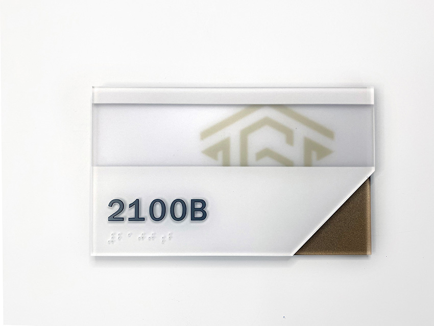
Photo courtesy of Inpro
There are now many qualities that make signs ADA-compliant, but one of the more obvious ones is Braille. Strict guidelines and requirements for Braille have been established and even revised over time to meet accessibility goals.
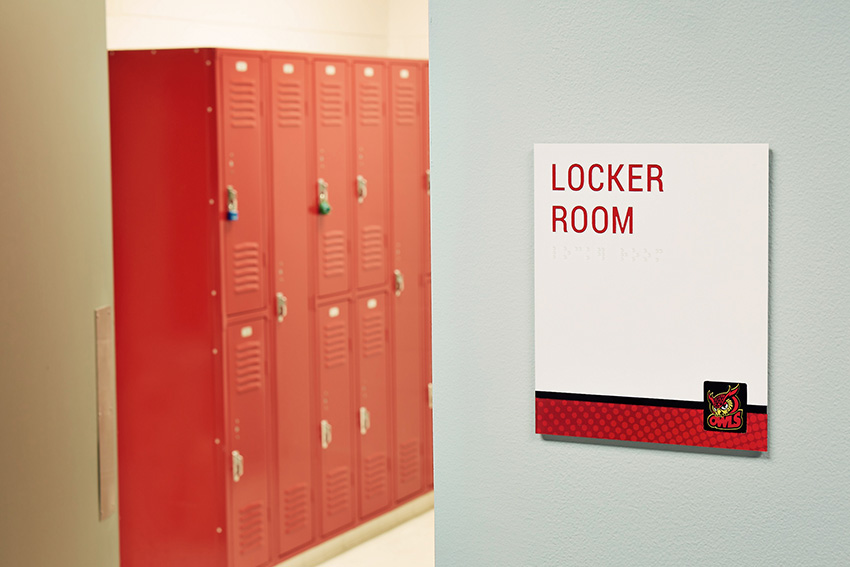
Photo courtesy of Inpro
Signage can help designate particular rooms, but also integrate with a whole building’s design for branding purposes.
SIGNS THAT SUPPORT HEALTHY, HAPPY DESIGN
Architectural signage has gone from being merely a practical obligation to becoming another key element of design. The latest technologies allow signs to fit the aesthetic vision of the architect and help tailor and enhance spaces in service to overall design goals.
By aligning architectural signage with modern concepts of workplace design, organizations can create environments that are visually appealing, functional, adaptable, and supportive of employee well-being and productivity. These signage elements enhance navigation, communication, and brand identity, and contribute to a positive and engaging workplace experience.
Education
Modern architectural signage recognizes the importance of accessibility within the educational environment. Signage is designed to meet the needs of all students, including those with disabilities. This includes incorporating features such as tactile elements, Braille, and high contrast colors for visually impaired individuals, as well as clear and intuitive design for individuals with cognitive or learning differences.
Signage in modern classrooms often goes beyond basic wayfinding and includes visual cues that support learning and engagement. Signage may display educational content, such as maps, diagrams, or inspirational quotes, that align with the curriculum and foster a positive learning environment. This can reinforce important information or serve as visual prompts for discussions and activities.
Some modern architectural signage incorporates interactive and engaging elements that encourage student participation. This can include digital signage displays or interactive touchscreens that provide information, resources, or interactive learning experiences. By incorporating technology, signage becomes an interactive tool that enhances student engagement and collaboration.
Modern classrooms often prioritize flexibility and adaptability to accommodate different teaching and learning styles. Architectural signage can align with this concept by using modular systems that allow for easy reconfiguration and customization. Signage components, such as interchangeable panels or magnetic boards, can be adjusted to reflect changes in classroom layout or content.
In line with the student-centered approach, modern architectural signage may involve students in its design and implementation. Schools can provide opportunities for students to contribute their ideas or artwork to signage, fostering a sense of ownership and pride in the learning environment. Personalized elements, such as student nameplates or recognition boards, can also be integrated into signage to celebrate individual achievements and promote a sense of belonging.
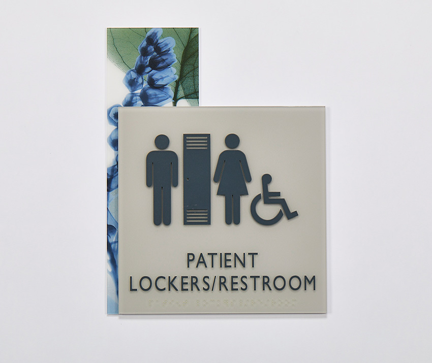
Photo courtesy of Inpro
Patient-centered signage may also include calming visuals or artwork to create a welcoming and healing environment.
Healthcare
Hospitals and medical clinics can be complex and overwhelming environments. And that quality is antithetical to the goal of health and the process of healing. Healing is a process of returning to balance. In times of serious sickness, we rely on doctors, specialists, and nursing staff to administer the best care.
In recent years, we have also grown to expect the quality of the healthcare environments to match the care we receive. In recent years, we have also grown to expect the quality of the healthcare environments to match the care we receive, which is evidenced by how Hospital Consumer Assessment of Healthcare Providers and Systems (HCAHPS) scores affect hospital reimbursements. So it isn’t a surprise that a great focus and research is being put on understanding and maximizing the impact that well-designed healthcare spaces have on patient experience and healing. A growing body of research suggests that healthcare environments can positively influence the healing process, putting more emphasis on the importance of the work that designers and architects do every day.
Modern architectural signage is a piece of the bigger picture of healthcare design. It prioritizes clear wayfinding and navigation, helping patients, visitors, and staff easily navigate the facility. Signage provides clear directions, maps, and arrows to guide individuals to different departments, clinics, or amenities within the healthcare facility. In healthcare settings, it takes a patient-centric approach, aiming to improve the overall patient experience. Signage provides essential information, such as check-in areas, waiting rooms, and registration desks, ensuring patients feel supported and informed throughout their visit. Patient-centered signage may also include calming visuals, positive messaging, or artwork to create a welcoming and healing environment.
Healthcare facilities serve individuals with a wide range of abilities and diverse needs. Modern architectural signage embraces accessibility and inclusivity by incorporating features such as Braille, tactile elements, and high-contrast colors for visually impaired individuals. Signage may also include multilingual communication, accommodating individuals with different language preferences.
Hospitals and medical clinics obviously prioritize safety and emergency preparedness. Architectural signage plays a crucial role in communicating vital safety information, including emergency exits, evacuation routes, and locations of first aid stations or defibrillators. Clear and strategically placed signage helps individuals navigate the facility in emergency situations. Additionally, signage in healthcare settings recognizes the importance of health information and patient education. Signage may display informative messages related to healthy practices, disease prevention, or specific conditions. Educational signage can promote health literacy, empower patients, and encourage informed decision-making.
As healthcare facilities embrace digital advancements, modern architectural signage may incorporate technology elements. This can include interactive touchscreens or digital displays that provide real-time information, appointment updates, or wayfinding assistance. Technology-integrated signage enhances efficiency, engagement, and communication within the healthcare environment.
Workplace
Architectural signage in the workplace reflects the organization's brand and identity. It incorporates the company's logo, colors, and visual elements, creating a cohesive and branded environment. Signage communicates the organization's values and culture and reinforces a sense of belonging among employees.

Photo courtesy of Inpro
Signage can help designate particular rooms, but also integrate with a whole building’s design for branding purposes.
As with healthcare and education, architectural signage in the workplace prioritizes effective wayfinding and navigation. It helps employees and visitors easily locate different departments, meeting rooms, common areas, and amenities. Clear signage with intuitive directions, symbols, and maps reduces confusion, saves time, and enhances productivity.
Signage also reflects culture change in the workplace, some of which has taken root during the pandemic. These days workplace design emphasizes collaboration and interaction among employees. Architectural signage supports this concept by incorporating collaborative spaces or interactive elements within signage. For example, signage might feature writable surfaces, digital screens for sharing information, or interactive boards for brainstorming sessions. Modern workplaces often prioritize flexibility and adaptability to accommodate changing needs and workstyles. Architectural signage aligns with this concept by using modular systems that can be easily reconfigured or updated. Signage components, such as interchangeable panels or magnetic boards, can be adjusted to reflect changes in workspace layouts or department assignments.
Another major impact of the pandemic: Workplace design increasingly considers employee wellness and productivity. Architectural signage can support this by incorporating elements that promote well-being, such as signage with calming visuals, motivational messages, or information related to wellness resources and programs. Signage can also provide reminders for breaks, encourage physical activity, or highlight ergonomic practices.
Modern architectural signage aligns with the growing focus on sustainability in workplace design. Signage may incorporate eco-friendly materials, use energy-efficient lighting, or promote environmental awareness through messaging related to recycling, energy conservation, or sustainability initiatives within the organization.
As technology plays a vital role in modern workplaces, architectural signage can integrate technology elements. Technology-integrated signage enhances communication, employee engagement, and efficiency.
DURABILITY FOR THE MODERN WORLD
In so many ways, technology and design innovation provide the architectural world with more exciting options. But this wealth of options also presents challenges: Architects are expected—and generally desire—to design enduring buildings that are also socially and environmentally responsible. Sustainable buildings must be physically durable but designed with flexibility in mind because modern organizations are constantly evolving. Hybrid offices, multipurpose rooms, moveable walls, and indoor-outdoor spaces must be built to last without confining the future possibilities of those spaces. They should be aesthetically appealing and on-trend, but not bound to fall out of date too soon.
Architectural signs can be both durable and flexible. When specifying signage durable material is key because signs should last as long as the building. New technology in signage materials offers designers durability with eco-friendly attributes and lots of aesthetic options.
Signage that lasts longer reduces the need for frequent replacement, saving both time and money.
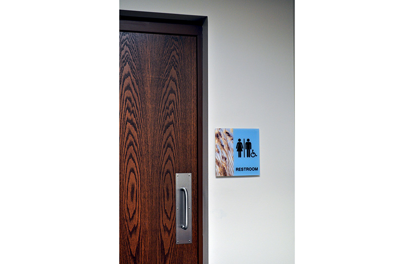
Photo courtesy of Inpro
Applied acrylic provides a balance between durability, visual appeal, and affordability, making it a popular choice for a wide range of architectural signage applications.
It also reduces maintenance costs associated with repairs or replacements. When signage materials are not durable, they may chip, crack, or warp easily, requiring frequent repairs or replacements. This not only incurs additional expenses but also leads to disruptions in the visual consistency of a space.
Durability is also about safety. Signage materials need to be structurally sound to ensure the safety of both individuals and property. For example, architectural signage placed in high-traffic areas or public spaces should be able to withstand accidental impacts without breaking or causing injury. Durable materials provide stability and reliability, minimizing potential hazards.
Another reason durability is so important is that it represents the identity and brand of an organization or institution. A well-designed and durable sign conveys professionalism, credibility, and attention to detail. On the other hand, signage that is worn out, faded, or damaged can create a negative impression and diminish the overall perception of the space.
Depending on its location and type, there may be specific regulations and codes that dictate durability requirements for signage. For example, in areas prone to earthquakes or strong winds, signage materials must meet certain standards to ensure they can withstand these environmental factors. Compliance with such regulations is crucial to maintain public safety and avoid legal issues.
Advancements in material technologies have led to the development of innovative options for durable architectural signage. Those technologies include high-performance plastics and metal composite materials, as well as digital ceramic printing processes and nanotechnology coatings. Here are some of the trending materials used in architectural signage that offer enhanced durability.
Rigid Vinyl
Rigid vinyl is known for its exceptional durability. It is highly resistant to scratches, dents, and impact, making it suitable for high-traffic areas or environments where signage may be subject to frequent handling or abuse. This durability ensures that the signage maintains its visual appeal and functionality over time. Signage made of rigid vinyl is designed to withstand various weather conditions, including extreme temperatures, humidity, and moisture. It is resistant to fading, warping, or discoloration caused by sunlight exposure or environmental factors, which makes it suitable for both indoor and outdoor applications, such as outdoor wayfinding signage or building directory signs.
It also requires minimal maintenance. It is easy to clean and can be wiped down with mild cleaning agents to remove dirt or stains. The material's resistance to damage and discoloration means that it retains its appearance with minimal upkeep, reducing the need for frequent replacements or repairs. This quality also results in reduced replacement costs over time compared to signage made from less durable materials. Another cost-saving quality goes back to the versatility of the material. Versatility allows for efficient production and customization, which can help control manufacturing and installation expenses.
Rigid vinyl can be easily fabricated and customized to meet specific signage requirements. It can be cut into different shapes and sizes, allowing for a wide range of design possibilities. The material can be easily printed on or laminated, enabling the incorporation of custom graphics, branding elements, or information specific to the signage purpose.
It is often manufactured using eco-friendly processes and materials and is also recyclable, contributing to waste reduction and environmental sustainability efforts. Choosing signage made from eco-friendly materials produced with eco-friendly processes is a way to align the material with organizations' sustainability goals and initiatives. Considering these advantages can help organizations make informed decisions when selecting signage materials that best meet their needs in terms of durability, functionality, and visual appeal.
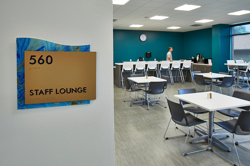
Photo courtesy of Inpro
When employees are surrounded by art in their workplace, it can spark their imagination, encourage innovative thinking, and provide fresh perspectives.
Applied Acrylic
Like rigid vinyl, applied acrylic offers advantages in durability and design. It is resistant to scratches, UV radiation, and weathering and does not easily break or damage. It can be formed into a variety of sizes and shapes and made available in a wide range of colors. This array of options allows for highly customized design, which can result in unique and eye-catching architectural signage that matches the aesthetic requirements of a space. It also enables the use of specific corporate or brand colors, ensuring that the signage aligns with the organization's visual identity.
Acrylic has excellent optical clarity, making it a popular choice for signage that requires clear and sharp visibility. It allows for high-resolution graphics, logos, and text to be applied, ensuring that the signage is easily readable and visually appealing. It’s lightweight, which makes it easy to handle, install, and transport. This quality can sometimes result in cost savings during installation and allows for flexibility in signage placement or repositioning within a space.
Applied acrylic provides a balance between durability, visual appeal, and affordability, making it a popular choice for a wide range of architectural signage applications. When considering applied acrylic for architectural signage, it’s important to consult with signage professionals or manufacturers who can provide guidance on the specific application, thickness, and mounting options to ensure optimal performance and longevity of the signage.
Photopolymer
Photopolymer is a type of plastic material that is being used more frequently in architectural signage. As with applied acrylic and rigid vinyl, photopolymer has a reputation for durability in both indoor and outdoor applications and lends itself to easy maintenance and cost-effectiveness. It is yet another material that offers design flexibility in terms of shape, size, and color and it can be combined with different substrates, such as metal or acrylic, to achieve desired aesthetics. The material tends to work well for signs that require precise, crisp, and detailed graphics, text, and images. It can showcase intricate designs and fine details, resulting in visually appealing signage.
Photopolymer is commonly used for creating tactile signage that meets ADA requirements. It allows for the production of signage with raised characters and Braille, enabling visually impaired individuals to read and navigate through spaces independently.
Some photopolymer materials are manufactured using eco-friendly processes and can be recycled. When considering photopolymer for architectural signage, it’s important to work with experienced signage professionals who can guide you on material selection, design considerations, and installation techniques to ensure optimal results and compliance with relevant regulations and standards.
Performance Standards and Codes
Performance standards for signage durability include ASTM D2247 for accelerated weathering, ASTM D2794 for impact resistance, and ASTM B117 for salt spray corrosion resistance. Underwriters Laboratories (UL) provides standards and testing for various products, including electrical signage components. These standards ensure safety and durability in the electrical and lighting aspects of signage.
Building codes and regulations can vary significantly between regions. Local authorities and municipalities may have specific requirements for architectural signage durability, fire safety, structural integrity, and accessibility. It’s essential to consult the relevant building codes and regulations in your specific location.
LEED and Healthy Building Practices
Architectural signage can contribute to various LEED categories, including:
- Signage that promotes alternative transportation options, such as bicycle racks or carpooling information, can contribute to reducing the impact of transportation on the site.
- Using energy-efficient lighting systems, such as LED lights, for illuminated signs can help reduce energy consumption and contribute to energy efficiency goals.
- Signage that incorporates low-VOC (Volatile Organic Compounds) materials and finishes can contribute to maintaining healthy indoor air quality.
- Incorporating innovative and sustainable practices in signage design and implementation can earn points in the innovation and sustainable practices category. Examples could include using renewable energy sources to power signage, implementing digital signage to reduce waste from printed materials, or incorporating signage that educates building occupants about sustainability and green practices.

Photo courtesy of Inpro
Through studies using magnetic resonance imaging (MRI) and brain-wave scanning, researchers were able to see that pleasure centers in the brain are triggered by viewing art and images.
SIGNAGE ART AND THE ART OF SIGNAGE
The recognition of art’s positive impact on human health and well-being can be traced back to ancient civilizations. Throughout history, various cultures and societies have intuitively understood the therapeutic value of artistic expression. In ancient Egypt, for instance, art was integrated into healing practices, with wall paintings and hieroglyphs adorning the walls of temples and tombs, depicting scenes of healing rituals and medical treatments. These artworks were believed to have magical and transformative powers, aiding in physical and spiritual healing. Similarly, in ancient Greece, art was closely linked to medicine and healing. The Greek physician, Hippocrates, recognized the significance of music in promoting well-being, and his approach to healthcare included the use of music and poetry as therapeutic interventions. The ancient Greeks also believed that viewing and creating visual art could have a profound impact on emotional and mental well-being.
Today, extensive scientific research continues to explore the impact of art on human health and well-being. Studies have shown that art engagement can reduce stress, improve mood, increase empathy, enhance cognitive abilities, and promote overall psychological well-being. This growing body of evidence has led to the integration of art in various healthcare settings, including hospitals, clinics, and long-term care facilities, as well as in workplace environments and educational institutions, recognizing its potential to positively impact individuals' health and quality of life. In that same vein, architectural signage, when thoughtfully integrated with visual art, has the potential to significantly contribute to health and well-being in healthcare facilities, workplaces, and schools. By incorporating visual art into signage, these environments can create a more positive and engaging atmosphere, impacting individuals on multiple levels.
In healthcare settings, paintings, sculptures, or other visual mediums, can reduce anxiety and even pain perception among patients. Art integrated with signage in healthcare facilities can create a more pleasant and comforting environment, supporting patients’ emotional and mental well-being during their healing process.
A 2017 study published in the International Journal of Qualitative Studies in Health and Well-being employed anthropological methods to show the interactional aspects of art in health interventions. A combination of experiments, semi-structured interviews, observation, and thermal cameras (which monitored the usage of rooms with and without art) showed that the presence of visual art created an environment and atmosphere where patients can feel safe, socialize, and maintain a connection to the outside world.
Art holds equal significance for both healthcare professionals and patients in medical offices and other work areas. It plays a vital role in combating the physical burnout experienced by approximately 30-55% of physicians, often resulting from long working hours. By cultivating a soothing and pleasant atmosphere, art aids in creating a relaxing environment that enhances work enjoyment. A survey conducted by the International Association of Professional Art Advisors (APAA) revealed that 82% of employees regarded art as crucial within the work environment. This underscores the essentiality of art as a means to uplift morale and alleviate stress.
Similarly, in workplace spaces, architectural signage infused with visual art can enhance the overall well-being and productivity of employees. Visual art has the ability to inspire creativity, boost morale, and reduce stress levels. By incorporating art into signage, workplaces can foster a more stimulating and inspiring environment, ultimately contributing to employee satisfaction, engagement, and overall mental health.
In educational settings, architectural signage combined with visual art can create an enriching and inspiring atmosphere for students. Visual art has been shown to enhance cognitive development, critical thinking skills, and creativity among learners. Schools can create visually stimulating and engaging environments, fostering a positive and conducive space for learning and personal growth.
There’s a Science to It
Providing evidence that art impacts humans in these spaces is one aspect of the research. The other question is: How or why? Neuro-architectural design or neuro-architecture science, is an emerging field that explores the relationship between architecture, neuroscience, and cognitive science. It aims to understand how the built environment impacts human behavior, cognition, emotions, and overall well-being by examining the neural responses and physiological reactions of individuals in different architectural settings.
The concept of neuro-architecture recognizes that our brains are constantly processing sensory information from the environment, and the design of spaces can influence our neural activity and cognitive processes. By applying scientific methods and knowledge from neuroscience, researchers in this field seek to uncover the underlying mechanisms through which architectural features, such as spatial layout, lighting, colors, materials, acoustics, and aesthetics, affect our neural responses and psychological states.
Neuro-architecture combines principles from neuroscience, psychology, architecture, and design to create spaces that are more supportive, engaging, and conducive to specific activities or goals. For example, in healthcare settings, neuro-architecture research may inform the design of hospital rooms and waiting areas to reduce stress and promote healing by considering factors like natural light, views of nature, calming colors, and noise reduction. It also examines how architectural design can optimize cognitive performance and well-being in other contexts, such as workplaces, schools, retail environments, and urban planning. By understanding how the brain processes environmental stimuli and how architecture can influence neural activity, designers can create spaces that enhance productivity, creativity, focus, and overall satisfaction.
In a recent article in Architectural Products by Jessica Shaw, ASID, pointed to new research showing art’s impact on the brain to stimulate new neural pathways and ways of thinking. Through studies using magnetic resonance imaging (MRI) and brain-wave scanning, researchers were able to see that:
- Pleasure centers in the brain are triggered by viewing art and images
- In addition, several other areas of the brain can be stimulated
- Brain-wave research shows that engaging with art triggers the brain’s work to form meaning
The implication of these studies is that art and imagery can play a role in greater cognitive functioning and creativity through brain stimulation. Two-dimensional art in the workplace can take two main forms: Printed wall art in frames or non-framed, and large graphics printed on durable impact-resistant panels.
According to Upali Nanda, a professor of architecture at the University of Michigan, art has multiple functions in a space, including creating a lasting impression, offering a positive diversion, evoking awe, and aiding in wayfinding. By encountering familiar artworks, individuals can easily orient themselves within a building, identify their intended destination, and navigate their way there. Studies have demonstrated that familiar and tranquil nature imagery tends to have the most calming effect. For that reason, healthcare facilities often find fine art photography featuring natural scenes to be an ideal choice.
Wayfinding
Wayfinding refers to the process of navigating and orienting oneself within a space, and it is crucial to create an environment that is intuitive, visually engaging, and easy to navigate. Art can play a significant role in supporting wayfinding through various facilities, including schools, office spaces, and healthcare facilities. A wayfinding system that helps patients, families, visitors, and staff find their way around a healthcare space is critical. Artwork can play a successful role in such a solution next to or incorporated into signage.

Photo courtesy of Inpro
A well-designed wayfinding system is essential for guiding patients, families, visitors, and staff within a healthcare facility.
Art can be incorporated into signage systems to make them more visually appealing and memorable. Instead of using plain, generic signs, artistic elements such as creative typography, colors, or pictorial representations can be employed to help people easily identify different areas, rooms, or departments within a facility.
- Art installations or distinctive visual features can serve as landmarks that help people recognize and remember specific locations within a facility. These landmarks can act as reference points and aid in orienting oneself in unfamiliar surroundings.
- Strategic use of color and contrast in artwork can also be employed to guide people through a space. Bold or contrasting colors can be used to highlight important areas or pathways, while muted or softer colors can indicate less important or secondary areas.
- Art can be used to establish thematic elements that reflect the purpose or identity of different sections within a facility. For example, in a school, each department or grade level might have its own distinct theme represented through artwork, making it easier for students, staff, and visitors to identify and navigate specific areas.
- Maps and murals can be created as large-scale art installations, providing both functional information and aesthetic appeal. They can be placed strategically at key locations within a facility, offering visual guidance and helping individuals understand the overall layout of the space.
- Artwork that encourages interaction, such as touch-sensitive displays or kinetic sculptures, can engage individuals and draw their attention to specific areas or pathways. Interactive elements can be incorporated into the artwork, prompting people to explore and follow a designated route.
CONCLUSION
Architects have a powerful tool at their disposal to promote healthy and happy design through innovative signage. By understanding the principles of human-centered design, architects can create environments that prioritize accessibility, functionality, and aesthetics. With signage, they can encourage healing, learning, and/or productivity through user engagement and wayfinding. New technologies focus on both durability and aesthetics while still ensuring that signage solutions adhere to ADA guidelines, guaranteeing accessibility for all individuals, including those with disabilities. The successful fusion of these elements not only enhances the functionality of the built environment but also contributes to a more inclusive, enjoyable, and empowering experience for everyone who interacts with it.
Erika Fredrickson is a writer/editor focusing on technology, environment, and history. She frequently contributes to continuing education courses and publications through Confluence Communications. www.confluencec.com


