Introducing new palettes in the kitchen to enhance welfare, health, and durability
Sponsored by BLANCO | By Amanda Voss, MPP
This CE Center article is no longer eligible for receiving credits.
DESIGNER GOES AGAINST KITCHEN CONVENTION IN HER OWN HOME
Photo courtesy of Shauna Beltramo, The House of Silver Lining
The black sink highlights the geometric tile while vividly contrasting against the deep green cabinets.
Colorado Springs, Colorado-based Interior Stylist and Blogger Shauna Beltramo of The House of Silver Lining recently completed the stunning build of her family’s custom dream home located in Colorado. Her new home, which she refers to as the Forest Modern, sits on 5 sprawling acres and features an open and airy feel. Shauna’s dream kitchen includes an attention-grabbing granite composite sink. She discusses the design process here.
What was your inspiration for the design?
For me, design is definitely a mood or feeling that I want the home to evoke. I believe one’s personality should be reflected in the style of his or her home. I love studying fashion design and actually gather some of my best design “visions” from a piece of wardrobe. My first step is to look in my own closet. What colors am I drawn to? Is there a lot of pattern or more simple and chic pieces? Most often, I’m comfortable in black, white, and gray. So, from there came the inspiration for the color palette throughout our new home. Pops of moody colors in cabinetry and feature walls were added to break up the monochromatic tones.
What challenges did you face?
In building this home, we faced many challenges. Every day was a new challenge. What matters most is that we learned how to problem solve and fight through until we got it right. Is it all perfect now? Absolutely not, but perfection is boring and way over rated. Don’t ya think?
What would you consider your design style to be?
It depends on the space I’m designing! I love many different styles, from traditionalism to ultra modern, Scandinavian, urban industrial, and even vintage. I love blending pieces of all those elements together throughout a home to add that personality!
What is unique about your design?
I like to incorporate the “unexpected” into my designs; a “conversation element” that causes guests to pause and ponder. As I designed our new home, The Forest Modern, I made sure to add those unexpected elements into the design. A good example is how I went with a deep green cabinetry in our laundry room against a whimsical patterned tile floor, even going with a black sink when the latest craze is all about white farm sinks.
What is your favorite part of your new home?
All of it! This home has been a true labor of love, and at this point, I can’t separate one space that I love the most. Every single room took careful design planning and is special in its own unique way.
Photo courtesy Michele Alfano Design
The modern sink has left behind the former color restrictions of stainless steel or white porcelain. Today, a wide variety of designs, sizes, and colors allow professionals to create the perfect kitchen, no matter what the style.
Removing Design and Welfare Boundaries with Color
Color can be useful in so many ways: from its simple aesthetics to its impact on mood, its ability to reflect personality and style, and its implications for health and welfare. Color is powerful, and design professionals—and the market itself—are increasingly recognizing and harnessing this power. Forecasting an annual color has become big business; nearly every paint company now names its color of the year. In a survey of paint companies, most of the colors of the year for 2019 are unsaturated, light colors. Clariant, a world leader in specialty chemicals, predicts that “colors become muted as consumers come to grips with a complex world and never-ending distractions. As people feel that things are spinning out of control, focusing on single tasks is critical. The color palette is simple: serene, soft, muted, and minimal colors.”13 These annual colors and associated palettes also help people “consider colors they may not have found on their own or felt confident enough to pick for their next paint project.”14
The modern sink has left behind the former color restrictions of stainless steel or white porcelain. Today, a wide variety of designs, sizes, and colors allow professionals to create the perfect kitchen, no matter what the style. Kitchens can now maximize an occupant’s style through a cast of colorful sink options that bring personalized design front and center. Intelligent color palettes reflect and support the people and activities within a structure.
Yet color plays not only plays a role in aesthetics and mood, as it also offers as an important means of integrating safety and functionality. While color can certainly create a visual celebration, it also enhances welfare and safety by defining workspaces and crafting optical clues that enhance occupant welfare. A contrasting sink color alerts occupants to a shift in work surface and establishes clear work zones. Using color in the kitchen enhances welfare and safety for aging-in-place and multigenerational homes, particularly as the dominance of open floor plans removes traditional work-zone transitions.
Color also has a role to play in sustainability. Though color is often regarded as a shifting trend, thoughtful selection of a palette enables a kitchen sink to offer an aesthetic highlight while also providing design longevity. A classic, neutral color scheme acts as an investment, allowing clients to avoid buyer’s remorse and ensuring an interior design that will never grow old.
Amanda Voss, MPP, is an author, editor, and policy analyst. Writing for multiple publications, she also currently serves as the managing editor for Energy Design Update.
END NOTES
1“Survey Results: Trend Stories in Kitchen Design & Color.” Frank Advertising. 2018.
The modern sink has moved beyond the confines of simple stainless steel or white porcelain.
Today, a wide variety of sink designs, sizes, and colors allow professionals to realize the perfect kitchen, no matter what the style. Kitchens have developed an individual character, and that vision is supported by a cast of colorful sink options that bring personalized design front and center.
Photo courtesy of BLANCO
New sinks today offer an intelligent array of color in the kitchen, creating modern aesthetics and enabling occupant welfare.
In a survey conducted by Frank Advertising, 60 design and architectural professionals were asked to weigh in on the top three trends influencing kitchen design for 2019. Among the assortment of responses, “color” was the most repeated word.1
Color is important. Not only is it a primary aesthetic driver, but design professionals are also seeing color becoming more than just a trend because it has major implications for welfare and health as well. Evidence demonstrates that color can evoke powerful emotions and create interactions that drive safety for building occupants.
The Evolution of Color in Today’s Kitchen
The expansion of the color palette in residential construction is making its way definitively into the kitchen.
According to a Houzz survey, while white continues to hold the top position in kitchen cabinetry color, gray is now used in one in 10 new cabinets—11 percent, as compared with 8 percent and 9 percent in 2017 and 2018 studies, respectively.2 When hardware and fixtures are matched in the kitchen, gray cabinets are significantly more likely to be matched with brushed or satin nickel door hardware (52 percent), compared with white or wood cabinetry (40 percent and 48 percent, respectively).
Frank Advertising’s 2019 Kitchen Design Survey asked architectural and design professionals to forecast the top three trends they felt would influence kitchen design. For cabinet colors, survey takers highlighted gray and onyx as rising contenders in the kitchen, and a majority believe that traditional warm-tone cabinet colors will become more popular, with less demand for white.
Styles and finishes in the kitchen are shifting, Houzz reports. While transitional remains the most popular style (21 percent), farmhouse (14 percent) has seen steady gains, now nearly tying with contemporary (15 percent) for second place.
Interestingly, a majority of homeowners are mixing metal finishes in hardware and fixtures with matte nickel, oil-rubbed bronze, and matte black. And engineered materials are retaining their dominance. Engineered quartz (48 percent) surpassed all natural stone materials (43 percent) in popularity. As more and more homeowners discover the ease of care and breadth of design choices in engineered products, the trend trajectory suggests that their popularity will continue to soar.
The entire kitchen, from walls to floors to hardware, is experiencing a color revolution. While strategies like pairing analogous colors (groups of colors that are adjacent to each other on the color wheel, like red, orange, and red/orange) or monochromatic colors (the use of only one color in shades from dark to light, like navy to powder blue) still reign, designers are increasingly using complementary or triad palettes. Bright blue cabinets may pop against white subway tile and yellow textiles under a complementary approach; a vivid palette of green cabinets, copper hardware, and an aubergine accent wall offers strikingly modern appeal with a triad palette.
In a residential setting, designers are increasingly cognizant of capturing the feeling the client wants to evoke in a space. In a serene design scheme, the homeowner may wish to use the kitchen to unwind and therefore prefer a palette of cool colors for calmness and peace. Another client might seek to highlight the kitchen as the hub of a busy, central, and social space in the home and therefore use stark, dominant colors like red to increase appetite and energy.
Photo courtesy of BLANCO
The expansion of the kitchen color palette means a greater ability to personalize the space and evoke a client’s desired mood.
This revolutionary wave of color has also reached the sink. As one of the most used and highly functional components of the kitchen, sinks should not be excluded from embracing these new palettes. Sinks are no longer bound by the material color conventions of the past, confining them to stainless steel, copper, or porcelain. Complementing the rise of gray cabinets, a fresh palette of neutral colors, from natural stone tones to black, is allowing the sink to become either a design highlight or an important supporting cast member for an overall design scheme.
“Neutral colors don’t have to be boring!” writes Shelley Little of Freshome’s Very Best.3 “In fact, a calm, neutral backdrop allows you to bring out some pretty bold elements into your design that may otherwise look garish.” Little notes that a neutral backdrop creates a welcoming interior when mixed with warm textures, and has great options for modern interiors, allowing the architectural elements of a design to take center stage. “Neutral is anything but boring, rather it is for the savvy home designer that loves keeping their options open,” Little concludes.
The new neutrals are reflected in granite composite sink colors. An emerging sink material over the past decade, granite composite sinks are made from crushed stone that is mixed with a resin filler in an average ratio of 80 percent stone to 20 percent resin. This combination produces a material that shares aesthetic qualities with real granite without the maintenance and durability issues associated with solid stone sinks. It also allows for a range of color options, depending on the manufacturer. The variable color palette gives it the ability to pair well with a variety of natural stone and granite countertops. Certain manufacturers offer granite composite sinks in as many as nine colors, moving from white to gray, sand, brown, and black. These color options can either make a sink a focal point or help it blend in with counter.
Granite composite sinks are tough and highly resistant to stains and scratching, but, as a general rule, granite composites have a higher durability than quartz. The leading granite composite sinks also boast heat resistance up to 536 degrees Fahrenheit, exceptional cleanability with hydrophobic finishes, and resistance to household acids and alkali solutions.
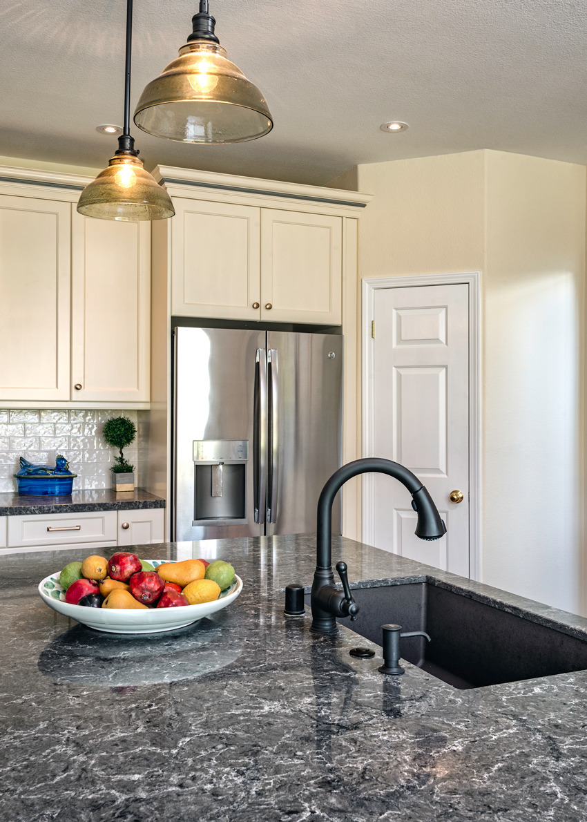
COLORFUL FAMILY KITCHEN REMODEL EARNS NKBA AWARD
Photo courtesy of Cheryl Kees Clendenon, In Detail Interiors
The gray-colored sink offered a match to hardware and appliance finishes, while the visual appeal of the granite composite material is softer than stainless.
Florida-based designer Cheryl Kees Clendenon of In Detail Interiors won a coveted National Kitchen and Bath Association (NKBA) design award for a beautiful and bright kitchen remodeling design featuring a gray granite composite sink. Here, she answers some questions about the project design.
What was your inspiration behind this design?
We began with just a budget—that was it. Over time, we got to know the clients and their young family’s lifestyle and began making recommendations on how to create a fun family space they would love, without breaking the bank. We presented four options with various colors and materials, and they chose one embracing yellows, blues, grays, and white. Once we made a few tweaks, we were up and running, and the design process began.
Did you have a certain theme in mind that you wanted to convey in the design?
Not really. The space itself was not easy to change, so we adapted where we could. For example, we took an unused wall near the back door and added a storage hutch designed to be a cool piece of functional furniture. We also created a fun magnet board on the side of the refrigerator to house the kids’ pictures as well as various calendars for their activities. One wonderful thing about this space is that while it may be a small kitchen, it lives very large.
How did sink selection aid the design and aesthetic?
I am a huge fan of granite composite sinks! In this case, I selected a granite composite sink in a metallic gray color, which looked so awesome with the beautiful materials we selected. I love how water spots are never an issue with certain granite composite technology, and the visual vibe of the material is “softer” than stainless, so it really helped us create a cozy feel in this particular space.
Intelligent Color Matching in the Kitchen
The Science Behind Color Choice
Modern design’s twin movements toward personalization of color and the evolution of kitchen design allow homeowners to set the tone and reflect the mood they wish to cultivate in a much more unbounded manner. It also creates a more adaptive and usable space. “The colors and design of a home should be a reflection of the people who live inside,” says International Color Consultant Amy Wax.
With the expansion of the color palette and the proliferation of new materials available in the kitchen, architects and design professionals are increasingly seeking how to best support client welfare through color choice.
Most building occupants don’t spend a lot of time thinking about the effects of color in their space. Yet color should reflect and assist the people and activities within a structure. Whether aware of it or not, color does drive behavior. Dave Alan Kopec, professor at the New School of Architecture and Design in San Diego, conducts research to find out how the physical environment affects emotions and behavior.4 Kopec defines environmental psychology as the study of human relations and behaviors within the context of the built and natural environments. This research-based information studies the complex interactions between environmental factors and people’s feelings and actions. As architects apply lessons about aesthetics and their impact on people in a space, these studies are providing data that support conclusions about the importance of design decisions like color.
Photo courtesy of Cheryl Kees Clendenon, In Detail Interiors
Complementary shades of blue pop when set against white and yellow accents, creating a cheerful family kitchen.
Designers and architects are now increasingly equipped with both the knowledge and products to use colors wisely to create the intended aesthetic in a building. Not only can color create a visual celebration, but it also enhances welfare by defining workspaces and crafting optical clues that enhance occupant safety.
Color saturation and tonal value have impact, according to the Morgridge Institute for Research and Wisconsin State Journal.5 Color can create responses in three different categories of human performance: cognitive, affective, and behavioral, notes Dr. Zena O’Connor, founder of Design Research Associates and the Colour Collective in Sydney, Australia, and member of the International Colour Association (AIC).6 Cognitive responses include judgments, assessments, and evaluations. Affective responses include mood and emotional reactions. Behavioral responses encompass actions, movements, and wayfinding.
With the expansion of the palette available to designers in the kitchen, architects and design professionals are freer than ever to explore personal expression for their clients. What will the kitchen be used for? Does the client prefer the kitchen as a more private or public space, and how much of the space will be used? Is the intent of the kitchen design and layout for engagement and work or serenity and relaxation?
How much and what kind of light will be used? Is there a lot natural lighting available in the space, or will incandescent or ambient be the main light source? Color can appear drastically different depending on the light source.
What kinds of accents will be used in the room? Does the design highlight bold accents in the space or patterns and textures? Do appliances and sinks take center stage, or do they complement cabinets and paint? Accents can warm up or cool down a space, according to Anna Vichnevetskaia, content development at TheArtCareerProject.com. They can add personality, bring out energy, make a room look modern, and more. Because of their flexibility, sinks and kitchen elements should bring out the personal style and taste of the homeowner.
In her presentation, “Colour in the Built Environment,” O’Connor reveals the highly complex interface between color and human response. Despite the complexity of factors that generate an individual response to a specific color, there are general strategies for color that can demonstrably humanize a space and encourage engagement.
In active, collaborative areas, O’Connor favors a range of mid-level saturated colors to indicate work teams, social areas, and meeting rooms. Strong color and light/dark contrast draws attention to key details. For quiet or contemplative spaces, less-saturated colors with minimal hue and light/dark contrasts evoke a sense of calm. O’Connor recommends the use of colors that the client considers calming. A sense of tranquility can be created simply by reducing the number of contrasts in tonal value and saturation.
O’Connor found that moderately colorful interiors support positive mood and sense of well-being, and that her research indicates people prefer some level of contrast. The interplay of color and light also encourages engagement and improves perceptions of safety.
Making Sense of Trends in Faucets, Counters, and Sinks
The move toward personalization in color does not spell design anarchy. There are notable trends being embraced in the market. In its 2019 survey of 60 kitchen design professionals, Frank Advertising asked about colors the design professionals plan to specify for kitchens in 2019. For cabinets, the top responses were white, gray, blue, and warm tones. This reflects the growing trend toward more overall color in the kitchen. The dominant responses for countertop color were white and gray. The top two appliance colors were stainless steel and black. Traditional choices of stainless steel and white were still tops for sinks. Faucets and hardware selections reflected the growing diversity of color tastes and personalization: stainless steel, brushed nickel, black, and chrome reigned at the top. Sneaking into the top choices for faucets were dual- and full-color finishes. Overall, designers noted that clients wanted to avoid the appearance of a “cookie-cutter” or “volume driven/standard appearance” kitchen.
The rising popularity of the color gray in the kitchen makes sense. Clean, organic, and extremely balanced, gray is at home in both urban and natural settings. The right gray offers both red and blue undertones, making it an exceptionally versatile color.
Photo courtesy of BLANCO
Mixed materials are becoming popular as clients seek to create a custom kitchen look.
“Our latest color innovation, Concrete Gray, makes a statement on many levels,” states Tim Maicher, director of marketing for BLANCO. “Concrete gray provides the greatest design flexibility. It is a perfect match for today’s kitchen materials and complements a wide range of countertops for a cool, modern design. We spend countless hours analyzing color trends to find timeless neutrals that offer a fresh, sophisticated look and seamlessly blend in a way that is practical yet inspirational.”
Right on trend, gray can create the perfect fit with a wide array of countertop and cabinet designs. This versatility is important, as designers report a fairly even split between contemporary, transitional, farmhouse, and traditional as top design trends overall in the kitchen.
The expansion of color and emergence of new technologies means the flexibility to match a sink and faucet, or match these elements seamlessly to appliances and countertops. However, this flexibility also offers the ability to create contrast; for example, with white countertops and black sink, appliances, and hardware for a black-and-white theme. Metal contrasts nicely with color; dual finishes in faucets can both match and contrast a sink and a color scheme. Polished chrome enhances a modern setting or marble counters, and satin nickel shines when paired with warmer finishes.
Although the abandonment of most of the rules and traditions in the kitchen brings freedom, it can also overwhelm a client with choices. Certain manufacturers offer modernized tools to help ease the selection process. Mobile color application tools help users evaluate a prospective sink’s appearance when paired with popular countertops and allow them to select the perfect color combination for their kitchen designs. These tools even permit users to add their own countertop selections to the app by capturing images using the device’s camera. Favorite combinations can be added to a list and emailed to others. Manufacturers also offer image galleries for inspiration and design ideas.
Knowledge Check
Which phrase best describes the evolution of color in today’s kitchen?
A wider range of colors are available to meet client’s aesthetic demands.
Designers today are incorporating the whole palette of colors to better personalize kitchens as well as enhance welfare and provide safety, especially for universal design and aging-in-place.
Kitchens are now embracing a monochromatic palette.
Design professionals and architects are using a wide range of colors in all elements of the kitchen to better personalize kitchens as well as enhance welfare and provide safety, especially for universal design and aging in place.
NAPA VALLEY KITCHEN REMODEL
Photo: Bart Edson Photography
A client’s kitchen went from tired to fresh with careful application of color.
In Napa Valley, California, two-time award-winning and published interior designer and principal of PLC Interiors Patti Cowger recently transformed an outdated kitchen into a fresh farmhouse space for longtime friends Jeff and Cathy. Cowger completed a full kitchen renovation for the couple featuring soft, coastal gray quartz countertops, beautiful creamy white cabinetry, and a café brown granite composite sink in order to create a dream kitchen for her friends of more than 50 years.
From the very beginning of the project, Cowger began her remodel facing the challenge of finding enough space to accommodate all the features Jeff and Cathy wanted for their kitchen. High on the couple’s list was getting a table large enough to enjoy breakfast and spread out the morning paper. Another tough challenge was creating a layout that is inviting for family functions and meetings.
Both Jeff and Cathy have busy social and professional lives, often holding meetings in their family room, adjacent to the kitchen. They needed their kitchen to always look clean and tidy, without having to spend too much time doing the work. Since their sink is located in the middle island, which is visible from the family room, Cathy worried about having the sink appear spotless for her guests.
Cowger noted that Cathy was immediately drawn to granite composite sinks and their various dark color possibilities. “She was immediately intrigued,” Cowger recalls.
Photo: Bart Edson Photography
The white cabinetry, coastal gray quartz counters, cream walls, and a gray island come together perfectly to create a warm, neutral look. The café brown granite composite sink and dark bronze faucet were the perfect finishing touches due to their earthy tones.
Granite composite sink technology is durable and heat, scratch, stain, and chip resistant—the perfect functional combination for Cathy and Jeff. From a design standpoint, the color selection was both sophisticated and novel, pairing perfectly with the quartz counter top.
Jeff and Cathy’s new modern-day farmhouse-style kitchen exudes a peaceful yet family-friendly ambiance. The white cabinetry, coastal gray quartz counters, cream walls, and a gray island come together perfectly to create a warm, neutral look. The café brown granite composite sink and dark bronze faucet were the perfect finishing touches due to their earthy tones.
Thanks to Cowger, each of Cathy and Jeff’s must haves were checked off their list, and there were even a few extras thrown in, like island seating for their grandchildren. The couple is now ready to enjoy their new kitchen and host family and friends.
Coloring the Path to Function, Welfare and Health, and Safety
Form and Function in the Kitchen
“Most clients are particular about aesthetics, but all clients insist on functionality,” responded a design professional in “Trends Stories in Kitchen Design & Color.” Clients want spaces that convey their personality, but most of all, they want their kitchen to make their lives easier. Here—perhaps surprisingly—color has critical roles to play.
Color provides an essential foundation for successful interior design. The use of color as a design element in interior environments also contributes to creating a design solution that encourages engagement and improves perceptions of safety. According to O’Connor, color can be harnessed as an effective nonverbal mnemonic device for orientation and wayfinding at a range of different scales. That means that color in the kitchen plays a vital role in welfare, health, and safety.
Color and Its Role Welfare, Health, and Safety
Surveyed designers reported that a majority of kitchens are being designed for people older than 55 or multigenerational/family households. Boomers, who are 77 million strong and make up 28 percent of the U.S. population, are quickly catching on to the economics of aging-in-place designer modifications. Moving into a typical assisted-living facility can cost up to $60,000 annually, according to the National Association of Home Builders (NAHB). The cost to adapt a home by widening doorways, putting in safety bars, switching out a sink, and adding a roll-in shower might typically cost about $8,000, but this represents a one-time expense rather than the on-going expenses involved in assisted-living facilities.
“From preventing falls through something as simple as choosing the right kind of carpet to designing beautiful, welcoming shared spaces to help address social isolation, architects and interior designers have the chance to improve, and even extend, the lives of seniors,” writes Karen Kubey, an urbanist whose practice specializes in housing and health. She also edited New York City Department for the Aging’s (DFTA’s) Aging in Place Guide in 2016 in collaboration with DFTA and AIA New York Chapter’s Design for Aging Committee.7
Color is the designer’s tool to establish wayfinding. Wayfinding is a term used to describe user experience and orientation within an environmental context. “Good architectural wayfinding design is important to universal design because it facilitates user access, increases satisfaction, and reduces stigma and isolation of users with disabilities,” writes Susan Hunter, Ph.D., M.Arch. IDeA Center, University at Buffalo.8 It reduces the confusion of visitors and mistakes by employees, saving time and money, and preventing accidents. It also reduces stress, boosting health and productivity.9
What does wayfinding look like in a home? “Painting walls a different color than the floor can help with perception,” says Mark Hager, cofounder of AgeInPlace.com, an aging-in-place resource.10 “Similarly, adding colored lines on the edges of steps, floor transitions, and counter edges can offer visual cues of a transition. These cues are easy to add and don’t distract from the design of the home.”
Colors and wayfinding are vital as we age.
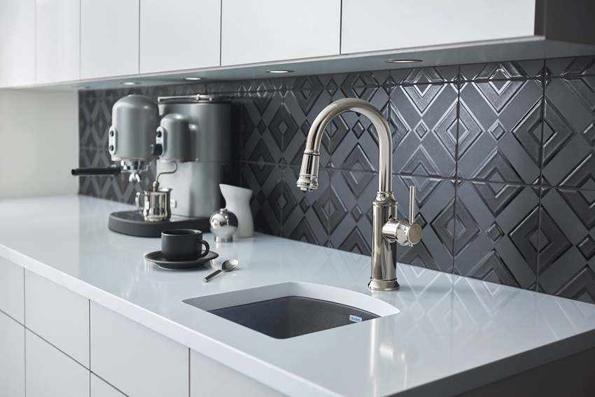
Photo courtesy of BLANCO
The contrast of black and white enhances both welfare and safety in a kitchen, particularly for users with visual limitations. The color highlights different workspaces, allowing for easy identification of counter and sink.
Visual perception declines from middle age onward. A strong color contrast improves environmental legibility. Environmental legibility is the degree of distinctiveness that enables viewers to comprehend their surroundings or the degree to which a building facilitates the ability of users to find their way within it.11
According to O’Connor, people with Dementia and Alzheimer’s disease can experience difficulties with spatial awareness. This includes difficulty judging distances, identifying an object from its background, finding light switches, and distinguishing between the toilet and bathroom floor.
While a distinct color contrast obviously is important between features like steps and risers, the leading edge of a step, and at contours and boundaries (walls from floors, doors from walls, windows from walls, and railings from walls), color contrast is also applicable in many other ways. For example, contrasting colors in the kitchen create much more legible work environments. A contrasting sink clearly delineates where the counter ends and the sink begins, as well as alerts a user to the depth discrepancy between basin and counter.
Aging-in-place principles are sweeping changes designed to custom fit a home to a client and his or her family as time goes by, according to the NAHB. Making remodeling decisions with aging in place in mind allows clients to continue living safely, independently, and comfortably at home in a familiar environment throughout their maturing years. Aging-in-place design principles focus on elegant, aesthetically enriching, and barrier-free environments.
The NAHB Aging in Place Checklist for the Kitchen includes the following recommendations:12
Counters
Wall support and provision for adjustable and/or varied height counters and removable base cabinets
Upper wall cabinetry three inches lower than conventional height
Accented stripes on edge of countertops to provide visual orientation to the workspace
Counter space for dish landing adjacent to or opposite all appliances
Base cabinets with rollout trays and turntable features
Pull-down shelving
Glass-front cabinet doors
Open shelving for easy access to frequently used items
Appliances
Easy-to-read controls
Microwave oven at counter height or in wall
Side-by-side refrigerator/freezer
Side-swing or wall oven
Raised dishwasher with push-button controls
Electric cooktop with level burners for safety in transferring between the burners, front controls, and downdraft feature to pull heat away from user; light to indicate when surface is hot
Miscellaneous
30-inch by 48-inch clear space at appliances or 60-inch-diameter clear space for turns
Multilevel work areas to accommodate cooks of different heights
Open under-counter seated work areas
Placement of task lighting in appropriate work areas
Loop handles for easy grip and pull
Faucets
Pull-out spray faucet
Lever or pedal-controlled handles
Thermostatic or anti-scald controls
Pressure-balanced faucets
Knowledge Check
What interactions can color create for human interaction within the built environment?
Color creates a wide variety of interactions with occupants, from emotional and visual to reactions that aid in promoting safety and welfare.
Color is often incorrectly cited as a behavioral trigger, but does not generate a reaction.
Color is used for aesthetic reasons only.
Employing color not only generates emotions, but it also creates wayfinding and legibility, ensuring a safe work environment for multiple ages.
Color in the kitchen gains added importance given the prevalence of open floor-plan settings. Color sets the kitchen apart aesthetically; a thoughtful palette helps delineate the kitchen space for better environmental legibility. Using color to define work areas in the kitchen and alert occupants to shifts in height is a vital strategy in ensuring occupant safety and welfare, particularly in the long term. Installing a colored sink offers an aesthetically pleasing option to differentiate this kitchen work zone. Selecting a neutral, saturated color also means greater design flexibility, allowing the sink to pair easily with new curtains, paint, or tile through the years.
Photo courtesy of BLANCO
Shown is an ADA-compliant sink and kitchen design. As an additional welfare benefit, the project uses a colored sink to differentiate this kitchen work zone.
HOW TO USE A SINK TO COMBINE ADA COMPLIANCE AND LUXURY AESTHETICS
Photo courtesy of BLANCO
Selecting a neutral, saturated color means greater design flexibility, allowing the sink to pair easily with new curtains, paint, or tile through the years. It also means the sink enjoys a maximized life cycle and will not be replaced to fit a trend.
By their very nature, kitchens are complicated spaces to design. They contain plumbing and electrical systems that need to be accounted for and are not found elsewhere in the residence. Furthermore, since kitchens are frequently regarded as the “heart of the home,” they must embody excellent aesthetics. It’s a daunting task—and one that designers take seriously.
Kitchen design gets even more complicated when ADA compliance standards are thrown into the mix. For instance, when accounting for clients who will need an ADA-friendly space, designers must place the kitchen sink no lower than 28 inches off the ground and no higher than 34 inches. The sink must be unobstructed and no deeper than 5.5 inches. The counter can be no more than 1.5 inches thick. These requirements are rigorous but necessary for a client to live in a home that supports bodily autonomy and enjoyment of the space.
Creating a compliant, aesthetically pleasing sink comes down to smart design. With the development of ADA-compliant options in granite composite materials, ADA sinks are now available in a modern palette of colors and feature a convenient 5-inch inside bowl depth that works within rigorous ADA constraints, ensuring compliance. Because the bowl is made of granite composite material, it will effectively resist chips, stains, and heat, meaning easier maintenance and better hygiene. Inspired by professional kitchens in both form and functionality, these versatile sinks bring experience and design to the next level.
Transcending Trend: Color and Life Cycle
Dominant in building and design today are the twin concepts of sustainability and life cycle. Though color is often regarded as a shifting trend, thoughtful selection of a palette enables a kitchen sink to offer an aesthetic highlight while also providing design longevity.
Sustainability is a key element of the architecture profession’s approach to design in the 21st century, as it tackles the compounding global challenges of resource availability, water quality, and increasing pollution. It is part of an architect’s approach to protecting the health, safety, and welfare of the public. Community sustainability goals are fulfilled in large part by an architect’s ability to create practical solutions to the challenges posed by climate change, population growth, and the pursuit of more connected, healthier communities.
Particularly when approaching color in features like sinks, which may last in place for 20 or more years, one must bear in mind a preference toward that longevity. The sink is the most utilized appliance in the kitchen, and there are many factors to consider before selecting the right sink for a client’s lifestyle. Attention to sustainability is also paramount for clients. Among architects and design professionals surveyed, a majority of clients shared that water or energy savings were of top importance in their kitchen design. Second was whether the products and design were environmentally friendly.
Smart, neutral colors can withstand the test of time, offering an updated aesthetic for a kitchen but not one that will be outdated within five years. Color palettes should be made to last in those components that have a long life cycle.
A classic, neutral color scheme acts as an investment, allowing clients to avoid buyer’s remorse and ensuring an interior design that will never grow old. Neutral colors, particularly those like gray, are happy to play along with multiple paint schemes and easily work with changing accents, like new throw pillows in a bold color or a beautiful bouquet of bright flowers.
“In the kitchen, we’re dealing with very long-lasting goods,” says Brigitte Ziemann, head of design at BLANCO. “If you’re planning a kitchen, then it’s a real investment, and you do it thoroughly because it also involves a whole lot of work. In some circumstances, major renovations are done. You do that every 15 to 20 years at the most. And therefore it’s important that our products have this longevity, this visual validity, so that they can survive a timespan of 15 to 20 years. You have to still like them after 15 years. That’s not the same as jeans or a cool purse. If I don’t like it, then I buy myself a new one. But when it comes to such firmly installed things like a kitchen interior, you don’t just throw it away.”
Knowledge Check
Why would an architect or design professional choose to incorporate a colored sink in the kitchen?
For aesthetic reasons only.
Employing color in a sink allows for better wayfinding and legibility in the kitchen, ensuring a safe work environment for multiple ages.
Colored sinks are currently not available.
Using color is not only visually appealing, but it also visually signals a change in surface and height, promoting safety. This aids occupants in multigenerational homes, and it helps create proper environmental conditions for aging in place.
DESIGNER GOES AGAINST KITCHEN CONVENTION IN HER OWN HOME
Photo courtesy of Shauna Beltramo, The House of Silver Lining
The black sink highlights the geometric tile while vividly contrasting against the deep green cabinets.
Colorado Springs, Colorado-based Interior Stylist and Blogger Shauna Beltramo of The House of Silver Lining recently completed the stunning build of her family’s custom dream home located in Colorado. Her new home, which she refers to as the Forest Modern, sits on 5 sprawling acres and features an open and airy feel. Shauna’s dream kitchen includes an attention-grabbing granite composite sink. She discusses the design process here.
What was your inspiration for the design?
For me, design is definitely a mood or feeling that I want the home to evoke. I believe one’s personality should be reflected in the style of his or her home. I love studying fashion design and actually gather some of my best design “visions” from a piece of wardrobe. My first step is to look in my own closet. What colors am I drawn to? Is there a lot of pattern or more simple and chic pieces? Most often, I’m comfortable in black, white, and gray. So, from there came the inspiration for the color palette throughout our new home. Pops of moody colors in cabinetry and feature walls were added to break up the monochromatic tones.
What challenges did you face?
In building this home, we faced many challenges. Every day was a new challenge. What matters most is that we learned how to problem solve and fight through until we got it right. Is it all perfect now? Absolutely not, but perfection is boring and way over rated. Don’t ya think?
What would you consider your design style to be?
It depends on the space I’m designing! I love many different styles, from traditionalism to ultra modern, Scandinavian, urban industrial, and even vintage. I love blending pieces of all those elements together throughout a home to add that personality!
What is unique about your design?
I like to incorporate the “unexpected” into my designs; a “conversation element” that causes guests to pause and ponder. As I designed our new home, The Forest Modern, I made sure to add those unexpected elements into the design. A good example is how I went with a deep green cabinetry in our laundry room against a whimsical patterned tile floor, even going with a black sink when the latest craze is all about white farm sinks.
What is your favorite part of your new home?
All of it! This home has been a true labor of love, and at this point, I can’t separate one space that I love the most. Every single room took careful design planning and is special in its own unique way.
Photo courtesy Michele Alfano Design
The modern sink has left behind the former color restrictions of stainless steel or white porcelain. Today, a wide variety of designs, sizes, and colors allow professionals to create the perfect kitchen, no matter what the style.
Removing Design and Welfare Boundaries with Color
Color can be useful in so many ways: from its simple aesthetics to its impact on mood, its ability to reflect personality and style, and its implications for health and welfare. Color is powerful, and design professionals—and the market itself—are increasingly recognizing and harnessing this power. Forecasting an annual color has become big business; nearly every paint company now names its color of the year. In a survey of paint companies, most of the colors of the year for 2019 are unsaturated, light colors. Clariant, a world leader in specialty chemicals, predicts that “colors become muted as consumers come to grips with a complex world and never-ending distractions. As people feel that things are spinning out of control, focusing on single tasks is critical. The color palette is simple: serene, soft, muted, and minimal colors.”13 These annual colors and associated palettes also help people “consider colors they may not have found on their own or felt confident enough to pick for their next paint project.”14
The modern sink has left behind the former color restrictions of stainless steel or white porcelain. Today, a wide variety of designs, sizes, and colors allow professionals to create the perfect kitchen, no matter what the style. Kitchens can now maximize an occupant’s style through a cast of colorful sink options that bring personalized design front and center. Intelligent color palettes reflect and support the people and activities within a structure.
Yet color plays not only plays a role in aesthetics and mood, as it also offers as an important means of integrating safety and functionality. While color can certainly create a visual celebration, it also enhances welfare and safety by defining workspaces and crafting optical clues that enhance occupant welfare. A contrasting sink color alerts occupants to a shift in work surface and establishes clear work zones. Using color in the kitchen enhances welfare and safety for aging-in-place and multigenerational homes, particularly as the dominance of open floor plans removes traditional work-zone transitions.
Color also has a role to play in sustainability. Though color is often regarded as a shifting trend, thoughtful selection of a palette enables a kitchen sink to offer an aesthetic highlight while also providing design longevity. A classic, neutral color scheme acts as an investment, allowing clients to avoid buyer’s remorse and ensuring an interior design that will never grow old.
Amanda Voss, MPP, is an author, editor, and policy analyst. Writing for multiple publications, she also currently serves as the managing editor for Energy Design Update.
END NOTES
1“Survey Results: Trend Stories in Kitchen Design & Color.” Frank Advertising. 2018.
BLANCO has passionately elevated the standards for luxury sinks, faucets, and decorative accessories. Proud of its European heritage and award-winning German engineering, BLANCO has been committed to innovative design and unsurpassed service since 1925. Dedicated to uncompromising quality, every sink is closely inspected many times before it receives the BLANCO name. www.blanco.com.
Originally published in Process Cooling
Originally published in May 2019
LEARNING OBJECTIVES
Discuss the evolution of color in today’s kitchen and the expansion of sink colors available to architects and design professionals.
Explain the important role that color plays in generating human interaction within the built environment, and discuss how occupants react to color.
Employ color to create wayfinding and legibility in the kitchen, ensuring a safe work environment for multiple ages.
Integrate color and new sink technology to aid occupants as they age and create the proper environmental conditions for aging in place.
Select a kitchen sink color that will allow the sink to maximize its life cycle while complementing shifting design schemes.