This CE Center article is no longer eligible for receiving credits.
The misconception that older people might want or need low-saturation colors because they seem more calming can be seen in the design of elder care facilities where pastel and low-saturation colors have been prevalent. For designers aiming to create a safe and comforting environment for older adults, medium-saturation colors are a practical choice, because they allow for contrast but are viewed as less vivid by the aging eye, promoting a soothing atmosphere. Studies looking at medium saturation highlight the suitability of blue and green for enhancing visual contrast in spaces occupied by older adults, making them a valuable choice for designers. That said, bright colors, carefully selected, can assist in distinguishing between objects, helping older people perform activities of daily living.
Designers should be aware of research on color preferences and understand the difficulties older adults may encounter in distinguishing between colors. Awareness will provide architects and interior designers the vernacular to confidently provide valuable information to their clients and be prepared to adapt their designs to meet those needs.
Eunice Noell-Waggoner, President of the Center of Design for an Aging Society, says designers should have a deeper sense of how aging clients are experiencing the design of a room. “Cataracts that form in the lens may be the most common age-related change that alters color perception,” she says. “The lens turns an amber color, which begins to alter or cancel seeing the blue range. A simple way for a designer to experience how a colored lens alters older adults' color perception is to take a sheet of clear amber film and view your color scheme through the film.”
Noell-Waggoner mentions there was an 80-year-old vision researcher who once commented that he was “blue deprived.” In other words, she noted, he knows blue is there, but he can't see it.
Color Contrast for Visibility and Well-Being
Designers can utilize color contrast for both aesthetic and functional purposes. By using different colors on walls and floor surfaces, using contrasting colors for other elements in the room (such as cabinets or bookcases), and/or using contrasting color schemes for switches, handles, or labels, designers can help define distinctive areas and objects in rooms. It provides a map to help an occupant perform daily tasks.
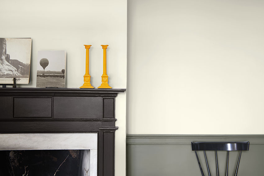
Photo courtesy of Benjamin Moore
The color contrast of the dark mantle against the light-colored wall serves both functional and safety purposes.
Color design can also highlight potential hazards or obstacles in the environment. For example, using contrasting colors on steps or the edges of furniture can make these elements more visible and reduce the risk of tripping or falling, which is a significant concern for older individuals. Designs like these that support both safety and daily function end up providing an important overall benefit: Allowing aging individuals more independence and control within their living space, which can contribute to positive well-being.
Another aspect of color design to consider is its potential mental and emotional impact. Studies have shown at least some link between color design and mood as well as an effect on cognitive function. Understanding and knowing where the psychology of color and the general principles of design intersect with the needs of those aging in place, offers additional value. Color contrasting done well should also be aesthetically pleasing. Enhancing the visual appeal of the living space makes it more pleasant and comfortable for aging individuals, which can positively impact their overall quality of life.
Reducing Glare with Finishes and Surfaces
Architects should prioritize non-reflective surfaces to reduce glare since older people with vision impairments are particularly sensitive to bright, reflective surfaces. Glossy paints or high-shine finishes can create discomfort and safety hazards due to excessive glare. Instead, opting for matte or eggshell finishes on walls and other surfaces is a wise choice because these finishes not only minimize glare but also facilitate ease of cleaning and maintenance, an important consideration for aging individuals. When designing for aging in place, designers should imagine making the space functional for decades. Choosing finishes that are durable and low-maintenance reduces the burden on older adults who may struggle with upkeep.
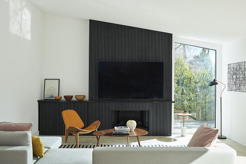
Photo courtesy of Benjamin Moore
Matte backgrounds ward off extra glare in a room with a television screen and window.
Architects should avoid using overly glossy surfaces on objects and fixtures around the house, as well, since these can pose similar problems.
Finally, do not use reflective materials, like glass, in places where it can be misidentified as a throughfare. To keep people with low- or aging vision from walking through the glass, make sure to define its borders with patterns or contrasting colors, or choose fritted glass. Providing contrasting delineations can help solve the problem.
ROLE OF LIGHT IN COLOR PERCEPTION
When it comes to color perception, the characteristics of the light source are critical. Elements such as correlated color temperature (CCT), color rendering index (CRI), and spectral power distribution (SPD) define how a light source affects the perception of color. Lighting choices can significantly influence the visual impact of a space on individuals, including older adults.
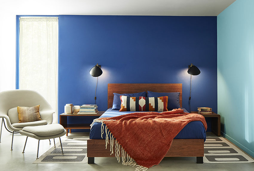
Photo courtesy of Benjamin Moore
This room provides daylighting, which plays against the light blue wall, while task lighting for reading helps focus additional light where it needs to be for reading.
Correlated Color Temperature
CCT is a measure of the warmth or coolness of light, usually measured in Kelvin (K). Architects consider CCT to create the desired ambiance in a space. Warmer (lower CCT) light, like incandescent bulbs (around 2700K), can create a cozy and intimate atmosphere, while cooler (higher CCT) light, like daylight (around 5000K), can make a space feel more energetic and vibrant. Architects select the appropriate CCT to match the function and mood of the space. For instance, they might choose warmer lighting in a restaurant for a relaxed, comfortable setting and cooler lighting in an office for increased alertness.
The most recent Aging in Place Guide recommends using lighting with a warmer CCT for spaces designed for aging populations—specifically between 2,700K and 3,000K. Warmer light is generally more comfortable and creates a cozier atmosphere, which can be especially beneficial for individuals with visual impairments.
Color Rendering Index
CRI measures how accurately a light source renders colors compared to natural daylight. It is usually rated on a scale from 0 to 100, with higher values indicating better color accuracy.
Architects consider CRI when selecting light sources, especially in spaces where color accuracy is crucial, such as art galleries, clothing stores, or kitchens. A high CRI ensures that colors appear as they would under natural daylight.
A high CRI is essential in spaces for aging occupants to ensure that colors are accurately rendered. A CRI of 90 or higher is often recommended to help distinguish between objects and perceive details more clearly. The most recent Aging in Place Guide recommends 100.
Spectral Power Distribution
SPD describes the distribution of light wavelengths emitted by a light source. Different light sources have different SPDs, which can impact how colors appear. Architects may choose light sources with specific SPDs to achieve the desired color effects. For instance, they might select a light source that enhances warm colors in a restaurant or a source that brings out the natural tones in wood or stone surfaces in a lobby.
When designing for aging populations, architects might want to select lighting sources with a balanced SPD that closely mimics natural daylight. This can help enhance the visual acuity of individuals with low vision and aging eyes. Full-spectrum or daylight-mimicking LED lights can be a good choice. Architects may also want to incorporate lighting with a broad spectrum of color temperatures to allow individuals to adjust the lighting to their specific preferences and needs.
The interaction between lighting and color involves multiple factors. A study conducted by Hegde and Woodson (1999) found that under fluorescent SP30 lighting, blue was rated as providing more clarity than when it was under incandescent light. This highlights the significant role that lighting choices play in shaping color contrast, regardless of age. Practitioners can use these findings to make informed design decisions in residential homes and other settings.
Other Considerations for Lighting
Beyond CCT, CRI, and SPD, there are a few other considerations when designing for low-vision and aging populations. Ensure that lighting is evenly distributed to minimize shadows and reduce glare, which can be particularly problematic for individuals with compromised vision. Use fixtures with appropriate shielding to prevent direct glare.
Consider providing adjustable or task-specific lighting in areas where detailed tasks are performed, such as reading nooks, kitchen workspaces, and bathroom vanities. Designers can also install motion sensors and dimmers for more lighting flexibility and energy efficiency.
Wayfinding with Color and Lighting
Wayfinding is the art and science of helping people navigate and orient themselves within built environments. It involves the design of signage, spatial layouts, and environmental cues to provide clear and intuitive directions, ensuring that individuals can easily find their way within complex structures such as buildings, airports, hospitals, malls, and public spaces, but also within their own homes.
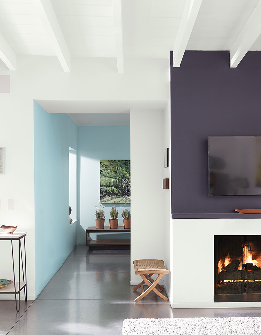
Photo courtesy of Benjamin Moore
Colors and textures provide a path through the room and down the hallway, which is painted a different color to further help define a separate space and provide wayfinding.
Effective wayfinding design takes into consideration human psychology, cognitive processes, and user experience to create a seamless and efficient pathfinding experience for users. It aims to reduce confusion and stress, enhance safety, and improve the overall user experience by making spaces more accessible and user-friendly. Wayfinding design impacts the functionality of a space, but it also impacts its aesthetics. Using color strategically can create a visual hierarchy that guides individuals through a space. This approach for wayfinding in a residential home, especially for aging occupants, is a thoughtful and practical design strategy that can help improve overall comfort for the residents.
Here are some ways interior designers and architects can use color for wayfinding in such settings:
- Color Contrast: Color contrast is a design strategy that helps aging or low-vision eyes understand a given space—and for that reason, it is an excellent tool for wayfinding. For example, using light-colored walls with dark door frames and handles can help older adults navigate their homes more easily.
- Color-Coded Paths: Establish color-coded pathways to guide residents through the home, distinguishing main circulation areas.
- Highlighting Handrails and Grab Bars: Use contrasting colors to highlight handrails and grab bars in areas where mobility may be a concern, enhancing wayfinding and safety.
- Color for Doors and Door Frames: Paint doors and their frames in distinctive colors to help residents differentiate between rooms.
- Contrasting Flooring: Use contrasting colors for different flooring materials in adjoining spaces to make transitions more noticeable.
- Accent Walls: Use distinctive colors along primary circulation paths as visual cues.
- Color-Coded Storage: Assign different colors to cabinets or closets in different rooms to help residents locate items.
- Color on Furniture and Accessories: Incorporate color into furniture or accessories placed strategically to assist with navigation.
- Personalized Color Schemes: Consider the specific needs and preferences of residents to ensure visibility and comfort.
- Accessibility Symbols: Use color in signs and symbols to indicate accessible features like ramps and elevators.
Contrasting with color can assist in memory and recognition, which fortifies the wayfinding benefits: By using distinct colors for specific items or areas, architects can help individuals remember the purpose of each space and easily locate essential objects or areas. It's essential to maintain a well-balanced use of color, avoiding excessive contrast, which can be disorienting for some individuals.
Lighting can also be integrated into designs for better wayfinding. Lighting in corridors should be designed to support a person's ability to move from one area to another. People's eyes tend to adjust to the brightest spot in their visual field, so ensure a well-lit pathway to rooms and key destinations. And, while lighting artwork along hallways can be aesthetically pleasing, it's important not to create overly repetitive patterns that might be visually confusing for those with low vision.
Photo courtesy of Benjamin Moore
Even with a lot of daylighting, this design can control glare and define shapes for a viewer to see all the elements, while the dark paint on the French doors safely delineates the glass.
Ensure that entrances to rooms are well lit and defined, making it easier for older individuals to identify and access different spaces. Balance aesthetic with the functional need for clear wayfinding.
Daylighting is increasingly popular for healthy residential design, but making sure daylight interacts with colors and other elements in a space is essential when designing for aging in place. Imagine a modern home that prioritizes natural daylighting and features large, floor-to-ceiling windows in common areas and hallways. While these windows bring in plenty of natural light and provide beautiful views of the surroundings, they can create navigational challenges for older individuals, especially those with visual impairments or age-related vision changes. The abundance of natural light can lead to glare issues, particularly during bright, sunny days. The large windows can create an extreme contrast between the well-lit areas around the windows and shaded areas or disrupt otherwise carefully contrasted color designs in the space.
Consider a lighting source that is more predictable. LED lighting is a highly efficient and economical choice for creating well-lit environments. It consumes less energy and provides an even, consistent light. Ensure LED lights are placed regularly and consistently to maximize their effectiveness in providing adequate illumination.
Finally, focus on lighting and color design early in the design process to map out how the combination of daylight and artificial light interact with color throughout the home. Designing for aging in place is a multidimensional challenge that encompasses color preferences, color contrast, and lighting choices. But executing it correctly can deliver an exquisite environment—one that raises the bar for design. In the evolving field of architecture, considering the specific needs and preferences of older adults has begun to reveal design solutions that appeal to everyone, no matter their age.
Brian J. Pape is the co-chair of the AIA New York Design for Aging Committee, which is focused on the needs of the aging population in an urban environment. He says that principles of color and light design for aging populations should be universally applied. “These are practical and common-sense principles that I would apply anywhere,” he says. “When an architect is working on a custom home and a client just wants it to be a certain way, you might not talk them out of it. But since we're usually making broader recommendations for many people—not just one-on-one—these principles should be the priority when we specify.”
Improved medical care, diet, and healthy living have benefitted our human species by steadily increasing our collective life expectancy. We are living longer, more active lives, with more independence and a greater opportunity to age in place. However, with a growing population, new challenges and considerations must be addressed to provide a supportive and healthy living space. Older adults often suffer from declining vision and an increased respiratory sensitivity to environmental influences like pollen, dust, and VOC’s. These vulnerabilities can be addressed through the thoughtful specification of paints and finishes that leverage appropriate colors, are durable, easy to clean, and contain low to no VOC’s.
Photo courtesy of Benjamin Moore
In this image, the light color of the moulding and baseboard contrast with the darker tone of the wall to provide easy visual definition of the room's layout.
AGING IN PLACE AND THE SCIENCE OF LOW-VISION DESIGN
According to the World Health Organization, by 2050, the global population aged 60 and over is expected to total two billion, nearly double what it was in 2015.
In fact, the 74 million Baby Boomers living in the U.S. will be 65 or older in less than 10 years. The most senior among them will be on the cusp of 85. Even sooner, by 2025, the number of seniors (65 million) is expected to surpass that of children aged 13 and under (58 million) for the first time. What does this have to do with architecture and design? As it turns out: A lot.
This demographic shift will impact obvious systems, such as health care. But it also presents a unique set of challenges and opportunities for architects, designers, and policymakers. The current number of skilled nursing facilities don’t have the capacity to handle the shift, which means there will be a need for more space. But the Baby Boomers also represent a culture shift: For many of them, how they age—and where—has become a big topic of conversation. Many of them want to stay where they are and age in place.
"Aging in place," as defined by the U.S. Centers for Disease Control and Prevention (CDC), is a term that describes the ability of individuals to live in their own homes and communities safely, independently, and comfortably, regardless of age or ability level. The demographic shift has given rise to a strong desire among older adults to continue living independently in their own homes and communities. In March 2023, U.S. News & World Report conducted a survey of 2,000 U.S. adults aged 55 and older to explore how they are embracing aging in place. The survey revealed a resounding consensus among older adults, with a striking 93% of respondents expressing their belief that aging in place is an essential goal.
The overwhelming support for aging in place highlights a deep-rooted desire of people to maintain their autonomy and stay connected to their familiar surroundings. This trend has led to a focus on home automation, medical monitoring, telehealth, and other in-home technologies. But aging in place also requires elements of design suited to the aging process – and that is something architects and interior designers can help occupants imagine and implement.
In this article, we'll explore how the choice of colors and finishes in architectural design can significantly impact the quality of life for an aging population. We will hear from experts working on the cutting edge of this field, including Eunice Noell-Waggoner from the Center of Design for an Aging Society, Ramesh Gulatee of LifeCare Design Studio, and Brian J. Pape of the American Institute of Architects NY Design for Aging Committee.
Designers who understand the science of color and light—and how aging eyes respond to their surroundings – can communicate these concepts to their clients and help them conceive a design that supports their health and well-being. Designers will be able to specify color and finishes for contrast, wayfinding, safety, and emotional well-being. Just as important is the discussion of universal design and the ways in which creating age-friendly environments—not just in the home, but in health care, hospitality, and commercial spaces—creates community, and offers accessible space for all ages and abilities.
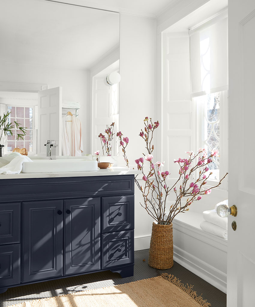
Photo courtesy of Benjamin Moore
The darker color of a cabinet sink helps create definition in a light and airy bathroom, offering an element of wayfinding for the occupant.
How Our Eyes and Brains See Color
Color is a fundamental aspect of our visual experience, and it plays a crucial role in our perception of the world around us. Whether it's the vibrant hues of a sunset or the subtleties of a painting, our ability to see and process color is a remarkable feat of biology. There is also a fascinating relationship between color and light, which we can explore by examining the basic biology of the human eye and the brain's role in interpreting the information it receives.
The human eye can be likened to a sophisticated camera. It all begins with the transparent cornea, which allows light to enter. The iris acts as the eye’s aperture, controlling the amount of light that passes through the pupil. Working in tandem, the cornea and lens focus the incoming light onto the retina, situated at the rear of the eye. Comparable to the film in a camera, the retina is the critical component responsible for converting light into signals that our brain can comprehend. The retina is lined with two types of light-sensitive receptors: rods and cones. These photoreceptors are akin to the pixels in a digital camera sensor, capturing the visual information we perceive.
Rods and cones are not created equal when it comes to vision. The human eye boasts approximately 125 million rods and 7 million cones, with each type playing a distinct role. Rods are photoreceptors that excel at perceiving light and dark, making them particularly crucial for night vision. Their sensitivity to dim light and ability to detect motion make them our allies in low-light conditions. If rods are the heroes of night vision, cones are the champions of color vision. The human eye houses three types of cones, each sensitive to different ranges of wavelengths: red, green, and blue. These cones are concentrated in a small pit at the back of the eye known as the fovea, where we perceive sharpness and detail.
The colors of the objects we see are intricately linked to how these objects interact with light. When light illuminates an object, it may absorb certain wavelengths while reflecting or transmitting others. Our eyes perceive the color of an object based on the wavelengths of light that reach our retinas and stimulate the appropriate cones. Consider the example of a yellow object. If this object transmits green and red wavelengths, it will stimulate the green and red cones in our retinas, leading us to perceive the object as yellow.
The way we perceive and process color is a marvel of biology and neuroscience. But what happens as we age? What does a room of light and color look like to a person with low vision, and how do designers calibrate their knowledge of color and light to encompass a more universal experience?
Understanding the Low-Vision Experience
Low vision is a term used to describe a condition where an individual's vision cannot be corrected to a functional level, typically falling below 20/70 even with standard corrective measures such as glasses, contacts, surgery, or medications. In the United States alone, a significant portion of the population deals with low vision, and that number is expected to grow as the population ages.
Low vision encompasses a broad range of visual impairments, including media opacities, macular dystrophies and degenerations, peripheral retinal degenerations, optic nerve anomalies, and damage to the visual cortex or the brain itself. While the causes may vary, the challenges presented by low vision are consistent—compromised visual acuity, reduced contrast sensitivity, and limited field of vision. One of the most prevalent low vision conditions among aging populations is age-related macular degeneration (AMD). In the U.S., AMD is the leading cause of blindness in individuals over the age of 65. Unlike complete blindness, individuals with AMD often retain their peripheral vision and mobility.
But even without diagnosed low-vision conditions, the process of aging changes the way people see. As people age, their visual capabilities undergo a series of transformations, particularly affecting their ability to discriminate between colors. This age-related shift in color perception, primarily attributed to the yellowing and thickening of the crystalline lens in the eye, has substantial consequences for how older adults perceive their surroundings. These changes are most pronounced in the less saturated colors, such as green, blue, and violet, as the aging lens blocks shorter wavelengths of color from reaching the optic nerves.
Visual challenges associated with aging, including diminished visual acuity and reduced color discrimination accuracy, typically manifest around the age of 40, with a rapid decline after 60 years of age. The lens's darkening or yellowing filters out short blue-violet visible light, further impeding color vision in the shorter (blue) wavelengths. Colors are perceived as less vivid in general, indicating that highly saturated colors appear paler to older individuals.
In an era marked by a rapidly aging population, architects and interior designers face an increasingly critical challenge: creating spaces that accommodate the evolving needs of older adults. The interplay between light, color, and visual perception is a pivotal consideration in this context, because it significantly impacts how older people experience their environments. Designers need to select their design elements in a holistic manner, taking into account pattern, texture, color contrast, value contrast, and sheen—and understanding how these elements work together.
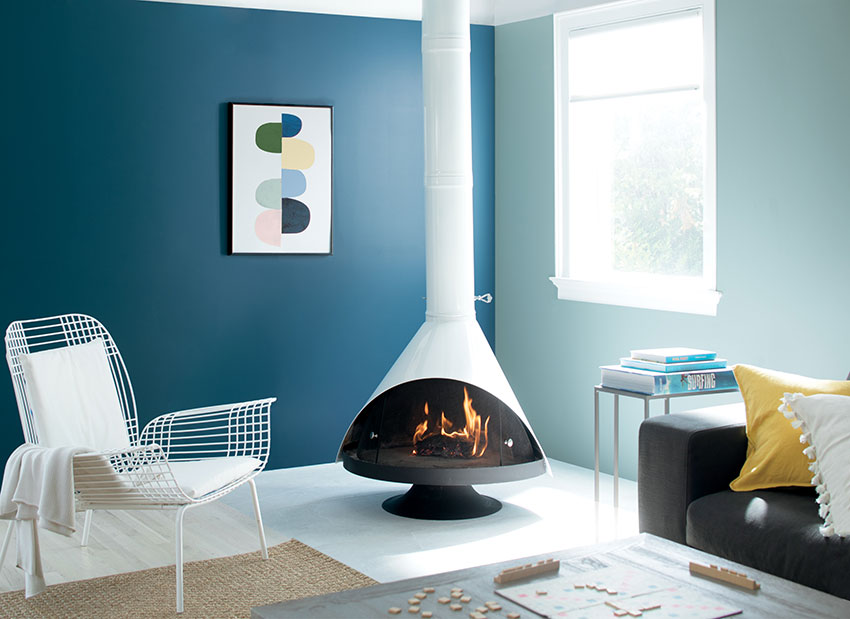
Photo courtesy of Benjamin Moore
Each element of this room is distinctive because the dark blue and light blue-green walls provide contrast, while the light interplays with the white fireplace, chairs, and rugs.
Color Preference and Age-Related Changes
Understanding color preference is an important aspect of designing for older adults. While color preference does depend on the individual, studies have shown that blue is consistently the most preferred color across various age groups, followed by green, red, violet, orange, and yellow. One significant aspect of color preference, however, is that it tends to shift with age. Older adults may exhibit a decreased preference for blue and an increased preference for red and green. These shifts can be attributed to age-related issues in color discrimination, mainly due to the yellowing of the lens in the aging eye.
Research has also indicated that as individuals age, errors in color judgment become more frequent, especially at lower levels of saturation. This means that older adults struggle to distinguish subtle variations in color saturation. One study emphasized the importance of avoiding low-saturation blue since older individuals perceive such colors differently, often as gray, potentially creating a confusing and hazardous environment. In low saturation, the colors that received the highest ratings for visual contrast were purple and red. When considering purple for spaces occupied by older people, choose a shade with more of a red base rather than a pure purple to ensure its effectiveness.
The misconception that older people might want or need low-saturation colors because they seem more calming can be seen in the design of elder care facilities where pastel and low-saturation colors have been prevalent. For designers aiming to create a safe and comforting environment for older adults, medium-saturation colors are a practical choice, because they allow for contrast but are viewed as less vivid by the aging eye, promoting a soothing atmosphere. Studies looking at medium saturation highlight the suitability of blue and green for enhancing visual contrast in spaces occupied by older adults, making them a valuable choice for designers. That said, bright colors, carefully selected, can assist in distinguishing between objects, helping older people perform activities of daily living.
Designers should be aware of research on color preferences and understand the difficulties older adults may encounter in distinguishing between colors. Awareness will provide architects and interior designers the vernacular to confidently provide valuable information to their clients and be prepared to adapt their designs to meet those needs.
Eunice Noell-Waggoner, President of the Center of Design for an Aging Society, says designers should have a deeper sense of how aging clients are experiencing the design of a room. “Cataracts that form in the lens may be the most common age-related change that alters color perception,” she says. “The lens turns an amber color, which begins to alter or cancel seeing the blue range. A simple way for a designer to experience how a colored lens alters older adults' color perception is to take a sheet of clear amber film and view your color scheme through the film.”
Noell-Waggoner mentions there was an 80-year-old vision researcher who once commented that he was “blue deprived.” In other words, she noted, he knows blue is there, but he can't see it.
Color Contrast for Visibility and Well-Being
Designers can utilize color contrast for both aesthetic and functional purposes. By using different colors on walls and floor surfaces, using contrasting colors for other elements in the room (such as cabinets or bookcases), and/or using contrasting color schemes for switches, handles, or labels, designers can help define distinctive areas and objects in rooms. It provides a map to help an occupant perform daily tasks.
Photo courtesy of Benjamin Moore
The color contrast of the dark mantle against the light-colored wall serves both functional and safety purposes.
Color design can also highlight potential hazards or obstacles in the environment. For example, using contrasting colors on steps or the edges of furniture can make these elements more visible and reduce the risk of tripping or falling, which is a significant concern for older individuals. Designs like these that support both safety and daily function end up providing an important overall benefit: Allowing aging individuals more independence and control within their living space, which can contribute to positive well-being.
Another aspect of color design to consider is its potential mental and emotional impact. Studies have shown at least some link between color design and mood as well as an effect on cognitive function. Understanding and knowing where the psychology of color and the general principles of design intersect with the needs of those aging in place, offers additional value. Color contrasting done well should also be aesthetically pleasing. Enhancing the visual appeal of the living space makes it more pleasant and comfortable for aging individuals, which can positively impact their overall quality of life.
Reducing Glare with Finishes and Surfaces
Architects should prioritize non-reflective surfaces to reduce glare since older people with vision impairments are particularly sensitive to bright, reflective surfaces. Glossy paints or high-shine finishes can create discomfort and safety hazards due to excessive glare. Instead, opting for matte or eggshell finishes on walls and other surfaces is a wise choice because these finishes not only minimize glare but also facilitate ease of cleaning and maintenance, an important consideration for aging individuals. When designing for aging in place, designers should imagine making the space functional for decades. Choosing finishes that are durable and low-maintenance reduces the burden on older adults who may struggle with upkeep.
Photo courtesy of Benjamin Moore
Matte backgrounds ward off extra glare in a room with a television screen and window.
Architects should avoid using overly glossy surfaces on objects and fixtures around the house, as well, since these can pose similar problems.
Finally, do not use reflective materials, like glass, in places where it can be misidentified as a throughfare. To keep people with low- or aging vision from walking through the glass, make sure to define its borders with patterns or contrasting colors, or choose fritted glass. Providing contrasting delineations can help solve the problem.
ROLE OF LIGHT IN COLOR PERCEPTION
When it comes to color perception, the characteristics of the light source are critical. Elements such as correlated color temperature (CCT), color rendering index (CRI), and spectral power distribution (SPD) define how a light source affects the perception of color. Lighting choices can significantly influence the visual impact of a space on individuals, including older adults.
Photo courtesy of Benjamin Moore
This room provides daylighting, which plays against the light blue wall, while task lighting for reading helps focus additional light where it needs to be for reading.
Correlated Color Temperature
CCT is a measure of the warmth or coolness of light, usually measured in Kelvin (K). Architects consider CCT to create the desired ambiance in a space. Warmer (lower CCT) light, like incandescent bulbs (around 2700K), can create a cozy and intimate atmosphere, while cooler (higher CCT) light, like daylight (around 5000K), can make a space feel more energetic and vibrant. Architects select the appropriate CCT to match the function and mood of the space. For instance, they might choose warmer lighting in a restaurant for a relaxed, comfortable setting and cooler lighting in an office for increased alertness.
The most recent Aging in Place Guide recommends using lighting with a warmer CCT for spaces designed for aging populations—specifically between 2,700K and 3,000K. Warmer light is generally more comfortable and creates a cozier atmosphere, which can be especially beneficial for individuals with visual impairments.
Color Rendering Index
CRI measures how accurately a light source renders colors compared to natural daylight. It is usually rated on a scale from 0 to 100, with higher values indicating better color accuracy.
Architects consider CRI when selecting light sources, especially in spaces where color accuracy is crucial, such as art galleries, clothing stores, or kitchens. A high CRI ensures that colors appear as they would under natural daylight.
A high CRI is essential in spaces for aging occupants to ensure that colors are accurately rendered. A CRI of 90 or higher is often recommended to help distinguish between objects and perceive details more clearly. The most recent Aging in Place Guide recommends 100.
Spectral Power Distribution
SPD describes the distribution of light wavelengths emitted by a light source. Different light sources have different SPDs, which can impact how colors appear. Architects may choose light sources with specific SPDs to achieve the desired color effects. For instance, they might select a light source that enhances warm colors in a restaurant or a source that brings out the natural tones in wood or stone surfaces in a lobby.
When designing for aging populations, architects might want to select lighting sources with a balanced SPD that closely mimics natural daylight. This can help enhance the visual acuity of individuals with low vision and aging eyes. Full-spectrum or daylight-mimicking LED lights can be a good choice. Architects may also want to incorporate lighting with a broad spectrum of color temperatures to allow individuals to adjust the lighting to their specific preferences and needs.
The interaction between lighting and color involves multiple factors. A study conducted by Hegde and Woodson (1999) found that under fluorescent SP30 lighting, blue was rated as providing more clarity than when it was under incandescent light. This highlights the significant role that lighting choices play in shaping color contrast, regardless of age. Practitioners can use these findings to make informed design decisions in residential homes and other settings.
Other Considerations for Lighting
Beyond CCT, CRI, and SPD, there are a few other considerations when designing for low-vision and aging populations. Ensure that lighting is evenly distributed to minimize shadows and reduce glare, which can be particularly problematic for individuals with compromised vision. Use fixtures with appropriate shielding to prevent direct glare.
Consider providing adjustable or task-specific lighting in areas where detailed tasks are performed, such as reading nooks, kitchen workspaces, and bathroom vanities. Designers can also install motion sensors and dimmers for more lighting flexibility and energy efficiency.
Wayfinding with Color and Lighting
Wayfinding is the art and science of helping people navigate and orient themselves within built environments. It involves the design of signage, spatial layouts, and environmental cues to provide clear and intuitive directions, ensuring that individuals can easily find their way within complex structures such as buildings, airports, hospitals, malls, and public spaces, but also within their own homes.
Photo courtesy of Benjamin Moore
Colors and textures provide a path through the room and down the hallway, which is painted a different color to further help define a separate space and provide wayfinding.
Effective wayfinding design takes into consideration human psychology, cognitive processes, and user experience to create a seamless and efficient pathfinding experience for users. It aims to reduce confusion and stress, enhance safety, and improve the overall user experience by making spaces more accessible and user-friendly. Wayfinding design impacts the functionality of a space, but it also impacts its aesthetics. Using color strategically can create a visual hierarchy that guides individuals through a space. This approach for wayfinding in a residential home, especially for aging occupants, is a thoughtful and practical design strategy that can help improve overall comfort for the residents.
Here are some ways interior designers and architects can use color for wayfinding in such settings:
- Color Contrast: Color contrast is a design strategy that helps aging or low-vision eyes understand a given space—and for that reason, it is an excellent tool for wayfinding. For example, using light-colored walls with dark door frames and handles can help older adults navigate their homes more easily.
- Color-Coded Paths: Establish color-coded pathways to guide residents through the home, distinguishing main circulation areas.
- Highlighting Handrails and Grab Bars: Use contrasting colors to highlight handrails and grab bars in areas where mobility may be a concern, enhancing wayfinding and safety.
- Color for Doors and Door Frames: Paint doors and their frames in distinctive colors to help residents differentiate between rooms.
- Contrasting Flooring: Use contrasting colors for different flooring materials in adjoining spaces to make transitions more noticeable.
- Accent Walls: Use distinctive colors along primary circulation paths as visual cues.
- Color-Coded Storage: Assign different colors to cabinets or closets in different rooms to help residents locate items.
- Color on Furniture and Accessories: Incorporate color into furniture or accessories placed strategically to assist with navigation.
- Personalized Color Schemes: Consider the specific needs and preferences of residents to ensure visibility and comfort.
- Accessibility Symbols: Use color in signs and symbols to indicate accessible features like ramps and elevators.
Contrasting with color can assist in memory and recognition, which fortifies the wayfinding benefits: By using distinct colors for specific items or areas, architects can help individuals remember the purpose of each space and easily locate essential objects or areas. It's essential to maintain a well-balanced use of color, avoiding excessive contrast, which can be disorienting for some individuals.
Lighting can also be integrated into designs for better wayfinding. Lighting in corridors should be designed to support a person's ability to move from one area to another. People's eyes tend to adjust to the brightest spot in their visual field, so ensure a well-lit pathway to rooms and key destinations. And, while lighting artwork along hallways can be aesthetically pleasing, it's important not to create overly repetitive patterns that might be visually confusing for those with low vision.
Photo courtesy of Benjamin Moore
Even with a lot of daylighting, this design can control glare and define shapes for a viewer to see all the elements, while the dark paint on the French doors safely delineates the glass.
Ensure that entrances to rooms are well lit and defined, making it easier for older individuals to identify and access different spaces. Balance aesthetic with the functional need for clear wayfinding.
Daylighting is increasingly popular for healthy residential design, but making sure daylight interacts with colors and other elements in a space is essential when designing for aging in place. Imagine a modern home that prioritizes natural daylighting and features large, floor-to-ceiling windows in common areas and hallways. While these windows bring in plenty of natural light and provide beautiful views of the surroundings, they can create navigational challenges for older individuals, especially those with visual impairments or age-related vision changes. The abundance of natural light can lead to glare issues, particularly during bright, sunny days. The large windows can create an extreme contrast between the well-lit areas around the windows and shaded areas or disrupt otherwise carefully contrasted color designs in the space.
Consider a lighting source that is more predictable. LED lighting is a highly efficient and economical choice for creating well-lit environments. It consumes less energy and provides an even, consistent light. Ensure LED lights are placed regularly and consistently to maximize their effectiveness in providing adequate illumination.
Finally, focus on lighting and color design early in the design process to map out how the combination of daylight and artificial light interact with color throughout the home. Designing for aging in place is a multidimensional challenge that encompasses color preferences, color contrast, and lighting choices. But executing it correctly can deliver an exquisite environment—one that raises the bar for design. In the evolving field of architecture, considering the specific needs and preferences of older adults has begun to reveal design solutions that appeal to everyone, no matter their age.
Brian J. Pape is the co-chair of the AIA New York Design for Aging Committee, which is focused on the needs of the aging population in an urban environment. He says that principles of color and light design for aging populations should be universally applied. “These are practical and common-sense principles that I would apply anywhere,” he says. “When an architect is working on a custom home and a client just wants it to be a certain way, you might not talk them out of it. But since we're usually making broader recommendations for many people—not just one-on-one—these principles should be the priority when we specify.”
The AIA New York Design for Aging Committee website is a valuable resource for architects to explore—not just for guidelines and recommendations, but to read about the possibilities for “age-friendly design.” For instance, there is information on co-housing models for intergenerational living where college students and older people cohabitate and can enjoy the benefits of intergenerational learning and mutual emotional support. The site features news about dementia villages (see sidebar), cutting-edge designs for Alzheimer’s gardens, and designs that encompass whole cities with a universal approach.
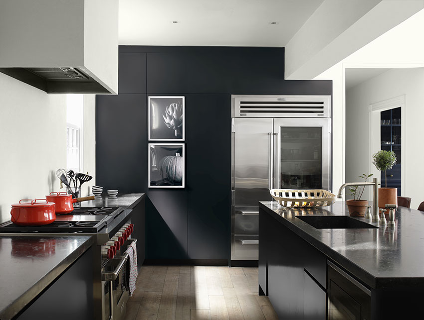
Photo courtesy of Benjamin Moore
This kitchen provides a combination of cleanable surfaces and low- or no-VOC materials while still providing contrasting design.
Expanding Accessibility: Universal Design
Designing for aging populations–just like designing for people with disabilities—has often been viewed in the architecture world as an adjustment to be made to “regular” design. However, putting the needs of aging populations at the center of design can result in an innovative and transformative architectural vision that does not sacrifice aesthetics.
Universal design is an approach to designing products, environments, and systems that are accessible and usable by as many people as possible, regardless of their age, abilities, or disabilities. The principles of universal design aim to create spaces and products that benefit a much broader audience. For example, curb cuts initially designed for people with wheelchairs are also convenient for parents with strollers, travelers with luggage, or anyone pushing a cart. Features like handrails, ramps, and comfortable seating are helpful for a range of individuals.
Universal design often focuses on safety features. For instance, anti-slip flooring, well-lit environments, and easily accessible emergency exits are vital for everyone, not just older people or those with disabilities. These features reduce the risk of accidents and create a safer environment. They also often result in spaces that are generally more comfortable and enjoyable.
Designers can offer more value to aging clients when they undergo training to understand the principles and benefits of universal design. This type of education should cover the psychological, physical, and social aspects of accessibility. Designers can be successful when they are familiar with local and international accessibility regulations and guidelines and when they collaborate with experts in the user-experience field. Universal designers who work directly with their clients on the design will see more successful outcomes.
Ramesh Gulatee, principal architect at the LifeCare Design Studio, has worked on housing projects in the Chicago area since 1997. One of his most notable projects was with the disabilities community at the Benny Farm in Montreal, Canada, which houses World War II veterans. As project manager, Gulatee designed a customized universal access housing assignment for quadriplegic veterans.
"It was very rewarding knowing that the project allowed me to give back to the soldiers who fought for our freedom and provide them the ability to live more independently within the facility," he said.
His work with the LifeCare Design Studio includes ADA consultancy, planning, designing, and building services emphasizing barrier-free and universal access strategies. He has been pushing for universal access design that goes beyond ADA compliance.
One major reason is that accessibility is not just an issue for some people. The latest CDC data shows that about 87% of Americans will experience accessibility-related issues in their lifespan. Some of it may be temporary or permanent, short or long term. It may deal with developmental, combat-related, sports, accidents, or lifestyle. And when it comes to age, many will find themselves in need of an accessible environment.
HEALTHY DESIGN IS ABOUT ACCESSIBILITY
As we drill down into the concepts of universal design and aging in place, it becomes clear that color and finish selection can’t be treated in a vacuum. The importance of selecting low- or no-VOC (volatile organic compound) paints and finishes that are also easy to clean becomes just as important as the benefits of wayfinding or visual comfort to the health and well-being of older people. Designers now know that healthy design principles are key to the health and well-being of the occupant—and those occupants who are most vulnerable to indoor environmental quality issues are often those who are aging in place.
Cleaning and Allergens
As individuals age, their respiratory systems may become more prone to respiratory conditions such as asthma, chronic bronchitis, or chronic obstructive pulmonary disease (COPD). Consequently, they may be more sensitive to indoor air quality issues, including pollutants, allergens, or irritants that can exacerbate respiratory symptoms.
Aging is linked to immune system changes, heightening susceptibility to indoor environmental factors like mold or mildew. Medications and treatments may increase sensitivity to indoor environmental quality and older adults with mobility issues tend to spend more time indoors, increasing exposure and amplifying the impact of indoor environmental factors on their health.
Finishes that are easy to clean and maintain, reduce the accumulation of dust, dirt, and allergens, while finishes that resist moisture can help prevent the growth of harmful microorganisms. When finishes are easy to clean, they are easier to maintain—an appealing quality for anyone, but particularly essential to those with mobility issues. As discussed previously, durable finishes require less frequent replacement or renovation, which reduces waste and environmental impact but also minimizes the release of any VOCs that might be present in new materials.
Selecting for Low- or No-VOC Products
Low- or no-VOC paints and finishes minimize the release of toxic chemicals into the indoor air. When designers select low- or non-VOC finishes and paints, the exposure of aging individuals to harmful emissions is significantly reduced, promoting better indoor air quality and minimizing potential health risks.
Low- or no-VOC paints and finishes help decrease the levels of respiratory irritants in the indoor environment, alleviating potential triggers and supporting respiratory health. Low- or no-VOC paints and finishes have reduced or no odor and minimal off-gassing. Specifying low- or no-VOC paints and finishes aligns with sustainable and green building practices. Many building certifications and standards, such as LEED (Leadership in Energy and Environmental Design), prioritize the use of low-VOC materials. Meeting these standards benefits the occupants and supports sustainable and environmentally responsible design practices.
Ramesh Gulatee takes these ideas a step further by explaining that healthy design cannot be divorced from the equation of accessibility. In so many cases, a building has a multitude of environmental quality design issues that undercut its design value. Everything must be taken into account.
“You can make the building accessible,” he says, “but the indoors might not be accessible because of the air that we breathe and the water that we drink. The crux of the matter comes to sustainability and accessibility being integrated as design layers and not as a code compliance layer. And these layers should be established right from the beginning. That is when and how the scope, schedule, and budget are determined. And it should go through to project delivery, as clients and designers talk about what kind of built environment is desired. If that happens then the design can take on a different direction.”
Gulatee sees designers as the initiators of this change, where those who require accessibility can attain it on every level.
“The client, in fact, is the most important part,” he says. “The designer is the conduit. The client does not have the know-how. They can react to situations. They can experience them. But they need somebody to listen to them.”
Erika Fredrickson is a writer and editor focusing on technology, environment, and history. She frequently contributes to continuing education courses and publications through Confluence Communications. www.confluencec.com