The Science of Light and Its Impact on Paint Color, Specification, and IEQ
Using artificial and natural lighting to help specify paint for healthy spaces
Sponsored by Benjamin Moore & Co. | By Andrew A. Hunt
Both natural and artificial lighting have a profound impact on how we perceive color. This course will provide the reader with a foundational understanding of how we perceive light and color and of the three characteristics—correlated color temperature, color rendering index, and spectral power distribution—which describe the quality and color of light. This course will also include a brief overview on the composition of paint and colorants, and explain how qualities such as sheen impact how the selected color is perceived in the space. Finally, this course will explore how light creates more than just visual effects; it also has biological and psychological effects that can impact the health and wellbeing of occupants. Included in this content will be research on design psychology as a basis for making informed color choices for clients, in addition to writing paint specifications that help avoid color discrepancies and confusion.
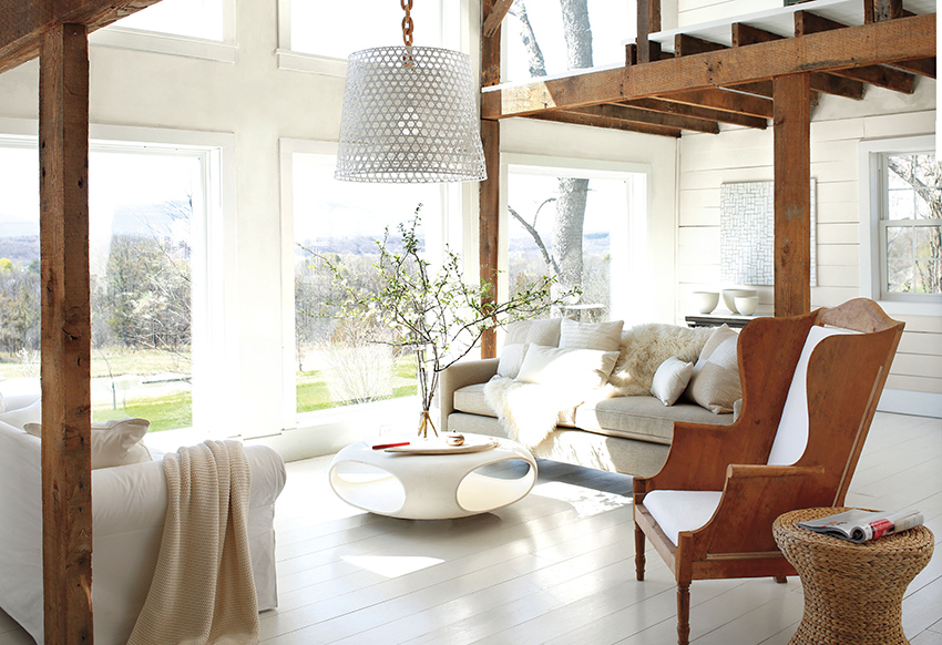
Photo courtesy of Benjamin Moore & Co.
The type of light that illuminates a room or surface greatly impacts how we perceive the color.
THE SCIENCE OF LIGHT
It might seem an obvious statement, but without light, there would be no color. Less obvious, perhaps, is the impact that certain types of light have on the colors we perceive. Think about how a human face appears when illuminated by early morning light. No matter what the color of skin, it will appear warm and soft. That same face in the midday sun will be marked with harsh, contrasting shadows, and the skin tones will appear “cooler.” Now imagine how that same face appears when bathed in candlelight versus a conventional fluorescent fixture. While candlelight is kind to most of us, under the fluorescent fixture, human skin often takes on a sallow, greenish cast.
The colors we perceive are determined in part by the quality and quantity of the light that illuminates them, whether natural, artificial, or a combination of both.
For millennia, humans relied solely on the sun or firelight. Today, of course, artificial lighting illuminates our world, day and night. We lived with the incandescent, or Edison bulb, for over 100 years. Today, several types of artificial lighting systems, each with its unique characteristics and impacts on color, illuminate our buildings. Light-emitting diodes, or LEDs, are quickly replacing other types of lighting in both new and existing buildings.
Because light has such a profound impact on color perception, design professionals should have a foundational understanding of how lighting choices will impact paint color and finish selections. To do so, we must first look at the nature of light itself.
The Electromagnetic Spectrum
Light is composed of many wavelengths of energy. The full range of these frequencies is called the electromagnetic spectrum. Only a small portion of these wavelengths are visible to the eye. This narrow band is known as the visible light spectrum, and it includes all the colors of the rainbow.
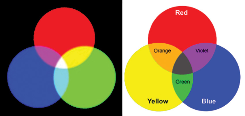
Photo courtesy of Benjamin Moore & Co.
Additive mixing (left) involves the mixing of light where the resulting color will become lighter and eventually white. Subtractive mixing (right) involves the mixing of substances and results in a darkening of colors.
The visible light spectrum includes wavelengths ranging from 780 nanometers down to 390 nanometers (nm). For comparison, UV light ranges from 10 to 400 nm, and X-rays are shorter still. Specific wavelengths correspond to specific colors. Reds have the longest wavelength and range from 650 to 700 nm. “Cooler” colors have shorter wavelengths. The violets have the shortest wavelengths of all and range from 390 to 430 nm.
Warmer, longer wavelengths are easier to see in dim light, while cooler colors tend to disappear. This concept is important to remember when we discuss the impact of light on paint color.
Two Ways of Making Colors with Light
When a beam of light is projected onto an object, the object will absorb some wavelengths while reflecting others. For instance, a red object absorbs all but the red wavelengths. However, it’s not always that simple. For example, an object may appear yellow if the object absorbs blue light but reflects green and red light, because when these wavelengths mix, they create yellow.
You can create different colors by mixing light in what are called the “primary wavelengths” of red, green, and blue. This is called additive color mixing.
Mixing red and green produces yellow, while mixing red and blue yields magenta, and mixing green and blue yields cyan. Mixing all three primaries creates white. Color televisions, computers, and other displays rely on additive color mixing to create the full range of colors.
Another way to create colors is through subtractive mixing. You likely recall the thrill of using tempera paints to make new colors—for instance, mixing blue and yellow to create green. This is subtractive color mixing. Most materials, including dyes, paints, colorants, and inks, rely on this process.
Most design professionals are familiar with the color wheel. Based on the primaries of red, yellow, and blue, this tool uses subtractive color mixing to create a plethora of secondary and tertiary colors. White and black can be added to create a nearly limitless number of tints and hues. The printing process, which relies on inks, uses slightly different primaries of cyan, magenta, and yellow, but this is still a subtractive process which relies on the mixing of substances, not on the mixing of light.
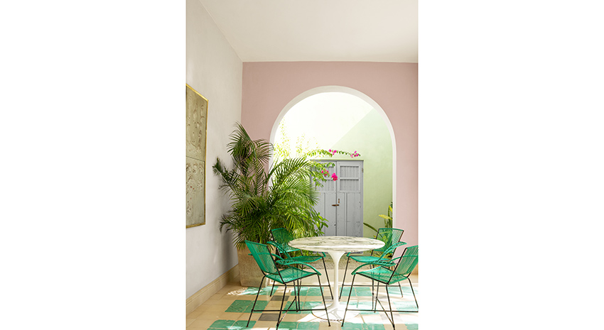
Photo courtesy of Benjamin Moore & Co.
How the Eye (and Brain) See
Whether color is created through additive or subtractive color mixing, the way we see and process color is the same. To better understand the relationship between color and light, let us first recall the basic biology of the human eye and how the brain interprets information received by it.
The eye works very much like a camera. A transparent cornea allows light to enter the eye, and the iris controls the amount of light entering through the pupil. The cornea and lens work together to focus the image on the retina, which is located at the back of the eye.
The retina—comparable to the film, sticking with the camera analogy—is lined with light-sensitive receptors called rods and cones. These photoreceptors convert light into electrical signals, which are transmitted to the brain via the optic nerve. The visual cortex of the brain converts the image impulses into objects.
The human eye has far more rods than cones—about 125 million rods to 7 million cones. Each type of receptor plays a distinctive role in vision. (The retina actually contains a third type of receptor, which does not play a role in vision, but which is essential for regulating the body’s circadian rhythms.)
Rods primarily perceive light and dark, and they are more sensitive to dim light than cones. Hence, rods are especially important for night vision. Rods are far more sensitive than cones, and better at detecting motion.
Cones detect colored light. The human eye contains three types of cones: red, green, and blue. Each is sensitive to a different range of wavelengths. Many cones are located in the fovea, a small pit in the back of the eye that helps us perceive sharpness and detail.
The color of the objects we see is largely due to the way the objects interact with light, and how that light is ultimately reflected or transmitted to our eyes. Using the example of the yellow object above, if an object transmits green and red wavelengths, the green and red cones are stimulated and we see the object as yellow.
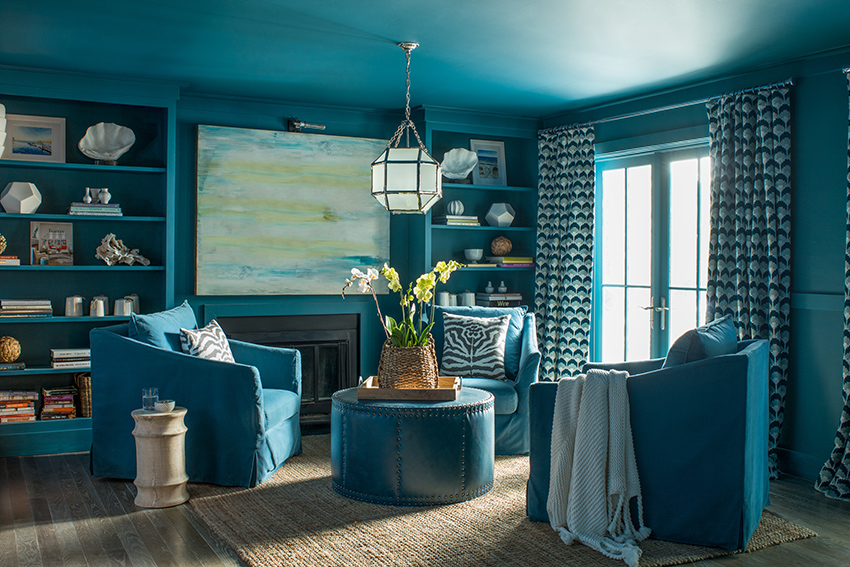
Photo courtesy of Benjamin Moore & Co.
Describing Color Properties of Light
Whether natural or artificial, different types of lighting possess unique characteristics that impact color. Most of these characteristics are determined by the specific wavelengths and intensities of light generated by the light source.
There are three concepts typically used to describe the color properties of light: Correlated Color Temperature (CCT); Color Rendering Index (CRI); and Spectral Power Distribution (SPD) graphs. CCT is used to describe the color of a white light source, while CRI helps predict how well a light source will render colors when compared to an ideal light source such as daylight. SPD graphs can help predict the CRI of a given light source.
Let’s take a close look at each of these concepts.
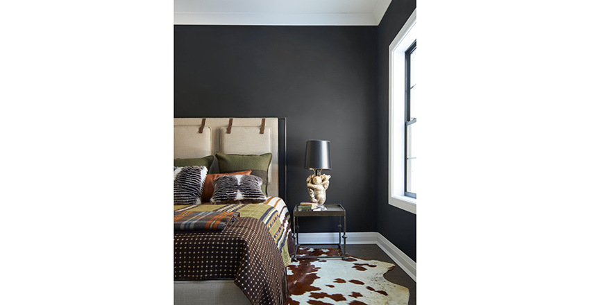
Photo courtesy of Benjamin Moore & Co.
Correlated Color Temperature (CCT)
The Correlated Color Temperature (CCT) scale measures the color temperature of light. More technically, this scale describes the color changes that occur when a “blackbody radiator” is heated. A blackbody radiator is an ideal but hypothetical physical body that absorbs all electromagnetic radiation that strikes it.
A real-world example can help us better understand this concept. Think of the color changes metal undergoes when it is heated. It first glows red, then orange and yellow. As the temperature rises, the color shifts to “white hot” and finally, to blue.
Correlated Color Temperature, sometimes just called color temperature, describes these changes by correlating a given color—whether red or white-hot—to its temperature as measured on the Kelvin scale. The Kelvin scale starts with absolute zero, or minus 273 degrees Celsius. The CCT of a candle is about 1850 K, while the CCT of light on an overcast day is 6500 K. Most artificial lighting ranges between 2500 and 5000 K.
The higher the temperature, the bluer or “cooler” the light; conversely, the lower the temperature, the “warmer” the light. Note that warmth and coolness are subjective terms which describe how we experience light. This can be confusing, as warmer light has a lower CCT than cooler light!
Light Throughout the Day and Throughout the Seasons
Because daylight is made up of sunlight that is filtered through the atmosphere, the color and intensity of daylight can change significantly throughout the day, impacting how we perceive color.
Think of the “golden light” of early morning and late afternoon in contrast to the bright white light of high noon. Morning and evening light ranges between 2000 and 3000 K, while daylight ranges from 5500 to 10,000K. For comparison, a “soft white” incandescent bulb measures 2700 K.
Clouds can also affect the quantity and quality of light that reaches our eyes. Light changes seasonally, too, as the sun’s path changes. This has important implications when selecting colors for rooms with different orientations, or for projects located in the higher latitudes. Such projects will see more dramatic changes in the quantity and quality of light as the seasons change.
Color Rendering Index (CRI)
Another important metric used when evaluating light sources is the Color Rendering Index, or CRI. This standard measures the ability of an artificial white light source to render color accurately. CRI is measured on a scale of 0 to 100. The nearer to 100, the better the light source is at rendering colors accurately. A CRI above 80 is adequate for most interior spaces. Lower CRI values indicate that some colors may appear unnatural when illuminated by the lamp. Correlated color temperature and CRI are two distinct measurements. Two light sources can have an identical color temperature but a different CRI, with important implications for how the light source will impact paint and other colors. Remember, the CCT rating tells us about the color of white light emitted by the bulb. The CRI rating tells us how well that same bulb renders color. To understand the difference between CCT and CRI, think about a soft white incandescent bulb with its CCT of 2700 K. This bulb has a perfect CRI rating of 100—in fact, most incandescents have high CRI ratings of 95 or more. An LED lamp with the same CCT of 2700 K may have a much lower CRI of around 80. To understand why, let’s consider the Spectral Power Distribution of a given light source. A Spectral Power Distribution graph shows the power (strength) of each wavelength of light across the visible spectrum produced by a particular light source. This characteristic is important in determining how a light source renders color. In general, broad-spectrum lighting—lighting that contains a more or less uniform quantity of all wavelengths—will provide the most uniform rendition of all colors. Daylight is considered an ideal light source because it is relatively balanced across the visible spectrum. Narrow spectrum lighting will make certain colors look monochromatic or less colorful. The higher the light source’s CRI, the more of the spectrum it will illuminate. Compared to other artificial light sources, incandescent lamps energize a broad range of wavelengths. Let’s go back to our soft white incandescent bulb with its perfect CRI of 100. This bulb produces much more energy at the red end of the spectrum, resulting in the warm light that so many people find appealing. (On the other hand, these lamps produce very little radiant energy in the short wavelength end of the spectrum; consequently, they do not render blues very well.) Our warm white LED, with its CCT of 2700 K and CRI of 80, produces energy in the middle of the visible spectrum. Whites are crisp and colors vivid, but they don’t render reds very well.
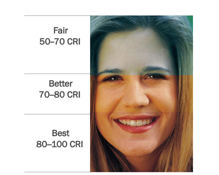
Photo courtesy of Benjamin Moore & Co.
Limitations of CCT and CRI
Color temperature and CRI provide some helpful information, but they are not perfect. Color temperature, for instance, fails to tell us anything about how a given light source renders colors. As we saw in the example above, two light sources with the same color temperature can have significantly different CRI ratings, with important implications for how paint and other colors will appear when illuminated.
Another challenge is comparing light sources with different color temperatures but similar CRIs. In general, a light source with a high CRI will render colors well, but this figure is based on an average and does not guarantee that a specific color will appear the way it does in daylight.
Still, when used together, color temperature and CRI can provide excellent benchmarks for the comparison of light sources.
ARTIFICIAL LIGHTING AND COLOR
Depending on the type and age of a building, you may encounter a range of artificial lighting systems, from incandescent and halogen to fluorescent and LEDs. Often buildings will include a combination of lighting types and will supplement artificial lighting with daylighting.
You likely understand intuitively that certain colors look more appealing when illuminated by certain types of artificial lighting compared to others. These differences can largely be explained by the differences in color temperature, color rendering index, and efficacy (efficiency) of these light sources. Understanding these characteristics can help design professionals select the ideal paint color for both residential and commercial projects. It can also help designers take into account how artificial lighting systems and color impact occupants’ well-being and productivity.
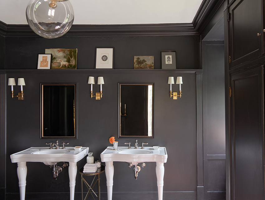
Photo courtesy of Benjamin Moore & Co.
Incandescent Lighting
The incandescent, or Edison bulb, has been with us for over 100 years, with the basic technology unchanged. These lamps produce light via a tungsten wire filament that is placed inside a glass bulb. When an electric current is passed through the filament, resistance in the filament creates heat, and the bulb glows. As we saw earlier, the spectral power distribution graph for incandescent lighting shows that there is much more energy toward the red end of the spectrum, which explains why incandescent bulbs produce such warm light.
Incandescent lighting has a CCT of about 2700 K and its CRI is 100, meaning incandescent lamps are very good at rendering color. Unfortunately, these lamps are highly inefficient. About 90 percent of the energy is lost as heat, and their life expectancy is short. Consequently, incandescent lamps are being rapidly phased out in the name of energy efficiency. The United States has set efficiency standards that, in effect, preclude the manufacture or importation of certain incandescent lamps. As of this writing, a second tier of even more stringent standards has been delayed.
Halogen Lighting
First patented by General Electric in 1959, halogen lighting is considered a type of incandescent lighting, but with several advantages over the Edison bulb.
Halogen lighting is about 20 percent more efficient than conventional incandescents. More energy is released as light, and the lamps have a longer service life. The bulbs burn at a continuous level of brightness and have a life span of about 2,000-3,000 hours.
The spectral power distribution of halogen lamps is the closest of all light sources to daylight; it’s relatively balanced across the visible spectrum. Consequently, halogen is considered an ideal light source.
The color temperature of halogen is approximately 3000K, which is considered “warm” light, and it renders color at 100 percent. This relatively high color temperature enables good color rendition across a wide range of colors.
On the downside, halogen lamps have a high operating temperature, and while they are more efficient than other incandescents, they are far less efficient than LEDs. Hence, many countries have begun phasing them out, and in the United States they are rapidly being replaced by LEDs. Also, the light quality is not consistent. Though bright and white at maximum output, when dimmed, halogen light appears amber.
In addition to specific applications in homes and commercial buildings, such as task lighting, halogen lamps are also used for film projectors, vehicle headlights, floodlights, work lights, and in film production.
Fluorescent lighting
Though the technology was developed in the 1880s, the first fluorescent lamps weren’t available commercially until the 1930s. These lamps work by exciting a vapor inside a glass tube. As electricity passes between tungsten cathodes, the mercury vapor releases ultraviolet energy. A phosphor coating on the inside of the tube converts the UV light into visible light—a process called fluorescence.
Fluorescent lamps require a ballast, which controls the current to the lamp. The current must be modulated as the gas inside the tube ionizes and the resistance lowers; otherwise, the lamp would destroy itself.
From classrooms to grocery stores, fluorescent lighting is widespread in commercial and institutional buildings. Fluorescent lighting is seen in residential settings, particularly kitchens, and compact fluorescent bulbs, or CFLs, have replaced the traditional Edison bulb in many homes.
The light produced by early fluorescent lamps was cold and undesirable; however, phosphor technology has improved, resulting in more pleasing light with higher CRIs.
The spectral power distribution graph for fluorescent lighting reveals spikes at the red, green, and blue wavelengths, with little or no output at others. Colors appear cool. Blues and greens are enhanced, while reds and yellows are muted.
Fluorescents are available in a range of color temperatures, from warm whites (2700 K) to cool white (6500 K), and they have CRIs in the 80-plus range. They have a life span of about 8,000-10,000 hours.
There are several types of fluorescent lamps. Linear, or tube lights, remain popular for their energy efficiency and their even, diffuse lighting.
Compact fluorescent lighting was designed specifically to replace incandescent bulbs. CFLs entered the market in 1979. The great advantages of CFLs over incandescents are their energy efficiency and long service life. CFLs use 75 percent less energy than incandescents, with a 23 to 27-watt CFL providing the same light output as a traditional 100-watt incandescent bulb.
Fluorescents have some disadvantages. One is the warm-up time required. CFLs require thirty seconds or longer to achieve full brightness.
Over the years, the U.S. Department of Energy has upgraded efficiency standards for fluorescent fixtures. A 2010 rule effectively phased out T12 fluorescent fixtures in favor of T8 and T5 systems, which are much more energy efficient.
More recently, the U.S. Department of Energy mandated that all “general service fluorescent lamps” manufactured after Jan. 26, 2018, meet increased efficacy standards, as measured by lumens per watt. This rule eliminated 32-watt T8 systems, which did not meet the standards, and encouraged the adoption of either 25W or 28W T8s or LED T8 replacements.
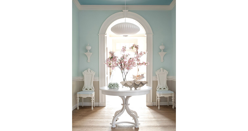
Photo courtesy of Benjamin Moore & Co.
Light-Emitting Diodes (LEDs)
LEDs are available in a wide range of color temperatures from 2700K to 7000K and offer CRIs of 80 or higher. Warm white LEDs are crisp and the colors are vivid; cool whites tend to emphasize greens, blues, and violets.
LEDs are extremely energy efficient. With a life span that ranges from 30,000 to 50,000 hours, a typical LED will last up to four times longer than a CFL or fluorescent and 25 times longer than an incandescent source. What’s more, the life span of LEDs is not effected by the number of times they are turned on and off. In the United States alone, LED technology is expected to contribute to approximately 40 percent lighting electricity savings by 2030.
Aside from their energy efficiency, LEDs hold several other advantages. When LED lamps are dimmed, the color temperature remains relatively consistent. Unlike CFLs or fluorescent tubes, which require a warm-up time, LEDs achieve full brightness instantly. LEDs also contain no mercury or UV radiation.
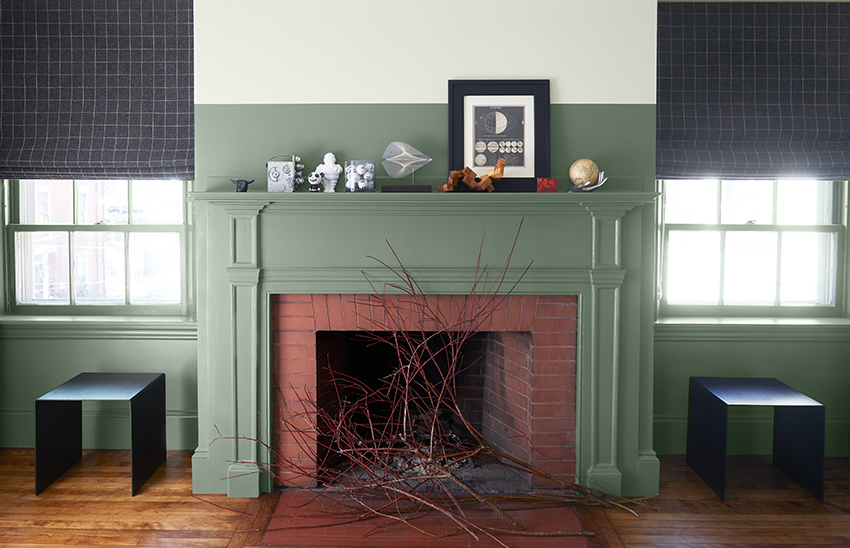
Photo courtesy of Benjamin Moore & Co.
Natural Light and Daylighting
Few can argue against the appeal of a room flooded with natural light. In fact, daylighting can promote energy efficiency and occupant well-being, so long as glare and unwanted solar gain are controlled.
Natural light can have a significant and usually positive impact on color, but it is dependent on the room orientation and angle of the light. Light in north-facing rooms tends to be diffuse and cool. Hence, strong colors show well in these rooms, while lighter colors tend to look subdued.
South-facing rooms receive the most light, which can be a problem if left uncontrolled. However, these rooms lend themselves to a range of colors, whether cool or warm.
East and west-facing rooms have particular challenges. Light changes the most in these spaces. East-facing rooms benefit from warm morning light, but colors cool off as the sun moves higher. Similarly, west-facing rooms enjoy warm late afternoon and evening light, but colors may appear dull earlier in the day. In general, warm colors work well for these spaces.
A History of Health and Well-Being Research
Former University of Michigan psychology professors Rachel and Steven Kaplan have done a multitude of studies on how light impacts the health and well-being of humans. In the 1989 study titled “The Experience of Nature: A Psychological Perspective,” Kaplan and Kaplan found that when human enter a new environment, they cognitively search for elements that match their memories. This is how humans interpret new spaces and it is the brain’s way of being able to settle in and find comfort. Those memory-matching qualities might include spaces that remind us of childhood or another familiar context that makes us feel safe, welcome, and even joyful. Lighting is an important aspect of that experience. Light can be used to highlight any elements that induce familiarity, such as color, texture, and the shape of the space itself. For example, the way a brick wall is lit could remind a person of their neighborhood cafe. A framed art piece lit in just the right way could transport a person back to their childhood home.
For this reason, light is more than just a visual effect. It creates image, shape, intensity, perception, and contrast, but it can also deeply affect how a person experiences the space. It can improve or disrupt our sleep. It can impact our mood in either negative or positive ways. Studies have shown that light has the power to decrease depression and increase cognitive performance in measurable ways.
Brightness, hue, and saturation can evoke a wide range of emotions. Blue/white light has shown to make people feel more energetic, but can disrupt sleep patters around bedtime. Red/amber light is the least likely to disrupt sleep because it increases the secretion of melatonin, leading to better sleep and better cognition for the following day.
Colors themselves have a variety of associations. Black in interior design can increase a sense of strength, authority, elegance, mystery, aggression, and other moods, depending on how it is lit and used. Green can be used to evoke a sense of nature, health, calm and an array of other feelings.
Another area in which light and color can impact health and well-being is with seasonal affective disorder (SAD). SAD is a mood disorder that causes symptoms of depression during certain times of year, especially winter. It is a disorder than can affect anyone, even those without a history of depression. Light therapy is a common treatment of the disorder and is used to mimic natural light during dark and dreary days. Lighting and its interaction with color has the potential to create better environments for those suffering from SAD.
CHARACTERISTICS OF PAINT
Just as the lighting source can have an impact on how a painted surface appears, so can the type of finish and the composition of the paint itself.
All paints include four main components: resins (or binders), colorants and pigments, solvents, and additives.
Resins and binders hold the pigment particles together and provide film integrity and adhesion. Colorants and pigments provide color and hiding. They also protect the underlying substrate, control gloss and sheen, and provide other performance attributes.
Solvents thin the coating for easy spreading and application and evaporate as the coating dries. Additives provide specific properties such as mildew resistance, viscosity, and foam control.
The balance and quality of these four ingredients impact the paint’s properties. And finally, the overall quality of the color can affect the psychology of an occupant, and result in health and wellness impacts.
Light Reflectance Value (LRV)
An important consideration when selecting paint is the paint’s light reflectance value, or LRV. This figure represents the total quantity of visible and usable light reflected by a surface at all wavelengths and in all directions. Put another way, LRV measures how much light a surface reflects and how much light it absorbs.
LRV is largely dependent on color. This quality is measured as a percentage from 0 to 100, where zero is absolute black and 100 percent is perfectly reflective white. In reality, the most absorbing black has an LRV of about 5 percent, and an extremely reflective white has an LRV of about 90 percent.
LRV has important implications for daylighting and energy use. Dark colors absorb more light and heat; consequently, spaces painted with darker colors may require more artificial light to light them. They may also require more cooling energy or less heating energy, depending on the building location, orientation, and other factors. If heat gain is a concern, a good rule of thumb is to choose colors with an LRV of 60 and higher.
Lighter colors reflect more light back into the room and absorb less heat. A color with a high LRV will contribute most to daylighting and can reduce reliance on artificial light sources. Naturally, whites have high LRV values, but colors in the yellow family can achieve LRVs of up to 80 percent or 90 percent. An important consideration is that yellow grows exponentially more intense the more area it covers.
Knowing the color’s LRV can help the designer ensure adequate illumination for tasks and general lighting. LRV can also help delineate spaces and highlight hazards by optimizing contrast. Designers can often find the LRV of a paint color on the opposite side of the fan deck or through the manufacturer’s website.
Importantly, LRV is an invaluable tool for creating successful lighting plans that optimize daylighting and reduce reliance on artificial lighting. Commercial spaces such as auditoriums, classrooms, banks, lobbies, museums, and restaurants have a suggested LRV of about 70 percent. Industrial spaces such as warehouses, manufacturing, and shipping facilities have a suggested LRV of 65 percent.
ASHRAE also recommends minimum reflectance values for interior ceilings, walls, and flooring for various building types. The ceiling is the most important light-reflecting surface; hence, the recommended reflectance values are high—80 percent or more. Reflectance values for walls should be at least 50 percent, and at least 20 percent for floors.
Photo courtesy of Benjamin Moore & Co.
Reflectance and Paint Sheen
The type of finish on the paint affects how light is reflected from a surface. This, in turn, impacts how light is distributed within a space—and ultimately, how we experience it.
Think about a glossy versus a matte finish. The glossy surface will have more variation, with highlights that appear white or nearly so, while the matte surface will have a more uniform color.
To understand why this is, it’s helpful to understand the two main types of reflection: specular and diffuse.
Specular reflection is the mirror-like reflection of light from a surface. Incoming light from a single direction reflects off the surface in a single outgoing direction. Satin, semi-gloss, and gloss sheens produce specular reflection.
Specular reflection creates highlights on glossy surfaces, especially those with texture and “topography,” like molding. While specular reflection tends to make surfaces more interesting, it can also induce glare, which can cause fatigue and eyestrain.
Diffuse reflection occurs when incoming light is reflected in many directions. Matte, flat, and eggshell paint sheens produce diffuse reflections.
Diffuse reflection makes surfaces appear matte and uniform. This type of effect tends to obscure surface defects and can help contain glare; however, it creates a more monotonous painted surface.
Photo courtesy of Benjamin Moore & Co.
Impact of Sheen on Color Perception
Because of the way light reacts to glossy surfaces, light colors can appear lighter, and dark colors can appear darker in glossy sheens. Intuitively, it makes sense that the highlights in a glossy finish can make the color appear lighter. With darker colors, there is a greater contrast between the lighter highlights and the rest of the surface where light is not reflected. The overall effect is for the color to appear darker.
- To summarize:
- Matte, Flat, Eggshell tend to produce a diffuse reflection
- Satin, Semi-Gloss, and Gloss will produce a specular reflection
- Darker colors may appear darker in higher sheens
Requesting a Drawdown
Sheen is a quality of paint that impacts not only its appearance and durability, but how colors are represented. Typically, color chips are produced using an eggshell finish; however, the same color can appear lighter or darker in a glossy finish. If a project calls for a glossy finish, it is advisable to sample the paint color in the desired sheen to ensure the color is right.
Design professionals can request drawdowns to get a good idea of what the paint will look like in a given space with a certain type of lighting. A drawdown is a sample of paint from the actual color and sheen specified for the job. Drawdown cards usually measure 8 x 11 inches and are made by placing a small amount of paint on a plastic card and spreading it using a metal bar. This method eliminates distracting brush strokes and ensures consistent coverage.
Metamerism
An important consideration when selecting paint is a phenomenon called metamerism. Metamerism occurs when two colors that look identical under one light source look different from each other under another.
Metamerism occurs because the spectral power distributions of these apparently identical colors are different. When two such colors are plotted on a graph showing relative reflectance across all wavelengths, the curves will overlap if they are non-metameric but they will cross or intersect at least three times if they are metameric.
Metameric matches, or pairs, are quite common, especially in near neutrals, grays, gray-blues, gray-greens, and mauve, and the differences can be surprisingly dramatic.
Metamerism typically occurs when matching two colors that are made of different materials—for instance, paint and fabric. This occurs because the paint is colored with pigments, while the fabric relies on dyes.
Recall that colors can be created using additive (light) mixing or subtractive (substance) mixing. Blending pigments is different than mixing inks for printed material or using light to create colors on a computer screen.
Evaluating Paint Color and Ensuring Consistency
Metamerism is a key reason to evaluate color chips under various lighting conditions, including natural daylight and different types of artificial light. Manufacturer color chips are typically produced using an eggshell finish, as this finish is less prone to glare and provides an accurate rendition of a color.
Professional paint retailers typically equip their stores with state-of-the-art lighting technology and light boxes that enable a customer to view paint chips under various lighting conditions.
To properly evaluate color, specular reflection must be eliminated. This is accomplished by viewing color at an angle—ideally, 45 degrees from horizontal. This angle ensures only diffuse reflection is seen. It also eliminates glare, which can distort color.
When color standards are viewed in the lab under specialized lighting in a light box, a stand is used to hold a drawdown on a 45-degree angle to improve color viewing accuracy.
A key point to remember is that color formulas are not the same across manufacturers. For example, one manufacturer may use more green in their formula while another may use more blue. The undertones in the colorant are impacted by the changing light source.
In addition to the range in color formulas, product composition varies from manufacturer to manufacturer. For example, some colorants are made from solvents, which are paint thinners; others are made with waterborne technology. Such resins improve durability and hide without contributing volatile organic compounds, or VOCs.
For these reasons, it is recommended that design professionals indicate on their specification or contractor instructions that product substitutions are unacceptable. This is the best way to ensure that the end result is exactly what the designer or architect intended.
There is more than one way to make the same color. Paint color prescriptions and colorants vary from manufacturer to manufacturer. Some use proprietary colorant systems, while others rely on third-party sources.
Recall that paints exhibit a mass tone, or dominant tone, and undertone. Examine two seemingly identical colors from two different manufacturers, and you may find that one adds more red, while the other adds more yellow. This difference only becomes apparent once the paint is applied and the light source illuminates the surface. The color temperature of the light source effects the undertones in the colorants and may cause a color shift.
Another factor that impacts the tinted color is the quality of the base paint, or the paint before it is tinted. Base paints vary; some are slightly gray or yellow, while others are white. The quality of the base paint also impacts the quantity and distribution of colorant that is used to create the tinted color.
SPECIFYING PAINT COLOR
This section will discuss the key factors to consider when specifying paint: Application, Light Source, LRV, and Sheen, and will instruct design professionals how to use paint chips to successfully select paint color. It will also discuss the importance of paint schedules and paint specifications and what each should include. This section will also discuss how specifications can be used to avoid color discrepancies.
As we have seen, artificial lighting sources vary in their ability to render color. It will be important to determine the color temperature and CRI of the light source. Is the CRI adequate for the application? Remember, a CRI of 80 or above is acceptable for most spaces. A CRI of 90 or above will provide excellent color rendering. In many cases, artificial lighting can be supplemented by daylighting. Many if not most colors show well in natural light; however, keep in mind that light conditions change throughout the day and through the seasons, and the color will often be illuminated exclusively by artificial light. Light sources with CCT values around 3000 K will better mimic natural light. Also, keep in mind that higher LRV will increase the amount of light reflected in the room, whether the light source is natural or artificial.
The choice of sheen can make colors appear lighter or darker, so be sure to request a drawdown in the exact color and sheen specified for the job. Remember that sheen tends to impact darker colors more dramatically, and that glossier sheens can cause glare.
LRV and sheen will in part be determined by the building type and function. An industrial or healthcare project will have different requirements for aesthetics, performance, and durability than a residential project.
Finally, the manufacturer’s paint formula will have an impact both on paint performance and on how the color is perceived in different lighting conditions.
Photo courtesy of Benjamin Moore & Co.
Paint Schedules and Specifications
During the design process, much time and effort are spent selecting lighting and color for a space. All too often, however, contractors allow product and color substitutions on the job, often with disappointing results.
Design professionals can use schedules and architectural specifications to ensure the correct products are applied on the right surfaces.
A schedule is a list of materials, fixtures, finishes, building components, or equipment in table form. Schedules can be found on construction drawings, or in the project manual. The purpose of schedules is to avoid cluttering a drawing with too much text, and to quickly clarify the size, quantities, location, finish, etc., of items.
A paint schedule provides an easy to understand materials list for all the paint finishes required for a job. It also helps the painters identify where each color should go. Paint schedules typically indicate a manufacturer, product name and number, a color name and number, and gloss or sheen.
Schedules are an important part of construction documentation. However, a specification is still required to control the quality of the supplied coatings and how they are to be applied. Division 01 defines if and how product substitutions are to be proposed, evaluated, and approved. This is particularly relevant to paint specifications, due to the practice of color matching.
The best way to completely avoid color discrepancies in critical installations is to use a proprietary spec to dictate the manufacturer’s name, product, and color name and number, with instructions not to substitute product and no color matching.
CONCLUSION
Selecting paint is more than just choosing an appealing color. How a given paint color will actually appear in a space depends on a host of factors, including the lighting type, reflectance, finish, and formulation of the paint itself. Specification can also have psychological and physical effects on occupants of a space. Design professionals can use their knowledge of light and color to select the perfect paint for the given application and can translate their selections into specifications and schedules that ensure the exact product is ultimately used on the job and—ultimately—provides design elements that lead to environmental quality and health and well-being for the occupant.

Founded in 1883, Benjamin Moore is North America’s favorite paint, color and coatings brand. A leading manufacturer of premium quality residential and commercial coatings, Benjamin Moore maintains a relentless commitment to innovation and sustainable manufacturing practices. The portfolio spans the brand’s flagship paint lines including Aura®, Regal® Select, Ultra Spec®, ben®, Advance®, and more. Benjamin Moore is renowned for its expansive color collection of more than 3,500 colors, and its design tools for consumers and professionals alike, including the Benjamin Moore Color Portfolio™ app. Benjamin Moore paints are available exclusively from 7,500 locally owned and operated paint, decorating and hardware retailers throughout the United States and Canada as well as 75 countries globally.
Originally published in Architectural Record
Originally published in June 2022
LEARNING OBJECTIVES
- Describe how color affects the symbolic, emotional or associative perceptions of occupants, and in turn, their health, safety and well-being.
- Explain how correlated color temperature (CCT), color rendering index (CRI), and spectral power distribution (SPD) impact the quality and color of light.
- Distinguish the CCT and CRI of different artificial light sources, and describe their effects on color.
- Provide examples of how design professionals can use their knowledge of light to create designs that support the health and well-being of the occupant.