Stepping It Up
A tower responds to planning mandates with shifting forms, clever engineering, and careful detailing
BY JOANN GONCHAR, FAIA
Londoners like to give the city’s office towers amusing nicknames. There’s Foster + Partners’ 30 St Mary Axe, known as the Gherkin (2004); Richard Rogers’s 122 Leadenhall, aka the Cheesegrater and Rafael Viñoly’s 20 Fenchurch Street, referred to as the Walkie Talkie (both completed in 2014); as well as KPF’s 52 Lime Street, called the Scalpel (2018). But now this collection of buildings, all in or near the financial district’s “eastern cluster,” has a new addition: WilkinsonEyre’s 50-story, 668-foot-tall 8 Bishopsgate, which some have dubbed the Jenga, due to the stacked and subtly rotated volumes that lend it a passing resemblance to the off-kilter towers of the popular woodblock game.

PHOTOGRAPHY BY DIRK LINDER
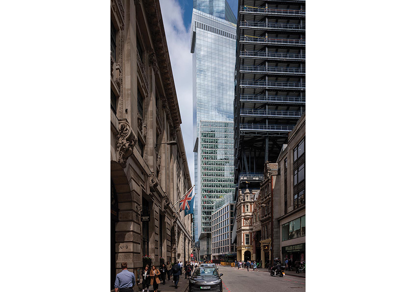
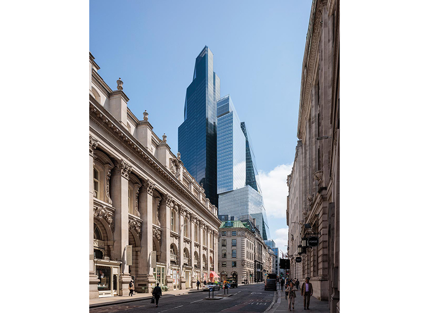
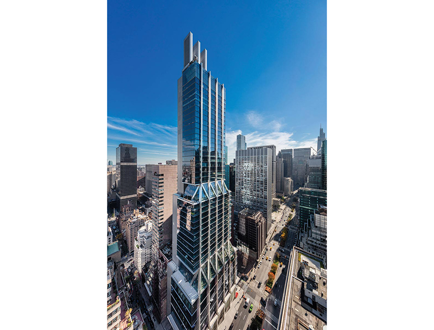
Eight Bishopsgate twists like the streets below and steps back to its taller neighbor, 22 Bishopsgate.

PHOTOGRAPHY BY DIRK LINDER
Completed in July for developer Mitsubishi Estate London, 8 Bishopsgate is much more nuanced than its moniker implies, however. Rather than a willfully haphazard and attention-grabbing form, the tower is a carefully considered response to client needs, to the surrounding context, and especially to the London View Management Framework—planning provisions protecting views of important landmarks across the city. Among the Framework’s requirements is a stipulation that buildings not interfere with the “skyspace” around the dome of St Paul’s Cathedral when viewed from the west and from a certain vantage point. These regulations were the source of the wedge shape and raked facade of the Cheesegrater, for instance, which sits immediately to the east of 8 Bishopsgate.
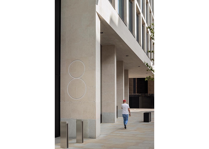
WilkinsonEyre took a different approach, translating the conditions of the Framework into a stepped profile. The building reads as a collection of stacked boxes, including one at the base clad in sandstone-faced precast panels to relate to nearby heritage buildings, and fully glazed volumes above. The blocks become more slender as they ascend, stepping back toward the north and 8 Bishopsgate’s much taller and heftier neighbor, PLP Architecture’s 2020 skyscraper, 22 Bishopsgate. As they rise, each of the blocks of 8 Bishopsgate is slightly rotated, with a modest cantilever, relative to the one below it. The result is a tower with a sympathetic scale and an assemblage that seems informed both by the mazelike street grid and by the variety of building heights and shapes nearby.
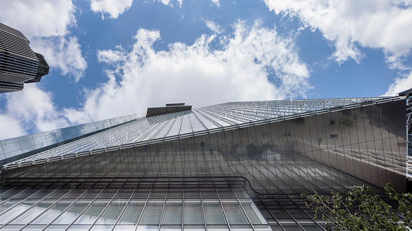
Critical to this expression is 8 Bishopsgate’s taut glass envelope, which Oliver Tyler, a WilkinsonEyre director, claims is the “crispest and flattest in the city.” And indeed the reflections seen on many of the skyscrapers in close proximity reveal that their facades ripple and bow, while there is little distortion evident on the skin of 8 Bishopsgate, which consists of a double curtain wall, about 8 inches deep, enclosing automated blinds. Tyler credits the precision of the cladding to a close collaboration with the Dutch fabricator that modified its usual assembly sequence to achieve the architect’s desired effect.

PHOTOGRAPHY BY DIRK LINDER
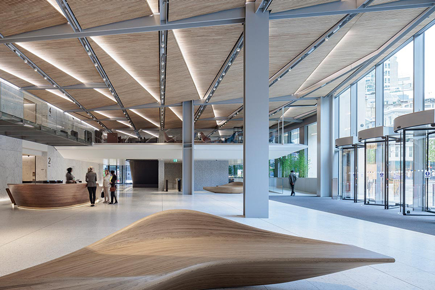
The attention to detail continues inside, in public spaces like the double-height entry hall, where visitors are greeted with Carrara-marble-clad walls, terrazzo floors that include the same marble in its aggregate, and elevator lobbies in expertly finished exposed concrete. Overhead, panels made of slats of sweet chestnut span the exposed steel ceiling structure. Curvaceous benches in oak, of Tyler’s design, are placed here and there. The overall feeling is sleek and inviting.
Eight Bishopsgate replaces two early 1980s buildings—one 20 stories and the other seven stories—which “were not maximizing the site nor were they fit for purpose,” says Kevin Darvishi, leasing director for Stanhope, the project’s development and asset manager. Their replacement has proved popular primarily with financial, insurance, and legal tenants. As of late January, of 560,000 square feet of office space at 8 Bishopsgate, about 85 percent is leased or under offer, according to Darvishi.

PHOTOGRAPHY BY DIRK LINDER
The double-height reception area has marble walls, terrazzo floors, and timber-slat ceilings.

PHOTOGRAPHY BY DIRK LINDER
The lower volume is clad in sandstone, while upper ones, which cantilever are fully glazed.
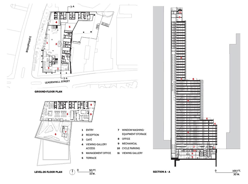
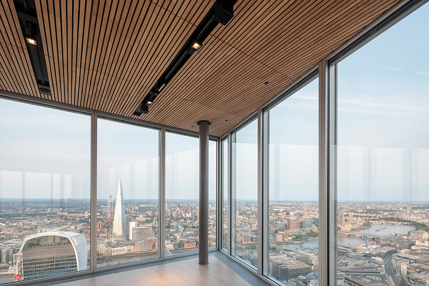
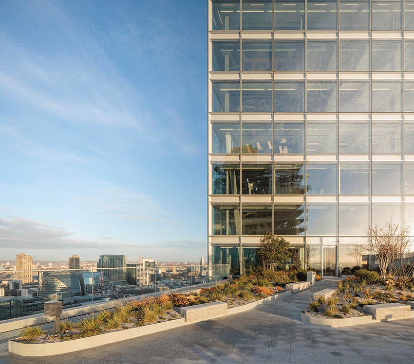
One of the tower’s main selling points, as companies try to lure employees back to the office, has been its amenities, such as outdoor space. Where the building steps back, at levels 9, 11, and 25, there are landscaped terraces for occupants of those floors. There are also shared amenities, including a tenants-only restaurant and bar on level 26, which opens out onto an especially capacious terrace, and on a mezzanine just above the lobby, a 200-person auditorium with an adjoining meeting space. Meanwhile, on the top floor, a viewing gallery with sweeping city vistas can be reserved for special events when not open to public. Below grade, there is parking for nearly 1,000 bikes—one of the largest such facilities in the city, according to the project team—and spa-like showers and locker rooms.
The structure of 8 Bishopsgate consists of a steel frame and two reinforced-concrete cores—one to the south that serves the building’s low-rise portion and another to the north, which extends to the crown. Linking the two cores together, a braced box at the building’s midsection helps stabilize the tower and enables the projecting volumes without the excess steel usually associated with such cantilevers, explains Chris Edgington, an associate director at Arup, which served as the structural and mechanical engineer. Together with rationalizing the frame, the braced box helped reduce the use of steel by 25 percent, saving 5,000 metric tons of embodied CO₂ when compared to a more conventional tower, according to the project team. Every steel member is “sized to do what it needs to do and is no bigger,” confirms Tyler.

PHOTOGRAPHY BY DIRK LINDER
A top-floor viewing gallery offers sweeping vistas.

PHOTOGRAPHY BY DIRK LINDER
A tenants-only restaurant opens onto a capacious terrace.
This “right-sizing” approach also extends underneath the tower, where, instead of relying on pile foundations typical of tall buildings, Arup designed a raft foundation with piles only under the taller north core. The hybrid solution, according to Edgington, resulted in the “leanest foundation possible,” avoiding the use of 80,000 cubic feet of concrete and saving another 680 metric tons of CO₂.
Operationally, too, the building is designed with sustainability as a priority. Contributing to its BREEAM Outstanding designation (the green-building rating system’s highest certification possible) are its: on-floor air-handling units, which allow tenants control over their individual spaces and provide higher fresh-air and filtration rates than is typical; a water-to-water heat pump that recycles waste heat from air-conditioning; and systems that capture and treat water from sinks and showers and from roof runoff, reusing it for toilet flushing and irrigation. And, of course, there is the double-skin facade, with its interstitial blinds, that helps to reduce glare and cooling loads.
The flawlessly flat skin is, arguably, emblematic of the whole tower: a symbol of 8 Bishopsgate’s high environmental aspirations, but also of a commitment to detail and precision that is rare in such large speculative projects.
Credits
Architect: WilkinsonEyre — Oliver Tyler, director; Ayman El Hibri, associate director
Consultants: Arup (structural, m/e/p, access, landscape), Alinea (cost), Andrew McMillan Associates (catering), Studio Sutherland with Whybrow Pedrola (wayfinding), EQ2 (lighting), Gerald Eve (planning), PFB Construction Management (construction design and management), Reef Associates (facade maintenance)
Construction Manager: Lendlease
Client: Mitsubishi Estate London + Stanhope
Size: 913,000 square feet (gross)
Cost: $377 million (development)
Completion date: July 2023
Sources
Curtain Wall: Scheldebouw
Precast cladding: Loveld
Glass: Interpane
Timber ceilings and paneling:
BCL Timber Projects, Gustafs
Marble and Terrazzo: InOpera
Locksets: Assa Abloy
Closers: Dorma
Exit Devices: Zumtobel, Philip Payne
Lighting: Osram, LED Linear, iGuzzini, Erco, Zumtobel, ACDC, Concord, Light Graphix, Light Lab
Vertical Transport: Kone
View course on architecturalrecord.com »

Photo © Jason O’Rear
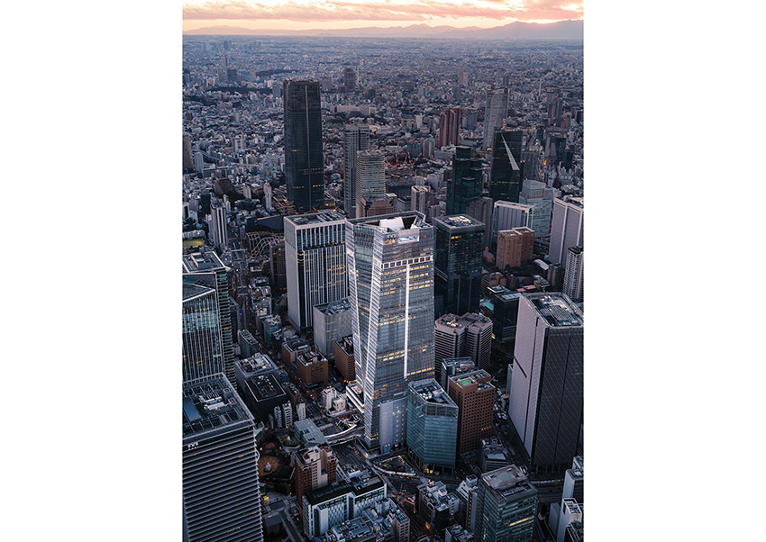
Toranomon Hills Station Tower, Tokyo, by OMA.
For March, RECORD’s editors crane their necks to survey a quartet of cloud-brushing projects: A twin-tower luxury development in Dubai linked by a record-breaking cantilever, a new addition to the London skyline with a Jenga-esque form that preserves views of historic sites, the first full-block skyscraper to rise on Manhattan’s storied Park Avenue in 50 years, and a twisting mixed-use tower with a transit hub at its base that stands as the concluding component of a bustling new Tokyo high-rise district.
Keeping with the tall building theme, March’s special lighting section—together with the project stories, this section comprises our CEU offering for the month—showcases three vertical illumination schemes, two of them in Tokyo and one in Hangzhou, China.
Raising the Bar
An eye-catching pair of towers, linked by a dramatic cantilever, stands out on the Dubai skyline.
BY LEOPOLDO VILLARDI
“This city is always pushing itself to accomplish something never before done,” says architect Fadi Jabri, head of Nikken Sekkei’s Dubai office. Record-setters abound—the Burj Khalifa is still the world’s tallest building 14 years after completion. The financial capital has also sprouted a gilded gateway, the Dubai Frame, and multiple sets of twins—such as the Emirates and Al Kazim towers. “We wanted to add something new to a skyline that seems to have everything; this was the challenge for us,” he adds.
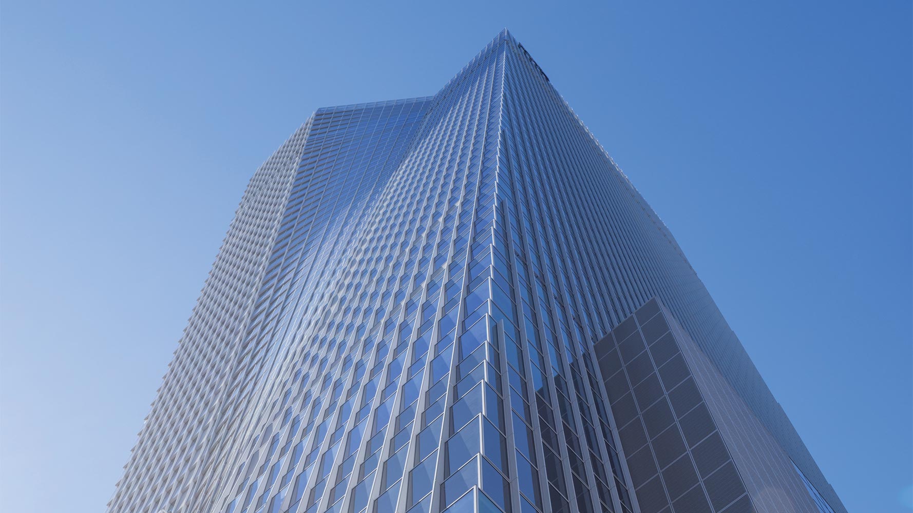
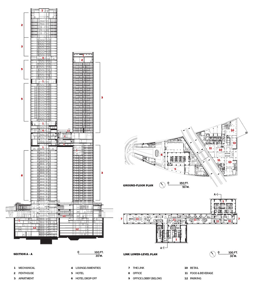
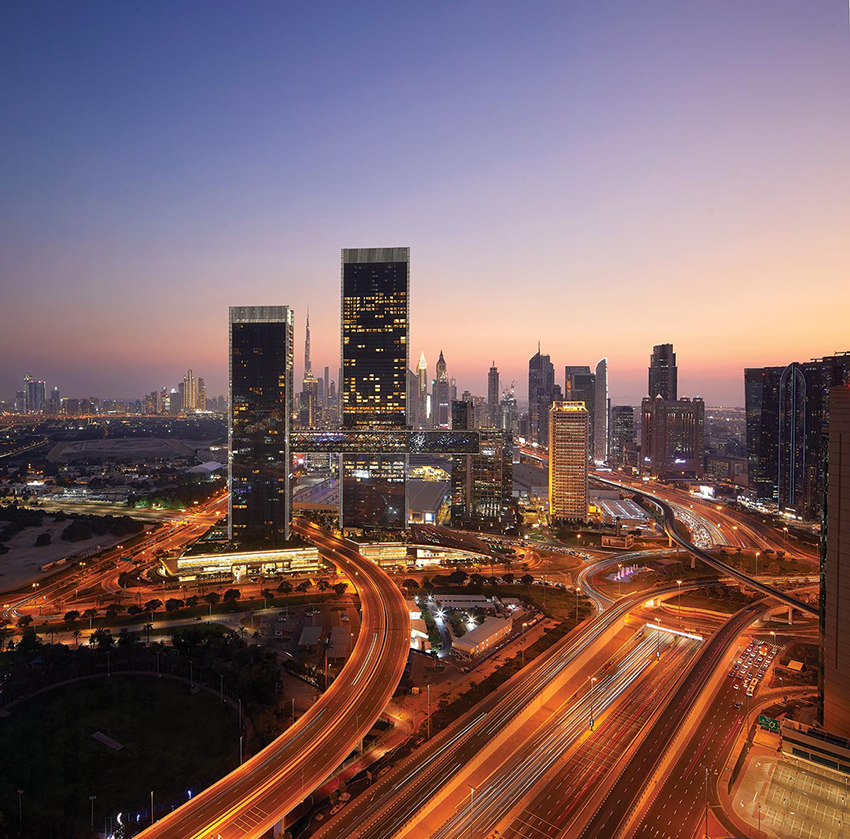
Such a simple-sounding exercise belies the complexity of realizing that achievement while building One Za’abeel, a double-towered mixed-use complex that spans an active road and shatters the record for longest occupiable cantilever. Situated in a little-developed neighborhood between historic Old Dubai and the dense downtown, the two skyscrapers—one 1,000 feet tall and the other 770—spring from a three-story, greenery-capped plinth that sits on a triangular island bounded by a sea of multilane highways. Getting there—and leaving—without the aid of a car is an onerous task, but that’s more or less the point. One Za’abeel was partly envisioned as a luxury “urban resort”—the sky-high version of an all-inclusive hotel—packed with amenities and places to eat, shop, and relax.

PHOTOGRAPHY BY HUFTON + CROW
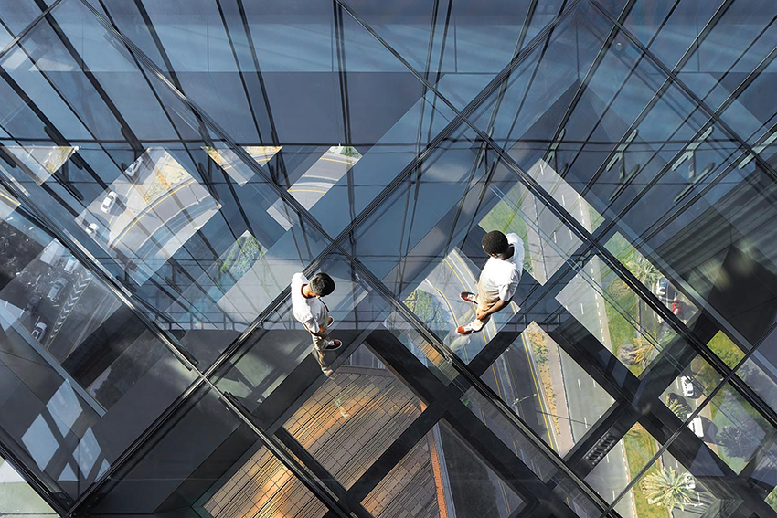
One Za’abeel’s dramatic cantilever features a transparent, walkable floor.
Clean, minimally detailed glass curtain walls cloak each of the sans-setback towers. Although the shorter exposures are regularly broken by balconies and terraces, the longer facades feature pristine, uninterrupted surfaces that terminate on both sides with bladelike planes, lengthened by the inverted corner tucked behind them. Heat-strengthened, laminated glass fins that penetrate the envelope partially support these facades, reducing the size of mullions and preventing distortion caused by “pillowing.” Embedded frit renders these fins, from an oblique angle, an opaque, misty gray that quickly evaporates as one moves around. And when the sun sets, the crisp, prismatic forms of One Za’abeel are accentuated by a subtle but effective lighting scheme, by Tokyo-based LPA, that outlines them.
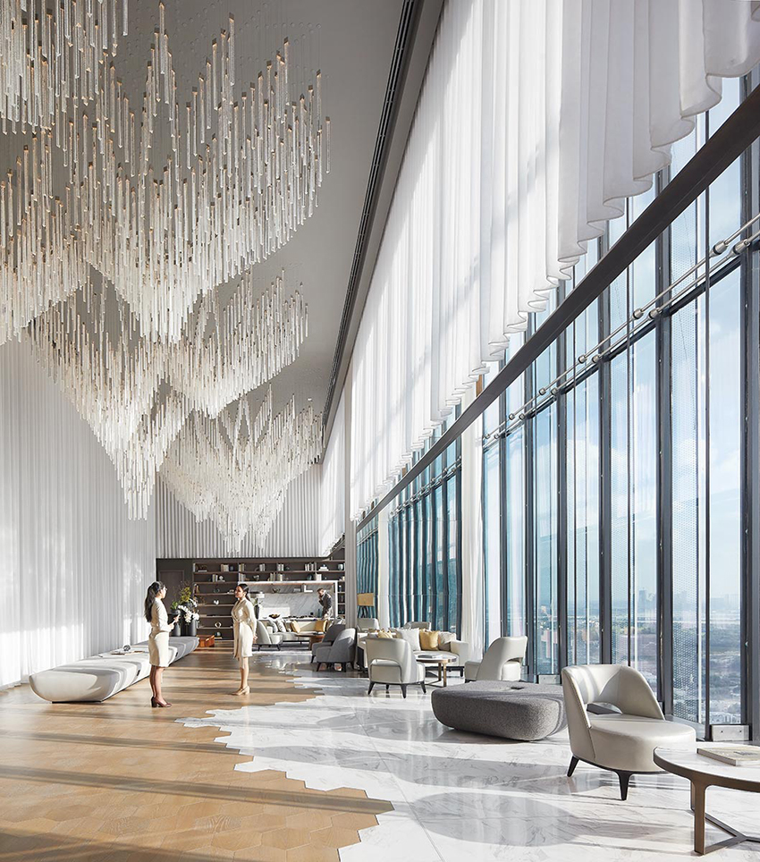
The upper floors of the taller tower host a 229-key luxury hotel, One&Only, and a 132-key wellness-oriented hotel, SIRO, both operated by Kerzner International, as well as 94 branded residences and nine “penthouses” at the crown. Guests approach via a shaded ramp, where, the architects explain, design cues hint at the atmosphere of an oasis. Water trickles down surrounding walls, while mashrabiya screens hide pumps that flood the arrival area with recycled cool air from the building—refreshing during scorching summer months, when temperatures can peak at 110 degrees Fahrenheit. Inside the hotel lobby, designed by Jean-Michel Gathy’s Malaysia-based firm, Denniston, dunelike sculptures flow through opulent marble-lined interiors.
The lower floors of the tower comprise 280,000 square feet of leasable Grade A office space, accessed via the ground-level concourse and podium, which include some of the few interiors designed by Nikken Sekkei. These, along with the office lobby by LW, are far more restrained in tone—elegantly so—with touches of warm woods, fluted and translucent glass, and burnished metals. One tenant is the Investment Corporation of Dubai, parent company of Kerzner and the principal investment arm of the local government, chaired by the crown prince of Dubai, Sheikh Hamdan bin Mohammed bin Rashid al Maktoum.
The shorter tower, One Za’abeel The Residences, comprises, as its name suggests, 264 apartments in both simplex and duplex arrangements.
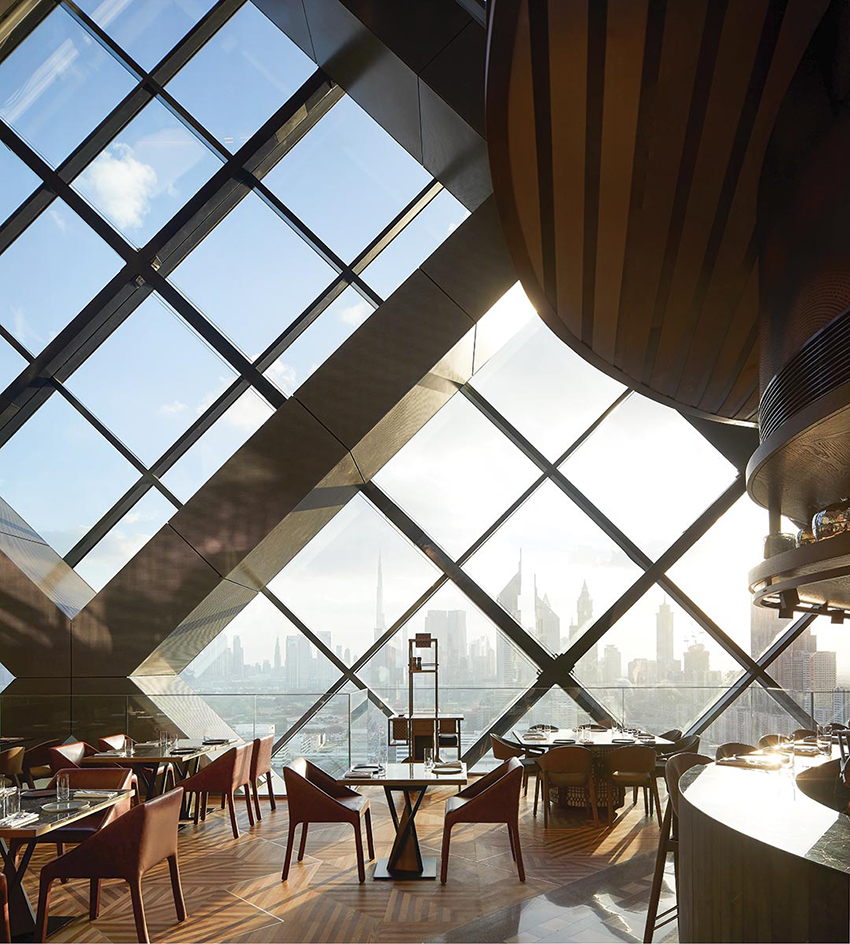
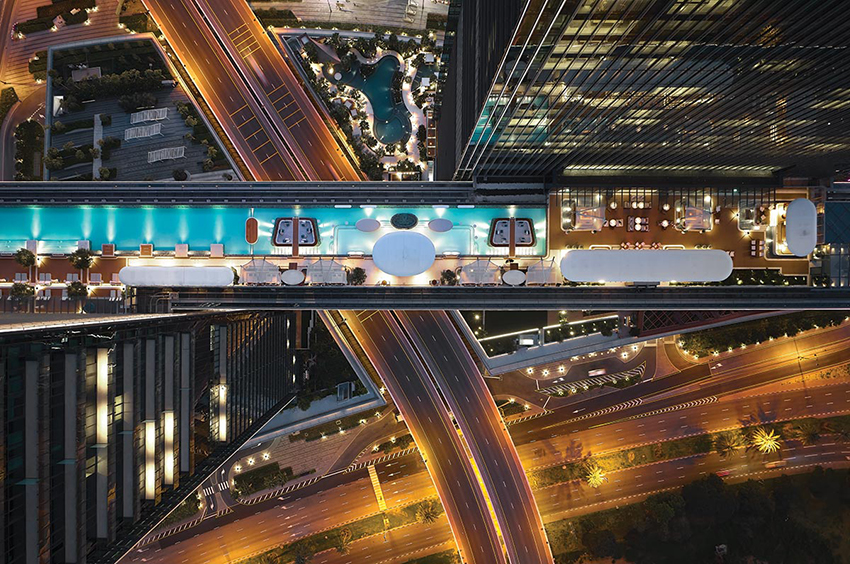
“The Link,” hovering 330 feet above the ground, connects the two high-rises. Guests who wander into it may not immediately realize that they have moved beyond the footprint of either tower, but a quick glance to either side will do the trick—suddenly, they stand in a 750-foot-long column-free expanse brimming with bars and restaurants. On one end, the Link dramatically juts out 221½ feet, forming the longest occupiable cantilever in the world, usurping the previous record holder, Moshe Safdie’s Marina Bay Sands in Singapore. At the other end of the Link, guests amble through Arrazuna—a restaurant designed to resemble a food market with multiple “stalls,” around which glimpses of Dubai’s skyline come in and out of view—or they can enjoy a meal at any number of high-end offerings with tasteful interiors by New York–based Rockwell Group.
Although the restaurants and bars help fulfill the ambition to become an urban resort, the Link was not planned in the project’s early days as a culinary destination. As Kerzner chief executive officer Philippe Zuber explains, the architects proposed something different. “What an expensive art gallery that would have been, suspended up there,” he remarks of the idea, noting that such a venture would not have been profitable.

PHOTOGRAPHY BY HUFTON + CROW
A diagrid wraps the Link, which is topped by a pool (middle). The hotel check-in is on the 25th floor (bottom).

PHOTOGRAPHY BY HUFTON + CROW

PHOTOGRAPHY BY HUFTON + CROW
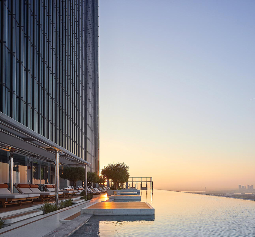
On the roof of the Link, guests will find a 360-foot-long infinity pool with stunning views of downtown Dubai. “This building gave us an opportunity to think about what an urban resort should stand for,” Zuber says. “This is an elevated boulevard. It is a beach in the sky.” The aim is not placelessness, either, given the many nods to local cuisine and culture—and, heard in the distance, the intermittent call to prayer serves as a reminder of One Za’abeel’s Emirati setting. (Initially, the pool was to have a transparent basin; though technically possible, the move was deemed too immodest.)
This sliver of paradise was not assembled in situ; rather, engineers built the structure in sections, using the podium as a staging ground, and then hoisted it into place over 72 hours. “Dubai has only stopped three times: when George Bush visited, when Covid first struck, and when the lift began, which halted car traffic,” Jabri says with a laugh. The endeavor required hundreds of cables and strand jacks temporarily affixed to both towers. At 9,600 tons (heavier than the Eiffel Tower’s frame), the massive diagrid would have pulled the skyscrapers closer together; instead, they were deliberately canted away from one another, and raising the structure brought them parallel.
The Link daringly hangs from both high-rises, bridging the gap between them—the gesture recalls the unbuilt Cross # Towers, proposed by Bjarke Ingels Group for Seoul in 2012, about a year before the competition for One Za’abeel was held. A hybrid concrete-and-steel system, on a 40-foot grid, holds up the towers and the Link—and a hefty, 6½-by-9-foot corner column bears the brunt of the tremendous moment load from the cantilever. On the upper floors, the concrete structural frame is more conventional. A 20-foot grid runs through SIRO, accommodating smaller rooms, and a 30-foot grid runs through the luxury hotel and penthouses. The transitions, concealed at transfer and mechanical levels, and further disguised by the highly regimented curtain wall, allowed the architects to pull columns away from the corners at higher levels, freeing up valuable space for views.
Refinement may prevail throughout much of One Za’abeel, but this makes a handful of loud interiors much more noticeable. Bulbous ceiling protrusions in the Link, formed by wood slats, detract from its impressive linearity. Campy blue velvet covers much of the hotel’s nightclub, the Sphere, which features what appears to be a kidney-shaped Anish Kapoor knockoff-turned-bar. Multimedia gimmicks, such as the digital locks that romantic duos can clip onto a digital chain-link fence, add lowbrow Las Vegas frill. “It has definitely been a challenge. We have our own design DNA and identity, but we’re creating a building for the client, for the community, for Dubai,” says project architect David Lehnort, noting the many stakeholders, six interior design firms, and considerable cast of international consultants involved. There’s a little bit for everyone.

PHOTOGRAPHY BY HUFTON + CROW
The Link connects the two towers of One Za’abeel.

PHOTOGRAPHY BY HUFTON + CROW
One Za’abeel does not add to the nearby roster of unremarkable and pastiche towers—on the contrary, it expresses a take on the tall building that is more sophisticated than almost everything else Dubai has to offer. And, in the process of realizing the world’s longest cantilever, Nikken Sekkei, Japan’s oldest architecture firm, may have accomplished something far more meaningful—that is, shown Dubai how to raise the bar.
Credits
Architect: Nikken Sekkei — Koko Nakamura, design director; Fadi Jabri, executive officer; Hiroshi Nishikiori, David Lehnort, Issei Kasashima, associates; Takamitsu Moriyama, architect
Engineers: Nikken Sekkei, WSP Middle East (structural, m/e/p); RWDI (wind)
Consultants: Inhabit (facade); Limah, ESD (signage); Cracknell (landscape); LPA (lighting); LW Design Group, Denniston, Rockwell Group, DWP, HBA Social F+B (interiors); Stufish (canopy); DPA Design Studio, Wellness by Design, Brimaxx, Farmboy, Capsule Arts, Crowd Dynamics, Brash
General Contractor: ALEC Engineering and Contracting
Client: One Za’abeel Holdings
Size: 5,704,800 square feet
Cost: withheld
Completion Date: January 2024
Sources
Curtain Wall: Al Abbar
Flooring: Tarkett, BASF, Silikal
Conveyance: Otis
Stepping It Up
A tower responds to planning mandates with shifting forms, clever engineering, and careful detailing
BY JOANN GONCHAR, FAIA
Londoners like to give the city’s office towers amusing nicknames. There’s Foster + Partners’ 30 St Mary Axe, known as the Gherkin (2004); Richard Rogers’s 122 Leadenhall, aka the Cheesegrater and Rafael Viñoly’s 20 Fenchurch Street, referred to as the Walkie Talkie (both completed in 2014); as well as KPF’s 52 Lime Street, called the Scalpel (2018). But now this collection of buildings, all in or near the financial district’s “eastern cluster,” has a new addition: WilkinsonEyre’s 50-story, 668-foot-tall 8 Bishopsgate, which some have dubbed the Jenga, due to the stacked and subtly rotated volumes that lend it a passing resemblance to the off-kilter towers of the popular woodblock game.

PHOTOGRAPHY BY DIRK LINDER
Eight Bishopsgate twists like the streets below and steps back to its taller neighbor, 22 Bishopsgate.

PHOTOGRAPHY BY DIRK LINDER
Completed in July for developer Mitsubishi Estate London, 8 Bishopsgate is much more nuanced than its moniker implies, however. Rather than a willfully haphazard and attention-grabbing form, the tower is a carefully considered response to client needs, to the surrounding context, and especially to the London View Management Framework—planning provisions protecting views of important landmarks across the city. Among the Framework’s requirements is a stipulation that buildings not interfere with the “skyspace” around the dome of St Paul’s Cathedral when viewed from the west and from a certain vantage point. These regulations were the source of the wedge shape and raked facade of the Cheesegrater, for instance, which sits immediately to the east of 8 Bishopsgate.
WilkinsonEyre took a different approach, translating the conditions of the Framework into a stepped profile. The building reads as a collection of stacked boxes, including one at the base clad in sandstone-faced precast panels to relate to nearby heritage buildings, and fully glazed volumes above. The blocks become more slender as they ascend, stepping back toward the north and 8 Bishopsgate’s much taller and heftier neighbor, PLP Architecture’s 2020 skyscraper, 22 Bishopsgate. As they rise, each of the blocks of 8 Bishopsgate is slightly rotated, with a modest cantilever, relative to the one below it. The result is a tower with a sympathetic scale and an assemblage that seems informed both by the mazelike street grid and by the variety of building heights and shapes nearby.
Critical to this expression is 8 Bishopsgate’s taut glass envelope, which Oliver Tyler, a WilkinsonEyre director, claims is the “crispest and flattest in the city.” And indeed the reflections seen on many of the skyscrapers in close proximity reveal that their facades ripple and bow, while there is little distortion evident on the skin of 8 Bishopsgate, which consists of a double curtain wall, about 8 inches deep, enclosing automated blinds. Tyler credits the precision of the cladding to a close collaboration with the Dutch fabricator that modified its usual assembly sequence to achieve the architect’s desired effect.

PHOTOGRAPHY BY DIRK LINDER
The attention to detail continues inside, in public spaces like the double-height entry hall, where visitors are greeted with Carrara-marble-clad walls, terrazzo floors that include the same marble in its aggregate, and elevator lobbies in expertly finished exposed concrete. Overhead, panels made of slats of sweet chestnut span the exposed steel ceiling structure. Curvaceous benches in oak, of Tyler’s design, are placed here and there. The overall feeling is sleek and inviting.
Eight Bishopsgate replaces two early 1980s buildings—one 20 stories and the other seven stories—which “were not maximizing the site nor were they fit for purpose,” says Kevin Darvishi, leasing director for Stanhope, the project’s development and asset manager. Their replacement has proved popular primarily with financial, insurance, and legal tenants. As of late January, of 560,000 square feet of office space at 8 Bishopsgate, about 85 percent is leased or under offer, according to Darvishi.

PHOTOGRAPHY BY DIRK LINDER
The double-height reception area has marble walls, terrazzo floors, and timber-slat ceilings.

PHOTOGRAPHY BY DIRK LINDER
The lower volume is clad in sandstone, while upper ones, which cantilever are fully glazed.
One of the tower’s main selling points, as companies try to lure employees back to the office, has been its amenities, such as outdoor space. Where the building steps back, at levels 9, 11, and 25, there are landscaped terraces for occupants of those floors. There are also shared amenities, including a tenants-only restaurant and bar on level 26, which opens out onto an especially capacious terrace, and on a mezzanine just above the lobby, a 200-person auditorium with an adjoining meeting space. Meanwhile, on the top floor, a viewing gallery with sweeping city vistas can be reserved for special events when not open to public. Below grade, there is parking for nearly 1,000 bikes—one of the largest such facilities in the city, according to the project team—and spa-like showers and locker rooms.
The structure of 8 Bishopsgate consists of a steel frame and two reinforced-concrete cores—one to the south that serves the building’s low-rise portion and another to the north, which extends to the crown. Linking the two cores together, a braced box at the building’s midsection helps stabilize the tower and enables the projecting volumes without the excess steel usually associated with such cantilevers, explains Chris Edgington, an associate director at Arup, which served as the structural and mechanical engineer. Together with rationalizing the frame, the braced box helped reduce the use of steel by 25 percent, saving 5,000 metric tons of embodied CO₂ when compared to a more conventional tower, according to the project team. Every steel member is “sized to do what it needs to do and is no bigger,” confirms Tyler.

PHOTOGRAPHY BY DIRK LINDER
A top-floor viewing gallery offers sweeping vistas.

PHOTOGRAPHY BY DIRK LINDER
A tenants-only restaurant opens onto a capacious terrace.
This “right-sizing” approach also extends underneath the tower, where, instead of relying on pile foundations typical of tall buildings, Arup designed a raft foundation with piles only under the taller north core. The hybrid solution, according to Edgington, resulted in the “leanest foundation possible,” avoiding the use of 80,000 cubic feet of concrete and saving another 680 metric tons of CO₂.
Operationally, too, the building is designed with sustainability as a priority. Contributing to its BREEAM Outstanding designation (the green-building rating system’s highest certification possible) are its: on-floor air-handling units, which allow tenants control over their individual spaces and provide higher fresh-air and filtration rates than is typical; a water-to-water heat pump that recycles waste heat from air-conditioning; and systems that capture and treat water from sinks and showers and from roof runoff, reusing it for toilet flushing and irrigation. And, of course, there is the double-skin facade, with its interstitial blinds, that helps to reduce glare and cooling loads.
The flawlessly flat skin is, arguably, emblematic of the whole tower: a symbol of 8 Bishopsgate’s high environmental aspirations, but also of a commitment to detail and precision that is rare in such large speculative projects.
Credits
Architect: WilkinsonEyre — Oliver Tyler, director; Ayman El Hibri, associate director
Consultants: Arup (structural, m/e/p, access, landscape), Alinea (cost), Andrew McMillan Associates (catering), Studio Sutherland with Whybrow Pedrola (wayfinding), EQ2 (lighting), Gerald Eve (planning), PFB Construction Management (construction design and management), Reef Associates (facade maintenance)
Construction Manager: Lendlease
Client: Mitsubishi Estate London + Stanhope
Size: 913,000 square feet (gross)
Cost: $377 million (development)
Completion date: July 2023
Sources
Curtain Wall: Scheldebouw
Precast cladding: Loveld
Glass: Interpane
Timber ceilings and paneling:
BCL Timber Projects, Gustafs
Marble and Terrazzo: InOpera
Locksets: Assa Abloy
Closers: Dorma
Exit Devices: Zumtobel, Philip Payne
Lighting: Osram, LED Linear, iGuzzini, Erco, Zumtobel, ACDC, Concord, Light Graphix, Light Lab
Vertical Transport: Kone
Towering Ambition
A full-block office building rises on Park Avenue for the first time in half a century
BY CLIFFORD A. PEARSON
Like the hedge-fund managers who work inside it, 425 Park Avenue faces the dilemma of standing out in a crowd while never screaming for attention or bragging (too) loudly. The reportedly $1 billion building on New York’s fanciest boulevard proves its worth the way high-priced financial bro’s do: by outperforming the competition (and talking a good game). The old guard here—Mies van der Rohe’s Seagram Building and Gordon Bunshaft’s Lever House—still command respect and challenge any new kid in the ’hood to show he belongs. The first full-block office building on Park in more than 50 years, 425 had to push its way into an exclusive club without seeming to break a sweat. Luckily, Norman Foster has done this before and isn’t easily intimidated. And, luckily for Foster, he had a deep-pocketed client who had hung onto the project through economic downturns, three different mayoral administrations, and the vicissitudes of New York’s rule-making process—and was determined to make a statement.

PHOTOGRAPHY: © NIGEL YOUNG/FOSTER + PARTNERS
The tower’s service core rises on its east side, culminating in three 136-foot-tall blades.
The client, L&L Holding Company, acquired the property in 2006 when it was occupied by a 32-story office building designed in 1957 by Kahn & Jacobs and had tenant leases that wouldn’t run out until 2015. It had low ceiling heights and outdated mechanical systems, making it unattractive to top-end tenants. The company brought in Lehman Brothers as an equity partner, but Lehman went belly-up at the start of the 2008–09 financial meltdown. David Levinson, chairman and CEO of L&L, found new financing and stuck with the project. In 2012, L&L organized a design competition for a new building, inviting nine world-renowned firms to participate. The client then narrowed the selection to four architects—Zaha Hadid, Richard Rogers, Rem Koolhaas/OMA, and Foster—and spent the next several months meeting with the architects, visiting their offices, touring their work, and getting to know their operations. “I thought it would get easier to make a decision after we cut the field to four,” recalls Levinson. “It got harder. They’re all great architects, and I got friendly with each of them.”
What struck Levinson about Foster was the clarity of his scheme, the quality of his team, and his ability to explain everything. “He draws in a sketchbook as you sit there, and you see his ideas come alive,” says Levinson.

PHOTOGRAPHY: © NIGEL YOUNG/FOSTER + PARTNERS
The tower’s mostly glass west facade addresses Park Avenue.
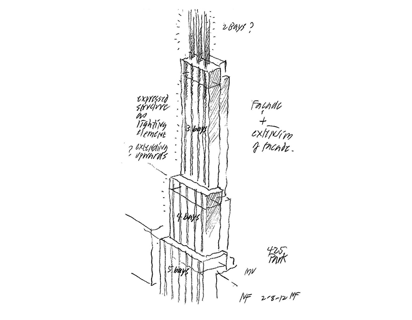
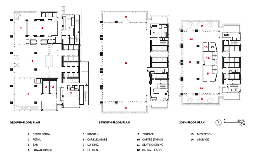
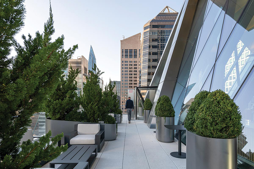
The Foster scheme stacks three blocks of offices with a double-height floor separating each one and stepping back each time on the north, south, and west. This provides three different-size floor plates, allowing L&L to attract a range of tenants—from large financial companies to smaller professional firms. Each of the two setback floors features outdoor terraces on the north and south, as well as social spaces for eating and gathering—for a single tenant on the 7th floor and for all building tenants on the 20th. Another healthy-building strategy provides a separate air-handling unit for each level, giving tenants more control and potentially reducing energy use.
Instead of placing the circulation-and-mechanical core at the center of the building, the project team, including mechanical and structural engineers at WSP, moved it to the east side, where an existing mid-rise office tower blocked views anyway. Doing this creates a large rectangular space on each floor for tenants to lay out as they see fit, rather than arranging offices within a square donut. Foster and WSP also designed a steel exoskeleton for the structure, so perimeter columns don’t impinge on the flow of interior space. Floor slabs extend beyond the steel frame on the north and south, creating corner offices that appear to float above the street.
Sliding the core to one side, though, creates asymmetrical loads on the structure, so the architects and engineers developed a diagrid system for the double-height floors where the building steps back. At the ground level, six steel columns rise along Park Avenue. But at each double-height transition level, one column drops off and loads are transferred to the next stack of floors via the diamond-shaped structure. A second row of columns runs through the center of the floors, with one dropping off at each transition level—so the lowest stack of floors has six of these columns, while the second has five, and the third has four. At the top of the tower, these columns disappear completely. The structure combines steel elements, a concrete core, and concrete floor slabs. A trio of concrete shear walls runs through the core and is expressed at the top of the building as blades extending 136 feet above the highest floor, creating a distinctive crown visible on the city’s skyline. On the north and south of this stylish top, LED screens present digital artwork to catch the eye of pedestrians from many blocks away.

An early sketch by Foster himself set the key ideas for the project.
Due to New York zoning regulations, L&L had to retain 25 percent of the old building’s structure if it wanted to develop the same amount of space as its predecessor—670,000 square feet. Though the City Council ultimately relaxed the rules in 2017, it was too late for L&L to benefit, since construction had already started the year before. To accommodate the more restrictive rules, the project team devised a complex plan that removed the top 15 floors of the existing building, inserted a temporary steel structure to support the remaining 17 floors, then removed every other floor slab to create double-height spaces for the new building. Once this was done, the contractor erected the new structure, incorporating the old floor slabs that remained and adding the new exoskeleton and 30 new floors on top of the old ones.

PHOTOGRAPHY: © NIGEL YOUNG/FOSTER + PARTNERS
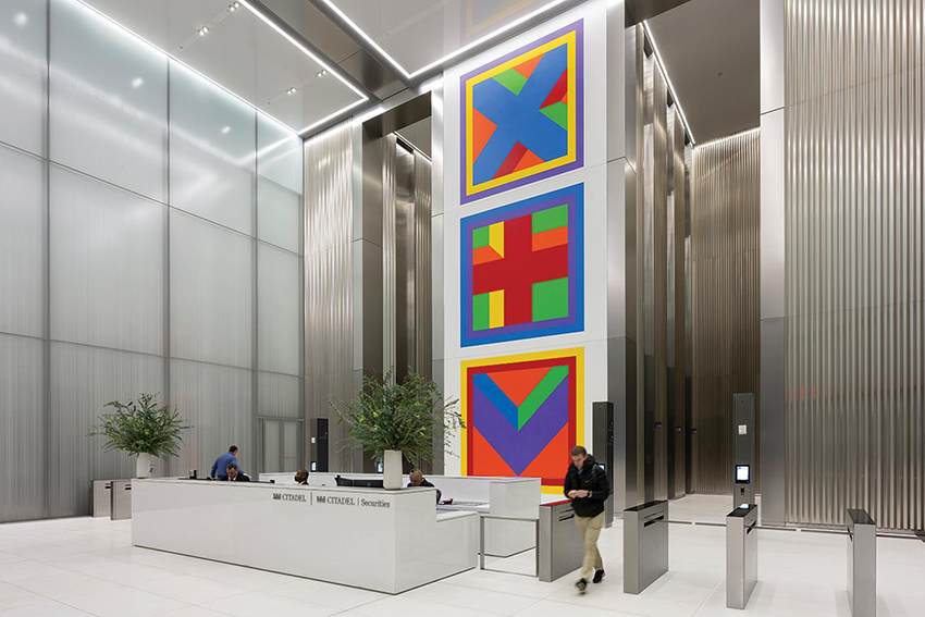
A Sol LeWitt painting animates the lobby.

PHOTOGRAPHY: © NIGEL YOUNG/FOSTER + PARTNERS
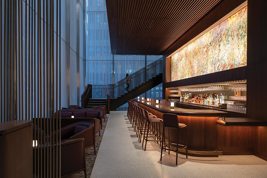
A painting by Larry Poons runs above the bar.
With its gridded facades and its exposed structure serving as its main architectural expression, 425 Park echoes the “tautness” of its illustrious neighbors, says Nigel Dancey, a senior executive partner and studio head at Foster. The architects also took inspiration from the drawings of Hugh Ferris, who envisioned moody, stepped-back towers lining the avenue, says Dancey. “We took the history and grandeur of Park Avenue and updated it for a new era,” says James Barnes, a senior partner at Foster.
The building also borrows from Foster’s own history. Moving the core to the perimeter was a key strategy that the firm employed in its first high-rise project, the Hongkong & Shanghai Banking Corporation (HSBC) Headquarters in Hong Kong, completed in 1986. On top of that, like HSBC, 425 Park separates blocks of office floors with multi-height levels identified by triangular structural elements boldly expressed on the exterior. The two buildings also engage the street with a bit of swagger, HSBC with its now iconic angled escalators taking visitors to a 10-story atrium raised a few levels above a covered plaza, 425 Park with a 45-foot-high lobby bookended by same-height spaces for a restaurant on the north and a gallery/retail component on the south.

PHOTOGRAPHY: © ALAN SCHINDLER
New York’s grid informed Foster’s design for the structure and its elevations.
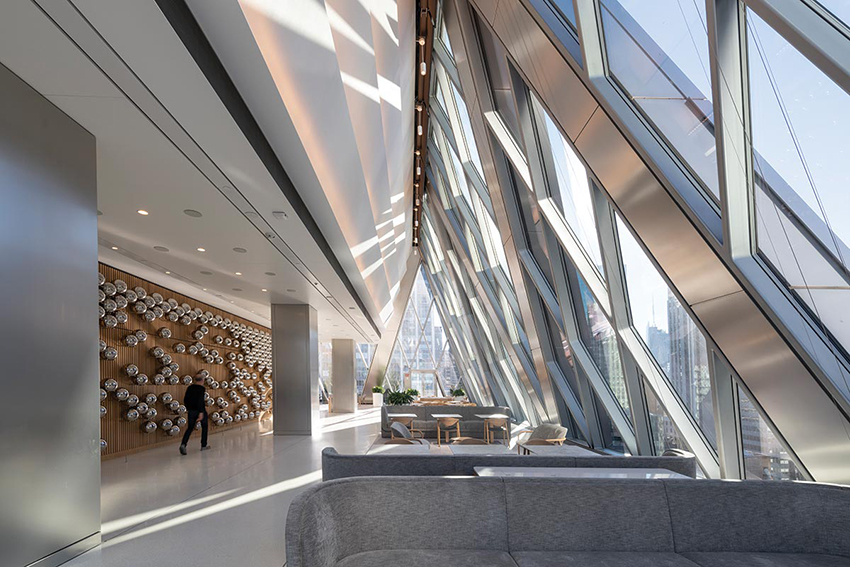
Art plays a key role throughout 425 Park. In the lobby, a large Sol LeWitt piece takes center stage. In the restaurant, which Foster himself designed, a long Larry Poons painting anchors the bar area. On the shared-amenities level on the 20th floor, the Foster team composed a wall-mounted sculpture repurposing 400 stainless-steel balls that artist Yayoi Kusama had created years before. Asked about the future of commercial districts like Midtown Manhattan at a time when many people work from home at least part of the week, Levinson is bullish. “The best companies now have their employees coming in almost every day. And recent data show that the top-quality office buildings are leasing out,” he states. According to L&L, 425 is 87 percent leased, nearly half of it to hedge-fund giant Citadel.

PHOTOGRAPHY: © NIGEL YOUNG/FOSTER + PARTNERS
A wall sculpture that uses Yayoi Kusama balls.

PHOTOGRAPHY: © NIGEL YOUNG/FOSTER + PARTNERS
A shared amenities floor features a pair of outdoor terraces.
Indeed, the success of 425 Park may entice other developers and rich corporations (like JPMorgan Chase, which hired Foster to design its 60-story headquarters now under construction a few blocks south, at 270 Park Avenue) to build expensive structures that can lure the top end of the commercial market. Right now, high interest rates are the main obstacle to that, says Levinson. But if rates come down, a new wave of ne plus ultra towers could sweep through Manhattan. If that occurs, what happens to older office buildings that can’t compete with the sexy newcomers? Will they hang on as partially vacant reminders of previous booms, get torn down to make way for new construction, or be reinvented as housing or something else? Instead of representing the end of an era, 425 Park might kickstart a transition—albeit painful and perhaps lengthy—to a more mixed-use Midtown that is active all day long.
Credits
Architect: Foster + Partners — Norman Foster, Nigel Dancey, James Barnes, Justin Boyer, Pier Rapana, Joe Bausano
Architect of Record: Adamson Associates
Engineers: WSP (structural, m/e/p); Langan (civil)
Consultants: Cerami (acoustics); Charlie Rizzo (code/expediter); Entek (window washing); Gardiner & Theobald (project management); Jenkins and Huntington (vertical transportation); Socotec (facade); Tillotson Design and Illuminating Concepts (lighting); Jacobs Doland Beer (kitchen); Kroll (security)
General Contractor: AECOM Tishman Construction
Client: L&L Holding Company
Size: 670,000 rental square feet; 770,000 gross square feet
Cost: withheld
Completion date: October 2022
Sources
Metal panels: Outokumpu Stainless Steel
Curtain Wall: Permasteelisa North America, Scheldebouw & Josef H. Gartner
Glass: AGC Interpane, Saint Gobain Eckelt
Entrances: CRL Blumcraft
Restaurant furniture: Foster with Karimoku
A New Slant
A tower twists to serve the public rather than to achieve pristine form
BY JOSEPHINE MINUTILLO
Tokyo does not have one of those iconic skylines—towers with striking forms or distinctive crowns do not emerge from the water the way they do in cities like New York and Hong Kong. Tokyo’s buildings—many of more or less similar heights—are not ordered but rather form a haphazard constellation in the urban fabric, where one does not stand out much more than the rest (with the exception perhaps of a bright orange and white Eiffel Tower–inspired communications structure). There is no proliferation of supertalls that dot the landscape. There are no gridded streets but instead long, winding boulevards that navigate hills and highways.

PHOTOGRAPHY: © JASON O’REAR
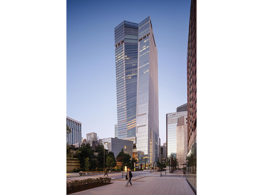
The torquing OMA building is a sharp contrast to the subtly curved Mori JP Tower in the distance.

PHOTOGRAPHY: © TOMOYUKI KUSUNOSE
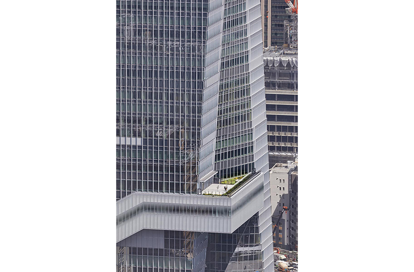
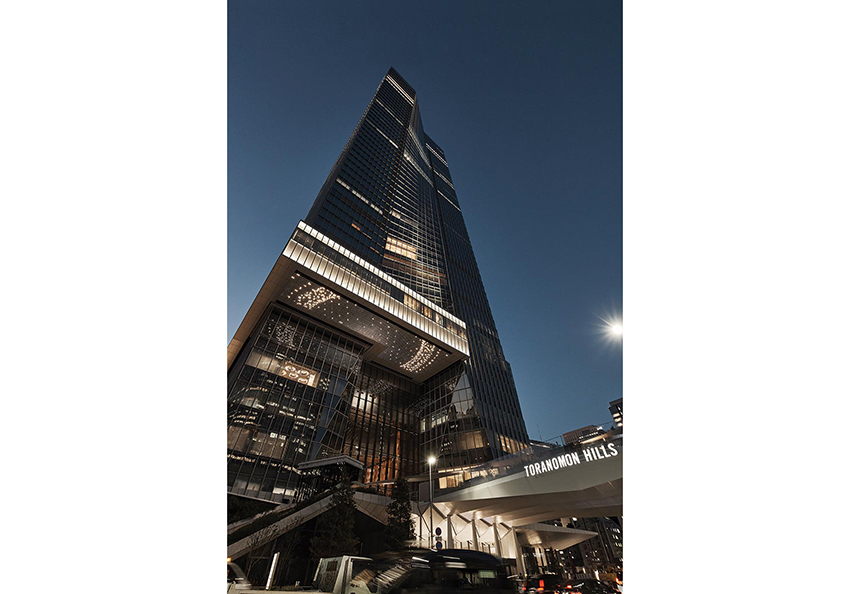
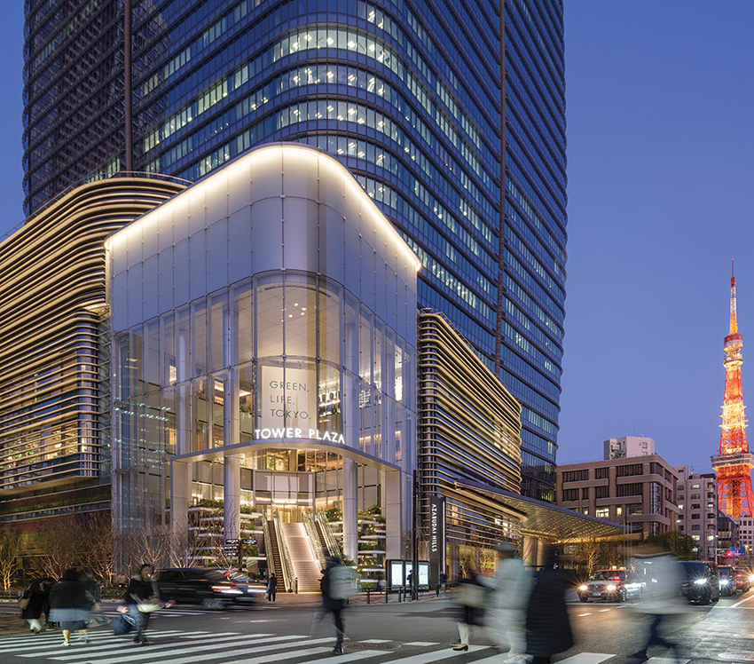
A faceted bridge just above street level and a “sky bridge” farther up the tower form part of the design.

PHOTOGRAPHY: © TOMOYUKI KUSUNOSE
It is within this context that the New York office of OMA, led by Japanese architect Shohei Shigematsu, who knows the context well, has completed a new tower to anchor a new neighborhood. If that anchor appears unsteady—seemingly twisting in the wind or, from certain angles, looking a bit crooked—it is, of course, by design.
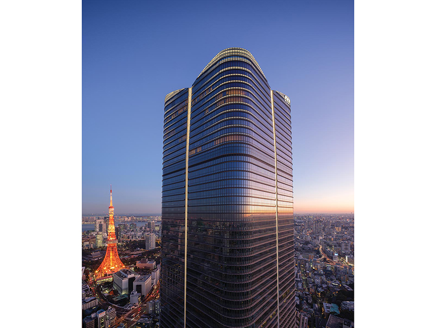
The torquing Toranomon Hills Station Tower accommodates a rich variety of program in its 49 above-grade stories, and even more below grade—most notably a subway station. The structure is among the latest in a decades-long transformation of Toranomon Hills, and of nearby Azabudai Hills—where Pelli Clarke & Partners also just completed the Mori JP Tower, the tallest in Japan (page 102)—into a business district.
The transformation comes at the hands of Mori Building, which famously earlier revamped neighborhoods such as the swanky Roppongi Hills in the Japanese capital. The family-owned real-estate giant has traditionally worked with firms like the late César Pelli’s, which are expert at skyscrapers, but in Toranomon Hills has broadened its portfolio of architects to include the likes of Christoph Ingenhoven (who designed a pair of plant-covered towers—one office, one residential) and OMA

PHOTOGRAPHY: © TOMOYUKI KUSUNOSE
The sky lobby is located on the seventh floor.
The unconventional choice of OMA, selected in a 2015 competition, resulted in this unusual structure. It is the firm’s first ground-up building in Tokyo and, at just over 2.5 million square feet and 873 feet tall, OMA’s largest built work to date. (Shigematsu completed the 19-story Tenjin Business Center in his home city of Fukuoka, west of Tokyo, in 2021.)
OMA’s Toranomon Hills building is the final piece of the nearly 20-acre development that previously contained small, aging structures in dense clusters. Positioned at the terminus of Shintora-dori Avenue, a thoroughfare connecting Tokyo Bay to the city center and what is now being called the city’s “Champs-Élysées”—in another Tokyo reference to the French capital—the tower serves as a gateway of sorts.

PHOTOGRAPHY: © TOMOYUKI KUSUNOSE
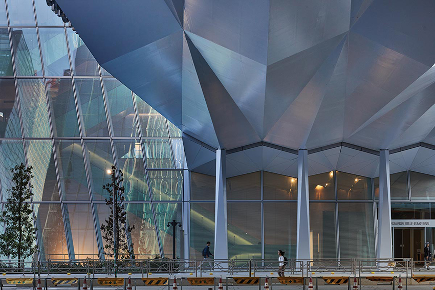
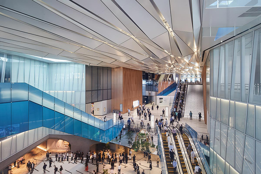
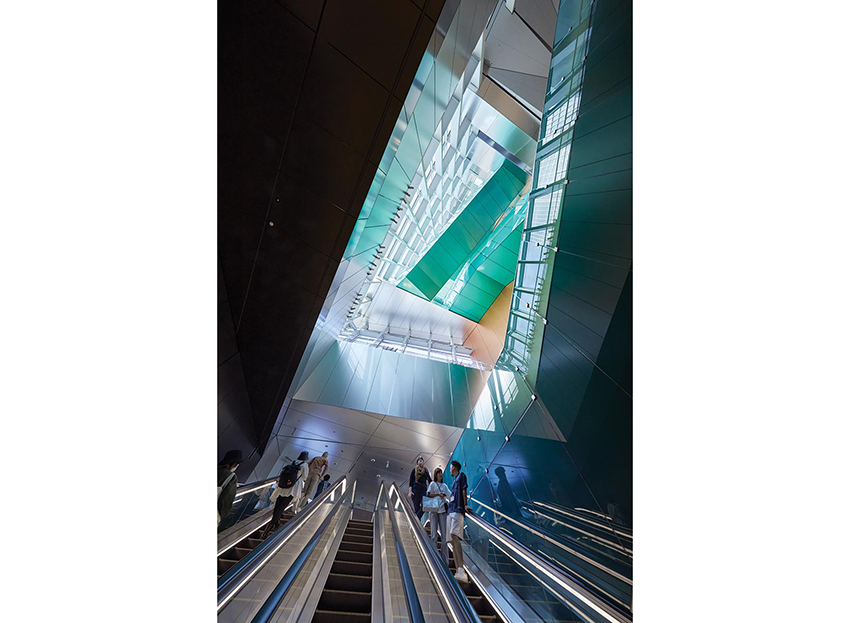
Origami-like ceiling panels and colorful glass along the escalators by Sabine Marcelis enliven the atrium.

PHOTOGRAPHY: © TOMOYUKI KUSUNOSE
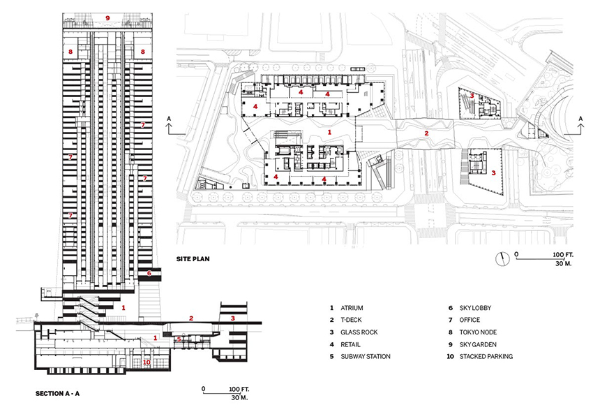
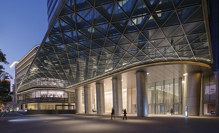
“We thought of the skyscraper as connective, not inward-looking,” says Shigematsu. At its base, a 50-foot-wide elevated pedestrian bridge, known as T-Deck, seemingly collides with the center of the tower, creating a rupture (and split structural and elevator cores) that pushes one side of the building forward—resulting in a 50-foot-long overhang—and the other back, with the middle contorting to accommodate the shifting planes. Despite the warping, the area remains the same on each floor throughout the building, and all of the 6-by-14½-foot IGU’s of the unitized curtain wall are straight.
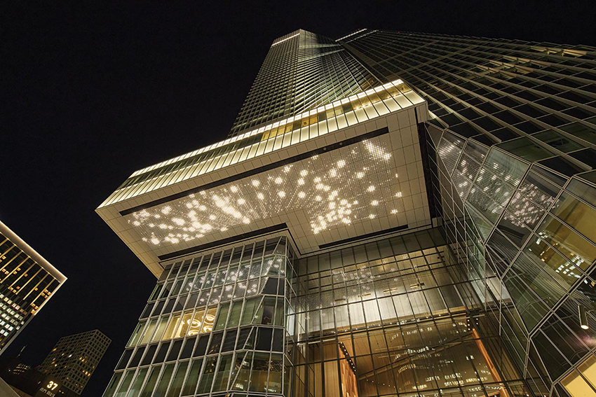
Above T-Deck, a sky bridge that wraps a corner of the building’s facade acts as a marquee over the main entrance; its underside hosts a dynamic light installation by artist Leo Villareal (page 100). The soffit of the prefabricated T-Deck—which connects to a squat subway headhouse across the street, dubbed Glass Rock, and other nearby Mori buildings and art-filled public space—features origami-like folds of half inch–thick welded steel plates that are carried into the Station Tower’s expansive atrium.

PHOTOGRAPHY: © TOMOYUKI KUSUNOSE
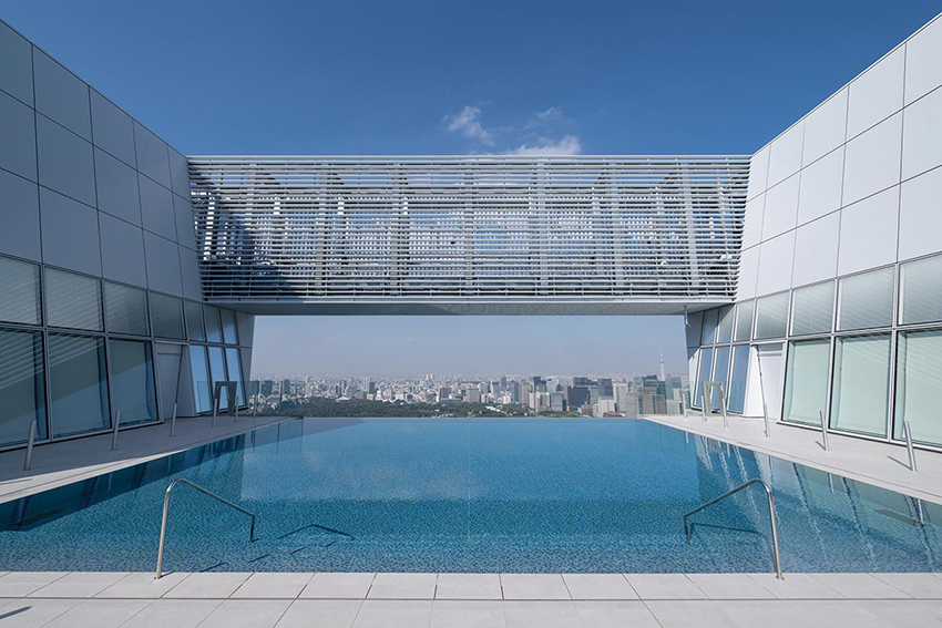
The sky garden’s infinity pool and a top-floor conference center offer arresting city views.

PHOTOGRAPHY: © TOMOYUKI KUSUNOSE

PHOTOGRAPHY: © TOMOYUKI KUSUNOSE
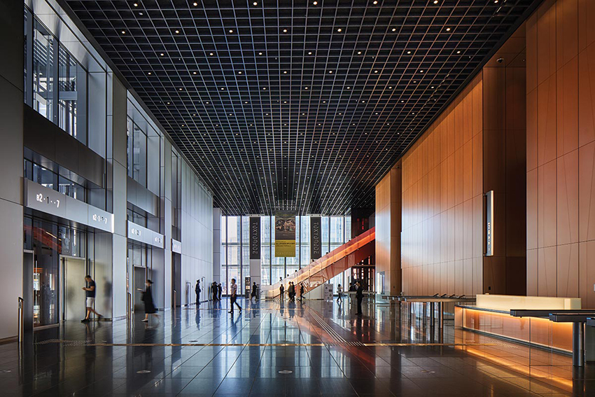
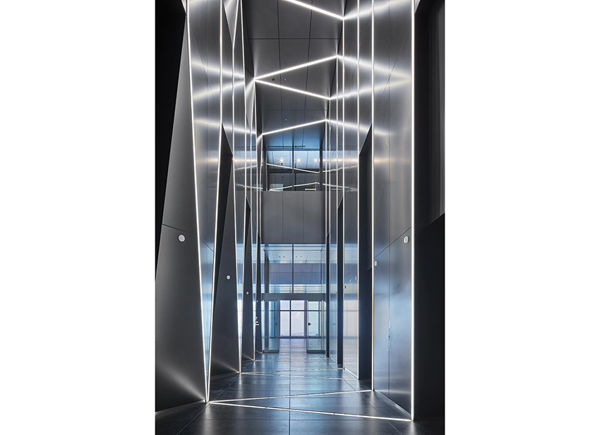
Elevator lobbies feature sleek lighting and metal finishes.
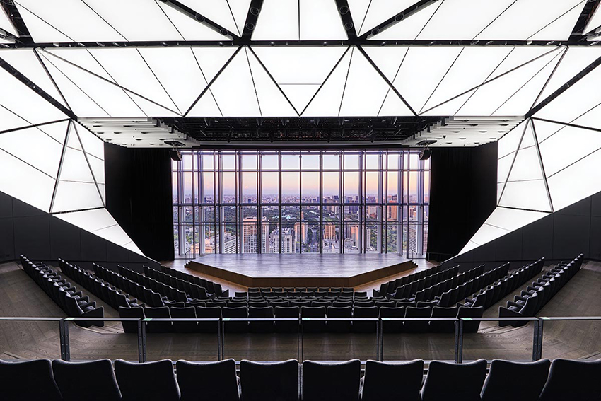
The multilevel atrium welcomes a vast array of visitors to the building, including those heading below grade to the retail concourse and subway platforms of the new Toranomon Hills Station on the Hibiya Line and above as guests of the 205-key hotel (designed with a Scandinavian flavor by Space Copenhagen), patrons of Tokyo Node, a 108,000-square-foot voluminous art space on the uppermost levels, or office workers spread out over a million square feet within the middle floors. At the very top, an infinity pool and greenery-filled observation area, known as the Sky Garden, wow diners at the two restaurants located there. (Plantings also accentuate the highly variegated base at street level, on the opposite side of the building from T-Deck.)
If, from a distance, the slanting structure gives the impression that it just wasn’t built right, that notion is quickly dismissed upon seeing the building up close. While OMA is not generally known for the impeccable execution of its projects, it’s apparently difficult to escape a certain attention to detail in Japan. The vibrant exterior, with its louvered facade, is matched inside, where there’s also a refinement that comes with recurring motifs—grated ceilings, sleek lighting, and color schemes that fade from intensely saturated to pale hues (particularly in the glass escalator panels throughout the atrium designed by Sabine Marcelis, a frequent OMA collaborator).

PHOTOGRAPHY: © JASON O’REAR
Elevator lobbies feature sleek lighting and metal finishes.
“For me, the focus was to create a highly public top and highly public bottom,” says Shigematsu. “The form is expressing the axis the building occupies, but it’s also creating a relationship to the context.” And if Shigematsu was less concerned about how his tower would transform the skyline, it still managed to achieve something most tall buildings in Tokyo do not—to stand out.
Credits
Architect: OMA — Shohei Shigematsu, partner in charge; Takeshi Mitsuda, Jake Sadler-Foster, Luke Willis, associates
Executive Architect: Mori Building
Engineers: Kume Sekkei (structural, m/e/p, fire protection, facade); Arup (structural for competition, facade)
Consultants: L’Observatoire International (exterior lighting); Arc Light Design (interior lighting); Ney & Partners (T-Deck)
General Contractor: Kajima Corporation
Client: Mori Building
Size: 2.55 million square feet
Cost: $1.3 billion
Completion date: October 2023
Sources
Curtain Wall: Showa Leadfu, YKK AP (aluminum); Asahi Building Wall (glass)
Entrances: NABCO Systems
Firmament at Toranomon Hills
OMA
Leo Villareal
BY JOSEPHINE MINUTILLO
Artist Leo Villareal has brought dancing lights to the cables of the Bay Bridge connecting San Francisco and Oakland. He’s illuminated the Thames River in London. His Multiverse transformed a tunnel connecting the East and West Buildings of the National Gallery in Washington, D.C. Smaller-scale interventions have had big impact on individual buildings. At the recently completed Lindemann Performing Arts Center at Brown University by REX, his Infinite Composition of white LED panels over structural columns injects life into the lobby (RECORD, November 2023).

PHOTOGRAPHY: © INKI KANG
Artist Leo Villareal brings a dynamic light show to OMA’s Tokyo tower, emphasizing its role as a gateway to a new neighborhood.
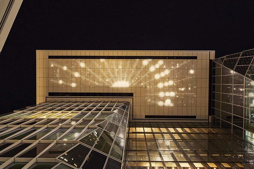
His biggest impact on a building may be his latest. Firmament at OMA’s Toranomon Hills Station Tower (page 94), is an emphatic punctuation mark at the tower’s entrance. Like all of Villareal’s work, it is a site-specific piece that, in this case, underscores the building’s role as a gateway to Tokyo’s recent Toranomon Hills development at one end of the newly reconfigured Shintora-dori Avenue. By dynamically illuminating the underside of OMA’s sky bridge, 132 feet above the ground, day and night, the artwork, which, for Villareal was meant to connect to the sky and cosmos, enchants visitors to the building and its belowground metro station as well as passersby on the street. “We had a proposal to do the top of the building, which was one idea,” says Villareal. “But this building occupied a very special location, so it was intriguing to me to activate the bottom of the sky bridge.”
Inspired by artists such as Diego Rivera, Villareal likens the 126-foot-long, L-shaped panel to a mural, the kind that, like Rivera’s, adorn historic buildings. Only here, the reflection of the piece in the tower’s glass skin creates a doubling effect of the constantly moving light show.

PHOTOGRAPHY: © INKI KANG
To some, the 6,000 LED nodes within Firmament may seem to react to the people walking beneath it, but the artwork does not contain sensors. “I did do some interactive pieces early on,” recalls Villareal, “but I found it difficult to create a satisfying experience like that.”
Instead, after spending several nights on-site observing the mixed-use tower, its many spaces, and how people move around it, Villareal created different visual sequences. These are displayed in a random order and for a random amount of time. Layers of sequences are dynamically combined so that observers are not seeing the same thing over and over. “It’s not a loop,” says Villareal. “I’m really shuffling the deck.”

PHOTOGRAPHY: © INKI KANG
To distinguish the quality of the light in this piece from the ambient light, Villareal used a 4000 Kelvin color temperature. The resolution of the graphics is relatively low compared to some of Villareal’s other more recent work. “I like how pared down it is and how it evokes something like an early kind of video game, which probably resonates in Japan,” says the artist. Using customized tools and working with products from Color Kinetics, the artwork incorporates LED nodes, power supplies, network switches, and computers, and is meant to be a permanent fixture on the building. “We have the ability to do some debugging remotely if we need to, but fortunately we haven’t had any issues, and the software we create is very robust.”
Villareal has described his pieces as digital campfires, bringing people together to observe a phenomenon. “The public nature of the work—that it’s available and free to everyone—is very important to me.”
Mori JP Tower
Pelli Clarke & Partners
L’OBSERVATOIRE INTERNATIONAL
BY LEOPOLDO VILLARDI
A stone’s throw from Toranomon Hills Station Tower (page 100) in Minato-ku, the ward in Tokyo that plays host to a suite of international company headquarters and national embassies, the Pelli Clarke & Partners–designed Mori JP Tower elegantly ascends to new heights—literally. At 1,083 feet, the building is the tallest skyscraper in Japan (only two communications structures surpass it in height) and represents the pinnacle of a 30-year relationship between architect and client, Mori Building.

PHOTOGRAPHY: © JASON O’REAR
Four vertical channels break up the skyscraper’s volume. Downlights wash columns and walls.
Mori JP Tower forms the centerpiece of a mixed-use, three-tower urban village called Azabudai Hills, master-planned by PC&P but with smaller-scale architectural contributions by Thomas Heatherwick and Sou Fujimoto, among others.
Measuring 267 feet square at its thickest—wider than a Manhattan block—Mori JP Tower would have appeared staggeringly stout without the help of a few design moves with big impact, reinforced in the evening by L’Observatoire International’s lighting scheme. The bulky height-to-width ratio prompted the introduction of a vertical channel down the middle of each face, rendering the otherwise singular tower into a bundle of four narrower volumes. The tower softly billows, like entasis, tapering at the base and toward its petal-like crown. Rounded corners add to the visual trickery at play, as does highly transparent low-iron glass, which gives the tower a silvery cast akin to a Mikimoto pearl, says Fred Clarke, partner at PC&P. “It has a commanding but still quiet presence.”

PHOTOGRAPHY: © JASON O’REAR
But, as L’Observatoire founder Hervé Descottes notes, “our cities live at night.” Tokyo is incredibly bright, he adds, while also pointing out that very few towers have lit crowns. “It’s important that they connect with people and serve as locators.”
Although 48 floors of Mori JP Tower were planned as leasable office space, the top 10 levels house Aman Resorts–branded residences. To ensure that the apex would glow without affecting these units, programmable LEDs were installed inside the glass-clad spandrels between floors. Concealed LEDs also illuminate the vertical channels, reinforcing the quadripartite expression of the facade at night but with an important twist: these bands of light dim toward the ground, creating a sense that the four wedges are opening—like a flower bud beginning to blossom. The lighting scheme at the crown may seem understated when compared to the intense brightness of nearby landmarks, such as Tokyo Tower, but it establishes a rare identifiable symbol in Minato-ku.

PHOTOGRAPHY: © JASON O’REAR
At the ground level, a louvered streetside plinth echoes the scale of the surrounding context. Uplights, integrated into every fifth fin, illuminate the undersides, while downlights wash other surfaces—a rounded-glass corner entrance filled with plants, or massive sloped columns near the office entrance—to dramatic effect.
“We see tall buildings as the intermediary between heaven and earth,” Clarke adds. “That’s what César Pelli always used to say.” Record-setting achievement notwithstanding, Mori JP Tower cuts an elegant, if still weighty, figure across the Tokyo skyline—day or night.
Hangzhou Century Center
SOM
TORYO International Lighting Design Center
BY MATTHEW MARANI
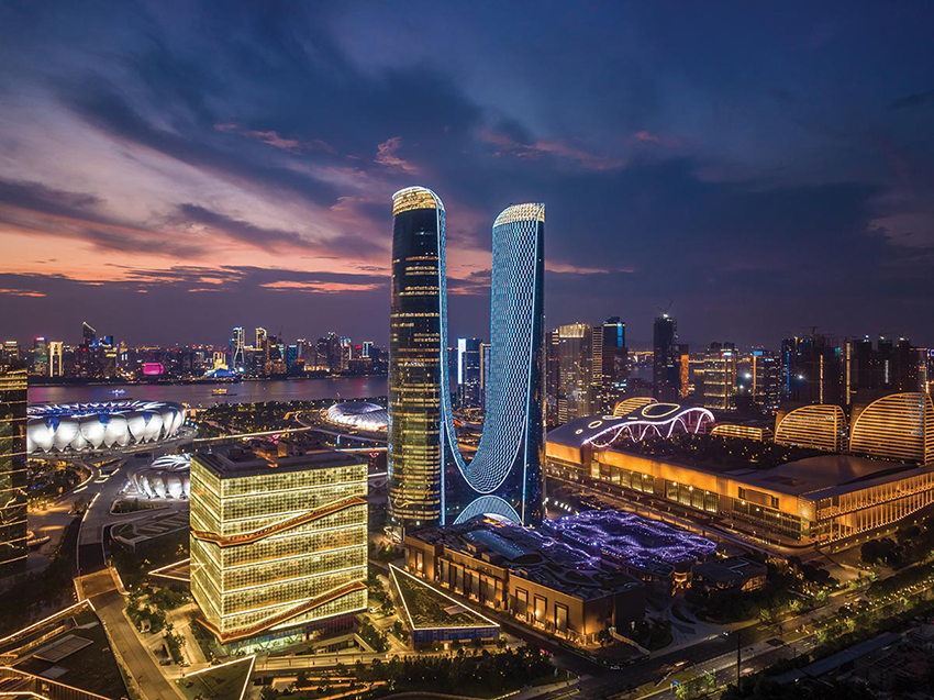
The city of Hangzhou, the capital of Zhejiang province, sits at the mouth of China’s Qiantang River, and, like other metropolises across the country, it has undergone exponential population growth over the last several decades, now at some 11 million residents. Having risen from approximately 600,000 in 1950, it developed along the way a panoply of skyscrapers, as well as a campus of parks and stadiums to support last year’s Asian Games. The Hangzhou Century Center, designed by SOM for developer Greenland Holdings, is one such project that—as a two-towered 1,000-foot-tall structure connected by a sweeping midsection—demands attention, especially with a spectacular lighting array that emblazons its sinuous form against the night sky.

PHOTOGRAPHY: © HANGZHOU GREENLAND
The tower is a visual landmark for the urban district.
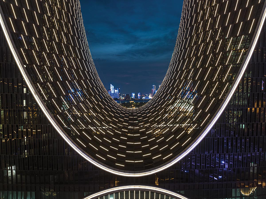
The Center, which contains offices, a hotel, and residences, is a linchpin for Qianjing Century City, a new nine-square-mile mixed-use district that incorporates the Asian Games sports infrastructure. Clad with a diaphanous glass veil that is suspended over the unitized glass curtain wall at the tower base and then merges into the fully enclosed facade as it arches upward, the supertall acts as a metaphorical and physical curtain opening to that urban scene. This outward-facing role is strengthened by the publicly accessible skybridge linking the two towers near their bases and by the more than 6,000 color-changing LEDs integrated into the glazing system on the internal face of the tower elevations.

PHOTOGRAPHY: © HANGZHOU GREENLAND
The LEDs follow the tower form.
“Many of the most interesting buildings in the world can be encapsulated in two or three lines or movements. So, in this case, it is primarily those two curves,” says SOM associate director and design studio head Mark Nagis. “The idea behind the lighting was to do everything we could to reinforce those design aspects.”
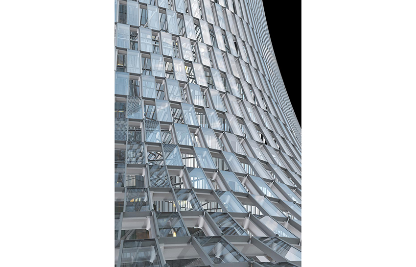
That accomplishment was no small feat for a project of this scale. The glass overlay is fritted and arranged in a running-bond pattern; at the midsection, alternating modules remain open to the elements to act as both apertures and protective covers for the exterior space of the bridge below. The lighting scheme follows the building contours, being embedded within the curtain wall at the outward surface of each mullion, and runs vertically for some 15 miles across the facade. At the underside of the bridge, the design team opted for flat, triangular metal-panel cladding that follows the doubly curved surface; the gaps between those panels are fitted with additional LEDs. All the lights can be set to any color on the WRGB spectrum—literally millions of options—and they are currently programmed to change every minute, though that speed can be ramped up to 24 refreshes per second.

PHOTOGRAPHY: © HANGZHOU GREENLAND
The glazing is a screen for the bridge, then merges into the curtain wall.
SOM collaborated with Beijing-based lighting consultant TORYO International Lighting Design Center for the scheme and with Arup as the facade consultant. Both were critical in determining the feasibility of different design iterations, such as placing a field of individual LED dots at the intersections of spandrels and mullions. SOM’s in-house structural and mechanical engineers also helped guide decision-making. The sum of all those parts is an eye-catching edifice that successfully beckons residents and tourists to the banks of the Qiantang River and the heart of Hangzhou.
Credits
Architect: SOM
Architect of Record: Ecadi
Lighting Designer: TORYO International Design Center
Consultants: D+H (landscape); Arup (facade)
Client: Greenland Holdings
Size: 5.7 million square feet
Cost: withheld
Completion date: February 2023
Sources
Glazing: Taiwan Glass
Curtain Wall: YASHA
Lighting: Webb Deco (LED fixtures); CREE (LED chips)
