Tall Buildings
Believe it or not, there is no universally accepted definition of a tall building
Sponsored by Architectural Record | By Katharine Logan, Suzanne Stephens, Joann Gonchar, John Knuteson, Russell Fortmeyer
View course on architecturalrecord.com »
Believe it or not, there is no universally accepted definition of a tall building. The experts don’t agree on a minimum height to qualify. On the following pages, RECORD has embraced this ambiguity with projects that include a 36-story residential building in St. Louis with a fan-like facade as well as a 1,148-foot-tall office tower in Shenzhen, China, and its muscular bracing system. But, despite the range, all the buildings share an interest in inventive form, ingenuity in structure, and engagement of context. Reading about them and taking the online quiz earns one hour of continuing-education credit.
PHOTOGRAPHY: © Ema Peter
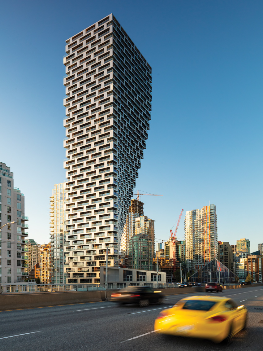
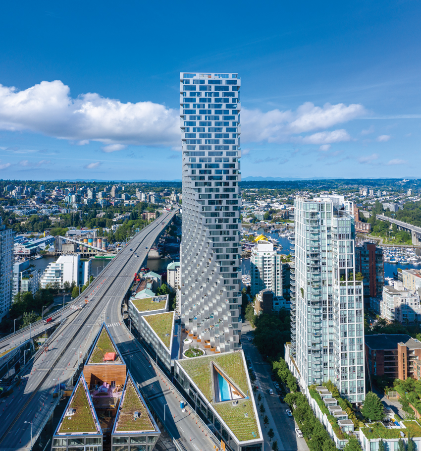
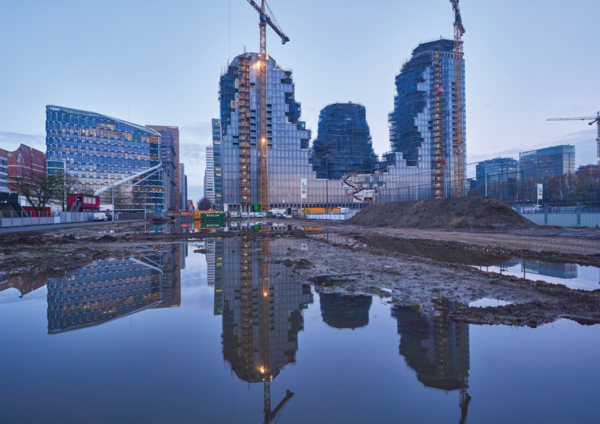
Vancouver House, British Columbia Bjarke Ingels Group
Downtown Vancouver’s location on a small peninsula on the Pacific coast comes with all-natural non-negotiable boundaries to urban growth. Combined with the public priorities of view corridors to the North Shore Mountains and a pedestrian scale at street level, these constraints have given rise to a distinctive form of urbanism. “Vancouverism” (an internationally recognized term in planning circles) refers both to the integration of dense mixed-use development with accessible natural amenities and to the city’s characteristic building type: the point tower on a retail or townhouse podium.
Photos © Ema Peter
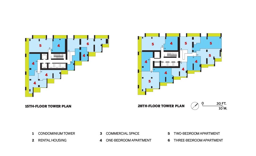
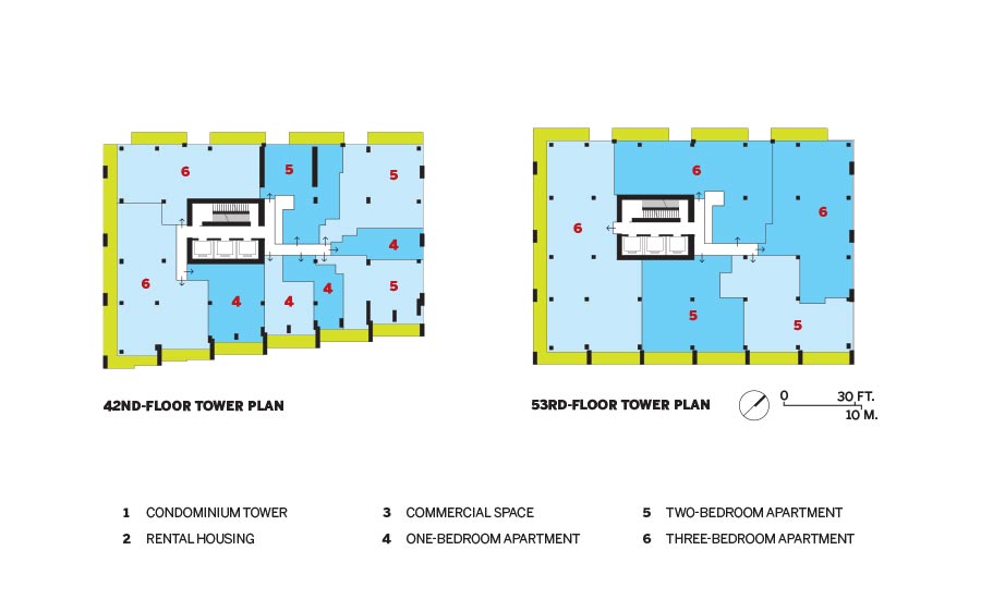
THE APPROACHES to Granville Street Bridge cut through the Vancouver House site (top). The tower’s incremental setbacks give the east facade (bottom) a pixilated appearance.
Highly successful as a model for urban livability, the typology from an architectural perspective is now arguably formulaic. Vancouver House—a 515-foot, 53-story mixed-use development designed by Bjarke Ingels Group (BIG) and completed in 2020 (it sold out in 2014)—reinterprets the tower on a podium in response to a uniquely challenging site. “We thought maybe there was a way to inject new life into the building type,” says Bjarke Ingels, “for the tower to escape the typology of the extruded universal plan in favor of one that reproportions as it grows.”
Located at the foot of the eight-lane Granville Street Bridge, one of three main gateways to the city center, the site is trisected by the fork of the bridge’s elevated ramps. A mandatory 98-foot setback from the traffic pares even the largest parcel down to a triangular footprint that’s too small for the money to work. “Those difficult places are really the ones that have the greatest potential to force creativity and invention,” says Ingels. In a solution negotiated with the city, the design interprets the setback requirement not straight-up, but as a radius. As the stainless-steel-and-glass-clad tower clears the redefined setback, pixel-like units begin corbeling from the hypotenuse of the triangle until the plan becomes orthogonal, doubling the floor area of the upper levels.
Photo © Ema Peter
A spinning chandelier by local artist Rodney Graham activates the space under the elevated roadway.
From some vantage points, the resulting form presents as a slender rectangle, from others as a curtain drawing aside to open the way out of the city, and from others, suggests Ingels, “it looks almost like a genie coming out of a bottle.”
A genie, however, is not inherently structurally stable. “The overturning due to self-weight is as much as that from an earthquake, and Vancouver is prone to large ones,” says Derrick Roorda, a principal in the San Francisco office of Buro Happold, structural engineer for the project with Vancouver-based Glotman Simpson. Post-tensioned high-strength steel cables inside the 2- to 3-foot-thick walls of the reinforced-concrete building’s core hold down the side opposite to the cantilever. They also keep the concrete under compression, preventing it from cracking, and thus significantly reducing the walls’ potential to deflect.
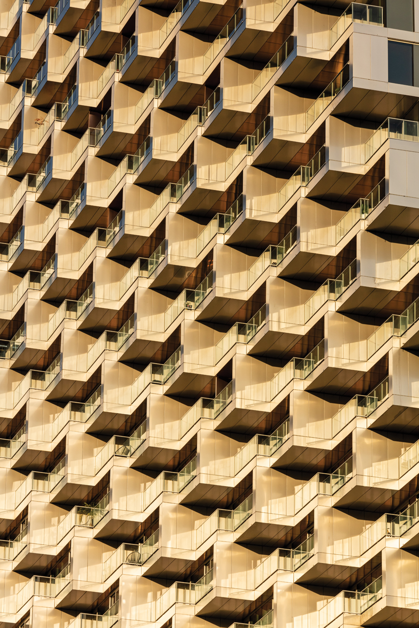
Each facade of the tower is different: the north and east because of the incremental cantilever, and the south and west in response to solar conditions. South-facing loggias and west-facing balconies are boxed with thick frames for shade and privacy; and where the facade elements of neighboring towers are mostly light and delicate, the scale of Vancouver House’s facade pattern holds up to that of the bridge and its steel-truss substructure and constant flow of traffic. In fact, the proportions of solid and void in the building’s elevations resemble those in some of the struts helping to keep the roadway aloft.
Photos © Ema Peter
The lobby includes copper-clad walls (top). The material is echoed in the kitchen backsplashes and the copper-toned balcony soffits (bottom). The kitchen island resembles the tower’s profile, but turned 90 degrees.
The tower’s distinctive silhouette and prominent site have made it the focus of public attention, but the project’s great surprise is the urban contribution made by the angular six-story “podium” buildings that are part of the complex. Three glassy prisms inserted between the tines of the bridge’s fork comprise residential rental units, commercial space that has been leased to a private university, and street-level retail. Formally, the wedge-shaped buildings respond to the constraints of the raised roadway, the need to get light to the public spaces beneath it, the sloping topography, and the dense and intense urban context.
For the streets between the lower levels of these buildings, the bridge with its monumental concrete bents and piers forms a sheltering hypostyle. The buildings’ upper levels create a street wall for the elevated ramps, domesticating them and defining a threshold to the downtown. Green roofs tilting toward the traffic offer a moment of refreshment for people driving past. Carved out of the buildings’ cores, multi-level, wood-lined courtyards—accessible to occupants and, potentially, the public—provide sheltered outdoor space. Those courts, and the steps and paths that thread through them, introduce an almost European, village-scale experience, completing the project’s span of scales from urban to intimate.
Ingels describes the solution for the tower as a hole in one, a simple meeting of requirements; the lower buildings, by contrast, represent most of the detailed design work. “Even though I knew that 80 percent of the effort had gone into this realm between the bridges,” he says, “I was happily surprised at what a Euclidean, Piranesian, three-dimensional urban space it has actually become.”
With a Twist?
RECORD asked BIG’s Bjarke Ingels how Vancouver House relates to the firm’s other towers, such as Telus Sky in Calgary, the fraternal-twin towers of the Grove at Grand Bay in Miami, and the dancing pair at The XI in New York, which all appear to twist as they rise.
Bjarke Ingels: First of all, neither Vancouver House nor Telus Sky is twisting, actually. I would say that the correct term for Vancouver House would be expanding—expanding from a triangular floor plan to a rectangle, which gives rise to the illusion or perception that the tower is twisting.
Similarly, or almost inversely, Telus Sky has a different prerequisite, in that the bottom half of the tower is work spaces. For work space, you want a floor plate that is as large as possible, but once the program transitions to living space, you want a shallower floor depth.
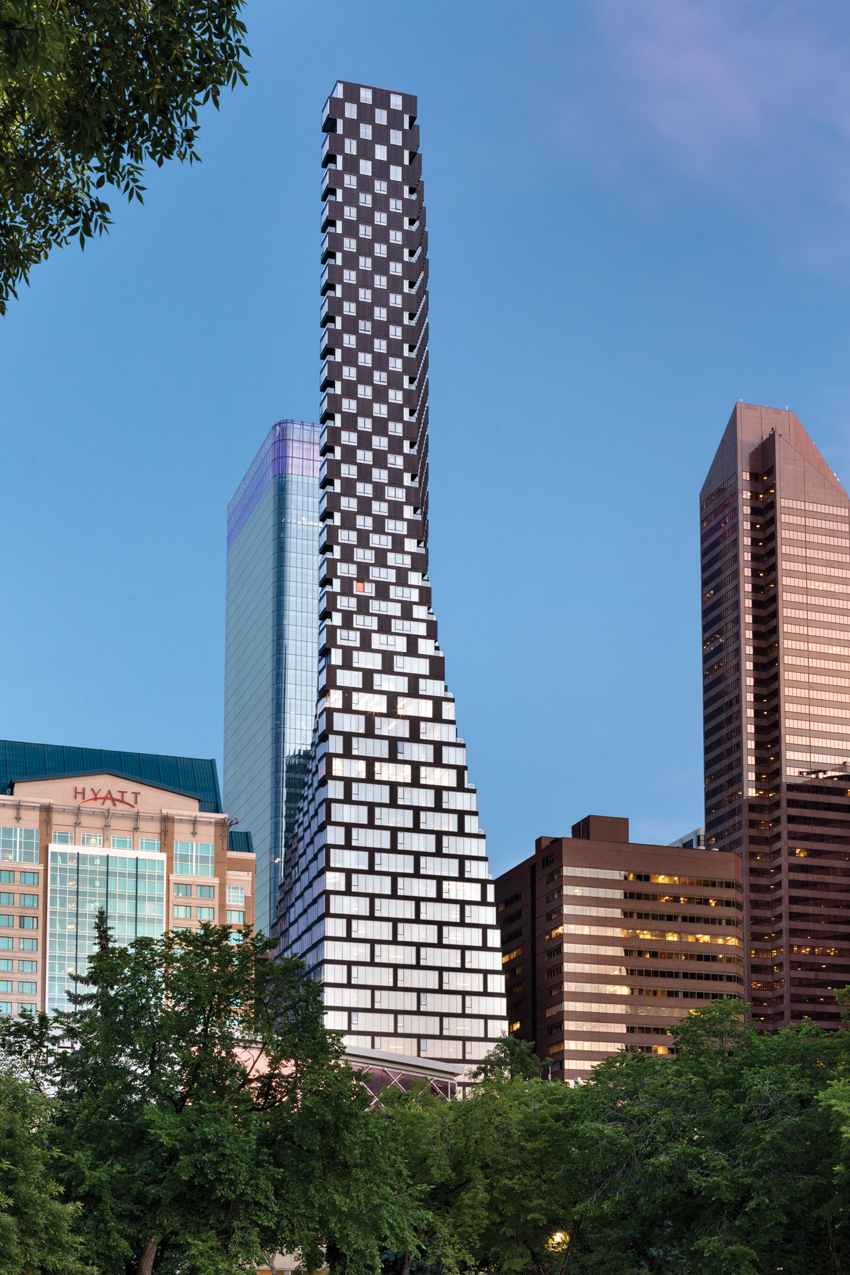
Photo © Ema Peter
Telus Sky, Calgary
In the Grove, there is an actual twist going on. The pair of towers are facing front and back on the lower levels, and then they turn as they rise to become side by side on the higher levels, reorienting the apartments toward the more desirable views of downtown Miami and the bay.
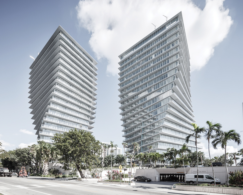
Photo courtesy of Rasmus Hjortshøj
The Grove at Grand Bay, Miami
Lastly, in New York, the two towers of The XI are reproportioning. On the lower levels, where you are surrounded by the urban context of Chelsea and the Meatpacking District, the river-facing tower is opening up a framed view toward the river for the High Line tower. And then, once they clear the rooftops of the neighboring warehouses, they change in proportion so that the river-facing tower takes up the entire elevation of the Hudson River, and the High Line–facing tower expands, with large north-facing and south-facing elevations looking uptown and downtown.
What unites all four projects is that they reject the more typical approach in which you choose a single floor plan that you repeat infinitely—or until you’re done with the building. In all four cases we realize that, as you rise up through the city, the demands, the requirements, the concerns, and the considerations for the context and for the neighbors—access to daylight, capturing views, etcetera—change. That means that the best or the right answer at the ground floor may be very different from the best or the right answer in the middle or at the top. That’s why you get these vertical buildings that change, or shift, or grow, or turn as they rise.
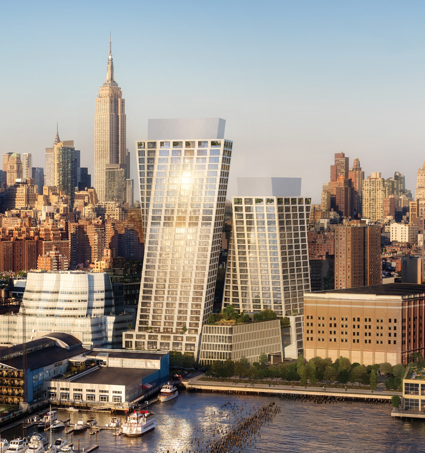
Image © DBOX
The XI, New York
Credits
Architect: Bjarke Ingels Group — Bjarke Ingels, Thomas Christoffersen, Beat Schenk, partners in charge; Agustín Pérez-Torres, project leader; Carl MacDonald, Melissa Bauld, project managers/designers
Architect of Record: DIALOG
General Contractor: ICON West Construction
Consultants: Buro Happold (structure); Glotman Simpson (executive engineer); Nemetz & Associates (electrical); Integral Group (mechanical); Brook Vandalen Group (facades); Morrison Hershfield (envelope); PFS Studio (landscape); HLB Lighting Design (lighting); James KM Cheng Architects (urban design)
Client: Westbank Projects
Size: 650,000 square feet
Cost: $278 million
Completion date: November 2020
Sources
Curtain Wall: Iljin, Glastech
Solid Surfacing: Avonite
Lighting: iGuzzini, Artemide, Ocean Pacific, Lutron
Elevators: TK Elevator, CEI
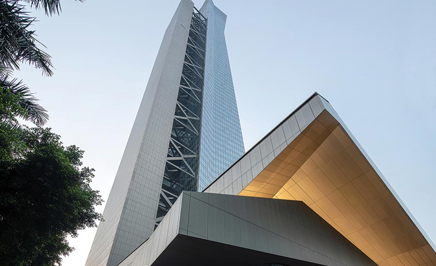
Hanking Center by Morphosis Architects, Shenzhen, China
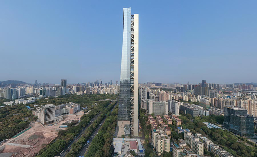
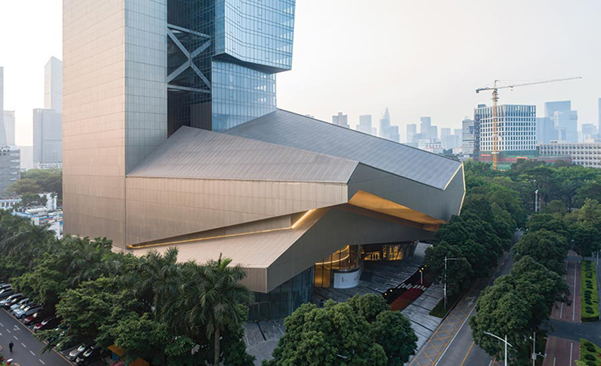
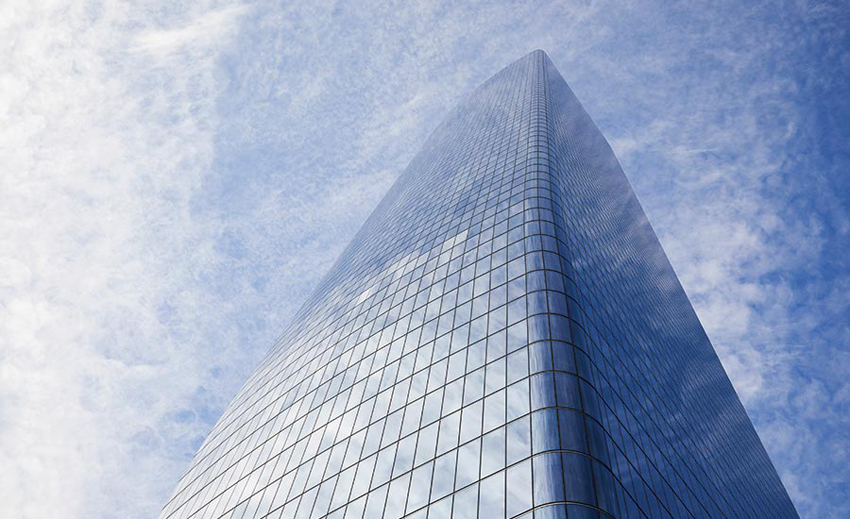
ALTHOUGH Thom Mayne and his firm, Morphosis Architects, have designed several supertall buildings (towers more than 300 meters, or 984 feet high), Hanking Center is the first one to be constructed. The firm’s earlier 985-foot-tall curvilinear Phare Tower, in Paris, of 2010, and its hotel tower for Vals, Switzerland (1,250 feet), designed in 2015, are both, so to speak, 6 feet under. So it’s good to have the 1,148-foot-high Hanking Center office tower in the Nanshan district of west Shenzhen, China, actually realized and currently filling up with office tenants. The office has entered a competitive category where Mayne can nod nicely to KPF (which has four supertalls alone in Shenzhen) and other architects he encounters during invited interviews with prospective global clients.
All PHOTOGRAPHY BY ZHANG CHAO
The entrance to the podium on the west (top) leads to a mix of activities.
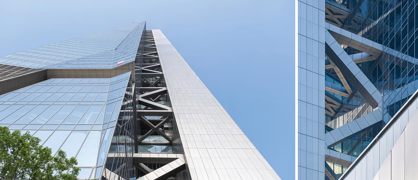
SKINNY IS IN with a vertically bifurcated steel structure that features a low-E double-glazed main tower and an aluminum-clad detached core (above).
In the U.S., the debate continues about the value of creating more supertall buildings, with some construction slowing during the pandemic and uncertainty about the amount of office space that will be needed in major cities in the future. But in other parts of the world, the skyscraper category is vibrant, especially in China, where seven of the 10 tallest buildings currently under construction are located. In addition, “the clients are adventurous,” says Mayne. “The representative for Hanking Center said he loved the lyricism of the scheme, and he would protect us during the process.”
Mayne claims, “We don’t deal in style.” It depends on what you call style. The building has all the muscular show of force characteristic of Morphosis’s best work. The Hanking Center takes a brawny frame of steel and glass and adds an elegance to its silhouette, where the main tower is cleaved from the core. Morphosis designed a mega steel-braced frame structure for a tropical climate where typhoons and earthquakes pose challenges for tall buildings. In working out the design concept with Robert Halvorson Associates of Chicago, the structural engineer, the architects came up with a slender tower coupled with a detached core, in which elevators, services, and mechanical functions are tucked. The engineers, of course, were essential: “We had that covered with Bob Halvorson,” says Mayne.
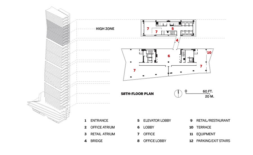
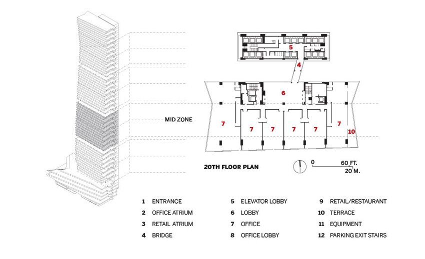
Having a core offset from a tower has a history: Skidmore, Owings & Merrill’s Inland Steel building in Chicago of 1958, although only 332 feet high, moved the elevator core from the center of the floor to the perimeter, to provide a column-free space. Rogers Stirk Harbour did the same with the 738-foot-high Leadenhall Building in London of 2014. Hanking Center is not only taller but even farther detached, with a 35-foot gap between the main tower and its separate core, enabled by a mega brace-frame system that takes care of seismic and wind forces. In plan, Hanking’s office floors are indented on the east and west. In elevation and in section, the main tower tapers as it ascends from larger to smaller floor plates (for boutique offices), while the detached core shoots up straight as a soldier’s spine.
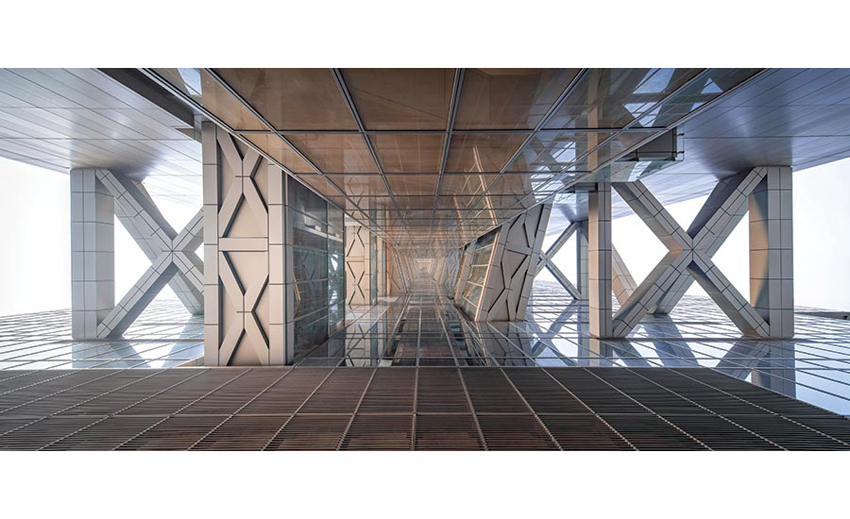
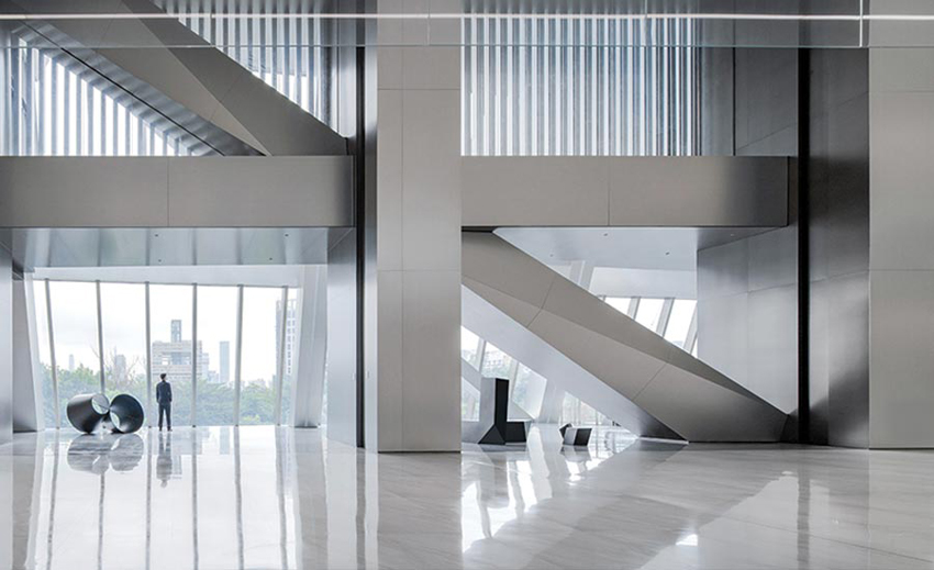
THE GAP between the main tower and the detached core, viewed looking up from a skylight in the podium, shows the drama of the mega–frame bracing (top). The office lobby in the podium looks south over the city (above).
The floors all have 270-degree views east, west, and south; only the vista on the north, where the core connects to the tower, is obstructed. Two smaller, supplementary elevator cores, inserted on the north edge of the main tower, provide additional modes of circulation—which can be useful for the privacy of visiting VIPs.
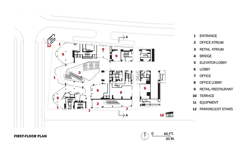
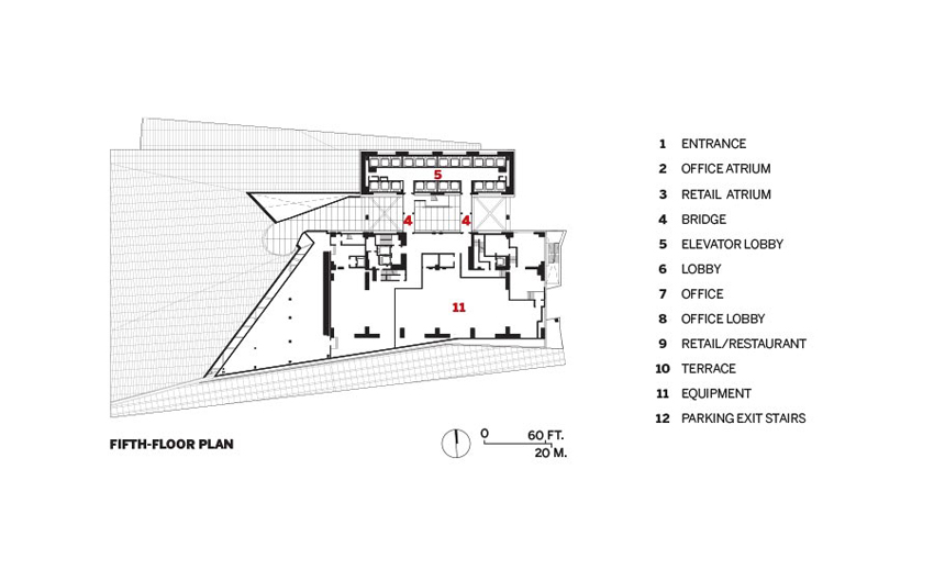
The 60 floors of offices sit on top of a 1,796-square-foot plinth with four-stories above grade and one below, for shops and restaurants. Four additional levels underground contain parking and services. Three “refuge” floors are inserted in the upper tower for fire safety.
While Zhubo Design, the architect of record, had oversight on drawings and building codes, Morphosis’s partner in charge of the project, Eui-Sung Yi, reports that “our firm did its own construction drawings”—highly unusual in China. The project took time: design started in 2012, and the core and shell were constructed by 2018, even if the interior design is ongoing.
Although steel’s ductility helped the tower meet seismic code restrictions, there was also the wind force to consider. Robert Halvorson (now retired, and whose firm has become part of WSP) points out that wind loads in Shenzhen’s location on the South China Sea are severe, with typhoons often raging between May and December, so you need to design for twice the amount of wind load common in Miami or other hurricane areas in the U.S. While concrete and composite structural systems offer twice the lateral stiffness of steel structures, the whole team favored steel for its strength and compactness, despite its being more expensive in China than concrete. The engineers arrived at a compromise—the columns have a concrete center with steel plates enclosing them. This composite solution allowed the columns to be heavier than steel alone, but lighter and slenderer than concrete. “We got approval to call it a ‘steel’ building, even with a steel/composite system for the columns,” says Halvorson. The strategy meant “welding in the field, adding to construction time, but allowed us to abide by a more reasonable lateral-stiffness code requirement and reduce material quantities, column sizes, and costs.”
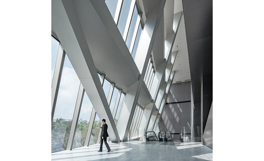
OFFICE LOBBIES on the third and fourth levels of the podium face south (top). The main entrance is on the west (above).
Other design moves helped counter seismic and wind forces. Not only are the main tower and the detached core linked by the pedestrian bridges at every floor, but the team inserted horizontal diaphragms, composed of beams and diagonal bracing, on every fourth level; they act like floor slabs linking the two structures. But—since the main building’s facades are of slightly different lengths, owing to its idiosyncratic geometry—the detailing of these bracing modules was tricky.
The pedestrian bridges linking the two structures, about 10 feet wide and 35 feet long, form an important experiential aspect of the concept. Says Mayne, “You look at the city from various sides—not only in the 270-degree view from the offices, but, when you walk across a bridge to the north, you see more of the city through solid glass. You are connected to the urban environment.” And everyone will traverse the bridges frequently, not just to use the elevators: “We even put the restrooms in the detached core,” he adds.
Since the pandemic has kept the American architects from being on the scene during the final stages of fit-out, they are waiting to see how it all came together when they visit in September, as planned. While some retail had a soft opening in September 2020, most shops and restaurants are expected to debut this fall, bringing life to the public spaces. But the rest of us will have to wait a little longer to assess the success of the bold, adventurous Hanking Center.
Brace Yourself
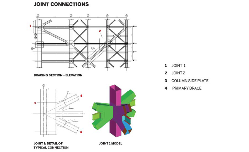
ACCORDING to Patrick Ragan, the project engineer for Halvorson and Partners (now absorbed by WSP) on the Hanking Center, the joints were key. The points of connection for the steel braced-frame structure binding the detached core to the main tower required special attention (above and right). As indicated by the section diagram of the beam/column/bracing joints (far right), which is cut along one of the two primary north–south bracing lines, diagonal steel tubes cross from the entrance facade of the main structure to the back face of the detached service core. In doing so, the bracing engages all the columns and helps resist lateral overturning forces. The detail of a typical connection (right, bottom) shows the intersection between the concrete-filled column, the diagonal steel-box sections, and the wide-flange steel floor beams; it is accompanied (far right, bottom) by the polychromatic isometric drawing from a structural-analysis joint model that highlights the complex geometry of the different plates’ coming together.
Photos © Wu Fei
INDENTATIONS in the main tower are emphasized by its smooth glass skin. The corset-like armature joining it to the detached core does a lot of work in a climate known for its seismic and wind forces.
Credits
Architect: Morphosis Architects — Thom Mayne, principal and design director; Eui-Sung Yi, project principal; Hann-Shiuh Chen, project manager; Jamie Wu, Amit Upadhye, Mario Cipresso, project architects
Architect of Record: Zhubo Design
Engineers: Halvorson and Partners (now WSP) — Robert Halvorson, principal, Patrick Ragan, engineer (structural); John A. Martin (structural concepts); Stantec (m/e/p and facade concepts); Parsons Brinckerhoff (m/e/p/fp)
General Contractor: China Construction Fourth Engineering Division Corp
Consultants: w.erk studio (general tower); RWDI (wind)
Client: Hanking Group
Size: 1.8 million square feet
Cost: withheld
Completion date: 2018 (core and shell); interior ongoing
Sources
Steel: Wuyang Steel; Xingcheng Special Steel Works
Eevator: Hitachi
Paint/Coating: AkzoNobel; Hempel A/S; Jotun; PPG
Ceilings: Compton Metal Ceilings
One Manhattan West by Skidmore, Owings & Merrill, New York
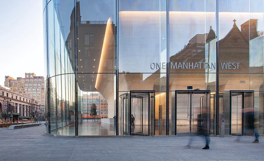
SKYSCRAPERS designed by Skidmore, Owings & Merrill (SOM) don’t show an obvious family resemblance—the venerable firm’s tall buildings are formally diverse. They include Chicago’s Willis Tower (1974), the Miesian office building previously known as the Sears Tower and made up of square “bundled tubes,” and the Burj Khalifa, in Dubai—still the world’s tallest tower 11 years after completion—with its seemingly spiraling pinnacles buttressing its core (RECORD, August 2010). But despite the aesthetic range, SOM buildings do have a common thread of DNA, says Gary Haney, design partner for One Manhattan West, a recently completed 67-story office building on New York’s far West Side.“It is impossible to invent shapes without thinking about structure,” says Haney, now a consulting partner of SOM. “It is part of our ethos.”
PHOTOGRAPHY: FADI ASMAR © SOM, EXCEPT AS NOTED
THE SUBTLE bow and bend of One Manhattan West’s east facade is achieved primarily with flat glass, but also uses some curved panels.
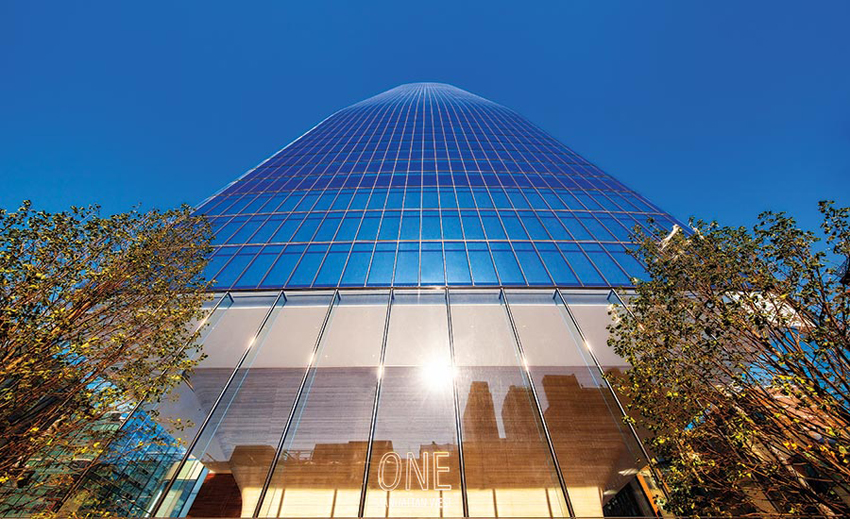
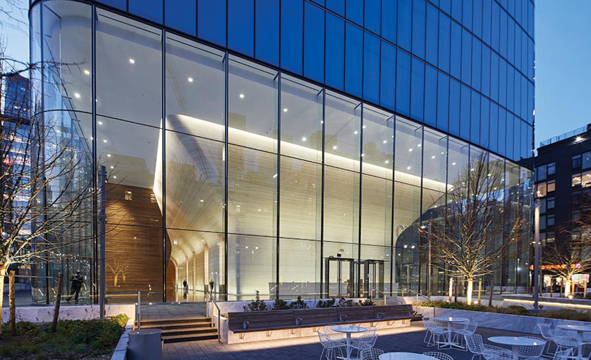
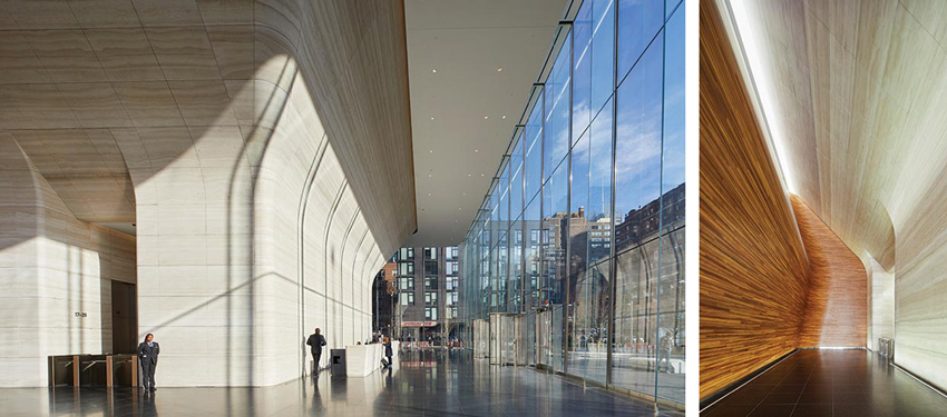
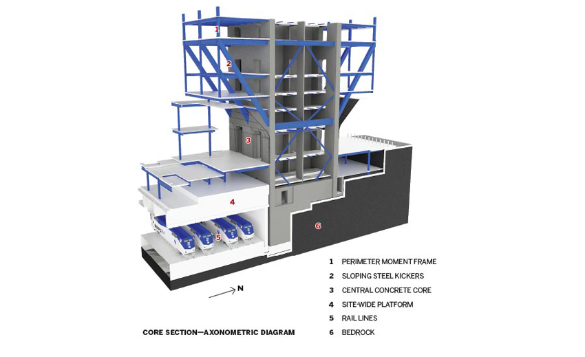
One Manhattan West is definitely the progeny of this philosophy, but just how so is not apparent from afar. On the skyline, the 996-foot-tall tower appears as a straightforward though refined shaft—an extrusion of repeated rectangular floor plates within a taut glass skin. From closer range, its rounded corners come into view, and one can see that its east-facing facade gently bows, and slopes back, creating a profile that subtly tapers toward its crown. However, the SOM genes truly reveal themselves where the building meets the ground. Here there are no perimeter columns. So, even without entering, passersby can look beyond the ultratransparent, mullionless enclosure (supported only with structural glass fins) into the lobby, taking in its main event: a muscular pedestal-shaped element at the center, clad in striated travertine, that gracefully flares outward toward the 45-foot-high ceiling.
The travertine feature is more than a sculptural conceit. Behind the stone (quarried, milled, and installed so that its veins seem continuous, even around corners) is the building’s reinforced-concrete core, with walls up to 4 feet thick, and a robust framework of steel diagonal “kickers,” each 75 feet long. These transfer the loads from the perimeter columns on the floors above through the core and to the foundations. The structural gymnastics are a direct response to the conditions below grade, where there was limited available terra firma on which the tower could touch down. The building sits on foundations representing only about 30 percent of its footprint. “It is as though it is standing on tippy-toes,” says Kim Van Holsbeke, an SOM design director.
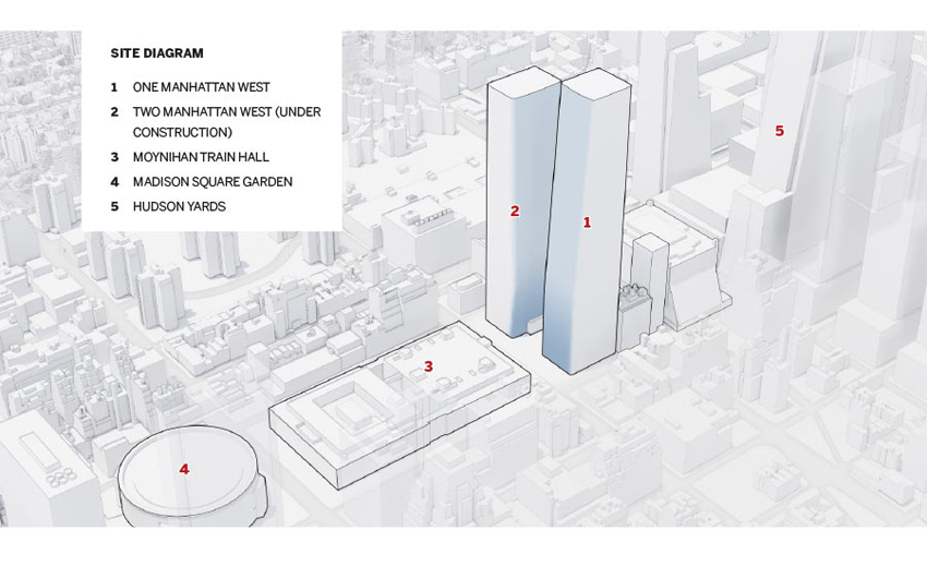
So little bedrock was accessible because the tower, as well as the surrounding eight-acre Manhattan West complex, is built over active passenger rail lines that connect to nearby Pennsylvania Station. The nearly complete $4.5 billion development—which sits between the James A. Farley Post Office recently transformed by SOM into Moynihan Train Hall (RECORD, February 2021) and the mega-development Hudson Yards—encompasses 7 million square feet of office space, apartments, hotel rooms, restaurants, and retail in six buildings, four of which were designed by SOM, which also created the master plan.
PHOTOGRAPHY: LUCAS BLAIR SIMPSON © SOM
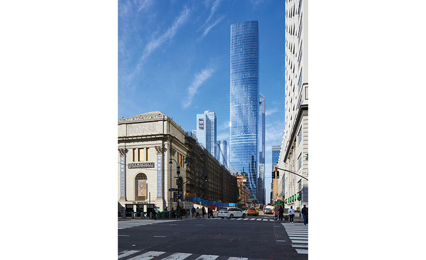
ON THE SKYLINE, the tower appears as a refined shaft.
Developed by Brookfield Properties, Manhattan West has been a long time in coming. Olympia & York, a Brookfield predecessor company, acquired the first parcel of land in 1985. Sabrina Kanner, then just starting her career at Olympia & York and now Brookfield’s executive vice president of development, design, and construction, says she was “just a kid in steel-toed boots” and did not see the potential of what was then primarily a void over the train tracks with some at-grade parcels used mostly for parking. But she now describes the emerging complex as a pedestrian-friendly neighborhood, a “people place.” Toward that end, the developer has decked over Dyer Avenue—a vehicular approach to the Lincoln Tunnel that ran through the site—and, with the landscape firm James Corner Field Operations, created an event plaza and other outdoor spaces. By the end of 2022, the “spur,” a branch of the immensely popular elevated park the High Line, will be extended to meet Manhattan West.
Photos © Fadi Asmar (top), Lucas Blair Simpson © SOM (bottom)
Through the lobby’s transparent glazing, a dramatic travertine enclosure for the building’s robust structure, is evident.
One Manhattan West was conceived as the centerpiece of the new neighborhood, along with Two Manhattan West, a slightly shorter office building at 912 feet tall and 60 floors, still under construction. Like its sibling, the second tower will have a tight glass skin and one tapering and bowing face, but the angled facade will be its north elevation instead of the east one. Together, the pair will mark either side of the events plaza, which sits directly across the street from the new Moynihan Train Hall. The towers make an “ensemble” and are “in dialogue,” says Van Holsbeke.
PHOTOGRAPHY: LUCAS BLAIR SIMPSON © SOM
WITH NO perimeter columns at the ground, the glazing is supported by structural glass fins that nearly disappear (left). A sculptural zebrawood wall separates the retail podium from the lobby (right).
Despite their similarities, Two’s base will be quite different from that of One. Due to the particular arrangement of the tracks under it, the shorter building will have eight perimeter megacolumns at lobby level and a braced central core of steel, only half of which will reach bedrock. Below grade, one-story-tall trusses will redirect the building’s loads to available zones between the tracks, explains Charles Besjak, structural engineering director for SOM. And, as a reflection of its structural configuration at the ground level (and below), the architectural expression of the lobby will be distinct from that of One, with the steel-framed core clad in eucalyptus wood and the megacolumns in stainless steel. “While different, it will be equally dramatic,” promises Haney.
Van Holsbeke says the aim is to make the towers appear almost as though they were milled from blocks of stainless steel, rather than clad in glass. At One, this effect has been achieved with a curtain wall of structural silicone glazing and a combination of flat and curved—but mostly flat—high-performance panels. The insulated glazing units (IGUs) for the building’s rounded corners were “hot bent” in the factory, while the few curved panels necessary to achieve the angle of the east facade, concentrated between floors 4 and 19, were “cold bent” on-site, during erection. The architects used parametric modeling extensively, both to visualize how many flat, faceted IGUs could be used and still achieve the appearance of a smooth and uninterrupted radius, and to understand the cold bending tolerances of the glass and the curtain wall assembly, explains Julia Murphy, an SOM managing director.
IMAGES: LUCAS BLAIR SIMPSON © SOM (TOP); COURTESY BROOKFIELD PROPERTIES (BOTTOM)
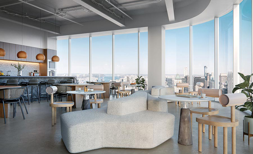
THE TAUT skin is intended to make the building seem as though it were milled from stainless steel (top). The envelope strategy yields office spaces with floor-to-ceiling glazing and, from the upper floors, sweeping views, as shown in a rendering (above).
On the inside, the glazing strategy yields offices with floor-to-ceiling glass, and from the upper levels allows for sweeping views of the city, the Hudson River, and beyond. Coupled with 13-foot 6-inch slab-to-slab heights and a core-to-perimeter depth of about 42 feet, the approach yields daylight-filled, flexible office spaces that have proved appealing to a variety of tenants, including white-shoe law firms, accounting firms, and the National Hockey League. The building is 90 percent leased, while Two, slated for completion in 2023, has secured an anchor tenant for 13 floors, according to Brookfield’s Kanner.
Although pundits are questioning the post-pandemic relevance of the office building, especially now that many companies have shown that remote work can be effective, Kanner is optimistic about the market. She insists that there is no substitute for the creativity that in-person collaboration allows, and maintains that even if employers don’t require a return to the office full-time, workers will still need designated desks.
For the moment, it is unclear how strong the demand for office space in New York (and other urban centers) will be as restrictions ease. It is uncertain if and when tourists and workers will return and how soon the environment that Kanner describes, with people dining at the complex’s restaurants, shopping in its retail outlets, and meandering through its outdoor spaces, might materialize. But, whatever the future, One Manhattan West’s structural acrobatics and subtle curves make it an elegant addition to the city’s far West Side.
Credits
ARCHITECT: Skidmore, Owings & Merrill — Gary Haney, design partner; Kenneth A. Lewis, T.J. Gottesdiener, managing partners; Kim Van Holsbeke, design director; Julia Murphy, managing director; Charles Besjak, Preetam Biswas, structural engineering directors; John Hollenberg, Joseph Chase, associate directors
ENGINEERS: Skidmore, Owings & Merrill (structure); Jaros, Baum & Bolles (m/e/p); Philip Habib and Associates (civil); Mueser Rutledge Consulting Engineers (geotechnical)
CONSULTANTS: James Corner Field Operations (landscape); Speirs + Major (lighting); Brandston Partnership (crown lighting); Vidaris (energy and enclosure); AKRF, WCD Group (environmental); DVS (security); Thornton Tomasetti (threat analysis); Cerami & Associates (acoustics)
GENERAL CONTRACTOR: Tishman Construction
CLIENT: Brookfield Properties
SIZE: 2.1 million square feet
COST: $1 billion
COMPLETION DATE: October 2019
Sources
GLAZING AGC Interpane, Tvitec, Cricursa
CURTAIN WALL Benson Industries
STOREFRONT: Sedak, W&W Glass
ENTRANCES: Blumcraft
LOCKSETS: Schlage
TRAVERTINE: Travertini Paradiso
GRANITE PAVERS: Polycor
ZEBRAWOOD PANELS: ADF Designs
LOBBY LIGHTING: Zumtobel Group, Cooper Lighting, acdc
CROWN LIGHTING: Traxon Technologies
ELEVATORS: Schindler Group
One Hundred by Studio Gang, St. Louis
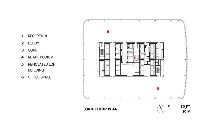
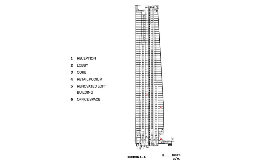
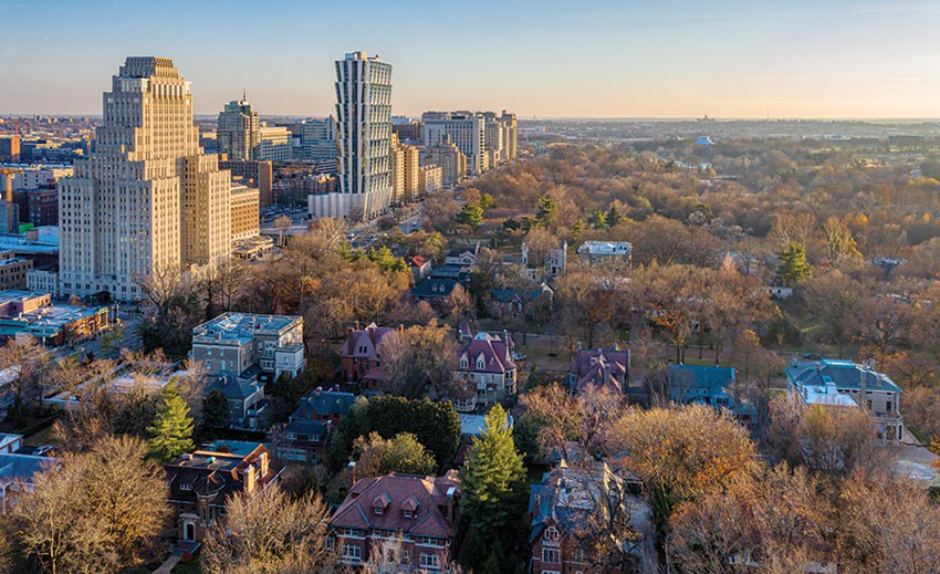
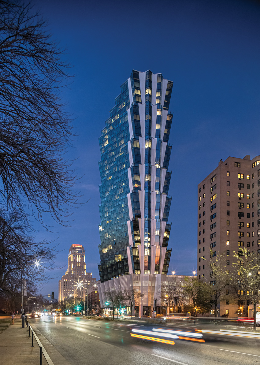
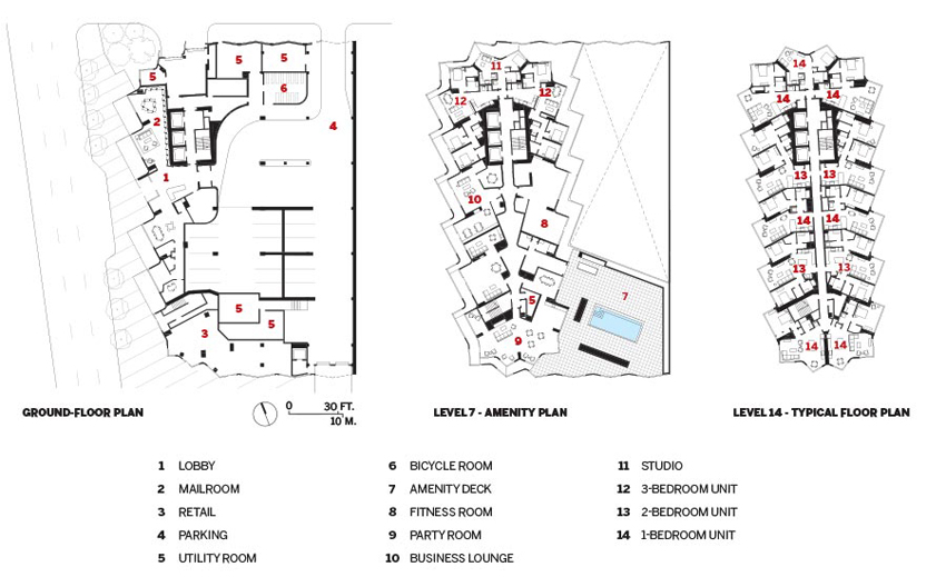
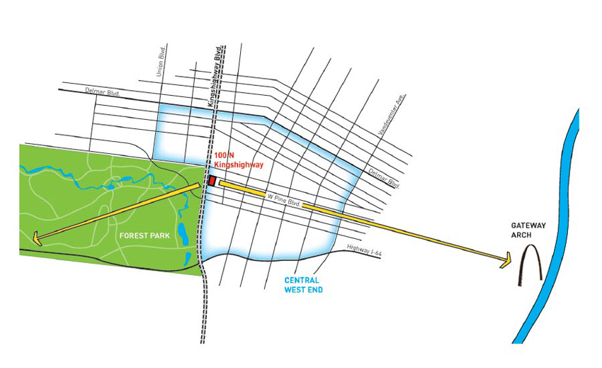
Forest park has been the 1,300-acre centerpiece of St. Louis for nearly 150 years: it hosted the 1904 World’s Fair and is home to many of the city’s beloved museums, gardens, and historical structures. Today, a new building punctuates the northeast corner of the park. Completed last fall, Studio Gang’s One Hundred is the firm’s first project in St. Louis. The tower houses 316 residential units ranging from studios to three-bedrooms and rises 36 levels above the Central West End neighborhood. Located near mansion-lined Lindell Boulevard at an intersection of a main artery, North Kingshighway, the building takes advantage of some of St. Louis’s finest views. To the west, it overlooks the rolling green space of Forest Park, while to the east, the building sits almost directly on axis with the Gateway Arch and downtown St. Louis.
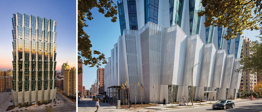
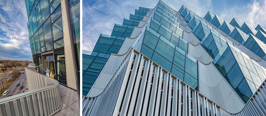
Photo © Sam Fentress (left); PHOTOGRAPHY: © TOM HARRIS (right)
The building springs up in four- to five-floor tiers (left). Its base features a striated screen of aluminum Z-channels (right).
A bustling district, with a vibrant streetscape of shops and restaurants, the Central West End was one of the neighborhoods that suffered least from the impact of urban decay that afflicted the city in the mid- to late 20th century. Vestiges of the neighborhood’s historic grandeur are speckled throughout the area, such as the Art-Deco Chase Park Plaza hotel and apartments. Until One Hundred surpassed that building by eight floors, the 28-story Park Plaza tower was the most prominent landmark in the area. For the design team, it was important for One Hundred to engage with this context. According to Studio Gang design principal and partner Juliane Wolf, “We wanted to create a massing that continues the street wall of Kingshighway and finds its place within the other tall buildings—Chase Park Plaza and Barnes Jewish Hospital—that define that edge.” The building also adds roughly 95 linear feet of retail frontage at street level, with the first tenant, a Pilates Lab, set to open in May.
The most striking feature of the new building is its distinctive shape. Above a horizontal podium consisting of the ground floor, parking levels, and an amenities level, the tower rises in a series of four- or five-floor tiers, each splaying upward in a pattern of oblique angles. One Hundred is the latest in a trio of ground-up projects that Studio Gang has completed with Chicago developer Mac Properties, each with successively more complex exterior skins that address conditions of natural light and solar heat gain. Studio Gang’s earlier projects with Mac Properties, City Hyde Park and Solstice on the Park, both in Chicago, foreshadowed the formal decisions made at One Hundred. But while those two buildings manipulated the skin solely in the horizontal or vertical axis, respectively, the faceted facade of One Hundred contorts in both directions, maximizing views and daylight.

PHOTOGRAPHY BY SAM FENTRESS
ONE HUNDRED is part of the street wall along the eastern edge of Forest Park, whose north side is lined with century-old mansions top). Rotated unit layouts create dynamic living spaces with views in multiple directions (above).
The splaying of the exterior wall was born from the desire to connect residents with the outdoors. Among the client’s initial goals for the project was for a quarter of the units to have exterior space. By pushing the envelope outward, the “roof” of each tier becomes a terrace for the first floor of the tier above. The outward thrust comes with a trade-off: the units at the top of each tier have more enclosed space, while units at the bottom are smaller but offer private terraces. The curtain wall’s slant also improves thermal performance: it reduces solar heat gain in the summer, when sun angles are steeper, but permits lower winter rays. This geometry was not without its challenges: the building required a structural strategy to support the cantilevering floors of each tier. To achieve this, the concrete structure is braced by a vertical core within the northern portion of the floorplate. At the perimeter, the columns align vertically throughout the building but are adapted into a wedge-shaped profile that transfers the load of each additional floor.
The shape of the floor plate was inspired by the plant life of Forest Park: the plan resembles the outline of a leaf, with jagged edges symmetrical around a central north–south spine. The corridor forms a central axis, and each unit rotates south about the spine, maintaining a 90-degree glazed corner at each living room. This essentially makes each apartment a “corner unit” with multidirectional views. Studio Gang took particular care to ensure that there is a direct view to the exterior from the entrance to each unit, adding to a feeling of openness in the nonorthogonal layouts.
PHOTOGRAPHY BY SAM FENTRESS
THE SPLAYING form creates units with private terraces (top). The crownlike tower is a new neighborhood landmark, surpassing the 28-story Chase Park Plaza just north of it (above).
The subtle rotation of the units results in a building that appears to be different from virtually every angle. The materiality of the exterior skin plays a critical role in this respect. The facade alternates between regions of transparent curtain wall glazing and corrugated anodized-aluminum rainscreen panels. According to the design team, the material decisions were inspired by the stainless steel of the Gateway Arch and the way it reflects its environment. This textured expression, as opposed to the minimal appearance often associated with curtain wall construction, feels appropriate in the historic brick-and-masonry character of its context. The facade is wonderfully dynamic, particularly as seen from Forest Park, where the tower has a strong visual presence. The pattern of transparent curtain wall and aluminum rainscreen enhances the experience of the building “in-the-round.” From the north, the aluminum shards dominate while, from the south, the curtain wall makes the building appear more open and transparent. The material expression is consistent from base to top; at the podium, the anodized aluminum panels become a striated screen of vertical Z-channels, allowing for natural ventilation at the parking levels and contributing to the project’s sustainability program.
One Hundred is full of inflections: between downtown and Forest Park, between the city’s past and its future. It serves as a bold new landmark for the Central West End that still subtly responds to the context through its massing, geometry, and materiality. The tower adds to the rich and layered history of its neighborhood while embodying an optimistic outlook for the city of St. Louis.
John Knuteson is a practicing architect and educator based in St. Louis.
Credits
ARCHITECT: Studio Gang — Jeanne Gang, founding principal and partner; Mark Schendel, managing principal and partner; Juliane Wolf, design principal and partner; Margaret Cavenagh, design principal; William Emmick, principal of design management; Jason Flores, senior project leader; John Dolci, senior project leader; Aurelien Tsemo, design management director
ENGINEERS: Magnusson Klemencic Associates (structural); dbHMS (m/e/p); Charles E. Jarrell Contracting Co (mechanical); Sachs Electric (electrical)
CONSULTANTS: Studio NYL (facade); MorLights (lighting); WGI (parking)
GENERAL CONTRACTOR: Clayco
CLIENT: Mac Properties
SIZE: 517,000 square feet (excluding parking)
COST: withheld
COMPLETION DATE: November 2020
Sources
METAL PANELS: Morin
CURTAIN WALL: Ventana Design-Build Systems
GLASS: Tianjin SYP Engineering Glass Co
ENTRANCES: Ventana Design-Build Systems, YKKAP, CMI Architectural
WOOD DOORS: Jeld-Wen hardware: Hager, C.R. Laurence
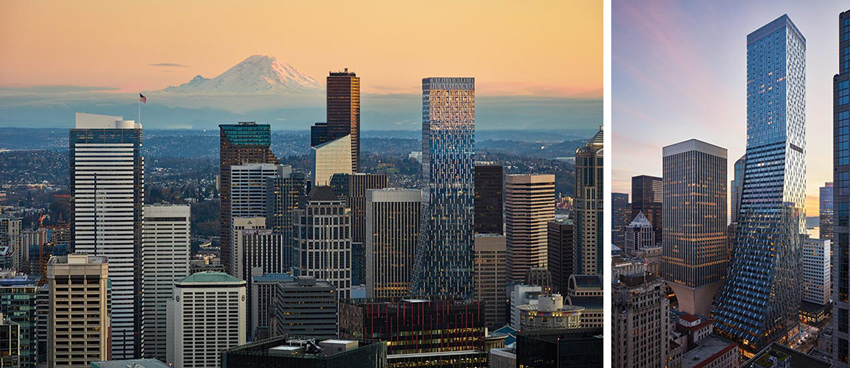
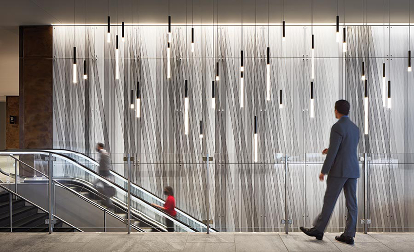
Rainier Square by NBBJ, Seattle
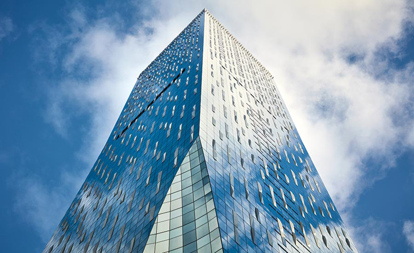
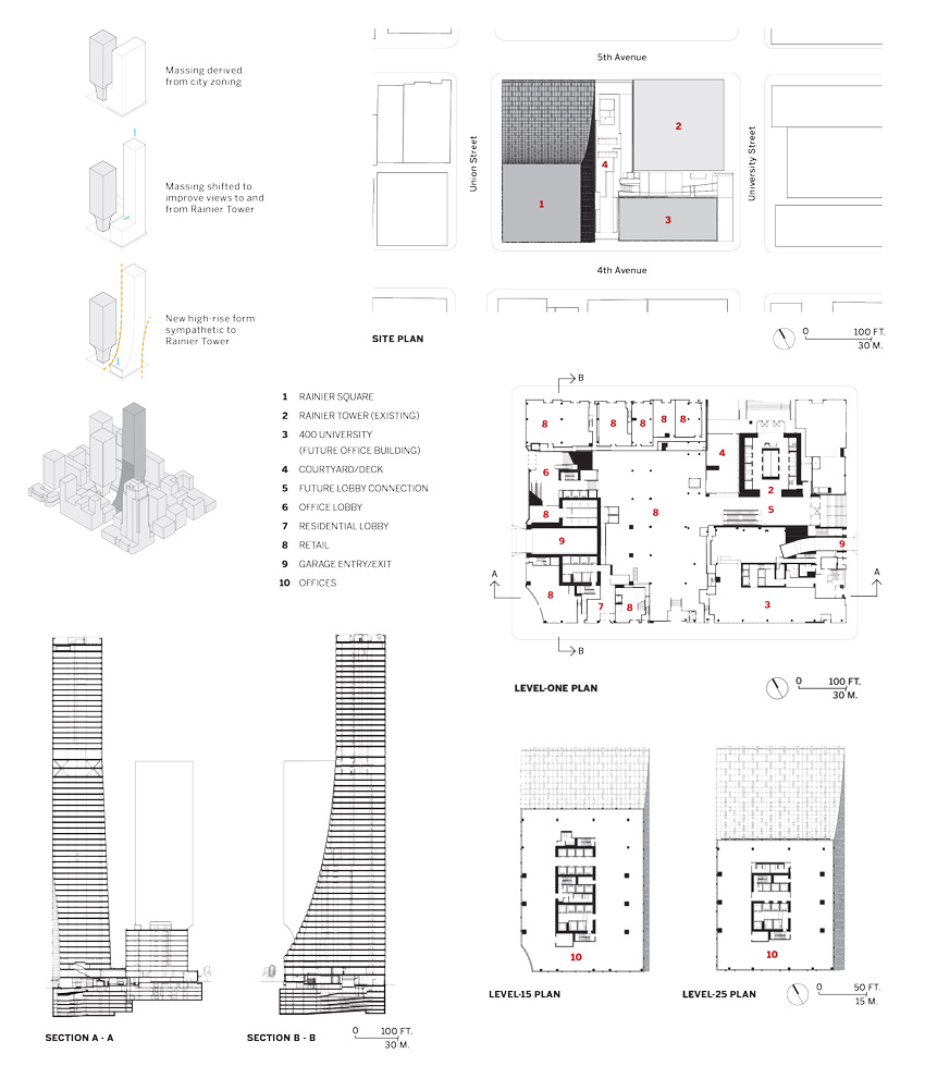
Humility is not a word often associated with skyscrapers, but scale need not override context in architecture. When the site is a downtown Seattle block anchored on one corner by Minoru Yamasaki’s Rainier Tower—a beloved local icon with a white, flared concave base supporting 41 stories—context is everything. Even Yamasaki, a native of Seattle, approached the design for his 1977 building in response to his own earlier work, diagonally opposite Rainier Tower, for the 1964 IBM Building, a 20-story high-rise generally considered the precursor to his 1973 World Trade Center in New York.
ALL PHOTOGRAPHY BY MORIS MORENO
THE CARVED base of Minoru Yamasaki’s Rainier Tower informed Rainier Square’s gentle slope.
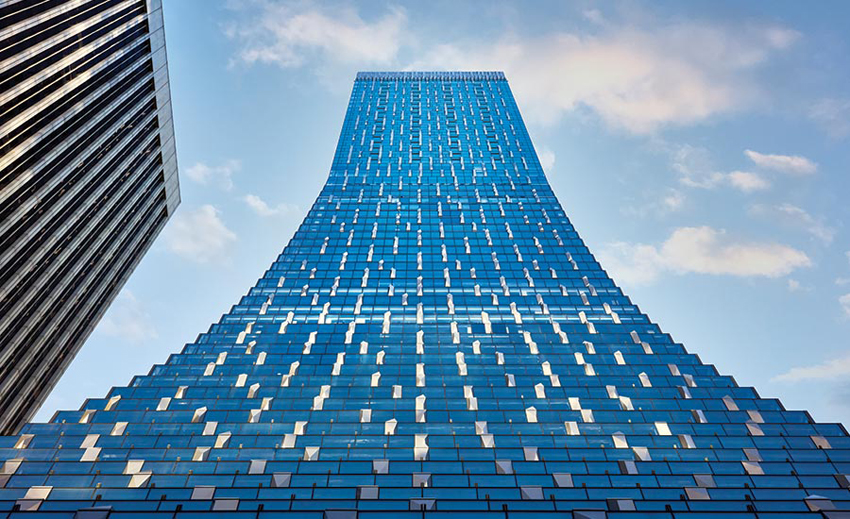
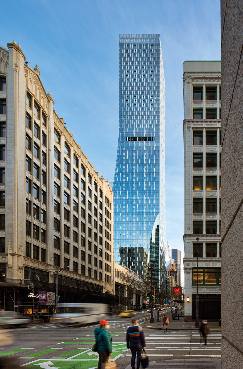
Adding to this high-Modernist mix, NBBJ Architects has gingerly inserted its new 1.3 million-square-foot Rainier Square—a 59-story mixed-use skyscraper completed in September 2020—on the block’s northwest corner, with a gentle upward slope that performs almost like the architectural equivalent of a bow down to the older landmark. The geometry of Rainier Tower’s inward-curving base informed the swoop of Rainier Square as it transitions from a four-story retail podium on Fifth Avenue to the 33 stories of office floors that diminish in size as they rise, topped by the even skinnier 20 stories of residential tower. Mechanical floors at levels 38 and 59 complete the building.
Mindy Levine-Archer, a partner with NBBJ, describes the new high-rise’s combination of vertical and angled flat glass curtain wall panels as an “accordion” in the way it arcs upward without employing curved elements. NBBJ adopted this geometrical strategy as a way to transition from the larger floor plates for the offices to the smaller floor plates for the dwellings higher up. “In Seattle, residential buildings have a limited floor plate size, whereas offices do not, so we had to think how we were going to go from one to the other in an elegant way,” says Levine-Archer. Seattle’s Municipal Code regulates residential floor plate sizes as a ratio to the block size when buildings exceed minimum heights, a threshold Rainier Square, at 850 feet high, easily surpassed.
VERTICAL AND ANGLED flat glass curtain wall panels act as an “accordion,” arcing upward without employing curved elements (top). A glazed scoop adds definition to street-level retail (above).
The project’s original brief, selected through a call for proposals by the site’s landowner, the University of Washington, envisioned six levels of subterranean parking, plus the retail podium, tenant office space, market-rate rental housing, and a separate 12-story hotel tower, as well as common areas and amenity space. In 2019, the hotel tower design was changed to tenant office floors to meet evolving market conditions. The tower’s office block includes a garden deck, with a landscape designed by Seattle-based GGN, as part of the lobby and amenity areas on floors two and three, which sit within the retail podium. A residential sky lobby at levels 39 and 40 contains a separate elevator bank for accessing the apartments above and has space for luxury amenities.
THE DESIGN TEAM wanted to ensure that the building—Seattle’s second-tallest—works both as part of the skyline and as part of the street.
Greg Johnson—CEO of Seattle-based developer Wright Runstad & Company, which controls the 80-year ground lease for the project—found the diversity of uses in the stacked program presented flexibility in vertical organization during the design stage. And the development team appreciated the University’s interest in maintaining views and daylight access to Yamasaki’s tower, which the institution also owns. “We weighed those considerations with the expectations for dramatic design, and the need to attract office tenants and residents to premium apartments,” Johnson says. Amazon leased the entire office space early on but, while considering a reduction in its workforce in Seattle, is now opting to sublease rather than occupy it, despite the tough commercial market.
Levine-Archer and her team were sensitive to the fact that the building—Seattle’s second-tallest—would need to work at several scales: as viewed from a distance and by pedestrians engaging with it at ground level. The podium incorporates wide expanses of glazing along the street, connecting retail tenants, like a food cooperative, to passersby who would be potential customers. Taking cues from Yamasaki’s metal-and-glass curtain wall, NBBJ developed the tower’s glass curtain wall system, interspersed with 2-foot-wide insulated aluminum panels finished with a shimmery mica paint, which protrude from the facade. The panels provide a repeating element that glimmers across the tower’s mass from afar, while defining a scale and texture to those at street level. The same panels enclose the mechanical floors at the top of the building, creating a “cuff” element also found in the two adjacent Yamasaki buildings.
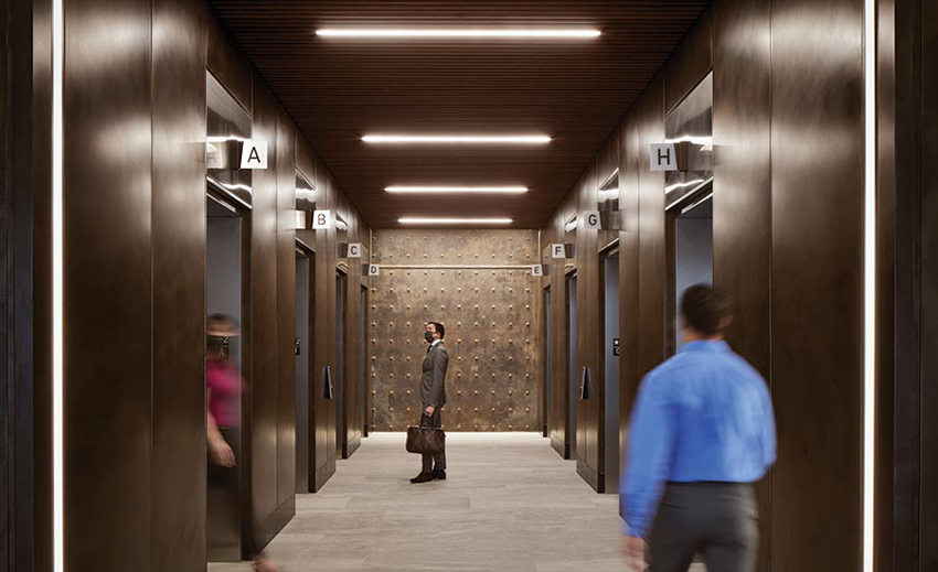
THE OFFICE TOWER’S main entrance level connects to a larger public lobby via escalators, elevators, and stairs (top). The speed core’s protruding steel rods form a textured surface in the office tower’s elevator lobby (above).
The design team employed shadow studies and curtain wall mock-ups to refine the geometry of the panels, so they could act as prisms, creating shadows on each elevation. Each of three types of panels were also rotated 180 degrees to ultimately result in six unique geometries. To create the building’s signature swoop, glazed panels connect at the level of the ceiling of one floor and step back in an angle to the sill of the floor above—in effect, a sloped spandrel condition. The residential curtain wall matches that of the office floors but incorporates operable windows, for natural ventilation. At one corner of the site, the architects carved out a glazed scoop to add definition to the street-level retail.
The tower’s structure consists of steel, with an innovative core design that integrates prefabricated steel panels with on-site concrete work. Developed by Magnusson Klemencic Associates (MKA), the project’s structural engineers, the so-called “speed core” design reduced construction time significantly (see sidebar, opposite). Given the tower’s height, wind load played a bigger part in the structural criteria than the site’s seismic hazard.
Ron Klemencic, chairman and CEO of MKA, and his team addressed wind loads by installing tuned liquid mass dampers at the top floor mechanical room, which consist of two 6,000-gallon water tanks in concrete vaults. As the building sways in the wind, the water sloshes back and forth against baffles in each tank as a directional countermotion, effectively balancing the movement to achieve a range acceptable for human comfort. MKA addressed the majority of the wind loads with steel outrigger trusses, which extend 40 feet from the core at the 38th-level mechanical floor and connect to three outrigger box columns at both the north and south elevations. “The columns act like ski poles, and the outrigger trusses are like the arms of the skier,” says Klemencic. For now, the only thing skiing down the slopes of the building is its maintenance unit, which extends 155 feet from the roof for window washing.
Rainier Square represents a leap in skyscraper evolution for Seattle, fulfilling the varied programmatic demands in an aesthetically unified and elegant tower that celebrates the rich architectural heritage of Yamasaki’s nearby originals.
Radical at its Core
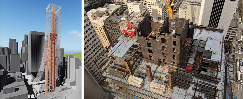
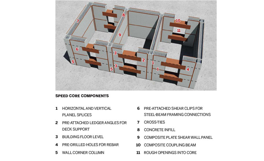
A DIAGRAM shows the tower’s overall structure (top left), and a construction shot depicts the speed core being erected as decking rises around it (top right and bottom).
Demands to reduce the budget and expedite construction are two imperatives at top of mind for most private developers. Rainier Square’s speed core design solves a problem that plagues tall building construction everywhere: how to minimize a schedule lag when building a concrete core that leads the erection of the surrounding steel structure. Choreographing separate trades, which are simultaneously adding floors in their respective materials, only exacerbates the issue.
Ron Klemencic, chairman and CEO of Magnusson Klemencic Associates, the project’s structural engineer, had never implemented his idea for a composite-plate shear wall core—or what is now called the “speed core”—on a high-rise before. Originally conceived in 2009 as a collaborative research project with Purdue University and subjected to years of testing, the speed core at Rainier Square consists of eight concrete-filled steel box columns at the core’s corners, each one the thickness of the core wall. Steel sandwich blocks (ranging from 21 to 45 inches thick) formed with two 14-foot-high steel plates (varying in thickness from 1⁄2 inch to 3⁄4 inches) and tied together with protruding steel rods 12 inches on center, were craned into place between each set of columns. The 536 core panels on the tower range in length from 30 to 40 feet, in line with the building’s structural bays, with some unique geometries to account for core openings.
Once set, the panels were field-welded to the box columns to seal the corners. The panels perform double duty in construction—they deliver strength to support the ongoing erection of the primary steel structure of the floor plates while acting as formwork for the concrete infill that provides the final strength to the core system.
“We could erect steel as much as eight floors ahead of where concrete was going into the core panels and as much as 12 floors ahead of where concrete was going in on the floor decks,” says Klemencic. This efficiency shaved nearly 10 months from the construction schedule but put other demands on NBBJ’s architects for coordination. A scale mock-up of the system in Seattle helped the team resolve issues well ahead of construction. “Working out the core penetrations in advance was a high priority,” Klemencic says, admitting the speed core does not readily allow for field changes such as a surprise pipe or conduit routing.
Given that the core is also the central life-safety egress feature of a high-rise, fire performance was a critical issue. Instead of arguing the case against added fireproofing to the exposed steel plates on the outer face of the core, the architects concealed a sprayed fireproofing material within a conventional furred gyp-board wall. This also hid the protruding rods from the panels, so the architects provided a furred gyp-board wall finish inside the core too. Subsequent testing at Purdue has demonstrated that the speed core performs safely without added fireproofing, a strategy that Kle-mencic is now implementing on a new project in development in California.
Russell Fortmeyer leads the sustainability group for Arup’s Los Angeles office.
Credits
ARCHITECT: NBBJ — Mindy Levine-Archer, partner in charge; John Thomas, principal/project manager; Jay Siebenmorgen, principal, concept design team; John Lemr, Peter Alderson, project architects; Brian Domini, project architect/designer
CONSULTANTS: Magnusson Klemencic Associates (structural/civil); MacDonald-Miller Facility Solutions (mechanical/plumbing); Prime Electric, Gerber Engineering (electrical); Gustafson Guthrie Nichol (landscape)
GENERAL CONTRACTOR: Lease Crutcher Lewis, Turner Construction (apartments)
CLIENT: Wright Runstad & Company
OWNER: RSQ Tower
SIZE: 1.3 million square feet
COST: withheld
COMPLETION DATE: 2021
Sources
PODIUM METAL PANELS: Custom Metal Contracting
CURTAIN WALL: Walters & Wolf
STRUCTURAL GLASS SYSTEM: Sentech Architectural Systems
PODIUM STOREFRONT SYSTEM: Herzog Glass
GLAZING: Viracon, Guardian, DeaMor (canopies)
INTERIOR FINISHES: Armstrong, Sherwin-Williams, Benjamin Moore, Daltile, Casa Dolce Casa, United Tile
CONVEYANCE: Otis
Eight Tall Buildings on the Rise
IMAGES: © OKO GROUP/CAIN INTERNATIONAL
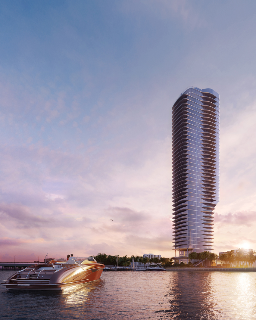
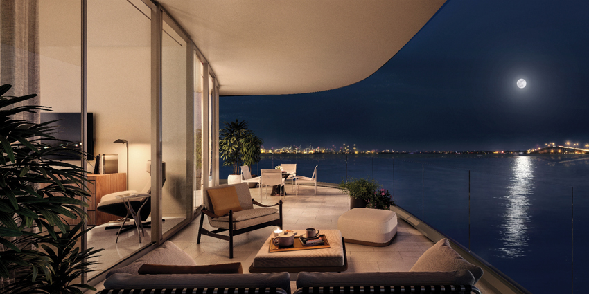
Una Residences
Adrian Smith and Gordon Gill, architects of some of the world’s tallest buildings, are lowering the height but not their sights with Una, in Miami’s Brickell neighborhood. The 47-story waterfront residential tower is Brickell’s first in over a decade, slated for completion in 2023. The architects have designed the interiors as well as the exterior, inspired by the curves and opulent materials of classic yacht design. “It stands contrapposto, where one side of the building is holding its full weight and the other side is relaxed, looking at you. I like that attitude,” said Gill in a press statement.
IMAGES: LUXIGON
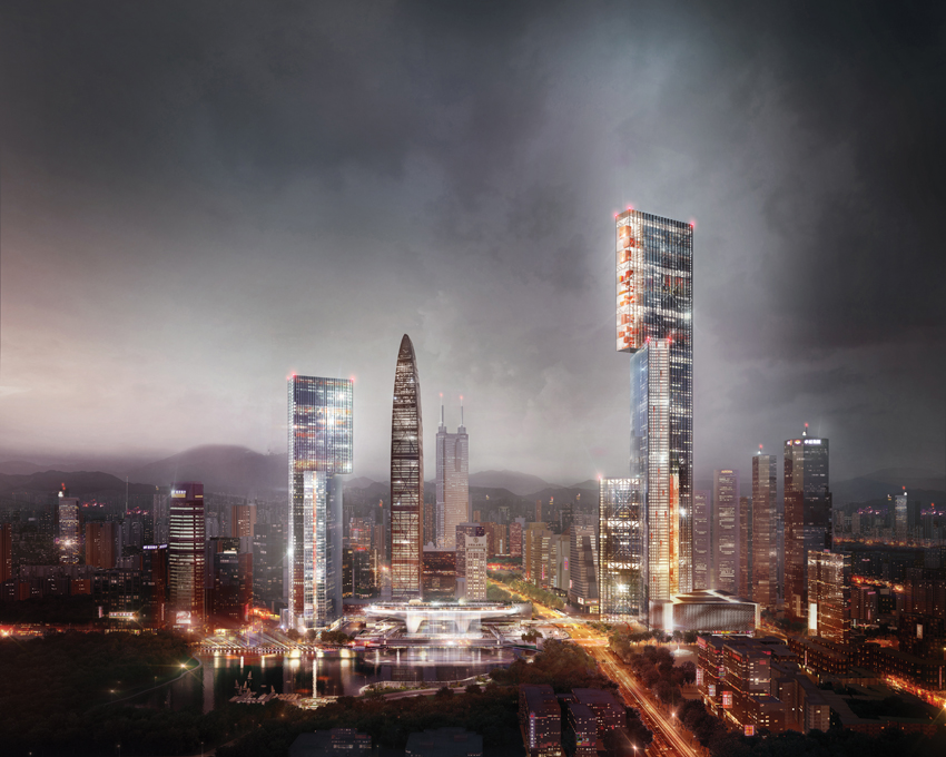
The Nexus
Work on the Nexus, in China’s Pearl River Delta, designed by London-based PLP Architecture, is paused, but the hope is that it will resume soon. The 1,969-foot-tall 124-story office and hotel tower (at far right in photo)—part of a complex of four PLP buildings in Guangzhou’s central business district—consists of three slab volumes of different heights, balanced on top of each other. The lower volume responds to the park nearby; the middle zone faces the urban context; and the upper component, perched dramatically askew, is oriented to the mountains beyond the city.
IMAGES: © MARCEL STEINBACH (TOP); VERO VISUALS (BOTTOM)
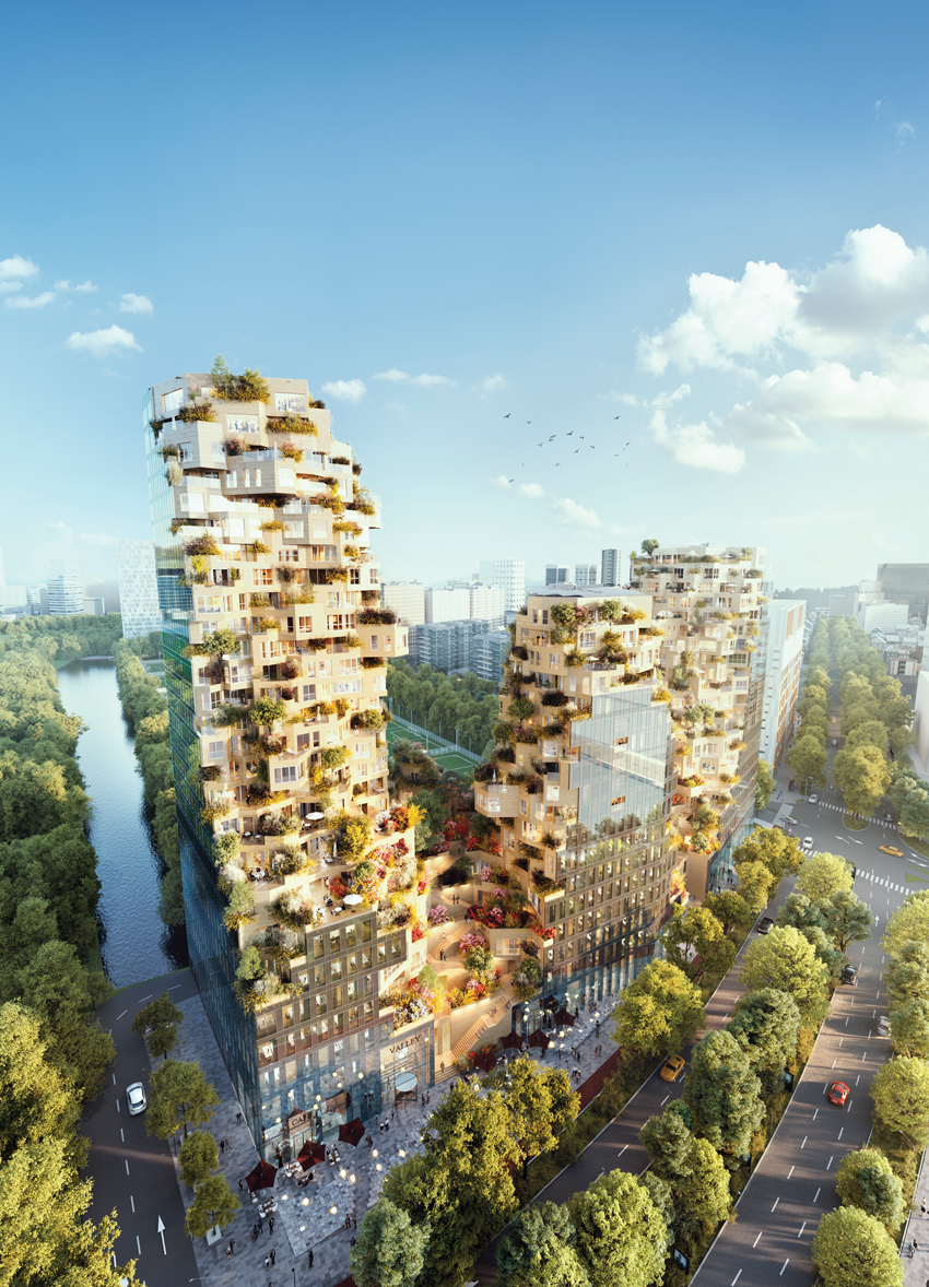
The Valley
The three “peaks” of MVRDV’s mixed-use Valley in Amsterdam look as if they were carved out of a mountain of glass, stone, and steel. Top-ping out at 338 feet in December 2020, Valley should be completed by the end of this year. Containing retail, offices, and apartments, it has a pedestrian path that winds around the exterior of the central tower, while the buildings’ inner facade features craggy terraces and gardens (right) by Piet Oudoulf.

IMAGE: FENDER KATSALIDIS
Merdeka 118
As of this March, the concrete core of this 118-story tower in Kuala Lumpur, Malaysia, had reached its peak, and the diamond-shaped, faceted glass facade was completed to level 101. Designed by Melbourne-based architect Karl Fender of Fender Katsalidis, Merdeka 118 will be the world’s second-tallest tower at 2,113 feet, behind Dubai’s Burj Khalifa (2,717 feet) and will surpass fellow city resident’s Petronas Towers by Cesar Pelli (1,483 feet). Arup, which has led the structural, civil, and geotechnical engineering, conceived three multistory-deep outrigger zones to achieve structural stiffness with high resistance to wind loads.
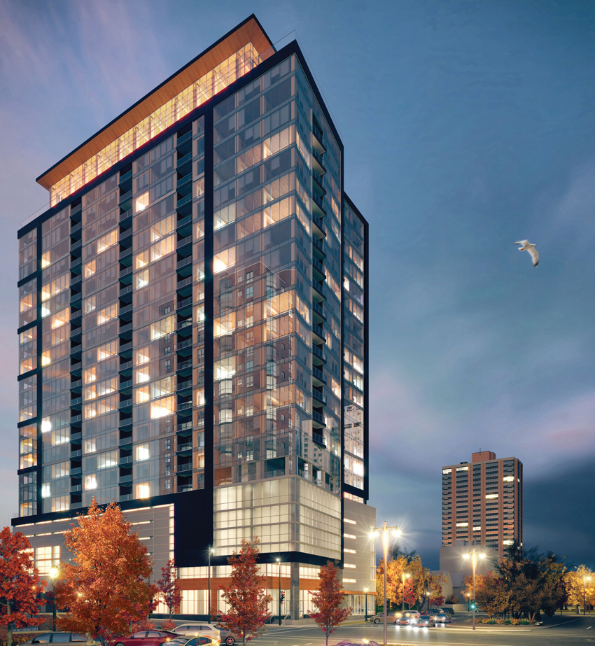
IMAGE: KORB ASSOCIATES
Ascent
For perhaps one hot minute, this 25-story residential building in downtown Milwaukee will be the tallest mass-timber tower in the world when it is completed in 2022. Wood structures have been on the rise for several years, due in part to new technology that uses cross-laminated timber (CLT) and glulam to create fire- and earthquake-resistant structures that store carbon and can be prefabricated off-site, slashing construction time. Designed by Korb + Associates Architects, with structural engineering by Thornton Tomasetti, the base, elevator core, and stair shafts of the 259-unit building will be concrete.
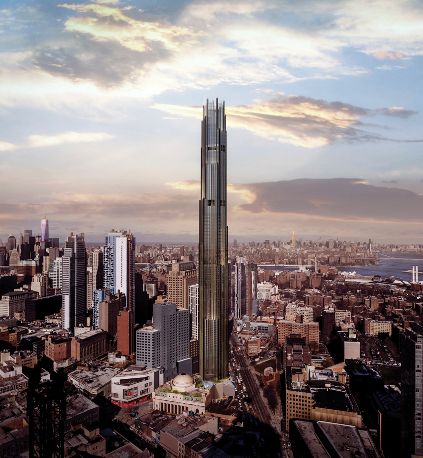
IMAGE: COURTESY SHOP ARCHITECTS/JDS DEVELOPMENT
DeKalb
At 1,066 feet, SHoP Architects’ 9 De-Kalb will be Brooklyn’s tallest building when it is completed in 2023. The residential supertall will reach 73 stories, containing 425 rental apartments and 150 condominiums. The hexagonal glass tower, which tapers as it reaches skyward, is clad in repeating vertical architectural profiles made of bronze, creating a gothic look that complements the Brooklyn Dime Savings Bank, an adjoining landmark of the City Beautiful era. SHoP is also restoring the bank as part of a new midblock connection for pedestrians between busy Flatbush Ave-nue and Fulton Street.
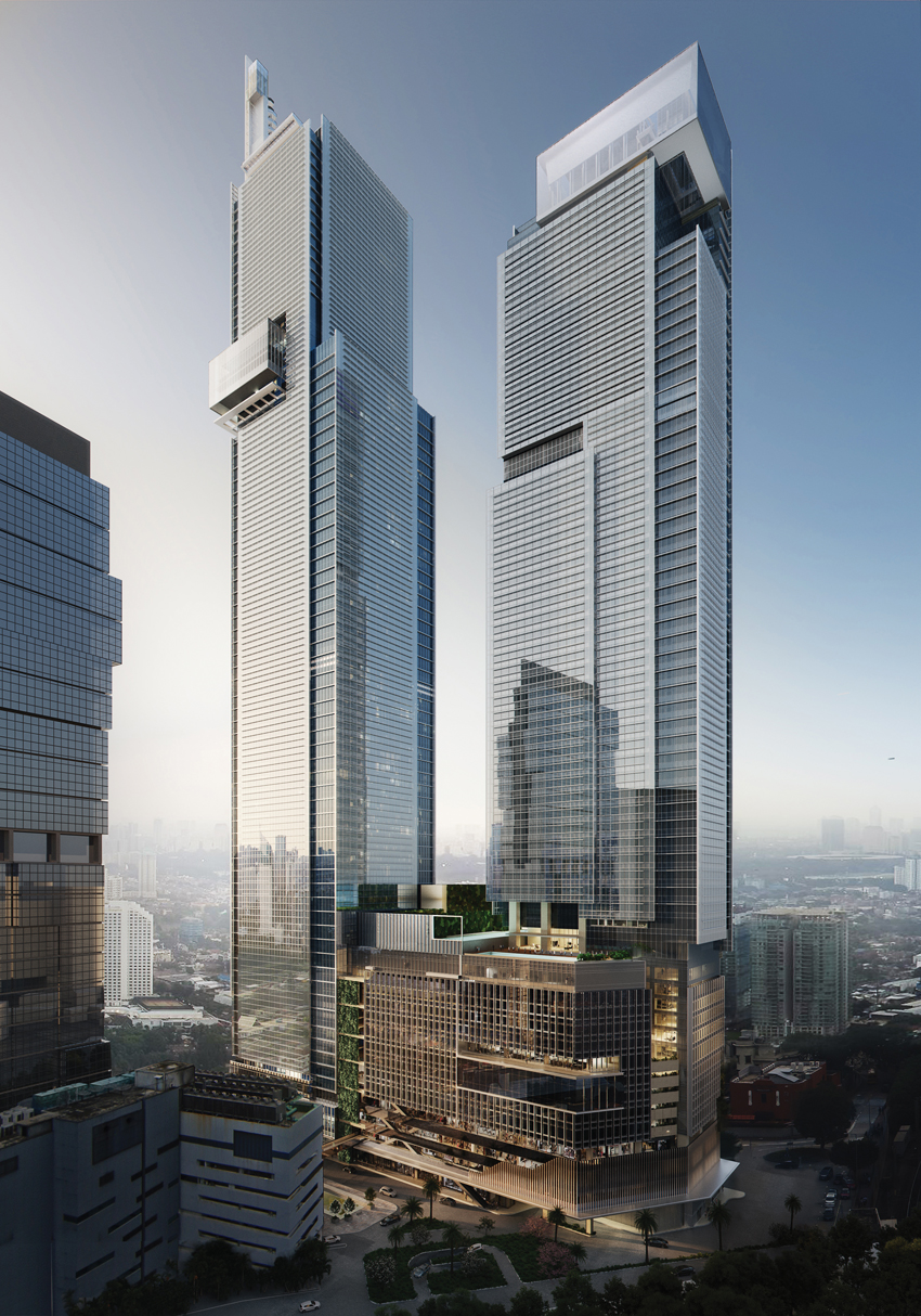
IMAGE: © LEMONS BUCKET
Autograph Tower
When completed later this year, the 1,256-foot-tall Autograph Tower, designed by Kohn Pedersen Fox (KPF), will be Jakarta’s first supertall, and the tallest building in the Southern hemisphere. Located in a mixed-use development between Old City and the central business district, the Autograph features offices, apartments, and a hotel. It shares a podium with the KPF-designed Luminary tower (to the right in photo), slated to be operational in 2022. Both buildings have pinwheeling glass planes and observation decks.
IMAGES: ADRIAN SMITH + GORDON GILL ARCHITECTURE ( LEFT); WIKIMEDIA COMMONS (RIGHT)
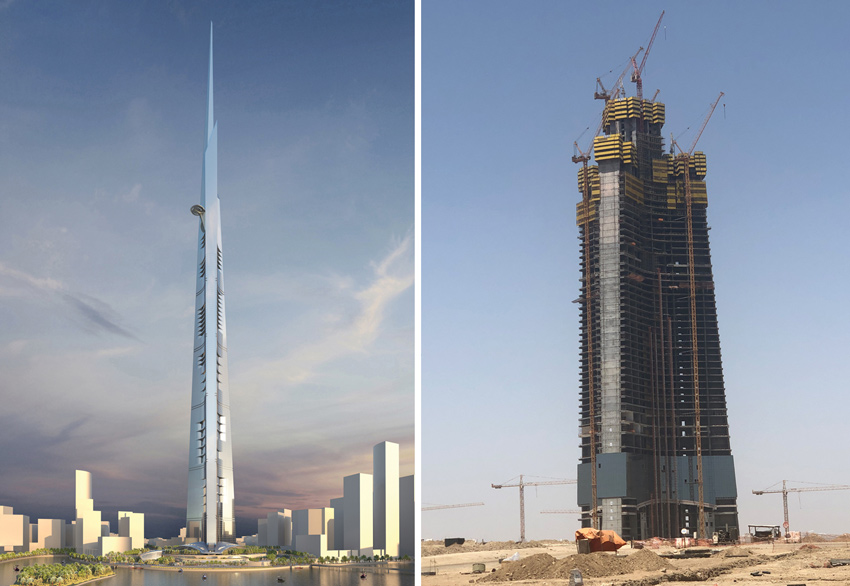
Jeddah Tower
With the Jeddah Tower in Saudi Arabia (formerly known as the Kingdom Tower), Adrian Smith of Adrian Smith and Gordon Gill Architecture was set to steal the crown for designing the world’s tallest building—from himself. Smith was in charge of the current record holder, the 2,717-foot-tall Burj Khalifa, in Dubai, while a partner at SOM. But construction of the 3,280-foot-tall Jeddah project stalled in 2018, at about 60 stories. In a talk hosted by the Skyscraper Museum in early March, Smith said the pandemic caused another setback. “We hope it gets going. We’ve been told it is going to happen. It is just a matter of time and circumstances,” he said.
Architectural Record is the #1 source for design news, architect continuing education, and info on sustainability, houses, projects, and architectural products.
Originally published in Architectural Record
Originally published in May 2021
LEARNING OBJECTIVES
- Outline different strategies for resisting wind and seismic loads in tall buildings.
- Describe ways tall buildings can make use of challenging sites, including those near elevated roadways and over train tracks, and discuss the urbanistic and structural ramifications.
- Explain how nonstandard geometries can be used to control heat gain while maximizing views and daylighting in tall buildings.
- Describe a novel time-saving method for constructing a tall building’s structural core.