View course on architecturalrecord.com
It is the journey, not the destination—so the saying goes. This month, RECORD turns this aphorism on its head, looking at the points of arrival (and departure) for traveling by plane, train, and sea. We examine innovative transportation buildings, at a range of scales, from a diminutive subway headhouse for a station in Cambridge, Massachusetts, to a vast, greenery-filled airport terminal in India. We also explore efforts to breathe new life into defunct infrastructure, including the transformation of what once was the world’s largest landfill into a sprawling park for the people of New York.
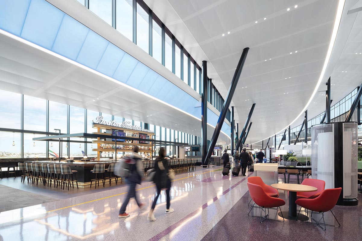
Photo © Ema Peter
Logan, Terminal E
Paint the Town Red
Flashy on the outside, Logan Airport’s new terminal is all about reducing passenger stress on the inside.
BY JOANN GONCHAR, FAIA
These days, air travel is mostly filled with aggravation and indignities, with long queues, having to remove your shoes for security screening, and jostling with fellow passengers for the limited overhead baggage space. It wasn’t always so. Flying used to be glamorous. And if any buildings epitomize that long-faded romance, it would be those of Eero Saarinen—the TWA Flight Center at Idlewild Airport in New York (now JFK) and his terminal at Washington Dulles, both of which opened in 1962—with their gravity-defying winglike forms in poured-in-place concrete. Now Boston Logan International Airport has a building that alludes to that era, with an addition to Terminal E. It seductively swoops and curves, but instead of volumes defined by concrete, the new structure has a lipstick red chassis, like a sports car.
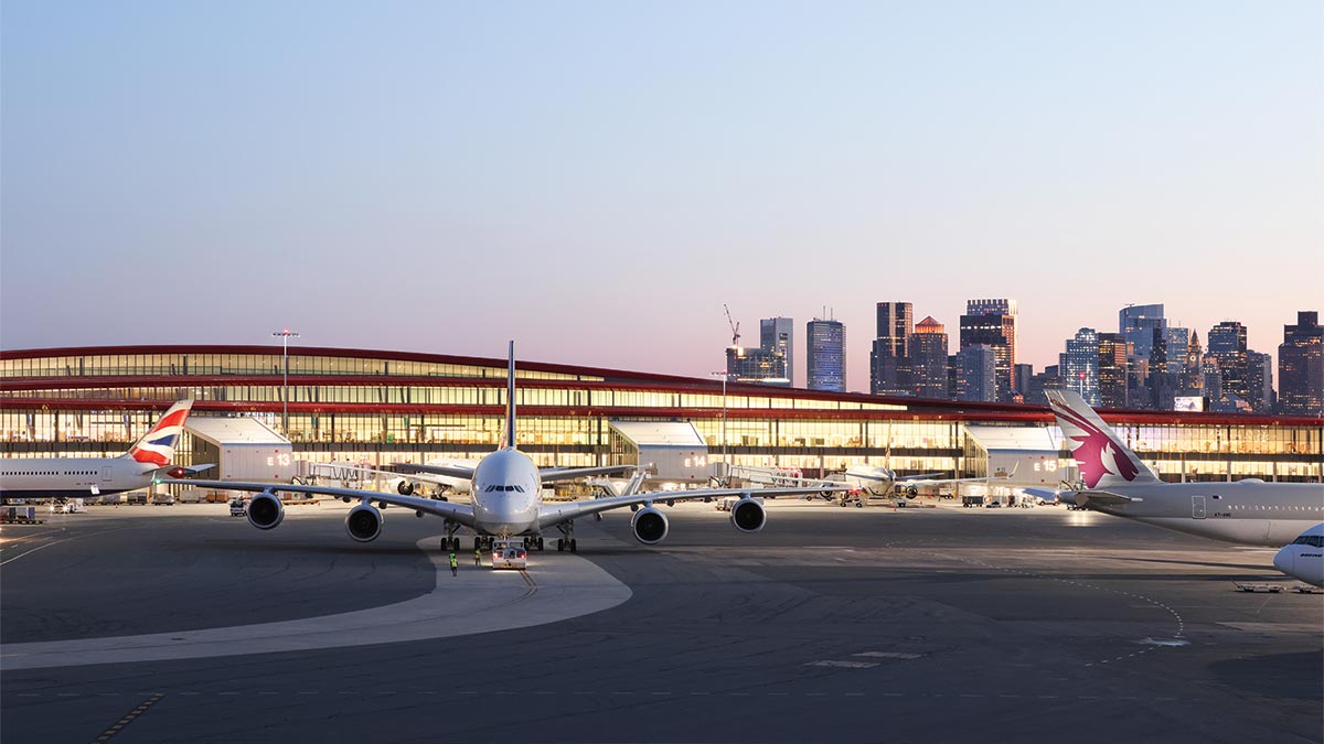
Photo © Ema Peter
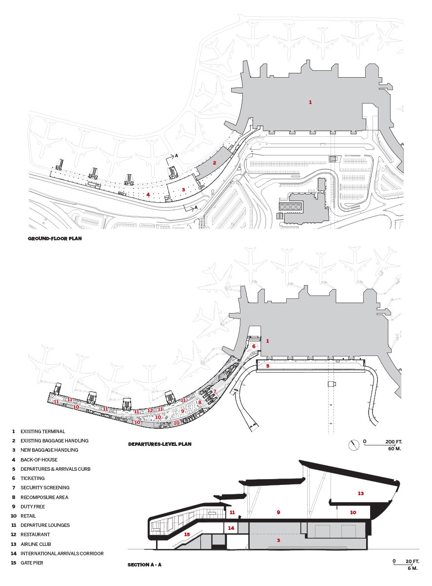
The $800 million expansion and renovation project has been designed by infrastructure specialists AECOM and, as the project’s “vision architect,” luis vidal + architects (LVA), a Madrid-based firm known for airport buildings with expressive skylit roofs, including Zaragoza, in Spain (2008) and Terminal 2 at London’s Heathrow (2014). Their scheme adds 320,000 square feet and four gates, bringing the total at Logan’s international terminal to 16. (The project was originally conceived as seven new gates, but, due to pandemic-related revenue losses, the three additional gates have been postponed).
So why red? Luis Vidal, LVA founder, says it was inspired by Boston itself: by the city’s brick buildings, the Red Sox, and the school colors of several of its universities. The hue for Terminal E’s cladding was developed with the coating’s Swiss manufacturer specifically for the project, and, because the paint contains glass particles, it has a prismatic effect, ranging—depending on the angle of the sun—from intense candy apple shades to orange tones.
If Vidal’s contextual argument seems tenuous, coming off as a justification, the surprisingly bold choice is effective. The color adds a sense of excitement to what had been a rather humdrum airport and makes the addition unmissable: from Boston’s Seaport district, you can appreciate its full 1,350-foot-long horizontal sweep; depending on the side of the plane you might be sitting on and its flight path, the sculptural roofscape can be spotted from the air; and you can catch oblique views of the brightly hued structure when arriving in an Uber or while moving between terminals over one of the airport’s connecting sky bridges. Just like the sexy curves of a classic sports car, Terminal E’s addition seems designed to get your heart racing—at least on its outside.
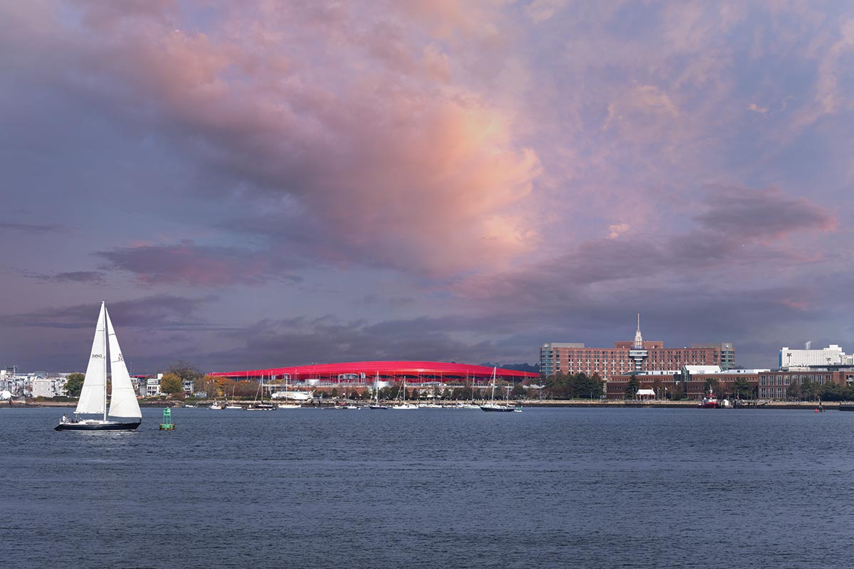
Photo © Ema Peter
From Boston’s Seaport District, one can appreciate the addition’s full horizontal sweep. Clerestory windows help create a daylight-filled interior.
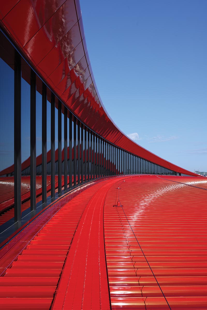
Photo © Ema Peter
Photo © Ema Peter
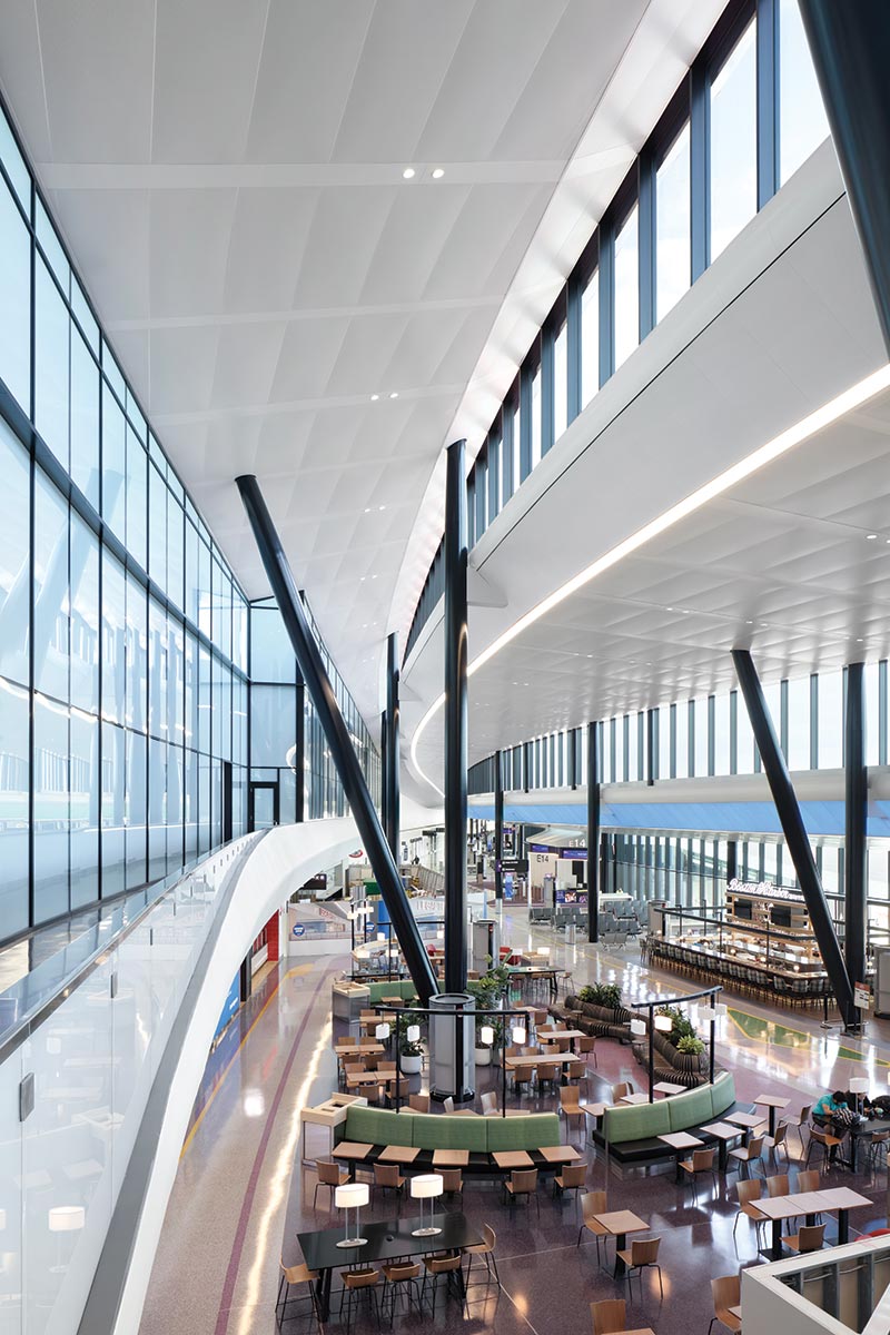
Photo © Ema Peter
On the inside, however, the effect is intentionally just the opposite. Here one is hardly aware of the adrenaline-inducing red. Instead, the environment is cool and calm, with ample daylight and finishes rendered primarily in white, including terrazzo floors, perforated metal ceiling panels, and curving drywall. Seemingly every move has been made with the idea of reducing the anxiety associated with air travel.
To understand travelers’ typical pain points, the team worked with a behavioral psychologist, says Terry Rookard, AECOM project director. Some of the outcomes of this collaboration are amenities, including a roomy “recomposure” area after security with plenty of seating, a lactation room, a pet-relief area, and a calming room where neurodivergent travelers can acclimate themselves before a flight. But the main factor is the openness of the addition and its boomerang-like footprint. By avoiding the use of right angles on the L-shaped site, designers have produced a departures level with clear sight lines and intuitive circulation. For instance, the configuration allows travelers to see almost all the gates while they are waiting to go through security, even though the distance from the screening area is more than 1,000 feet. Meanwhile, the scale of the interior expands and contracts to accommodate the flow of passengers: the ceiling is highest (reaching nearly 60 feet) and the floor plate widest at the addition’s midsection, with the volume becoming appropriately shorter and skinnier, tapering where foot traffic is the lightest—as one approaches the final gate.
Helping guide passengers past the duty-free shop, the restaurant, other concessions, and to the gate waiting areas are two roughly parallel “streets,” demarcated with change of floor finish or colors. These circulation paths track with the contours of the ceiling and are further articulated by the structural grid comprising pairs of V-shaped steel columns (filled with concrete to avoid the need for fireproofing) marching down the length of the terminal.
The interior has an airy feel that is in no small part due to its daylighting scheme, which includes two tiers of clerestories. Because they are predominantly, but not entirely, north-facing, they are shielded from direct sun by overhangs that Vidal refers to as “eyelashes.” Similarly, the generous curtain wall looking out onto the runways includes electrochromic glazing, which darkens to reduce heat gain and glare. The daylighting, along with features such as building-integrated photovoltaics on the south facade, displacement ventilation (which supplies conditioned air only to the occupied portions of the tall terminal volume), and all-electric building systems are part of the addition’s bid for LEED Gold certification.
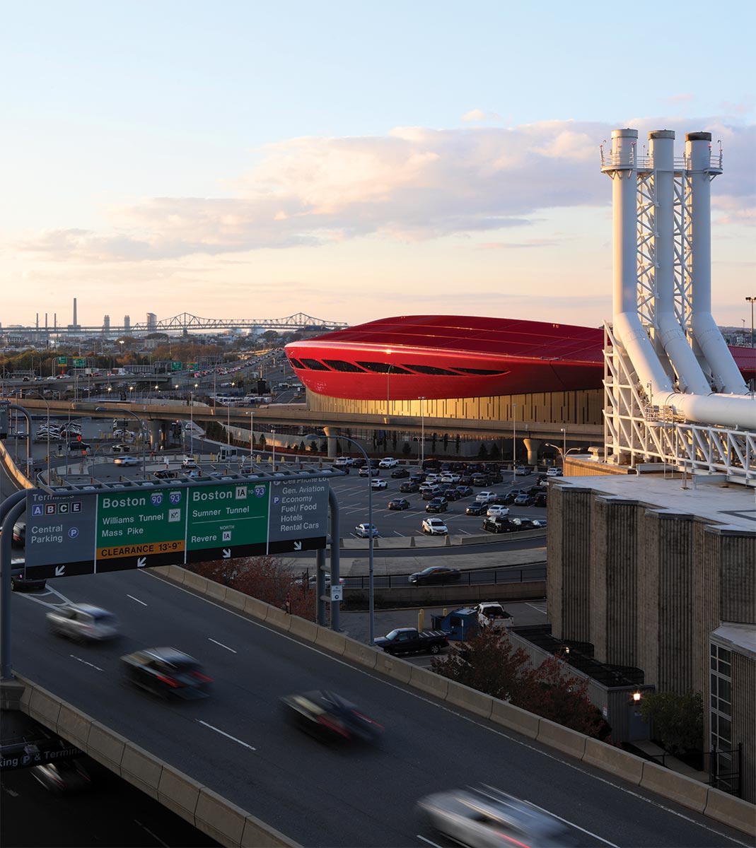
Photo © Ema Peter
Below the portion clad in fire-engine red panels, the south facade includes building-integrated photovoltaics.
The sustainable strategies also contribute to the net zero goal set by the Massachusetts Port Authority (Massport), the airport’s owner, to reach net zero by 2031. But before that can be achieved, the central heating plant will need to be overhauled, since it is the facility’s largest carbon emitter, according Luciana Burdi, Massport director of capital programs and environmental affairs.
The project team faced several construction and engineering challenges, including building over an existing baggage-handling system, whose operation could not be disrupted. To deal with the problem, structural engineers from Thornton Tomasetti devised a mega-truss to span the baggage-handling system and support the portion of the terminal above. And then there are the expansion’s signature curves. There are so many, in fact, that Jonathan Rushmore, AECOM design manager, likes to joke that the only flat surface is the floor plane. Most bend in more than one direction, and with different radii, creating the potential for a fabrication and construction nightmare. But Sam Sleiman, executive vice president at Suffolk Construction, the project’s construction manager, points to the “federated” BIM model shared among the consultants, trades, and subcontractors. As a result, the building feels tightly coordinated and cleanly detailed.
Below the portion clad in fire-engine red panels, the south facade includes building-integrated photovoltaics.
On the whole, the new interior is smart, bright, and spacious. Its mood, however, doesn’t quite match the drama of the exterior—not to mention that of Saarinen’s terminals. But drama-free flying is what today’s travel-weary passenger desires. The expansion of Terminal E succeeds in delivering the kind of smooth airport experience most of us want, while providing a burst of visual energy for Logan and a new landmark for Boston.
Cruise Control
A former industrial site at the Port of Montreal is transformed into a tourist destination.
GRAND QUAI AND PORT OF MONTREAL TOWER I MONTREAL I PROVENCHER_ROY
BY MATTHEW MARANI
The Old Port Of Montreal, like that of Buffalo and New York, connected the Wheat Belt of the Great Plains to markets beyond the continental shelf. In those cities, a complex web of shipping and rail routes would transfer cereal crops for storage across an array of piers and grain elevators and silos for export abroad. The completion of the St. Lawrence Seaway in 1957, which provided direct maritime access from the Great Lakes to the Atlantic Ocean, rendered those silos and elevators redundant, and they were left to decay over the succeeding decades.
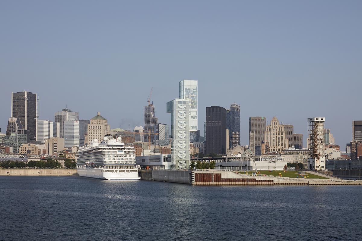
PHOTO © JAMES BRITTAN
The Grand Quai extends into the St. Lawrence River.
The Grand Quai du Port de Montreal (the Grand Pier) is a site over a century old within that defunct industrial ecosystem. Formerly known as Alexandra Pier, it served as both a cargo facility and reception area for immigrants and travelers until its conversion into a cruise terminal in 1967. But, like its surroundings, it too faded with time. That is, until May 2023, when the firm Provencher_Roy, based in Montreal, wrapped up a multiphase renovation and redesign of the facility, including the newly opened Port of Montreal Tower.
The architects were awarded the commission back in 2014 following a competition, and construction began in 2015. For Provencher_Roy, the project not only entailed the rehabilitation of the existing two terminals located on the nearly 350,000-square-foot pier, but also opening the hermetic postindustrial site—entry was previously permitted only for cruise passengers and the cars and buses ferrying them to and from the city—to the public, through several gestures.
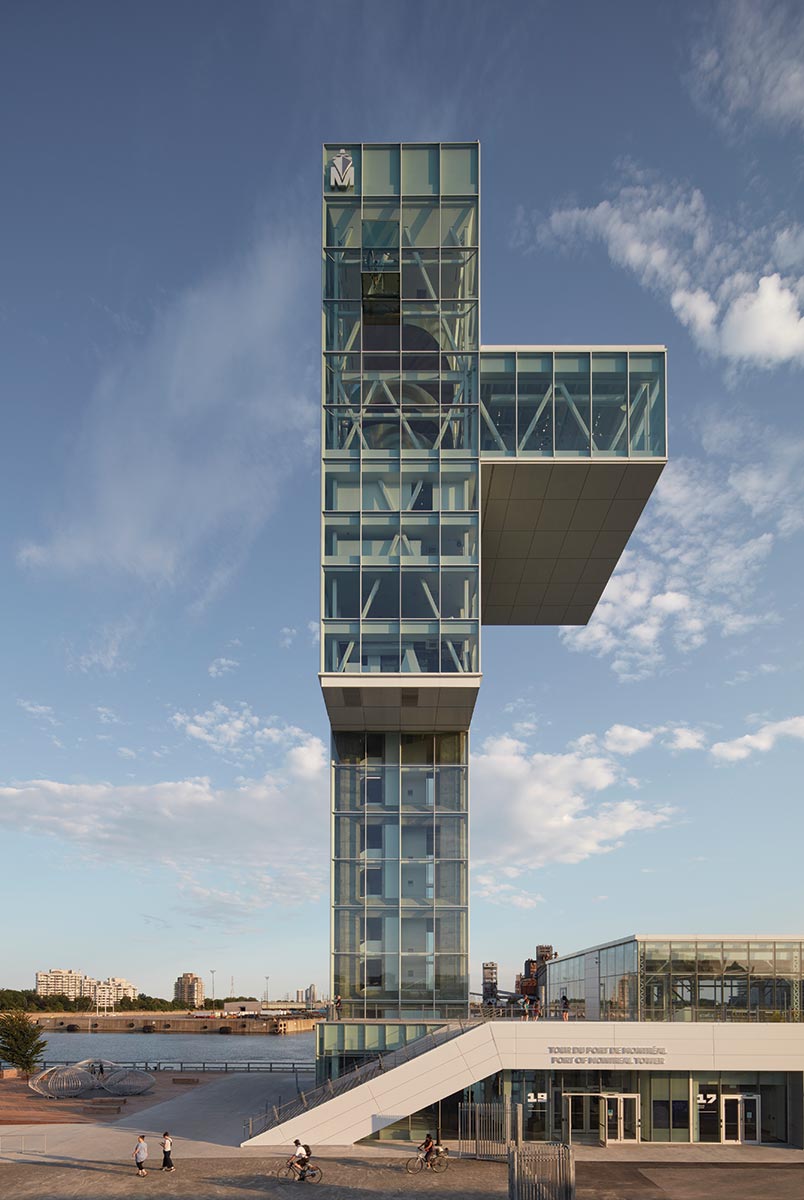
PHOTO © JAMES BRITTAN
The Port of Montreal Tower is The Grand Quai’s most conspicuous landmark.
In collaboration with landscape architect NIPPaysage, also Montreal-based, the architects linked the pier to the Old Port’s existing park infrastructure through a planted, red cedar–paved esplanade atop Terminal 1, the primary cruise depot. They also carved out a public park at the eastern extremity of the pier, which slopes downward toward the St. Lawrence River, as something of an outdoor amphitheater. The Port of Montreal Tower is an additional visual landmark and experience aimed to draw the public to the formerly inaccessible waterfront.
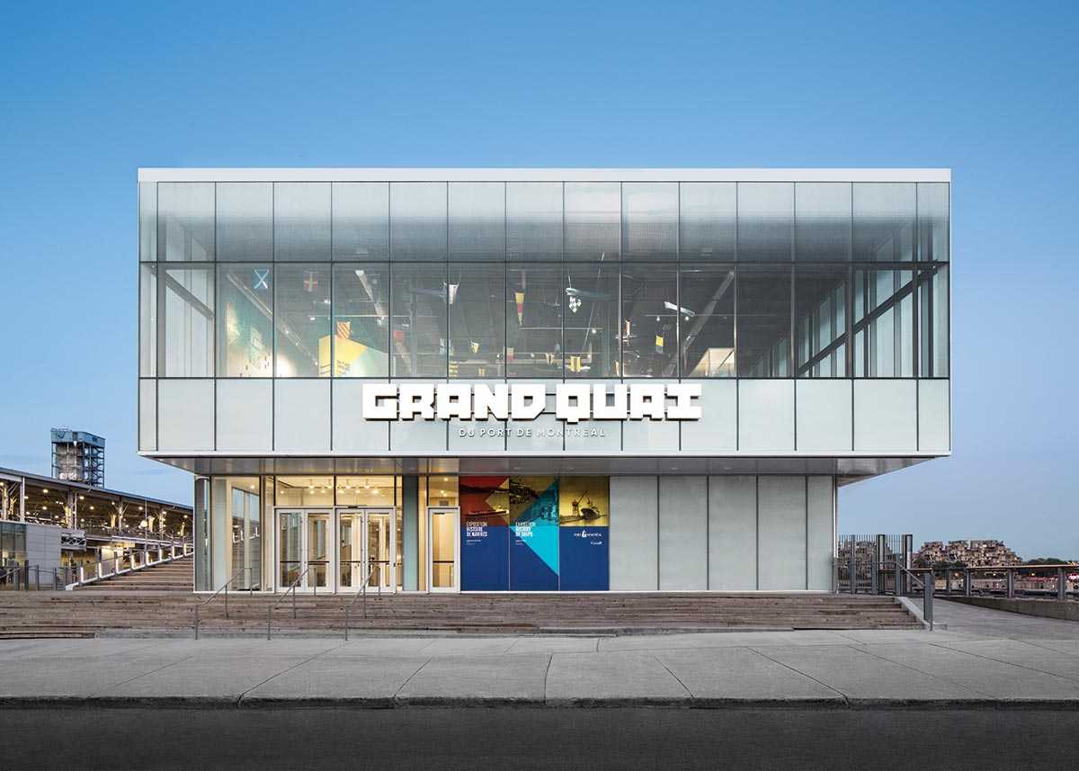
Photo © Stephane Brugger
Terminal 1 now features an entrance that faces the city and a landscaped esplanade on its roof.
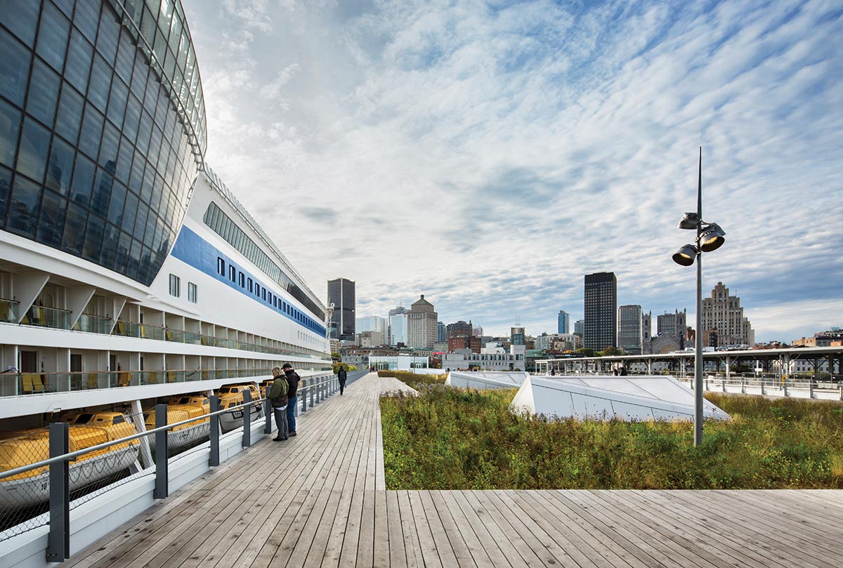
Photo © Stephane Brugger
“The Grand Quai and Tower project is the realization of the Port of Montreal’s vision to open the site to the public and give Montrealers and visitors access and views between two emblematic components of the City of Montreal, the St. Lawrence River and Mount Royal,” explained Provencher_Roy principal partner Sonia Gagné, referring to the promontory and park just west of downtown.
The renovation of the hangar-like terminals—each measures just under 70,000 square feet—entailed reworking the facility’s program. Terminal 2 was converted into the site’s parking garage, with an additional ticketing pavilion and boat landing for Croisières AML, a sightseeing cruise line servicing Montreal. That move freed up space at the ground level within the redesigned Terminal 1 for circulation of some 50,000 tourists streaming to and from 50 cruise liners annually.
Within both terminals, the design team opted for a degree of conservation. “We sought to celebrate the heritage of the existing rigorous and pragmatic infrastructure,” said Provencher_Roy partner Sophie Wilkin. To that end, damaged sections were repaired, and, throughout, all lead-based paint was removed and those areas repainted a luminous white. Steel bracing was added to bring the two terminals, which are linked by a newly constructed pedestrian bridge, up to current seismic requirements.
Unlike Terminal 2, which, as a parking facility, is left partially exposed to the elements, Terminal 1 underwent a substantial reorientation and recladding. A new entrance pavilion announces itself to the riverfront promenade with brash and playful signage and a welcoming glass facade—the former concrete-clad entrance was accessed on the pier, behind a now demolished perimeter wall—and that transparency is carried through the approximately 760-foot-long terminal with floor-to-ceiling insulated-glass units and skylights carved into the esplanade above. That emphasis on lightness extends to the terminal’s cladding, which consists of horizontally oriented bright-white aluminum panels.
The Port of Montreal Tower, the final component of the Grand Pier, is the facility’s principal homage to the Old Port’s commercial past. The tower rests upon a raftlike concrete slab, supported below by concrete caissons that reach down to the bedrock beneath the St. Lawrence River. It rises to nearly 215 feet, and that height, coupled with its vertigo-inducing cantilevers to the north and west, resembles the remaining rusted grain elevators nearby. The structure of the tower, like that of the terminals, is laid bare, this time by ultra-clear glass panels that frame its concrete core and steel hollow structural sections, the latter supporting those daring protrusions. Care was taken to add visual interest to the exposed concrete through a subtle play in formwork, the inner edges of the pillars being angled inward to generate further depth and shadowing.
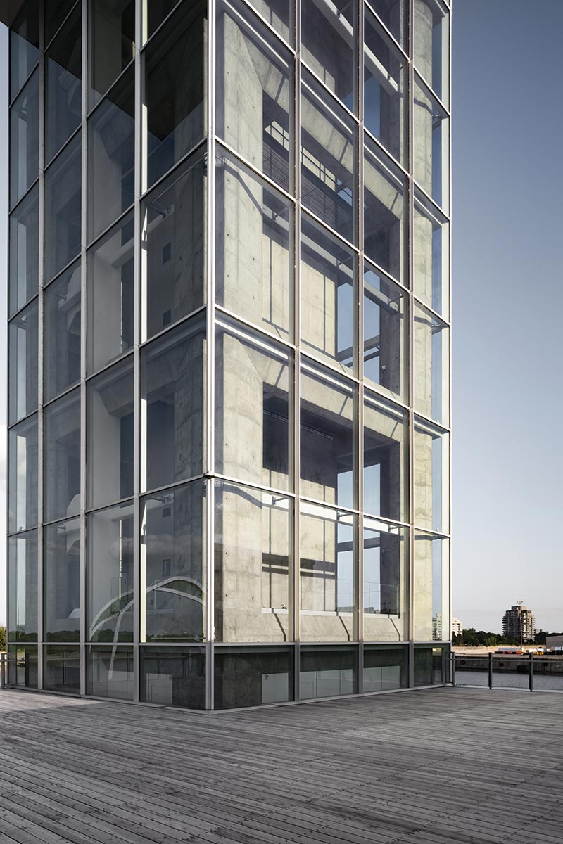
PHOTO © JAMES BRITTAN
The Tower core is fully visible.
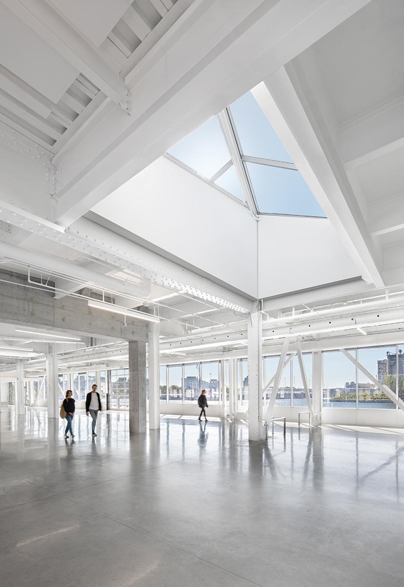
PHOTO © JAMES BRITTAN
The terminal and tower interiors bear a minimal material palette.
PHOTOGRAPHY: © STEPHANE BRUGGER
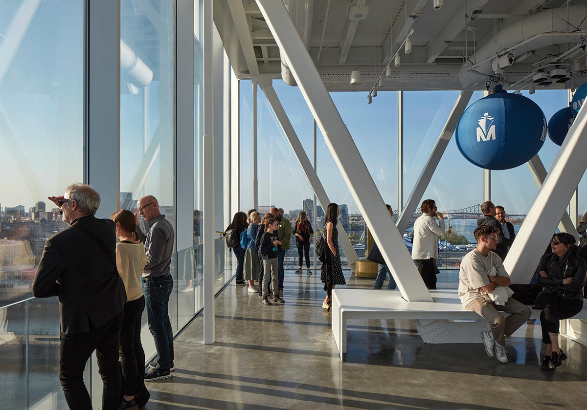
Visitors enter the tower through the ground-floor, river-fronting lobby to a bank of elevators that whisk them directly to the 13th-floor observatory. The observatory, along with the lobby and an executive room tucked into the 10th floor, can be rented as event spaces, supported by a commercial kitchen on the 11th floor. At the observatory level, a sculptural helicoid staircase, fashioned of wood, nods to the spiral staircases that line Montreal’s historic streetscape and, with its golden-hued balustrades, to the port’s heyday as a leading exporter of wheat products. At the tower’s summit, one has unobstructed views in all directions, of landmarks like Moshe Safdie’s Habitat 67 and Basilique Notre-Dame, as well as to Mount Royal. This denouement is a sweeping panorama, looking back and toward the city’s past, present, and future.
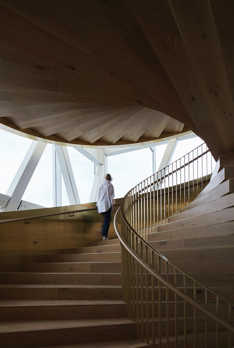
PHOTO © JAMES BRITTAN
A stairwell delivers visitors to the tower summit.
Credits
Architect: Provencher_Roy — Sonia Gagné, principal partner; Sophie Wilkin, partner
Engineers: NCK (structural & civil); Pageau Morel (electromechinal)
Consultants: WSP Group (maritime infrastructure); Elema (structural glass); CS Design (lighting design); RWDI (wind tunnel); NIPPAYSAGE (landscape architect)
General Contractor: Pomerleau
client: Port of Montreal
Size: 410,000 square feet (Grand Quai); 11,000 square feet (Port of Montreal Tower)
Cost: $29.5 million
Completion date: May 2023
Sources
Steel: Structures XL
Concrete: Coffrage Alliance
Damper: Gerb
Metal panels: Clermont
Curtain Wall: Vitreco
Glazing: Agnora
Doors: Alumico
Acoustical Ceilings: Pinta Acoustic; Armstrong
Paints & Stains: Sherwin-Williams
Helicoidal Stairwell: Mirage (wood); Chemtal (balustrade)
Lighting: Luxtech; Hi-Tech Lighting
Wood terrace and furniture: Goodfellow
To New Heights
A complex construction strategy helps reinvent what was once the worst-ranked airport in the U.S.
LAGUARDIA AIRPORT, TERMINAL B | QUEENS, NEW YORK | HOK
BY LEOPOLDO VILLARDI
“How do you fly out of LaGuardia on time? Fly out of JFK instead.”
Until recently, that old joke always landed. Following a nine-year, $8 billion campaign, it hardly rings true. The dark, cramped, and seemingly universally detested Central Terminal that once stood at the heart of LaGuardia Airport has been replaced with a spacious, brighter headhouse: Terminal B. The about-face is all the more remarkable considering the complexities of building in front of, behind, and over existing roadways as well as an active concourse that continued to serve roughly 45,000 daily passengers during the transformation.
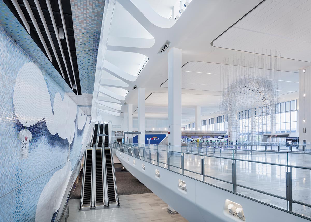
Photo © Jeff Goldberg
Daylight fills the headhouse. A mosaic by Laura Owens uses 625,000 tiles, while Sarah Sze’s Shorter than the Day hovers over a floor opening.
“It was a bit like driving down the highway at 60 miles per hour, getting a flat, and having to change the tire without being able to stop the car,” says Peter Ruggiero, design principal at HOK, architect of the 1.3 million-square-foot, 35-gate project.
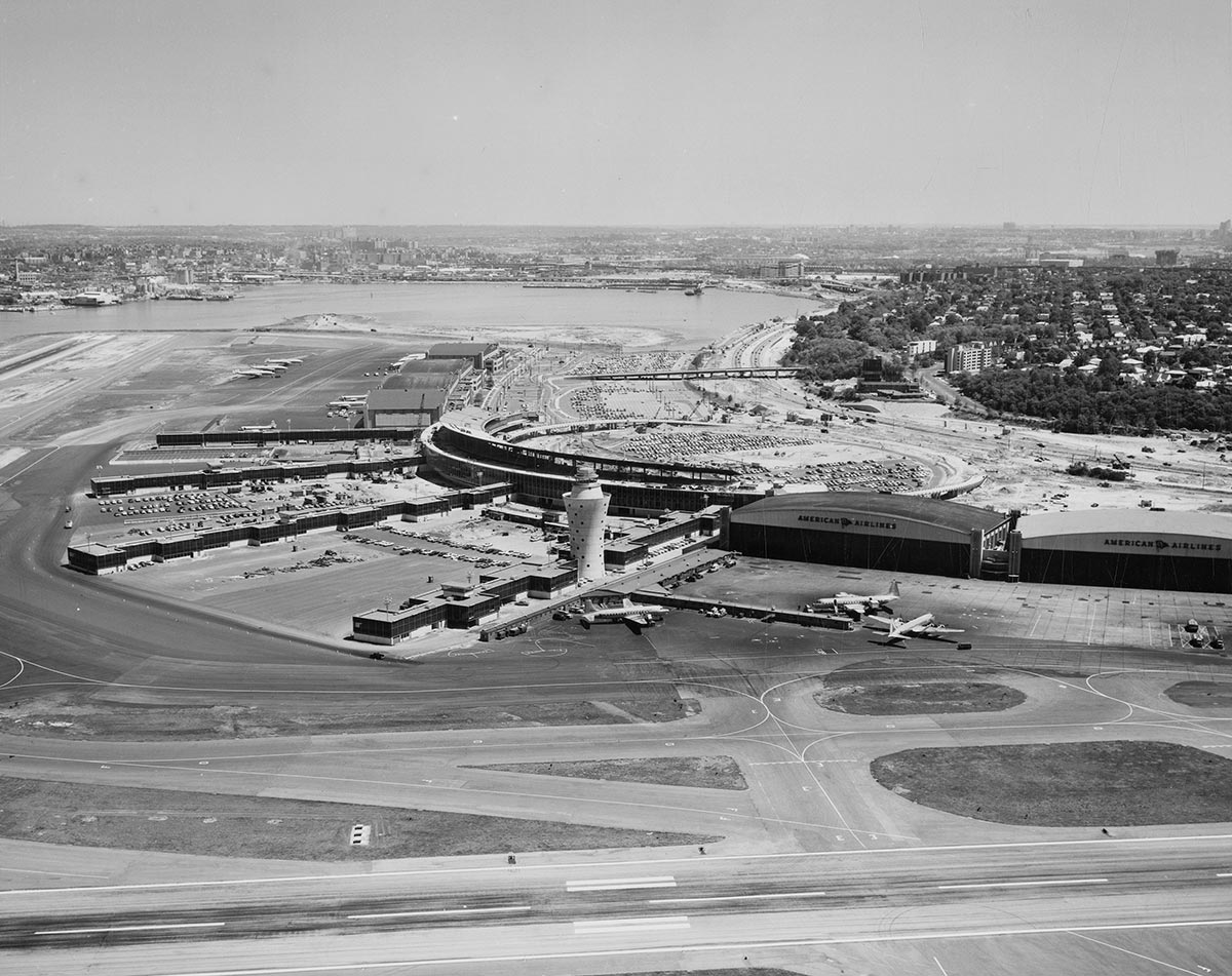
Despite its recent reputation, LaGuardia’s Central Terminal had been heralded as the “air gateway to America” when it opened in April 1964, 25 years after commercial operations began at the airport. Locals would visit the rooftop observation deck just to watch planes come and go. Its arrival marked an exciting moment in New York history too—down the road, the World’s Fair opened at Flushing Meadows, and the Mets threw their first pitch at Shea Stadium. Harrison & Abramovitz’s no-nonsense, quarter-mile-long building may have lacked the formal niceties of Eero Saarinen’s freshly minted TWA Flight Center at John F. Kennedy International Airport, but it brought LaGuardia into the jet age, along with space for 8 million passengers annually.
But times change, as Shea Stadium (now demolished) and the former exposition grounds (which have had their ups and downs) illustrate.
“LaGuardia, like other airports from that era, had difficulty responding to changing needs,” explains Ruggiero. As aircraft incrementally increased in size, airports seemed to shrink, leaving less space for pilots to maneuver on the ground and creating pinch points near jetways. This was especially true at the Central Terminal, where a single setback could cause delays to pile up while engines idled and passenger patience plummeted. New security measures, introduced following a slew of hijackings in the late 1960s and ’70s and especially after the 9/11 attacks, meant bulky screening devices crammed into facilities never designed to accommodate them. “Everyone wants something to blame, but they don’t understand the forces—in the market, in government, and in world events—that really drove airports of this vintage to fail,” he says.
PHOTOGRAPHY: COURTESY THE QUEENS BOROUGH PUBLIC LIBRARY, ARCHIVES, CHAMBER OF COMMERCE OF THE BOROUGH OF QUEENS COLLECTION
Pedestrian bridges were built over the old Central Terminal as part of the construction strategy. LaGuardia’s Central Terminal opened in April 1964.
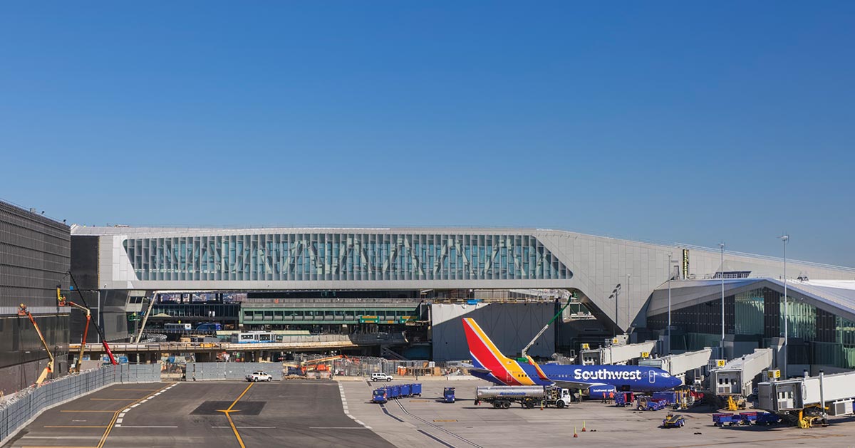
Photo © Jeff Goldberg
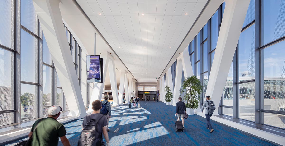
Photo © Jeff Goldberg
Pedestrian bridges (1) were built over the old Central Terminal as part of the construction strategy (2).
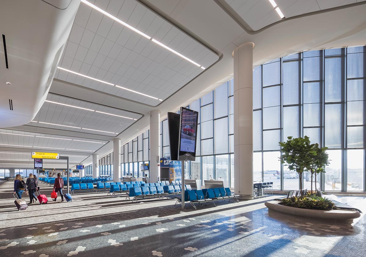
Photo © Jeff Goldberg
The sloped concourse ceilings maintain sight lines from the ATC tower.
LaGuardia didn’t have much room to spread its wings, either. The same proximity to Midtown Manhattan that first drew officials to the location has been, at times, a crutch—residential neighborhoods surround much of the airport, which is built on filled marshland along Flushing Bay. After additional terminals were erected in 1983 and 1992 (recently reconfigured by Gensler and Corgan into the new Terminal C, operated by Delta), little room remained to expand. To ease congestion, the Port Authority of New York and New Jersey, the interstate agency responsible for overseeing infrastructure in the New York metropolitan region, implemented a six-day-per-week “perimeter rule,” restricting flights from destinations farther than 1,500 miles away (Denver being the only exception).
And with two 7,000-foot-long runways, LaGuardia was better suited to smaller, narrow-body aircraft with shorter ranges—making it a go-to hub for commuters and regional business travel. (By comparison, the longest runway at JFK is twice that length, accommodating much larger planes that can travel farther distances.) With quicker turnaround comes more opportunity for schedules to go awry.
During the last year of its full service, the Central Terminal saw nearly 14 million passengers—almost double what it had been designed to support and about half of the airport’s total passenger volume. “LaGuardia Airport was the worst in the country, period,” says Rick Cotton, executive director at the Port Authority. “It was embarrassing, substandard, and out of date.” Americans agreed—in Travel + Leisure magazine’s inaugural airport survey, readers rated the airport dead last.
In 2015, the Port Authority announced a public-private partnership with LaGuardia Gateway Partners (LGP), a consortium comprising Vantage Airport Group, Skanska USA, Meridiam, and JLC Infrastructure, to completely overhaul the Central Terminal. The financing arrangement—valued at $5.1 billion, the largest such partnership in U.S. aviation history—was intended to reduce the burden on taxpayers. “For every dollar of Port Authority capital, there were three dollars of private financing,” says Cotton, who took charge of the agency in 2017. This allowed the public partner to set quality and design standards, he explains, while the private partner brought “efficiency, operational skills, and attention to customer experience. The interplay of those two produces a much better product for the public.”
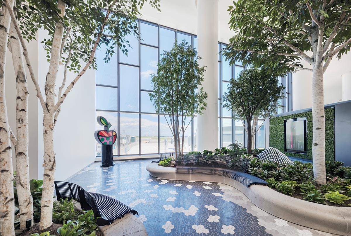
Photo © Jeff Goldberg
Indoor gardens, with hexagonal floor patterns echoing the pavers found in New York City parks, offer places to rest.
Photo © Jeff Goldberg
Manhattan is visible from the airport.
HOK and engineering partner WSP collaborated closely with the design-build joint venture of Skanska-Walsh to develop an ambitious but implementable scheme: a headhouse would be erected in front of the existing Central Terminal, two island concourses would be built airside, and two bridges would connect the structures—all completed while closing no more than four active gates. The old terminal would then be systematically disassembled. “At times, it led to some strange conditions, where passengers would land, walk through a brand-new concourse, cross a temporary bridge, and then emerge into the old terminal,” recalls HOK president Carl Galioto, “but in the end it worked.”
Construction began in 2016 with a 3,100-space parking garage west of the Central Terminal, which freed the team to demolish an existing one that, since the 1970s, had become the unsightly public face of the airport. With it gone, the new headhouse began to rise in its place, about 600 feet closer to the Grand Central Parkway, helping HOK echo the civic presence that the Central Terminal once commanded. “The architecture should start as soon as travelers approach from the road,” Ruggiero adds. The team’s work in this regard extended to advising on the redesign of neighboring terminals, helping to create a coherent, unified airport.
At Terminal B, a sweeping 1,200-foot-long glass curtain wall ensures that the interior of the departures and arrivals hall remains bright—in fact, engineers devised a cable-supported facade system that minimized mullion size—and clerestories along the opposite wall balance that brightness. In section, the architects punched through floor plates, bringing daylight to the arrivals level and baggage carousels (so often tucked into the lowest and darkest floors, but here conceived as a mezzanine, with another floor underneath). Partnering with the Public Art Fund, LGP filled the arrivals and departures hall, as well as other spaces, with commissioned artworks too.
After checking in and passing through security, travelers glimpse the not-so-faraway concourses and the soaring pedestrian bridges that will transport them there. Although similar crossings have appeared in other airports—notably, at London’s Gatwick Airport and Denver International Airport—LaGuardia’s Terminal B is the first in the world with two, and the first to use them as an active part of construction phasing. “It’s also a metaphor,” adds Galioto. “New York is a city of islands and bridges.”
During the planning stage, designers needed to sandwich the bridges between two datum lines. Above, visibility from the air-traffic control tower to the apron could not be obstructed (this also led to the concourses’ gently tapered profiles). Below, the bridges needed to hurdle the existing Central Terminal, which, after demolition, would create space for additional taxiways beneath them to improve aircraft circulation. With 57 feet of clearance, there is enough room for a Boeing 767—a rare but occasional visitor at LaGuardia—to pass by.
HOK’s internal engineering team, using parametric software, studied over 100 truss configurations in search of the right balance of transparency, construction feasibility, and cost. Structurally isolated, the bridges flare outward on either end with steelwork that continues to the ground, where they are supported on 150-foot-long piles. And, with each spanning a distance of about two Manhattan blocks, different scenarios—from routine commuter foot traffic to simultaneous, multi-aircraft deplaning—were analyzed to minimize vibration.
After crossing either of the bridges, travelers begin their descent toward the gates. The Terminal B concourses may lack some of the finer material touches—slatted wood ceilings and marble accent walls—that are flaunted next door at Terminal C, but in many respects, the two facilities cannot be compared. One, operated and developed by a single airline, reflects that company’s “brand”; on the other hand, Terminal B, hosting four major airlines, was always intended to be more universal.
When the ribbon was cut at Terminal B in 2022, some questioned the wisdom of its opening during a pandemic that had upended the airline industry. Others wondered why the new facility had the same number of gates as its predecessor, and not more. Air travel has returned—as of December 2023, the airport is on track to eclipse its previous peak of 31.5 million passengers in 2019—and gate numbers alone do not tell the whole story. With common-use jetways and 57 percent more space for passengers in Terminal B, plus an additional two miles of taxiways across the airport, LaGuardia is operating more efficiently. According to the U.S. Department of Transportation, airport-wide flight delays have decreased from 26.62 percent four years ago to 20.75 percent, which translates to a lot of time and energy saved.
The accolades have steadily trickled in as well. Terminal B recently became the first in North America to receive five stars from airline- and airport-rating service Skytrax. “The evolution from worst-in-class to best-in-class is something that we are very proud of,” Cotton says. “It’s not just that the airport is new, but that, as passengers experience the architecture, interior design, public art, and multiple concessions, they recognize that they’re in New York, too.”
Credits
Architect: HOK — Carl Galioto, project principal; Peter Ruggiero, lead project designer; Jeannette Segal, senior project designer; Paul Auguste, design manager; Matt Breidenthal, engineer of record; James Christerson, senior project architect; Peter Costanzo, Scott Yocum, project architects
Engineers: WSP (m/e/p, civil, geotechnical); Arora and Engineers (fire); Thornton Tomasetti (structural)
Consultants: Vantage Airport Group (operations); Cerami & Associates (acoustics); Cage (baggage); WC3 Design (irrigation); Supermass Studio (landscape); Goldstick Lighting Design (lighting)
General Contractor: Skanska-Walsh Design-Build Joint Venture
Client: LaGuardia Gateway Partners
Owner: Port Authority of New York and New Jersey
Size: 1.3 million square feet
Cost: $5.1 billion
Completion date: January 2023
Sources
Exterior cladding: Navillus (masonry); Sobotec (metal panels)
Curtain Wall: Permasteelisa
Moisture barrier: Carlisle Coatings & Waterproofing
Doors: Nabco; Kawneer (sliding doors); Rytek (rolling doors)
Lighting: 3G Lighting; Pinnacle Architectural Lighting; Architectural Lighting Works; Birchwood Lighting; Cooper Industries; V2; Hubbell Columbia Lighting; Electric Mirror
Conveyance: Kone
Interior finishes: Norton (hardware); Armstrong (acoustical panel ceilings); Modernfold (operable panel partitions); Tarkett (carpet); Dupont (solid surfacing); Scuffmaster (paint)
Garden Variety
An airport terminal brings nature inside and provides spaces to enjoy the outdoors too
By Clifford a. Pearson
WELL BEFORE Bangalore became known as a center of high-tech and information industries, it earned the moniker “the Garden City of India” in response to its plentiful public parks and a temperate climate that nurtures a broad range of flora. The New York office of Skidmore, Owings & Merrill (SOM) leaned into this horticultural legacy in its design of Terminal 2 at Kempegowda International Airport, the rapidly growing transit hub about 20 miles north of the city now known as Bengaluru. “The streets in Bangalore are often lined with trees, and the city has a rich history of landscape design,” says Laura Ettelman, the managing partner for the project. “The idea was to create a terminal in a garden,” says Roger Duffy, a former design partner at SOM.

Photo © Ekansh Goel
Kempegowda Airport Terminal 2

Photo © Ekansh Goel
Bamboo cladding and hanging plants add warmth to spaces throughout the terminal, including the drop-off area.
From the moment travelers arrive at the new terminal to the time they spend waiting to board their planes, they find themselves surrounded by trees, plants, and flowers—many hanging from the terminal’s bamboo-lattice ceiling, others growing on green walls, and some in a “forest belt” between the building and the 11 new aircraft gates. Landscaped outdoor spaces play a vital role in the project’s design, establishing a remarkable degree of indoor-outdoor fluidity for a modern airport with all the standard security protocols. The greenery was a response to Indian cultural practices, sustainability concerns, and a local climate that’s comfortable for most of the year, thanks to Bengaluru’s altitude of about 3,000 feet above sea level.
The 2.75 million-square-foot terminal will handle 25 million passengers each year and help prepare the airport for additional growth, including a 1.3 million-square-foot multimodal ground-transportation hub on the west, now under construction, and an extension to the south of the new terminal still on the drawing board. Much of the SOM team had previously worked on a new terminal at Chhatrapati Shivaji International Airport in Mumbai that opened in 2014. While the project in Mumbai offered a sculptural response to a complex program—employing an enormous undulating roof—the terminal in Bengaluru takes a more orthogonal approach to the roof structure. Designed for modular construction and structural efficiency, it is one of the lightest large-scale terminal roofs in the world, according to the architects. The portions above the check-in and retail halls use longspan steel moment frames supported by steel columns set on a 59-foot (18-meter) grid. Each column brings together a cluster of four steel posts clad in bamboo, a material that grows rapidly and appears throughout the project. In the gate areas, the design team used long-span steel trusses that push columns to the periphery and keep walkways and sight lines open. For the lower floors, the architects created a uniform grid of reinforced-concrete moment frames that provides large column-free spaces for the baggage-claim and arrival areas.
The experience working on the Mumbai airport helped SOM understand how Indian culture affects transportation buildings. For example, it’s common in India for families to accompany travelers to airports, even though people without tickets are not allowed in terminals. So SOM designed a large covered plaza between the multimodal transit hub and the terminal at Bengaluru for families to gather, shop, eat, and wish each other “bon voyage.” “We wanted it to be generous and welcoming,” says Peter Lefkovits, a design principal on the project.
Inside the terminal, the expansive grid structure and bamboo-lattice ceiling provide adaptability so interiors can change as new technologies for check-in and security are deployed. Already, some check-in counters use facial-recognition systems. Instead of installing planters on the floor, SOM and landscape architects at Grant Associates suspended an indoor jungle of plants and flowers from the ceiling, creating a more flexible interior. Skylights above and large perimeter curtain walls bring plenty of daylight inside. Fashion designers Abu Jani and San deep Khosla assisted with furnishings that use local materials such as rattan and helped with the design of planters inspired by local bronze bells and hanging baskets reminiscent of Ruth Asawa sculptures. To underscore the seamless flow of outdoors and indoors, the suspended planters extend from the deep roof eaves over the drop-off area in front of the terminal all the way through the building. They also provide directional cues to travelers, forming tighter clusters in high-traffic areas and spreading out in less busy parts of the terminal.
Sustainability was a driving force behind the design, informing the roof eaves shading much of the building’s glazed perimeter and a daylighting system that includes extensive skylights above the main public spaces. The architects say the terminal will rely entirely on renewable energy (mostly solar, supplied by on-site and off-site arrays). The project captures, treats, and reuses rainwater from the building’s roofs and the site to irrigate plantings both indoors and out. To complement the glass, steel, and concrete of the building’s structure, SOM specified brick for interior walls, local granite for flooring, and engineered bamboo (treated for fire protection and insect resistance) for many interior surfaces and roof soffits. These materials give the large public spaces a warm, tactile quality and connect them to the local building tradition. In the retail area, water trickles down freestanding red-stone walls to add another touch of nature. The project is the largest terminal in the world to be precertified as a LEED Platinum building by the USGBC, before it opened. It also earned Platinum certification for sustainable architecture and design from the Indian Green Building Council.
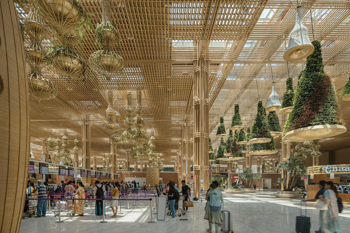
Photo © Ekansh Goel
Daylight streams in above the check-in area. To help passengers navigate the terminal, suspended “bells” and planters cluster most tightly in high-traffic areas.
Indian airports operate 24 hours a day, so SOM designed Terminal 2 to adapt to daily changes in the flow of domestic and international flights. All of the terminal’s gates offer “swing” capability, which allows them to handle either one large-body aircraft (most often used for international flights) or two small planes (for domestic travel). Perhaps the most striking aspect of the project is the so-called forest belt, a 250,000-square-foot landscape separating the “landside” building— the portion before security checkpoints—from the departure gates. Enclosed bridges cross the outdoor area, connecting the landside structure to the gates, while two-story garden pavilions offer places for travelers to relax before their flights take off. SOM worked with Grant Associates on the outdoor feature, using native flora for the landscape and bamboo pavilions inspired by traditional cane weavings.

Photo © Ekansh Goel
Landscaped spaces such as the arrivals plaza and the “forest belt” adjacent to the departure gates embrace the outdoors as integral parts of the terminal, while green walls and suspended plants bring nature indoors.

Photo © Ekansh Goel
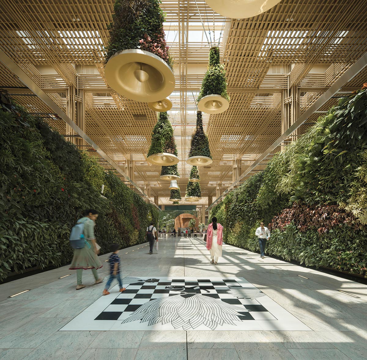
Photo © Ekansh Goel
Airport terminals are essentially machines for processing travelers and often glorify notions of speed and efficiency. “Don’t worry, we’ll get you there as fast as possible,” they try to say. The new building at Kempegowda Airport has a different message for passengers: “Relax, go outside, enjoy a bit of nature.”
Credits
ARCHITECT: Skidmore, Owings & Merrill — Roger Duffy, Colin Koop, design partners; Laura Ettelman, managing partner; Peter Lefkovits, Derek A.R. Moore, design principals; Jason Anderson, Jordan Pierce, Seok Yoon, William Emenecker, Nick Winter, Christoph Timm, Elizabeth Sennott, Tamicka Marcy, Xialu Xu, Blake Altshuler, Preetam Biswas, Charles Besjak, Georgi Petrov, Alexander Jordan, Stanley King, Ece Calguner Erzan, Lauren Kosson, project team
ENGINEERS: Arup (m/e/p/f for Terminal 2); Buro Happold (m/e/p/f for multimodal transit hub)
CONSULTANTS: Grant Associates (landscape); Abu Jani and Sandeep Khosla (interior design); STUP Consultants (landside infrastructure); BNP Associates (baggage); Ch2m Hill (airside facilities)
GENERAL CONTRACTOR: Larsen & Toubro
CLIENT: Bangalore International Airport Limited (BIAL)
SIZE: 4.1 million square feet (including multimodal hub)
COST: $600 million
COMPLETION DATE: September 2023
Sources
CURTAIN WALL: Geotrix Building Envelope
ROOFING: Kalzip
NTERIOR BRICK: L&T (locally made)
RATTAN MILLWORK: Sreeji & Rachana Art
LIGHT FIXTURES IN GATE LOUNGES: Rachana Art + Regent (custom)
ELEVATORS/ESCALATORS: Otis
Designed to a ‘T’
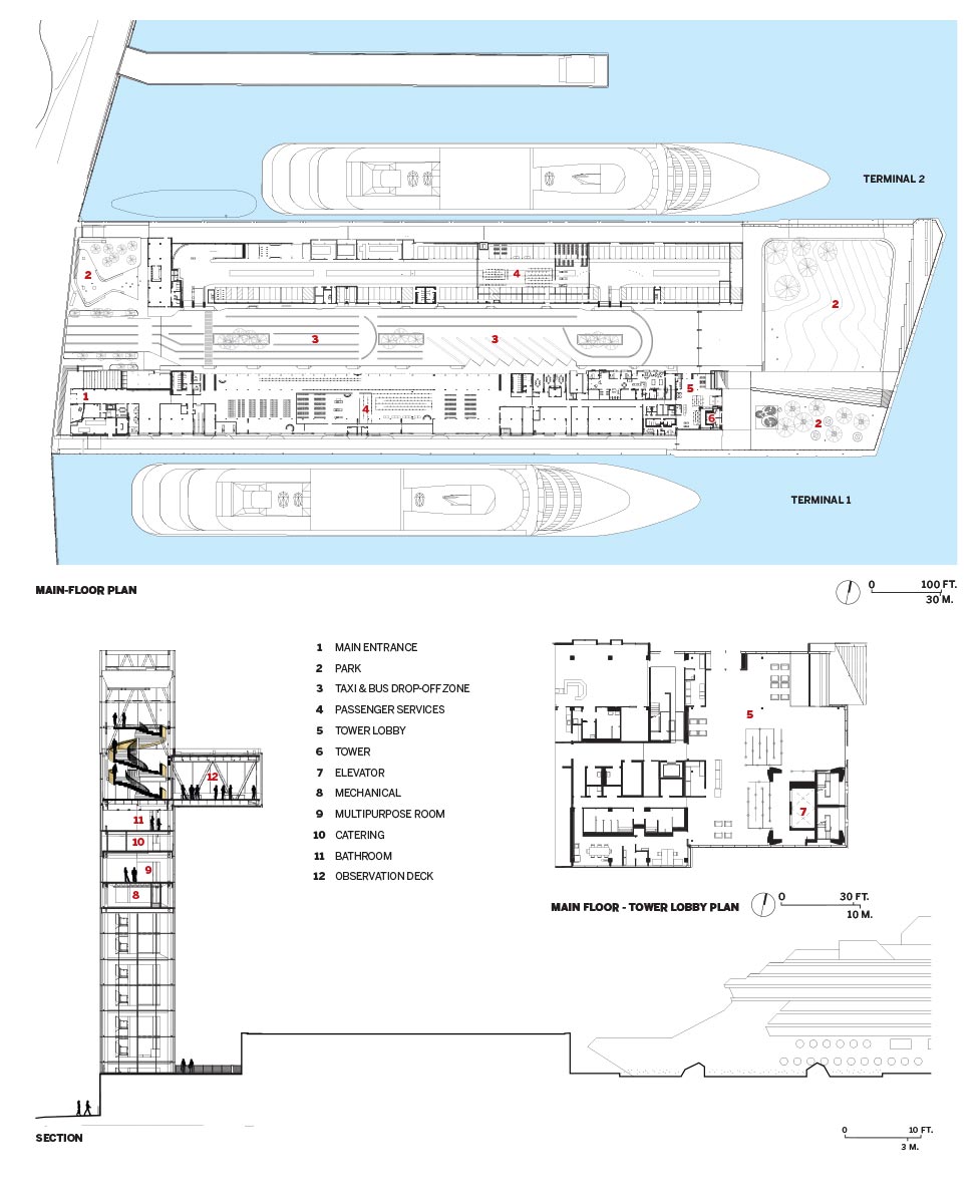
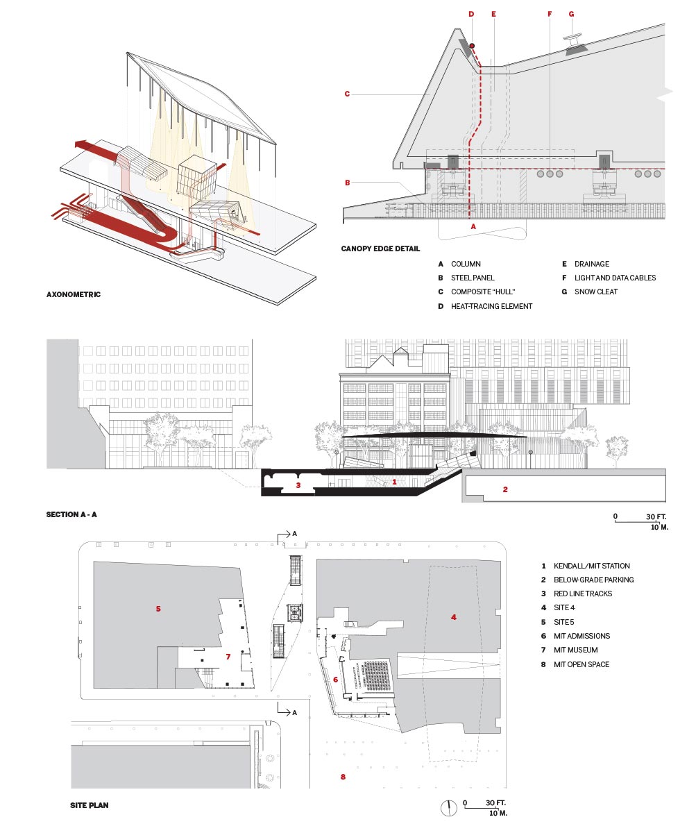
A geometric ensemble doubles as a mass-transit headhouse and marks a new gateway to MIT’s campus
KENDALL/MIT GATEWAY | CAMBRIDGE, MASSACHUSETTS | NADAAA WITH PERKINS&WILL
BY LEOPOLDO VILLARDI
The Red Line is the Massachusetts Bay Transit Authority’s workhorse “T” line—as the Boston-area subways are colloquially known—moving more commuters than any other in the system. Heading south from Alewife Station, in north Cambridge, the Red Line passes by Harvard University and the Massachusetts Institute of Technology (MIT) before crossing the Charles River to service downtown Boston and the South Shore. Earlier this year, NADAAA and the Boston office of Perkins&Will inaugurated a new headhouse along the line at the Kendall/MIT stop. Despite a rebrand in 1978 to include the institute’s acronym, most signs inside the station still only read “Kendall.” That identity crisis was at the root of the problem.
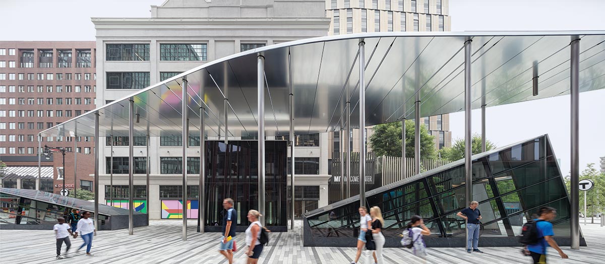
Photo © John Horner
Pedestrians filter through the gateway, passing beneath a semireflective underside.
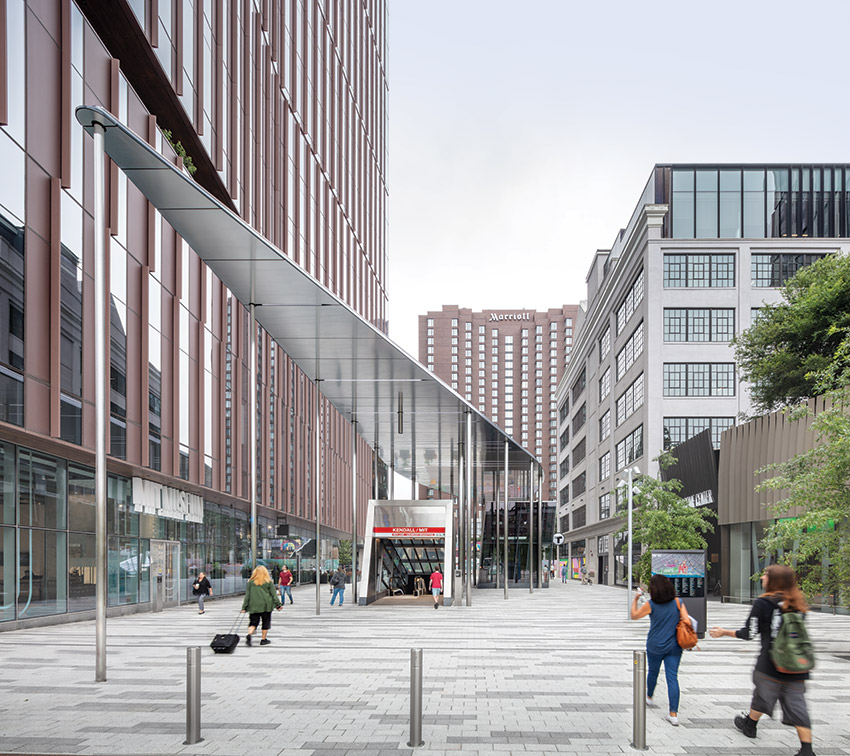
Photo © John Horner
Unlike the Red Line’s Harvard stop, which opens onto a public square at the edge of that university’s Yard, MIT’s most recognizable symbol—architect William Welles Bosworth’s domed Building 10—is a half-mile away from its respective station. “You’d come up into a CMU bunker and ask: Where’s MIT?” says Harry Lowd, associate at NADAAA. In recent years, that venerable institution has expanded eastward, toward the T stop, replacing parking lots with a burgeoning tech and life-sciences hub. The central question became, as Lowd explains: “How do we design a headhouse and gateway to MIT, but still encourage passage through it and connect the Kendall Square neighborhood with the rest of Cambridge?”
The team at NADAAA is no stranger to this slice of campus—the “gateway” sits next to Site 4 (RECORD, November 2021), which the firm, again working with Perkins&Will, completed under a separate contract three years ago. That faceted, glinting tower—Cambridge’s tallest—houses graduate students and incorporates two century-old warehouses, adaptively reused as group study and social spaces, an innovation and entrepreneurship incubator, and a ground-floor admissions office, which importantly sits exactly where travelers exit the station.
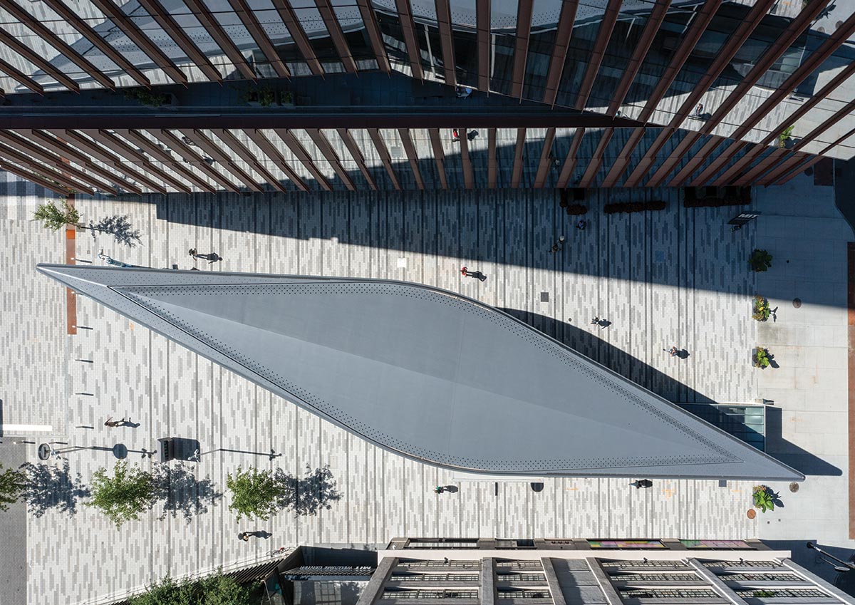
Photo © Harry Lowd
The canopy’s two halves were shipped on a barge (above) and connected in situ (below).
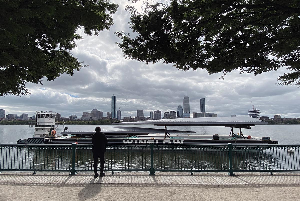
Photo © John Horner
Opposite NADAAA’s building, on the other side of the gateway, Weiss/Manfredi’s 17-story Site 5 accommodates the new MIT Press bookstore and the MIT Museum by Höweler + Yoon (RECORD, December 2022). To the north is Main Street (under which the Red Line runs) and a Marriott hotel beyond, and to the south is MIT Open Space, an often-bustling, art-filled 4¾-acre urban park by Hargreaves Jones that conspicuously hides an astonishing seven levels of subterranean parking. The location of the new headhouse, along the town-and-gown boundary, is a highly charged one.
The Kendall/MIT Gateway is not a portal in the traditional sense. “Normally, it’s a threshold, a door, a facade, a perpendicular plane to one’s path of travel,” says NADAAA principal Nader Tehrani. But that’s not possible here, he explains, because the distance between Site 4 and Site 5 is 76 feet. Instead, the team developed a geometric ensemble through which people can filter.
The approach architectonically acknowledges the needs and motivations of two very different clients. Falling under the jurisdiction of the MBTA are three precisely canted volumes—one enclosing a staircase, another accommodating an escalator, and the last housing an elevator—that peek up above the ground plane and lead to the station below. But beyond these access points, the street level is ostensibly MIT’s campus. A sleek, streamlined canopy, supported by a field of 26-foot-tall columns, hovers over the three prismatic kiosks to unify the composition. It is a fitting urban baldacchino for straphangers and students alike.
Fabricating this winglike form, which is a rounded parallelogram in plan, would have proved daunting had the team relied on traditional construction methods, with hundreds, if not thousands, of pieces and all the attendant precision. “Looking at composite structures used in the maritime and aviation industries reduced complexity tenfold,” Tehrani says of the decision to partner with Maine-based shipwright Lyman-Morse.
At almost 159-feet long, the assemblage is the longest the boat builder has ever produced. The process largely resembled that of crafting a ship’s hull, albeit one turned upside down—fiberglass cloth, laid inside a CNC-milled mold, is reinforced with carbon fiber (where loads required it) and resin to create a monocoque, a shell with inherent structural properties. Bulkheads, or internal ribs, were installed to provide additional lateral support and to accommodate the canopy’s “guts” (connections to columns, lighting and data cables, and drainage). For logistical reasons, the shell was made in two pieces and shipped to Cambridge on an ocean-faring barge that traveled along the Atlantic Coast and through the locks of the Charles River. With the columns already erected, the two halves were hoisted, jostled into place, and connected in situ in a single day.
Semireflective steel panels and programmable light strips enclose the underbelly. The resulting effect is subtler and more atmospheric than the spectacle of Norman Foster’s Ombrière in Marseille, France (RECORD, August 2013), which Tehrani and his team examined. But, given the many tall buildings around the Kendall/MIT Gateway and the high vantage points they provide, special attention was paid to the canopy’s top—a surface that, as a boat hull, would never be seen, but here is on full display. A keel-like spine accentuates its camber, while snow cleats dot the edges of the shell like industrial rivets.
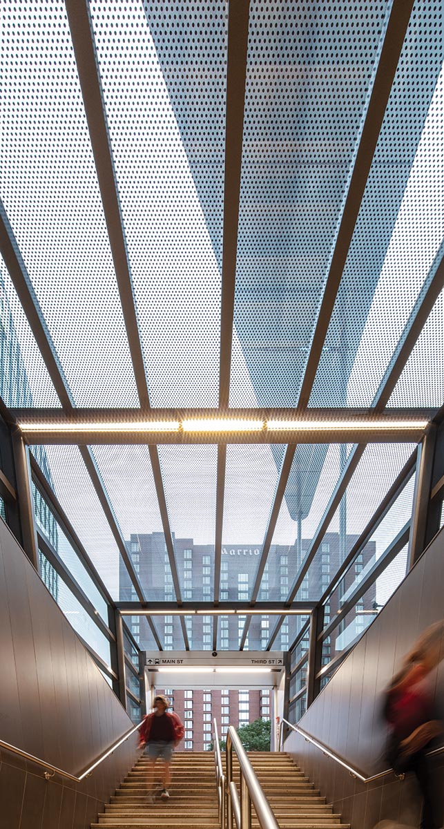
Photo © John Horner
Three access points are clad in fritted glass.
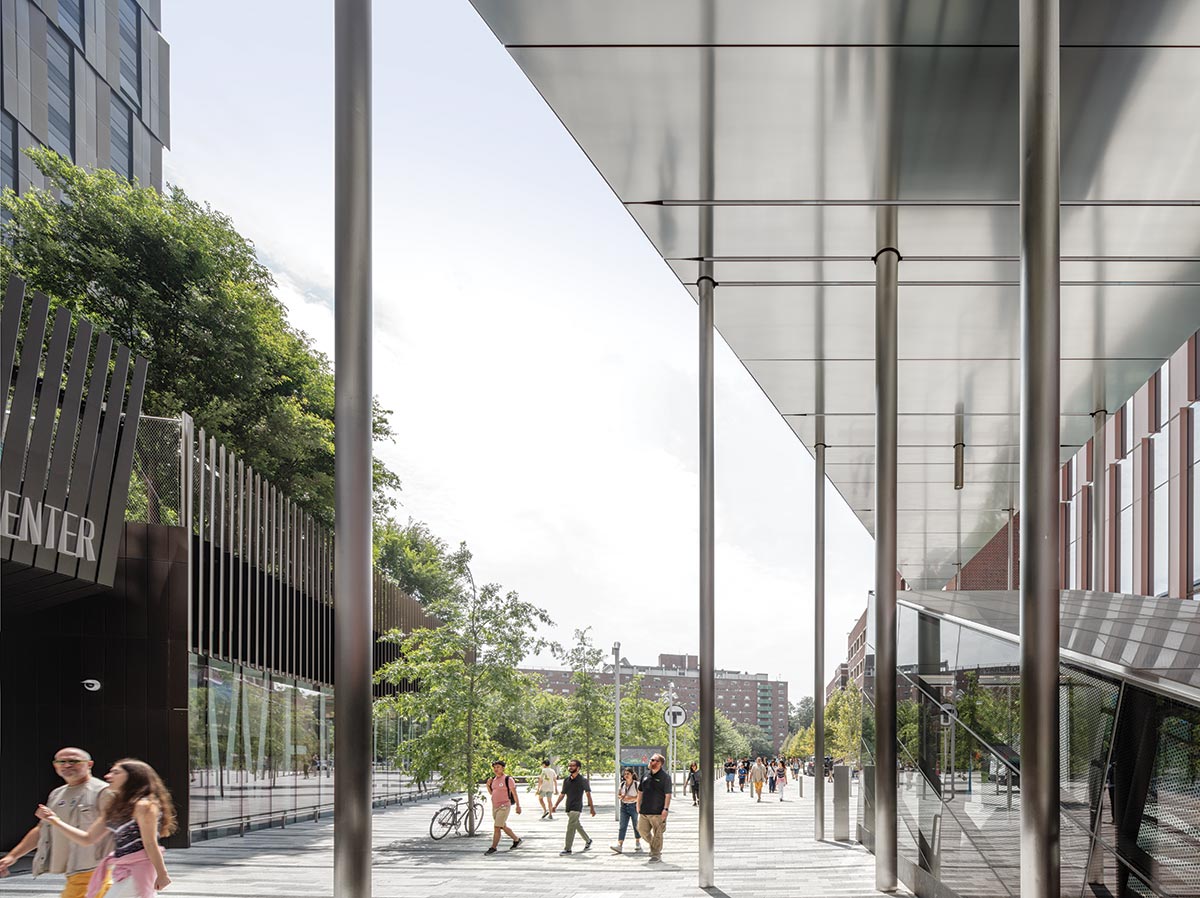
Photo © John Horner
A field of columns echoes the trees on MIT Open Space.
From a structural standpoint, the inverted hull essentially operates like an airfoil. “It takes very little to support the weight. The problem is that it’ll fly away because of the wind. The columns work in compression, but they also work in tension to hold that baby down,” Tehrani adds. Although NADAAA explored a variety of column configurations, the final scheme is airy, with a handful of hearty columns (that conceal drainage and heat-tracing systems) near the canopy’s center, slender ones at the ends, and suspended stalagmites with integrated LEDs that strategically illuminate the ground.
Across Main Street, a different team of designers, with a different vision, is realizing another headhouse. The MBTA might have missed an opportunity by not considering both sides of the stop as a single design problem—but, in the meantime, comers and goers can handily amble underneath the Kendall/MIT Gateway’s lustrous soffit and take in its tapered silhouette as they exit the station. It was never meant to be a gem, says Tehrani, but, coming near the conclusion of a campus expansion, “it is like the period at the end of a sentence”—one that has as much to say about urban planning as it does about local placemaking.
Credits
Architect: NADAAA — Nader Tehrani, Katherine Faulkner, principals; Harry Lowd, Tom Beresford, project managers; Arthur Chang, Alex Diaz, Tim Wong, Nick Safley, Elias Bennett, Ali Sherif, Katie Solien, Ergys Hoxha, Luisel Zayas, design team
Architect of record: Perkins&Will — Robert Brown, principal; Sandy Smith, project manager; Ramsey Bakhoum, project architect; Marko Goodwin, Jeff Lewis, Matthew Pierce, Stephen Messinger, Josh Rathbun, James Lee
Engineers: SGH, McNamara Salvia (structural); AHA Consulting Engineers (m/e/p/fp); Nitsch Engineering (civil); McPhail Associates (geotechnical)
Consultants: Lyman-Morse (canopy and design assist); Hargreaves Jones (landscape); SoSo Limited, Lam Partners (lighting); Jensen Hughes (code)
General Contractor: Turner Construction Company
Client: MITIMCo
Owner: MBTA
Size: 2,700 square feet (above grade); 3,900 (below grade)
Cost: withheld
Completion date: July 2023
Sources
Steel structure: Capco Steel
Curtain wall: Linel
Cladding: QC Facades (canopy underside)
Conveyance: Otis (escalator), Delta Beckwith (elevator)
Paving: Hanover
Lighting: Standard Vision (canopy downlights)
Stone: Neolith (sintered stone); Commercial Masonry (granite)
High Line
CAMPANHÃ INTERMODAL TERMINAL I PORTO, PORTUGAL I BRANDÃO COSTA ARQUITECTOS
A bus station topped by an elevated walkway on the city’s edge cuts across the landscape
BY IZZY KORNBLATT
Behind the Campanhã railway station on the eastern edge of Porto, an elevated concrete walkway cuts north across the landscape, turning sharply where it meets a roundabout and then continuing on a viaduct over a hillside. From this vantage point, one looks out over a tangle of tracks and platforms on one side and an old, low-rise residential neighborhood, bitten into by an eight-lane highway, on the other. The rush of traffic, the clash in scales, the division of the city wrought by infrastructure: Campanhã represents a familiar landscape defined by conflicting ways of occupying and moving through space.
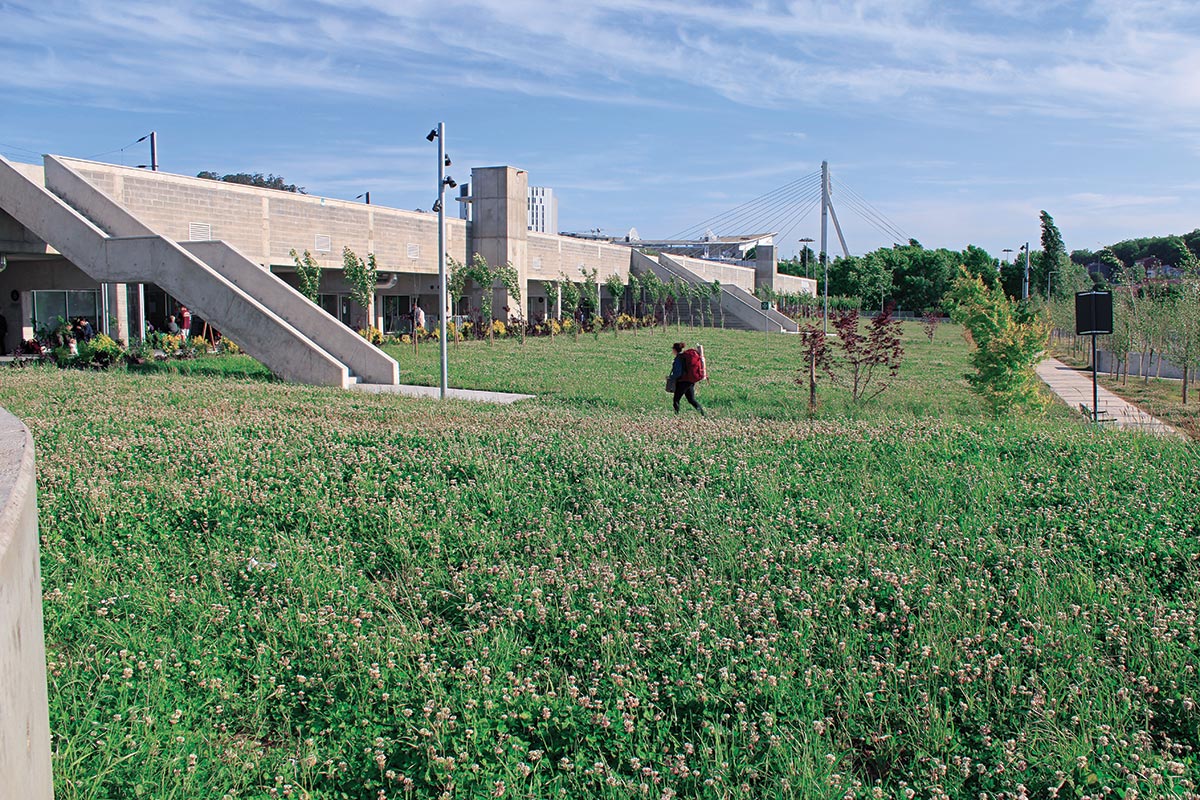
Photo © Rita Guedes
The terminal creates a large new park on a site squeezed between a highway and railway tracks.
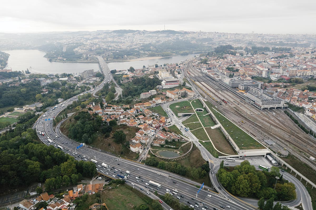
Photo © Francisco Ascenção
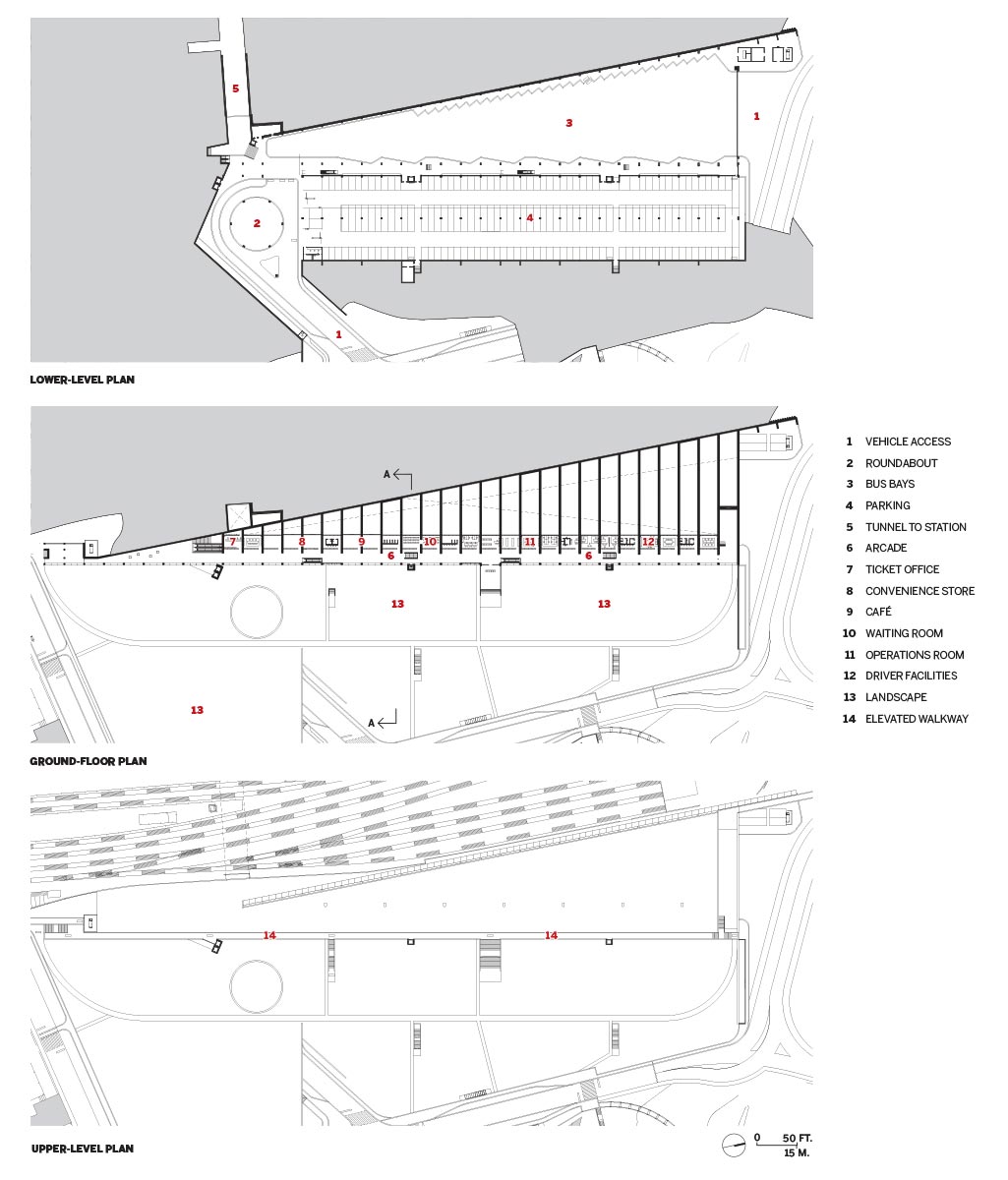
Below the walkway, in a cavern built into the 35-foot-high hillside and topped with a green roof, is the new Campanhã Intermodal Terminal, a 200,000-square-foot bus station that is now one of the main gateways to Portugal’s second-largest city. Designed by architect and University of Porto professor Nuno Brandão Costa, who won a public competition for the project in 2016, the terminal stitches together the heterogeneous conditions on each side of the tracks, reconfiguring roadways to create new public green spaces and opening up access to two existing tunnels below the tracks for the first time. The interstitial slice of land where it sits was what “the urbanists of the ’80s and ’90s used to call the ‘non-place,’ ” says Brandão Costa, and in designing the terminal, which is organized on three levels around the gesture of the linear path—elevated walkway at the top, arcade below, and bus-access area underground—Brandão Costa undertook an “urban intervention,” as he puts it, giving new purpose to this disused piece of land.
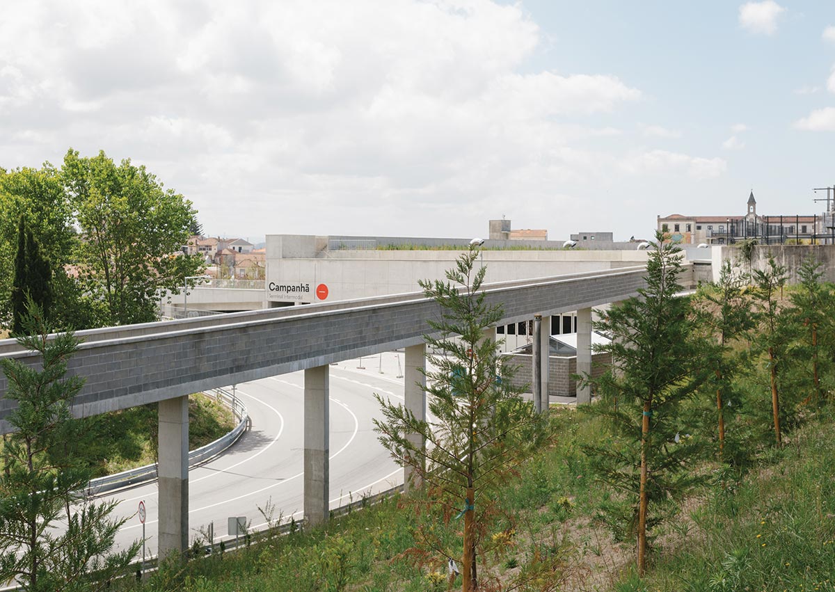
Photo © FRANCISCO ASCENSÃO
A walkway on the terminal’s upper level continues north on an elevated viaduct adjacent to the railway embankment.
The story of redemption that this calls to mind is nothing new: the forlorn or vacant site given value through the building of a good and stirring work of architecture. But such narratives carry with them a risk: that the uncomfortable realities of modernity are made palatable in the realm of aesthetics, where they are answered with “design solutions.” What Brandão Costa has done is to realize a design solution—a clever organization of spaces that benefits both its occupants and the adjacent neighborhood—but without a pat sense of redemption.
Like the works of Álvaro Siza, another central figure at the University of Porto, Brandão Costa’s building earnestly seeks to reconfigure the built world for the better while at the same time laying bare the realities of the society that produced it. Rather than tempering the harshness of the site, it makes the site—and the collision of infrastructure and neighborhood that defines it—its subject, so that as you arrive, buy tickets, descend into the cavern, and board your bus, you remain ever aware of the fragmented landscape, of the railway embankment as a brutal unyielding datum, of the industrial reality of modern infrastructure, and of the contemporary reality that public buildings must be built as cheaply and simply as possible.

Photo © Rita Guedes
The upper-level walkway offers a vantage point and a place to pass time.
In total, the terminal stretches roughly 2,000 feet, beginning, on its southern end, at an existing passage to the railway station, and continuing alongside the tracks as a single-level covered walkway that then splits to two levels. After another hundred feet, where the site is finally wide enough to fit the bus infrastructure below, the lower arcade widens, station amenities (café, waiting room, restrooms, ticket office, and more) appear on its western side between the arcade and the tracks, and staircases, escalators, and elevators come into view. The arcade ends above an access road; this is where the upper walkway jogs back and continues north along a viaduct leading to a narrow green space between the embankment and the highway. There Brandão Costa has renovated and restored a 19th-century farm building, turning it into a public community space for the municipality.
The below-grade level is dominated by a grand triangular space, lit through clerestory windows set between deep concrete beams that span eight bus-boarding bays and 30 storage bays; a second tunnel to the rail station is accessed from here. But, apart from the linear walkways and vehicle entrances, the only aboveground indication of this complex program is a circular portal in the landscape that floods a below-grade vehicular roundabout with light—and helps provide enough air to render mechanical ventilation unnecessary throughout the complex. The practical benefits of excavating into the hillside are self-evident: idling buses, parking, and even a drop-off area for passengers are removed from the surface, enabling the creation of some 300,000 square feet of park space, designed in collaboration with landscape architect Rita Guedes.
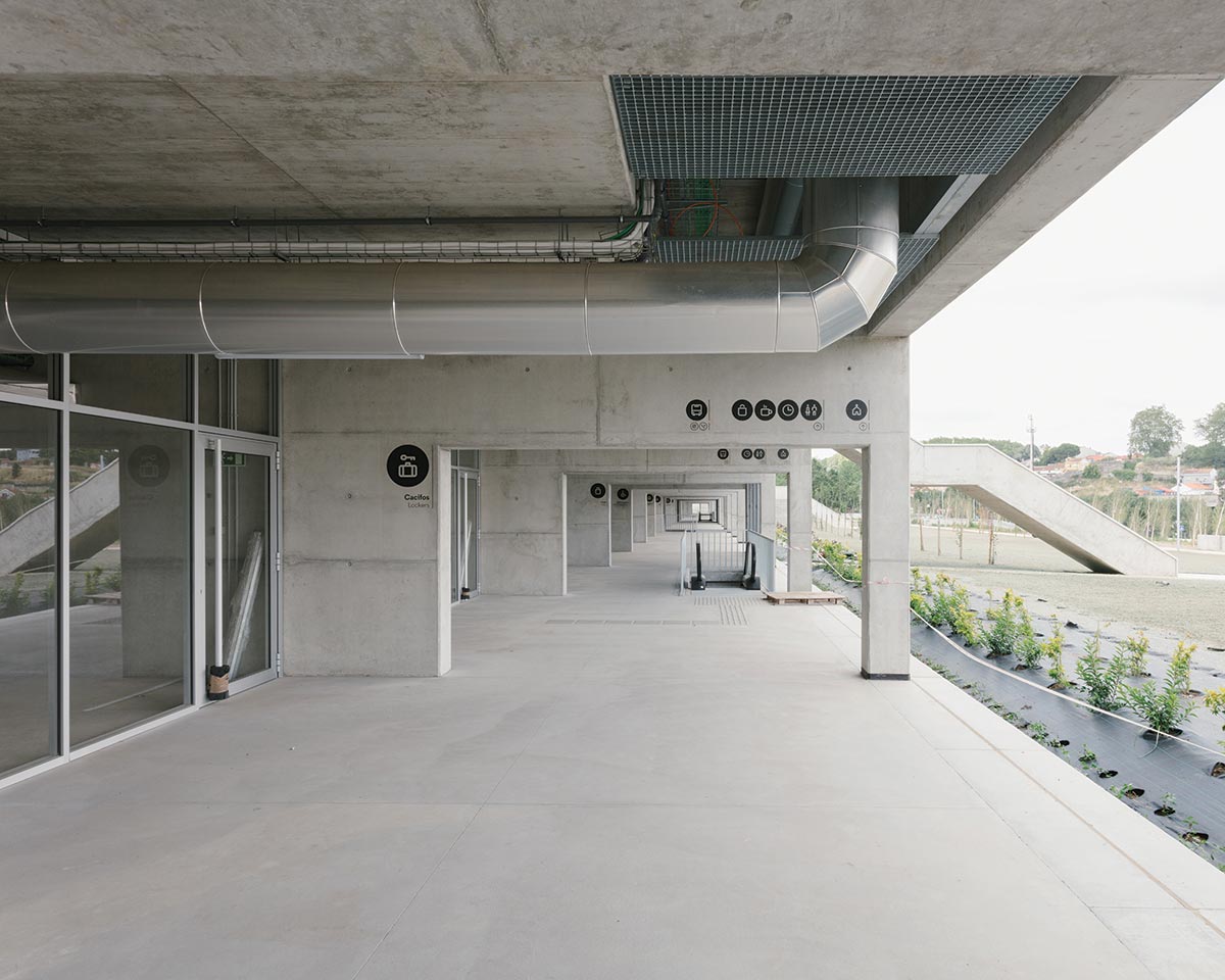
PHOTO © FRANCISCO ASCENSÃO
Station amenities are located along an arcade one level above.

PHOTO © FRANCISCO ASCENSÃO
Natural light and ventilation are provided by a circular oculus
Like Siza’s, Brandão Costa’s material palette is spare to the point of asceticism. Most of the structure is framed in cast-in-place concrete infilled with concrete block and glazing. Corrugated-metal roofing covers two small service structures at the northern roadway portal as well as the restored community building. Ducts and conduits are exposed throughout. The only material luxury is the dark granite pavers used for the underground roadway surface, which lends the space the feel of a “covered street,” as Brandão Costa puts it, and a dignity not often accorded the most inexpensive form of intercity transportation.

PHOTOGRAPHY: © FRANCISCO ASCENSÃO
Monumental concrete beams span the bus bays on the lower level (above and below). Concrete is the primary material throughout (below).

Photo © FRANCISCO ASCENSÃO
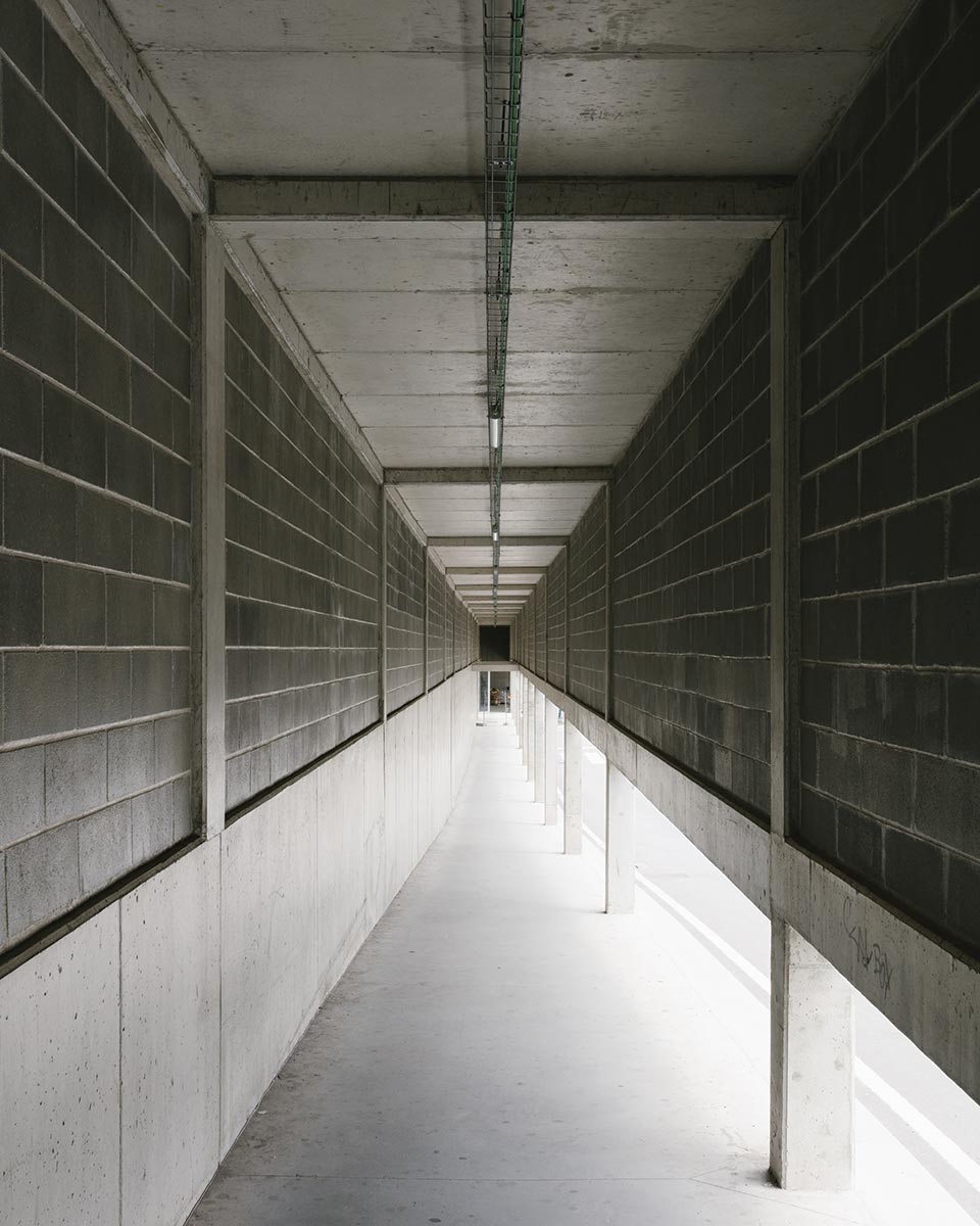
PHOTO: © FRANCISCO ASCENSÃO
Concrete is the primary material throughout.
There is one other element of architectural superfluity: the upper walkway itself, which in the provision of pedestrian access is largely redundant. “It has no utility,” Brandão Costa confirms, and was not included in his original competition scheme. It is simply a “space you visit to understand where you are”—it provides the only vantage point from which one can take in the vista of Campanhã in all its complexity and is that rarest of things, a space entirely free of program, for visitors to make their own. Within the context of what might be termed an “architecture povera,” an architecture that like the arte povera of postwar Italy insists on placing the cultural impoverishment of modernity on display, the generosity of this gesture is striking, and telling.
The severe early works of Siza that the terminal brings to mind have similar if smaller moments of indulgence, like the famous staircase leading nowhere at the Bouça housing complex just a few miles away. And though the reality that Siza addressed in the 1970s—the literal poverty of post-dictatorship Portugal—is hardly the same as that faced by Brandão Costa today, it’s notable that both architects find space for excess within austerity. In neither case is the excess trivial: it is essential to the way in which both architects make use of aesthetics. For, rather than proposing the usual redemption of experience through beauty, these buildings instead offer new ways to occupy, and thus new ways to think about, the quotidian, debased environments of modern life. This is true throughout the Campanhã terminal, but nowhere is it more true than the walkway, where one becomes aware of one’s own place within this chaotic landscape. And in this substitution of reckoning for redemption, the terminal illustrates a compelling method by which ethics is restored to architectural form-making.

Credits
Architect: Brandão Costa Arquitectos — Nuno Brandão Costa, architect; Francisco Ascensão, project coordinator; Anna Kazimirko, Beatriz Ferreira, Damião Franco, José Pina, Luís Filipe Carreno, Rita Leite, Simon Ruey, team
Engineers: AdF Consultores (structural); RS Associados (mechanical); GET (electrical)
Consultants: Rita Guedes (landscape); Cacao (road design); United By (signage)
General Contractor: ABB
client: Municipality of Porto
Size: 535,000 square feet (gross, including landscape)
Cost: $14 million (construction)
Completion date: July 2022
Sources
Green Roof: LandLab
Windows: Eme Singular (metal frame); Tria (fire-control windows)
Furnishings: Gorka (chairs, tables)
Ellinikon Park
Athens | Foster + Partners with Sasaki
ANDREW AYERS
When it opened, in 1938, Kalamaki Airfield, as it was then known, stretched out between the Aegean Sea and the countryside of East Attica, five miles south of central Athens. By the time it closed, in 2001, Ellinikon International Airport, as it had become, was in the middle of the city, engulfed by an ocean of apartment buildings. Operating at well over capacity and unable to expand, it was replaced by Athens International Airport Eleftherios Venizelos, which entered service in anticipation of the 2004 summer Olympics. After closure, in preparation for the games, the section of the disused airport nearest the city center was converted into sports facilities—the grass between runways became hockey, baseball, and softball fields, the aircraft-repair hangar transformed into a basket- and handball arena, while a whitewater course for canoe and kayak slaloming was dug where cargo services once operated. But, following the Olympics, the sports facilities were abandoned, after which the 2008 financial crash and the ensuing Greek government-debt crisis saw to it that the future of the 1,500-acre site would hang in the balance for well over a decade.
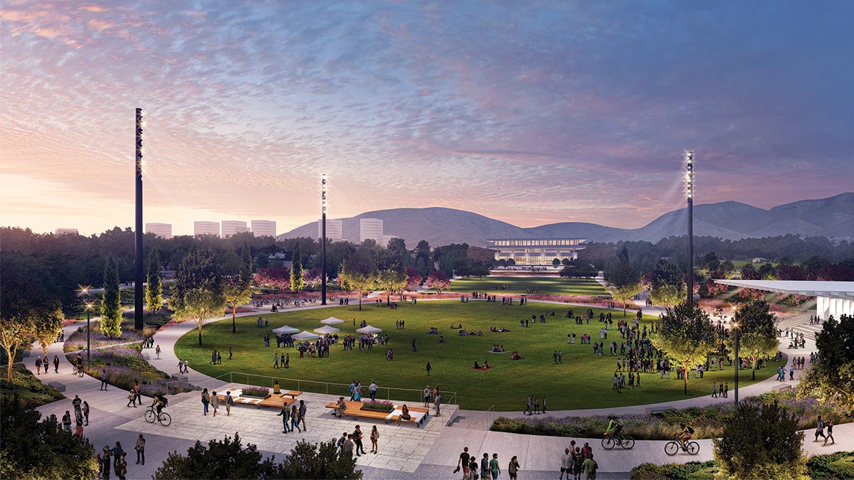
IMAGE: COURTESY SASAKI
South of central Athens, the Ellinikon Park development will replace a disused airport with a residential area, coastal resort, and 600-acre park. As part of the project, an Eero Saarinen terminal will be preserved and adapted as a cultural center.
IMAGE: COURTESY SASAKI
South of central Athens, the Ellinikon Park development (above) will replace a disused airport with a residential area, coastal resort, and 600-acre park (below).
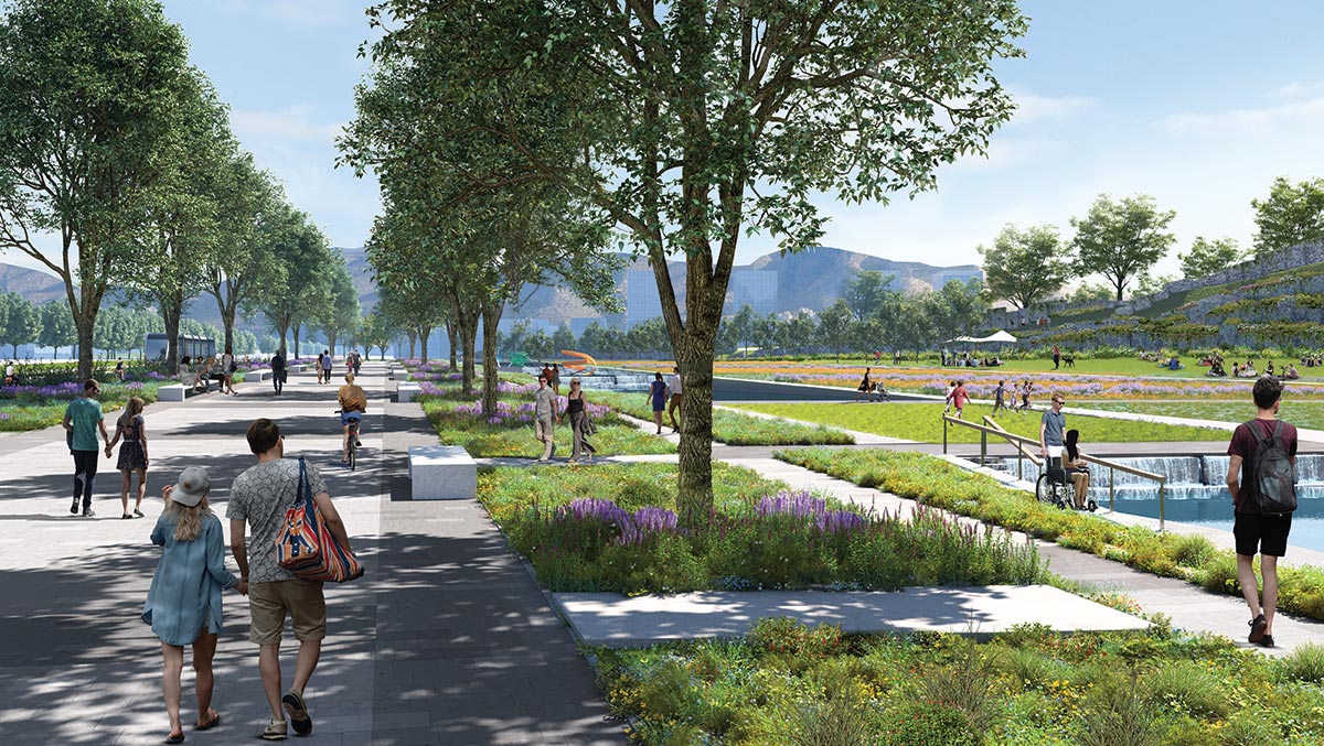
IMAGE: COURTESY SASAKI
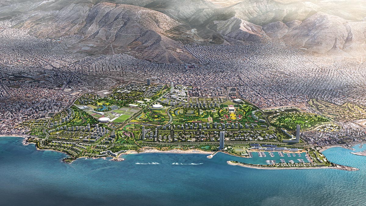
IMAGE: COURTESY SASAKI
All of that changed in 2020 when demolition work began as part of a 25-year redevelopment program, master-planned by Foster + Partners, that will see Ellinikon become a new residential neighborhood, coastal resort, and 600-acre park. “The largest urban regeneration project in Europe,” according to Lamda Development, the Greek real-estate company behind the estimated-$8 billion scheme, it will include thousands of new homes, upmarket shopping malls and hotels, a business park, sports facilities, a mega-yacht marina, and other leisure destinations such as a cultural center in Eero Saarinen’s East Terminal building (1960–69), one of several airport structures that will be preserved and repurposed. In 2021, in a shrewd marketing move, Lamda opened the Ellinikon Experience Park, a tiny chunk of the much bigger Ellinikon Metropolitan Park (slated for completion in 2030), as well as a giant visitor-information center inside the renovated Air Force Hangar C (one of three hangars at Ellinikon landmarked by the Greek culture ministry).
Today, as depollution and infrastructure works continue, ground has broken on Foster + Partners’ Riviera Tower—one of two waterfront skyscrapers planned for Ellinikon—which, at 650 feet, is set to become Greece’s tallest building when the luxury residential complex completes in 2026. In its shadow, next to the marina, Kengo Kuma’s wave-canopied Riviera Galleria, “the finest luxury retail and leisure development in Athens” according to Lamda’s promotional blurb, will follow at an as-yet-unspecified date. Just inland, and therefore slightly down-market, the recently announced Little Athens, one of the Ellinikon’s new residential neighborhoods, will consist mostly of 66-foot-high apartment buildings as well as a handful at 164-feet-high, one of which, the BIG-designed Park Rise, will form the sector’s centerpiece with a “concave facade [that] creatively reimagines the classic Greek column.”
In a low-wage Greece, where the economic situation remains precarious and young Athenian families have great difficulty buying homes, the Ellinikon project has been criticized for catering only to the rich foreigners who will be able to afford its upscale living. In response, the project’s backers stress the need for overseas investment and the jobs that the development will create. But the cash-strapped Greek authorities can perhaps claim one unalloyed victory, namely that so much of the Ellinikon site has been earmarked for parkland. In a city notoriously lacking public parks—Athens comes second to last in the European Environment Agency’s ranking of urban green space and tree cover in the continent’s capitals, and its densely built neighborhoods already broil in average July temperatures of 91 degrees Fahrenheit—a huge green lung has the potential to make a palpable and lasting difference. According to American landscape architects Sasaki, who are masterminding the park, it will not only increase the allocation of open space per inhabitant by 44 percent but will also “have a significant impact on Athens from a climate perspective.”
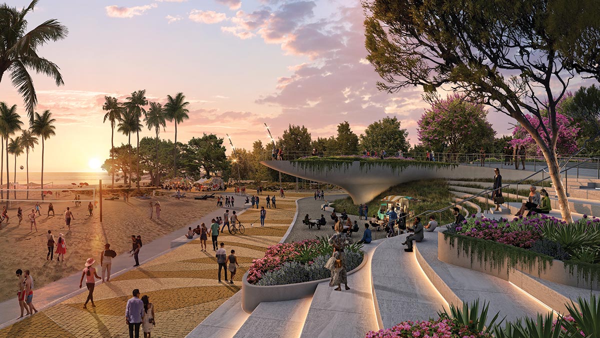
IMAGE: COURTESY SASAKI
The BIG-designed Park Rise will be at the heart of one residential sector. A beachfront promenade is also part of the plan.
IMAGES: COURTESY BJARKE INGELS GROUP
As commercial passenger aviation passes its centenary, Ellinikon joins a growing number of obsolete airfields—among them Berlin’s Tempelhof, Quito’s Mariscal Sucre, Shanghai’s Longhua, and two former airports in the Taiwanese city of Taichung—that have been wholly or partly repurposed as public parks. But this is perhaps the first time that such care will have been taken to make the project as low-carbon as possible. Besides recycling all demolished concrete and using the Olympic whitewater course as an ornamental lake, to be filled with stormwater, Sasaki plans to pile up chunks of marble-aggregate runway to form a fountain of concrete menhirs that will be fed, like the park’s irrigation system, with treated wastewater. Thirty percent of the park is planned for higher-maintenance frequent human-contact use, while the remainder will be landscaped so as to reestablish local Mediterranean ecosystems. Setting “a new standard for ecological restoration,” the park will “resonate for the next 1,000 years,” claims Sasaki.
Southern Gateway Park
Dallas | HKS and SWA
BY MATT HICKMAN
Although it does have a celebrated park built directly over a major freeway, Dallas cannot claim bragging rights as the first city to create one. (Per the Federal Highway Administration, Seattle maintains that distinction with its aptly named Freeway Park, which opened in 1976.) Since debuting in 2012, the OJB Landscape Architecture–designed Klyde Warren Park, which spans a below-grade section of the Woodall Rogers Freeway to unite the downtown Dallas Arts District with the fast-growing Uptown district, has served as an exemplar of infrastructure-topping parks that (re)connect freeway-sundered neighborhoods while generating new open public space for recreational and cultural pursuits.

IMAGE: COURTESY HKS AND SWA FOR THE SOUTHERN GATEWAY PUBLIC GREEN FOUNDATION
View of Southern Gateway Park’s first phase, including its playground and escarpment feature, looking toward downtown Dallas.
Beginning in 2025, Texas’s interstate-tangled third-largest city will be able to boost two freeway-lid parks with the planned first-phase completion of Southern Gateway Park. Designed by the Dallas offices of HKS and SWA with Pacheco Koch, the new park will cover a section of I-35E between Ewing and Lancaster avenues adjacent to the Dallas Zoo. Capping 5.5 acres of freeway and extending to Marsalis Avenue when fully completed, Southern Gateway Park will stitch together long-severed sections of Oak Cliff, a sprawling patchwork of communities colloquially referred to simply as South Dallas and originally developed as a separate township, before its annexation in 1903. Like far too many interstate construction projects initiated during the mid-20th century, I-35 bisected a historic Black community in the southeast of Oak Cliff, taking with it property and prosperity.
“In following years, lack of capital investment and adequate services contributed to generational poverty, social isolation, environmental injustice, and economic despair for much of southern Dallas,” summarizes SWA in a statement, adding that this “park with a purpose” is an opportunity to “knit historic Oak Cliff back together and to create a physical connection and public space that drives equitable community revitalization and economic mobility.”
As notes April Allen, a longtime Oak Cliff resident who serves as president and CEO of the nonprofit Southern Gateway Public Green Foundation, this is what sets Dallas’s next freeway-deck park apart from its celebrated predecessor. “Klyde Warren Park has been a runaway success, but what’s different about our project is the community that we’re in,” she says. “We’re really about reconnecting a neighborhood that was divided by the interstate system.”
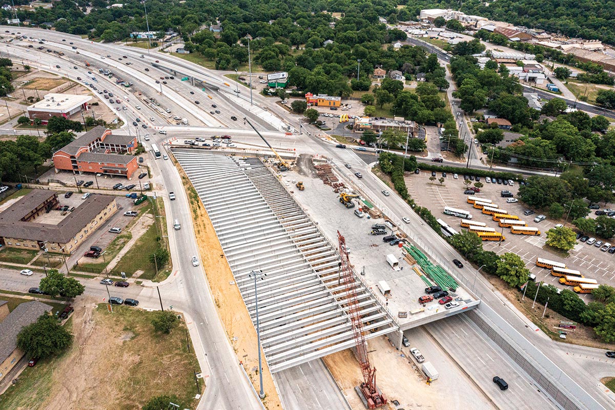
Work on the $82 million first phase of Southern Gateway Park kicked off last November, following the completion of the deck structure by the Texas Department of Transportation as part of a multiphase reconstruction/widening project along I-35E.
Like Klyde Warren Park, it is being executed through a public-private partnership.
PHOTOGRAPHY: © DAVID LLOYD/SWA
Deck construction over 1-35E in Oak Cliff was completed by the Texas DOT last year.
With construction on the initial 2.8-acre section of the park under way, Allen hopes it will be aspirational for similar projects in more preliminary stages seeking funding from the U.S. Department of Transportation’s first-of-its-kind Reconnecting Communities and Neighborhoods Grant Program. “We feel like we’re kind of the poster child for the program,” says Allen. “There are a lot of other communities looking at grant funding for planning purposes at this stage, but, in terms of actual construction, we are, to my knowledge, the furthest along for a project located in a historically under-resourced neighborhood impacted by the freeway system.” (Late last year, the North Central Texas Council of Governments applied for a total of $95 million in grant funding through the program for the second phase of Southern Gateway Park, along with three other freeway-lid park projects.)
What can be expected when the first phase of Southern Gateway Park opens next year? The design, guided by an equitable development plan with vital input from the community, references the unique topography of Oak Cliff through undulating-pathway-laced landforms dotted with mature trees. Locals will recognize that the design echoes the area’s signature geographic feature, a craggy limestone escarpment. The park “visually matches the neighborhood, its vegetation and topography,” says Chuck McDaniel, lead designer and founding principal of SWA’s Dallas studio.
Within this rolling interstate-blanketing landscape, the design team packs in myriad amenities: a terrace-topped restaurant and retail building tucked beneath a manmade hill, water features, a wide public promenade cutting diagonally through the park, and flexible gathering and performance spaces, including a sprawling open lawn and a stage pavilion. On the south side of the park will be the first part of a destination playground, which will double in size with the completion of phase two. Play equipment is being built from natural materials, going for what McDaniel calls “a playhouse-in-the-woods notion, as if the children themselves cobbled it together in the ravine.”

PHASES 1 AND 2 SITE PLAN
There are also plans for features throughout the park that relay the history and culture of Oak Cliff, including what Allen calls an “Oak Cliff Walk of Fame” on the main promenade, where the names of notable community members would be engraved in bronze pavers, complete with QR codes that will lead to biographical information about them online. There’s also the potential for a public art program, although details of that have yet to be ironed out.
Along with Southern Gateway Park’s primary role as a community-unifying green space in a pocket of Dallas starved of walking-distance public parks, there are hopes that, like Klyde Warren Park, it will serve as a catalyst for economic growth.
“The community felt that a deck park was very equitable—it’s new ground that everybody can celebrate,” says McDaniel. “And it was really refreshing on our end to think that this could become something that local residents would rally around.”
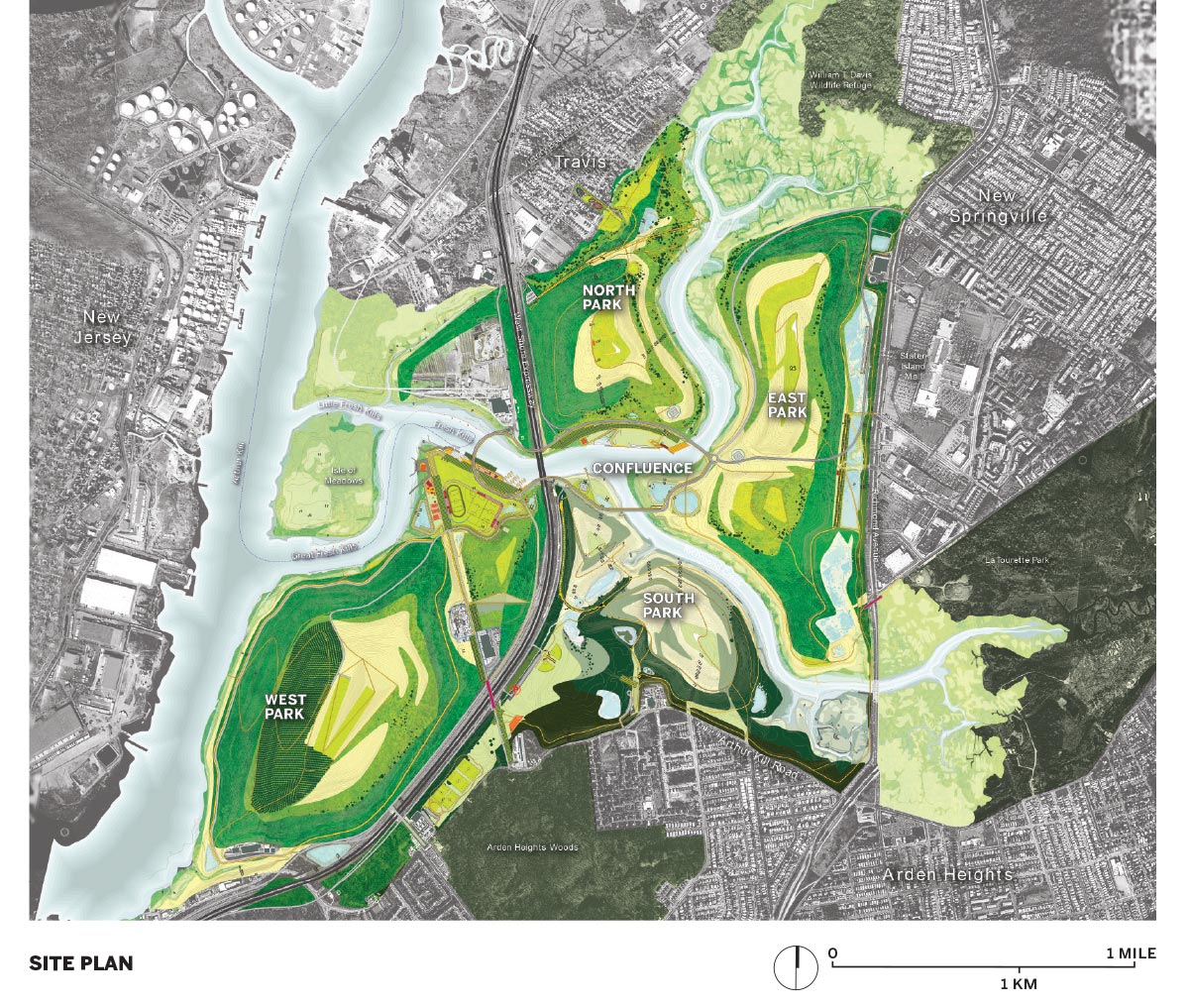
North Park, Freshkills Park
Staten Island, NY | Field Operations
By VICTORIA NEWHOUSE AND ALEX PISHA
“A big chunk of nature in the city, wild and strange”—James Corner’s description of Freshkills Park hits the mark on several fronts. Big chunk of nature? At almost four square miles (2,300 acres) in western Staten Island, Freshkills is roughly three times the size of Central Park and almost certainly the last large designed park that will be built in New York City. Wild? The vast tract is covered in profuse growth, mostly self-propagating, having been produced by seeds carried onto the site by wind or birds. And strange? Not as strange as it was when the site served for over half a century as the world’s largest landfill, but it remains an unusual scene, with its four steep mounds of collected waste that are capped and undergoing remediation.
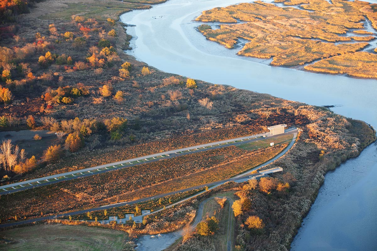
PHOTO © MONA MIRI
Freshkills Park.
It is hard to believe, when viewing Freshkills Park (the name derives from the Dutch Kille, or channel), and its vast grasslands, stands of trees, woodland edges, wetlands, and tidal creeks, that it is a mere 12 miles from the southern tip of Manhattan. One observer, the landscape architect Matt Urbanski, has described Freshkills as closer to a Midwestern prairie than to an east-coast green space. Certainly it is a park like no other. While Mark Murphy, administrator of Freshkills Park and president of the Freshkills Park Alliance, notes that it has been designated a large designed park—the first in over half a century in the city and the last one that will be built there—Corner considers his work at Freshkills as being “more like a farmer cultivating land than traditional landscape architecture.”
Unlike a farm, however, the site handed to Corner’s New York–based Field Operations, with the four mounds named according to the four cardinal directions, was heavily contaminated. These piles of collected waste had to be remediated before work could begin. Since the mid-20th century, innumerable industrial sites around the world have been converted to parkland. In every case, the site’s previous use, be it factory, quarry, or railroad, left brownfields in need of decontamination. But the condition left by the Staten Island landfill marked a particularly aggressive assault on nature. The NYC Department of Sanitation, which controls Freshkills in collaboration with the city’s Department of Parks & Recreation, has undertaken the Herculean job of capping the mounds, which requires collecting and treating methane, the combustible gas produced by the decomposition of organic matter. The steel-cased gas wellheads that occasionally poke up from the grass-covered slopes attest to the process. (The city sells the purified natural gas to the local utility.) Hazardous materials have been removed, and between 6 to 16 feet of topsoil have been added to North Park; 100,000 cubic yards of clean soil comprised 70 percent of the cost.
The main feature is an outsize bioswale, which extends from the parking entrance through the whole length of the park. This stepped landscape element, part of the stormwater infrastructure that feeds into the wetlands, matches the huge scale of the mounds and the scattered industrial remnants that have been left in place. The same scale and industrial aesthetic inform the robust galvanized-steel tables and benches designed by Field Operations; the signage, by Wkshps, is neat and informative. Attention to ongoing sustainability is evident in the comfort stations’ composting toilets (prefabricated by Clivus Multrum) and the solar panels that provide power for lighting in the parking lot (the only area with illumination).
The park offers numerous activities. A wide asphalt biking strip and an equally wide gravel pedestrian path run along either side of the bioswale. The bike and pedestrian trails will eventually connect with those in the 3.2 mile Springville Greenway (2015) and the Staten Island Greenbelt. A pristine bike-repair station in the parking lot provides a gamut of up-to-date tools for bicycle maintenance. Judging from the number of cyclists of all ages swarming through the park, this will undoubtedly be one of its most popular attractions. At the far end of the paths is a galvanized-steel lookout tower that signals North Park’s other favorite attraction: watching the numerous bird species—bald eagles, 19 families of osprey, red-tailed hawks, American kestrel, and northern harrier—that have moved, together with deer and foxes, into the renewed landscape.
A planned seed nursery of native plants will serve the park and sell to the public. The nursery will also support an existing curriculum that teaches the ecological importance of grasslands to approximately 3,000 schoolchildren, primarily from Title 1 schools that serve students from low-income families. So far, this is the only program scheduled for Freshkills, which, unlike other urban parks with their multiple activities, is simply about enjoying nature in this unnatural site.
North Park’s relationship to the community is most evident at the entrance from Schmul Playground at its northwest. Renovated by Field Operations in 2012, this 8.5-acre open space contains a playground, picnic lawn, and sports facilities. Peripheral projects of this kind—another is Owl Hollow Soccer Fields, part of the future South Park—were meant to attract attention to the mammoth Freshkills. A long, elegant pedestrian avenue planted with oak and sweet gum trees connects Schmul Park and North Park. The nearby entrance hill, bordered by swaths of dense switchgrass, raises the visitor into the quiet vastness of the whole. The view encompasses William T. Davis Wildlife Preserve, a tidal wetland, and the cleanest estuary in the tristate region, which is understandably popular with kayakers.
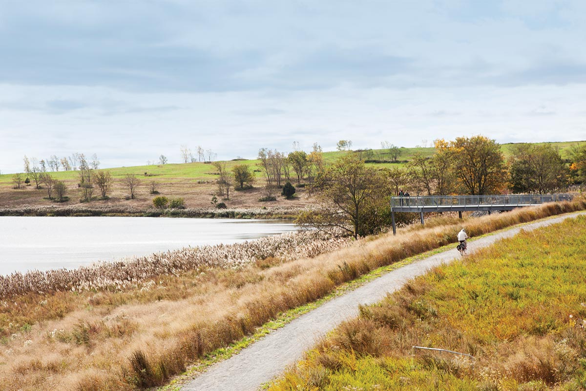
PHOTO © MONA MIRI
Bike trails are among the park’s most popular features.
North Park’s mini-taste of Freshkills is something of a tease—South Park, slated to be next to open, has not yet started construction, according to Corner—and while Freshkills as a whole is scheduled for completion by 2036, there is no definite timeline. Corner points out that a great deal more time-consuming preparation is needed to assure healthy, safe conditions, and accessibility. Stay tuned!
Author Victoria Newhouse wrote Parks of the 21st Century: Reinvented Landscapes, Reclaimed Territories, with Alex Pisha, a landscape architect and architectural designer.