This CE Center article is no longer eligible for receiving credits.
In the 1999 book 30, architect Rem Koolhaas wrote, “Maybe color could make a comeback,” suggesting that it passed away in the 1990s. For its return, color would “no longer be just a thin layer of change, but something that genuinely alters perception.”
Building on this idea, this continuing education course examines three sets of manufacturing technologies that—over the last several decades—have significantly expanded the modern palette for building design, indoors and out.
As leading architectural practitioners have explained, the essential considerations for material and surface articulation remain constant regardless of the technology employed. Architectural solutions, light quality, and the integral nature of materiality and visual expression result directly from the building's objectives. In its own ways, the structural solutions lead to many choices of color and texture; programmatic needs also imply appropriate colors and textures.
In this way, Koolhaas contended, “There are two kinds of colors. The ones that are integral to a material, or a substance—they cannot be changed—and the ones that are artificial, that can be applied and that transform the appearance of things. The difference between color and paint. After an initial outburst of the use of paint at the beginning of the century—was it the easiest way to transform, to get rid of history?—at the end of the 20th century, we are committed to the authenticity of materials even more, to materials that announce their own dematerialization.”
Because of their integral nature and direct links to building materials and methods, color and texture should reveal themselves in the early studies and sketches that comprise the conceptualization of the building project, says Daniel Kelley, FAIA, senior partner with MGA Partners Architects, Philadelphia. “Craft is an essential element of architectural process, connecting the hand drawing using the pencil and other tools as a craft-related activity that extends to the craft of actually making a building,” says Kelley. He sees this as reinforcing “the meaning and value of architectural drawings,” especially those made by hand.
To get his firm's project designs started, Sven Shockey, AIA, LEED AP, design principal in the Workplace Studio at SmithGroupJJR's Washington, D.C. office, says, “We initially try to get a sense about what the client might need in their space. Some clients want a pure, simple environment while others are looking for warmth and texture.”
Talking to the building's ultimate occupants or end users can be very valuable, Shockey adds, because often the tenants, students, patients or visitors are looking for something that the project developers or owners may not be expecting. “But then we look for a parti or metaphor for the project that can guide decisions throughout the project from overall form to the materials themselves,” he says, ultimately resulting in answers to the question: Which colors and textures are best for this situation?
 |
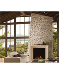
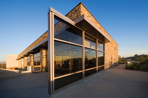
For the University of Southern California’s School of Cinematic Arts, architect Urban Design Group used precast accent stones and ornamental Venetian plasters hand-troweled over gunned concrete in shades of terra cotta, off-white, and muted goldenrod.
Photo courtesy of Parex USA |
Trends in Color and Texture
A few macro-level changes are influencing some of these parameters, too. For example, “In an age of globalization, there is an increasing need for rarity, individualism, and uniqueness in the selection of materials that make up our interior spaces and environments,” says Hans Mutzke, design director for Lamin-Art, based in Schaumburg, Illinois. For this reason, architects and designers seek out decorative surface materials “that translate into lasting impressions,” he adds.
Among those effects are sensory experiences including tactility, which was shown to be an innate desire of primates in a controversial 1958 experiment by American psychologist Harry Harlow. His seminal study proved that infant rhesus monkeys preferred a cloth-covered surrogate over a similar surrogate without cloth—even when she was holding a bottle of milk.
In architectural interiors, users may select soft surfaces and texture in ways that glass and steel or concrete do not always afford. “In this way, dimensionality in surface treatment is a new material selection criterion,” says Lamin-Art's Mutzke. “That's why premium wood printed laminates, which have a tactile and optical finish that may be described as having haptic properties, interact with light and our movement around a surface.” An early example of the use of the term haptic—defined generally as the process of recognizing objects through touch—was in the book Body, Memory, and Architecture by Charles Moore and Kent Bloomer, two architects, educators, and authors. More recently, the Finnish architect Juhani Pallasmaa has argued the case for a “haptic, sensuous architecture.”
 |
Dimensionality in surface treatment, as with these wood-print laminates, brings a tactile and optical finish that has haptic properties.
Photo courtesy of Lamin-Art |
The integral nature of color and texture in building materials is also influencing design approaches in fashion, interior design, and architecture. Many of the companies that provide annual forecasts of color trending have also begun advising on “texture trends” for the coming year. This new mode has been evinced by Leatrice Eiseman, executive director of the Pantone Color Institute, who expects “earthy textures” to predominate in 2013 along with primarily blue and green hues.
As Koolhaas suggests, texture on interior and exterior surfaces can be inherent to materiality and linked to color, as with a natural stone finish, or it can exist independently of those, as with a more sculptural, moldable material such as a stucco or exterior insulation and finish system (EIFS). “Many architects think stucco is stucco, but there are a broad range of techniques for using EIFS and stucco indoors and outdoors,” says Heidi Larsen, a product and brand manager with Parex USA. “We can achieve textures from ultra-smooth to highly abrasive while conforming to a variety of surface shapes.” As an example, she points to the Encounter Restaurant at Los Angeles International Airport, with its super-smooth, white parabolic arches.
This contrasts with the use of an intentionally textured surface such as a grainy wood veneer or a simulated stone surface made of cast masonry. The latter is a stone-like panel for use in both interior and exterior applications, ranging dramatically in color and surface quality, says Brent Spann, vice president of marketing and product development for Eldorado Stone. “Colored stones, such as the irregular, rustic rubbles with more depth and vibrant hues, have been common for a number of years,” Spann says. “But today we're seeing more modern stones, which tend toward a more monochromatic palette and may have a more linear quality, like a stacked stone.”
In contrast to interior surfaces—which traditionally have been smooth and are now trending toward more grain, pattern, shape, and texture—today experts see exterior surfaces that once were highly textured now moving in the other direction, toward a more sleek, monolithic look, says Jamie Makuuchi, a Parex USA marketing executive with 25 years of experience in building materials. “What's trending now are surfaces with as few joints as possible, such as large panels or smooth troweled finishes that can follow any surface shapes, corners, or curves and remain more seamless than a panelized or mullioned system.”
 |
To update Pereira & Luckman’s 1961 Encounter Restaurant at Los Angeles International Airport, the renovation clad the signature parabolic arches in a super-smooth, white EIFS.
Photo courtesy of Parex USA |
Visual and Biophilic Benefits
In all cases, texture and color confer actual benefits to the building user. “In evidence-based design research, the use of color, texture, and natural character have been shown to provide psychological health benefits to building occupants and city dwellers,” says New York City architect Andrew Franz, RA, principal of Andrew Franz Architect, PLLC.
Part of the benefit comes from biophilia—the instinctive bond between human beings and other living systems—a term coined by German social psychologist Erich Fromm in the early 1960s and later posited as a widely influential sociobiological hypothesis by the American biologist E. O. Wilson in 1984. Another aspect of the health benefit of color and texture, say experts in education, comes from the stimulation of the human mind from texture gradients and tonal variation in a given space, properties that can be sensed visually or by touch, such as smoothness, dimensionality, and color shift. This can imbue a surface or interior space with a unique kind of authenticity.
“Subconsciously your eye and brain notice these variations, in part because of how light picks it up,” says Mutzke. “There is a dynamic interplay that we respond to as building occupants.”
As an example, Claire Weisz, AIA, founding principal of New York City's WXY Architecture + Urban Design, points to how subtle aesthetic flourishes can have an important effect on the development of young minds. For the Day School at Christ & St. Stephens in New York, Weisz incorporated the technique of tonal variation, eschewing a single color in favor of using as broad a palette as possible within a single color choice. The Dutch-style tiles in the student washroom, for instance, were sourced in 13 different shades of white.
“Our research indicates that tonal variation encourages the children to add color and texture to their work in the classroom,” says Weisz. “It not only fosters imagination, but can promote abstract thinking as well.” In this way, color serves the school's primary function—the care and intellectual nurturing of young children—while preserving and celebrating the church's heritage and its important role in the community.
A More Authentic Finish
Another design idea factoring into the focus on biophilia has been the use of more basic, unadorned materials and natural finishes, as well as the look of long-standing building methods such as bricklaying and lapped siding. The big-picture trend is authenticity, says Eldorado Stone's Spann, who reinforces Koolhaas's big idea from a decade ago.
Some designers, like the New York City architect Andrew Franz, have offered the term living finishes to describe the use of materials that are allowed to show their natural characteristics and to exhibit the visually attractive effects of wear and tear. “Some technological advances have yielded undesirable results, with plastified, impermeable, and highly sheened surfaces that offer little of the warmth or connection to the natural world that humans naturally crave,” says Franz.
Untreated woods and other natural surfaces—cork, stone, metals, wool fabrics, and more—offer a direct way to achieve a more authentic, living surface. But as Spann and others contend, authenticity can also be achieved in manufactured products and faux finishes by using more honest, organic materials or by better expression of those natural elements in the finished product—or both.
 |
The intricate detail of small stones with the simplicity of a premanufactured panel gives the impression of a hand-laid, dry-stack set.
Photo courtesy of Eldorado Stone |
This is true even if it's a processed, industrialized, or formed application, says Spann. “We've seen manufactured stone that does not look natural or authentic,” says Spann. “The first issue is a lack of visual controls and process controls in those manufacturing plants. Second, the products should be molded from natural stones with proven molds that can capture the most finite details. Third, the molds should not be used for too long, because with overuse the material begins to lose its textural details and crispness.” It's important to identify a manufacturer who is invested in creating authentic and believable products, Spann adds.
As a fourth consideration, utilizing artisans trained in the process of applying multiple layers of oxides within each stone results in more visual color depth. “It's well documented: When you have that human element that gives the finish a certain randomness, the observer is attracted to the result over something that looks too consistent and fake, such as when the highlights are applied by a robotic spray-painting arm,” says Spann. The human craftsmanship and attention to detail is the key to an authentic product.
In addition to the human touch in production techniques, some manufacturers rely on original materials from nature or from other product areas to add to finishes a special hand, defined as its properties that can be sensed by touch, such as resilience or smoothness. This can imbue a surface or space with a different kind of authenticity.
An example is a burlap-textured, high-pressure laminate created originally for Starbucks, says Mutzke. “They asked for a hard surface to suggest old coffee bags. They wanted that turn-of-the-century relaxed, inviting feeling of Americana—of old ships unloading their goods,” Mutzke recalls. The solution was to embed a layer of 100-percent jute textile between the laminate layers, yielding the look of organic, natural fibers but with a haptic laminate finish for ease of cleaning. More sophisticated manufacturing techniques that incorporate natural flitches of wood bring out the inherent beauty, look, and feel of the underlying veneer with an in-registration finish.
 |
A burlap-textured, high-pressure laminate created originally for a chain of coffee shops was made by embedding a layer of jute textile between laminate layers.
Photo courtesy of Lamin-Art |
Other textured laminate products use embedded natural banana fibers as an inclusion material; the plant, which only lives for one season, is dried, ground into fine particles, and recycled as the inclusion layer under a transparent sheet in the laminate sandwich. Again, the particulates of the ground-up leaves transfer to a subtle natural tactile finish; metal filings, coffee beans, and textiles have also been used.
Another unique laminate production method uses embossed papers that transfer photorealistic ticking, knots, and sap lines of an oak, ash, or cherry to the laminate surface during production. The hardened papers are used between press plates in the laminate production, often “in register” with the décor paper design. Some of these techniques can also include variations in gloss levels to enhance geometric or stone designs.
These advanced surface treatments and overlay technologies now play an important role in the design and “development of decorative surface materials, enhancing both the visual and tactile qualities of the products,” according to the Composite Panel Association, Leesburg, Virginia.1
 |
A high-performance wood veneer, in Honey Annigre, was used on the Cook County Court House, Chicago; The project was designed by Booth Hansen; Millwork by Lange Brothers Woodwork Co.
Photo © 2007 Ballogg Photography, Chicago
Photo courtesy of Lamin-Art |
Benefits for Health and Environment
Texture in the finished material does more than just please the senses and provide for healthful, mood-elevating biophilia. There are additional, functional considerations. “Textured materials not only add a tactile element to design, but they can also help to disguise wear and tear on different products and surfaces,” says Marybeth Orlando, interior design director with The Architectural Team, a 60-person planning and design firm based in Chelsea, Massachusetts. “Textured glass in particular is extremely multifunctional. Uses range from stair treads to room dividers—the glass brings a translucent sparkle to the space, while still allowing light to penetrate and permeate the environment.”
 |
For the LEED Platinum “Hillside House” in Mill Valley, California, the firm SB Architects employed Western Red Cedar and cost-effective manufactured stone panels in a monochromatic palette.
Photo courtesy of Eldorado Stone |
According to Parex USA's Makuuchi, some colored and textured finishes have added components that confer robust qualities to improve life-cycle performance or sustainability, often in unexpected ways. “One new acrylic finish and coating that can be used for EIFS has enhanced hydrophobic and photocatalytic properties, which means it is highly water repellent, heat reflective, and smog reducing. The formula reflects the sun's heat and ultraviolet (UV) rays, lowering surface temperatures and saving energy in a process known as a photocatalysis. Being hydrophobic helps clean building exterior surfaces with rain or other water sources. As water hits the finish, it simply beads off the exterior wall and takes any dirt or soil in its path with it, helping to keep buildings clean, dry, and aesthetically pleasing longer,” he explains.
Very different is photocatalysis, which also describes the acceleration of a photoreaction in the presence of a catalyst. The effect, which is similar to photosynthesis in plants, was discovered in 1967 at the University of Tokyo and has since been used for anti-fogging mirrors and soil-resistant tensile fabric structures. “The photocatalytic properties initiate an oxidation process that decomposes organic and inorganic pollutants—components of smog—in the environment,” says Makuuchi. “This allows sunlight to literally break down the smog molecules, creating a cleaner environment.”
More basic environmental benefits have resulted from the use of realistic faux finishes that imitate endangered resources, such as rare stones, woods, and even animal prints.
An example is Brazilian rosewood, a strong, dense, and oily wood that weighs about 53 pounds per cubic foot, according to woodworking expert Lee Swindel, but is endangered and cannot be sold internationally. “Brazilian rosewood has natural oils that prevent water absorption and make it resistant to insects and decay,” according to Swindel, one reason that the wood has been favored for everything from wine barrels to furniture to classical guitars.
Overuse of the species has depleted most of the straight-growing trees that produce the high-quality lumber needed for these uses. Of the few that are left, in fact, a portion is protected from harvest in a global bid to save the species. In the absence of new sources, recently the reclaimed rosewood from wine barrels has been fashionable as flooring in restaurants, costing hundreds of dollars per square foot to procure and install.
Demand is high, but with resources very limited several manufacturers have created faux rosewood lookalikes in laminate, ceramic tile and other unexpected materials.
“Many advances have been made in the development of flooring materials,” says Katie Grimwood, an interior architect with TowerPinkster Architects | Engineers, Grand Rapids, Mich. “Manufacturers have made great strides in digital printing on ceramic, porcelain, and vinyl substrates. For instance, wood visuals can be applied to tile products in high traffic areas, blending the warmth and depth of wood with the durability of tile.”
Another technique that has opened new possibilities is digitally printed wall coverings, says Grimwood. “These products add color, texture, and branding very easily to large wall areas. These kinds of processes allow greater flexibility in the selection of materials that offer particular physical properties and also, through new technology, offer a greater variety of colors, textures and appearance.”
Turning Materials on Their Heads
With the architectural palette expanding but many natural resources shrinking, architects are availing themselves of an expanding array of faux finishes in recent years. Examples include stucco finishes that are smooth rather than rough textured, as well as facsimile brick and granite rendered in EIFS or stucco for use on walls indoors and outdoors.
These kinds of simulated finishes often look real enough, but thanks to their material properties can be used in unlikely applications. The use of EIFS and manufactured stone finishes indoors is one example, just as others use high-pressure laminate or large-format ceramic tiles on exterior façades. Where building codes and common sense allow, architects are even applying ceiling and flooring materials to walls, columns and other vertical surfaces.
“Patterns that are typically applied horizontally can be used vertically or on an angle, for a completely different and successful look,” says The Architectural Team's Orlando.
Another trend in recent years has been the use of more sophisticated, contemporary colors and textures where traditional looks have prevailed. For example, says Eldorado Stone's Spann, “Interior applications of natural and manufactured stone, especially in the commercial sector, are tending toward more modern styles, with a recent resurgence of use of Frank Lloyd Wright's linear stones.” The look is best exemplified by Wright's 1936 masterpiece Fallingwater in Bear Run, Pennsylvania, which used the latest technologies to take his ideas of organic architecture to their aesthetic limits. The towers of stacked shale, rising through the cantilevered floors, evokes the natural beauty of the rocky site while providing a strong visual anchor for the seemingly floating planes.
The look is powerful and quite hard to achieve at a reasonable cost for the majority of homeowners. Sensing an opening, manufacturers have recreated cast-stone representing stacked shale and other stone combinations into panelized sections in a variety of lengths and heights. The panels require no grout, to create a more faithful reproduction of the modernist stacked-stone walls, in light color palettes like Fallingwater as well as dark, slate like tones.
Another design conceit that has recently seen a rebirth from its modernist roots is the use of more monochromatic material palettes, both on building facades and in commercial interiors. The trend seems to extend the popularity of neutral colors to have even more subtlety and—thanks to the more monolithic look—added drama and intensity. It also sets the stage for contrast: “A single strong color can be powerful in an otherwise neutral context,” says SmithGroupJJR's Shockey. “Nonrepeating and organic textures have great potential to be explored.”
Spann and other manufacturing authorities have noted a growing investment in product development and raw materials that respond to the more monochromatic and neutral palettes favored by many architects today. Instead the color depth is more subdued, today's projects employ warm grays and warm light neutrals on the one hand, as well as a range of deep charcoals, maroons and other darker neutrals on the other. At either end of the spectrum, the palettes tend to be monochromatic and warm ranges.
Along with these color choices, recent trends in texture have been increasingly subtle and smooth, many with unique visual properties. An example is the use of iridescent, pearlescent and opalescent optical and textural ingredients, which emerged in the late 1970s in the cosmetics industry. Pearlescent or “pearlized” pigments are coated with such additives as colored pure white mica or colored bismuth oxychloride, among others. In the cosmetic industry, however, finer pearlized particles are common, ranging in size from 3 to 25 microns; for architectural finishes, the particles range from 25 to 100 microns and larger.
Case Studies of Color and Texture
The pearlized finish played a central role in the design of the Sport and Medical Sciences Academy in Hartford, Connecticut. Designed by DuBose Associates, the college preparatory middle school and high school were designed to be two separate schools in one building to accommodate the nearly 500 high school students and 250 middle-school students, according to says Craig Saunders, a partner with the firm.
“Aside from spaces the kids could take turns using, such as the library and lunchroom, the middle and high schools had to be separate from each other,” says Saunders. “It's tricky to design a building that creates a physical separation but doesn't seem separate.”
Vibrant planes of color played a large role in the architectural solution, according to Saunders, helping to set the school's overall tone, assimilate the children into both a sports and academic environment, and to bring the design concept to life. “Bright colors were used for the sports-related environments and neutral colors were for the classrooms,” says Sherry-Ann Oxley-Williams, interior designer with DuBose Associates, many of them specified with a pearlescent-finish, high-pressure laminate. The memorable colors include a deep blue based on corundum (aluminum oxide) crystals found in nature, as well as a brilliant gold that seems to be based in a nickel-titanium yellow.
The colors extended to the building's exterior, where metal wall panels and painted windows and door trim feature silver and bright blue. As user types go, students tend to appreciate bold colors, say experts, and Saunders agrees: “Everyone really liked it. The kids were running around with their cell phones, photographing everything.”
 |
For the Sport and Medical Sciences Academy in Hartford, Connecticut, designers at DuBose Associates used neutral colors for classrooms and bright colors—a deep blue based on corundum (aluminum oxide) crystals found in nature, and a brilliant gold—to enliven the college preparatory middle school and high school.
Photo courtesy of Lamin-Art |
This contrasts with the sophisticated modern homeowner—someone like the high-end developer Elaine Culotti of Santa Monica, California, who has been throwing parties in her 10,000-square-foot mansion known as “House of Rock” to generate publicity and prime a sale of the property.
Filled with posh furnishings and finishes, House of Rock contains rooms inspired by such rock stars as the Rolling Stones, Bruce Springsteen, and Tina Turner. It is also appointed with party tools such as expensive music equipment, hard-wired microphone panels, fiber-optic cables, soundproofed ceilings and a recording studio, according to The Los Angeles Times. The property has been listed for sale at a price exceeding $20 million.
Yet the house is also a serious work, designed in 1926 by noted Pasadena-based architect Elmer Grey, who designed such Southern California landmarks as the Beverly Hills Hotel, the Huntington Art Gallery, and the Pasadena Playhouse. Chicago-born Grey's contribution—much of it in partnership with Myron Hunt—expanded the vocabulary of a new American design idiom in the early 1900s to be in “harmony with nature” by building in ways he saw as appropriate to the local climate, soils, and flora.
For decades, the House of Rock was home to the actress and singer Kathryn Grayson. When Culotti bought it, she brought expertise in renovating at least a dozen homes in the Los Angeles area. Her own design firm, Porta Bella, would develop the overall renovation design, with help on specific rooms and suites from such well-known designers as Ralph Pucci, David Bromstad, and Sami Hayek. The concept was to explore the notion of “marrying not just rock but all kinds of music to lifestyle and classical architecture.”
The bones of the house were restored and expanded. In the wine cellars, for example, the glam and glitz yield to a more natural yet still contemporary and modern feel, with a stacked-stone motif in manufactured, adhered masonry panels. With a birch-hued palette, the flat stone look has the contemporary edge while fitting in with Grey's naturalist leanings. Elsewhere, however, the glitz predominates: chain and crystal chandeliers, peacock-blue upholstered banquette, a sofa in silver leaf and brown leather, and a Lucite piano.
Institutional Idiom
In other situations, such as institutional interiors and façades, the need for decorative and durable wall finishes drives the specification. One trend has been the increased use of specialty acrylic finishes that allow a broad range of color, texture and design options that can be used both indoors and outdoors. These high-performance plasters can be spray- or trowel-applied as textured wall finishes or Venetian plasters to cost-effectively achieved a level-5 finish system.
According to the Association of Wall and Ceiling Industries International (AWCI), a Level 5 finish is recommended “for areas where severe lighting conditions exist and areas that are to receive gloss, semi-gloss, enamel or non-textured flat paints.” The finish requires tape embedded in two coats of joint compound for all interior angles and joints, three coats over fasteners and accessories, and a drywall primer. On top of that, a thin skim coat of joint compound or a similar, purpose-made material, is applied across the entire surface to hide imperfections and create a flat, smooth surface.
 |
The wine cellars at the House of Rock in Santa Monica, California, have a natural yet still contemporary and modern feel, with a stacked-stone motif in manufactured, adhered masonry panels.
Photo courtesy of Eldorado Stone |
For the University of Southern California's School of Cinematic Arts, the architects Urban Design Group incorporated a level 5 finish Venetian plaster into a LEED Silver, high-performance solution for film and media education. While this is a high-tech facility, its Mediterranean profiles, Spanish clay tile roofs and ornamental plasters are in keeping with the USC campus aesthetic.
A number of architectural techniques were employed to adapt the building's looks to a more efficient construction process and the region's high-seismic design requirements. Rather than casting concrete to produce the 14-inch-thick, soundproof exterior walls, the general contractor recommended using spray-applied concrete. Over the Shotcrete, the plasters were hand-troweled to provide the classic finish expected for the exterior in shades of terra cotta, off-white and muted goldenrod. Custom accent stones were cast in precast concrete by a supplier, and attached with epoxy and steel pins.
Custom trowels were also made for the occasion, to create the desired plaster textures or to accommodate the intricate building wall shapes. Urban Design Group specified an abuse-resistant acrylic plaster for the exterior, with a primary finish used on walls and an upper-level tile pattern alongside a contrasting color for an ersatz colored grout. (Faux tiles were better than real ceramic, primarily for seismic reasons.) Last, a “color-wash” material was applied to both the main walls and the tile band to create an aged and mottled look.
Two Paths Forward
For building façades as for interior walls, color and texture preferences for the architectural universe tend to follow material trends and technical needs—not the momentary whims of fashion or consumer goods. Yet, increasingly architects are responsive to the styles of the times, creating a tension between material choices and their suitability for an architectural application.
Perhaps that fact confirms the prediction by Koolhaas that color could stage a comeback as something that “genuinely alters” how people perceive the work of architecture, the façade, the environment.
The three types of industrial surface technologies explored here—manufactured stone, high-pressure laminate, and the family of EIFS, stucco, and plaster—have developed a solid reputation for not only delivering unique color and texture options that alter our perception of space and form, but do so with valuable physical properties that add to a building's long-term performance.
Architects may not change their preferences for color or texture due to the offerings from the supply side, but they can take advantage of more kinds of technologies for a given solution than ever before.
As Koolhaas offered, some colors are integral properties of the material, while others are artificial and change the appearance of the material. As we embark on the 21st century, we have both kinds of products at our disposal as we create new buildings.
C.C. Sullivan is a writer and communications consultant specializing in architecture and building products.
| ENDNOTE |
| 1 |
Composite Panel Association |