View course on architecturalrecord.com »
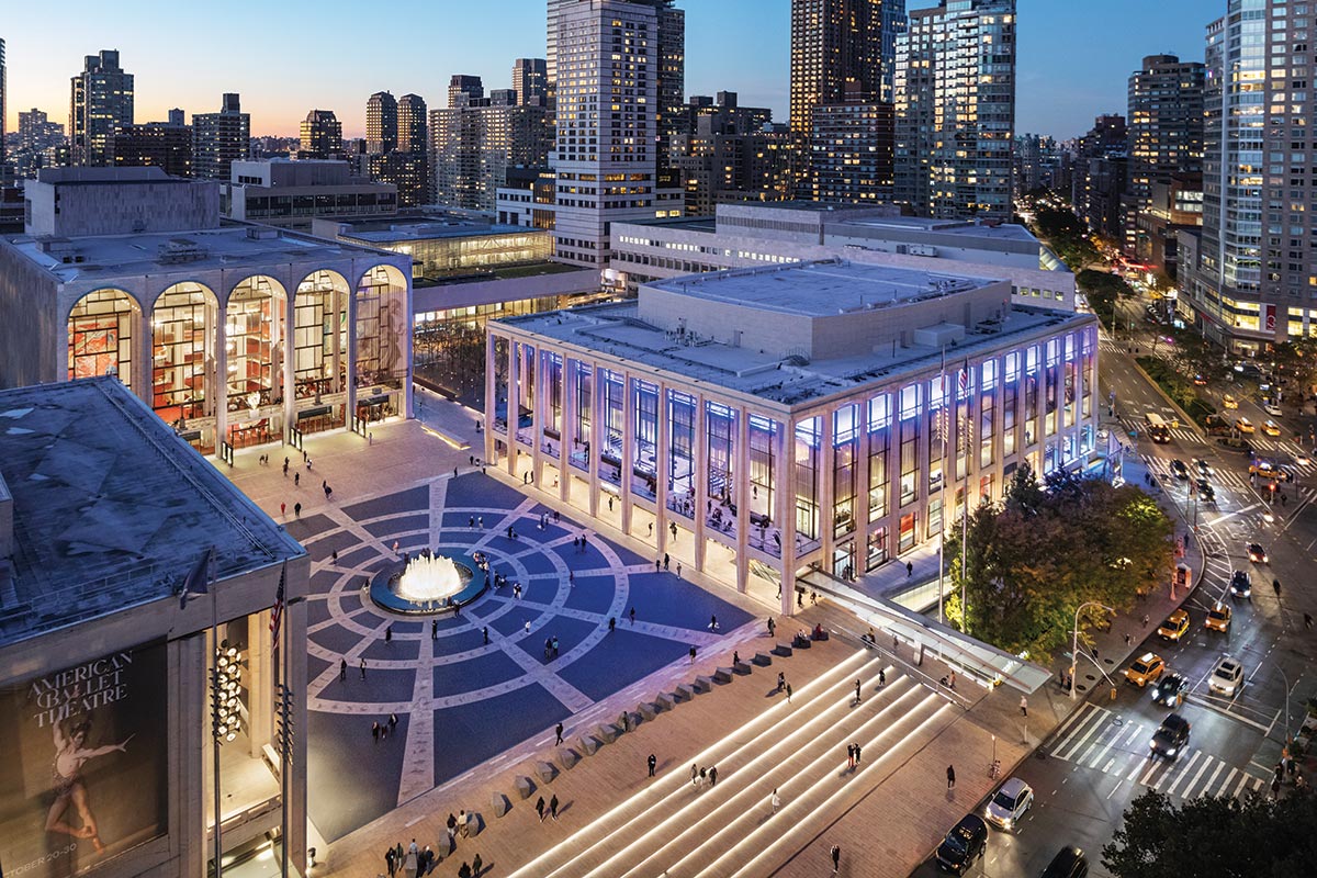
Photo © Michael Moran
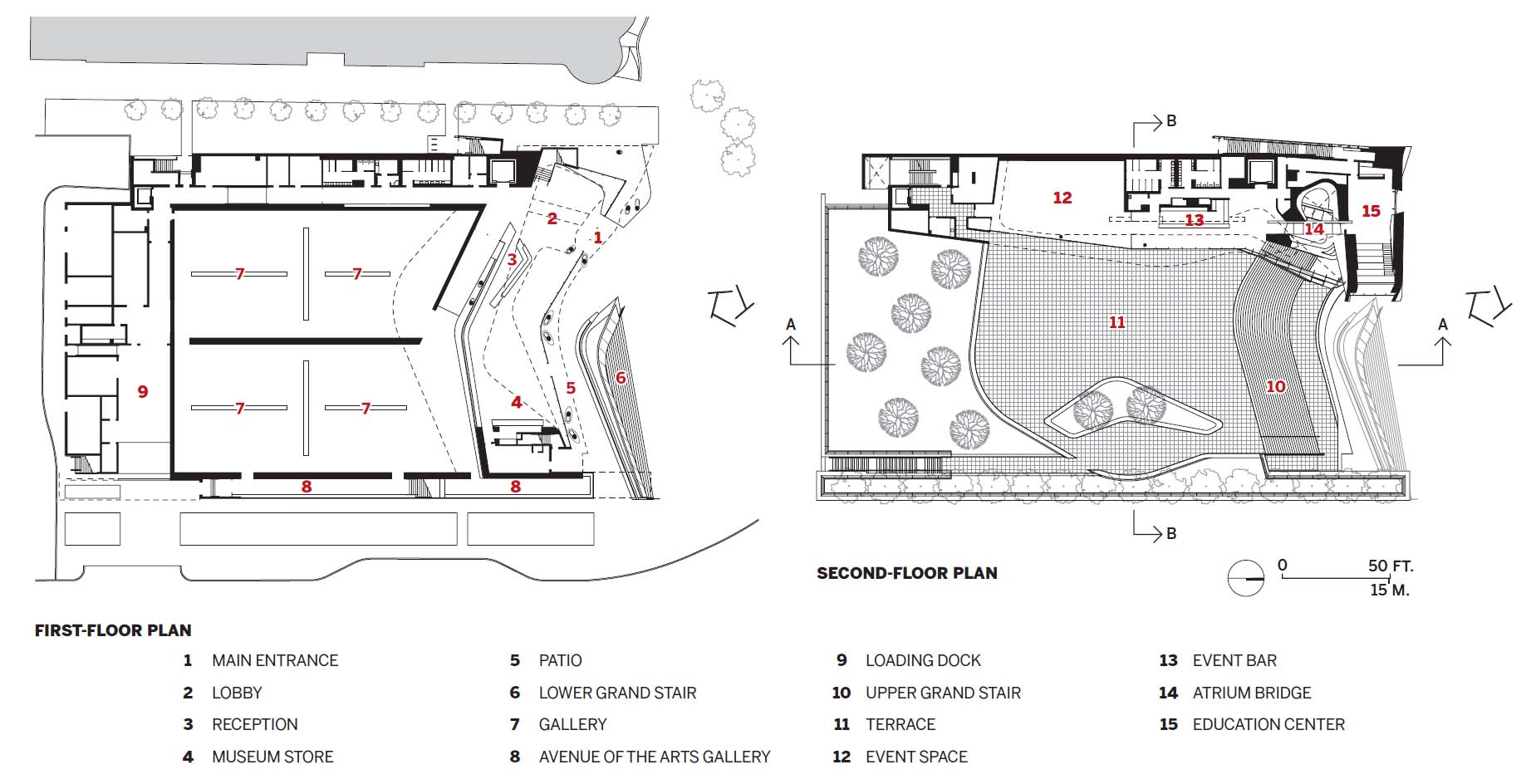
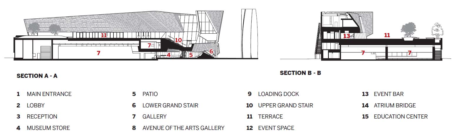
David Geffen Hall.
From a Rem Koolhaas-designed theater in Taipei to a site-sensitive museum in California, this month's arts and culture projects push the boundaries of architecture with dramatic forms, complex constructions, and challenging contexts.
OMA’s Taipei Performing Arts Center floats above the city, promising new possibilities for the making of theater.
BY IZZY KORNBLATT
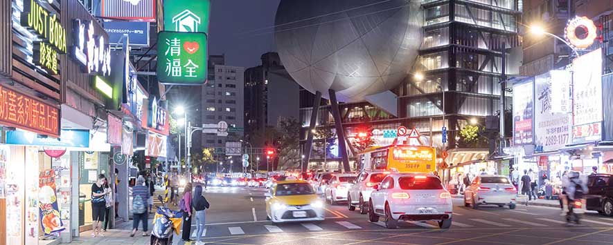
Photo © Iwan Baan
Taipei Performing Arts Center.
THE ARCHITECT Kazuo Shinohara once observed that some of the most advanced machines in the world—fighter jets and spacecraft—do not conform to refined modern aesthetics. Their parts appear “clumsily joined together,” he wrote in a 1981 essay, lacking in “elegance from an architectural standpoint.” But in these machines’ refusal to cover up messiness with a veneer of beauty, Shinohara found the promise of a revelatory architecture: building as ungainly machine.
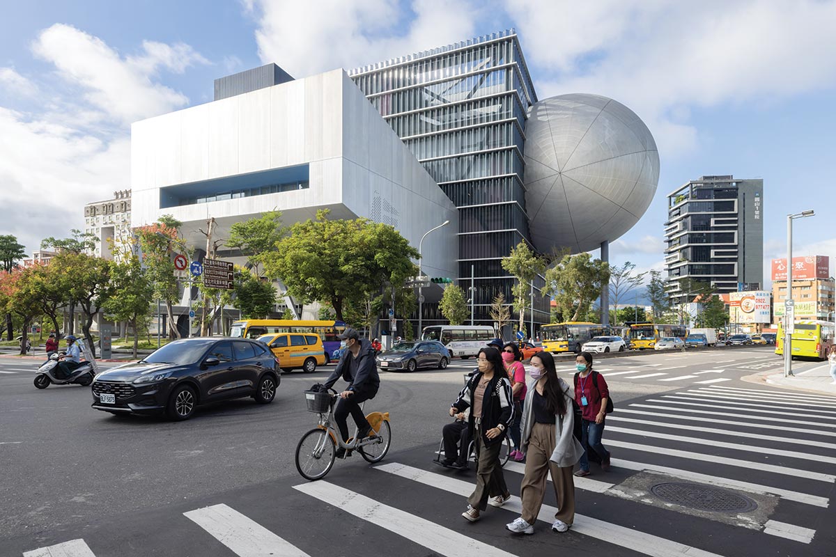
Photo © Iwan Baan
Located at a major intersection, TPAC commands attention despite the city’s vibrant lights and signs (top).
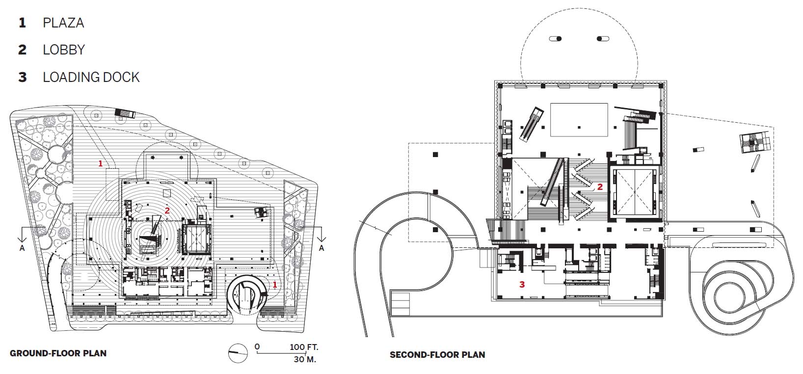
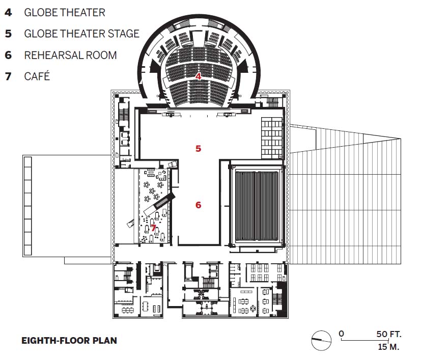
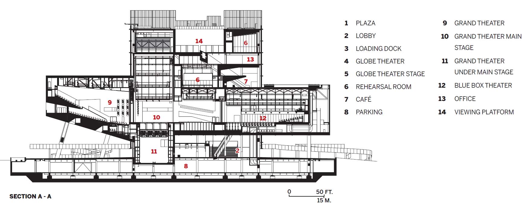
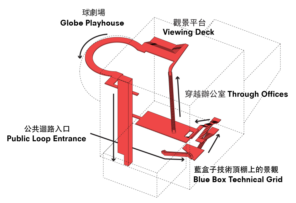
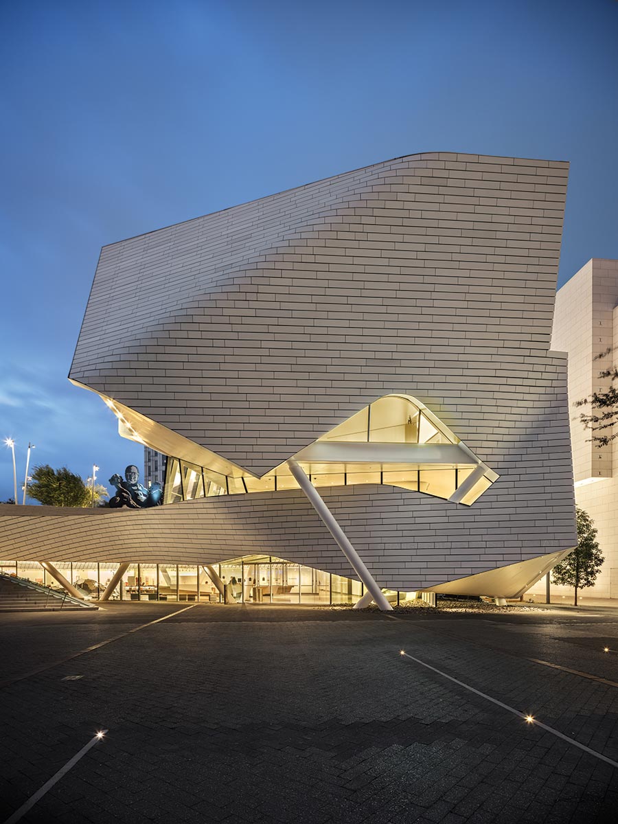
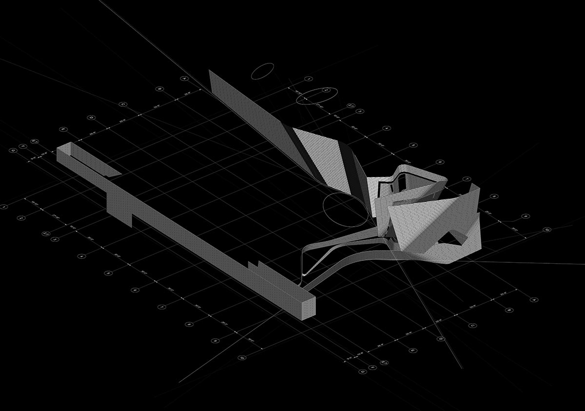
The Taipei Performing Arts Center (TPAC) comes as close as any contemporary building to embodying Shinohara’s vision. Designed by an OMA team led by partners Rem Koolhaas and David Gianotten and project director Chiaju Lin, with the Taiwan-based firm KRIS YAO | ARTECH, the center was first proposed in 2008 for a site in the city’s Shilin district and is now complete, after a tortured construction process marked by the general contractor’s bankruptcy. The building takes the form of a 10-story glass cube from which three aluminum-clad volumes—a rectangular prism, a wedge, and a slightly distorted sphere—protrude awkwardly, supported by long columns that touch down on a sweeping plaza below. In order to unlock the near limitless range of possible configurations and uses dreamed of by performers, the architects have pulled three theaters out of the cube—or, rather, crashed them, stage-first, into the cube, enabling the stages and backstage areas to be joined in various ways. Two of the three—a 1,500-seat proscenium theater with conventional raked seating (the wedge) and an 800-seat flexible “blue box” (the prism)—can become a single, enormous space when partition walls are moved, a feature that proved useful for runway shows during Taipei Fashion Week. The third, an 800-seat “globe” that is naturally housed within the sphere, can expand into a backstage rehearsal room.
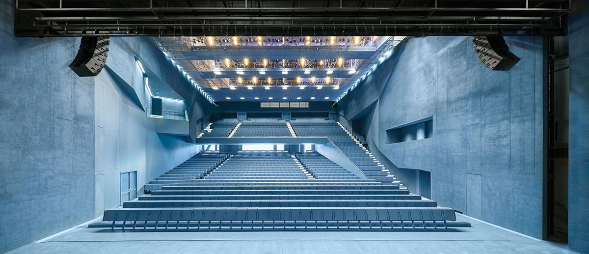
Photo © Iwan Baan
The 1,500-seat grand theater projects from TPAC’s south face.
Photo © Iwan Baan
An 800-seat theater is housed within the spherical protrusion.
In its ingenious flexibility, TPAC takes its place within a history of OMA’s investigation of the theater—from one of Koolhaas’s first built projects, the Netherlands Dance Theater in the Hague (1987) to the Wyly Theater in Dallas (RECORD, February 2010)—and that of the firm’s pursuit of architecture that can be transformed by its users. “I find it difficult as an architect to be specific, because each specificity excludes or kills other possibilities,” says Koolhaas. By enabling the theaters to be combined, “we were able to offer both specificity and an alternative to specificity.”
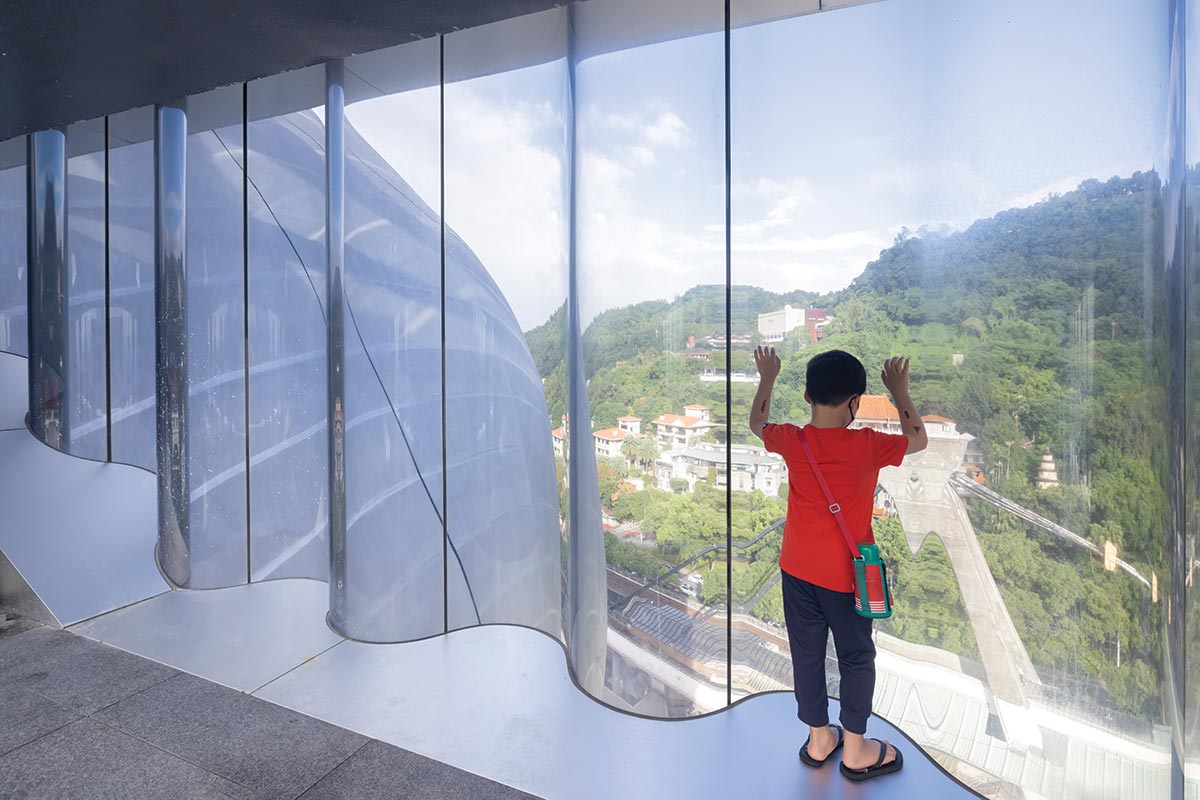
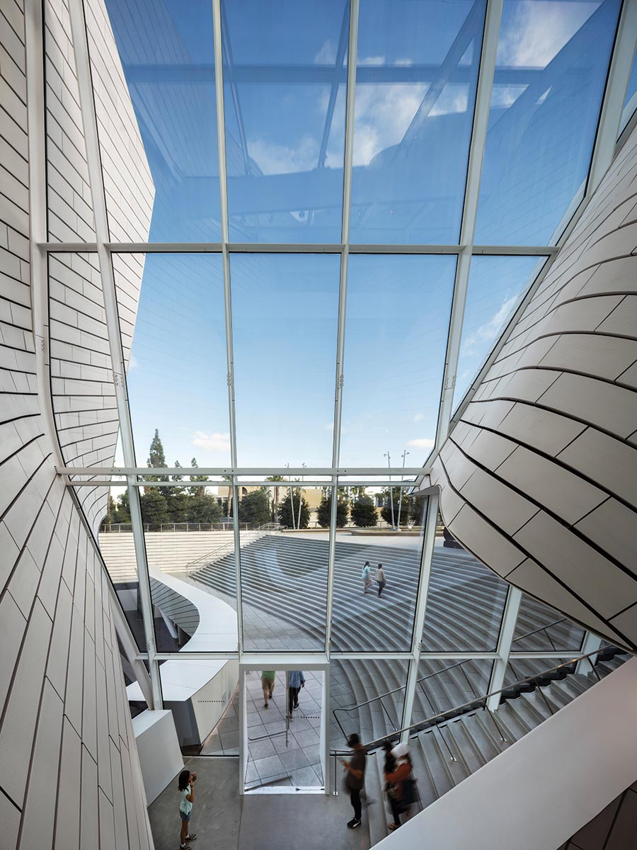
Beyond the diagram of three floating theaters surrounding a core, another, less obvious one is at work: that of a “public loop” that winds its way from the ground floor to a top-level viewing platform and down again, passing by various front- and back-of-house spaces along the way. Within the loop’s darkened spaces, members of the public gaze through apertures that afford sometimes voyeuristic views of theater in the making. The loop culminates in a curved black room above the globe from which observers can catch a glimpse of rehearsals or performances, and here the building’s second theme emerges: the demystification of theater. This theme is also evident in the building’s unusually welcoming sequence of public spaces, which pulls visitors from the plaza through a three-level lobby that remains open throughout the day, and in theaters that are utilitarian, rendered matter-of-factly in blue, with no trace of pomp or deep-red luxury. Throughout the interiors, the processes of construction and operation are revealed, from the fireproofed steel structure that threads its way around the central cube (enabling the long spans needed within the theaters) to OMA’s familiar unpainted drywall. The loading docks are raised to the second floor, via a concrete ramp, placing oft-hidden logistics on public display. And the cube’s undulating glass facade (see sidebar, this page) becomes a distorted lens through which backstage spaces are revealed—and through which outward views of the city become equally theatrical.
Photo © Iwan Baan
A sequence of public spaces, including the multilevel lobby (above), pulls visitors from a plaza (below) into the building.
Photo © Iwan Baan
“There have been a few moments where we tried to articulate a theory in a building—where we tried to address the issue of the maximum you can achieve” given practical constraints, says Koolhaas, and most remain unbuilt. “This is part of that sequence, with those ambitions, but built.”
Koolhaas, ever transgressive, initially proposed lifting the three theaters in order to enable the site’s previous occupant, the informal, boisterous stalls of the Shilin Night Market, to continue operating in their shadow. Political concerns nixed this idea—the market was instead moved nearby—but OMA’s concept retained its provocative undermining of hierarchies. As a work of “good sabotage,” in the words of ARTECH founder Kris Yao, TPAC questions theater’s inflated social status and the luxe architecture that typically supports it.
Illustration © Rem Koolhaas with Zoe Zenghelis, courtesy OMA
Spheres have been a leitmotif for Koolhaas at least since his 1972 “city of the captive globe” speculative project.
One way the building inverts hierarchies is in speaking the language of the city. In Taipei, everyday life is made visible through architecture: like a “chaotic Tokyo,” as Lin describes it, the city is crammed full of signs, lights, and banners that compete happily for attention. Standing tall over a major intersection, an elevated metro station to one side with mountains just beyond, and a set of narrow lanes branching off across the street, TPAC embraces Taipei. Its disjointed forms seem always to be in motion, as if jostling with the dense crowd of buildings. Each of its faces is distinct, but what most visitors will remember is Koolhaas’s looming aluminum globe, a sphere within the urban labyrinth easily visible from afar. Spheres have been a leitmotif for Koolhaas at least since his speculative 1972 project “city of the captive globe.” And in Delirious New York, his mythic 1978 manifesto, he comments that the appearance of spheres in Western architecture coincides “with revolutionary moments” in history.
Taiwan today—a democracy with a potent counterculture that has emerged both in spite of and because of the perpetual threat of a Chinese invasion—seems fittingly revolutionary.
But whereas most of Taipei is filled with explicit symbols, this building is signless and mute, a machine whose parts are made visible but refuse to speak. As a result, TPAC has become a subject of widespread interest in a way that now seems rare for architecture. What, the public asks, could these strange forms mean? Some call it huaji, or comical, on account of a popular theory that each of its volumes represents a different Taiwanese food often sold in night markets. Others compare it to the popular dish of preserved duck egg with tofu. And TPAC has sought to explain the building by likening it to three-broth hot pot. The battle of culinary metaphors has become a way of collectively making sense of architecture—“a way of digesting it,” in Koolhaas’s apt phrase—and the building has itself become a kind of public performance; its abstract forms, like the costumed dancers of Oskar Schlemmer’s Triadic Ballet, tempt observers to interpret it through their own cultural lenses.
At TPAC, then, the show begins long before the theater doors are open. It begins even before trucks arrive at the stagelike loading docks or the public loop fills with visitors. Here, everything, from seeing the city through distorted glass to interpreting the architecture, becomes a matter of performance and observation. Once the elitist box circumscribing the art of theater is torn away, theater is freed to enter into every aspect of life.
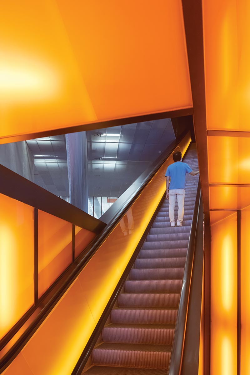
Photo © Iwan Baan
Escalators carry visitors to upper levels where they get a glimpse of backstage spaces.
One might ask whether, in diffusing the idea of theater, the building upstages the very performances it was built to house. But, come evening, as the sun sets and signs light up across Shilin, crowds of eager theatergoers can be seen moving slowly toward TPAC as if pulled in by the sphere’s gravitational force. And as you walk across the plaza—passing teenagers snacking and taking selfies—and as you ride the escalator up to have your ticket checked and then again, up farther, to the doors of the immersive blue theater, and at last settle into your seat, the old excitement of going out for a show returns in full force. Then the lights go down, the curtain rises, and this revolutionary building disappears, as it should.
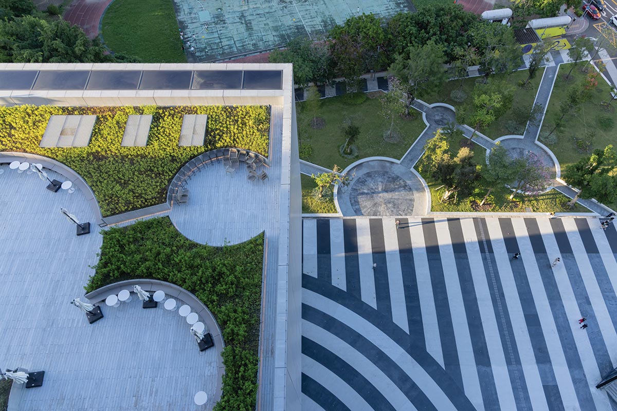
Photo © Iwan Baan
A terrace (above) is connected to a seventhfloor restaurant, while a top-floor outdoor viewing platform (below) is part of the public circulation route that winds its way through TPAC.
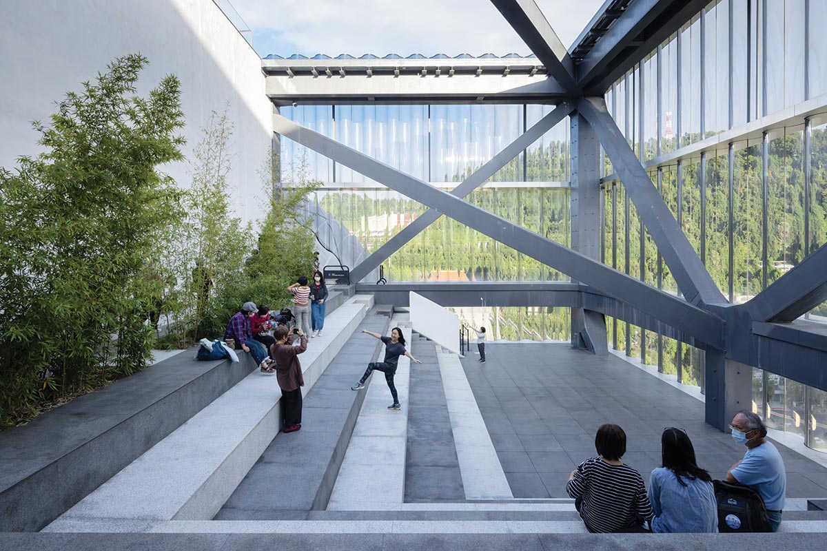
Photo © Iwan Baan
Credits
Architect: OMA — Rem Koolhaas, David Gianotten, partners in charge
Executive Architect: KRIS YAO | ARTECH
Engineers: Arup (structure, m/e/p, building physics, fire); Evergreen Consulting Engineering (structure); Heng Kai, IS Leng and Associates Engineers (building services); Taiwan Fire Safety Consulting (fire)
Consultants: dUCKS Scéno, Creative Solution Integration (theater); Royal HaskoningDHV, Theo Raijmakers, SM&W (acoustics); Chroma 33 (lighting); ABT, CDC (facades); Segreene Design and Consulting (sustainability); CNHW (landscape);
Contractors: International Engineering & Construction (former general contractor); Sun-Sea Construction (facades); Ancang Construction (interior and landscape); Jung Yan Interior Design & Decoration, Tech-Top Engineering (m/e/p, fire); Shiu Guan Machine Electric Engineering (AC); Jardine Schindler Lifts (elevators)
Client: Taipei City
Size: 630,000 square feet
Cost: $188 million
Completion date: July 2022
Morphosis’s highly sculpted museum in Costa Mesa, California, was shaped in response to its urban context.
BY SARAH AMELAR
All photos courtesy of Photography by Mike Kelley
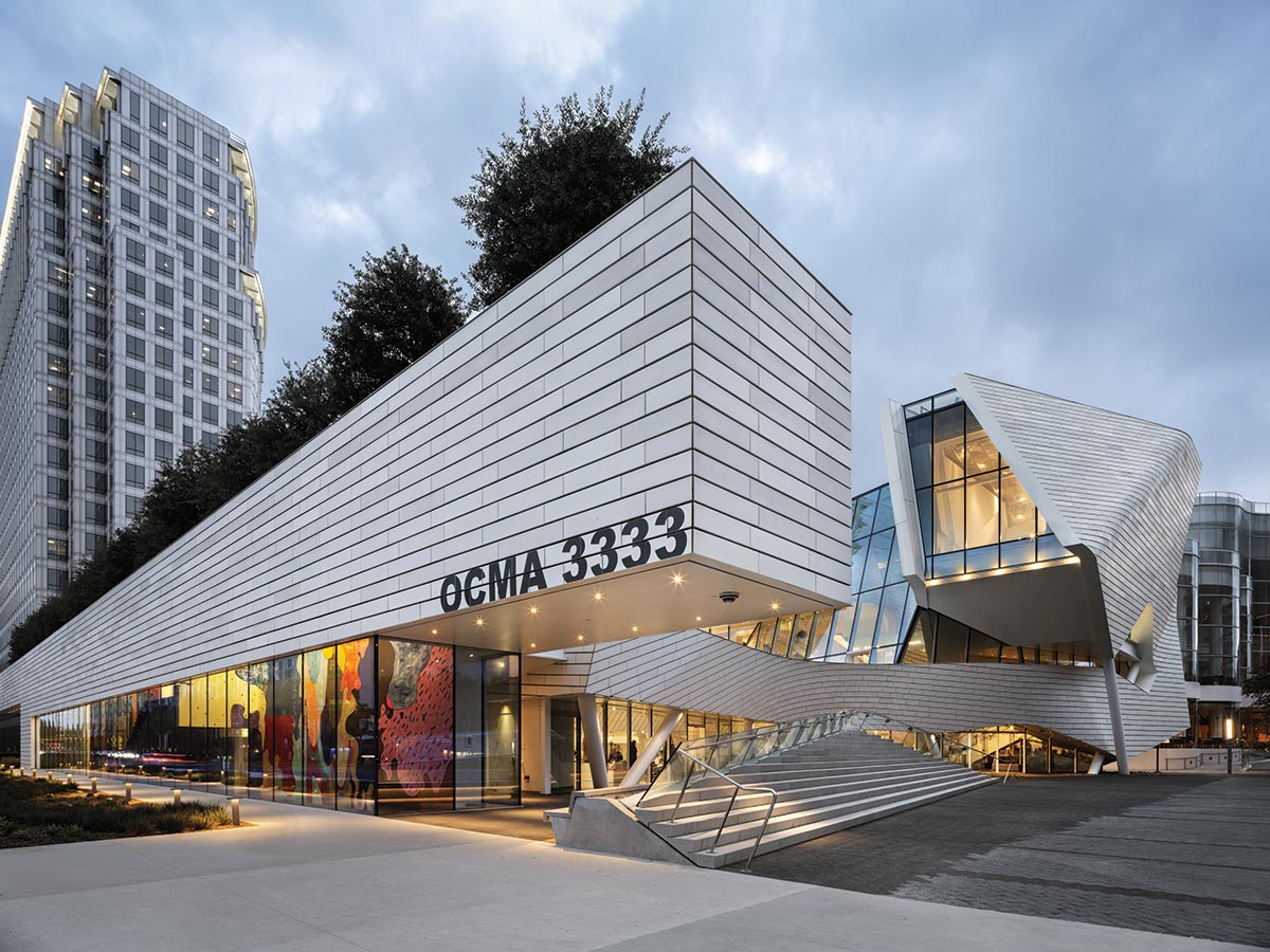
Orange County Museum of Art.
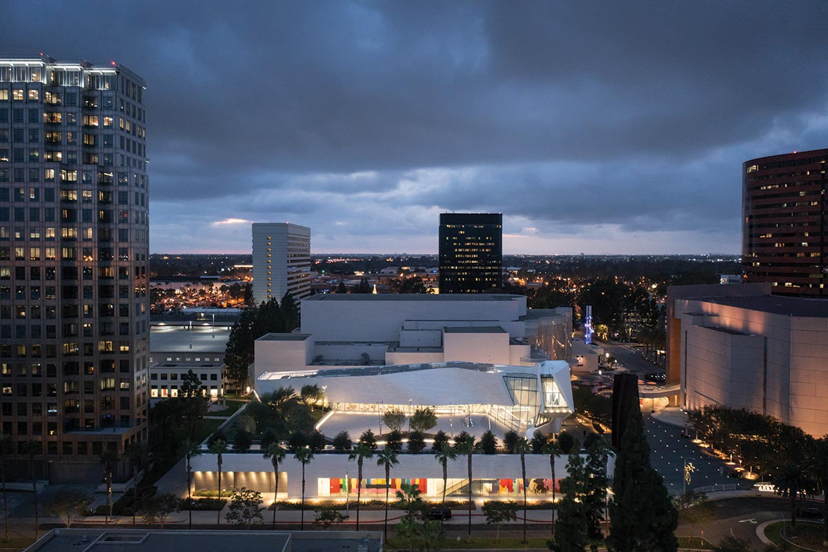
In 2007, Morphosis won the competition for the new home of the Orange County Museum of Art (OCMA), in Costa Mesa, California, and, by 2008, the project was officially under way. “Fourteen years and 17 schemes later,” as OCMA CEO and director Heidi Zuckerman recently put it, the building finally opened, in October. The project had evolved in fits and starts as the museum’s leadership changed (twice) and the program shifted from a museum with one, even two, residential towers above it to a stand-alone venue for art.
OCMA’S generous roof terrace includes an amphitheater-like grand stair whose shape is mirrored in a bank of seating at street level.
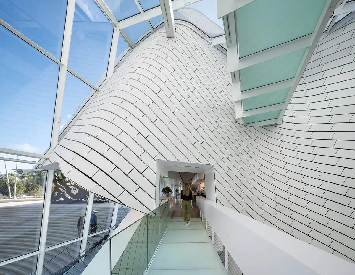
In the final results, Morphosis’s DNA is instantly recognizable. Highly energized with multiple, complex moves, the building features a rainscreen—clad in off-white, lightly glazed terra-cotta tile—that warps, bends, and undulates across its facades (see sidebar, page 71). Each curve skews the wrapper’s large-scale, bricklike pattern at a different angle, as if it were a wallpaper overlay. Like a great curtain, the screen also pulls away in key places to reveal idiosyncratically shaped areas of glazing or muscular structural elements, including canted supporting columns.
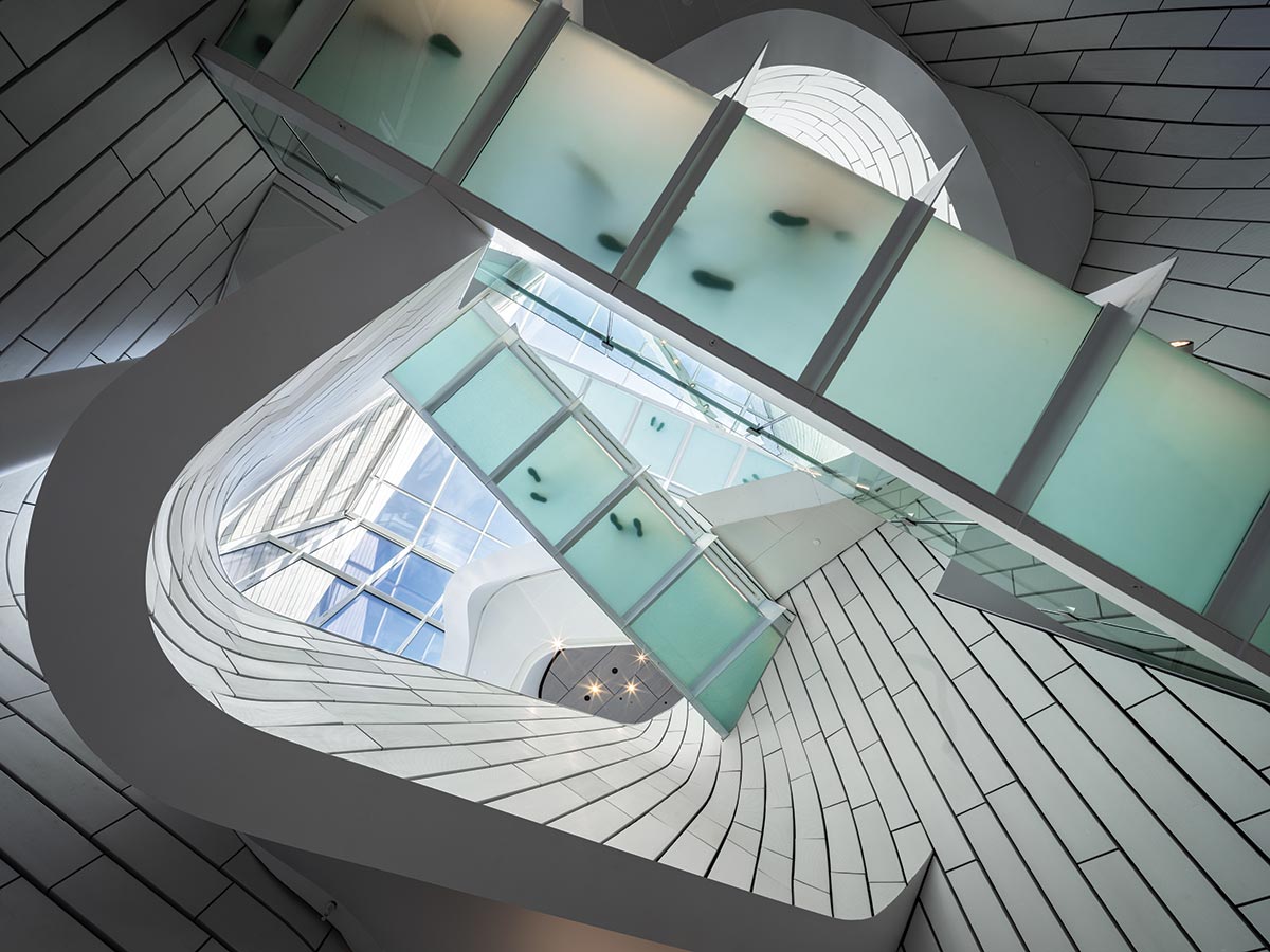
Fluid as textile, the rainscreen flows from outside to inside and loosely spirals up through the atrium.
“This is an architecture about civic space, about city-making. It’s also about interactions, rather than shiny objects. I’ve been attacking the idea of ‘object’ building for years,” says Morphosis founder Thom Mayne. “I’m most interested in the interstitial moments, the spatial experiences of the in-between, and how those seeming fragments can become a cohesive whole.” Tying it all together, the enveloping skin—independent of any solid volume and appearing almost as fluid as a textile—continues from outside in. “It’s a hybrid solution that expresses multiple conditions at once,” Mayne continues. “It’s part urban space, part landscape, part building, part outdoor, part indoor.” Indeed, the results defy characterization as a single form, or object.
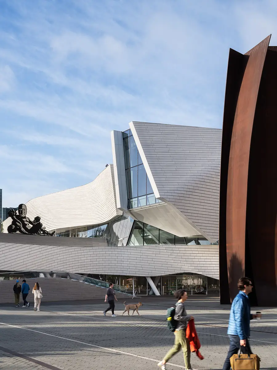
The museum’s facade seems to bow inward to honor a monumental Richard Serra sculpture in front of it.
Sculpted in the round, the 53,000-square-foot, $94-million structure also addresses the likelihood that visitors will approach from many different directions. The site—long slated for an art museum—was the last unbuilt parcel at Segerstrom Center for the Arts (SCA), a 14-acre campus with several theaters, erected between 1986 and 2006, as well as a 2017 plaza by Michael Maltzan. SCA’s freestanding buildings are densely packed and stylistically eclectic—ranging from the mega-scaled masonry geometries of architect Charles Lawrence’s Segerstrom Hall to the glassy, wavelike facade of Cesar Pelli’s concert venue, next door to OCMA. Whether intentionally or not, the museum’s tile wrapper seems to riff on the pale, strictly rectilinear stonework of Pelli’s side elevation. But Morphosis’s most explicit contextual gesture is where its facade bows inward to honor the aptly named Connector in front of it—a monumental vertical weathered-steel sculpture by Richard Serra, a campus landmark that predates the museum. “Another factor: this site was an open field for a long time,” says Morphosis partner in charge Brandon Welling. “So we [conceptually] lifted the field and inserted the museum under it.” By creating a publicly accessible roof deck one story up, he adds, “the design essentially gives back to the community 70 percent of the building footprint.” That 28,000-square-foot “outdoor room” includes landscaping by the Office of Jim Burnett, as well as a grand stairway, reminiscent of a raked theater balcony, overlooking the plaza below. The broad steps—mirrored by a detached lower run that rises from the sidewalk like a bank of “orchestra” seating—form not so much a circulation route as a two-tiered amphitheater and urban social space, a nod to the front steps of the Metropolitan Museum of Art in New York.
The museum, part of the Segerstrom Center for the Arts, includes a skylit atrium soaring to 50 feet.
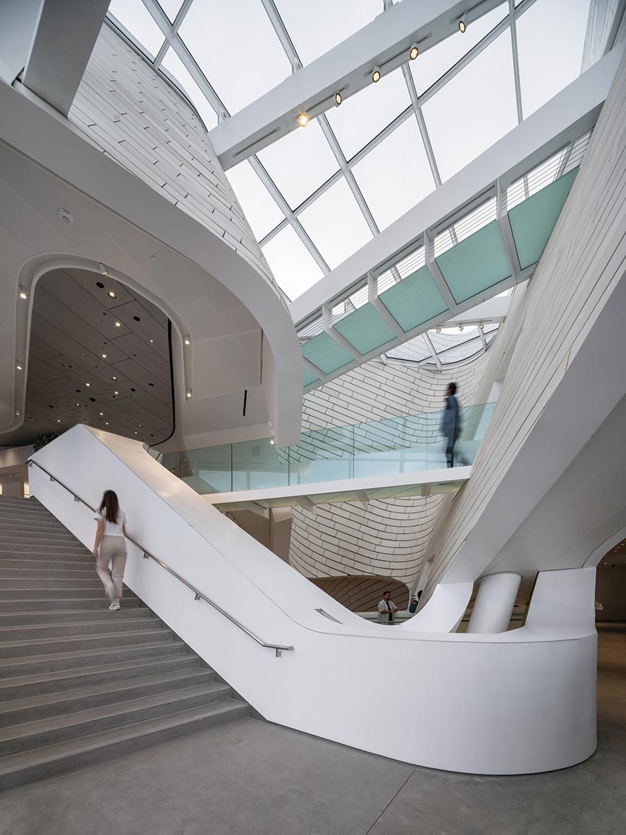
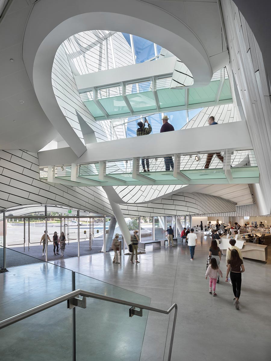
Leading essentially nowhere, OCMA’s version is more purely a gathering place and civic gesture or symbol. The museum’s main entrance is at street level, through a glassy section of the north-facing facade. Inside, the sequence proceeds from compression to expansion, with a relatively low ceiling giving way to a soaring atrium. Such shifts recur at key thresholds throughout the museum. “Actually,” says Mayne, “I would have made the compression even more extreme—if that were allowed—to further accentuate the contrast.” With a floor area of roughly 2,500 square feet, the irregularly shaped atrium rises 50 feet to a clear skylight, with the tiled rainscreen loosely spiraling up through it and translucent glass footbridges crisscrossing overhead. This nexus’s dynamism recalls the dramatic elevated walkways of the 1927 sci-fi film Metropolis. Yet OCMA’s lobby—which includes a museum shop and Minimalist-style coffee bar on one end—is neither monumental nor looming, but mostly human-scale and surprisingly intimate.
Translucent footbridges span the atrium.
Here, behind a long, ash-wood reception desk, a curved glass wall—echoing the facade’s bowed form—invites glimpses into the main galleries, set 18 inches below the lobby. “We wanted the exhibition areas to feel accessible, rather than hidden or precious,” says Welling. Anything but sequestered, the interior integrates long views all the way out to a street along the site’s eastern edge.
Like the tiled wrapper, other exterior forms and materials also flow inward. Concrete paving, for example, extends indoors to become polished flooring; and rough, piled stones appear both inside and out around the canted column bases. Similarly blurring boundaries, the lobby’s reception counter crosses the glass divide into the galleries, morphing into a long bench. Meanwhile, throughout the interiors, unexpected slots and moments of transparency open up, offering views from one space into another, or occasionally into the architecture’s underlying material or structural layers.
The main galleries have louvered ceilings and LED illumination evocative of daylight. A tall street-facing hall showcases a mural by Alicia McCarthy.
In contrast to the highly charged entry zone, the main galleries are serene, rectilinear, and luminously white—a sublime backdrop for the permanent collection of mostly 20th- and 21st-century art with ties to California. Forming the bulk of the building’s 25,000 square feet of exhibition space, this 17,000-square-foot, column-free expanse has a louvered, 19½-foot-high ceiling that provides even, diffuse illumination, convincingly evocative of daylight (though it’s an LED system, which the curators preferred over skylights). With partitions stopping short of the ceiling, the glowing surface continues uninterrupted overhead, capping a reconfigurable space so cleanly detailed that not even an electrical switch or outlet appears on any art wall. Just east of these galleries, a tall, separate hall opens itself to abundant daylight, with floor-to-ceiling glazing, showcasing to passersby a colorful, site-specific interior mural by Alicia McCarthy. Overall, the building doubles the art-display area of OCMA’s previous home, in Newport Beach.
A tall streetfacing hall showcases a mural by Alicia McCarthy.
Upstairs is a smaller gallery, suitable for works on paper, plus a lofty 900-square-foot education space—a partially cantilevered volume, prominently visible out front. “We wanted to give education a position of importance and not relegate it to a basement,” says Welling. Though the upper level is primarily outdoor space, it includes, along one edge, a restaurant and bar that can open completely to the roof terrace.
“Embracing the community has always been core to our mission,” says Zuckerman. Not only is the roof deck accessible to everyone, whether or not they’re visiting the museum, but—thanks to a $2.5 million gift from Lugano Diamonds, a Newport Beach jewelry store—OCMA will operate admission-free for the next decade. “We were searching for a new museum paradigm,” says Mayne of the hybrid, fluid model that merges with its urban setting. “In the end, of course, it’s people who will activate the spaces and really make them work. As Heidi [Zuckerman] and I were just saying, we hope the building will make lots of kids curious enough to poke their heads in and look at art for the first time—and maybe, someday, one of them will end up on the museum’s board. That’s how high we’re aiming.”
View course on architecturalrecord.com »
Photo © Michael Moran
David Geffen Hall.
From a Rem Koolhaas-designed theater in Taipei to a site-sensitive museum in California, this month's arts and culture projects push the boundaries of architecture with dramatic forms, complex constructions, and challenging contexts.
OMA’s Taipei Performing Arts Center floats above the city, promising new possibilities for the making of theater.
BY IZZY KORNBLATT
Photo © Iwan Baan
Taipei Performing Arts Center.
THE ARCHITECT Kazuo Shinohara once observed that some of the most advanced machines in the world—fighter jets and spacecraft—do not conform to refined modern aesthetics. Their parts appear “clumsily joined together,” he wrote in a 1981 essay, lacking in “elegance from an architectural standpoint.” But in these machines’ refusal to cover up messiness with a veneer of beauty, Shinohara found the promise of a revelatory architecture: building as ungainly machine.
Photo © Iwan Baan
Located at a major intersection, TPAC commands attention despite the city’s vibrant lights and signs (top).
The Taipei Performing Arts Center (TPAC) comes as close as any contemporary building to embodying Shinohara’s vision. Designed by an OMA team led by partners Rem Koolhaas and David Gianotten and project director Chiaju Lin, with the Taiwan-based firm KRIS YAO | ARTECH, the center was first proposed in 2008 for a site in the city’s Shilin district and is now complete, after a tortured construction process marked by the general contractor’s bankruptcy. The building takes the form of a 10-story glass cube from which three aluminum-clad volumes—a rectangular prism, a wedge, and a slightly distorted sphere—protrude awkwardly, supported by long columns that touch down on a sweeping plaza below. In order to unlock the near limitless range of possible configurations and uses dreamed of by performers, the architects have pulled three theaters out of the cube—or, rather, crashed them, stage-first, into the cube, enabling the stages and backstage areas to be joined in various ways. Two of the three—a 1,500-seat proscenium theater with conventional raked seating (the wedge) and an 800-seat flexible “blue box” (the prism)—can become a single, enormous space when partition walls are moved, a feature that proved useful for runway shows during Taipei Fashion Week. The third, an 800-seat “globe” that is naturally housed within the sphere, can expand into a backstage rehearsal room.
Photo © Iwan Baan
The 1,500-seat grand theater projects from TPAC’s south face.
Photo © Iwan Baan
An 800-seat theater is housed within the spherical protrusion.
In its ingenious flexibility, TPAC takes its place within a history of OMA’s investigation of the theater—from one of Koolhaas’s first built projects, the Netherlands Dance Theater in the Hague (1987) to the Wyly Theater in Dallas (RECORD, February 2010)—and that of the firm’s pursuit of architecture that can be transformed by its users. “I find it difficult as an architect to be specific, because each specificity excludes or kills other possibilities,” says Koolhaas. By enabling the theaters to be combined, “we were able to offer both specificity and an alternative to specificity.”
Beyond the diagram of three floating theaters surrounding a core, another, less obvious one is at work: that of a “public loop” that winds its way from the ground floor to a top-level viewing platform and down again, passing by various front- and back-of-house spaces along the way. Within the loop’s darkened spaces, members of the public gaze through apertures that afford sometimes voyeuristic views of theater in the making. The loop culminates in a curved black room above the globe from which observers can catch a glimpse of rehearsals or performances, and here the building’s second theme emerges: the demystification of theater. This theme is also evident in the building’s unusually welcoming sequence of public spaces, which pulls visitors from the plaza through a three-level lobby that remains open throughout the day, and in theaters that are utilitarian, rendered matter-of-factly in blue, with no trace of pomp or deep-red luxury. Throughout the interiors, the processes of construction and operation are revealed, from the fireproofed steel structure that threads its way around the central cube (enabling the long spans needed within the theaters) to OMA’s familiar unpainted drywall. The loading docks are raised to the second floor, via a concrete ramp, placing oft-hidden logistics on public display. And the cube’s undulating glass facade (see sidebar, this page) becomes a distorted lens through which backstage spaces are revealed—and through which outward views of the city become equally theatrical.
Photo © Iwan Baan
A sequence of public spaces, including the multilevel lobby (above), pulls visitors from a plaza (below) into the building.
Photo © Iwan Baan
“There have been a few moments where we tried to articulate a theory in a building—where we tried to address the issue of the maximum you can achieve” given practical constraints, says Koolhaas, and most remain unbuilt. “This is part of that sequence, with those ambitions, but built.”
Koolhaas, ever transgressive, initially proposed lifting the three theaters in order to enable the site’s previous occupant, the informal, boisterous stalls of the Shilin Night Market, to continue operating in their shadow. Political concerns nixed this idea—the market was instead moved nearby—but OMA’s concept retained its provocative undermining of hierarchies. As a work of “good sabotage,” in the words of ARTECH founder Kris Yao, TPAC questions theater’s inflated social status and the luxe architecture that typically supports it.
Illustration © Rem Koolhaas with Zoe Zenghelis, courtesy OMA
Spheres have been a leitmotif for Koolhaas at least since his 1972 “city of the captive globe” speculative project.
One way the building inverts hierarchies is in speaking the language of the city. In Taipei, everyday life is made visible through architecture: like a “chaotic Tokyo,” as Lin describes it, the city is crammed full of signs, lights, and banners that compete happily for attention. Standing tall over a major intersection, an elevated metro station to one side with mountains just beyond, and a set of narrow lanes branching off across the street, TPAC embraces Taipei. Its disjointed forms seem always to be in motion, as if jostling with the dense crowd of buildings. Each of its faces is distinct, but what most visitors will remember is Koolhaas’s looming aluminum globe, a sphere within the urban labyrinth easily visible from afar. Spheres have been a leitmotif for Koolhaas at least since his speculative 1972 project “city of the captive globe.” And in Delirious New York, his mythic 1978 manifesto, he comments that the appearance of spheres in Western architecture coincides “with revolutionary moments” in history.
Taiwan today—a democracy with a potent counterculture that has emerged both in spite of and because of the perpetual threat of a Chinese invasion—seems fittingly revolutionary.
But whereas most of Taipei is filled with explicit symbols, this building is signless and mute, a machine whose parts are made visible but refuse to speak. As a result, TPAC has become a subject of widespread interest in a way that now seems rare for architecture. What, the public asks, could these strange forms mean? Some call it huaji, or comical, on account of a popular theory that each of its volumes represents a different Taiwanese food often sold in night markets. Others compare it to the popular dish of preserved duck egg with tofu. And TPAC has sought to explain the building by likening it to three-broth hot pot. The battle of culinary metaphors has become a way of collectively making sense of architecture—“a way of digesting it,” in Koolhaas’s apt phrase—and the building has itself become a kind of public performance; its abstract forms, like the costumed dancers of Oskar Schlemmer’s Triadic Ballet, tempt observers to interpret it through their own cultural lenses.
At TPAC, then, the show begins long before the theater doors are open. It begins even before trucks arrive at the stagelike loading docks or the public loop fills with visitors. Here, everything, from seeing the city through distorted glass to interpreting the architecture, becomes a matter of performance and observation. Once the elitist box circumscribing the art of theater is torn away, theater is freed to enter into every aspect of life.
Photo © Iwan Baan
Escalators carry visitors to upper levels where they get a glimpse of backstage spaces.
One might ask whether, in diffusing the idea of theater, the building upstages the very performances it was built to house. But, come evening, as the sun sets and signs light up across Shilin, crowds of eager theatergoers can be seen moving slowly toward TPAC as if pulled in by the sphere’s gravitational force. And as you walk across the plaza—passing teenagers snacking and taking selfies—and as you ride the escalator up to have your ticket checked and then again, up farther, to the doors of the immersive blue theater, and at last settle into your seat, the old excitement of going out for a show returns in full force. Then the lights go down, the curtain rises, and this revolutionary building disappears, as it should.
Photo © Iwan Baan
A terrace (above) is connected to a seventhfloor restaurant, while a top-floor outdoor viewing platform (below) is part of the public circulation route that winds its way through TPAC.
Photo © Iwan Baan
Credits
Architect: OMA — Rem Koolhaas, David Gianotten, partners in charge
Executive Architect: KRIS YAO | ARTECH
Engineers: Arup (structure, m/e/p, building physics, fire); Evergreen Consulting Engineering (structure); Heng Kai, IS Leng and Associates Engineers (building services); Taiwan Fire Safety Consulting (fire)
Consultants: dUCKS Scéno, Creative Solution Integration (theater); Royal HaskoningDHV, Theo Raijmakers, SM&W (acoustics); Chroma 33 (lighting); ABT, CDC (facades); Segreene Design and Consulting (sustainability); CNHW (landscape);
Contractors: International Engineering & Construction (former general contractor); Sun-Sea Construction (facades); Ancang Construction (interior and landscape); Jung Yan Interior Design & Decoration, Tech-Top Engineering (m/e/p, fire); Shiu Guan Machine Electric Engineering (AC); Jardine Schindler Lifts (elevators)
Client: Taipei City
Size: 630,000 square feet
Cost: $188 million
Completion date: July 2022
Morphosis’s highly sculpted museum in Costa Mesa, California, was shaped in response to its urban context.
BY SARAH AMELAR
All photos courtesy of Photography by Mike Kelley
Orange County Museum of Art.
In 2007, Morphosis won the competition for the new home of the Orange County Museum of Art (OCMA), in Costa Mesa, California, and, by 2008, the project was officially under way. “Fourteen years and 17 schemes later,” as OCMA CEO and director Heidi Zuckerman recently put it, the building finally opened, in October. The project had evolved in fits and starts as the museum’s leadership changed (twice) and the program shifted from a museum with one, even two, residential towers above it to a stand-alone venue for art.
OCMA’S generous roof terrace includes an amphitheater-like grand stair whose shape is mirrored in a bank of seating at street level.
In the final results, Morphosis’s DNA is instantly recognizable. Highly energized with multiple, complex moves, the building features a rainscreen—clad in off-white, lightly glazed terra-cotta tile—that warps, bends, and undulates across its facades (see sidebar, page 71). Each curve skews the wrapper’s large-scale, bricklike pattern at a different angle, as if it were a wallpaper overlay. Like a great curtain, the screen also pulls away in key places to reveal idiosyncratically shaped areas of glazing or muscular structural elements, including canted supporting columns.
Fluid as textile, the rainscreen flows from outside to inside and loosely spirals up through the atrium.
“This is an architecture about civic space, about city-making. It’s also about interactions, rather than shiny objects. I’ve been attacking the idea of ‘object’ building for years,” says Morphosis founder Thom Mayne. “I’m most interested in the interstitial moments, the spatial experiences of the in-between, and how those seeming fragments can become a cohesive whole.” Tying it all together, the enveloping skin—independent of any solid volume and appearing almost as fluid as a textile—continues from outside in. “It’s a hybrid solution that expresses multiple conditions at once,” Mayne continues. “It’s part urban space, part landscape, part building, part outdoor, part indoor.” Indeed, the results defy characterization as a single form, or object.
The museum’s facade seems to bow inward to honor a monumental Richard Serra sculpture in front of it.
Sculpted in the round, the 53,000-square-foot, $94-million structure also addresses the likelihood that visitors will approach from many different directions. The site—long slated for an art museum—was the last unbuilt parcel at Segerstrom Center for the Arts (SCA), a 14-acre campus with several theaters, erected between 1986 and 2006, as well as a 2017 plaza by Michael Maltzan. SCA’s freestanding buildings are densely packed and stylistically eclectic—ranging from the mega-scaled masonry geometries of architect Charles Lawrence’s Segerstrom Hall to the glassy, wavelike facade of Cesar Pelli’s concert venue, next door to OCMA. Whether intentionally or not, the museum’s tile wrapper seems to riff on the pale, strictly rectilinear stonework of Pelli’s side elevation. But Morphosis’s most explicit contextual gesture is where its facade bows inward to honor the aptly named Connector in front of it—a monumental vertical weathered-steel sculpture by Richard Serra, a campus landmark that predates the museum. “Another factor: this site was an open field for a long time,” says Morphosis partner in charge Brandon Welling. “So we [conceptually] lifted the field and inserted the museum under it.” By creating a publicly accessible roof deck one story up, he adds, “the design essentially gives back to the community 70 percent of the building footprint.” That 28,000-square-foot “outdoor room” includes landscaping by the Office of Jim Burnett, as well as a grand stairway, reminiscent of a raked theater balcony, overlooking the plaza below. The broad steps—mirrored by a detached lower run that rises from the sidewalk like a bank of “orchestra” seating—form not so much a circulation route as a two-tiered amphitheater and urban social space, a nod to the front steps of the Metropolitan Museum of Art in New York.
The museum, part of the Segerstrom Center for the Arts, includes a skylit atrium soaring to 50 feet.
Leading essentially nowhere, OCMA’s version is more purely a gathering place and civic gesture or symbol. The museum’s main entrance is at street level, through a glassy section of the north-facing facade. Inside, the sequence proceeds from compression to expansion, with a relatively low ceiling giving way to a soaring atrium. Such shifts recur at key thresholds throughout the museum. “Actually,” says Mayne, “I would have made the compression even more extreme—if that were allowed—to further accentuate the contrast.” With a floor area of roughly 2,500 square feet, the irregularly shaped atrium rises 50 feet to a clear skylight, with the tiled rainscreen loosely spiraling up through it and translucent glass footbridges crisscrossing overhead. This nexus’s dynamism recalls the dramatic elevated walkways of the 1927 sci-fi film Metropolis. Yet OCMA’s lobby—which includes a museum shop and Minimalist-style coffee bar on one end—is neither monumental nor looming, but mostly human-scale and surprisingly intimate.
Translucent footbridges span the atrium.
Here, behind a long, ash-wood reception desk, a curved glass wall—echoing the facade’s bowed form—invites glimpses into the main galleries, set 18 inches below the lobby. “We wanted the exhibition areas to feel accessible, rather than hidden or precious,” says Welling. Anything but sequestered, the interior integrates long views all the way out to a street along the site’s eastern edge.
Like the tiled wrapper, other exterior forms and materials also flow inward. Concrete paving, for example, extends indoors to become polished flooring; and rough, piled stones appear both inside and out around the canted column bases. Similarly blurring boundaries, the lobby’s reception counter crosses the glass divide into the galleries, morphing into a long bench. Meanwhile, throughout the interiors, unexpected slots and moments of transparency open up, offering views from one space into another, or occasionally into the architecture’s underlying material or structural layers.
The main galleries have louvered ceilings and LED illumination evocative of daylight. A tall street-facing hall showcases a mural by Alicia McCarthy.
In contrast to the highly charged entry zone, the main galleries are serene, rectilinear, and luminously white—a sublime backdrop for the permanent collection of mostly 20th- and 21st-century art with ties to California. Forming the bulk of the building’s 25,000 square feet of exhibition space, this 17,000-square-foot, column-free expanse has a louvered, 19½-foot-high ceiling that provides even, diffuse illumination, convincingly evocative of daylight (though it’s an LED system, which the curators preferred over skylights). With partitions stopping short of the ceiling, the glowing surface continues uninterrupted overhead, capping a reconfigurable space so cleanly detailed that not even an electrical switch or outlet appears on any art wall. Just east of these galleries, a tall, separate hall opens itself to abundant daylight, with floor-to-ceiling glazing, showcasing to passersby a colorful, site-specific interior mural by Alicia McCarthy. Overall, the building doubles the art-display area of OCMA’s previous home, in Newport Beach.
A tall streetfacing hall showcases a mural by Alicia McCarthy.
Upstairs is a smaller gallery, suitable for works on paper, plus a lofty 900-square-foot education space—a partially cantilevered volume, prominently visible out front. “We wanted to give education a position of importance and not relegate it to a basement,” says Welling. Though the upper level is primarily outdoor space, it includes, along one edge, a restaurant and bar that can open completely to the roof terrace.
“Embracing the community has always been core to our mission,” says Zuckerman. Not only is the roof deck accessible to everyone, whether or not they’re visiting the museum, but—thanks to a $2.5 million gift from Lugano Diamonds, a Newport Beach jewelry store—OCMA will operate admission-free for the next decade. “We were searching for a new museum paradigm,” says Mayne of the hybrid, fluid model that merges with its urban setting. “In the end, of course, it’s people who will activate the spaces and really make them work. As Heidi [Zuckerman] and I were just saying, we hope the building will make lots of kids curious enough to poke their heads in and look at art for the first time—and maybe, someday, one of them will end up on the museum’s board. That’s how high we’re aiming.”
Credits
Architect: Morphosis Architects — Thom Mayne, design director; Brandon Welling, partner in charge; Aaron Ragan, Crystal Wang, project architects; Tom Day, Daniel Pruske, project designers; Ilaria Campi, Austin Griffis, Salvador Hidalgo, Zach Pauls, Stan Su, Natalia Traverso Caruana, Abagael Warnars, project team; Cory Brugger, Joseph D’Oria, Kerenza Harris, Atsushi Sugiuchi, advanced technology; Jasmine Park, visualization
Consultants: John A. Martin & Associates (structure); Buro Happold (m/e/p, sustainability); KPFF (civil engineering); OJB Land-scape Architecture (land-scape); HLB Lighting Design and TM Light (lighting); Walter P Moore (facade)
General Contractor: Clark Construction Group
Client: Orange County Museum of Art
Size: 53,000 square feet
Cost: $94 million
Completion date: October 2022
Sources
Terra-cotta: Boston Valley Terra Cotta
Glass: Guardian
Skylights: Roschmann Group
Entrances: CRL/Blumcraft
Sliding doors: Dormakaba
Ceilings: Armstrong
Gallery lighting: Litelab
In France, Beaudouin Architectes Facilitate Culture and Community with Charles Nègre Library
A cultural center in a dense historic town in the south of France gets up close and personal with its neighbors
BY ANDREW AYERS

All Photos © Fernando Guerra
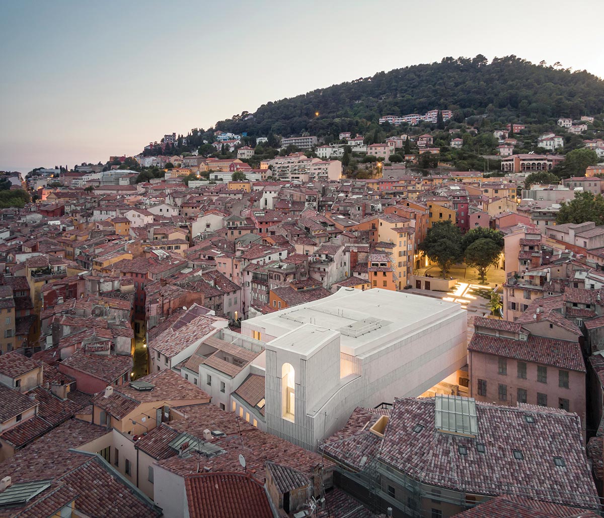
Charles Nègre Library and Cultural Center.
Long famed for its perfume, the ancient town of Grasse sits high up in the hills above Cannes, overlooking the French Riviera. While the terraced perfumers’ gardens now belong to the likes of Dior and Chanel, the dense historic center has deteriorated, its decaying fabric home to a poor, immigrant population. In one particularly rundown neighborhood, designated a priority zone by the national government, the municipality chose to build a new library and cultural center to replace an old, inadequate facility nearby. The result of targeted demolitions in the 1940s, the site was complex: steeply sloping, it measured barely 10,000 square feet for an ambitious 40,000-square-foot program; it included historic housing that had to be incorporated into the project; and it faced a large 1950s covered reservoir whose structure was too fragile to support any extra load. It was into this challenging context that Paris- and Nancy-based Beaudouin Architectes and Marseille-based Ivry Serres, winners of the 2011 architectural competition, deftly inserted their clever, elegant design.
Constricted by the medieval urban fabric, the building nevertheless has breathing room where it opens onto large plazas.
“We were immediately struck by Grasse, with its very narrow streets, the houses almost touching each other on either side, and the wonderful strong light that slips in between,” recalls Laurent Beaudouin. “Though complex, the site allowed this type of constriction but also breathing room, thanks to the two public squares, place du Rouachier and place Vercueil, on its northwestern and northeastern flanks.” Located on the plot’s southeastern side, the historic housing offered capacity for just a third of the required floor area, so the architects had to squeeze all the rest into the remainder of the site. To do so, they excavated a basement story and dramatically cantilevered the upper floors.
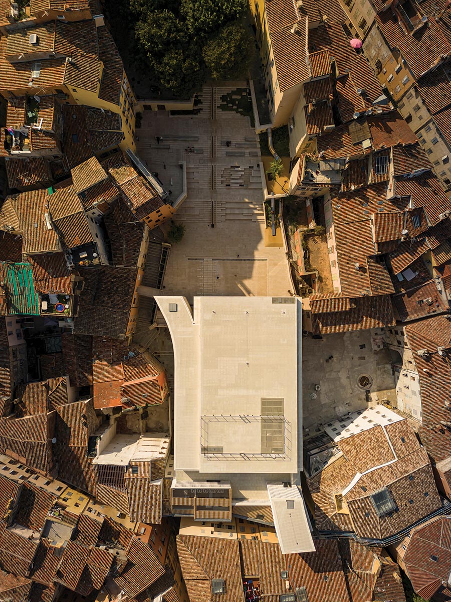
Cantilevering portions of the structure helps navigate the tight urban fabric of which the building is a part.
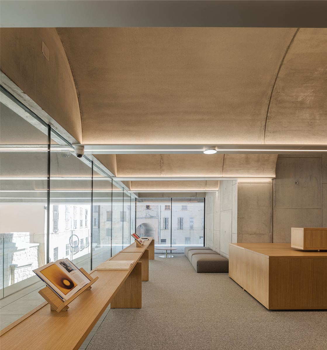
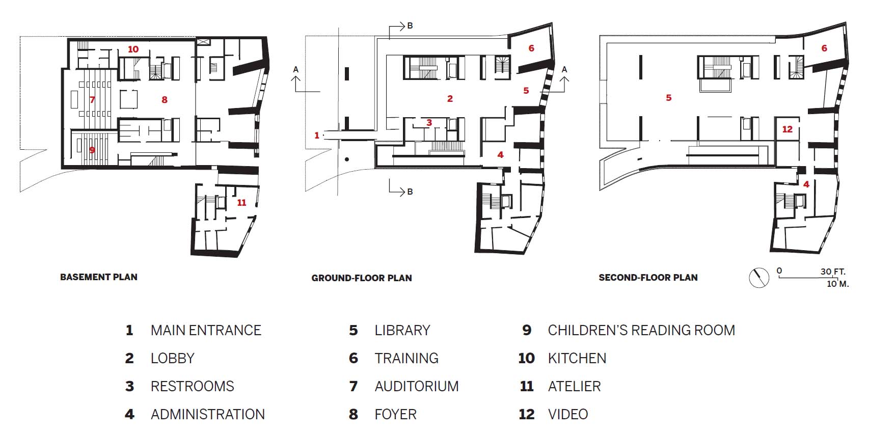
Because of the sloping ground, the building has four entrances, on different levels. While the basement contains HVAC, level I, entered via the historic housing on rue Charles-Nègre, contains the library for children to age 6, and a 108-seat auditorium, carved into the hillside. On level II, which has two lateral entrances on place Vercueil (one public and the other for staff), there is a double-height temporary-exhibition space, as well as a smaller gallery dedicated to local photography pioneer Charles Nègre (1820–80), for whom the project is named. The main public entrance and lobby are on level III—which is aligned with the reservoir roof, now place du Rouachier, landscaped by Marseille office Stoa—and are connected to the green space by a footbridge. Levels IV and V, which jut far out over the reservoir, contain the two principal library floors, with a small terrace and cafeteria up top at the rear. Gutted in order to integrate it into the project, the historic housing contains both public spaces, seamlessly joined to those in the new structure, and backstage activities, while staff offices are stacked up in the southern corner.
Given both French know-how and the region’s earthquake regulations, concrete was the obvious construction material. “Historically, Grasse’s public buildings were in stone,” points out Serres, “which contrasts with the colored stucco facades of the typically Provençal housing. Not only are we following that cue, we have a compact structure with high thermal inertia that’s ideal for the climate here.” As well as striking a strong spatial note, the cantilevering vaults (see sidebar, above), inspired by Louis Kahn and José Luis Sert, help to attenuate the relatively low ceiling heights engendered by the dense program. Three vertical shafts on the top three levels further enrich the spatial experience, and bring daylight from above. In addition to stair and elevator cores, there is a structurally separate tower to the southeast that contains the main vertical route—monumental stairs linking levels I to III, and a long hairpin ramp connecting levels III to V. “In our libraries and museums, we try to slow down time,” explains Beaudouin. “Places of contemplation, they require a temporality different from the hustle and bustle outside. The ramp is part of the promenade architecturale, prolonging the journey in both time and space.”
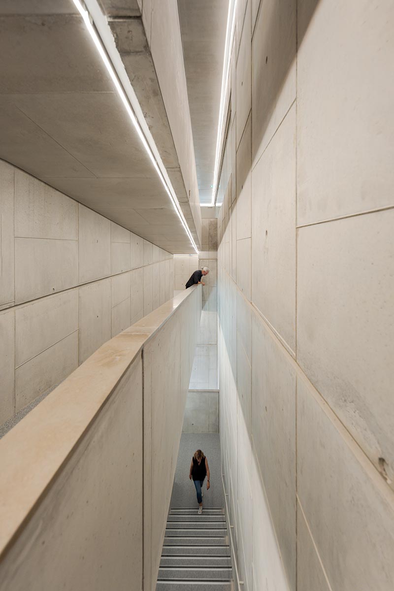
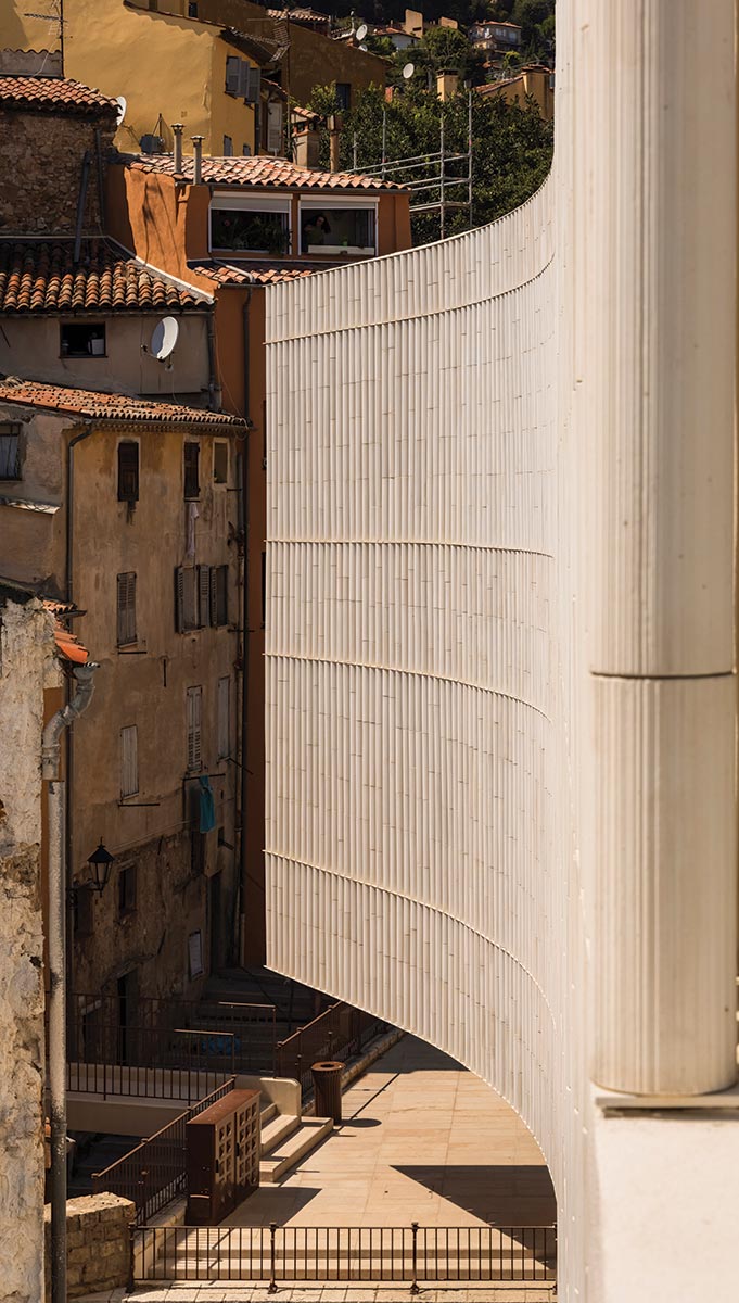
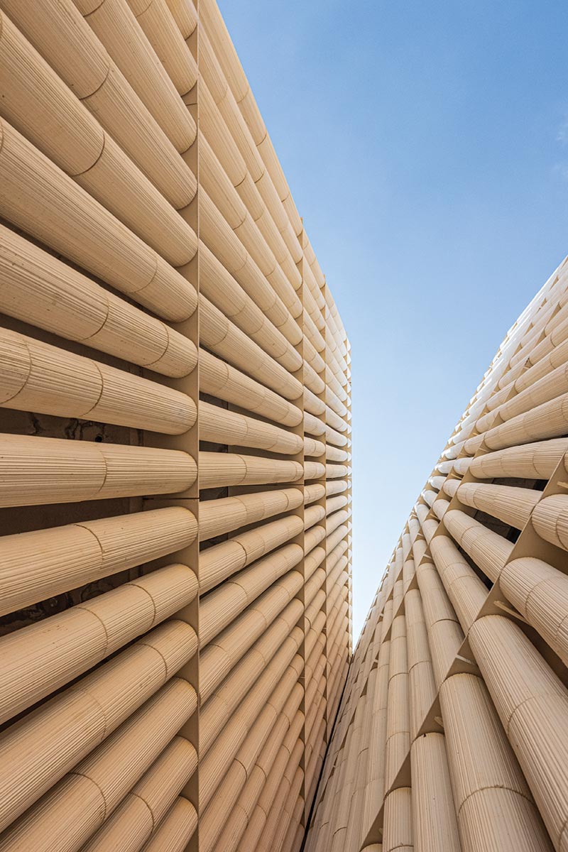
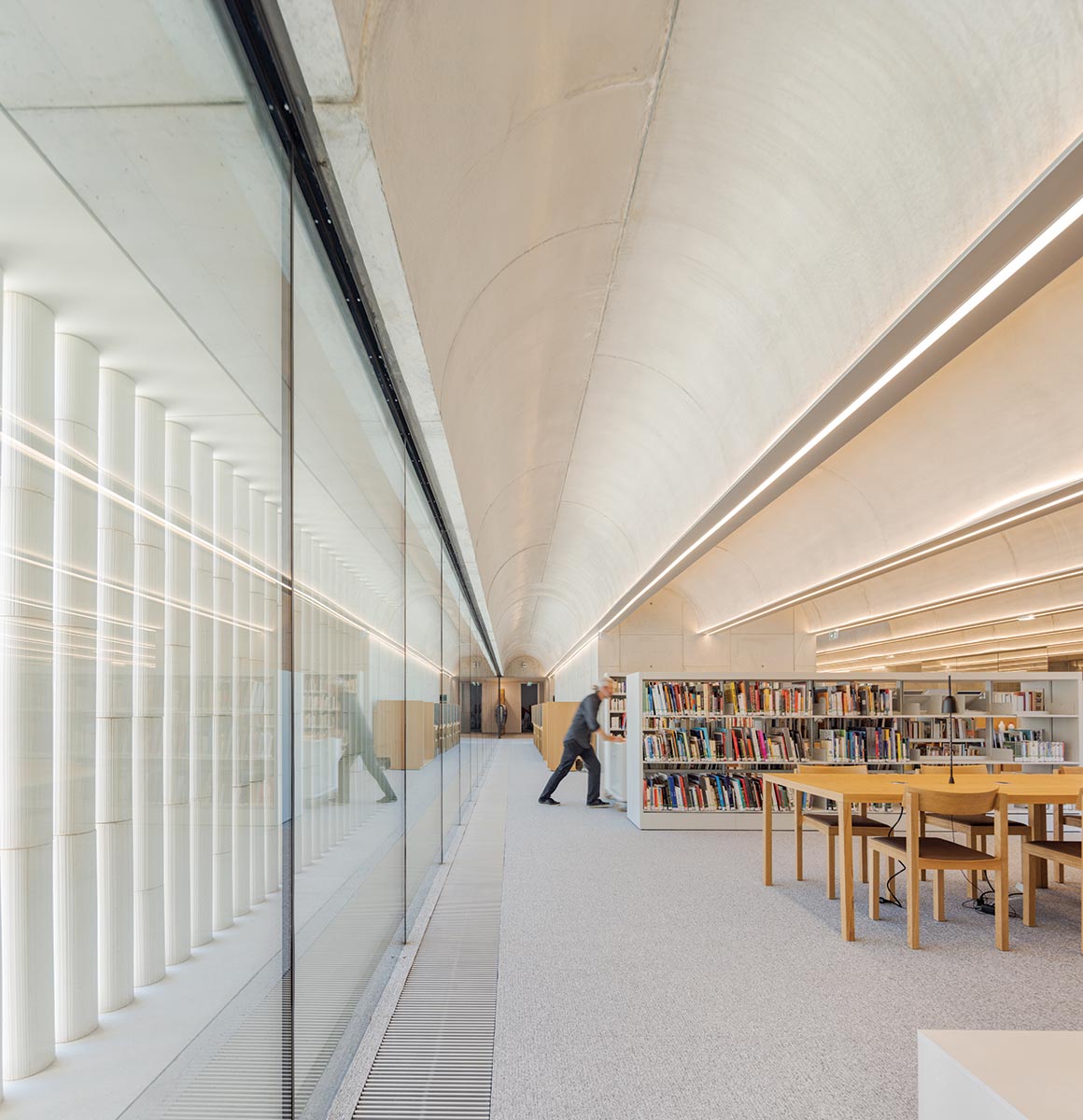
Vertical shafts enrich the spatial experience (above). The concrete colonnettes are a striking feature inside and out (below).
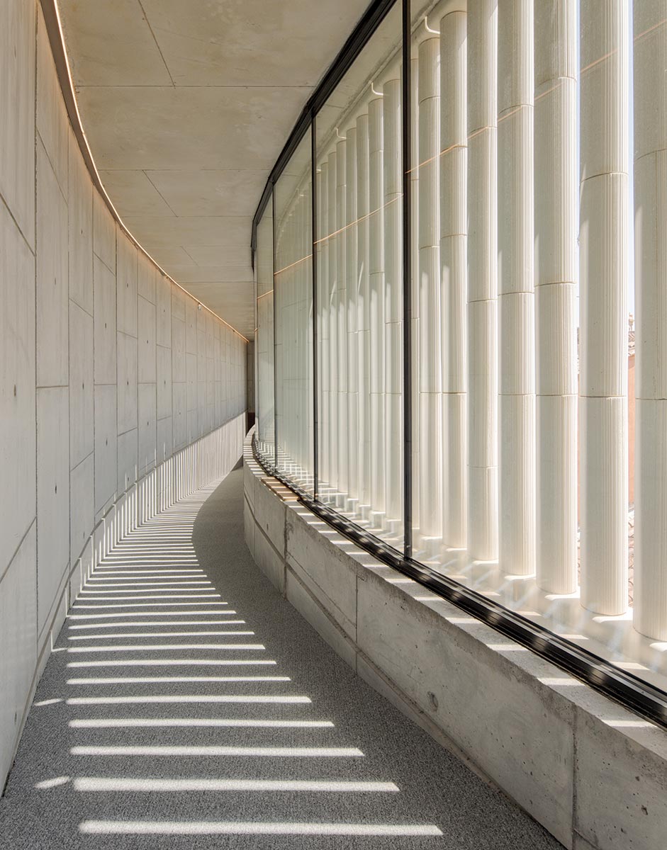
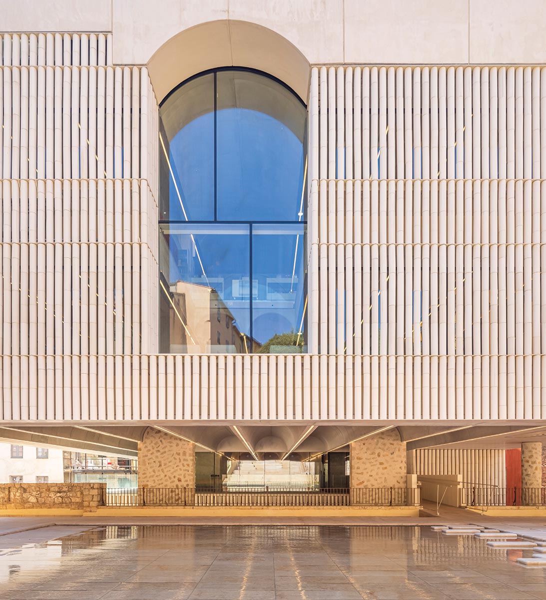
Since libraries need daylight, the new structure’s envelope is entirely glass. But, because of the region’s strong sun and the proximity to neighboring apartments, it is hidden behind a grill of white prefabricated concrete colonnettes, which would stretch five miles if placed end to end. Fixed to steel for seismic stiffening, and spaced just 2 inches apart to deter pigeons, the colonnettes catch the light when viewed from inside, thanks to their curvature and striation, reminiscent of both bamboo and classical fluting. Outside, they appear graphically striking and opaque by day, but at night the building glows from within. On the place du Rouachier, below the central and widest vault, the glazing has been left exposed, providing an urban connection between outside and in and contributing to the promenade architecturale: shown what happens inside, you are encouraged to try to get there. Meanwhile, at the rear, a rectangular turret, signaling the library’s presence when viewed from the surrounding hillsides, recalls the medieval towers that once bristled above Grasse.
The structure’s envelope is entirely glass, bringing daylight to the interiors (above), but much of the glazing is hidden behind a grille of prefabricated colonnettes (below).
At the time of writing, the Charles Nègre Library and Cultural Center was a few weeks from opening, though staff had organized outreach visits. “Initial reactions among the local population are often very negative,” says director Valérie Molins. “Remarks such as, ‘Oh, it’s not very Provençal’ or ‘There’s too much concrete’ or ‘It’s an eyesore!’ Once we explain the building, people generally leave with a far more positive view.” Children, she says, have no such aesthetic qualms, seeing only the good side: three times larger than the old facility, its collection doubled in size, the new library offers video games and computer terminals unavailable before. While it remains to be seen whether locals will reject it as an alien, elitist landing, this sophisticated project ticks all the boxes for architecture aficionados, who will immediately recognize the care that went into its making, from the staggered casting of the concrete panels—another borrowing from Kahn, and a labor of love for both architects and contractor—to Serres’s Mendes da Rocha–inspired railings and oak desks specially designed to hide monitor backs. Indeed, no effort has been spared to hide technical mess and clutter. At once simple and complex, heavy and light, solid and diaphanous, this monastically elegant building finds potential in constraint and poetry in paradox.
Credits
Architects: Ivry Serres Architecture — Ivry Serres, Benjamin Vassia, Hugo Marquet; Beaudouin Architectes — Emmanuelle Beaudouin, Laurent Beaudouin, Aurélie Husson
Engineer: C&E Ingénierie (structural)
General contractors: Fayat, Prowood
Cost: $13.8 million (construction)
Client: City of Grasse
Size: 40,000 square feet
Completion date: December 2022
Diamond Schmitt and Tod Williams Billie Tsien Architects reimagine New York’s David Geffen Hall
BY JAMES S. RUSSELL, FAIA
All photos © Michael Moran
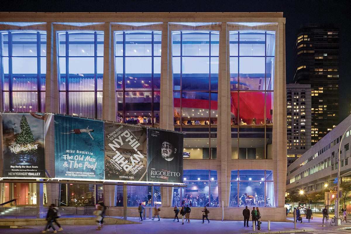
David Geffen Hall.
Does a concert hall with great natural sound matter anymore? People can access beautifully recorded music through their computers, mobile devices, and home audio/video equipment. Saddled with a dreary, substandard 2,738-seat hall with a dwindling audience, Lincoln Center and the New York Philharmonic had to face a hard question: what would persuade people to leave the comforts of home and pay to hear a live performance?
The glass and travertine shell by Max Abramovitz, including its porticoed terrace, is unchanged, though new lighting and diaphanous draperies hint at the transformation.
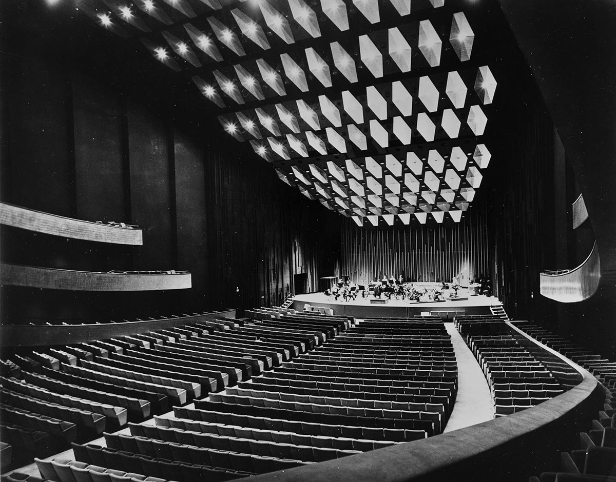
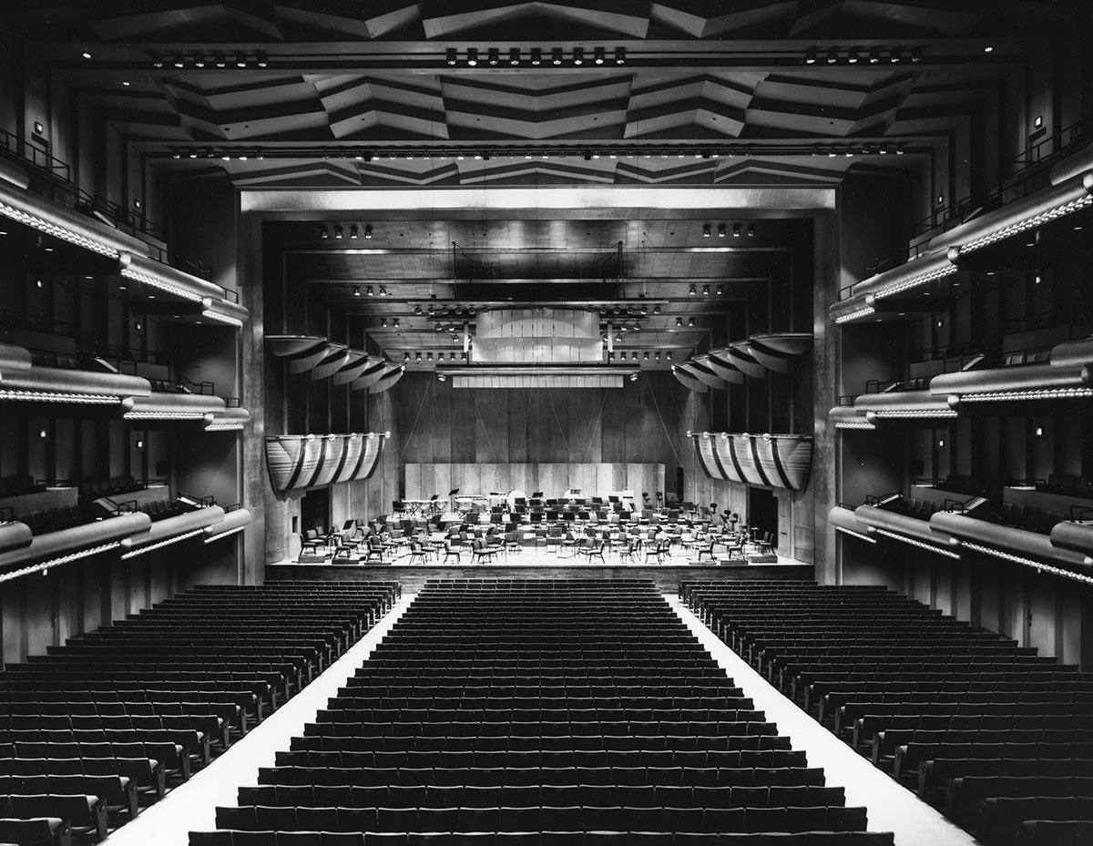
That became a particularly urgent question in the early 2000’s, when the shortcomings of Lincoln Center’s primary concert venue could no longer be overlooked. The acoustic problems dated back to the original design by Max Abramovitz of Harrison & Abramovitz. Then known as Philharmonic Hall, it opened in 1962 and was unsuccessfully altered several times. The orchestra had lived for decades with a 1976 gut renovation by Philip Johnson and John Burgee (with acoustician Cyril Harris). That iteration stretched what was then called Avery Fisher Hall into the rigidly rectangular “shoebox” plan of such admired venues as Boston’s Symphony Hall. The sound improved, but audiences felt distant from the musicians and disengaged from the experience.
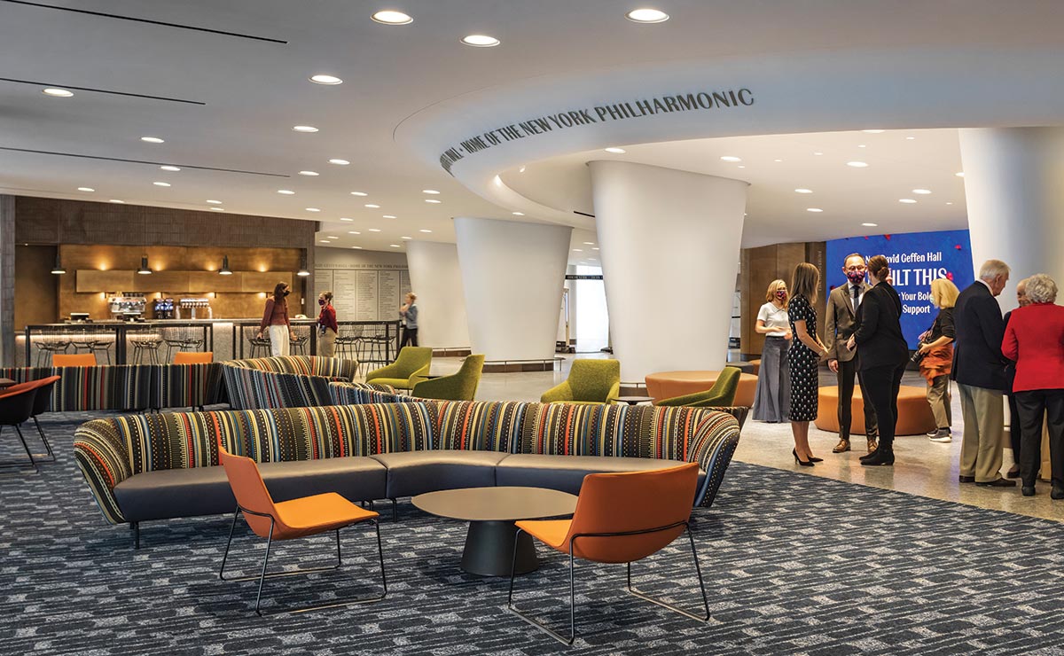
The new hall shines among neighboring venues at Lincoln Center (above) and welcomes audiences and locals with a Sidewalk Studio and loungelike lobby (below).
After several false starts, a gift in 2015 from the entertainment mogul David Geffen, followed by the arrival of a new leader for the Philharmonic, Deborah Borda—who had brought Frank Gehry’s Walt Disney Hall to fruition (RECORD, November 2003)—sparked an act of great faith: raising $550 million to attempt another transformative overhaul. The clients teamed Diamond Schmitt, experienced in opera and concert hall design in Montreal; Saint Petersburg, Russia; and the firm’s hometown, Toronto, with Akustiks, a Norwalk, Connecticut, sound consultant that had worked on halls in Nashville, St. Paul, and Cincinnati. (An earlier design, in which Diamond Schmitt had been paired with Thomas Heatherwick, was canceled in 2017 due to a ballooning budget.)
The clients and design team united behind a rethink of the auditorium that would connect with audiences through a visceral, immersive sound and architectural experience—one that would appeal to the Philharmonic’s core fans while broadening its reach with performances that shatter the limits of traditional classical-music programming. In this way, says Diamond Schmitt principal in charge Gary McCluskie, “the live event produces engagement that comes to the fore.”
New York–based Tod Williams Billie Tsien Architects (TWBTA) was brought in to bring a greater sense of occasion and improved circulation to the cramped lobby and austere upper-level concourses. The result is a venue with three distinct personalities: the unchanged exterior, a glass box lined with tapered travertine columns in an ambivalent mashup of Classical proportions and Modernist details; the lobby and public spaces, where TWBTA has deployed a hospitality style very much in contrast to Abramovitz’s civic-monument neutrality; and the auditorium, which Diamond Schmitt has treated with purposeful, wood-paneled restraint. The reimagined hall opened in early October.
Self-consciously styled as a “living room,” a lounge just inside the entrance suggests a hotel lobby and has instantly been adopted as a hangout by audience members and casual visitors; it is open all day, even when there are no performances. It replaces an intimidating wall of ticket booths. With administrative offices moved to the top floor, this once-cramped entrance has doubled in size and now features a 50-foot-wide video screen that can simulcast performances and display digital artworks such as the inaugural tableau, An Eclectic Dance to the Music of Time, by Jacolby Satterwhite.
Other changes activate the sober Harrison & Abramovitz exterior: a street-facing welcome center invites ticket-buyers and passersby to learn more about Lincoln Center events while enjoying a coffee; A Sidewalk Studio—visible through the expansive windows of a former private office on a pedestrian-thronged corner—features a lively digital wall and hosts such events as a Nightcap series of cabaret concerts.
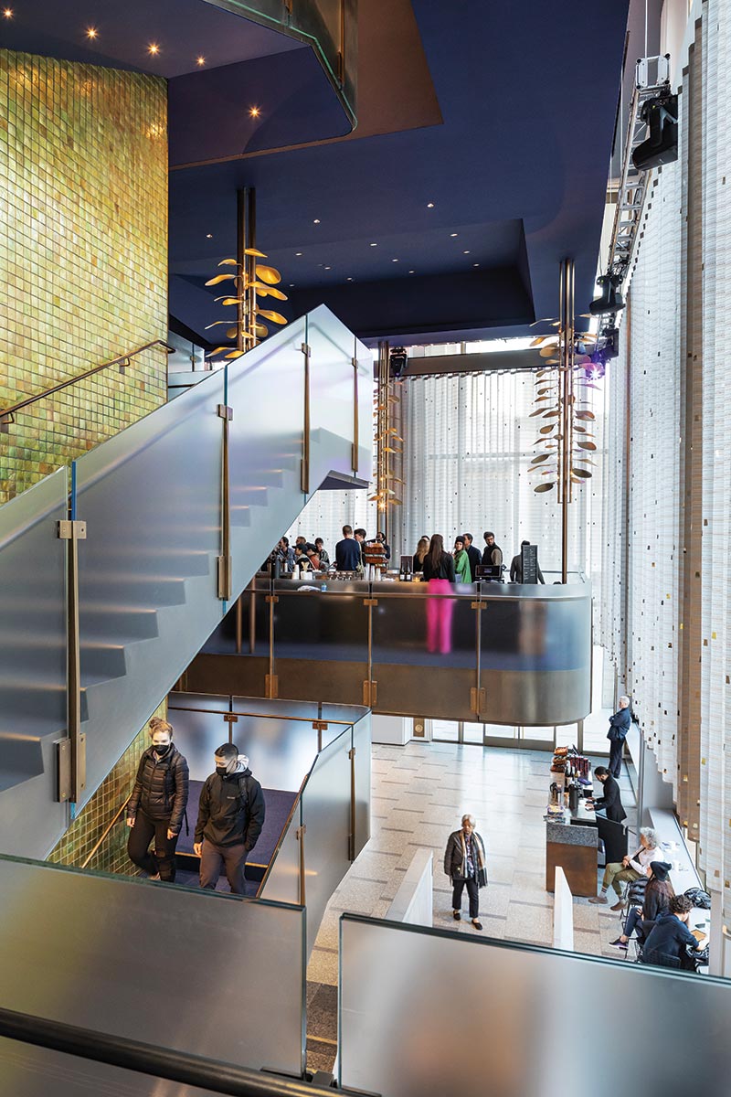
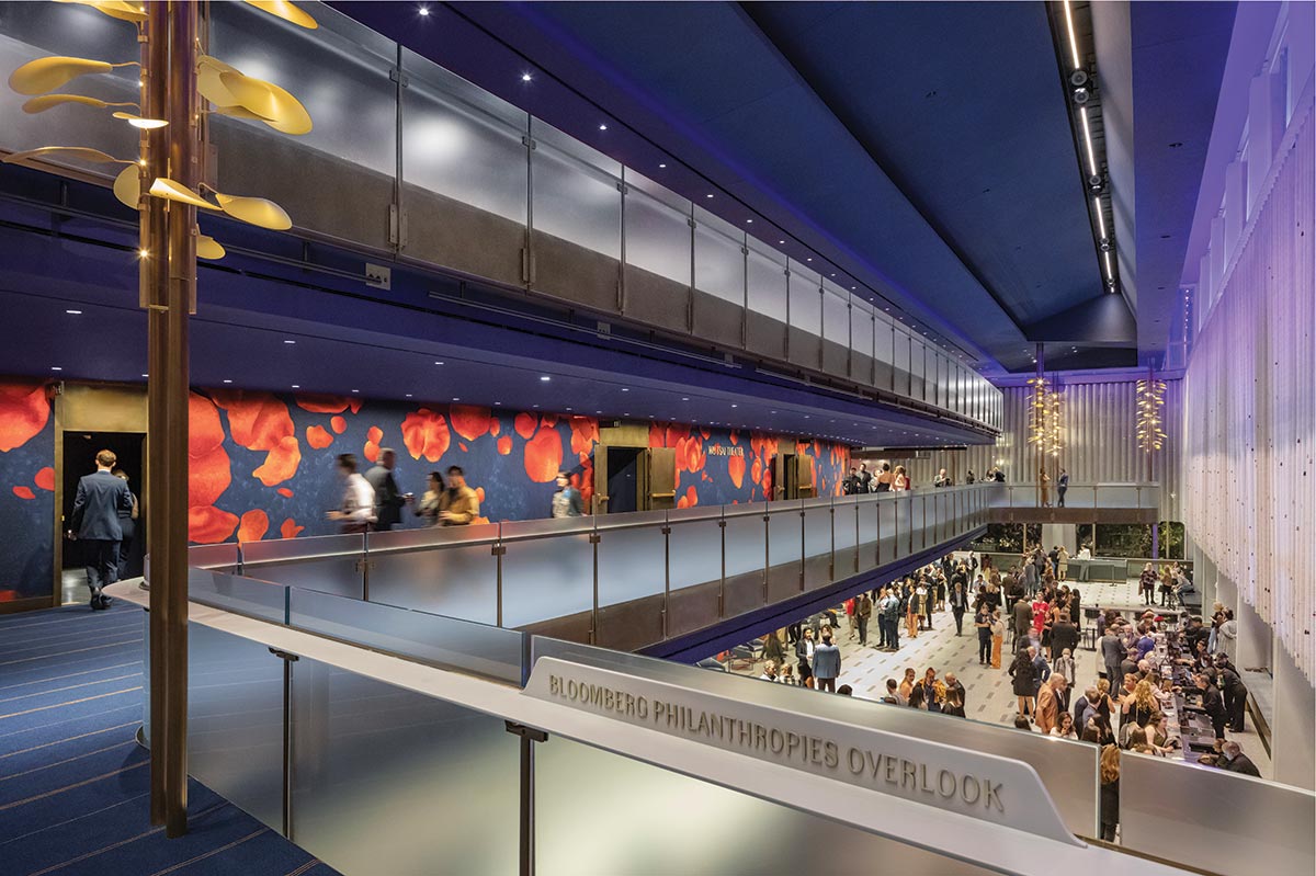
Bronze-wrapped cables bearing expanded first-tier overlooks on each side of the atrium double as housing for leaflike luminaires.
Above the lobby, Abramovitz’s cool, neutral surfaces on concourses for orchestra seats and three balcony levels have been painted cobalt blue. A felt wallcovering printed with oversize “falling flower petals,” as Tsien calls them, in shades of red, fuchsia, and orange, clads the auditorium exterior, and glows through frosted-glass and bronze railings. A convivial nightclub aura invites audiences to linger, and was devised with concerts, galas, and other events in mind (not to mention bringing in additional revenue), aided by numerous bars and retractable, ceiling-hung trusses for special lighting and sound effects.
TWBTA also reconfigured the atrium that Abramovitz built above the lobby. Now the first tier extends out toward the glazed facade on either end, enabling a more dynamic appreciation of the swirl of people at every level. Cables clad by bronze pipes suspend these balconies; they sprout leaves that diffuse light from built-in lamps.
The theatricality of this procession toward the auditorium may seem a prelude for architectural spectacle within. Instead, audiences will encounter warmth but also a restraint akin to Diamond Schmitt’s previous halls. The architecture defers to the music.
Saturated colors and warm materials enliven areas outside the hall.
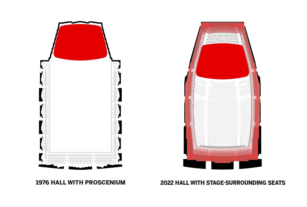
Though it was built within the steel frame and concrete-block perimeter of the 1962 hall, the long-sought intimacy that successfully transforms the experience comes from moving the stage 25 feet into the orchestra-level seating and reducing the overall audience count by 500, to 2,200.
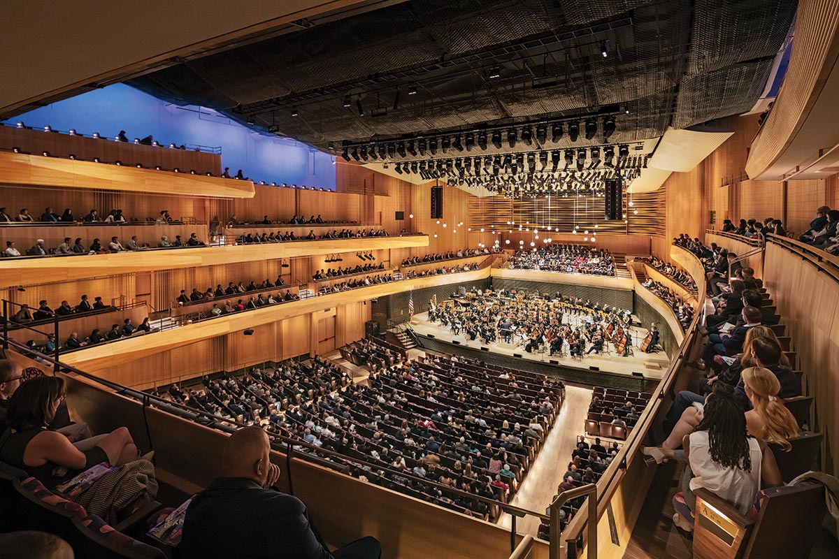
The stage was thrust deeper into the audience, with seating tiers that wrap the performers, akin to the “vineyard” plan of several recent halls.
A low-ceilinged proscenium that trapped sound has been demolished to achieve the sense of a “single room” that performers and concertgoers share, McCluskie says. Now the side seats of two of the hall’s three tiers curve gently inward to frame the stage, forming the “shallow vineyard” that the architect and acoustical consultant envisioned (see “Acoustic Redux,” page 90). These seats offer musical immersion and close views of the players. Seven rows of seats behind the stage allow those ticket-holders to face the conductor, or they can contain a chorus.
The beechwood panels that wrap the room “are a unifying visual element,” says McCluskie, and among several strategies intended to reduce the formality of the Johnson design. While the original Philharmonic Hall was conceived as a temple for natural sound, the clients recognized that Geffen had to be far more versatile, so it can support film and amplified performances. The stage—and the seating area behind it—can take on numerous configurations to suit various programs.
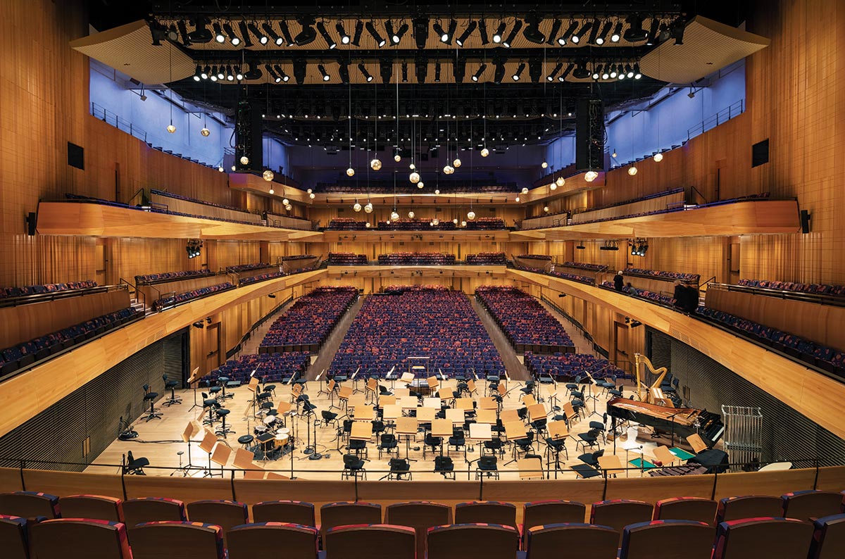
Side tiers curve in toward the rear of Geffen Hall (above), while the outer walls retain the rectangular “shoebox” shape of the 1976 revamp.
Early performances put both the sound and the advanced video and lighting to the test. Reviews have been positive, if cautious, with most critics describing a new wealth of instrumental intensity, detail, color, and timbre. Selections that mixed the orchestra with video and a partly amplified jazz septet, as well as a performance in which an amplified vocal ensemble led the orchestra, showed that acoustic and enhanced performers could successfully coexist. As for unamplified sound, the New York Times music critic Zachary Woolfe found the hall “mightily improved,” though he feared it was marred by “an objective, almost clinical feeling.” He did note that the sound was consistently balanced throughout the space (a rarity even in the best halls), whether in the rear balconies, where the hall’s resonance most noticeably kicks in, or at the sides, from the newly created seats around the stage.
In recent performances this writer attended, the programs attracted more diverse and younger audiences. With the classical repertory being nearly the last bastion of unamplified performance, Geffen’s versatility may lead to the rediscovery of natural sound for all kinds of music—from jazz to traditions of “unplugged” music from around the world.
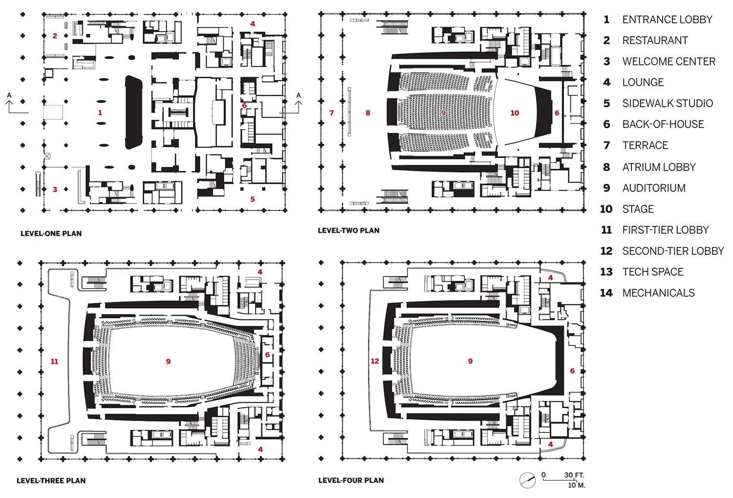
Image courtesy Diamond Schmitt Architects
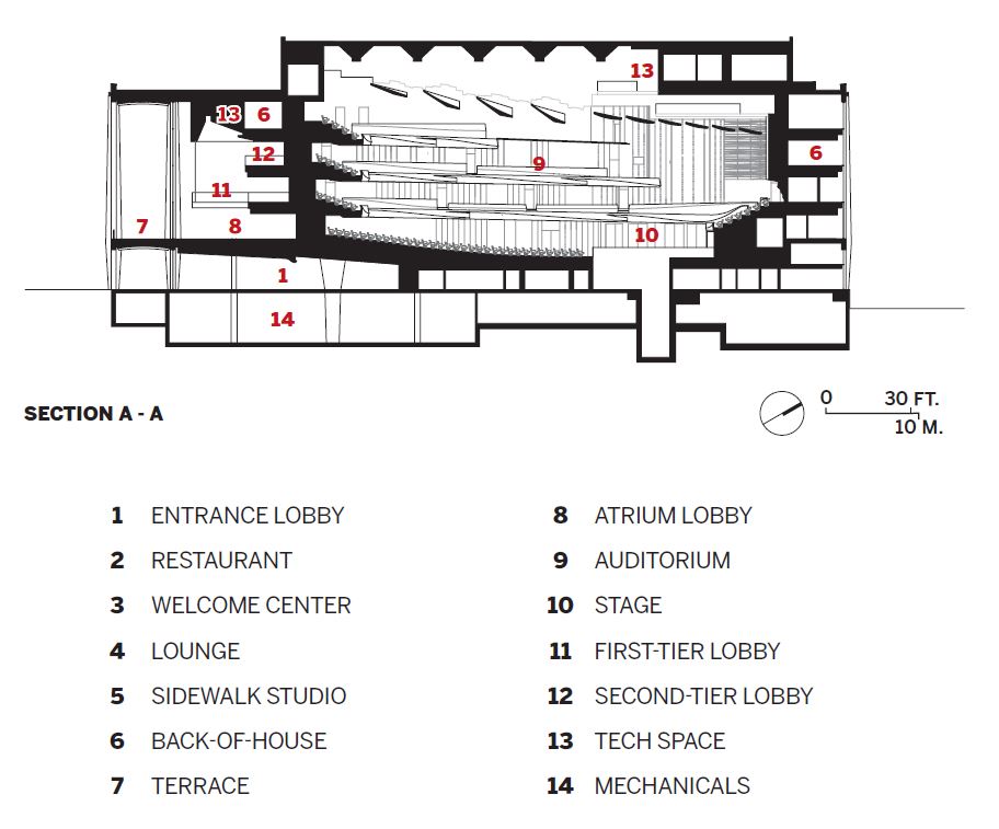
Image courtesy Diamond Schmitt Architects
Credits
Architect (Concert Hall): Diamond Schmitt Architects (concert hall) — Gary McCluskie, principal in charge; Sybil Wa, Matthew Lella, project architects
Architect (Public spaces): Tod Williams Billie Tsien Architects | Partners — Tod Williams, Billie Tsien, princi--pals in charge; Paul Schulhof, partner; Azadeh Rashidi, John Skillern, project managers; Whangjin Suh, Olen Milholland, project architects
Engineers: Thornton Tomasetti (structural); Kohler Ronan (m/e/p/fp)
General Contractor: Turner Construction Company
Consultants: Akustiks (acoustic design); Fisher Dachs Associates (theater planning); Fisher Marantz Stone (lighting); Forst Consulting Architects (envelope)
Client: Lincoln Center; New York Philharmonic
Size: 225,000 square feet
Cost: withheld
Completion date: October 2022
Sources
Metal Panels: Centria
Glass: Pulp Studio
Wood: Fetzer; Legere
Ceilings: Kreysler & Associates; Eventscape
Lighting: Aurora Lampworks
Interior finishes: Benjamin Moore; Liora Manné; Formica; Corian; Orsoni; Scott Group; Kriska Decor; Eric Bruce with creation Baumann
Furnishings: Arper; Andreu World; Geiger; Knoll; Prismatique; Maharam