Functional Color and Design in Healthcare Environments
 |
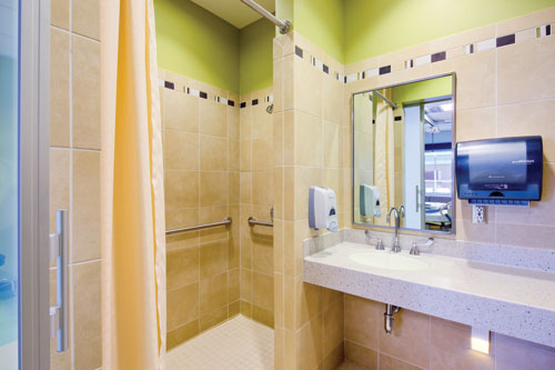
This brightly colored patient bathroom uses a multi-color palette at Banner Ironwood MC. Photo by Ross Cooperthwaite: SmithGroupJJR |
Patient and Family Spaces
Recent trends in healthcare settings for patient rooms are the creation of homelike settings. Important patient essentials are the inclusion of family, comfort and privacy. In addition, patients should feel connected to the outside world and have a sense of control. The following concepts provide some tools for designing the patient room.
- Light ceilings
- Nature inspired artwork
- Windows w/scenic views
- Single bed rooms
- Same handed rooms
- Family spaces
- Guest sleeping accommodations
- Desk and locked storage
- Convenient work surfaces for staff
- Linen and supply storage
A 1984 study by Roger Ulrich revealed that patients who had a window required less medication.9 Studies show that views of nature or natural images results in decreased pain and patients spend less time in hospitals. According to some researchers, even images of nature in patient rooms resulted in lower sensory pain responses.
The selection of a color palette is based on the designer's intention. Most designers use one base color in healthcare settings although multi-color schemes from two colors to many colors are gaining in acceptance. Often soft warm tones of rose, coral, peach and yellow or cooler tones of green, teal or blue are balanced with comfortable neutrals in patient rooms. The goal is to provide visibility of many colors through artwork, fabrics and accessories in each room so patients have the benefit of a complete spectrum. However, it is best to refrain from using strong color on the head wall as colors may reflect on the patient's skin and make diagnosis difficult.
Pediatrics
Pediatric environments offer the ability to turn up the color creating a welcoming and fun space. The goal is to create a positive mindset and make children part of the process with interactive activities and a sense of control. Creating a residential style that masks medical equipment can provide a comfortable and nonthreatening environment. Primarily clear and light colors add brightness. Windows and skylights can provide views of nature. A variety of color accents provide creative mental diversions from the world of medicine. Learning and fun activities in the room or waiting areas will keep children focused on creativity as they heal.
Youth activity areas should incorporate cognitive stimulation and designers may use large amounts of bright color on walls. Colorful artwork created by other children offers comfort in the foreign atmosphere of the healthcare facility. Realistic art with limited fantasy themes can provide reassurance to young patients. Teens require bolder, stimulating color for their social zones. Adaptable furniture and a way to find privacy and moments of escape will help to create a safe haven for young adults. Staff and parents should aim for an environment that closely simulates normal life even though they are in the hospital.
Maternity, NICU and Nurseries
Enhanced maternity areas provide an excellent experience for new mothers and sometimes begin the life-long relationship with the healthcare facility. Home-centered design, art and improved aesthetics align with the perception of excellent care. Women in labor had an average 2.1 hours less of delivery time and requested fewer epidurals to block pain, when visual art was incorporated in the room.10 Delivery/birthing rooms should be soothing in nature. Colors may range from warm, comforting tones to those that are cooler and relaxing. Indirect lighting, floor to ceiling curtains, beautiful textures, art and wood furnishings add to the sense of a residential atmosphere.
In 1957, Dr. Heinrich Frieling founded the Institute of Color Consultants/Designers (IACC) to train architects, designers, educators and scientists around the world on the psychology of color.11 His research on infants suggests that colors in nurseries should be lighter in hue and have low chromatic values. The translucent skin of infants reflect color; therefore, pale neutrals and off-whites are preferred rather than pink, yellow, green, blue and gray which can make diagnosis and medical evaluations more difficult for the doctor. In general, off-whites and pale neutrals that are between 55 percent and 75 percent LRV are in an acceptable range for these areas.


