Functional Color and Design in Healthcare Environments


COLORS
As shown in many studies, our feelings about color depend on many facets of our physiological and psychological profiles. Color may be an important emotional trigger, however, there is no clear evidence to suggest that any one color is effective in achieving a particular healthcare outcome. Humans are complex and it is not possible to provide one design solution for all cultures, places and activities. Designing for unique human beings requires the design of unique built environments.
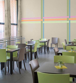
A pleasant combination of all colors works to make this space an appealing get-away for diners at the Nursing WZC De Regenboog, in Zwijndrecht, Belgium. Photo by Wout Devijver Zinin Communication
|
||||||||||||||||||||||||||||||||||||||||||||||||||||||||||||||||||||||||
Vision occurs when light enters the eyes, strikes the retina and is absorbed by rod and cone cells. These cells send signals to the optic nerve and then to the brain where these messages are blended with stored information. The way humans 'see' color depends on many variables from previous knowledge to associations and emotions. Studies suggest that humans that have had a negative experience, such as receiving a vaccination (while wearing a green sweater) or a positive experience, like a birthday party, (while wearing a green dress) associate and are influenced by their following experiences with this color. The physiological and associative effects of the use of color in the chart at the end of this article are based on numerous studies by color theorists. The “character” of colors is subjective and this table has been developed as a guide to some of the assumptions about color that can be applied to healthcare settings.
LIGHT
There is a direct relationship between light and color. The reflectance of light is translated by the eye and brain to allow humans to see color. When specifying color in pigments, the light reflectance value or LRV is the measure of the percentage of light reflected from a surface. The perception of light is also affected by the type of light source as well as by the adjacent colors in a room. Some manufacturers label pigments by number codes with up to three numbers, a designation that defines the color (or where it falls in color space), the light reflectance value (LRV) (indicating the lightness or darkness of the color) and the intensity of the hue (which indicates the saturation or strength of the color).
Optimum light reflectance values range within a room, depending on the light source. Researchers have found that there can be a great degree of variance in light reflectance values in different parts of a room and have identified values that are appropriate for any different surface. However, the chart below provides some guidelines for design professionals to follow:
For optimum visual clarity, government safety guidelines specify that a 30 percent value difference should be maintained between ceiling, walls, doors and floor surfaces. This guideline also helps the visually impaired or older adults with navigation in public places.
| AREA: | LRV Percentage: |
| Ceilings | 70% - 90% |
| Walls | 30% - 60% |
| Floors | 15% - 40% |
This sample checklist, based on research and methods of authors Sara O. Marberry and Laurie Zagon, demonstrates how a professional can assure that a comprehensive use of the complete spectrum has been included. Advocates of using color in healthcare settings recommend that a full spectrum of colors be considered to promote health and well-being. These colors may be found in all the design elements (walls, fabrics, upholsteries, floor coverings and artwork) within the space.
Notice