Functional Color and Design in Education Environments


Gymnasiums
The gym environment should stress the joy of being healthy. The design of gyms in elementary schools should create an atmosphere of vitality, with neutrals of beige, tan and white with warm accents in saturated mid-tones, or cool accents of lime or other shades of green. Bright graphics will help children feel welcome and encourage activity. Natural light should be maximized to promote well being. For teens, the colors need to convey action. Red, orange, yellow, apricot and lime with bold colors for accents and graphics are good choices. Large expanses of turquoise are to be avoided. Equipment should support today's active life styles, such as resilient wood and synthetic sports flooring, and mirrors and ballet bars for dance and yoga programs. To reinforce physical fitness, gyms for teens should take a holistic approach; designers may want to consider connections to a kitchen space to teach the benefits of a healthy lifestyle.
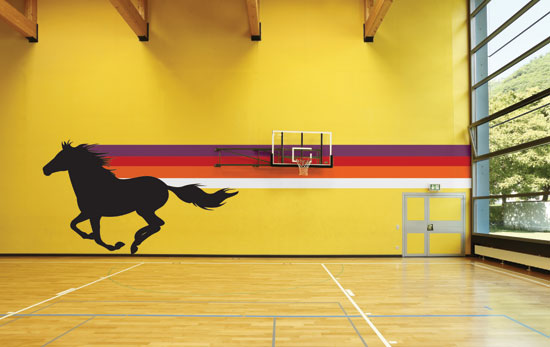 |
Gyms for teens should use active colors and graphics. Photo courtesy of Shutterstock.com |
Locker Rooms
These spaces provide a wonderful opportunity for color. Lockers themselves are available in both neutral and bold, colorful shades that make dramatic statements. Using several colors, both warm and cool, prevents the space from being overwhelmed by one color statement. One option would be to use neutral colors with accents of school colors incorporated for interest. Locker colors and walls should strike a balance. With stronger locker colors, neutral and mid-tone walls are preferable., and with neutral locker colors, warm or cool mid-tone wall colors create the best design schemes. Wood accents, as in benches, can be used for warmth. LRVs for walls should be lighter to maintain higher light levels. Designers should also consider high opaque windows to admit natural light.
Cafeterias
The theme for cafeterias is good nutrition. Colors should be cheerful, appetizing and reminiscent of citrus, spice and food themes with clean, reflective surfaces that bounce light and feel fresh. Flamingo, red, rose, pumpkin, coral, peach, orange and brown along with charcoal for high contrast combinations work well. Avoid yellow-green, blue or magenta on large expanses of wall areas. Different size and table configurations facilitate small or large groups. Designers will want to note that cafeterias also double as spaces for after-school activities, in the evening for adult programs, as a community setting for town meetings, and on weekends for both adult and children's programs.
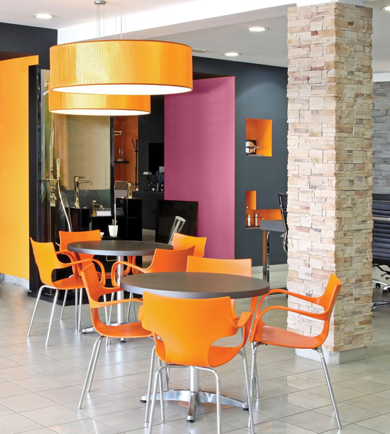 |
Use colors that are cheerful, appetizing, and reminiscent of citrus, spice, and food themes. Photo courtesy of Shutterstock.com |
School Offices
At the heart of the complex, the school office should project a feeling of calm and security and encourage care and interaction. Colors should reflect a comfortable, protected, and balanced approach. Bright colors like red, orange, and yellow should be avoided in favor of mid-tone and dark neutrals with magenta, rose, coral, soft gold, light green, turquoise and blue accents. Offices with glass areas and an open view to the entry way and corridors provide an “eye on the street” perspective that is important with respect to security, supervision, and safety.
Notice