Functional Color and Design in Education Environments


Study Hall
Study areas engender equilibrium, balance, and stillness and should be quiet in design and allow for concentration. Cool colors encourage concentration by lowering heart and respiration rates (Bordwell/1998). Off-white, pearl gray, earth tones, browns, greens or blues should be used rather than warmer colors such as red, orange or yellows. Acoustical sound panels assist in providing an atmosphere essential for contemplation
Art Studio
Both art and music studios should be planned around the activity setting model. They are multifunctional places that give students opportunities to become engaged in different projects alongside one another. Folding partitions and stackable seating will help increase flexibility. Colors should encourage creativity, such as green, violet, red, peach, pink and light yellow, which should be used as accents.
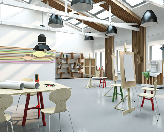 |
Keep creative areas neutral with small accenting. Photo courtesy of Shutterstock.com |
Band and Choir
These are team endeavors and neutrals along with colors that instill calm and creativity such as greens and violets are ideal for band and choir rooms. Other useful design elements include wall space for professional pictures and artwork, sectional sofas for student relaxation and tiered and movable risers to increase the flexibility of the space. Mirrors for show choirs and absorber and diffuser acoustical panels are also useful elements and add a professional dimension to the space. Designers of band and choir rooms should specify wood or hard finished floors, which are easier to clean and resemble most performance areas.
Shop and Domestic Arts
Luminous hues such as light yellow and light orange are appropriate; tan or pale green are suitable for manual training workshops. Shop and domestic arts room should be equipped with tackable surfaces and movable marking boards, high stools with padded backs and seats, and massive storage space. Sealed concrete floors are ideal for this area.
Library
The library is moving away from a book storage building toward a gathering place for people. Today's school libraries have a multifaceted job. They must be vital and dynamic environments that foster a spirit of collaboration, stimulate creativity, and serve as a testing place for learning. Increasingly, libraries are a gathering space that stimulate and enhance relationships between students and staff, and provide the flexibility to work alone or in groups as well as serve as a venue for large events and presentations. Libraries don't need to be dreary, dull spaces. Actually, using color to warm and brighten these spaces encourages students to read. For younger elementary students, consider graphics that energize walls and contrast with book-lined shelves.
There is a lively conversation in expert circles about the implications of the Internet and the future of libraries. Even today's libraries frequently contain numerous computers, so it makes sense to use colors that reduce eye strain. For teens, and especially where computers are used, mid-tone and deeper colors that reduce glare and enhance quiet and facilitate concentration are preferable. Libraries with a pale or light green create an effect that enhances quietness and concentration. Mid-tone, subtle golds, varieties of greens and smoky blues may also be considered, particularly for study rooms within the library.
Media Center
Today's media centers require areas for quiet independent work as well as one-on-one and large group meetings. There are areas for computer work, reading, printing, and study. All these functions should be against a restful backdrop, with no stark white or dark or bold colors. Creams, mid-tone neutrals, rose, coral, light green and aqua are preferable in these spaces.
Auditoriums
Auditoriums are dignified spaces, and colors should reinforce this. Rose, pale gold, fern green are suggested because of their friendly character. Violet, black, dark green, navy, and warm neutrals suggest distinction. In all cases, mid-tone and deeper colors should be specified as they absorb light and do not distract from the stage or the performance.
Notice