Functional Color and Design in Education Environments


Classrooms
The heart of the school beats in the classroom. Within this area students invest the greatest portion of their day, and it is the designer's goal to make this environment favorable to learning. Color and light play key roles in classroom design. In an attempt to “feature” children and teachers, rather than architecture, colors of the 1960s and 1970s utilized neutral design, a concept that was a failure and considered soulless. Research reveals that color and light have a pronounced physiological effect on children. When deprived of natural light, studies have shown that children's melatonin cycles are disrupted, thus likely having an impact on their alertness during school (Figueiro and Rea/2010). Professor H Wohlfarth, President of the German Academy of Color Science and Photobiologist at the University of Alberta notes that color and light definitely have a physiological effect on children. He says that studies show an “identical” impact on blood pressure, pulse, and respiration rates, of both blind and normal sighted children, were lower after walls were changed from warm to cool colors. When the full-spectrum lighting was included, children became more behaved, attentive and less aggressive and fidgety.
Used properly, color and light can provide an atmosphere conducive to learning. In classrooms, students and teachers need to feel stimulated and motivated, but not so much so that the colors discourage concentration. A successful technique to focus attention in classrooms and to provide visual breaks against neutral walls is the incorporation of feature walls. The feature wall should be the main wall at the front of the room and/or a side wall that is a solid plane. Painting the teaching wall a deeper or brighter shade than is used on the side walls does two things: It attracts attention to the front of the classroom, yet the eyes get a visual break when focus is shifted to the side walls. In addition to breaking up monotony of wall color, a feature wall of approximately 20 to 50 percent LRV will add greater visibility to teacher and educational materials, relieve eye strain as student transitions from coursework to instructor, and reduce glare from bright overhead lights or natural light. Research recommends classroom feature walls to be approximately 40 to 50 percent LRV. Depending on the color, room lighting, size, window and light exposure, a lower LRV may be considered for visual comfort. In the yellow family these LRV values may be higher.
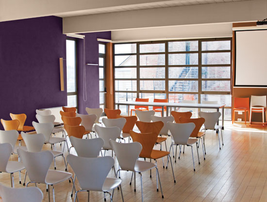 |
A feature wall of approximately 20 percent to 50 percent* LRV will add greater visibility to teacher and educational materials and relieve eye strain as student transitions from coursework to instructor. *See table on LRV factors on page 3. Photo courtesy of Shutterstock.com |
Notice