Color in the Built Environment: Past, Present, and Future


Emerging color theme 2: "finding the way." Defining directions, signposting new ways, navigating life and understanding context are ideas that have a basis in both our personal identities and the wider aspect of where we fit into a globalised world. This notion of mapping responds to our desire for a clearer, simpler and more orderly way of seeing, doing and being. Uncluttering of our mind, home and attitude allows us to make sense of our immediate community and the world at large. We need to understand what our global and cultural identity is, both as individuals and communities. Once we understand where we belong, where and how we are rooted, then we can move forward. Finding our way in the world is important, both to our everyday lives and our mental attitudes. By mentally mapping out our daily lives we can simplify and structure things.
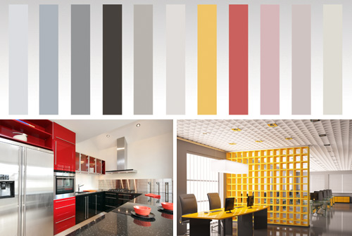 |
Emerging color trend #2 using neutrals and selective color accents to define "finding the way" in navigated, clarified, simplified, decoded terms Photo: Used under license from Shutterstock.com |
Â
The color palette associated with these trends is characterized as navigated, clarified, simplified, and decoded inspired by signs, maps and urban architecture. Pure, contrasting cool and warm neutrals are highlighted by pastels from old maps and brighter signage shades. Mapping via color is a powerful way of decoding our environment. Highlighting certain areas helps us know where we are heading, thus saving time and energy. It allows us to navigate space, decode complex problems and clarify reality, so developing a sense of calm and order. Single accent shades are useful in defining areas or in feature walls which contrast with neutrals to create combinations that are calming or exhilarating, easy to live with and refreshingly clear. This theme is a true yellow brick road to a new, clearer and calmer future.
Emerging color theme 3: "pop-up pleasure." The time has come to smile again, to bring a sense of poetry and pleasure back into our lives in a way that is both charming and slightly childlike. We want a lighter approach, a gentler humor and a quirky creativity. This easily accessible state of lightness is a far cry from dark, complicated and conceptual looks - here we are captivated by a sense of fun, animation and temporality. Refreshingly simple and immediate it puts a smile on our faces - as transient as blowing bubbles, the color of a rainbow or petals in the wind. This lightweight story is full of the unexpected. We find this same spirit of surprise appearing in pop-up restaurants, cinemas, bars and galleries - locations that seize the moment and have no need to last for all time. They play with creation for the fun of it without being preoccupied with notions of eternal existence or fixed meanings. This in turn opens our eyes to a sense of magic and joy - ageless, classless and cultureless, charming and unpretentious, poetic and childlike.
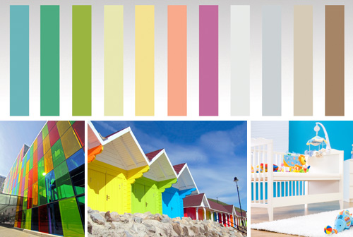 |
Emerging color trend #3 effused with "pop-up pleasure," which is surprising, refreshing, poetic, and joyful Photo: Used under license from Shutterstock.com |
Â
This palette purports emotions that are surprising, refreshing, poetic, and joyful. It perfectly reflects the freshness of sorbets and vitamins - light zingy tints and clean pastels that are grounded by typical cardboard brown. A single clean background color can easily be accessorized by an array of pastel shades. Temporary art is quick and easy to achieve, personalizing housewares and clothing is creative and fun. Magic can be created from the mundane, and poetry from the prosaic. Time doesn't have to go so fast - slow down, make something and be surprised.
Notice