Rear-Projection Tiled Digital Media Walls
Image Quality
Rear-projection tiled digital displays are designed for superior image quality in high ambient light environments, without glare or reflections, so the message and images are always clear. Using the strengths of DLP® and LED technology, rear-projection tiled digital displays have higher resolution, substantially brighter images and a wider color palette than conventional LCD and plasma displays. Therefore, display images remain crisp and clear at any viewing distance or viewing angle. This is not possible with some other forms of digital technology where images are distorted at close range. LED displays look best from afar, but lose clarity when viewed up close.
Color space is a term describing an abstract model of how colors are represented in a triangle where each point is red, blue and green. The color mixing within a digital color display is the color space. Some digital displays are limited to the colors they can produce, depending on the size and shape of their color space. Flat-panel screens typically have a weaker color space than rear-projection tiled digital displays which offer more saturated colors and a bigger color space. A wider color gamut (i.e. color space) results in a richer color palette which can reproduce logos and branding colors with accuracy and high ambient effect.
| CASE STUDY | ||
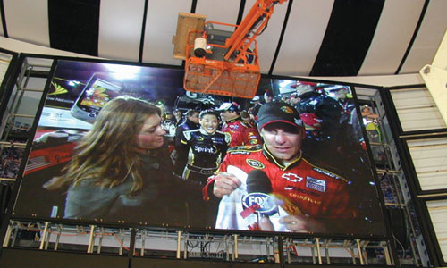
Client: NASCAR Hall of Fame and the City of Charlotte, North Carolina The $195-million shrine to stock car racing was designed by the New York architectural firm, Pei Cobb Fried, and features exhibits that honor the past and use the latest digital technology. The visual centerpiece is a giant video board in the soaring Great Hall, using an 18-tile wide by 14-tile high array (24 feet by 14 feet) consisting of 252 rear-projection digital display tiles. Soaring heights, curves, and glass curtain walls dominate the exterior design, posing a challenge to the environmental designers tasked with integrating high-impact digital media into the space. In the Great Hall, above a section of sloping track that shows the history of NASCAR, there were plans for a giant billboard to show old racing films. The audio-visual consultant had to select a display technology for the curved space above the track, and ensure the screen didn’t obstruct other building elements. The rear-projection tiled digital display reduced the depth of the display space originally planned, and the overall weight dropped substantially. The housing and fascia design of the tiles meant they could be set in a gentle curve to match the curved wall. When compared to other technologies that were considered, the rear-projection tiled digital display reduced overall costs. Design Solutions
|
HK Effect
Color perception is a vital aspect of appreciating digital display technology. It is possible to look at two versions of the same image or displays, having the same technical measure of brightness, and perceive one to be much brighter, just by the way the colors are reproduced.
This phenomenon is called the Helmholtz-Kohlrausch Effect (the HK Effect). In lay terms, the HK Effect makes reds and blues look deeper and richer and yellows look brighter than they may actually be. The effect was first described by two eponymous nineteenth century German physicists, Hermann von Helmholtz and Friedrich Kohlrausch, and has been a major part of research into human perception of brightness and color.


