Functional Color and Design in Healthcare Environments
Color and nature provide healing benefits in hospital settings
![]() Continuing Education
Continuing Education
Use the following learning objectives to focus your study while reading this month’s Continuing Education article.
Learning Objectives - After reading this article, you will be able to:
- Recognize the philosophy of Evidence Based Design for healthcare professionals.
- Review psychological and physiological use of color and nature and the application of color theory to healing environments.
- Define elements of color, hue, light reflectance and intensity and optimize selections for visual clarity for major areas and departments within the hospital atmosphere.
- Discover the positive impact on the hospital environment that is achievable when incorporating the influences of the five senses in the design process.
Applied research and careful study conducted by professionals on the impact of color and design on healthcare settings have changed the design palette used in new healthcare settings. There is a wide consensus that there is no clear evidence suggesting that any one color is effective in achieving a particular healthcare outcome. In fact, the highly subjective nature of color, color combinations as well as cultural associations of color palettes make the selection of effective color for any environment difficult to predict. However, data does suggest that design professionals who understand the elements of color and the introduction of nature into healthcare environments can make an impact on healing. Architects who engage all five senses into the design process can enhance the healing process.
This article will explore some of the design research into the psychology of color and exposure to nature to enhance healing environments. As architect Anne Cox, AIA, LEED BD+C, EDAC, healthcare planner at Albert Kahn Associates, Inc. explains, “The latest and lasting trend in healthcare is to use informed research. In addition, one of the newest mandates for healthcare design is to become stewards of the environment—a reflection of the medical mandate 'to do no harm.' The case for green healthcare design is no longer just about energy savings. The rationale for building green today takes into account financial gains, improved patient outcomes, better staff health and reduced turnover, and community benefits through a reduced environmental impact.”
HISTORY
A brief review of the history of medicine provides insight into the transformation of medicine from religion to science. Early humans living between 4,000 BC and 3,000 BC believed that illness was a punishment from the gods. In ancient Egypt, priests served as physicians as well as religious leaders. By the fourth century B.C., the Greek physician Hippocrates, considered the father of western medicine, was among the first to credit the environment as a cause for illness as well as a means of healing. The Greeks and Romans developed therapies that included massage, art and herbs for healing. In China, acupuncture was developed as a means to treat numerous illnesses. Throughout the world, early humans' life expectancy increased from 20 to 30 years of age.
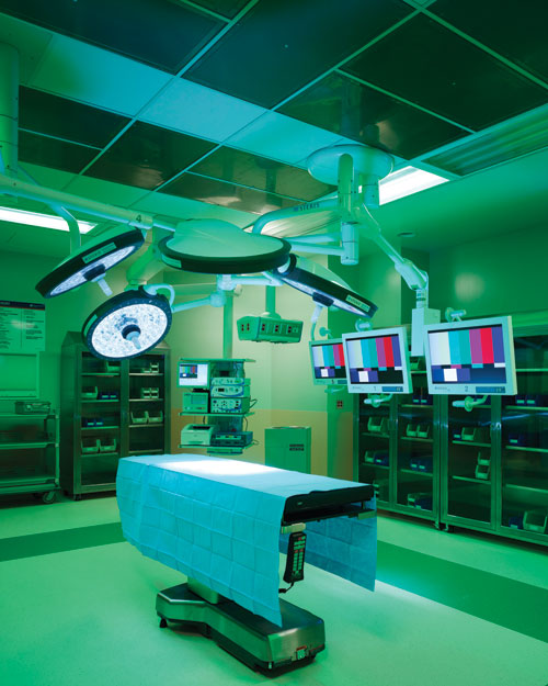 |
Color used in surgical areas at the Elmhurst Memorial Hospital, designed by Albert Kahn Associates, Inc., provides a calming and soothing atmosphere for patients as well as an inspirational and functional work atmosphere for staff. Photo by Scott McDonald |
In Medieval times, the study of medicine was prohibited as religious leaders restricted the growth of science. Human life spans declined until advances in printing led to scientific collaboration and the Renaissance. The 16th and 17th centuries brought about the creation and development of the microscope, opening up new worlds of medical exploration and equipment including the first mercury thermometer. By the 18th century, the life span of the average person increased to 50 years of age as a variety of illnesses began to be diagnosed and treated with medicine, confinement and care.
Women became active healthcare participants in the 19th century. In Florence Nightingale's preface to her book on hospitals, she wrote, “It may seem a strange principle to enunciate as the very first requirement in a hospital that it should do the sick no harm.”1 She began the first nursing school in 1860 that led to the reform of hospital environments.
The 20th century brought organ transplants, healthcare plans and a life expectancy of 77 years. The 21st century has seen the first implantable artificial heart, stem cell research and an anticipated life span of 90 to 100 years of age. In this period there has been continued research and understanding of the impact of the environment on healing and healthcare outcomes.
GROWTH OF EVIDENCE-BASED DESIGN
In the last quarter of the 20th century, researchers began to explore design concepts that might improve healthcare facilities. In the 1990s, the Center for Health Design, a non-profit organization, was committed to advancing design in healthcare settings to improve patient outcomes. They launched the Pebble Project in 2000 to encourage the adoption of stricter research methodology, data collection and collaboration for healthcare designers. Evidence-based design (EBD) practitioners employ credible data and research to influence design decisions. The Pebble Project was created as a way to engage healthcare designers who were building or renovating environments to document their results and meet frequently with each other. The goal of the project was to create a cascade of insights on healthcare environments that would have a beneficial ripple effect throughout the industry. The research from the Pebble Project gained even more momentum as in tandem with its acceptance and growth, mind-body medical science was developing rapidly and confirming that patient stress and emotional states affect clinical outcomes. The Center for Health Design is the primary source for certification in evidence-based design and those professionals who have passed this exam list EDAC after their names as qualified providers of EBD design planning.
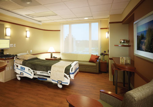 |
Designed by Albert Kahn Associates, Inc., this patient room in Elmhurst Memorial Hospital demonstrates how the use of natural colors and materials along with views to the outdoors can create an enhanced atmosphere for healing. Photo by Scott McDonald |
Hospitals built in the mid-20th century were functionally efficient yet blind to the emotional needs of the patient. One of the most cited and influential evidence-based healthcare design researchers in the world is Roger S. Ulrich, PhD, professor of architecture and landscape architecture and faculty fellow for the Center for Health Systems and Design, Colleges of Architecture and Medicine, Texas A and M University. His 1984 study, published by Science magazine titled “View Through A Window May Influence Recovery from Surgery”2 discussed the emotional needs of patients and the influence of design on patient safety and health.
His studies are lauded for their scientific rigor, and his findings continue to be readily implemented by healthcare managers, clinicians, architects and policy makers throughout the world. His research has influenced the design of many billions of dollars of hospital construction and improved the safety and health outcomes of patients across the globe. Because of his work in this field, we are learning that designing within the basic principles of nature can lead to positive outcomes. It is becoming clear that evidence-based design is an approach to design that improve outcomes for the patient, family and staff within the healthcare facilities.
GOALS OF HEALING ENVIRONMENTS
There are three principal goals to every healing environment. Healthcare designers strive to heal the patient, support the staff and engage the family. The first goal is to heal the patient. A primary focus is to make sure that patients spend all of their energy fighting the disease—not the healthcare environment. Research reveals that individuals in healthcare settings nationwide agree that privacy, respect as an individual and their safety and security were the highest priorities for their care setting. Implementing EBD design theories that respond to these priorities has shown to improve patient satisfaction.
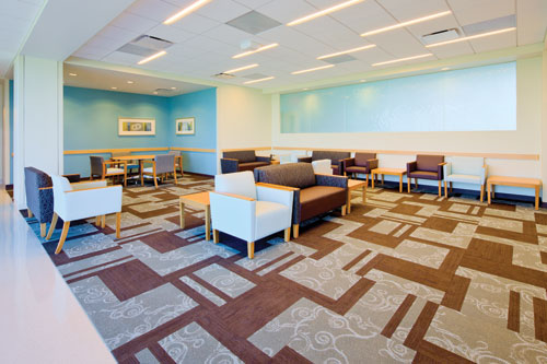
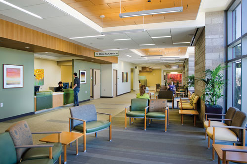 |
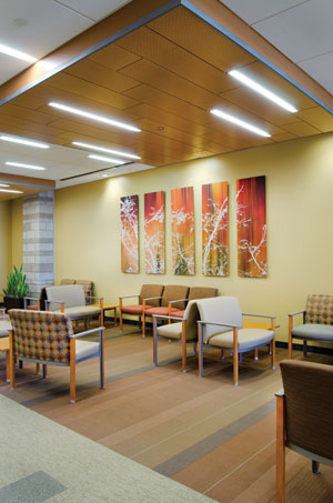
This colorful, daylit waiting area at Banner Health Clinic in Maricopa, Arizona, is designed by SmithGroupJJR using evidence-based design principles to help provide an atmosphere of comfort. Photo by Gregg Mastorakos: SmithGroupJJR |
Additionally, patients need supportive staff. Healthcare organizations and institutions are finding that they must differentiate themselves to recruit and maintain personnel. When featuring EBD to recruit and retain staff, they are finding that they are elevating themselves in competitive marketplaces.
Finally, family support is essential in therapy, caring and advocating for the patient. Families that are involved in the healing and therapy process respond to EBD environments and are engaged as good advocates for the patient. Healthcare settings that simulate a home environment and engage all of the five senses by design are shown to improve healthcare outcomes and family involvement in the patient care.
Design professionals using EBD have identified 12 aspects of a healing environment that have the ability to be a part of the healing process. These include:
- Single patient rooms
- Ergonomics
- Furniture arrangement
- Air quality
- Windows
- Wayfinding
- Building layouts and zoning
- Access to nature
- Light – particularly natural daylight
- Floor materials
- Noise control
- Positive distraction through the use of aesthetics
Although there is no exact “design medicine,” hospitals with designers who pay attention to these 12 areas achieve results for hospital caregivers. Healthcare design professionals should aim to provide patient's control over their environment and thoughtful accommodations for all caregivers including family members and friends. The cultural and geographic area of the world in which the hospital is located may guide the design direction and aesthetic choices. A hospital with the desert of Arizona in the background may have a very different design direction from one in Paris. Healthcare design that is inspired by the art, craft and culture of place will provide a setting that meets many sustainable design goals.
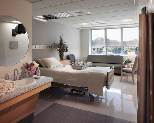 |
This inpatient oncology room at Holy Cross Hospital in Silver Spring, Maryland, designed by SmithGroupJJR, simulates a home atmosphere. Photo by Gregg Mastorakos: SmithGroupJJR |
An example of this is the design of the Banner Maricopa Clinic in Arizona. According to Sonja Bochart, associate, IIDA, LEED AP at SmithGroupJJR, “The design of Banner's Maricopa Health Center was based on the Banner Health Center prototype, which defines and reinforces a strong and relevant brand image of quality, patient-centered care.” The architect used a foundation color palette that represented the neutral, quiet background of the Center, combined with a stronger palette of accent colors. They used “the saturated greens of local flora, terracottas and plums that reflect the canyons and landforms of the Southwest, and smoky blues with hints of green to reflect the expansive desert sky—strategically aligned with specific areas of the Center. The overall effect is a timeless connection to nature and a sense of wellness.”
In some communities, hospitals are becoming both places for healing the sick as well as places for the community to gather for well-being. A “hospitality mentality” is becoming an all-important inspiration for healthcare designers. Computer desks, magazines, books, newspapers, movies on demand, 24/7 food service, whirlpools, spa services, valet parking, music and Internet accessibility are all part of the amenities common to the hotel industry that are now making hospital visits more comfortable and less intimidating. Hospital interior designers are also borrowing color palettes from the spa, hospitality and retail industries borrowing from branding initiatives that are intended to soothe or energize customers.
Ninety-five percent of all individuals who are asked how to alleviate a stressful situation respond that they are most comforted and soothed by being outdoors.3 Furthermore, they specifically mention that they would like to engage all of their senses. Physical and mental well-being is the top concern for a hospital. The exploration of the biologically based bond between humans and nature is especially important in environments where medical technology and products seem to be an antithesis to nature. To reduce stress and pain and to replenish the human condition, design professionals are learning to add strong references to nature in healthcare environments.
ACCESS TO NATURE
 |
Nature-themed artwork, warm colors, natural materials and ample lighting provide a soothing waiting area at the Banner Maricopa Health Clinic. Photo by Gregg Mastorakos: SmithGroupJJR |
Ninety-five percent of all individuals who are asked how to alleviate a stressful situation respond that they are most comforted and soothed by being outdoors.3 Furthermore, they specifically mention that they would like to engage all of their senses. Physical and mental well-being is the top concern for a hospital. The exploration of the biologically based bond between humans and nature is especially important in environments where medical technology and products seem to be an antithesis to nature. To reduce stress and pain and to replenish the human condition, design professionals are learning to add strong references to nature in healthcare environments.
It is becoming evident that direct access to nature through daylighting and landscaping are essential to our health. In the last decade, many healthcare projects are providing healing gardens and direct access to nature from the hospital setting. In addition, landscape design is now standard practice both for exterior gardens as well as interior gardens in healthcare facilities. Healing gardens offer a way to blur the lines between indoors and outdoors. Roof gardens are providing more ways to access nature as well as changing the views from many hospital rooms. A few years ago, the introduction of daylight deep into a large institutional facility seemed costly and frivolous. Today research has proven differently giving design teams the freedom to use daylight as a standard light source for interiors.
The human experience and need for nature has been discussed and developed by numerous writers and philosophers of the 20th century. Psychologist Erich Fromm coined the word “biophilia” to describe the profound human attraction to nature.4 Biophilia, a book written by entomologist Edward O. Wilson and co-authored by Steven R. Kellert in 1984, teaches the concept of this deep rooted connection to the natural world by humans and the relationship of this drive as an essential component of sustainable design.
Healthcare designer Barbara Huelat, FASID, AAHID, EDAC, has written extensively on designing with nature. She believes that exposure to natural materials and images have the benefit of reminding humans of their evolution and connections to nature. For designers like Huelat, environmentalism is a necessity, not a luxury. Biophilia has become a guideline for designing healthcare facilities that derive value from the natural world.
Another recent design movement “biomimicry” is based on the understanding of the basic principles of nature and imitating those principles to inspire design innovations. Nature teaches the design of systems and integration. The principles of biomimic design (organization, structure, diversity, color and movement) are being applied to healthcare environments.
COLORS OF A HEALING ENVIRONMENT The use of nature as a design principle is not new to healthcare design or to the principles of new movements such as biomimicry. Elmhurst Memorial Hospital was designed based on the Prairie School of Design. This style was chosen to harmonize with the hospital’s Midwestern, suburban Chicago location. The Prairie Style is characterized by long, horizontal lines that draw the eye to the surrounding landscape. In harmony with nature and drawing cues from the four seasons of the Midwestern year, the colors of the Prairie style are often inspired from an earthen palette. The range of colors can include fresh new green found in spring’s first growth to the deepening green leaves and grass of summer. Spring and summer also bring pops of color from flowering blooms including red, yellow, white, purple and blue. Ochre, amber, gold, fire red, oranges and deep burgundy come with the leaves and plants of fall. Browns and grays are revealed on the bare tree branches and trunks as winter arrives. Bringing these earth tones into the hospital interior provides a soothing, calming environment that promotes healing. At Elmhurst Memorial Hospital, the use of a nature-inspired color palette helped to enhance the sense of healing and well-being that the hospital wanted to promote. The hospital design was also influenced by the Planetree model of patient-centered care. The core components of design included these principles: • Human interaction Architect Anne Cox commented that the interiors at the Elmhurst Hospital were designed based on the client interest in bringing nature-inspired colors into the hospital setting to provide a calm and soothing atmosphere. |
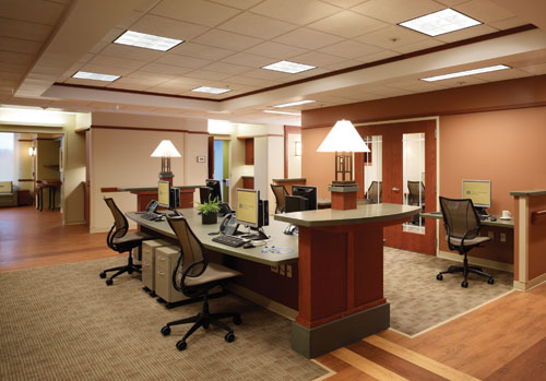 |
Influenced by both the Planetree model and the Prairie School, this caregiver work station at Elmhurst Hospital is designed for the comfort of staff, patient and family access. Photo by Scott McDonald |
SENSORY DESIGN: SIGHT AND COLOR THEORY
New research suggests that our senses and sensory awareness may be vital to healing and that sensory information can evoke physiological or emotional responses that can range from serenity to anxiety. Researchers are also learning that emotional responses triggered by both the use of color and natural materials can affect physiological responses in patients. A recent study at the University of British Columbia demonstrated that using wood, a natural material, in the design of a room lowered sympathetic nervous system activation and patient stress.5
Using color in healthcare settings is not a new concept, and the years of hygienic white walls that symbolized cleanliness in the 20th century were only a trend that has become a stereotype for hospital decor. Using color to heal may date back to ancient Egypt and Greece, when rooms in temples were embellished with the color spectrum. The Greeks color-diagnosed a patient and placed them in a temple that radiated the color prescribed. In ancient Egypt and Greece, colors were used to evoke healing based on their understanding of the power of sunlight and the incorporation of colored crystals and gems.
The study of color is also the study of light and emotional reactions to stimulus. In 1810, Johann Wolfgang von Goethe, the German scientist, playwright, poet, novelist and essayist, elaborated on Newton's theories of color and light when he published the Theory of Color. Goethe stated that how we experience an object depends on a combination of the object itself, its lighting and our perceptions of these interconnected phenomena. Major color theorists include Josef Albers, Faber Birren, Frank Mahnke, Leatrice Eiseman, Antonio E. Torrice and Max Lüscher. The latter wrote about human connections to nature and how nature communicates through color. These studies form the basis for many theories about color and patient care.
LÜSCHER COLOR THEORY
Prof. Dr. Max Lüscher was the head of the Institute of Psycho-medical Diagnostics in Lucern (Switzerland) and studied clinical psychiatry, philosophy and psychology in Basel, Switzerland. He has held numerous professorships in Amsterdam, Paris, Rome, in South America, Australia and at Yale University. He theorized that human feelings regarding specific colors is based on human experiences with that color. For example, the common association of tranquility with the color green may be the result of early humans use of lush green forests or jungles as an escape from the open fields of sunlight where he would be visible. The forest was considered a place of rest and recovery. “Our survival has meant understanding what nature is telling us and communicating to us through color.”6 This quote by Dr. Max Lüscher reflected his belief that the life of early man was dictated by environmental factors. Many EBD practitioners use his color studies as a guide for their design selections.
Design professionals like Sara Marberry write about the healing use of color in healthcare settings. She writes, “Color is literally the 'wavelength' medicine of the future. It calls to us and asks us to recognize its value as an alternative medicine that the environment can provide.”7 In the 20th century, primarily white or neutral colored walls were normal for all healthcare settings. Today, white and neutral walls can be appealing and appropriate choices for some healthcare surfaces. However, many people have emotional associations of white and neutral walls as antiseptic, sterile and unfriendly places. Using color speaks to a variety of human emotions and can create healing environments that are approachable.
In an article written about healing environments in the ICU, the authors discuss the psychological and physiological response to color in our bodies derived from light.8 They believe that healthcare designers can create visual serenity for those that are very ill and alternately, visual stimulation for those who are recuperating. Designers should consider using a balanced palette, with a color variety that encourages health and well-being. Among their principles are the following:
Based on current studies, design professionals are encouraged to limit the use of monochromatic color schemes as they may appear institutional. Conversely, strong primary colors may cause visual fatigue and should be used minimally or as small accents.
COLORS
As shown in many studies, our feelings about color depend on many facets of our physiological and psychological profiles. Color may be an important emotional trigger, however, there is no clear evidence to suggest that any one color is effective in achieving a particular healthcare outcome. Humans are complex and it is not possible to provide one design solution for all cultures, places and activities. Designing for unique human beings requires the design of unique built environments.
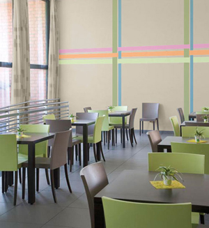
A pleasant combination of all colors works to make this space an appealing get-away for diners at the Nursing WZC De Regenboog, in Zwijndrecht, Belgium. Photo by Wout Devijver Zinin Communication
|
||||||||||||||||||||||||||||||||||||||||||||||||||||||||||||||||||||||||
Vision occurs when light enters the eyes, strikes the retina and is absorbed by rod and cone cells. These cells send signals to the optic nerve and then to the brain where these messages are blended with stored information. The way humans 'see' color depends on many variables from previous knowledge to associations and emotions. Studies suggest that humans that have had a negative experience, such as receiving a vaccination (while wearing a green sweater) or a positive experience, like a birthday party, (while wearing a green dress) associate and are influenced by their following experiences with this color. The physiological and associative effects of the use of color in the chart at the end of this article are based on numerous studies by color theorists. The “character” of colors is subjective and this table has been developed as a guide to some of the assumptions about color that can be applied to healthcare settings.
LIGHT
There is a direct relationship between light and color. The reflectance of light is translated by the eye and brain to allow humans to see color. When specifying color in pigments, the light reflectance value or LRV is the measure of the percentage of light reflected from a surface. The perception of light is also affected by the type of light source as well as by the adjacent colors in a room. Some manufacturers label pigments by number codes with up to three numbers, a designation that defines the color (or where it falls in color space), the light reflectance value (LRV) (indicating the lightness or darkness of the color) and the intensity of the hue (which indicates the saturation or strength of the color).
Optimum light reflectance values range within a room, depending on the light source. Researchers have found that there can be a great degree of variance in light reflectance values in different parts of a room and have identified values that are appropriate for any different surface. However, the chart below provides some guidelines for design professionals to follow:
For optimum visual clarity, government safety guidelines specify that a 30 percent value difference should be maintained between ceiling, walls, doors and floor surfaces. This guideline also helps the visually impaired or older adults with navigation in public places.
| AREA: | LRV Percentage: |
| Ceilings | 70% - 90% |
| Walls | 30% - 60% |
| Floors | 15% - 40% |
This sample checklist, based on research and methods of authors Sara O. Marberry and Laurie Zagon, demonstrates how a professional can assure that a comprehensive use of the complete spectrum has been included. Advocates of using color in healthcare settings recommend that a full spectrum of colors be considered to promote health and well-being. These colors may be found in all the design elements (walls, fabrics, upholsteries, floor coverings and artwork) within the space.
ROOM BY ROOM: COLOR RECOMMENDATIONS
According to Melinda Gray, senior color consultant at Glidden Professional: “There is no one color or palette of colors that can be specified to guarantee healing in healthcare settings. In order to create an atmosphere in the hospital setting that appeals to all of the five senses, the design professional can define a number of color and design goals for major areas and departments. From public spaces to operating rooms, there are numerous ways to specify color to enhance the hospital setting.” The following is a review of many typical healthcare departments. To provide visual clarity and to enhance the healing process for patients, to improve the environment for caregivers and to enhance the working atmosphere for staff the following design recommendations are based on current color and EBD theories.
Public Spaces
Public spaces in a hospital range from lobbies and waiting rooms, to corridors, nursing stations and cafeterias. Lobbies and waiting rooms welcome the patient and their family to the healthcare setting. These areas should be welcoming and promote social interaction through comfortable, movable furniture and different levels of lighting that can offer some control to visitors. Many designers choose cool colors where wait times will be lengthy and add color elements for positive distraction. The palette chosen for waiting areas should be calming and soothing with a variety of color accents and art for visual interest.
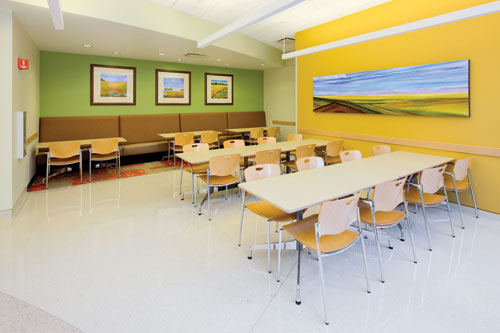 |
This small-scale cafeteria designed for Banner Ironwood Medical Center demonstrates how the use of bright colors and images of nature provide a diversion from a typical hospital setting. Photo by Ross Cooperthwaite: SmithGroupJJR |
Corridors consume large areas within the hospital. Generally, corridors in public spaces can be painted using a wide variety of colors. Designers may choose to incorporate warm and visually comforting colors for these vast spaces. Visual calmness when colors are being selected for corridors can be important when finalizing a palette for other parts of the hospital. For example, in surgical and intensive care corridors, the design professional might select cooler tones to suggest tranquility. In contrast, bright colors may be used in the corridors of the pediatric wing of the hospital. Sections of long corridors can be broken up with color blocking to provide interest, color and ease in navigation. Accenting ends of corridors provides visual cues for visitors and can identify destinations. The use of color in corridors can be the visual mechanism that provides the continuity and essence of the services on each floor. Color selections should include a variety of hues and avoid the institutional stereotypes of the past.
Lighting in the corridor is also important. Diffused lighting in corridors is preferable to the use of overhead fluorescents. Soft lighting placed in cornices or sidewall soffits avoids the institutional appearance and glare of overhead fluorescent lighting. Lighting can be used to illuminate a color accent, a change in direction of the corridor or as a means to add to the atmosphere of a waiting room.
Nurses' stations are critical to the healthcare process and must be easily identified by visitors and staff. Friendly, cheerful color selections are important for these spaces. Every effort should be made to connect decentralized nursing stations, through color and design to the main desk. This connection is important in making staff feel emotionally linked to the medical team.
Cafeterias, dining and gift areas are places of diversion and a time to escape from the typical hospital setting. Design professionals use these areas as a place to create an entirely different atmosphere from one that has been established in the main healthcare facility. In general, the designer should use the following design concepts:
- Create a unique atmosphere
- Provide an oasis from the real world
- Use a distinctive color palette
- Provide access to nature
- Select furniture that promotes social interaction
- Create small, flexible groupings
- Enhance relative privacy
- Design to enhance the dining experience
As mentioned earlier, many professionals are turning to the hospitality industry for inspiration for healthcare settings.
 |
This brightly colored seating respite in Banner Ironwood Medical Center in San Tan Valley, Arizona, also acts as a wayfinding accent along a main corridor. Photo by Ross Cooperthwaite: SmithGroupJJR |
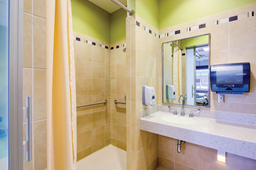 |
This brightly colored patient bathroom uses a multi-color palette at Banner Ironwood MC. Photo by Ross Cooperthwaite: SmithGroupJJR |
Patient and Family Spaces
Recent trends in healthcare settings for patient rooms are the creation of homelike settings. Important patient essentials are the inclusion of family, comfort and privacy. In addition, patients should feel connected to the outside world and have a sense of control. The following concepts provide some tools for designing the patient room.
- Light ceilings
- Nature inspired artwork
- Windows w/scenic views
- Single bed rooms
- Same handed rooms
- Family spaces
- Guest sleeping accommodations
- Desk and locked storage
- Convenient work surfaces for staff
- Linen and supply storage
A 1984 study by Roger Ulrich revealed that patients who had a window required less medication.9 Studies show that views of nature or natural images results in decreased pain and patients spend less time in hospitals. According to some researchers, even images of nature in patient rooms resulted in lower sensory pain responses.
The selection of a color palette is based on the designer's intention. Most designers use one base color in healthcare settings although multi-color schemes from two colors to many colors are gaining in acceptance. Often soft warm tones of rose, coral, peach and yellow or cooler tones of green, teal or blue are balanced with comfortable neutrals in patient rooms. The goal is to provide visibility of many colors through artwork, fabrics and accessories in each room so patients have the benefit of a complete spectrum. However, it is best to refrain from using strong color on the head wall as colors may reflect on the patient's skin and make diagnosis difficult.
Pediatrics
Pediatric environments offer the ability to turn up the color creating a welcoming and fun space. The goal is to create a positive mindset and make children part of the process with interactive activities and a sense of control. Creating a residential style that masks medical equipment can provide a comfortable and nonthreatening environment. Primarily clear and light colors add brightness. Windows and skylights can provide views of nature. A variety of color accents provide creative mental diversions from the world of medicine. Learning and fun activities in the room or waiting areas will keep children focused on creativity as they heal.
Youth activity areas should incorporate cognitive stimulation and designers may use large amounts of bright color on walls. Colorful artwork created by other children offers comfort in the foreign atmosphere of the healthcare facility. Realistic art with limited fantasy themes can provide reassurance to young patients. Teens require bolder, stimulating color for their social zones. Adaptable furniture and a way to find privacy and moments of escape will help to create a safe haven for young adults. Staff and parents should aim for an environment that closely simulates normal life even though they are in the hospital.
Maternity, NICU and Nurseries
Enhanced maternity areas provide an excellent experience for new mothers and sometimes begin the life-long relationship with the healthcare facility. Home-centered design, art and improved aesthetics align with the perception of excellent care. Women in labor had an average 2.1 hours less of delivery time and requested fewer epidurals to block pain, when visual art was incorporated in the room.10 Delivery/birthing rooms should be soothing in nature. Colors may range from warm, comforting tones to those that are cooler and relaxing. Indirect lighting, floor to ceiling curtains, beautiful textures, art and wood furnishings add to the sense of a residential atmosphere.
In 1957, Dr. Heinrich Frieling founded the Institute of Color Consultants/Designers (IACC) to train architects, designers, educators and scientists around the world on the psychology of color.11 His research on infants suggests that colors in nurseries should be lighter in hue and have low chromatic values. The translucent skin of infants reflect color; therefore, pale neutrals and off-whites are preferred rather than pink, yellow, green, blue and gray which can make diagnosis and medical evaluations more difficult for the doctor. In general, off-whites and pale neutrals that are between 55 percent and 75 percent LRV are in an acceptable range for these areas.
Studies show that stable and secure environments in neonatal intensive care units (NICU) help the development of babies. Babies heal faster when they are in close contact with their parents and family members who often choose to stay close around the clock. These rooms may need to include showers, sleep sofas, TV and wireless internet. Colors, natural light, warm decor and original art also contribute to a quiet and healing environment. In general, the atmosphere in both nursery and NICU areas should incorporate neutral colors, warm décor and gentle color accents.
Surgical Areas
Surgical suites in the 1960s and 1970s were designed for the function and the technology of the era. Most surgical rooms had ceramic tile walls and conductive flooring. Today's designers are finding that surgical environments are best when calming and soothing to patients as well as creating a professional and inspirational work atmosphere for staff. Depending on surgery performed, color selections may vary. In general, neutrals, greens, teals and blues are chosen due to their cool and soothing qualities.
Many new surgical suites are offering LED lighting with filters that can change the color of the lighting to one chosen by the patient. Glass panels have been incorporated into rooms to mask equipment, sometimes etched with scenes of nature. The Society of Critical Care Medicine recommends using calming colors that promote rest in critical care units.12 Frank Mahnke, president of the IACC, advocates quiet and relaxing tones with perhaps even a slightly warm color to lift the spirits in recovery rooms of patients who have just undergone surgery. In addition, postsurgical patients recover more quickly, hospital stays are shortened, and costs reduced when patients are exposed to a window view.
Emergency Rooms and Treatment Areas
Barbara Huelat, AAHID, FASID, IIDA, is one of the designers on Project ER One, a federally funded initiative to examine the ideal emergency room in case of mass casualties due to a terrorist attack at the nation's capital. In the design of this prototype, Huelat recommends that emergency environments need to be areas with soft and muted palettes based on nature.13 The focus of good design is to achieve safety, comfort and speed. All materials used in ER rooms should be selected for good acoustic values and the ability to mitigate the spread of bacteria.
Exam and consultation rooms may need to incorporate neutral colors that will not interfere with visual diagnosis. The addition of imagery that conveys a nature theme supports the goal of creating a comforting experience.
Staff Areas
Due to the critical nature of observation, labs are best supported by whites, off-whites, tan, beige or gray tones. It is best to add color only as an accent on furniture, seating and with artwork. Work stations should be visible and use good ergonomic design. Staff lounges can be designed as a respite from the rest of the hospital areas incorporating bright colors, and contemporary artwork.
 |
The waiting area at Banner Ironwood Medical Center, designed in hues of a serene winter palette, includes adjacent ambient light, views and decorative glazing to the patient and staff corridor. Photo by Ross Cooperthwaite |
THE FIVE SENSES AND HEALING
Sight, sound, touch, smell and taste: designs and best practices that integrate all five senses should be the goal for all healthcare design professionals. Color palettes that use the complete spectrum can refresh patient spirits. Using images of nature and natural daylight can rejuvenate both patients and staff. Throughout this article many aspects of how to design with sight in mind using light, art and color have been explored.
However, there are many physical design elements that affect the sense of touch. These include:
- Window blinds that provide color, offer light control, privacy and sound absorption.
- Cubicle curtains that can bring color and pattern into the environment.
- Countertops which should be the highest quality of solid surface materials, avoiding crevices and delaminating that could trap bacteria.
- Upholstery and furniture selections that can provide a surface to use as accents of color as well as provide different opportunities for the sense of touch.
- Ergonomic designs will provide enhanced safety for patients and visitors.
- Flooring alternatives that can include linoleum, rubber and wood.
- Combined, these “touchable” surfaces work to improve these important environments.
From the ancient Greeks to recent researchers, the healing power of music has been well documented. Today architects can use building elements such as ceiling tiles, insulation and carpets as well as the technology of personal communication systems and water features to manage sound. Healthcare quality surveys report patient sleep disruption from noise as a very common and serious complaint. The ability of the brain to become habituated to sound has spawned a whole web industry of downloadable nature sounds called 'pink noise'. Some design tools to reduce noise include:
- Superior ceiling tiles
- Elimination of overhead paging systems
- Installation of quiet nurse communication system
- Additional insulation
- Introduction of a water feature
- Provide sound equipment to Incorporate music as therapy
- Specify sound – absorbing flooring in patient rooms
- Machinery and delivery carts w/rubber wheels
- Installation of carpet in corridors and public areas
A new trend in psychoacoustic therapy involves music accompanied with sounds of nature. The sound of birds, water, rain and waves are integrated with soft classical music to lower anxiety and make people more comfortable in the healthcare setting.
The sense of smell can also trigger a sense of comfort. Florence Nightingale moistened foreheads of wounded soldiers with lavender oil that was often used as a sedative. In hospital environments the designer should provide a clean environment and can also specify green cleaning supplies to reduce harmful odors and contaminants. The control of smell in the hospital environment can range from the use of advanced ventilation techniques to opportunities for aromatherapy.
Although the design professional does not have much control over the taste of hospital food, the design of cafeterias, lunch rooms and kitchens have all changed in the past decades. As mentioned above, healthcare professionals are taking design inspiration from the hospitality industry and providing unique opportunities for dining in healthcare facilities. Many hospitals are now providing food that is locally sourced. Nutritious, healthy meals are now becoming standard dining options for the patient, staff and family. Coffee bars, bakeries and even small farmers markets are just some of the new spaces in hospitals.
The 21st century design professional will need a complete set of design tools to enhance healing and well-being in healthcare settings. These include great acoustics, integrative lighting schemes, good ventilation and mechanical systems as well as complex color palettes. Patient surveys and feedback loops are beginning to help hold hospitals accountable regarding many elements of satisfaction with their care. Concern for safety, comfort and well-being will yield healing environments that help to “do good and to do no harm.” Architects who engage all five senses into the design process can enhance the healing process.
COLOR OBSERVATIONS The following chart list colors in the spectrum that can be coordinated with a manufacturers color palette.
|
| ENDNOTES | |
| 1 | Nightingale, Florence. Notes on Hospitals. 1859, 3rd Edition 1863. |
| 2 | www.majorhospitalfoundation.org/pdfs/View%20Through%20a%20Window.pdf |
| 3 | www.healthcaredesignmagazine.com/article/next-generation-interior-healing-environments |
| 4 | www.healthcaredesignmagazine.com/article/embedding-nature-built-environment |
| 5 | www.solutionsforwood.com/_docs/reports/Wood_Human_Health_final-single.pdf |
| 6 | Lüscher, Max. The Lüscher Color Test. Random House. |
| 7 | Marberry, Sara O. The Power of Color. |
| 8 | www.jblearning.com/samples/0763738638/38638_CH03_027_040.pdf |
| 9 | www.sciencemag.org/content/224/4647/420.abstract |
| 10 | www.smh.com.au/articles/2003/02/07/1044579930534.html |
| 11 | www.iaccna.org/?q=node/10 |
| 12 | www.jblearning.com/samples/0763738638/38638_CH03_027_040.pdf |
| 13 | www.healthcaredesignmagazine.com/article/er-one-interview-barbara-j-huelat-aahid-fasid-iida |
 |
Glidden Professional™ paints is dedicated exclusively to serving the needs of the professional, specifically commercial painting contractors, architects and specifiers, building owners and facility managers. As a recognized leader in no-VOC waterborne paints, their paints and related products are available at over 500 Glidden Professional Paint Centers and authorized dealers. www.gliddenprofessional.com |