Functional Color and Design in Education Environments
Smart choices in color and design facilitate the learning process
![]() Continuing Education
Continuing Education
Use the following learning objectives to focus your study while reading this month’s Continuing Education article.
Learning Objectives - After reading this article, you will be able to:
- Explain the color and design choices that benefit the developmental stages of children in the school environment from grades K through 12.
- Describe the philosophy of educational professionals, design authorities, and education researchers on the basic principles of school design and structure that promotes the health, safety, and well being of students.
- Discuss each color palette combined with an understanding of light reflectance values in the design process to create effective school environments.
- Identify appropriate color and design choices for major areas and rooms within the education environment.
Color is a powerful communicator. It impacts us on many psychological and physiological levels. Color can enhance or impair learning, morale, and behaviors. Studies have shown that color affects a student's attention span and perception of time and can reduce absenteeism and vandalism. In addition to color, incorporating nature and the five senses into design scenarios for schools can have a positive impact on the learning process. While no one color or design scheme is infallible—and are heavily influenced by a host of factors—certain principles apply. This article will discuss the findings of extensive research and explore the role of the color palette, light, nature, and the five senses in the process of designing for preschool, elementary, middle, and high school. Optimum color and design scenarios for each room of the school will be highlighted.
Color Research—What the Experts Say
There is extensive research regarding design initiatives and their importance in the school environment. Study after study concludes that there is an explicit relationship between the physical characteristics of school buildings and educational outcomes. Four studies that evaluated the relationship between school buildings and student achievement reported higher test scores for students learning in better buildings and lower scores for students learning in substandard buildings. One of these studies showed a difference in student test scores ranging from 5 to 17 percent. Another report evaluating school facilities in Milwaukee, completed by the Council of Educational Facility Planners International, found that facility condition may have a stronger effect on student performance than the combined influences of family background, socioeconomic status, school attendance, and behavior. In his article “'Effects of School Lighting on Physical Development and School Performance,” Warren E. Hathaway clearly shows that the visual environment is one of the most important factors in learning, affecting mental attitude, class attendance, and performance.1
Education experts agree that getting an education is more than just memorizing facts and figures. It involves a positive social climate within the school and a sense of caring and guiding. Both young children, who enter school for the first time and are away from home, and teenagers facing the pending responsibilities of adulthood, need the support that only a positive school environment provides.
Color helps create an unthreatening learning environment that improves visual processing, reduces stress, and challenges brain development through visual stimulation/relationships and pattern seeking. According to a study by Simmons in 1995, visual stimulation actually rewires the brain, making stronger connections while fostering visual thinking, problem solving, and creativity. The choice of color in schools can have a critical impact, either favorably or unfavorably, on students. Studies have shown that color affects a student's attention span and perception of time and can reduce absenteeism and vandalism. Yet using more than six colors in a learning environment strains the mind's cognitive abilities—a conclusion that underscores the need for a careful approach to color and design in the educational environment.
 |
Study areas engender equilibrium, balance, and stillness and should be quiet in design and allow for concentration. Photo courtesy of Shutterstock.com |
Design Considerations—The Role of Nature and the Five Senses
Nature rises to an extraordinary level of importance in designing for education, particularly in terms of its bright colors, full-spectrum lighting, its view out into the world, and learning outdoors. In response to the question of where they would like to be to alleviate stress, 95 percent of individuals respond that they are most comforted and soothed by being outdoors. Many of the field's seminal thinkers have underscored the importance of nature in design. Erich Fromm understood humans' link to nature and created the term biophilia. Noted social critic Edward Wilson stated that we seek a “deep-rooted” connection to the natural world. Steve Kellert, professor at Yale University School of Forestry and Environmental Studies, feels that biophilia is an essential part of sustainable design. Harvey Berstein, vice president of industry insights and alliances for McGraw Hill Construction/Greenbuild 2012 panel discussion, claims that a 32 percent reduction in absenteeism and 68 percent improvement in test scores were recognized in schools with green features.
Another important design consideration is use of the five senses. Educational psychologist A. Jean Ayres notes that “Sensory integration is the ability to take in information through senses...to put it together with prior information, memories, and knowledge stored in the brain, and to make a meaningful response.” In 2002, Susan Mazer, president and CEO of Healing Healthcare Systems, stated: “We need to look beyond the visual aesthetic and raise our awareness of sensory influences. Information we receive via all our senses evokes physiological and emotional responses of anxiety or serenity.”
 |
Color Palette—What it Means
As early as 1810, Goethe explored the psychological and soulful implications of color, and stated that how we experience an object depends on a combination of the object itself, its lighting, and our perceptions of these. The energy of color is derived from light and that energy evokes both psychological and physiological responses in the body.
Colors carry very different implications. In the built environment, white walls can be devoid of character and, although they may highlight architecture, they do not add emotion to an environment. Studies show that, left in an environment devoid of color, animals and humans had increased anxiety, distress, and fear, and that this lack of stimulation from color resulted in irritation, restlessness, difficulty concentrating, and excessive emotional responses. Conversely, color can create a calm and soothing environment for the student to study and contemplate, or it can create excitement where it is desired such as in an activity area or a gymnasium. In an educational setting, it is advisable to incorporate a balance of all colors in the spectrum for optimum emotional and physiological responses. In classrooms, additional elements of color in artwork or accents should be incorporated for the full spectrum benefits they provide (A. Starkweather et al/2005). (See chart below which summarizes the characteristics and the feelings engendered by various colors.)
Still, it is important to emphasize that there are no rigid rules in applying color. Proper color decisions are tempered by a host of other factors. The location and regional culture of the school, for example, may guide the design direction. A school in Arizona with the desert in the background would be designed very differently from one in Paris. In the Sunbelt, where the sun shines most days, orange may be too over-stimulating a color choice. In the Northern U.S., where winters tend to be colorless, taupe or gray in quantity is not a good choice. On the West Coast, where day to day life is less conservative, bright accent colors, such as oranges, bright blues, and lime greens are popular choices. On the more conservative East Coast, traditional and muted toned-down colors, such as hunter green and burgundy or pastels, are preferred. In the Southwest, more saturated colors are favored, possibly because of the area's stark landscape. In addition to considering the population, community, culture, and location of the school in formulating color and design decisions, architects can also look for inspiration from teachers, students, and home design. The rationale being that those who work and learn in these settings provide needed insight into the colors and finished elements that best suit their needs and dreams.
COLOR OBSERVATIONS The following chart list colors in the spectrum that can be coordinated with a manufacturers color palette.
|
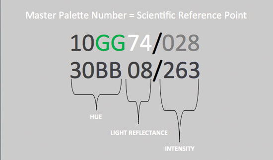
LRV (Light Reflectance Value)
A measurement commonly used by design professionals to identify the percentage of light that is reflected from a surface, light reflectance value (LRV) supports our understanding of the amount of light that will be reflected from the surface. Numerous studies attest to the benefits of views and light—particularly full spectrum light—in the educational environment.
LRV specifications have a great degree of variability. While the accompanying guide establishes what has been documented to support the specifier in determining LRV values, the designer must still balance LRV concepts with experience, knowledge, and expertise, and consider work surface reflectance values, which have a vast range due to the variety of tasks preformed in schools. Some desktops, for example, may require wood surfaces; some labs require dark counters; low lighting may require lighter counters; art surfaces may need to be near white. For optimum visual clarity, government safety guidelines specify that a 30 percent value difference should be maintained between ceiling, wall, doors, and floor surfaces.
| AREA | LRV Percentage |
| Ceilings | 70% - 90% |
| Walls | 30% - 70% |
| General Wall Color in Classrooms | 60% - 70% |
| Feature Walls | 20% - 50%* |
| Work Surface | 30% - 80%** |
| Floors | 15% - 40% |
| *Research recommends classroom feature walls to be approximately 40 percent to 50 percent LRV; however, depending on the color, room lighting, size, window, and light exposure, a lower LRV may be considered for visual comfort. In the yellow family, these LRV values may be higher. **Work surface reflectance values have a vast range due to the variety of tasks performed in schools. Some desktops require wood surfaces; some labs require dark counters; low lighting may require lighter counters; art surfaces may need to be near white. Consider all elements of room design in specifying a work surface. | |
Color Preference by Age
Color supports a child's developmental process. Noted education planner, Kathie Engelbrecht, maintains that being sensitive to each age group's different responses to color is key in creating an environment stimulating to their educational experience.
Dr. Heinrich Frieling of the Institute of Color Psychology studied the color preferences of 10,000 children from around the world. He found that:
• Most children 5 – 14 rejected black, white, grey, and brown
• Children 5 – 8 preferred red, orange, yellow, and violet
• Children 9 – 10 preferred red, red-orange, and green-blue
• Children 11 – 12 preferred green and yellow
• Children 13 - 14 preferred blue, ultramarine, and orange
Frieling acknowledged that the pure hues noted above were not appropriate for large fields of color in the school environment. Frank Manhke, president of the International Association of Color Consultants, worked to convert the color preference test results into suitable colors to be used as a palette guideline, stressing that it was merely a guideline and not a formula, as color decisions will also depend on architectural conditions, light characteristics, geographic, and cultural situations.
Preschool
Today's young children spend many hours in a “new” environment—child care. Some children who begin attending child care in infancy may spend as much as 12,000 hours in this setting. This massive number of hours in one environment demands that the space be carefully designed to create the “best” place possible for young children.
Young children gravitate towards bright colors, primarily warm colors, such as red and yellow, orange, and violet. Dr. Frieling also notes that warm and bright color schemes seem to complement the active, energizing nature of children. However, they may be better used as accents as these colors may be too harsh on full walls. While color brightness and intensity are useful in attracting attention, they may not be conducive to learning. Other considerations in designing supportive environments are based on age-appropriate developmental patterns. Preschoolers, for instance, pretend they are doing adult activities, and their language ability explodes. Creation of learning centers is desirable to divide activities and clearly communicate areas for thoughtful activity, rest and private spaces, group activity, and role playing.
|
|
As younger students enter their school, the environment should embrace them, welcome them, and provide feelings of support and enrichment. Photo courtesy of Shutterstock.com |
Kindergarten and Early Elementary
Like preschoolers, elementary students prefer a warm, bright color scheme that complements their natural extroverted nature. Younger children find high contrast and bright colors stimulating with a growing penchant for colors in graphics.
Designed environments for kindergarten and early elementary schools include spaces for privacy and active play, with open areas being the ideal place to run with abandon and expend physical energy. The visual environment must include activities for children to develop their visual acuity during the first eight years. Art materials will encourage more thoughtful interactions with color and designs. Providing soft elements such as flowers will instill a sense of gentleness, while having heavy metal toys will encourage children to play forcefully.
Enhanced organization and minimization of clutter will support children as they focus. Designers should consider mild soothing colors such as warm, soft shades of whites, light creams as a base color, with stronger, brighter mid-tone colors and accents as a focal point. Children's artwork should be incorporated into the environment to provide color and inspiration.
Middle School and High School
Middle school and high school teens have a growing appreciation of sophisticated color and tend to view primary colors as immature. Often influenced by prevailing fashion, young teens typically reject neutral colors in favor of blue, ultramarine, and their current favorite, orange. In selecting a color scheme for middle schools and high schools, there may be more leeway, depending on the objective. Subtle colors work well, such as light sage greens and refreshing blues and greens, with brighter, trendy, and more saturated hues used as accents.
 |
Middle school students prefer bright, medium colors in cool tones such as greens, teals, and blues with orange accents. Photo courtesy of Shutterstock.com |
For adolescents, cooler colors and more subdued hues provide enough stimulation without creating distractions or inducing stress. Blue, in particular, seems to be strongly associated with math and science. High schoolers prefer burgundy, gray, navy, dark green, deep turquoise, and violet. A variety of color is important, and it is advisable to incorporate a full spectrum in designing educational environments.
Color can be used strategically in a classroom to avoid distraction from equipment like televisions, video monitors, and projectors. Another option, in the case of middle and high schools, is the use of school colors to promote school spirit.
Education Room By Room
Colors can make a major impact in every room in the school, and the following sets out guidelines room by room.
Entrance
Colors in school entrances set the tone for the experience ahead. As younger students enter school, the environment should welcome them and provide feelings of support and enrichment. Showcasing student's artwork in the corridors demonstrates the talents of the student body, while adding color, pattern, and interest—and changing art displays sends the message that the school is a dynamic and vibrant place to learn.
As older students enter their schools, feelings of opportunity, social interaction, support, sophistication and a connected, enriching atmosphere sends the message that the experience beyond holds the keys to the future.
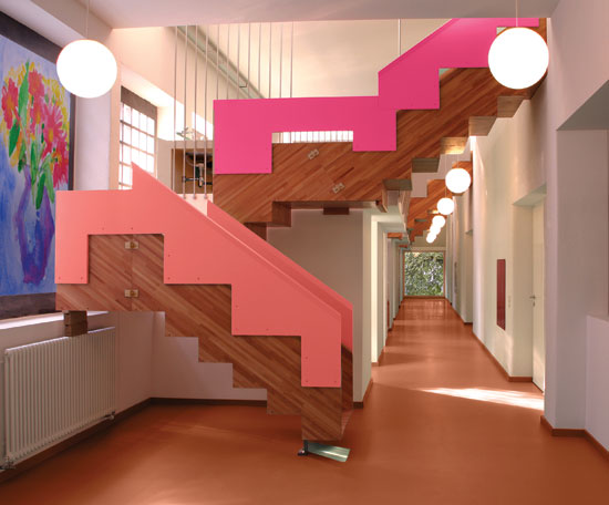
Corridors
More tolerance exists in these areas with respect to color, and they are ideal spaces to reflect a positive and happy environment. Corridors and stairwells with bright colors can lift school spirits. The color scheme should be attractive and give the school a distinctive personality. In the lower grades hues may be lively; in a multistoried or multi-wing school, each corridor can be treated differently. Design features such as central, appealing staircases could encourage students to take stairs in multistoried school buildings, thus increasing their physical movement and, ultimately, improving health.
Complementary color schemes are quite appropriate. For example, light orange walls offset with blue doors, or light-green wall, with lower chroma red doors work well. Long hallways are opportunities to incorporate graphics, art, hue-blocking visuals and design solutions to brighten and shorten these areas. Lockers, too, may be used to add color and visual variety. Older students will appreciate the unifying cultural identity that can be created with color and design.
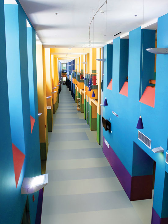 |
Long hallways are opportunities to incorporate color along with graphics, art, hue-blocking visuals, and design solutions to brighten and shorten these areas. Photo courtesy of Shutterstock.com |
In today's schools, spaces within corridors have emerged and been turned into individual learning areas. Color palettes are endless and may range from neutral or warm hues on walls with cool door accents to mid-tone colors on walls that correlate to a local connection of regional influences.
Colors can also help students learn their way around a school, with hallways serving as “way finders.” This is particularly important for primary school children as young learners will identify with brighter graphics and colorful elements in the corridor to connect with the building and find it a friendlier atmosphere. Graphics and identification offer attractive solutions to way finding by adding impactful design and making the environment fresh and fun.
Classrooms
The heart of the school beats in the classroom. Within this area students invest the greatest portion of their day, and it is the designer's goal to make this environment favorable to learning. Color and light play key roles in classroom design. In an attempt to “feature” children and teachers, rather than architecture, colors of the 1960s and 1970s utilized neutral design, a concept that was a failure and considered soulless. Research reveals that color and light have a pronounced physiological effect on children. When deprived of natural light, studies have shown that children's melatonin cycles are disrupted, thus likely having an impact on their alertness during school (Figueiro and Rea/2010). Professor H Wohlfarth, President of the German Academy of Color Science and Photobiologist at the University of Alberta notes that color and light definitely have a physiological effect on children. He says that studies show an “identical” impact on blood pressure, pulse, and respiration rates, of both blind and normal sighted children, were lower after walls were changed from warm to cool colors. When the full-spectrum lighting was included, children became more behaved, attentive and less aggressive and fidgety.
Used properly, color and light can provide an atmosphere conducive to learning. In classrooms, students and teachers need to feel stimulated and motivated, but not so much so that the colors discourage concentration. A successful technique to focus attention in classrooms and to provide visual breaks against neutral walls is the incorporation of feature walls. The feature wall should be the main wall at the front of the room and/or a side wall that is a solid plane. Painting the teaching wall a deeper or brighter shade than is used on the side walls does two things: It attracts attention to the front of the classroom, yet the eyes get a visual break when focus is shifted to the side walls. In addition to breaking up monotony of wall color, a feature wall of approximately 20 to 50 percent LRV will add greater visibility to teacher and educational materials, relieve eye strain as student transitions from coursework to instructor, and reduce glare from bright overhead lights or natural light. Research recommends classroom feature walls to be approximately 40 to 50 percent LRV. Depending on the color, room lighting, size, window and light exposure, a lower LRV may be considered for visual comfort. In the yellow family these LRV values may be higher.
 |
A feature wall of approximately 20 percent to 50 percent* LRV will add greater visibility to teacher and educational materials and relieve eye strain as student transitions from coursework to instructor. *See table on LRV factors on page 3. Photo courtesy of Shutterstock.com |
With respect to color schemes, it is generally accepted that neutral colors of tan, beige, oyster, sandstone, oatmeal, cream, taupe, frost, smoke, pewter and silver are comfortable, conservative, stable and versatile, providing a safe, secure environment. Warm colors of rose, carnation, melon, coral, buttercup, almond, honey, and yellow are comfortable, cozy, nurturing and embracing, and advance occupants toward creating a friendly atmosphere. Soft yellow, coral and peach will have a diverting effect. Warm colors can also be used to reduce the scale and size of large spaces, making them more intimate. In cold climates, warm earthy tones have been shown to invite students and teachers into an environment for both reflective and collaborative learning and are good choices for gathering spots.
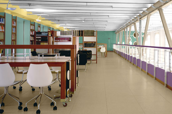
While brightness and warmth pull attention outward, softness and coolness of color have a reverse effect. Cool colors of pale green, mint, sea foam, robin's egg, aqua, sky, denim and soft blue are cool, refreshing, calming, relaxing, soothing and expansive; they recede away, which provides a spacious feeling. Softer surroundings created by subtle and/or cooler hues have centripetal action which enhances the ability to concentrate. Hence, cool colors become appropriate for upper and secondary grades as well as for study rooms and the school library.
Depending on the unique circumstances of a particular classroom, any of the above categories could be selected for three walls of a room, with an LRV of approximately 60–70 percent, with the fourth or feature wall incorporating a complementary or monochromatic color with an LRV of approximately 20 to 50 percent.
Other generally accepted guidelines for classroom design include:
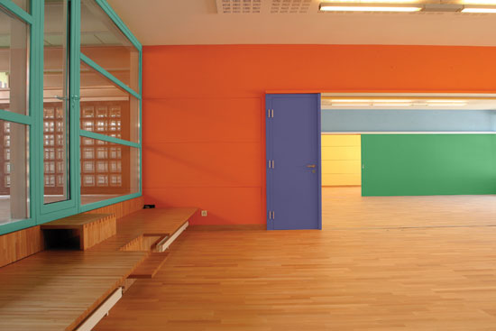
• Light yellow-orange, almond, pale or light green or blue-green are good choices for three of four wall surfaces.
• The best practice is to use a tint like oyster white, sandtone, or beige for side and back walls and to have the front wall in medium colors, such as terra cotta, old gold, avocado, emerald green, turquoise and sapphire blue.
• Large areas of deep tones and saturated colors that are harsh and depressing, such as dark reds, browns and heavy blues are especially problematic and should be avoided.
• For consistent appearance and optimum light reflection specify white ceilings.
Classroom designers should also be aware that there is a design direction towards creating schools where classrooms are each individual and unique to each other. The basic concept is that children need to be constantly inspired, challenged and presented with new materials and environments. This concept is both liberating and challenging. It allows designers and teachers to explore constant design possibilities; yet, it increases the pressure to create this uniqueness which speaks to children in different ways throughout their school encounters in each area.
Science Laboratories
Depending on whether the lab is devoted to biology or chemistry, different color choices should be made. If diagnosis or examination of materials is critical, white, off-white or pearl gray are good choices. Because biology refers to nature, a biology lab would be best with earth tones such as neutral and/or beige, brown, green, teal or blue. Neutral or green and blue are the best choices for a chemistry lab consistent with chemistry's more logical focus.
Study Hall
Study areas engender equilibrium, balance, and stillness and should be quiet in design and allow for concentration. Cool colors encourage concentration by lowering heart and respiration rates (Bordwell/1998). Off-white, pearl gray, earth tones, browns, greens or blues should be used rather than warmer colors such as red, orange or yellows. Acoustical sound panels assist in providing an atmosphere essential for contemplation
Art Studio
Both art and music studios should be planned around the activity setting model. They are multifunctional places that give students opportunities to become engaged in different projects alongside one another. Folding partitions and stackable seating will help increase flexibility. Colors should encourage creativity, such as green, violet, red, peach, pink and light yellow, which should be used as accents.
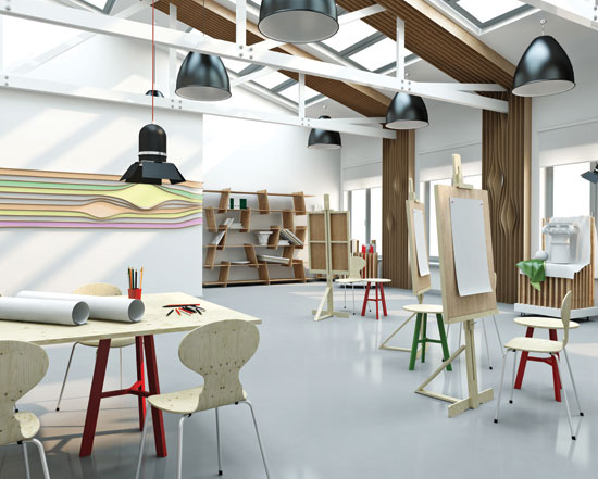 |
Keep creative areas neutral with small accenting. Photo courtesy of Shutterstock.com |
Band and Choir
These are team endeavors and neutrals along with colors that instill calm and creativity such as greens and violets are ideal for band and choir rooms. Other useful design elements include wall space for professional pictures and artwork, sectional sofas for student relaxation and tiered and movable risers to increase the flexibility of the space. Mirrors for show choirs and absorber and diffuser acoustical panels are also useful elements and add a professional dimension to the space. Designers of band and choir rooms should specify wood or hard finished floors, which are easier to clean and resemble most performance areas.
Shop and Domestic Arts
Luminous hues such as light yellow and light orange are appropriate; tan or pale green are suitable for manual training workshops. Shop and domestic arts room should be equipped with tackable surfaces and movable marking boards, high stools with padded backs and seats, and massive storage space. Sealed concrete floors are ideal for this area.
Library
The library is moving away from a book storage building toward a gathering place for people. Today's school libraries have a multifaceted job. They must be vital and dynamic environments that foster a spirit of collaboration, stimulate creativity, and serve as a testing place for learning. Increasingly, libraries are a gathering space that stimulate and enhance relationships between students and staff, and provide the flexibility to work alone or in groups as well as serve as a venue for large events and presentations. Libraries don't need to be dreary, dull spaces. Actually, using color to warm and brighten these spaces encourages students to read. For younger elementary students, consider graphics that energize walls and contrast with book-lined shelves.
There is a lively conversation in expert circles about the implications of the Internet and the future of libraries. Even today's libraries frequently contain numerous computers, so it makes sense to use colors that reduce eye strain. For teens, and especially where computers are used, mid-tone and deeper colors that reduce glare and enhance quiet and facilitate concentration are preferable. Libraries with a pale or light green create an effect that enhances quietness and concentration. Mid-tone, subtle golds, varieties of greens and smoky blues may also be considered, particularly for study rooms within the library.
Media Center
Today's media centers require areas for quiet independent work as well as one-on-one and large group meetings. There are areas for computer work, reading, printing, and study. All these functions should be against a restful backdrop, with no stark white or dark or bold colors. Creams, mid-tone neutrals, rose, coral, light green and aqua are preferable in these spaces.
Auditoriums
Auditoriums are dignified spaces, and colors should reinforce this. Rose, pale gold, fern green are suggested because of their friendly character. Violet, black, dark green, navy, and warm neutrals suggest distinction. In all cases, mid-tone and deeper colors should be specified as they absorb light and do not distract from the stage or the performance.
Gymnasiums
The gym environment should stress the joy of being healthy. The design of gyms in elementary schools should create an atmosphere of vitality, with neutrals of beige, tan and white with warm accents in saturated mid-tones, or cool accents of lime or other shades of green. Bright graphics will help children feel welcome and encourage activity. Natural light should be maximized to promote well being. For teens, the colors need to convey action. Red, orange, yellow, apricot and lime with bold colors for accents and graphics are good choices. Large expanses of turquoise are to be avoided. Equipment should support today's active life styles, such as resilient wood and synthetic sports flooring, and mirrors and ballet bars for dance and yoga programs. To reinforce physical fitness, gyms for teens should take a holistic approach; designers may want to consider connections to a kitchen space to teach the benefits of a healthy lifestyle.
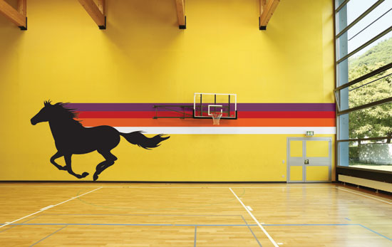 |
Gyms for teens should use active colors and graphics. Photo courtesy of Shutterstock.com |
Locker Rooms
These spaces provide a wonderful opportunity for color. Lockers themselves are available in both neutral and bold, colorful shades that make dramatic statements. Using several colors, both warm and cool, prevents the space from being overwhelmed by one color statement. One option would be to use neutral colors with accents of school colors incorporated for interest. Locker colors and walls should strike a balance. With stronger locker colors, neutral and mid-tone walls are preferable., and with neutral locker colors, warm or cool mid-tone wall colors create the best design schemes. Wood accents, as in benches, can be used for warmth. LRVs for walls should be lighter to maintain higher light levels. Designers should also consider high opaque windows to admit natural light.
Cafeterias
The theme for cafeterias is good nutrition. Colors should be cheerful, appetizing and reminiscent of citrus, spice and food themes with clean, reflective surfaces that bounce light and feel fresh. Flamingo, red, rose, pumpkin, coral, peach, orange and brown along with charcoal for high contrast combinations work well. Avoid yellow-green, blue or magenta on large expanses of wall areas. Different size and table configurations facilitate small or large groups. Designers will want to note that cafeterias also double as spaces for after-school activities, in the evening for adult programs, as a community setting for town meetings, and on weekends for both adult and children's programs.
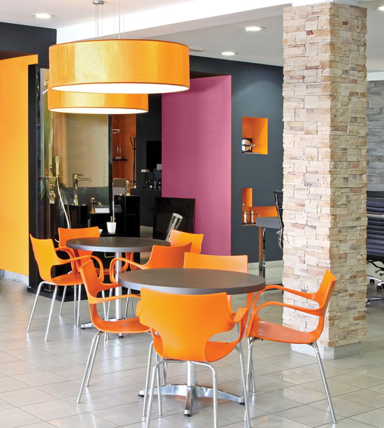 |
Use colors that are cheerful, appetizing, and reminiscent of citrus, spice, and food themes. Photo courtesy of Shutterstock.com |
School Offices
At the heart of the complex, the school office should project a feeling of calm and security and encourage care and interaction. Colors should reflect a comfortable, protected, and balanced approach. Bright colors like red, orange, and yellow should be avoided in favor of mid-tone and dark neutrals with magenta, rose, coral, soft gold, light green, turquoise and blue accents. Offices with glass areas and an open view to the entry way and corridors provide an “eye on the street” perspective that is important with respect to security, supervision, and safety.
Counseling Offices
Colors in counseling offices should convey harmony and a feeling of warmth and confidence. The best choices here are quiet, comfortable colors, such as coral, soft yellow, gentle green, grayed blue-green, lavender and cocoa brown. Bright reds and yellows are inappropriate for counseling spaces. In terms of furniture, a traditional desk and chair, round table, and alternate chairs for a variety of seating options are useful. Carpeted floors increase soundproofing, decrease noisy distractions, and add warmth.
Clinics
A feeling of cleanliness is essential in a clinic. Specify colors that are clean and uplifting, such as white, pink, light yellow, green, and sky blue. Using more than one color will create a sense of balance and interest, and some color theorists advocate a balanced scheme of yellow, gold, and blue for uplifting general medicine environments. Artwork featuring nature-related themes can be used for their soothing qualities, with vistas, sunsets, and groves among the most relaxing and preferred subjects according to research by Professor Irving Biederman of the University of Southern California, who maintains that nerve cells in the opiate-rich pathway in the brain become active almost as if morphine was present when these subjects are viewed.
Restrooms
Cleanliness and comfort are also the qualities to project in designing for school restrooms. Light, clean, refreshing colors with bold and contrasting accents work well. As much light as possible should be incorporated. Automated devices such as auto-flush toilets, motion sensitive sinks, soap dispensers, and hand-dryers create a sense of sleek design, improved health, and environmental benefits. Upbeat messaging on mirrors—uplifting phrases and reminders of school events—can work to instill school spirit, while providing a colorful accent.
Outdoor Spaces
Wherever possible, schools should take advantage of outdoor spaces to interact with nature, expand the classroom and offer enhanced flexibility. Color brings this space to life with a spectrum of offerings. Inexpensive, native plantings keep budgets low, and overhead shading keeps temperatures cool. Outdoor spaces can be an extension of the school as a place for teaching. The current emphasis on science-based programs means that it is important to consider exterior furniture in overall design plans and budgets. Brightly colored benches and chairs create outdoor spaces that encourage collaboration and the observation of nature.
Color—A Smart Choice for Schools
While no one color scheme is right for all situations, designers have a powerful tool in applying color properly in school situations. That choice will be based not only on the intrinsic nature of the color itself, but by the age of the students as well as the location of the school, its community and its culture. Ideally teachers and students will also have input. Designs that incorporate these factors as well as nature and the five senses will have a real impact on students' experience in school—and positively impact their morale, behavior and ability to learn.
| ENDNOTES | |
| 1 | The Journal of Educational Research Vol. 88, No. 4 (Mar. - Apr., 1995), pp. 228-242, Published by: Taylor & Francis, Ltd. |
|
PPG PAINTS™ unites the U.S. store networks of PPG Pittsburgh Paints®, PPG Porter Paints®, and Glidden Professional® into one powerful brand. The new PPG Paints effectively serves the needs of the professional, including contractors, property managers, architects, and designers, with a complete offering of paints, stains, caulks, and adhesives. Visit ppgpro.com. |