Frank Lloyd Wright: American Icon, Architectural Master, Modern Dreamer
![]() Continuing Education
Continuing Education
Use the following learning objectives to focus your study while reading this month’s Continuing Education article.
Learning Objectives - After reading this article, you will be able to:
- Discuss the career of Frank Lloyd Wright as an architect and designer, and understand his influence on modern design.
- Describe the important periods of Wright's career, his impact on the design of his time, and his inspiration of other architects and designers.
- Explain the influence Wright has had on product designers, even those of today.
- Review Wright's process for design and color selection at Fallingwater.
- Describe the color palette used at Taliesin West.
Frank Lloyd Wright (1867-1959) is recognized and revered worldwide as one of the greatest architects of the 20th century. His work heralded a new thinking in architecture, using innovation in design and engineering made possible by newly developed technology and materials. His creative ability extended far beyond the border of architecture to graphic design, furniture, art glass, textiles, and decorative products for the home.
This course looks at the professional life of Frank Lloyd Wright—true American icon, highly influential architectural master, and all-around modern dreamer. It illustrates his influence on, and achievements in, modern design, and ends by providing an in-depth review of his body of work resulting from his time at Taliesin West.
The Career of a Master
We begin by looking at an overview of Frank Lloyd Wright's career, which spanned the course of more than seven decades between the 1890s and the later 1950s.
While there are many great quotes credited to Wright, for the purposes of this presentation it is fitting to reference one quote in particular: “Every great architect is—necessarily—a great poet. He must be a great original interpreter of his time, his day, his age.”
Wright embodied this spirit in every aspect as he approached any and all realms of design. To him, design was not something solely attainable by the elite, but rather an essential part of every area of life. This belief was evident in his design philosophy, which can be summarized in four words that are related and yet distinct, and, of course, utterly meaningful when it comes to design. These four words are: unity, simplicity, harmony, and integrity.
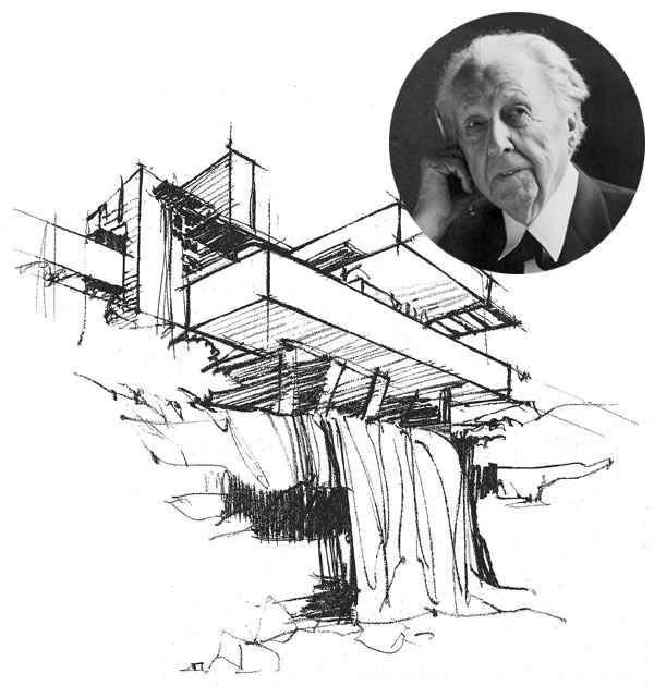
Images courtesy of OBMA, © Wright Foundation (top inset); Western Pennsylvania Conservancy, Mill Run, PA (bottom)
Illustration of Frank Lloyd Wright’s Fallingwater®
Unity
Unity was perhaps the single most important word in Wright's design vocabulary and an idea that was instilled in him from a very early age. As a child, his family often spoke about the interdependence—or “unity of all things”—in reference to having a “oneness” with the world and all forms of life.
Simplicity
In a lecture on modern architecture in 1930, Wright stated that “To think 'in simple' is to deal in simples, and that means with an eye to the altogether.” This quote is especially compelling because it greatly exemplifies how Wright approached design—with simplicity yet considering the totality of a home rather than just the structure itself. He often insisted on being involved in every aspect of the design of a home for his residential clients, creating not just the building and landscape, but the interior look from lighting to furnishings to carpeting and textiles.
Harmony
Throughout his career, Wright insisted on designs that worked in harmony with each other and with nature, rather than ones that competed or contrasted. Harmony was clearly a critical element of his architectural work, and can be seen across all of his design choices.
Integrity
When integrity is referred to in reference to design, most architects use it to indicate sound engineering, successful functioning, and the right application of materials in consideration of the end use. When Wright used the word integrity, it meant much more. During the annual Sir George Watson lectures at the Royal Institute of British Architects of 1939, Wright is quoted as saying, “What we call organic architecture is no mere aesthetic nor cult nor fashion but an actual movement based upon a profound idea of a new integrity of human life, wherein art, religion and science are one: Form and Function seen as One, of such is Democracy.”
Three early influences helped shaped Wright as a young boy, and into being the most prestigious architect of his time. These three influences were: nature, his family, and instructional toys.
Wright once said “I believe in God, only I spell it Nature.” Nature was an integral influence in Wright's designs—he was both deeply respectful of it and was a keen observer in the forms, structures, and patterns created in it. Growing up in southwestern Wisconsin afforded him the opportunity to experience nature in an often rugged circumstance as well.
Wright's family—primarily his parents and grandparents—were instrumental in both shaping his future and providing a framework for life that he translated into his work. As mentioned earlier, unity was a core design philosophy of Wright's and one that he learned from his family. In addition, his mother was insistent from the time he was very young that he would grow up to be an influential architect. She sought to fill his early life with things that would help shape his mind and lead him to do so. Such mind shapers came in the form of instructional toys, given to Wright as a young child by his mother and father to help him build his architectural understanding. Among the best known instructional toys given to Wright were Froebel blocks—essentially a series of wooden building blocks in various shapes. The blocks have a reputation for shaping young minds, including those of notables Buckminster Fuller, Charles Eames, and painter Paul Klee.
Wright had astounding creative prowess that was not limited to a single discipline. Of course, he is most known for his architectural designs, in both residential and commercial architecture. But as was mentioned earlier, he was not interested in solely designing structures and simply handing them off to his clients. Much like a runway designer creates a collection each season, where individual items shown together have a sense of cohesion, Wright envisioned each architectural contract in its totality. This would include the form and function of a building, how it would be used, the requirements of the commissioning client, and other elements of consideration.
As an example, Wright equally envisioned the lighting for each of his projects. Not just the fixed, electrical lighting, but also the use of natural light and how it would be filtered through specifically placed windows or stained glass. While he loved controlling light, his interest in block formations and geometric repeats influenced from Froebel blocks becomes most obvious when looking at his lighting and window designs. Two examples of this are his Butterfly Chandelier, a glass and brass pendant light that appears to have 'wings' much like a butterfly, and his Tree of Life hanging chandelier that geometrically mimics three trees in bloom.
Textiles and carpeting were another area of each environment Wright sought to assert his vision over. Today, many of his geometric patterns are evident on small textile items, such as table runners, placemats, and throw pillows available for purchase through the Frank Lloyd Wright Preservation Trust.
Furniture was a notable area of control for Wright. While he loved building furniture directly into a room, he also had a penchant for slat-back chairs and cantilevered tables...and, of course, his usual interest in geometry is evident, as are his four core principles of unity, simplicity, harmony, and integrity.
Important Periods, Pieces, and Influences
Although Wright developed and grouped his entire architectural practice as an effort in “organic architecture,” he also greatly contributed to, and in some cases founded, eras of design styles. This section looks at significant periods, pieces, and influences that he had impact over during the course of his life and career.
Wright is heavily credited as leading the Prairie movement, based on an interest in offering American families functional homes that rejected the showier, excessive styles of the previous Victorian era. Sources differ on the exact years that Prairie style architecture was prevalent. Some sources refer to the years from 1893 to 1920, while others narrow the timeline to a little more than a decade, running from 1901 to 1913.
Essential elements of a Prairie era style residence include the following:
• Horizontal lines
• Built-in furniture
• Restraint of ornamentation
• Hipped roofs with large, straight overhangs
• Open floor plans which created flow through a home and gave specific focus to the living and dining room areas of the home
• Rows of windows that further emphasized the horizontal aesthetic
Some of Wright's most notable homes designed during the Prairie era include the Thomas House built in 1894, the Ingalls House and the May House in 1909, the Robie House in 1910, the Coonley House in 1912 and the Little House 1914. Each home featured a strong horizontal design emphasized by striking rows of windows so indicative of the Prairie style.
Less well-known than Prairie architecture, the Textile Block period of Frank Lloyd Wright's career was relatively short and limited to southern California. While the period is known to run from approximately 1917 to 1924, Wright's commissioned works in this style were constructed in just 1923 and 1924. Using pre-cast concrete blocks bearing various patterns, the Textile Block form of architecture brought some sense of ornamentation back, while Wright still maintained simplicity of line and space.
Loosely inspired by Mayan Revival Architecture, Wright built four homes in Los Angeles using the Textile Block system—the Millard House and The Storer House in 1923, and The Freeman House and the Ennis house during 1924. These homes kept the geometric styling of the Prairie era, but did not utilize the signature hipped roofs or horizontal window rows.
While Wright was not the first to coin the term “Usonia,” he did refer to this word when speaking of his vision of a new architectural landscape for America that was in no way associated with the conventional architecture of Europe of the same period. The word originated from the abbreviation USONA—which stood for United States of North America. Writer James Duff Law repurposed the word as Usonia, likely a play on the word Utopia.
In architecture, Usonian Era homes were usually modest in size and scale. They were typically single story homes with a healthy balance between indoor space and outdoor space. It's important to note that the Usonian period began in 1936 in the midst of the great depression. As such, Wright consciously created this style to be cost-affordable to average families, resulting in these homes lacking attics, basements, and garages. The word “carport” was first coined by Wright himself, as he built overhangs under which home owners would park their vehicles in lieu of the traditional garaged space.
During this Usonian period, homes attributed to Wright included the Hanna House built in 1936, the Rosenblum House in 1939, the Pope-Leighey House in 1940 and the Isadore-Zimmerman House, also built in 1940. While more modest than much of Wright's previous work, each of these homes was striking in its own right, with the distinctive geometric harmony so often attributed to the architect.
Of course, Wright could not have inspired whole periods of American architecture if he did not inspire other architects along the way. Here are just a mere few examples of those he influenced either directly or indirectly, although his influence over architects as a whole was likely more in the tens of thousands:
John Rattenbury—worked with and studied directly under Wright himself. Rattenbury is best known for his book A Living Architecture, which discusses the work of Wright and other Taliesin architects.
Michael Rust—worked and studied under John Rattenbury, and Rust's work borrows much of the Wright aesethetic, including low, horizontal lines, banks of windows that further emphasize the horizontal, and a harmony of the design with the surrounding landscapes. The Collins House, designed by Rust and built in 2007, is a prime example of Wright's influence on his work.
Richard Neutra—while he has his own distinct style and only studied under Wright for a brief period of time, Neutra's architectural point of view shows a definite connection to Wright's own. Neutra was well known for creating harmony between indoor and outdoor living, especially since much of his work was commissioned in southern California. He used floor to ceiling windows as much as possible, as well as open floor plans. The Troxell House in the Los Angeles area, dating from 1956, blended many elements reminiscent of Wright's own design approach.
William Wesley Peters—worked so closely with Frank Lloyd Wright that he actually married Wright's daughter. Peters is well regarded for continuing Wright's love of geometry inspired by nature and clean lines. The Benton House, constructed in 1985, features dramatic floor-to-ceiling windows with geometric patterning completely reminiscent of the architectural styling of Wright.
There are also specific examples of contemporary architecture inspired by Wright, although without knowing the body of his work, it may be easy to look at these examples and see no relationship between them and Wright's influence:
The Water Cherry House by Kengo Kuma—with strong Japanese references, this home bears much of Wright's interest in low, horizontal lines, celebration of light, and a closeness with nature and the surrounding landscape, including water, trees, and stone.
The Namhae House by Joho Architecture—this home uses steel latticework to filter daylight and create a semi-enclosed terrace that blends interior and exterior space, a blending Wright was exceptionally focused on delivering in each of his residential projects.
The Stone House by Vo Trong Nghia Architects—located in Vietnam, this home allows the inhabitants a strong relationship with nature by virtue of the courtyard designed within the home and the many windows which allow in light.
The Edgeland House by Bercy Chen Studio—built on a rehabilitated brownfield site in Austin, Texas, this unique, triangular shaped home is actually built into the earth, again bringing nature into play with decisive geometric shaping, not unlike many of Wright's projects.
Amangiri Hotel & Resort (Canyon Point, Utah)—architecturally, the resort has been designed to blend into the landscape with natural hues, materials, and textures as a feature of the design. The structures are commanding and in proportion with the scale of the natural surroundings, yet provide an intimate setting from which to view and appreciate the landscape.
The Aliah Hotel—the Aliah Project aims to be not only a comfortable and innovative hotel, but a transcendental space, where visitors are encouraged to re-evaluate their attitudes in favor of a better, healthier, and more balanced way of life. The proposed architecture for the Aliah Project seeks to put these concepts into focus, restoring essential and timeless values that underlie the interaction between humans and the environment, and thereby promoting opportunities for contemplation, walking, and meditation.
Wright's influence on design stems far beyond architecture. His interest in geometry is often borrowed by many of today's product designers. Examples are such household items as a table runner and placemats, or an iPhone case, which are inspired by Wright's horizontal designs and are available via the Frank Lloyd Wright Preservation Trust's “ShopWright” website. Another example is a patterned tile front of a fireplace by Daniel Becker Design, which seems to be a contemporary twist on the textile block patterns Wright created in California.
Wright was a huge proponent of low, long horizontal lines, a connection to nature, and considering how light would disperse through a given area. In the design of many contemporary products, the designers may not even feel the impact of Wright's influence directly, yet without his contributions to the design world these kinds of creations may not exist today. If Frank Lloyd Wright were alive today, living walls, glass bricks, and illuminated furnishings might be some of the things he himself would consider creating.
Let's return to Wright's own work and take a look at some of the well-known works from the architect himself.
While many people do not know that the current Guggenheim museum, completed in 1959, is a Frank Lloyd Wright creation, it is certainly recognized worldwide as an architectural masterpiece. Originally considered quite the controversial building for exhibiting modern art, the Guggenheim is a cultural landmark and a beloved modernist icon in and of itself. Indeed, the cylindrical, ribbon-like shape, curved interior walls, and gently ramped floors actually make it difficult to hang art or display large three-dimensional sculptures.
In a letter from Hilla Rebay—then director at the Guggenheim museum—written to Wright in 1943 in which she invites him to design a new space, she states:
“I need a fighter, a lover of space, an originator, a tester and a wise man. Your three books, which I am reading now, gave me the feeling that no one else would do.”
As one of the most loved and, at the same time, criticized buildings in America, it seems Rebay chose her architect quite wisely.
Much has been written about Fallingwater®, perhaps Wright's most well-known residential project. The now famous cantilevered home was built in 1935 to perch over a waterfall in Stewart Township, Pennsylvania, which is located just outside of Pittsburgh.
Originally commissioned by Edgar J. Kaufmann as a family retreat, Wright kept his clients at bay for months before finally drafting plans for the home a mere two hours before meeting with them to review the scope of the project. Today, it is designated as a National Historic Landmark and widely celebrated as Wright's most exceptional work and one of the most important buildings in American architecture. According to the Fallingwater website, it “is the only major Wright-designed house to open to the public with its furnishings, artwork, and setting intact.”

Photo courtesy of the Western Pennsylvania Conservancy, Mill Run, PA
Frank Lloyd Wright’s Fallingwater®
*Note: Fallingwater® is a trademark and a registered service mark of the Western Pennsylvania Conservancy. Photographs of Fallingwater are used with permission of the Western Pennsylvania Conservancy.
The Approach to Color at Fallingwater
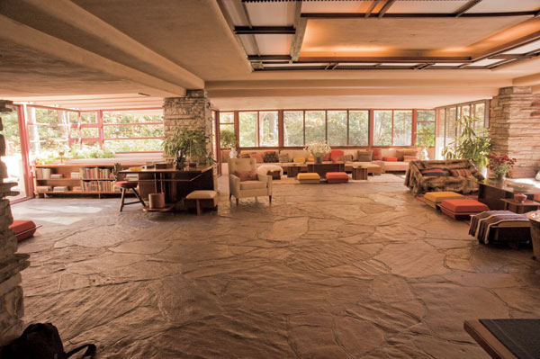
According to Lynda Waggoner, vice president and director of Fallingwater, color was always very important in conveying Frank Lloyd Wright's aesthetic of organic architecture as a unified whole. He drew from two sources in determining his palette for a given project: the nature of the site and the nature of the building materials. In the early projects, particularly the Prairie houses that were constructed of brick and stucco, autumnal colors appear to predominate: those include warm shades of red, gold, brown and yellow-green. These restful yet intense colors were accented by a palette of related hues and created a harmonious, unified and serene environment for the client. At Fallingwater, Wright employed both a limited palette of color and a limited number of materials in his desire to create an organic and integrated whole.
As in all of Wright's works, the colors at Fallingwater were chosen thoughtfully and deliberately. In keeping with his strong connection to nature, he selected each color to illustrate the significance of the direct impact of the landscape and the environment that surrounds this unique property. Here is a look at the meaning behind each of the 13 colors Wright used in the celebrated Fallingwater color palette:
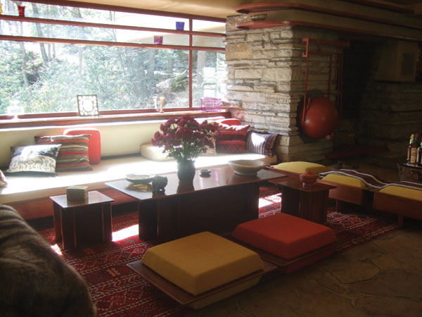
There are two reds in the palette. The first is a deep, autumnal red with hints of brown that was widely recognized as Frank Lloyd Wright's personal favorite color. It is perhaps the most famous color at Fallingwater, and was used to coat all of the home's metal and ironwork. Wright is said to have limited his use of this red at Fallingwater only to metal accents.
The second red is brighter and was drawn from a fabric that was used at Fallingwater, specifically for accent pillows on the cantilevered couches. It is a warm complement to many of the neutrals used in the home, helping to create a welcoming feel.
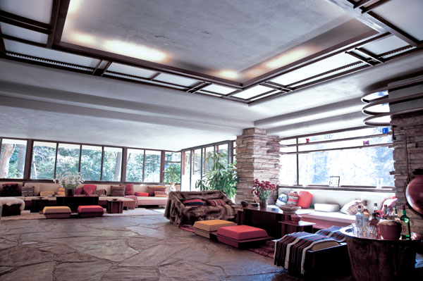
Photos courtesy of the Western Pennsylvania Conservancy, Mill Run, PA
Fallingwater® living room
A color that is evident throughout Fallingwater is a buttery gold that appears in the kitchen—on the cabinets and countertops—and on more of the accent pillows on the cantilevered couches in the living room. This warm, golden hue was chosen to accentuate the natural colors and sunlight filtering into the house from the surrounding wilderness.
There is one true blue in the palette, and that is a warm blue shade that is reminiscent of the famous, fast-rushing stream that continually crashes and flows beneath the Fallingwater home.
A deep green tone was chosen to replicate the impressive moss-covered tree trunks found in the majestic setting above Bear Run at Fallingwater. It is a dark, olive-tinged hue that works well as a darker tone within the palette, and is a particularly nice complement for the buttery gold and russet-tinged shades described above.

Photo courtesy of the Western Pennsylvania Conservancy, Mill Run, PA
Fallingwater® bathroom
Another green used throughout the home is representative of the live rhododendron leaf that can be seen extensively in the setting around Fallingwater. During the spring and summer, the vast bank of windows in the main living room allows this vivid and rich green color to literally infiltrate the living space.
In the winter, the fallen rhododendron leaves ripen to create a rich, chocolate-brown ground cover that is recalled by a deep earthy brown used as a darker accent.
The remaining six colors Wright chose are all neutrals, primarily a mix of grays and taupes, that continue to relate to nature while balancing all of the deeper, stronger colors found throughout the home. These include:
- A light, medium and slightly darker gray, all aptly representing the multicolored stone that can be found throughout the house and property. Many of the interior walls, floors, and structural elements at Fallingwater are built from rocks quarried near its isolated Western Pennsylvania site.
- A light ocher can be found on the concrete walls inside and outside of Fallingwater. Wright chose this color because it is reminiscent of the 'sere' (or dying) leaves of the rhododendron plants, again found in such great abundance on the property.
- A cool gray trim coats the screens covering the windows at Fallingwater. This bluish-tinged shade lends an airy coolness and brings traces of sky and water into the setting.
- A final color identified by Wright as part of this notable palette is an essential and primary mid-tone neutral that was pulled from the fabric on the cantilevered couches in the living room. Plain, unpatterned furniture coverings were purposely chosen to complement the breathtaking window views of the natural setting surrounding Fallingwater, and this neutral color is a great example of a shade that provides harmony in any setting.
Discovering Taliesin West
Two properties designed by Wright bear the name Taliesin. The first, his own summer home near Spring Green, Wisconsin, is loosely referred to as simply Taliesin, while his winter home and studio in Scottsdale, Arizona is known as Taliesin West.
For the purpose of this course, we will address Taliesin West in depth, which would not just serve as Wright's winter home, but also his workshop and would later become the Frank Lloyd Wright School of Architecture.
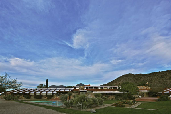
Photo courtesy of Andrew Pielage for Frank Lloyd Wright Foundation, OBMA, © Wright Fdn.
View of guest deck and Taliesin West from prow
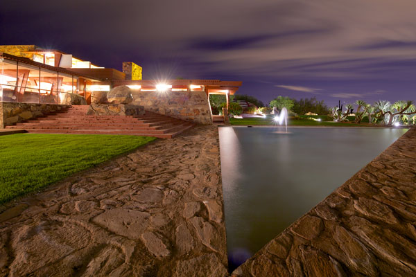
Photo courtesy of Andrew Pielage for Frank Lloyd Wright Foundation, OBMA, © Wright Fdn.
Taliesen West Panorama
Taliesin West was built primarily with desert rocks taken from the local landscape along with concrete and steel. Wright approached the design of Taliesin West like he did everything else, with an interest in harmony and unity for the surrounding environment. In some areas, particularly his work room, he chose translucent canvas as a roofing material in order to optimize natural light inside the building.
Wright also put his stamp on the grounds and landscaping in order to complete the vision of Taliesin West that he held in his mind. Complementing the desert-like terrain of the surrounding area, he worked with a limited palette and jagged or chunky shapes. That jagged aesthetic is mimicked in the architectural structure and silhouette. Jutting wood beams and steel frames both create and yet interrupt the low, horizontal lines Wright is famous for. The pool is unusually triangular in shape, further serving to imitate the jaggedness of the landscape.
On the interior, the lines are dominated by horizontals and verticals showcasing Wright's love of geometry. Steel beams, painted his often-used favorite shade of red, are precise contrast to walls and surfaces made of the same rock and cement used on the exterior.
Colors of Taliesin West—Then and Now
We now move on to the third section of the presentation and take an in-depth look at the colors Wright chose to create a palette for Martin Senour paints that represented the wealth of hues in the landscapes and environments of Taliesin.
Frank Lloyd Wright's original palette was compiled for Martin Senour, a West Coast paint brand, back in 1955. The palette was formatted with 36 colors—16 hues on the left side of the card, while 20 more hues appeared on the right side of the fold. Next to the hues on the left was a small amount of copy. This copy gave credit to not just the Martin Senour brand for paint, but also several other manufacturers of other elements in the home, including furniture (Heritage-Henredon), rugs (Karastan) and fabrics and wallpaper (F. Schumacher & Co.).

Image courtesy of Frank Lloyd Wright Foundation, OBMA, © Wright Fdn.
But as Wright was a careful and deliberate designer, it appears the design of the card was not just merely a matter of formatting.

Photo courtesy of Frank Lloyd Wright Foundation, OBMA, © Wright Fdn.
Colors at Taliesin West
On the left side of the color card, there is a dominant interest in what we refer to as 'baked earthen' tones. Neutral browns, oranges, and reds make up the majority of the palette. As mentioned earlier, Wright's favorite color, which is a deep vibrant red, is among these cherished baked earth hues. It was used for steel elements of the Taliesin buildings, in the same way that he used it for steel at Fallingwater.
On the right side of the color card, there is a distinct interest in what we refer to as more airy, or ethereal, tones derived from nature. Indeed, this side of the palette is decidedly cooler in tone, with sky and watery blues along with leafy greens dominating the palette.
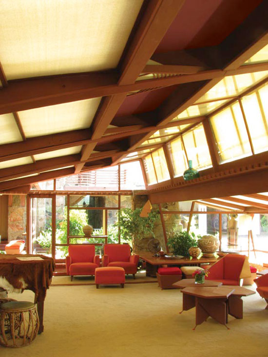
Photo courtesy of Frank Lloyd Wright Foundation, OBMA, © Wright Fdn.
Colors at Taliesin West
The total grouping of the 36 hues on the original Taliesin West color palette is exceptionally complete and offers exponential variations for micro harmonies. We will take a look in greater detail at these micro harmonies a bit later to understand how they were created and can be used in actual design, but first we will break down the original palette to take a look at it by family and grouping type:
Seventeen neutrals were included, with varying undertones of pink, yellow, green, and blue. This ensured there would be a neutral to pair with virtually any combination of other colors, no matter what their hue or tone.
Pastels might be seen as unlikely hues for Wright, since he was known to lean heavily towards neutrals and strong earthen hues. Yet the presence of a mere five pastels indicates how thoroughly he considered the marketability and totality of the color card for American consumers. These five pastels were primarily warm shades of red, pink and yellow and suited the southwest landscape.
Let's look at the palette further, dividing it into warm and cool tones. By pulling all of the warm hues of the palette together, some of the 17 neutrals, and all of the pastels, reappear, but are now flanked by richer orange and red hues.
The cool hues of the Taliesin West palette are nearly as plentiful as the warm tones, and are dominated by airy blues and nature-derived greens.
Another way to consider the palette is to isolate the mid-tones, of which there are several from both the cool and warm directions of the palette. With a mix across hues of nicely saturated shades, it's easy to see how Wright considered colors for textiles and carpeting.
And, since we began with describing almost a full half of the 1955 Taliesin palette from the perspective of 'baked earth,' we must of course address the earthen shades. This mix of clay-like neutrals, sunset reds and oranges, and natural greens is truly indicative of the striking Arizona landscape.
In complete contrast to the predominant earthen shades, Wright still managed to include colors that could be considered light as air—like clouds or mist. These are considered ethereal shades, again including the pastels and some neutrals in the mix.
We now return to the full Taliesin palette once more, to address additional micro harmonies. As we've already pointed out, part of Wright's brilliance as an architect and designer is that he obsessed over every last detail to the point of absolute perfection —keeping the pillars of unity, simplicity, harmony, and integrity as his essentials. His obsession with these things is just as evident in the Taliesin West palette. One can literally find an exponential amount of exquisite micro harmonies to suit any style or occasion among this carefully selected group of 36 shades. These micro harmonies can be seen grouped on the palette as four colors in a single row, or by creating a 2 X 2 boxed grouping, illustrating the skill with which the palette was put together.
It is also important to acknowledge some of those potential micro harmonies as they relate to design today and how they can still be seen on some of the latest product offerings on the market. Despite being created almost 60 years ago, the range of colors in the Taliesin West palette are exceptionally relevant for our contemporary market place. There are countless examples of this timeless palette still in use today—whether for residential or for commercial use—in clothing, furniture, carpets, textiles, and on all types of decorative accessories. This certainly lends credence as yet another example of Frank Lloyd Wright's true genius.
In Summary
In short, Frank Lloyd Wright was a designer of more than just architecture. Believing the architect should create total environments, he also designed art glass windows, furniture, fabrics, lamps, carpets, china, statuary, urns, tiles, and paint color palettes that are organic and ethereal, organized and inspiring. He found ways to bring nature into his work that is unparalleled to this day. And, his ability to achieve harmony and integrity throughout his designs is, in itself, a work of art.
Today, there are thousands of design examples, created by as many different artists, which were clearly influenced by Wright's unique style and mastery. It is a testament to the genius behind the vision of this great American icon, an architectural master to his core and one of our nation's best examples of a modern dreamer—Frank Lloyd Wright.
The Frank Lloyd Wright Collection product is authorized by the Frank Lloyd Wright Foundation, Taliesin West, Scottsdale, Arizona, U.S.A. “Frank Lloyd Wright”, “Frank Lloyd Wright Collection”, Mr. Wright's photograph and signature are trademarks of the Frank Lloyd Wright Foundation and are used with permission. © 2014 Frank Lloyd Wright Foundation. All rights reserved.
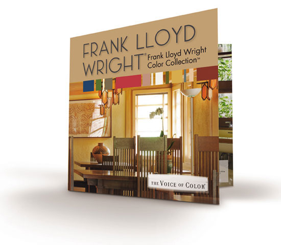
Image courtesy of PPG Architectural Coatings
Wright's brilliance is evident in his choice of color palettes.
Additional Resources
Should you wish to review Frank Lloyd Wright in more depth, the following is a bibliography listing of relevant and compelling source material.
1) “Frank Lloyd Wright, An Autobiography,” Frank Lloyd Wright (New York: Duell, Sloan and Pearce, 1943) or as reprinted by Barnes and Noble.
2) “Frank Lloyd Wright's Taliesin and Taliesin West,” Kathryn Smith (New York: Harry Abrams, 1997)
3) “Frank Lloyd Wright: In the Realm of Ideas,” Bruce Brooks Pfeiffer & Gerald Nordland (Carbondale: Southern Illinois University Press, 1988)
4) “The Essential Frank Lloyd Wright: Critical Writings on Architecture,” Bruce Brooks Pfeiffer, Editor, Princeton University Press, 2008.
The following is an excellent source for quotations:
1) “An American Architecture: Frank Lloyd Wright,” Edgar Kaufmann, Editor (Pomegranate Communications, 2006)
The following are excellent sources for design images:
1) “Frank Lloyd Wright - Graphic Artist,” Penny Fowler (Pomegranate Communications, 2002)
2) “Light Screens - the Leaded Glass of Frank Lloyd Wright,” Julie L. Sloan, (Rizzoli International Publications, Inc., 2001)
| PPG PAINTS™ unites the store networks of PPG Pittsburgh Paints www.ppgpaints.com®, PPG Porter Paints www.ppgpaints.com® and Glidden Professional into one powerful brand with a complete line of professional-grade paints and sundries. www.ppgpaints.com |